Maintenance
Two Weeks of Strategic Break
Almost two weeks have passed since the last project because I wanted to complete course 5 of Google UX, create the high fidelity prototype, reorganize all my notes adding everything to the UI & UX Vademecum and finally prepare adequately for a Pitching Session related to a university exam.
The latter went great! Although she is a demanding professor who rarely commits and frequently requires project modifications, in our case she said to think about turning it into a startup. It was a project aimed at reducing food waste through technology. In the next session we will have to present the definitive concept, while in this first phase we presented blue sky research (a type of research that aims to break usual design patterns and think outside the box), mandala, personas, user journey, case studies, mind map and product system, thus building the foundation to arrive at the How Might We (HMW) question.
The Usability Test Failure
Regarding the Google course, I tried to administer the usability test of the low fidelity prototype to 5 of my colleagues, but without success.
I sent a detailed WhatsApp message that included:
- Explanation of the industrial project
- 7 points of detailed instructions
- An industrial simulation story
- 3 different situations to test with screen recording
- Final questions
The result? A complete disaster. I received:
- No response from someone
- "I'm not in that department" from someone else
- "I'll read it later" without follow-up
- "Message too long, I don't feel like it"
Error Analysis
Blaming these people for being unfriendly or unwilling wasn't the right approach. It could have been if I had received 4 yeses and 1 no, but such an overwhelming result meant that I was the problem. I reflected on it and here's what I understood:
"If I Understand It, Everyone Understands It"
I didn't want to insist, because doing so would have made it almost impossible to make them understand that the problem was mine in how I had written the message and not their inadequacy in understanding it. As I had read in "Don't Make Me Think" users tend to attribute the causes of their errors in a UI to themselves rather than to the designer, when in fact the problem always lies with the designer. This is a fundamental principle that I don't just cite: I've seen it in action with my own eyes.
The First Official Usability Test
After giving up insisting with my colleagues, I did my very first moderated usability test (face-to-face) with a friend of mine who will actually start working in a factory soon. So it wasn't a simple simulation, but a test with a person who will really set foot in that environment for the first time. I had already done usability tests for other application projects at work, projects I'll talk about in some future README, but I had never reached such depth. I tried to avoid any bias and for the second time I fell into the trap of "if I understand it, everyone understands it".
Test result: Only 1 of 3 tasks failed.
From Material to Metro Design
After this test I immediately tried to solve the problems. Fortunately only one of the 3 tasks failed. I literally overhauled the UI, I switched from Material to Metro Design. I chose the latter because I noticed that in factories, including mine, Windows is the most used operating system, this would have guaranteed the comfort zone for many more people. I armed myself with my first phone, a Nokia Lumia 520 and took inspiration from it for the design.
Before (Material Design)
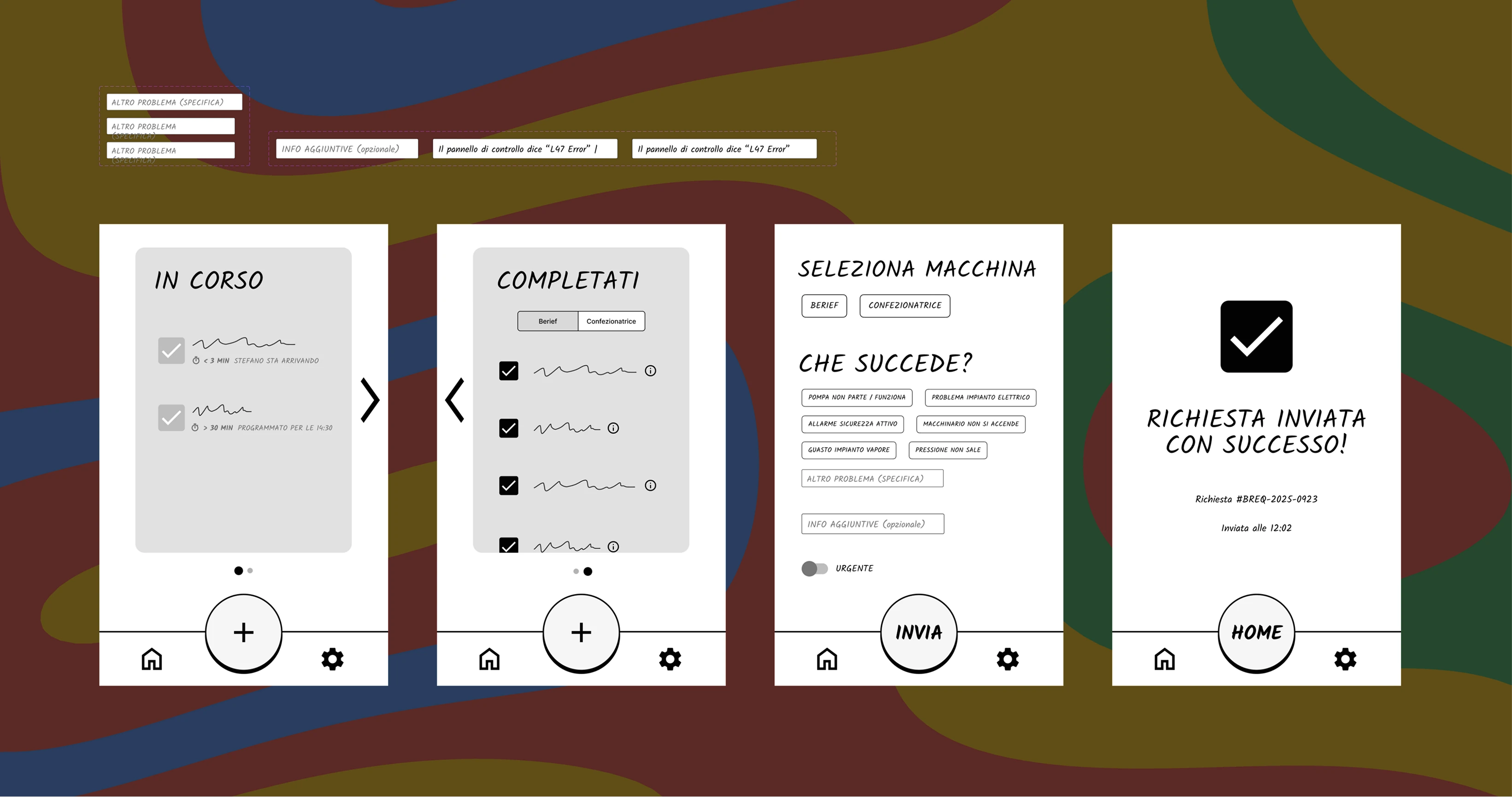
After (Metro Design / Windows Style)
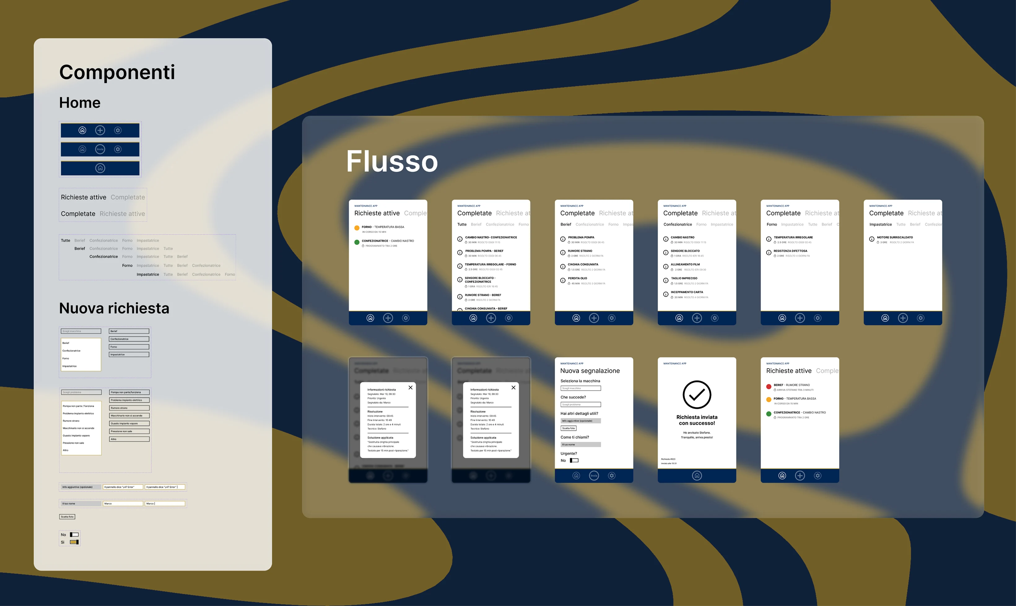
The Second Test: Same Surprise
I repeated the test and it was again the same task that failed. Surprising right? Well, it was the organization of the scenario order that I was getting wrong, but also the time indicator was ambiguous.
As emerged from the interviewee's actual words: it wasn't clear whether the intervention was scheduled in a certain amount of time, had been ongoing for a certain amount of time, or would take place in a certain amount of time. I should have put the creation of a new report first, because it was an emergency. The user should never have wasted time looking for whether someone else had already reported, but rather: I have an emergency, I report immediately, then I check how it was resolved or if someone else had already reported.
In addition to this, the first task (checking if someone else had already reported) was too simple to complete: the information was present on the first screen as soon as you opened the app. The user would have expected to have to search for the right screen, not to find it immediately in front of their eyes. After showing them where it was, they also felt stupid for not seeing it right away.
The Final Lesson
I have the high fidelity ready that I will administer as soon as I return to work, after the operation, to my colleagues. I expect everything to go smoothly but I understood that in this field you can't take anything for granted. Either you completely lose personality and therefore shamelessly copy what already works, or you have to clash with all the variables and human beings are full of them.
UI Bonus: The Website
While the App is undergoing testing, I developed the Sales Website for the service as part of the Google Certificate requirements.
View Website Previews
Desktop Version
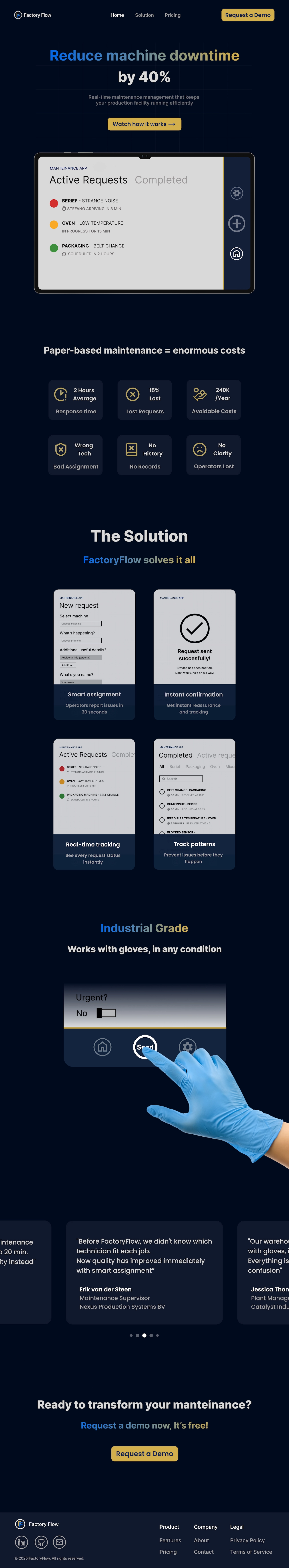
Mobile Version
