The Design of Everyday Things
The Book
This was absolutely the first UX book I read, and I still consider it the fundamental operating manual for understanding the psychology behind human-computer interaction. Norman dismantles the belief that errors are the user's fault, demonstrating how every slip is actually the result of poor design. Through concepts like Affordance, Mapping, and Feedback, the book transforms design from a purely aesthetic exercise into a behavioral science. It was pivotal for me because I believe a UX Engineer shouldn't just decorate interfaces, but design mental paths where the user never has to ask how to use an object or a component.
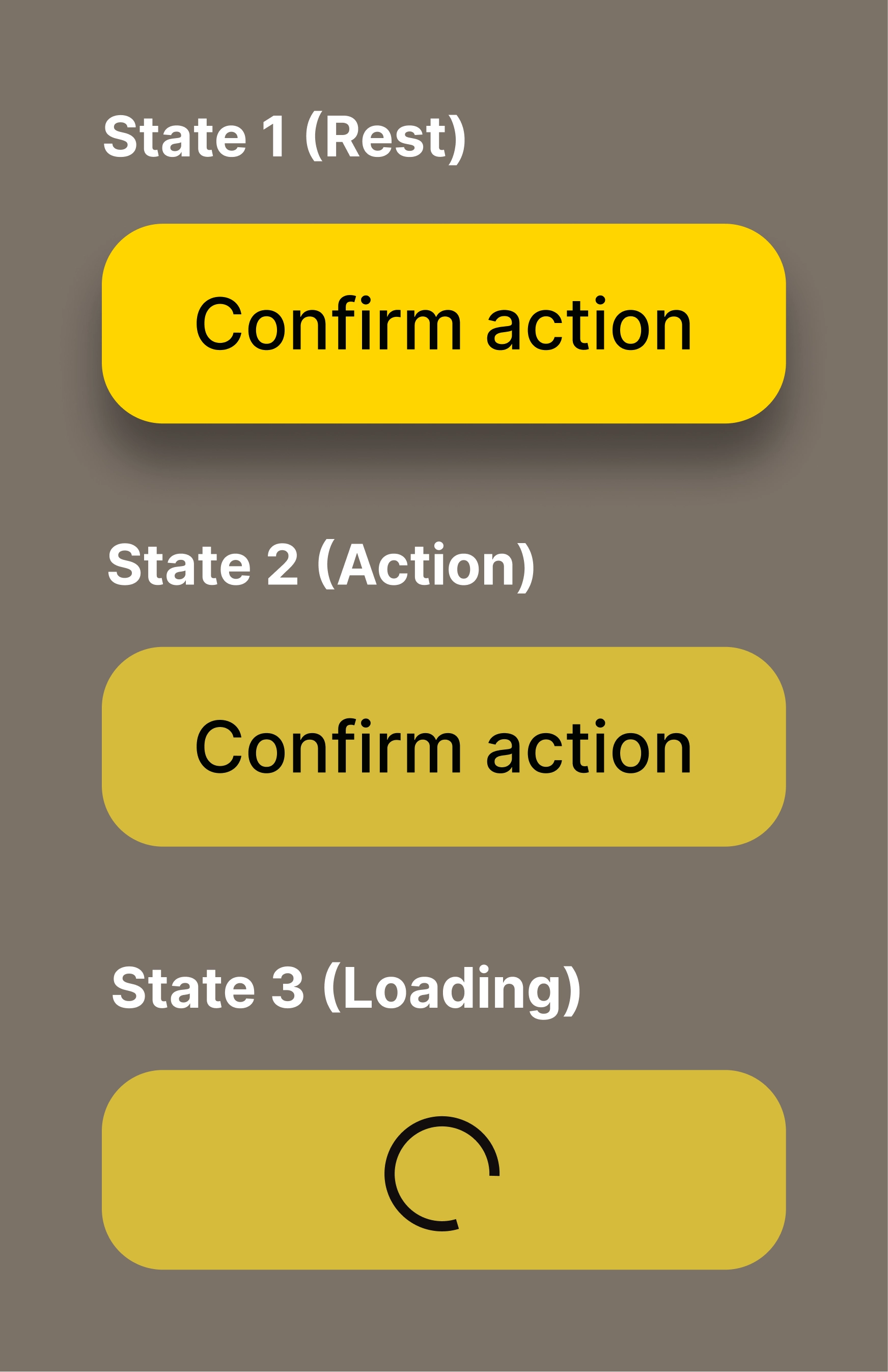
Practical Example: "The State Machine Button"
To demonstrate Norman's principles in a purely software context, I designed and developed a "conscious" Button component. Too often, in websites and apps (less within the Apple ecosystem thanks to the standards enforced by the Human Interface Guidelines), buttons are static rectangles that only change color upon clicking, violating the principle of continuous Feedback. I created a component that respects the complete action cycle described by Norman. Affordance is guaranteed by visual elevation provided by the shadow suggesting clickability, while Feedback is immediate and traverses five distinct stages: rest, intention, action, waiting, and confirmation. This ensures that the space between the user's action and the understanding of the result is reduced to zero.
Figma Prototype
Live Implementation (Code) • 0.5x Speed
Source Code
Regarding the implementation, I used semantic HTML, modern CSS with Custom Properties for state management, and Vanilla JavaScript with Arrow Functions for interaction logic.
- index.html
- styles.css
- script.js
<!--
   DESIGN
   ------
   * Semantic structure and accessibility first:
   * - Semantic tag: I chose <button> over <div> to gain native keyboard
   *   focus and screen reader support (Affordance)
   * - ARIA integration: aria-live="polite" is critical here. It ensures
   *   that the feedback (loading/success) is announced to non-visual users
   * - State readiness: The .loader is present in the DOM but hidden,
   *   ready to appear without causing layout shifts.
-->

<div class="button-container">
    <button id="action-btn" class="norman-btn" aria-live="polite">
        <span class="btn-text">Confirm action</span>
        <span class="loader"></span>
    </button>
</div>

<link rel="stylesheet" href="styles.css">
<script src="script.js"></script>
/* DESIGN
   ------
   * Physics metaphor and state management.
   * - Token-based depth: Shadows represent the Z-axis (elevation)
   *   I defined them in :root to maintain consistent "physical laws"
   *   across the application
   * - Interaction physics: The transition is tuned to mimic a mechanical
   *   spring (ease), providing realistic tactile feedback
   * - Constraint styling: The 'loading' state enforces the constraint
   *   visually (opacity) and functionally (pointer-events: none)
   * - Layout stability: I use CSS Grid Stack technique here. Instead of
   *   absolute positioning, I place both text and loader in the same
   *   Grid cell (1x1). This guarantees mathematical centering.
*/

/* * Here I manage the "Button physics".
   * The shadow is not decorative but functional, as it suggests
   * elevation (Affordance)
   * When pressed (:active), the shadow decreases and the element goes down,
   * simulating real mechanical resistance (Tactile feedback).
*/

:root {
    /* Colors */
    --primary-color: #ffd500;
    --hover-color: #d5bb3b;
    --bg-body: #524236;
    --btn-text: #000000;

    /* Shapes and typography */
    --btn-radius: 14px;
    --btn-weight: 550;

    /* Physics */
    --shadow-rest: 0 8px 10px -1px rgba(0, 0, 0, 0.4);
    --shadow-active: 0 1px 2px 0 rgba(0, 0, 0, 0.05);
}

body {
    background-color: var(--bg-body);

    /* Viewport Centering */
    margin: 0;
    height: 100vh; /* Full viewport height */
    display: grid;
    place-items: center; /* Perfect centering */
}

.norman-btn {
    /* GRID STACKING TECHNIQUE: Perfect centering without magic numbers */
    display: inline-grid;
    place-items: center;
    grid-template-areas: "stack";

    position: relative;
    padding: 0.75rem 1.5rem;
    min-width: 160px; /* Prevents width collapse during state change */
    border: none;
    border-radius: var(--btn-radius);
    background-color: var(--primary-color);
    color: var(--btn-text);
    font-weight: var(--btn-weight);
    box-shadow: var(--shadow-rest); /* Affordance: elevation */
    cursor: pointer;
    transition: all 0.1s ease;
}

/* Stacking both elements in the same grid cell */
.btn-text, .loader {
    grid-area: stack;
    transition: opacity 0.2s ease;
}

.norman-btn:hover {
    background-color: var(--hover-color);
    transform: translateY(-1px); /* Intention: it moves closer to the finger/cursor */
}

.norman-btn:active {
    transform: translateY(2px); /* Action: it sinks under pressure */
    box-shadow: var(--shadow-active);
}


/* STATE MANAGEMENT: LOADING */

.norman-btn.loading {
    cursor: wait;
    opacity: 0.8;
    pointer-events: none; /* Constraint: prevents double clicks */

    /* UX physics: the button stays "pressed" during work */
    box-shadow: none;           /* Removes elevation (flat against surface) */
    transform: translateY(2px); /* Keeps the pressed position */
    background-color: var(--hover-color); /* Maintains the active/pressed color */
}

.loader {
    /* Visibility handled by opacity for smooth transition */
    visibility: hidden;
    opacity: 0;
    width: 1rem;
    height: 1rem;

    /* Loader color inherits from text color token for consistency */
    border: 2px solid var(--btn-text);
    border-bottom-color: transparent;
    border-radius: 50%;
    animation: rotation 1s linear infinite;
}

.norman-btn.loading .btn-text {
    visibility: hidden;
    opacity: 0;
}

.norman-btn.loading .loader {
    visibility: visible;
    opacity: 1;
}

@keyframes rotation {
    0% { transform: rotate(0deg); }
    100% { transform: rotate(360deg); }
}
/* DESIGN
   ------
   * State logic and async simulation.
   * - Event-driven architecture: The logic reacts to user intent immediately
   * - Constraint enforcement: The guard clause prevents "Rage clicks" or
   *   double submissions by checking the current state
   * - Feedback loop: Simulates network latency providing visual
   *   feedback throughout the entire lifecycle.
*/

/*
   I use arrow functions to manage the logic. On click, the button enters
   a "Loading" state (constraint) preventing further accidental clicks,
   then provides final feedback (success).
*/

const btn = document.getElementById('action-btn');

const handleClick = () => {
    // Constraint: prevent multiple clicks
    if (btn.classList.contains('loading')) return;

    // Feedback: enter the waiting state
    btn.classList.add('loading');

    // Simulation of an asynchronous call (e.g., API)
    setTimeout(() => {
        // Feedback: end operation and return to resting state
        btn.classList.remove('loading');
        alert("Action completed!");
    }, 2000);
};

btn.addEventListener('click', handleClick);
Micro-Patterns
I isolated other key concepts from my notes and tried to translate them into development patterns.
Constraints and Error Prevention
Norman teaches that it is better to prevent errors at the source rather than curing them later. Instead of showing annoying error messages like "Invalid Date" after the user has already clicked, I will use native HTML5 constraints. For example, by setting min, max, and required attributes directly on the input, I guide the user toward the correct action invisibly, leveraging logical constraints to make entering incorrect data impossible.
Slips vs. Mistakes
Norman makes a truly interesting distinction between Slips and Mistakes (cognitive errors).
A Slip is an execution error: I wanted to click 'Edit' but my mouse "slipped" onto 'Delete' due to distraction.
A Mistake, on the other hand, is a planning error: I performed the correct action, but my mental model was wrong (I thought that button did something else).
I realized that, especially for Slips, the solution is not to punish the user by blocking the flow with annoying 'Are you sure?' modals, but to offer them an elegant way out.
From now on, wherever possible, I will replace preventive confirmation with a non-intrusive Undo system.
Here is how I imagine this 'recovery' logic managed via code:
// "Undo" Pattern I will use instead of confirmation modals
const deleteItem = (itemId) => {
    // Remove item from view immediately (Instant Feedback)
    removeItemFromDOM(itemId);

    // Show Toast (temporary non-intrusive notification) with Undo option
    showToast({
        message: "Item deleted",
        actionText: "Undo",
        onAction: () => restoreItem(itemId) // Arrow function for restoration
    });
};
The Leitz Projector Test
The case of the Leitz projector cited by Norman, where a single button handled too many functions causing disasters, is also interesting. Thanks to it, I will apply a rule I would define as “one action = one distinct control.”. I will avoid creating ambiguous icons that change function based on context in unclear ways; if an action is different, it must have a visually distinct control.
The Revelation
Thanks to Don Norman, I understood that the approach to CSS shouldn't be focused on pure decoration; a shadow doesn't serve to make the design more modern or simply pleasing to look at. I grasped that every pixel has a communicative weight and simulated physics serves to tell the user's reptilian brain "this object can be pressed". I have indeed stopped seeing micro-interactions as stylistic quirks and started viewing them as necessary dialogues, because if the system doesn't respond within 100 milliseconds with a state change, the user inevitably loses trust in the interface. And, as we've seen, it's never the user's fault: if they make a mistake, it means I failed in the design.
What I Learned
- Affordance is not beauty: A beautiful button that doesn't look like a button is useless; the function must be visible in the form.
- Asynchronous Feedback: The user must always know if the system is working, which is why Loading States are not optional.
- Reversibility (Undo > Confirm): Allowing errors to be remedied is infinitely better than terrorizing the user with continuous confirmation modals.
- Spatial Mapping: Controls must be close to the objects they modify, logically grouped to reduce cognitive load.
Reflection
If I had to summarize the book in one sentence, I'd say that invisible design is the best design. If a user notices my button because it's aesthetically pleasing, I've done a graphic job, but if they click it without even thinking, knowing exactly what will happen, I've done an engineering job. My task isn't to amaze the eye, but to free the mind from useless cognitive loads. Every time a user has to stop and think if an element is clickable, I have failed. In other words, my code must be the answer to that question before it's even formulated.