Center
The Project
A suite of Web Apps (PWA) designed to operate as floating widgets on the production line's industrial touch monitors. Born between night shifts to resolve operational bottlenecks, it achieved 100% organic adoption, eliminating human error in consumption calculations and FIFO management.
Source Code
The source code has been handed over to the company for exclusive use. Below, I document key moments of the development journey, the most significant technical choices, and above all the mistakes made.
Genesis: The Obsession
Center represents the closing of my chapter in the factory.
I waited until my very last day of work to write about it, because only then did I have the clarity to tell the story without the adrenaline of ongoing production.
I had mentioned it in the UX Engineer Log readme, where I said:
Before even calling myself a UX Engineer, I became one out of necessity in a food factory. While official management software was ignored because it was complex and detached from reality, I saw my colleagues stressed out. After just 4 days in the department, I realized that daily production planning was the bottleneck. From there, the idea was born to develop a Web App to manage hourly consumption and forecast production quantities. I was obsessed with it. I worked on it during breaks, in the bathroom, on night shifts, between sets at the gym, letting my muscles go cold because my mind was lost in creating the tool everyone would use. And so it was. The app achieved 100% organic adoption, used by the entire department across all 3 shifts. Not because it was graphically perfect, but because it solved a real problem. That’s when I understood that empathy is the most powerful technical skill there is. Soon enough, colleagues from other departments started asking me for similar solutions. That was the moment I did UX without knowing UX: I conducted usability tests and user interviews without knowing the formal method, but applying its essence.
In a year and a half of iterations, when I still had no formal UX or coding skills, I managed, in my own small way, to facilitate the work of two critical departments within the company.
Breaking Silos: Radical Transparency
In complex corporate contexts, I have often observed what I would call, to stay on theme, "silo dynamics": a fragmentation where departments don't talk to each other and knowledge is jealously guarded rather than shared. I have lived through situations where innovation was perceived more as a risk than an opportunity.
Faced with this, I chose the opposite path: radical transparency. I didn't limit myself to creating software; I documented every process, communicated with stakeholders, and shared tools with anyone who needed them. I firmly believed that to break silos, you need to build bridges. Beyond applying this principle in Web Apps, I found it extremely efficient to document procedures under the supervision of the figures who had solved problems in the plants. I always wrote to call reference figures (like mechanics and quality control) anyway because they were the only ones authorized, but those individual sheets came in handy not just for us, but also for the figures themselves, who often didn't know the specific plant accurately due to high turnover.
I realized how recurrent the problems were; that’s why I found it inefficient not to have a guide on how they had been resolved. It was the same purpose I applied in Maintenance, one of the projects done during the Google UX course. Some of these procedures were later formalized by the office without my request: laminated, hung on the walls, word-for-word copies of what I had written. It was the first time I saw one of my ideas "institutionalized" without going through bureaucracy or formal approvals. Radical transparency had won.
Center-01: The Evolution of Mental Models
Here is the very first version:
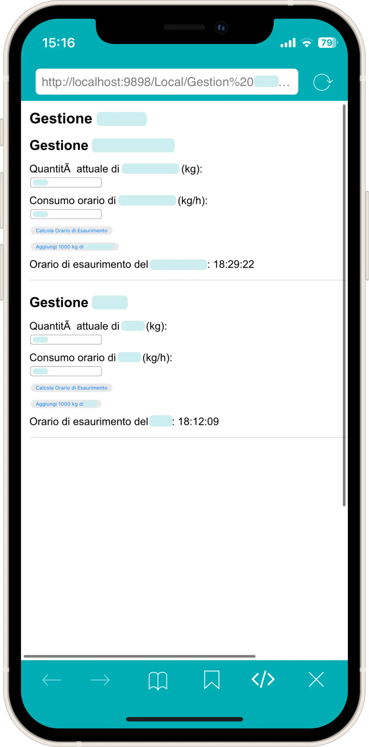
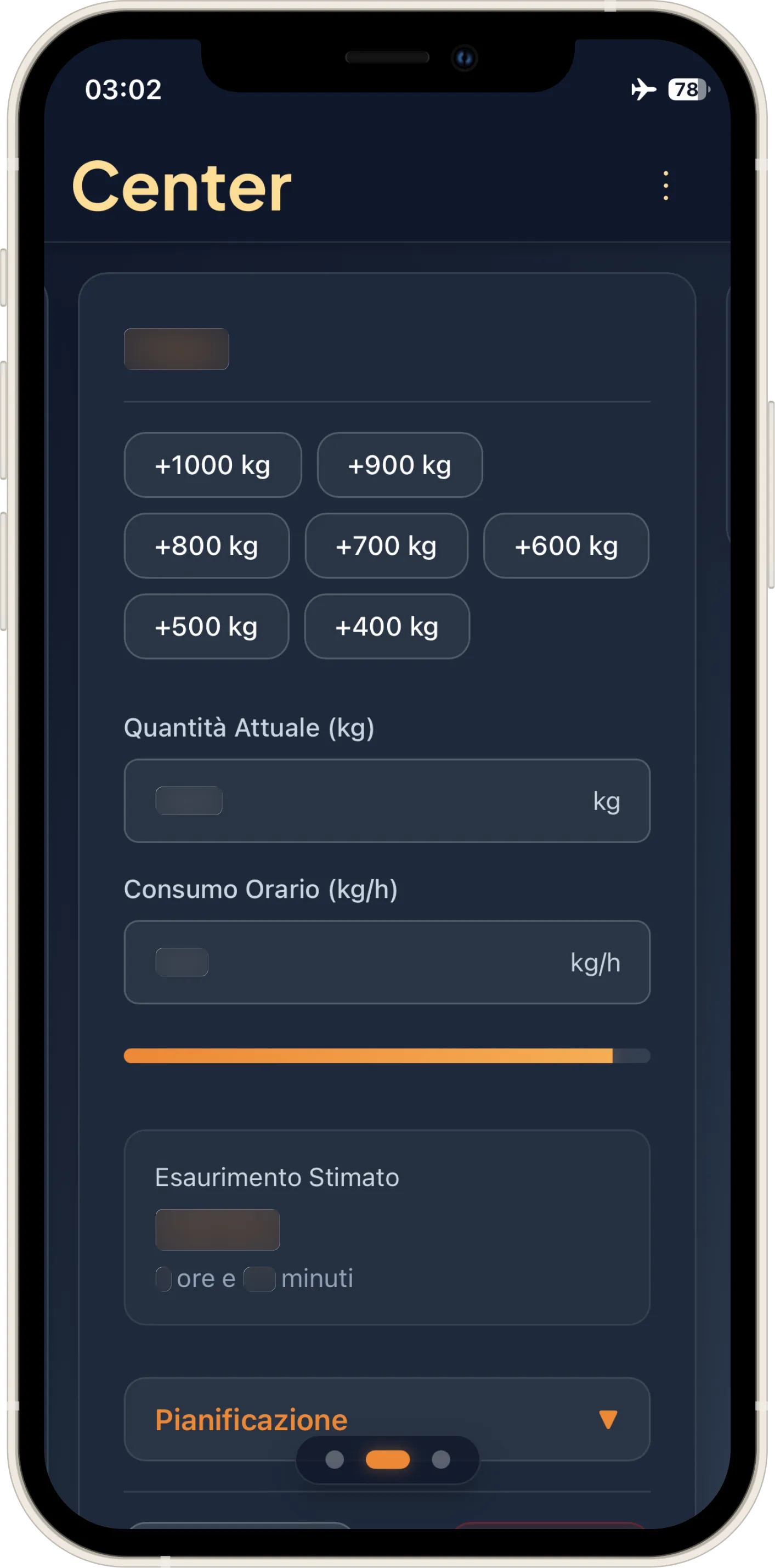
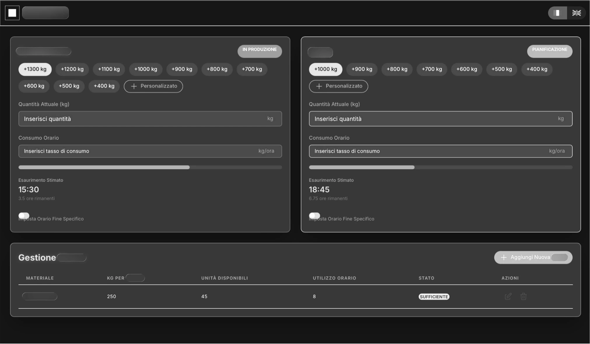
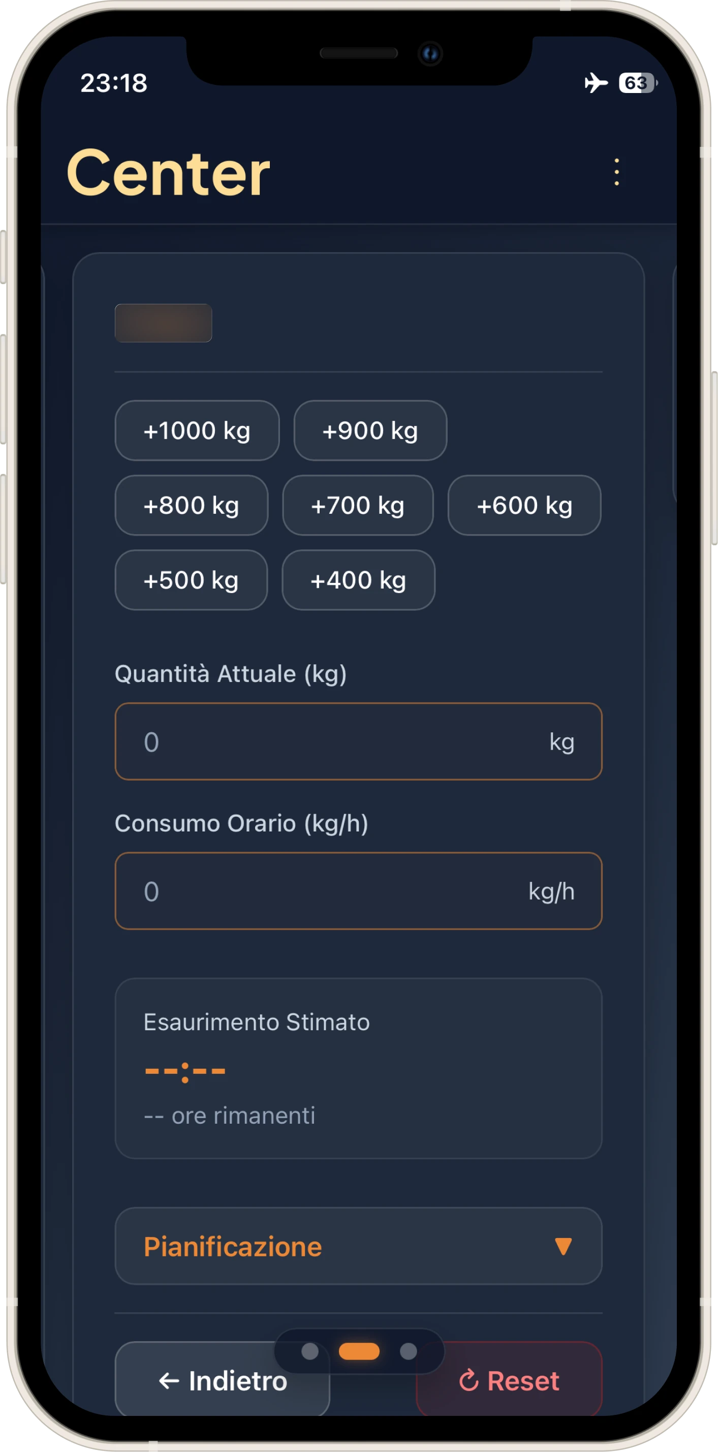
A terrible interface. And yet, what was the point of those two "Add 1000 kg" buttons? They replicated the exact procedure we did by hand with the calculator: we added 1000 to see until what time we would reach by cooking that quantity.
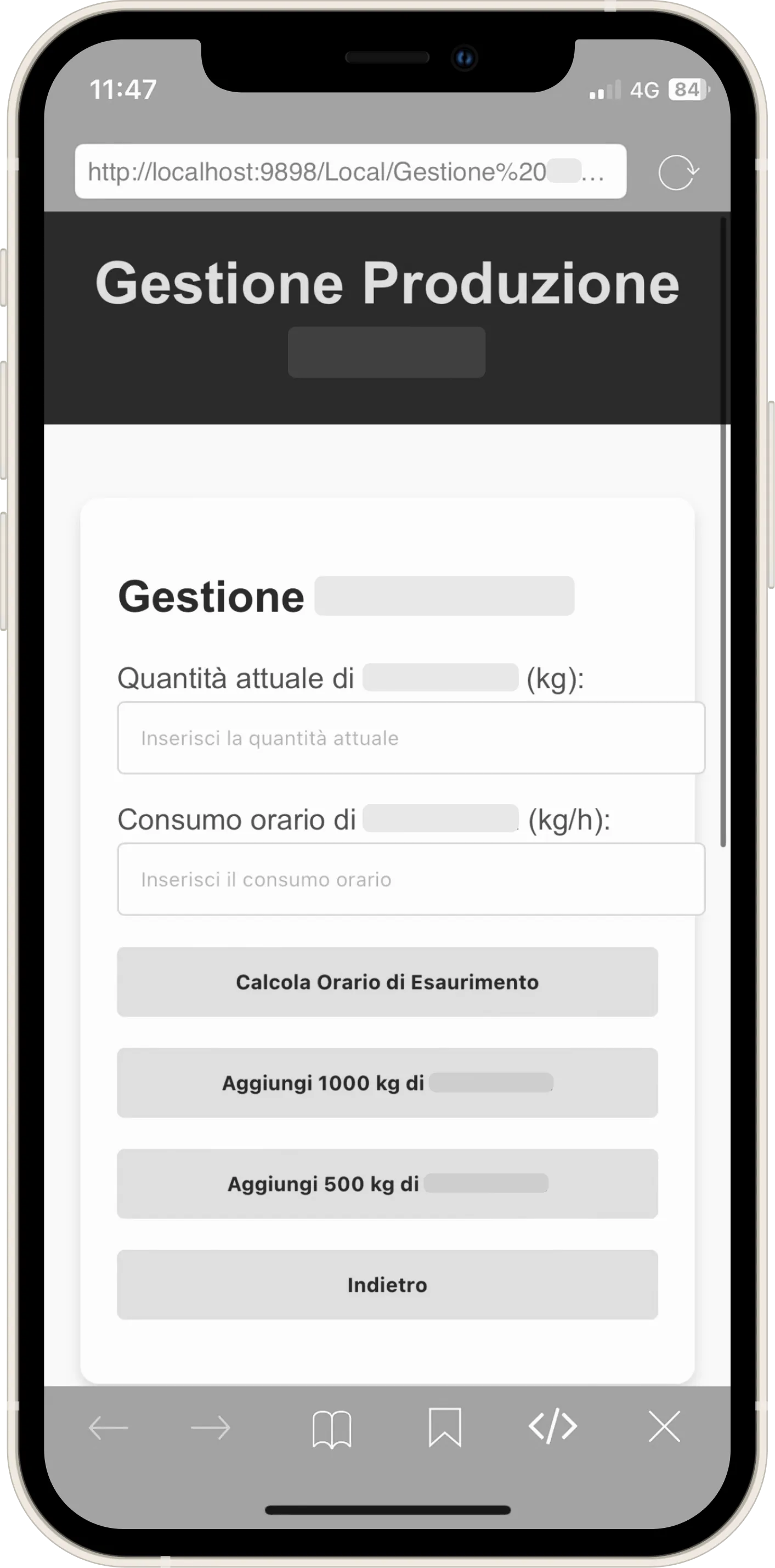
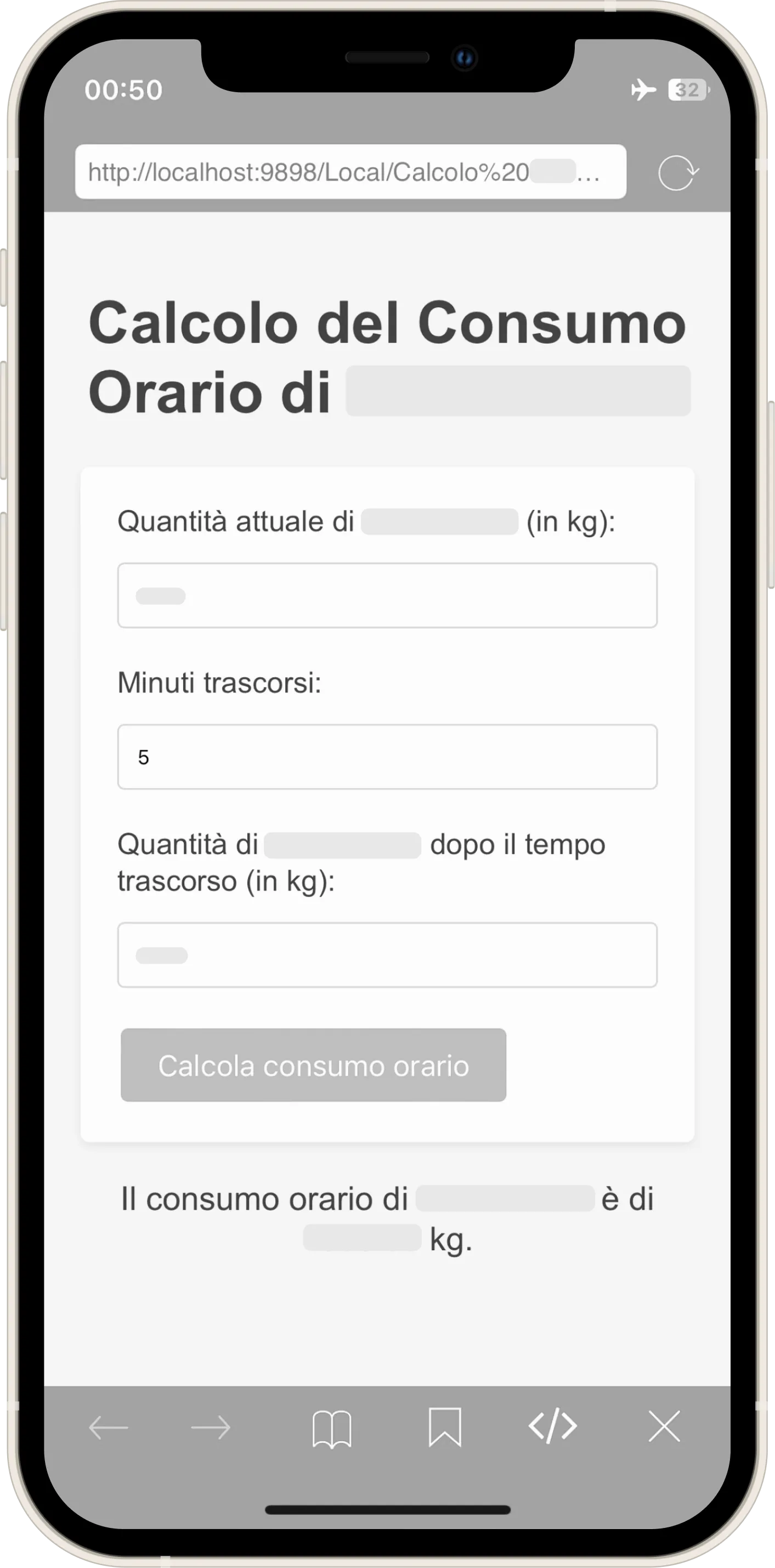
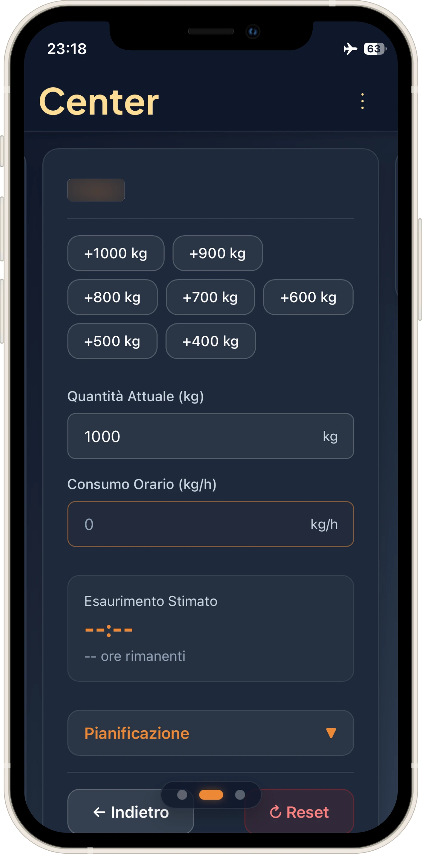
It was too restrictive: what if I wanted to try with other kg increments to understand how much to cook at closing and not waste raw material? Every phase of the application reflects my knowledge of the task itself. The answer came with the second version, finally featuring something "human" in the interface: the remaining time in hours and minutes (and fortunately, CSS too).
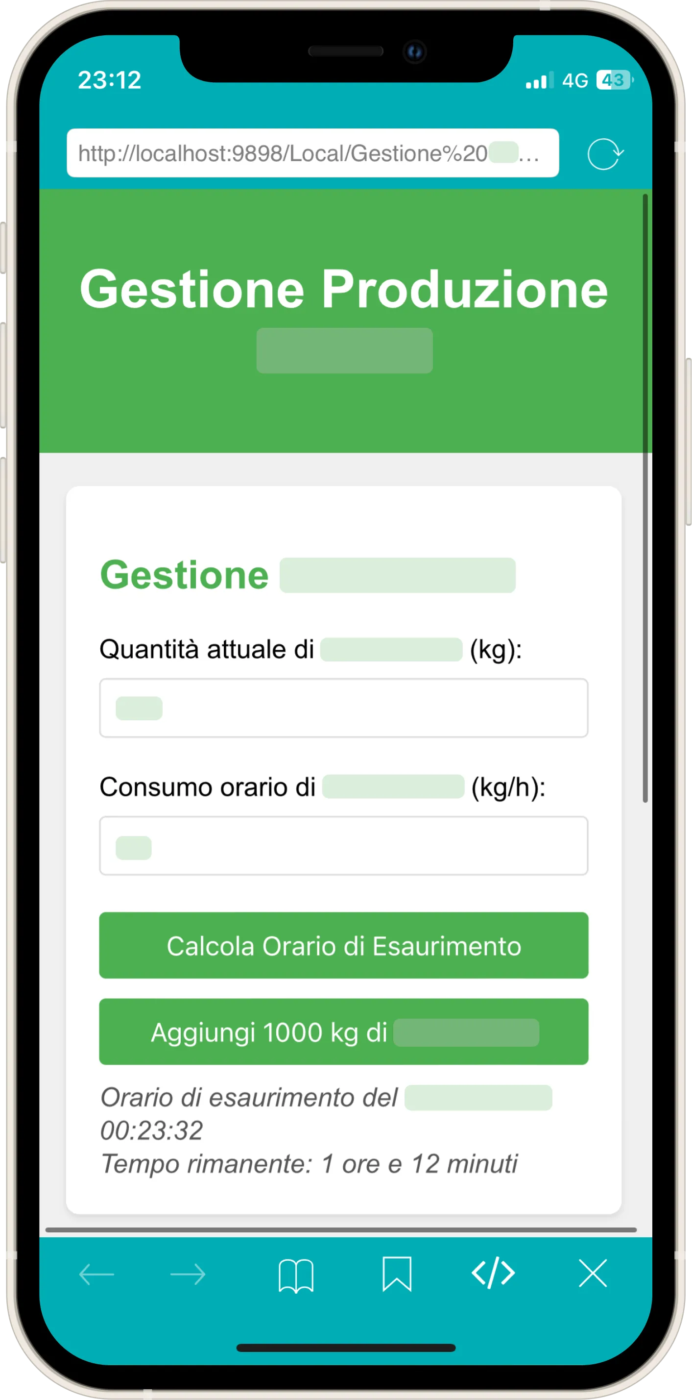
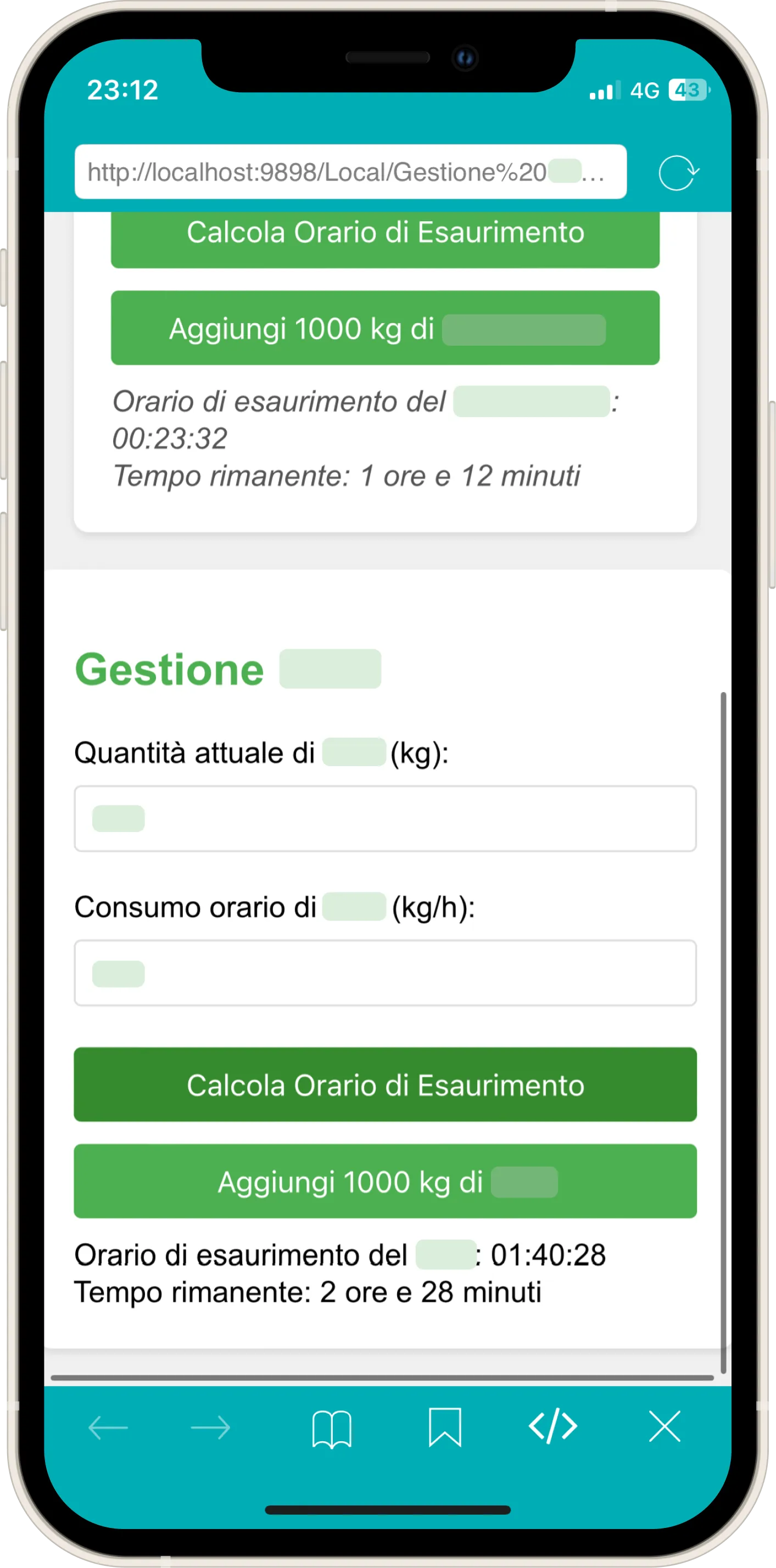
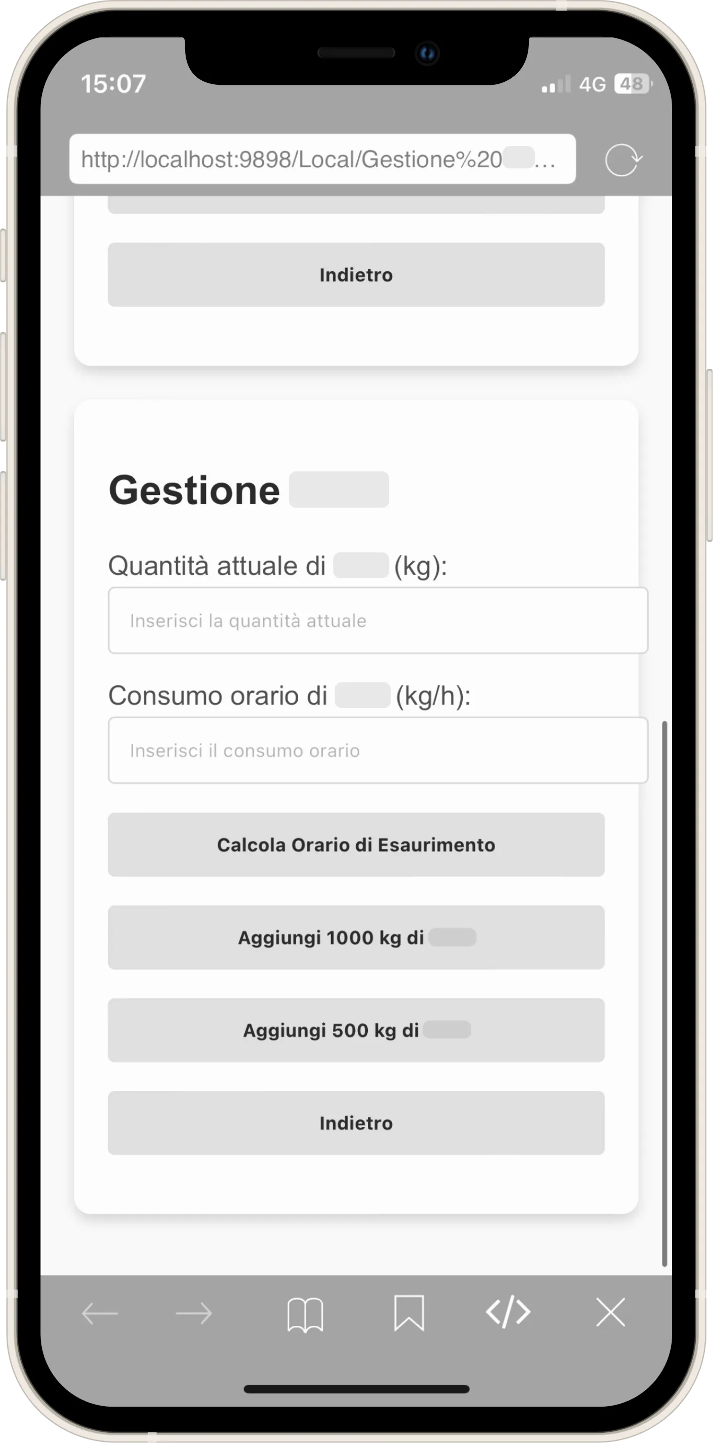
I added a 500 kg increment, but it still wasn't enough.
From here on, I will apply a monochrome filter, because even without the exact hex codes, the company colors would be immediately recognizable.
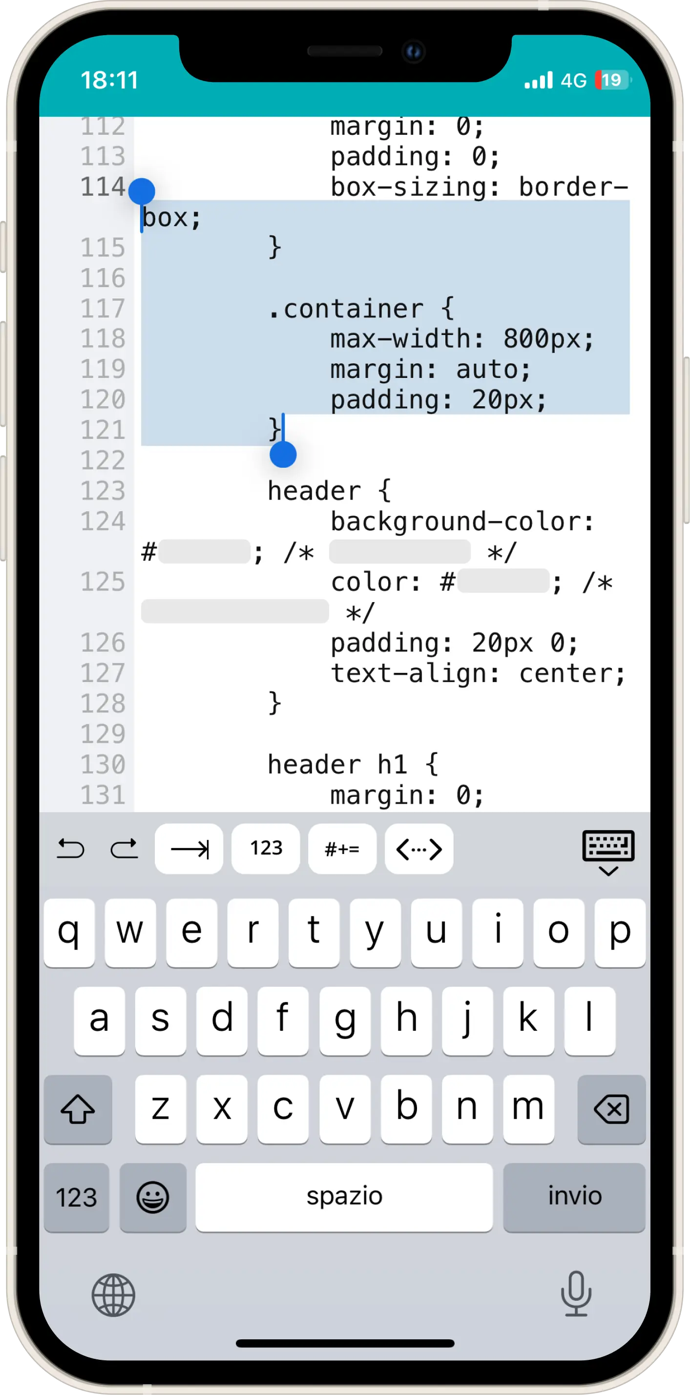
I made every modification on an IDE called "Koder" on an iPhone 12 mini:
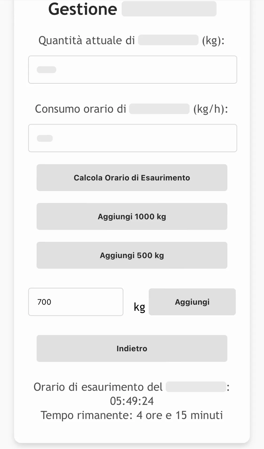
Where I finally centered those input boxes within the container:
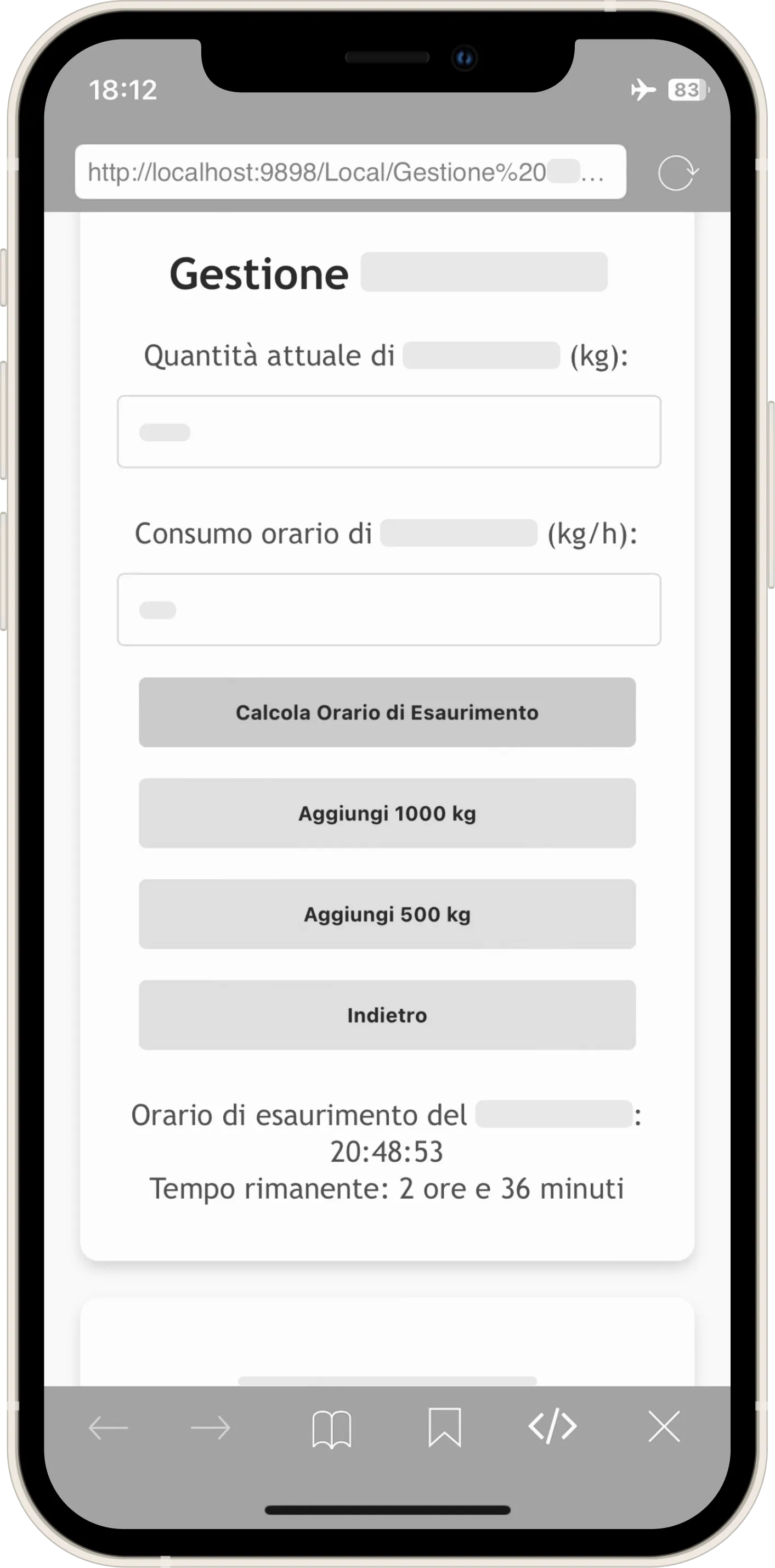
This was the moment the tool became scalable for the first time. The operator had the freedom to add the desired kg, exactly as they would have done through trial and error with a calculator (the procedure they were used to).
You might have thought: Why not directly ask the operator what time they want to reach and calculate backwards the quantity to cook? For two fundamental reasons tied to the mental models we held:
- We were used to reasoning by trial and error (adding, removing, deciding whether to oversupply based on the line's trend).
- I didn't want an app giving orders ("Cook X kg"). I wanted the user to feel they were participating in the calculation.
The Unconscious A/B Test
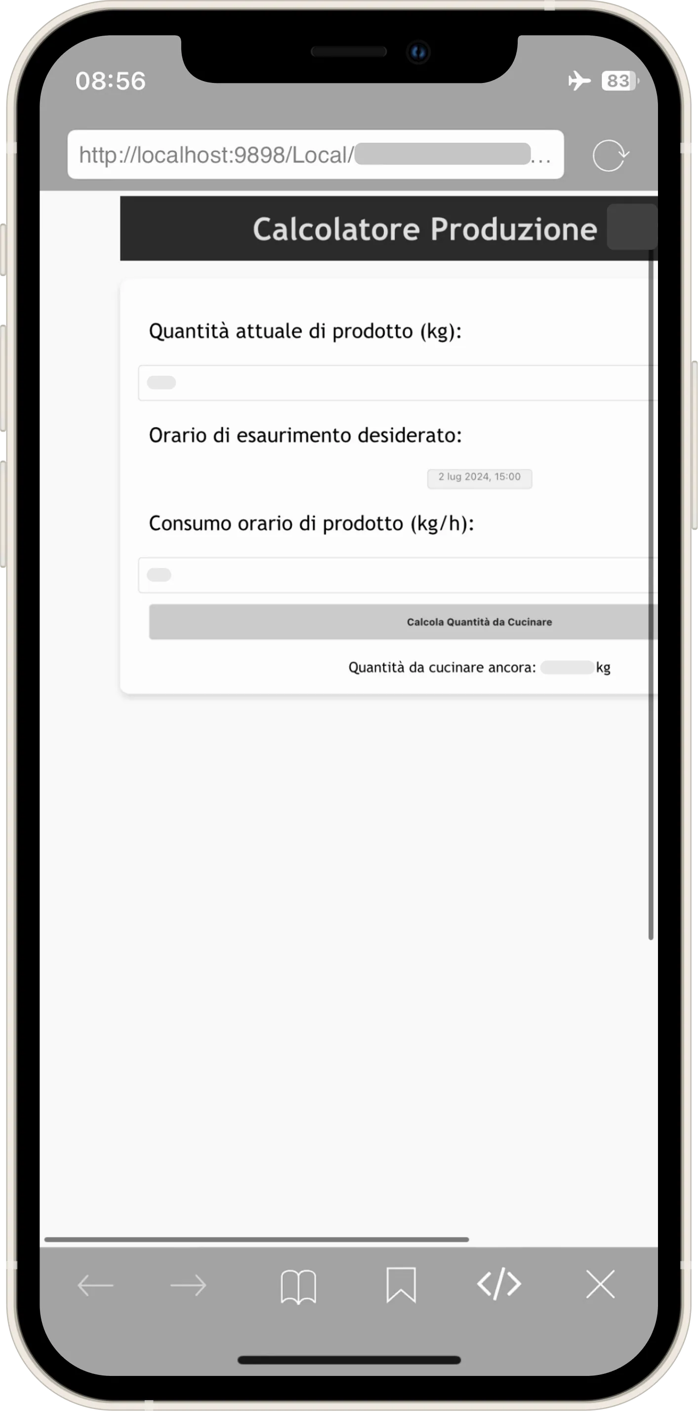
Despite this, I experimented anyway. I created an "automatic mode" that calculated everything on its own.
Without knowing it, I was conducting an A/B test. The result was clear: the manual mode was the only one used.
What you see is the initial attempt. Although I later standardized the graphics to match the manual one, adoption remained zero: operators wanted control, not blind automation.

The application now helped calculate with precision, but a doubt remained: what if the theoretical hourly consumption we had been given was wrong?
To verify this, colleagues performed the so-called "dosate" (dosing checks). The procedure was paradoxical: the line flow was interrupted, product was dripped from the dosers into a tub, it was weighed to calculate the flow, another 3 calculations were done for every single doser (quite a few), and finally... everything was thrown away.
What was the point? Analyzing the process, 3 wastes occurred simultaneously:
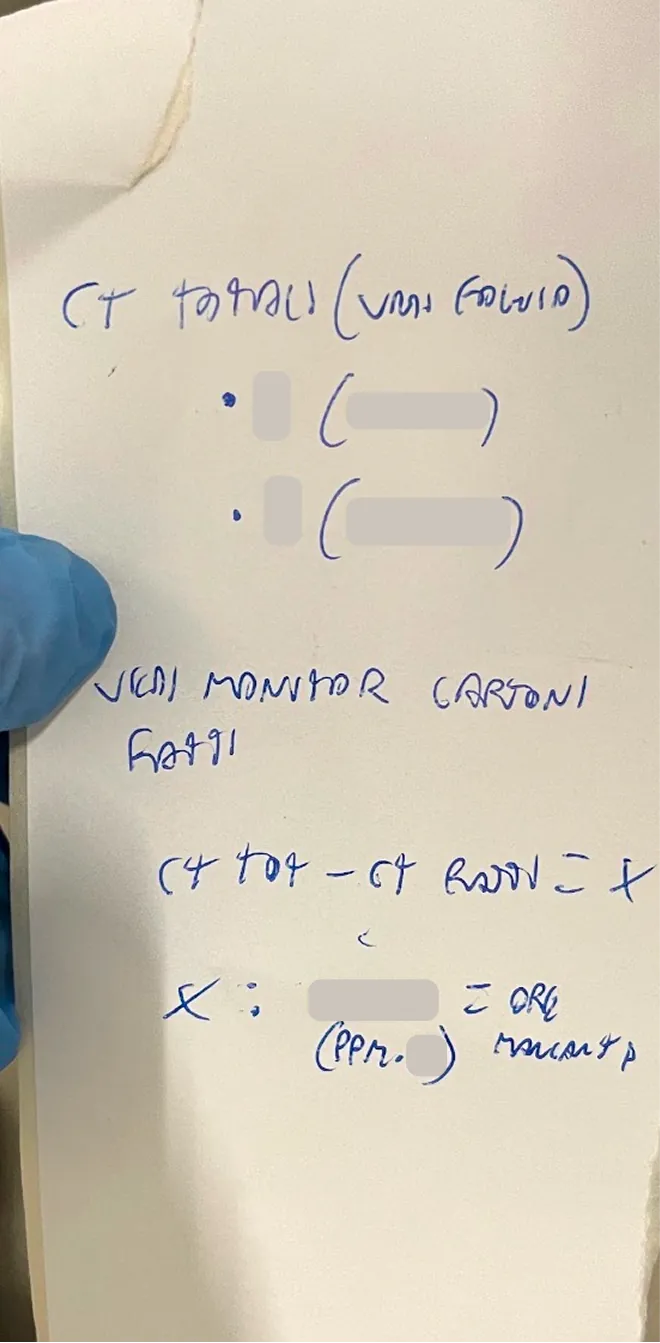
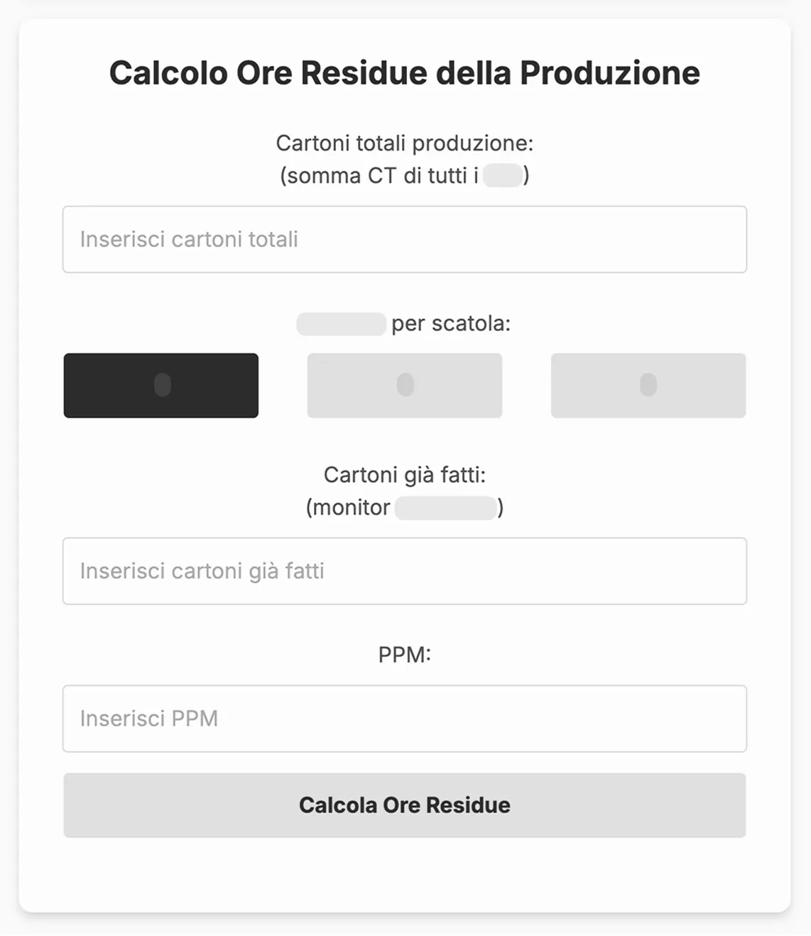
With Center, I had eliminated all of this. It only took entering 3 simple figures: Quantity in Silos, Elapsed Minutes, and Residual Quantity. After some comparisons, we confirmed that the mathematical result was identical to the physical one of the "dosing checks," but with zero waste and zero line downtime.
Another thing I discovered over time was that production changeover times were not always set in stone; sometimes we had to calculate the end time based on the quantity of cartons still to be produced. It was a factor that could compromise calculations if not managed, generating massive leftovers, exactly what the application aimed to eliminate. I also automated this calculation (which until then was done by hand), democratizing an operation that had previously been the exclusive domain of those more skilled in math who knew the formula.
↓
At this point, the tool expanded and gained adoption, albeit not total, in another department as well, because it solved a problem for them too, not just for us.
The Error of Deduction (and why IT needs to go down to the department)
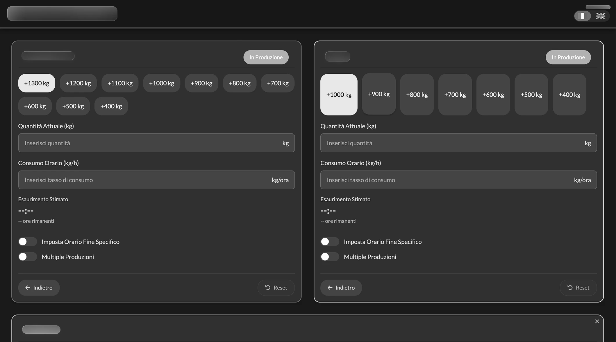
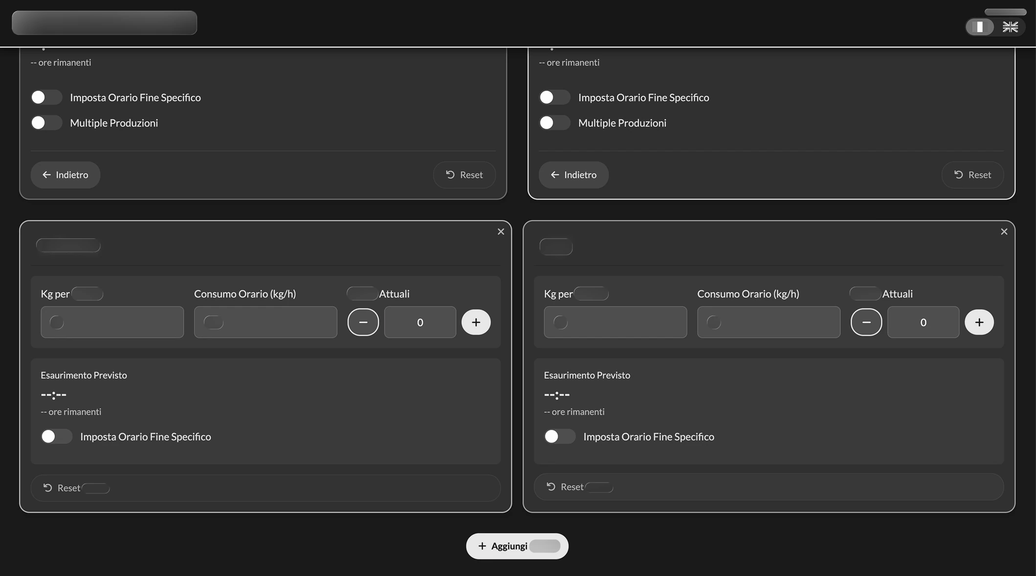
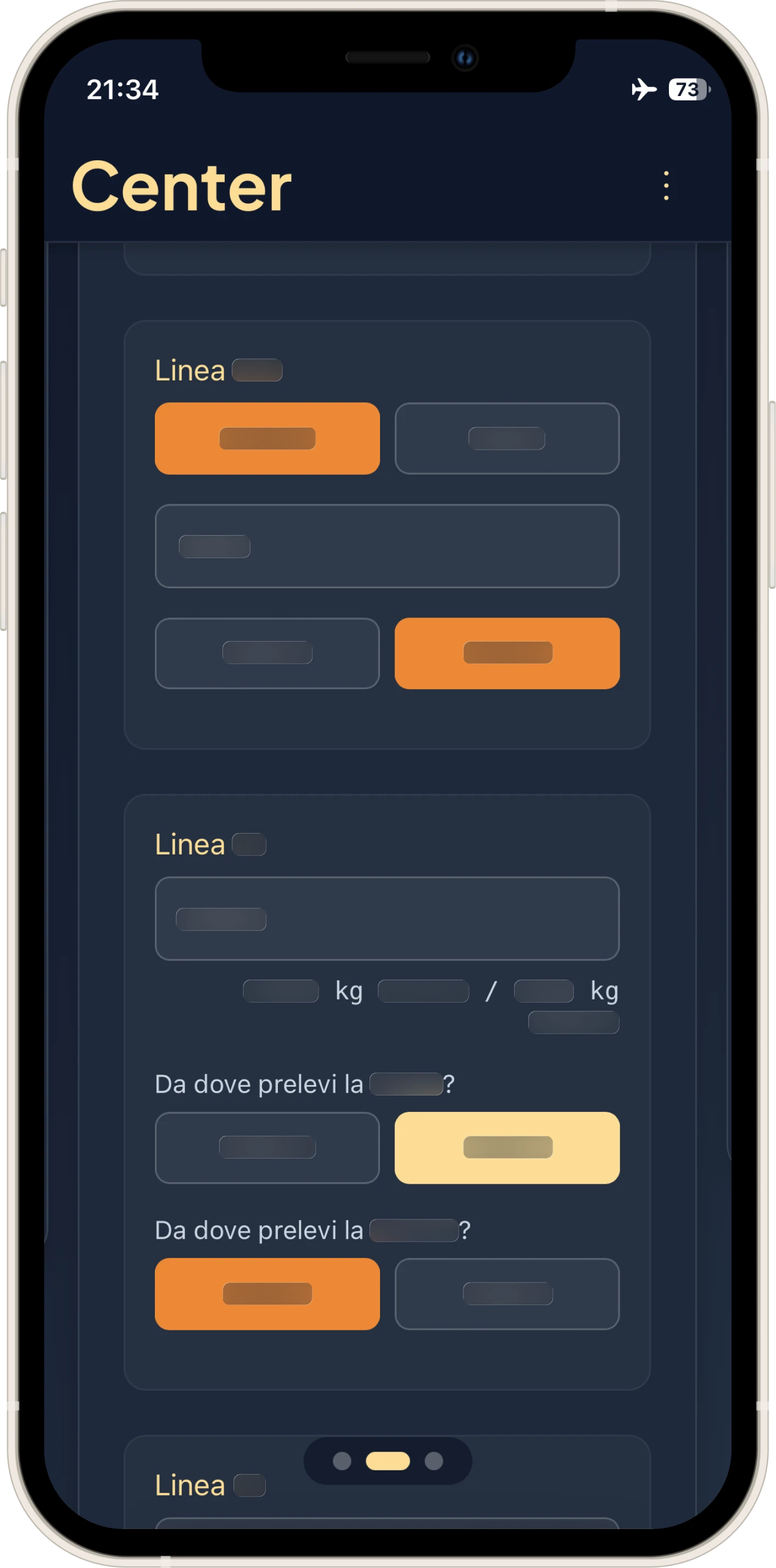
With every change in the department, I updated the interface. When we were told we would have to manage two lines instead of just one, I implemented two identical sections side-by-side.
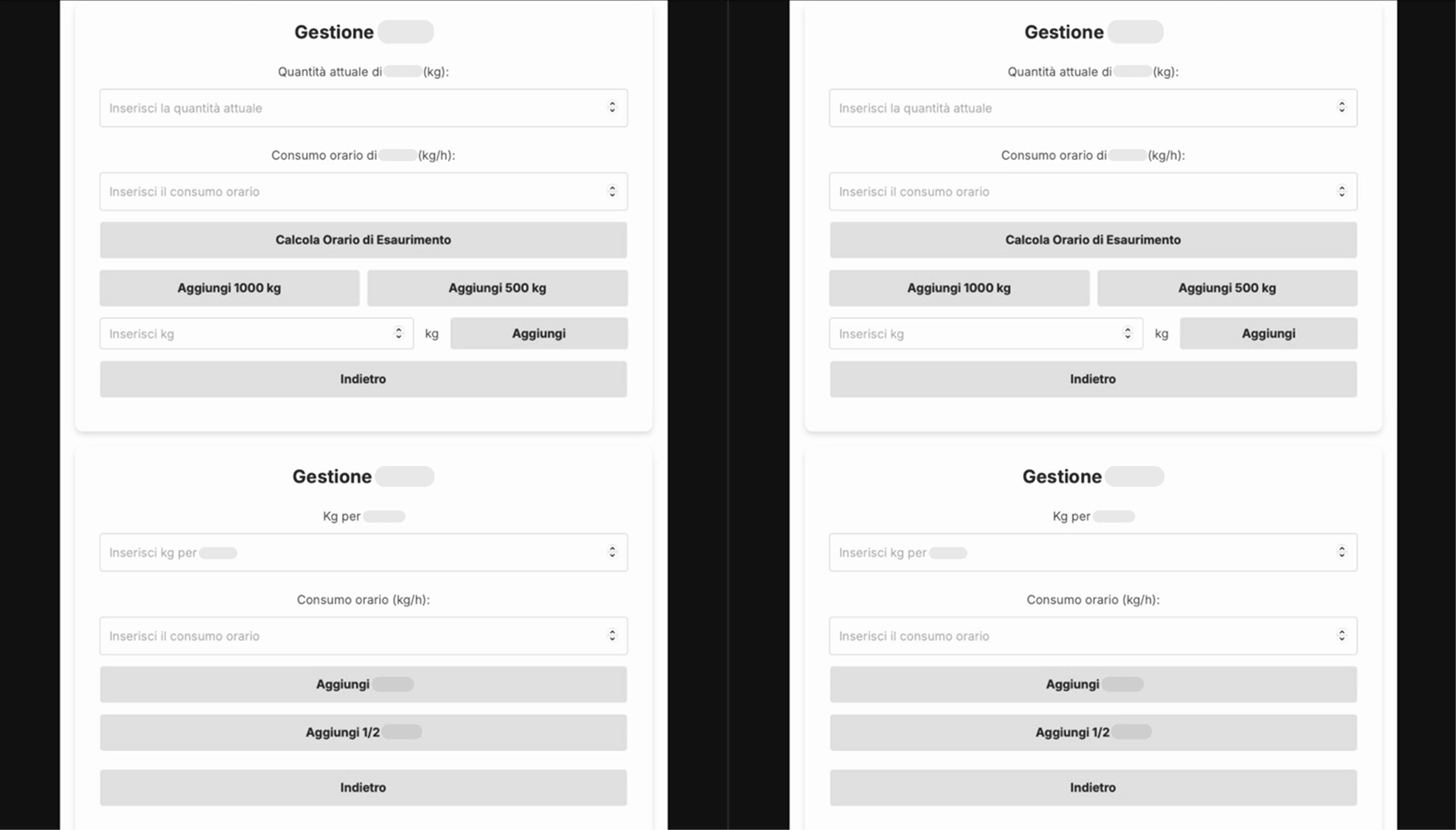
I made the classic mistake a Software Engineer working in an office would make: deducing without seeing the situation with my own eyes. At that moment, I was on vacation and had only heard about the new line. What I realized once I returned was that the lines were not as independent as I had assumed. One raw material, in particular, was used for both lines, ending up in the same silos: it was a calculation impossible to separate upstream, given that the silos were shared and the pump distributed the product. The logical thing (which everyone rightly did) was to sum the hourly consumption of both lines.
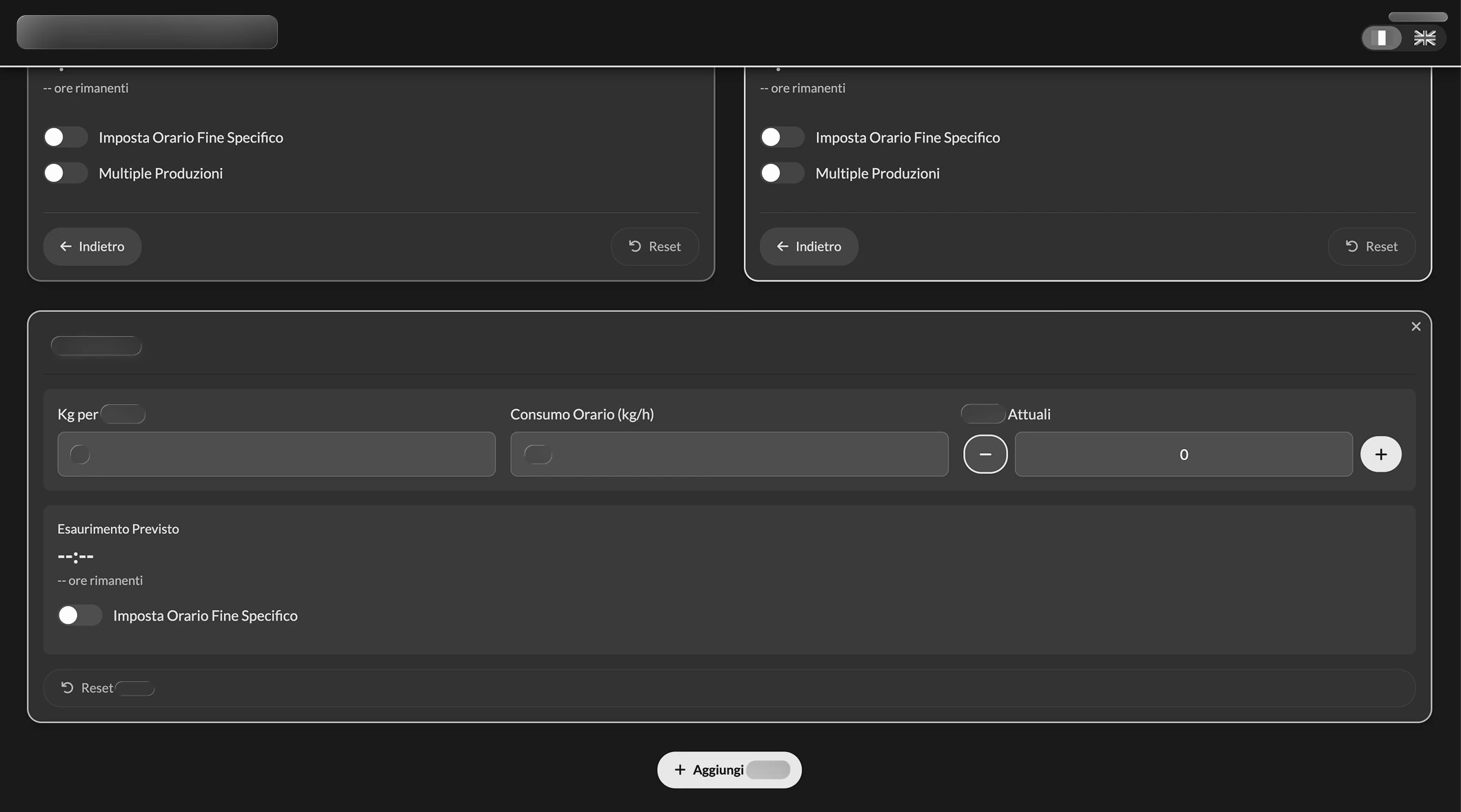
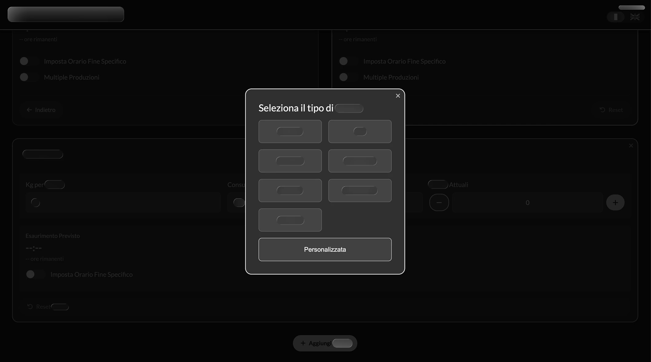
I corrected course as soon as I got back, completely redesigning the interface with a tool called "Krisspy" (I didn't know how to use Figma yet). I wanted everything on a single screen, with a toggle to "recycle" values already entered and finally make the use of automatic mode smoother, including the ability to plan two production runs by also specifying the time required for the changeover. I chose the following mockup:
I have obscured, just as in the other images, the specific numbers and wording to ensure the utmost integrity of corporate intellectual property.
Here is what it looked like in the implementation phase:
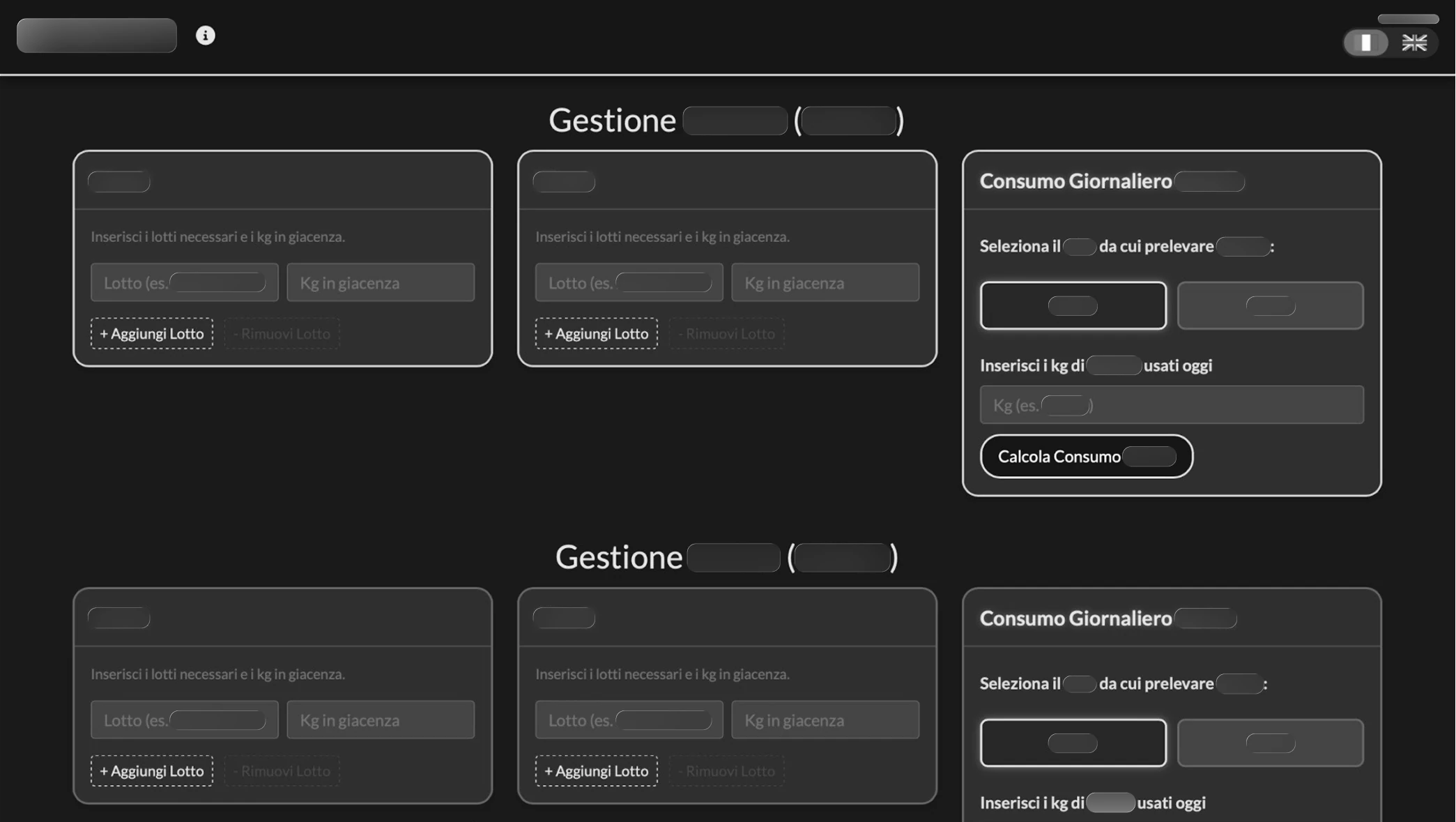
Center-02: The Apprentice and Gatekeeping
Word had spread to the point that 3 other departments asked me for a solution that could help them too. I accepted only one, as the others would have violated intellectual property or data security policies; I therefore chose to decline, explaining the risks. The request I accepted involved working with a Senior operator (over 30 years of experience in the role). Unknowingly, I applied the principle of Contextual Inquiry described in About Face: I positioned myself as an apprentice, treating the user as the master in their real context.
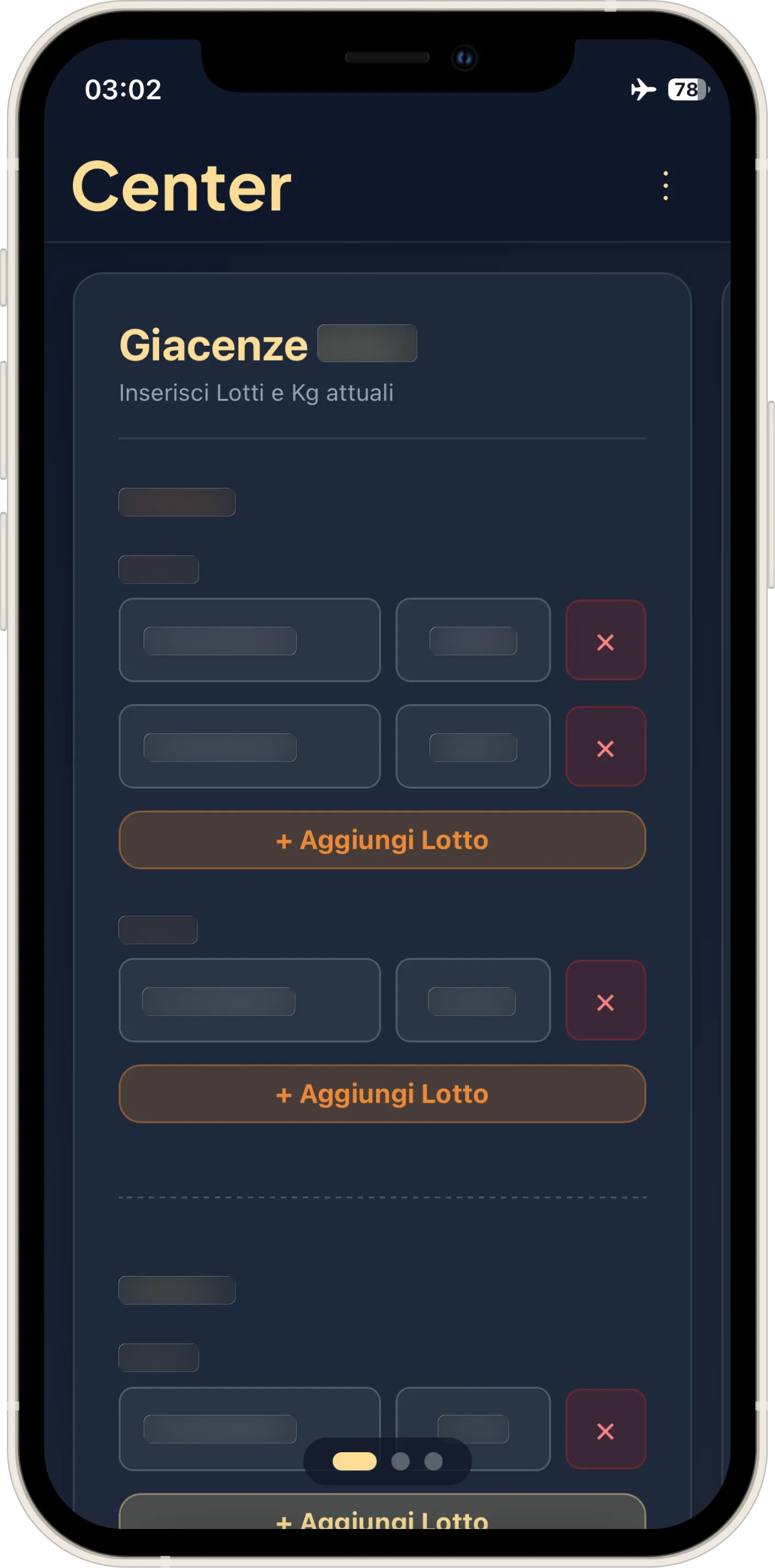
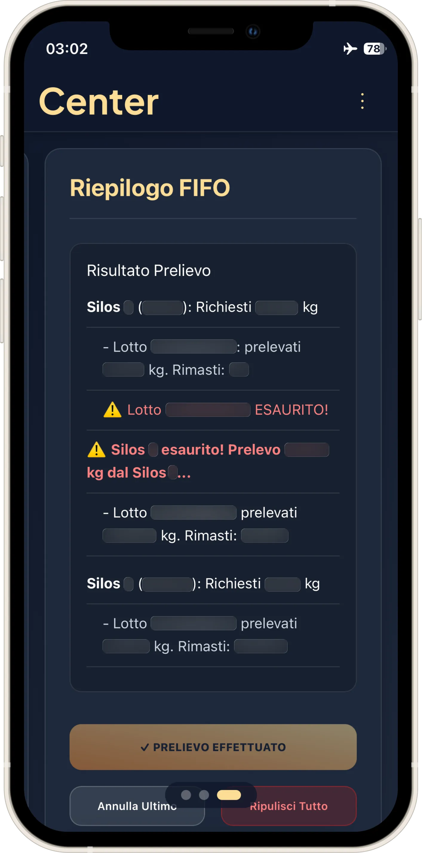
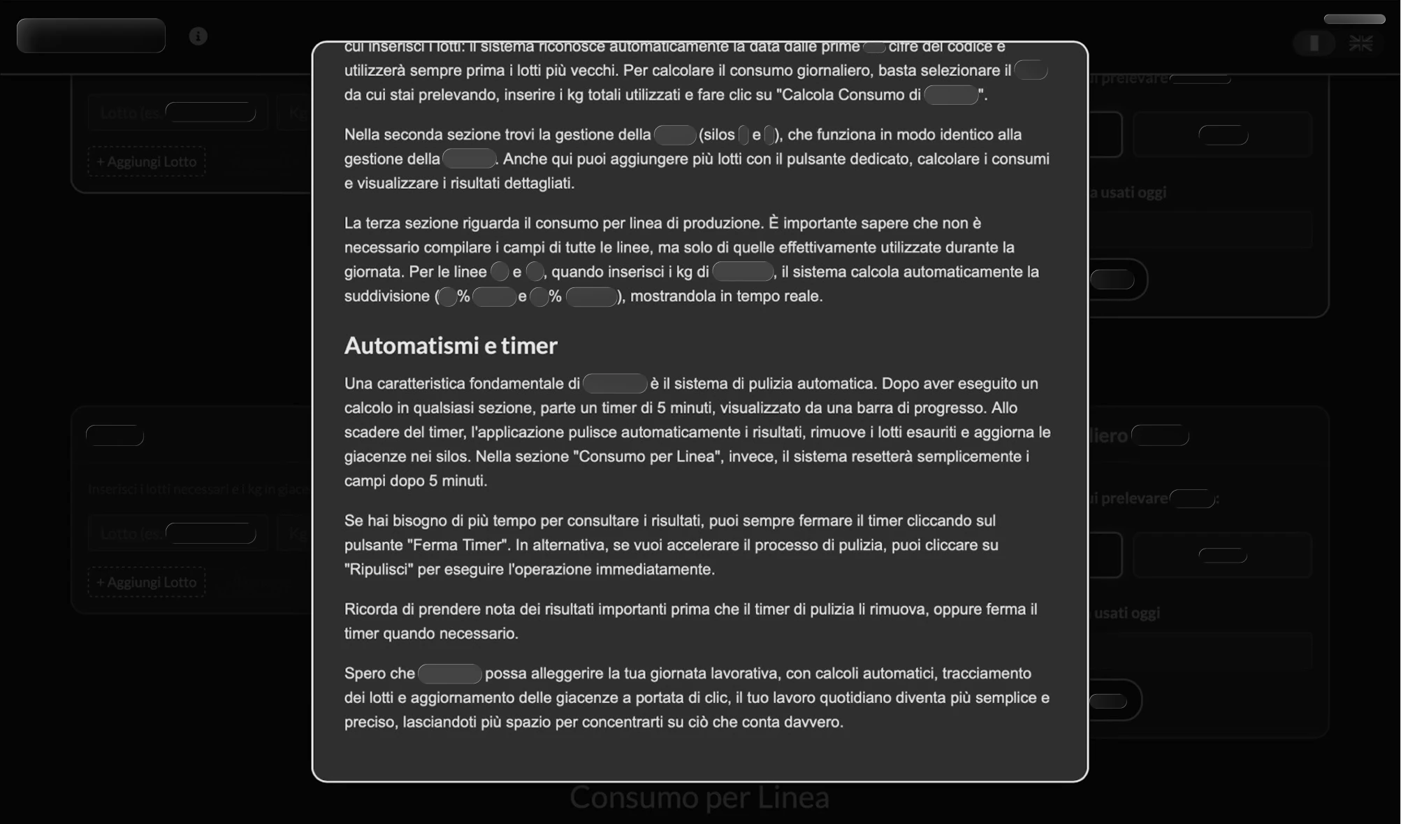
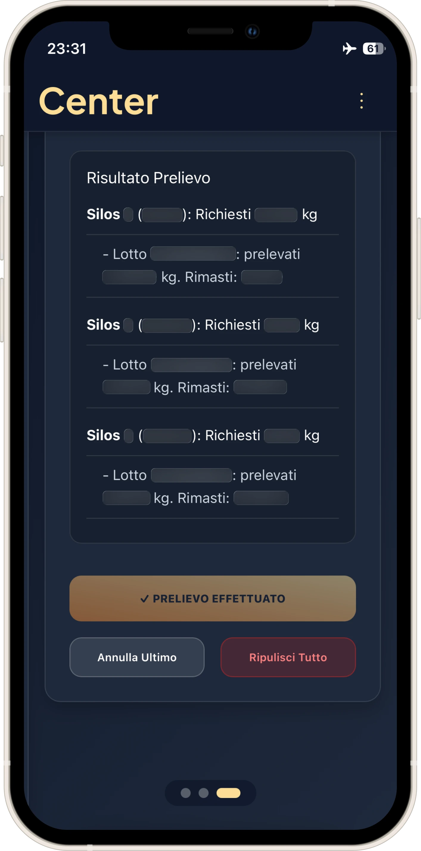
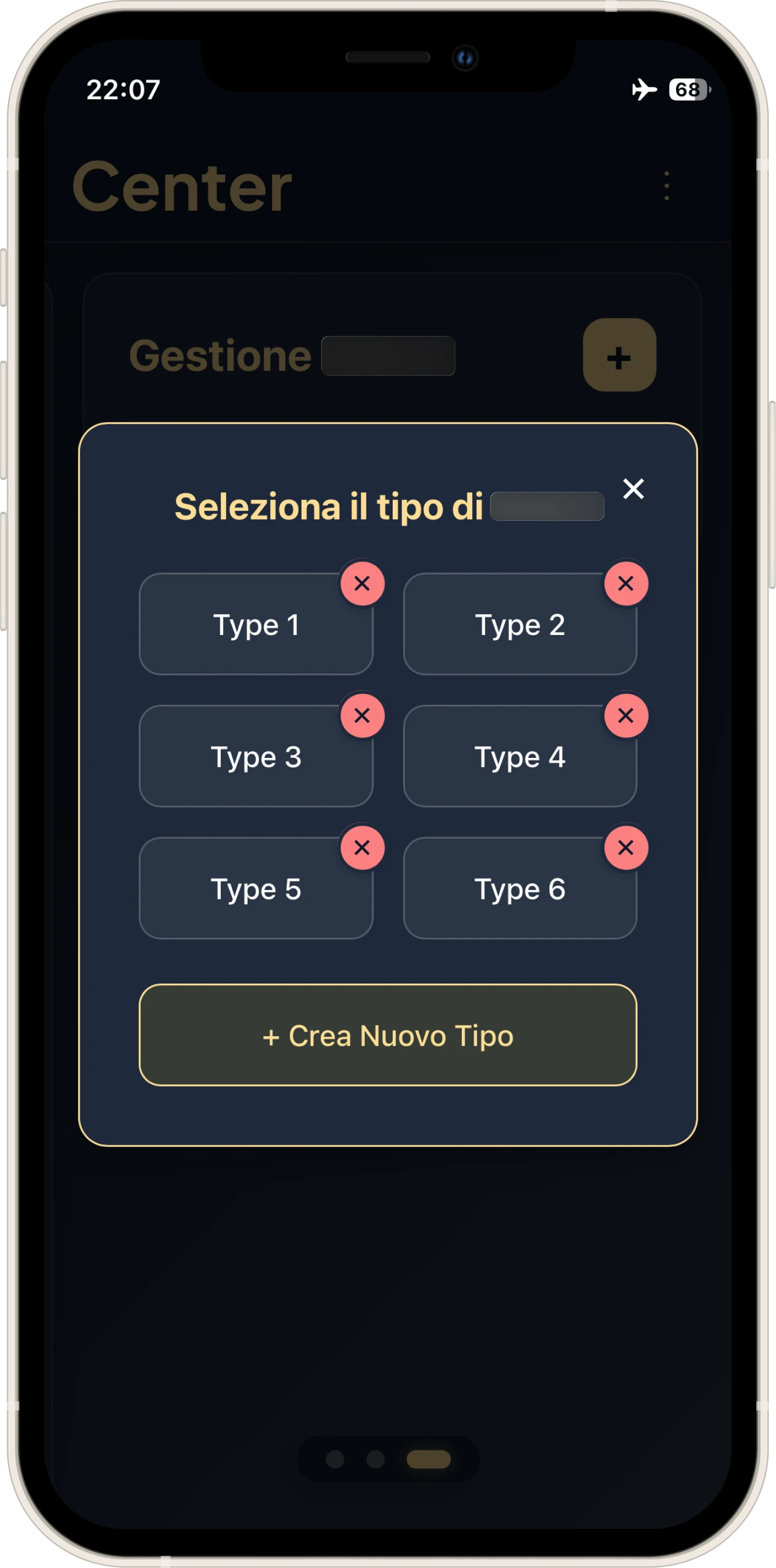
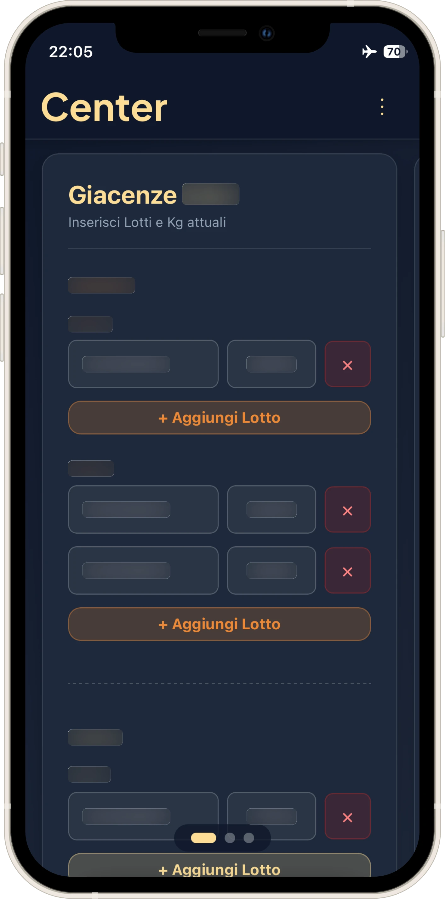
The technical problem here was the FIFO (First In, First Out) algorithm: determining which batch to remove first based on expiration.
An interesting insight emerged during adoption: the colleague didn't want to share the tool with others. He wanted to guard it jealously. Although I ethically disagreed, I took it as the strongest possible empirical validation: the software gave him such a competitive advantage that he wanted to keep it for himself. It was a déjà vu, because I had seen the same jealousy on my own shift. When they found out I had shared the tool with the other two shifts, they took it badly: they asked me to change the password to cut the others out and keep it all to ourselves. I had created once again, without realizing it, a superpower.
Norman vs Reality: The Failure of the Timer
I added an in-app guide. I know that Norman (in "The Design of Everyday Things") and Krug (in "Don't Make Me Think") say that if you need a manual, you have failed. However, I remain convinced that a one-minute guide is an acceptable price to pay to avoid critical errors in production.
But I made a mistake. I implemented an automatic Timer to clear data after 5 minutes, displayed via a progress bar. A "very designer" idea, scenic. It proved disastrous. The senior operator explained that they often didn't log output data immediately; I proceeded to remove it. That was the moment I realized that theoretical elegance is often worth zero compared to operational pragmatism.
What I Learned
Before handing in my resignation, I reopened the source code, performing a total refactor to leave IT with a professional product.
Refactoring and Architecture:
- Transformation from "Spaghetti Code" to an Object-Oriented architecture based on JS Classes.
- Modular logic to facilitate IT maintenance: to add a new line, one simply inserts an object into the
LINES_CONFIGarray (id, label, type) and the system automatically adapts the calculations. - Implementation of relative paths (
./) to allow deployment in any subfolder of the company Intranet without configuring routing.
UX and Interaction:
- Responsive Design: On mobile, it uses a carousel pattern to maximize space and focus on touch monitors; on desktop (or landscape tablet), it "unrolls" into a complete dashboard, showing all information on a single screen.
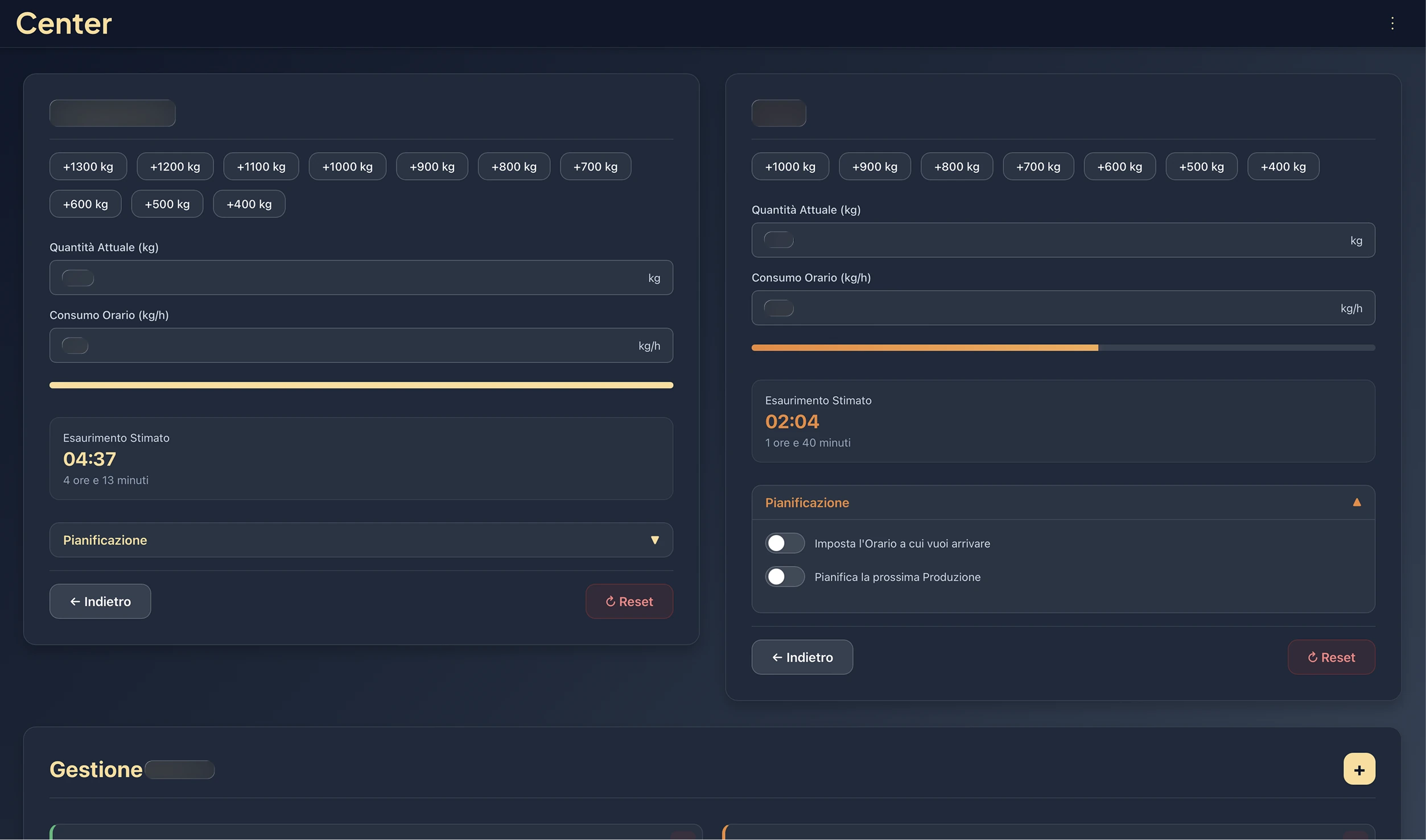
- Visual Feedback: Introduced colored borders on mandatory fields (Quantity/Consumption) that turn off as soon as they are filled, replacing the old textual Call to Actions.
→
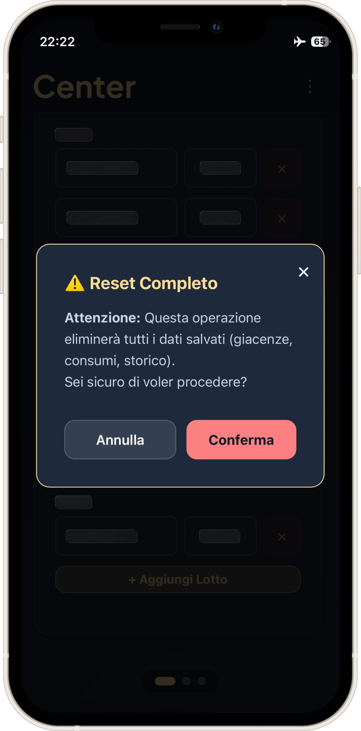
- Destructive Actions: The "Withdraw" button now disables itself after clicking to avoid double calculations. The only way to reset is "Clear All," a destructive but intentional action.
- Chromatic Distinction: In Center-02, added clear distinction between raw material 1 and 2; on desktop, the color is visible on hover, allowing the raw material to be associated with the relative Silo even before clicking.
Security and PWA:
- Total input sanitization to prevent XSS attacks.
- Full keyboard navigation and compliance with WCAG standards.
- Elimination of all external dependencies: only HTML, CSS, and Vanilla JS.
Offline-First Strategy:
- Selective LocalStorage: Center-01 adopts a hybrid logic. Production calculations are "disposable" (since calculations are redone every hour/hour and a half during the workday), but custom configurations, such as user-created product types, must remain saved.
- Center-02, on the other hand, is totally persistent to guarantee the continuity of batch history.
- Edge Case: If the user presses "Full Reset" while offline (common on the Intranet), the UI doesn't break and handles cache repopulation upon the return of the connection.
Reflection
In short: I entered the factory stitching together blocks of code, creating a "Frankenstein" for survival. I leave it behind having delivered two scalable, maintainable, Mobile and Offline-First software products.
I donated the applications to the company, specifying that they are the sole rights holders.
Center is no longer mine, but I carry with me the entire lesson on what it means to put the user at the center.
That is why I decided to call it Center.