RPG Creature Search App
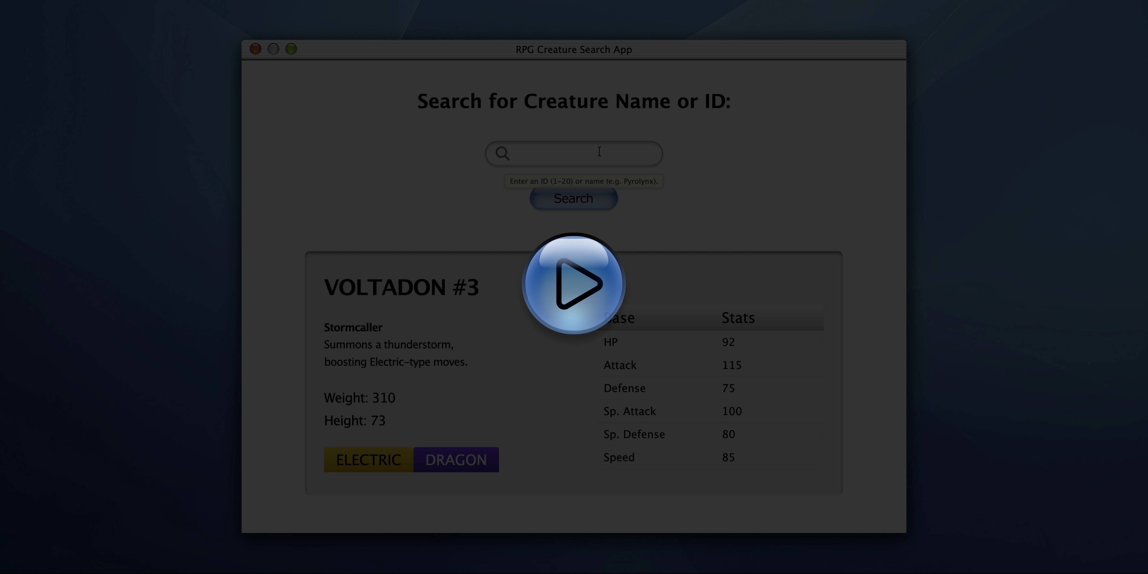
Click to play the demo (1080p, 28 s, 1.1 MB)
The Project
RPG Creature Search App built as the final Certification Project of the JavaScript Algorithms and Data Structures course on freeCodeCamp.
An app that combines JavaScript, state management and a carefully crafted UI in early-2000s Aqua/macOS style, with special attention to vector SVGs, “jelly” effects, and aggressive image optimization.
Source Code
- index.html
- styles.css
- script.js
<!-- DESIGN
   ------
   * This file contains the HTML structure of the "RPG Creature Search App" application.
   * The design emulates the "Aqua" user interface from Mac OS X 10 (2000s) but reinterpreted
   * in certain aspects

   * Font Choice:
   * I didn't import external fonts, instead I chose native system font stacks
   * (like Lucida Grande, Verdana) to ensure historical fidelity to the original OS and instant
   * loading performance with no external dependencies

   * Flow:
   * - Head with meta tags and link to the local style sheet
   * - Body containing a <main id="window-container"> element that acts as the frame for the
   *   main window
   * - Inside the <main>, the structure is divided into two inner containers to allow
   *   independent management, specifically:
   * - A <div> ".header-overlap-wrapper" for the title bar and controls (always visible)
   * - A <div> "#main-content-container" that wraps all the functional content

   * The main container (#main-content-container) is structured in two main blocks:
   * - #search-container: Contains the input interface. Uses a "stack" technique
   *   that overlays elements (background image, icon, and transparent text box) one
   *   on top of another, instead of placing them side by side, to perfectly recreate the complex
   *   graphic appearance of the original bar.
   * - #creature-output-box: Contains the results area. Currently has "mock-up" data (Creature #1,
   *   Pyrolynx) that serves as visual placeholder meant to facilitate my subsequent CSS design
   *   and provides the structure that will be dynamically updated via JavaScript.
-->


<!DOCTYPE html>
<html lang="en">
    <head>
        <title>RPG Creature Search App</title>
        <meta charset="UTF-8" />
        <meta name="viewport" content="width=device-width, initial-scale=1.0" />
        <link rel="stylesheet" href="styles.css">
    </head>
    <body>
        <!--
            * freeCodeCamp instructions:
            * You should have an input element with an id of "search-input", and is required. ✔️
            * You should have a button element with an id of "search-button". ✔️
            * You should have an element with an id of "creature-name". ✔️
            * You should have an element with an id of "creature-id". ✔️
            * You should have an element with an id of "weight". ✔️
            * You should have an element with an id of "height". ✔️
            * You should have an element with an id of "types". ✔️
            * You should have an element with an id of "hp". ✔️
            * You should have an element with an id of "attack". ✔️
            * You should have an element with an id of "defense". ✔️
            * You should have an element with an id of "special-attack". ✔️
            * You should have an element with an id of "special-defense". ✔️
            * You should have an element with an id of "speed". ✔️
        -->

        <!--
            * Later I use a div instead of a button because if I do that I would have
            * to write a lot of "reset" CSS to cancel all the native browser styles,
            * still risking unexpected behavior on different browsers.
            * I'll handle this accessibility "debt" with semantics and JavaScript
        -->

        <div id="desktop-app-icon" class="hidden" role="button" aria-label="Reopen RPG Search App" tabindex="0"></div>
        <main id="window-container">
            <section id="main-content-container">
                <div class="header-overlap-wrapper">
                    <div class="window-top-separator"></div>
                    <div class="traffic-lights-container">
                        <button id="btn-close" class="traffic-light red" aria-label="Close window" title="Close"></button>
                        <button id="btn-minimize" class="traffic-light yellow disabled" aria-label="Minimize window" title="Minimize"></button>
                        <button id="btn-maximize" class="traffic-light green" aria-label="Maximize window" title="Maximize"></button>
                    </div>
                    <h2 class="window-title">RPG Creature Search App</h2>
                </div>
                <div id="search-container">
                    <h1 id="main-heading">Search for Creature Name or ID:</h1>
                    <div class="input-stack">
                    <div class="search-bg-layer"></div>
                        <div class="search-content-layer">
                            <!--
                                * The magnifying glass icon is a separate element, not drawn directly on the background
                                * This allows positioning it with millimetric precision via CSS over the bar,
                                * maintaining independent control of the three layers (background, icon, text)
                            -->
                            <svg class="search-icon-physical" width="24" height="24" viewBox="0 0 27 27" fill="none" xmlns="http://www.w3.org/2000/svg">
                                <path d="M17.564 18.1162L24.8043 25.1027" stroke="#686868" stroke-width="3.28349" stroke-linecap="round"/>
                                <circle cx="10.8521" cy="10.8521" r="9.21039" stroke="#686868" stroke-width="3.28349"/>
                            </svg>
                            <input type="text" id="search-input" required aria-label="Search for creature name or ID" autocomplete="off"/>
                            <div id="aqua-tooltip" class="aqua-tooltip-box hidden-tooltip">Enter an ID (1-20) or name (e.g. Pyrolynx).</div>
                        </div>
                    </div>
                    <div class="search-btn-container">
                        <button id="search-button">Search</button>
                    </div>
                </div>
                <section id="creature-output-box" class="output-container">
                    <div class="output-left-col">
                        <div class="creature-title-container">
                            <h2>
                                <span id="creature-name">PYROLYNX</span>
                                <span id="creature-id">#1</span>
                            </h2>
                        </div>
                        <div class="attributes-container">
                            <p class="description">
                                <span id="special-name" class="special-name">Blazing Reflex</span><br>
                                <span id="special-description" class="special-description">Increases speed when hit by a Fire-type move.</span>
                            </p>

                            <!--
                                * I decided to put the fixed text ("Weight: " and "Height: ") and then the number in
                                * two separate "span" elements, because this way it will be easier in the JavaScript
                                * phase: when it needs to update the data, it only needs to update the field with
                                * the number.
                            -->
                            <p class="attribute-item">
                                <span>Weight: </span><span id="weight">42</span>
                            </p>
                            <p class="attribute-item">
                                <span>Height: </span><span id="height">32</span>
                            </p>
                        </div>
                        <div id="types" class="types-container">
                            <span class="type-badge type-fire">Fire</span>
                        </div>
                    </div>
                    <div class="output-right-col">
                        <table class="stats-table">
                            <thead>
                                <tr>
                                    <th>Base</th>
                                    <th class="text-right">Stats</th>
                                </tr>
                            </thead>
                            <tbody>
                                <tr>
                                    <td>HP</td>
                                    <td id="hp" class="stat-value">85</td>
                                </tr>
                                <tr>
                                    <td>Attack</td>
                                    <td id="attack" class="stat-value">50</td>
                                </tr>
                                <tr>
                                    <td>Defense</td>
                                    <td id="defense" class="stat-value">120</td>
                                </tr>
                                <tr>
                                    <td>Sp. Attack</td>
                                    <td id="special-attack" class="stat-value">100</td>
                                </tr>
                                <tr>
                                    <td>Sp. Defense</td>
                                    <td id="special-defense" class="stat-value">115</td>
                                </tr>
                                <tr>
                                    <td>Speed</td>
                                    <td id="speed" class="stat-value">55</td>
                                </tr>
                            </tbody>
                        </table>
                    </div>
                </section>
            </section>
        </main>
        <script src="script.js"></script>
    </body>
</html>
/* DESIGN
   ------
   * The document emulates the "Aqua" user interface, an Apple graphical user interface,
   * reinterpreting it for the modern web through a Mobile-First approach
   * Base styles are optimized for rapid loading on narrow screens (the majority
   * traffic), while desktop versions are handled with media queries
   * I chose Verdana as the main alternative because it's the most similar overall
   * to Lucida Grande (the official MacOS X font for 13 years, from Cheetah to Mavericks).
   * Verdana is omnipresent on Mac and PC and shares the distinctive "squared" dots.
   * Unfortunately Verdana isn't always present on Linux, so the second choice is
   * DejaVu Sans, the most similar native font on the latter
   * I've included other fallbacks (Geneva, Tahoma) for safety, though it's highly likely
   * they'll never be used
   * Lucida Grande remains the very first choice in the stack, to ensure
   * maximum native fidelity on modern Macs, where it's still hidden in the system.

   * CSS Architecture:
   * - "Utility-First" variables: almost total centralization of design tokens (colors,
   *   fonts, spacing, animation curves) in :root for easy maintenance, divided into
   *   UNIVERSAL, MOBILE DEFAULT, TABLET / SMALL DESKTOP, MEDIUM DESKTOP / TABLET LANDSCAPE
   *   and finally FULL DESKTOP
   * - Component structure: CSS rules mirror the HTML hierarchy
   *   (Window -> Title Bar -> Search Stack -> Output Area)
   * - Hybrid hierarchy: strategic use of IDs for unique macro-structural areas
   *   (e.g. #window-container) and BEM-like classes (Block, Element, Modifier) for
   *   repeatable elements.
   * - Desktop overrides: specific media queries handle layout changes for larger screens
   * - Accessibility: beyond respecting WCAG AA color contrasts, the design includes explicit
   *   handling for user's reduced motion preferences (prefers-reduced-motion) and ensures
   *   visible focus states for keyboard navigation.

   * Note on Graphic Assets:
   * To achieve maximum fidelity to the complex "jelly" effects and textures typical of Aqua,
   * I opted for vector SVG assets for the frame and main buttons, delegating to CSS only
   * the shadows for depth.
   * I want to mention that I created them from scratch on Figma and regarding the Search button
   * I took inspiration from Arthur Objartel's creation (https://www.figma.com/@arthur_objartel),
   * who generously shared the button with the community.
   * The closed application, meaning the app icon, I also designed with Figma, I created the
   * fire (freeCodeCamp style) with pixel effect, using the pen tool, it was meticulous and long
   * work but it served to practice with this tool, the lens that wraps it was born from the idea
   * of taking inspiration from Safari of that era which had that skeuomorphic outline with shiny
   * parts, I also added two shiny parts and to complete the tribute to freeCodeCamp I made the
   * darker parts of the outline fall on the sides (right and left) just like the freeCodeCamp logo.
*/


/* DESIGN TOKENS (VARIABLES) - UNIVERSAL */
:root {
    /* Background & Assets */

    /*
    * I achieved just 163KB for the desktop background by refining my image compression process,
    * here's how:
    * Instead of applying AI upscaling directly on the original PNG image, I decided to
    * preventively convert it to JPEG applying a slight compression already.
    * Only after this intermediate step did I perform the AI upscaling on the JPEG file.
    * Finally, as a concluding step, I processed the resulting image with ImageOptim to further
    * reduce the weight. The direct comparison results are remarkable: compared to the standard
    * procedure (upscaling on PNG followed by JPEG conversion and ImageOptim), this alternative
    * method allowed me to achieve a file weight reduction of over 50%, thus obtaining 382 KB
    * with the first procedure and only 163 KB with the optimized one! Maintaining an almost
    * identical visual quality.

    WPO - Base64 Embedding (Data URIs)
    * Very small critical user interface (UI) assets (< 5KB) have been converted to Base64
    * strings and embedded directly in the CSS.
    * By doing this I eliminated 5 separate HTTP requests to the server and the interface
    * appears instantly without the loading "flash".
    * The only disadvantage is a slight increase in CSS file size.
    *
    * Procedure followed (macOS):
    * 1. Opened terminal and navigated to the asset folder (using "cd " + dragging
    *    the folder containing the svg file), pressed Enter
    * 2. Executed the command "base64 -i file-name.svg", replacing file-name.svg with the actual
    *    file name, pressed Enter
    * 3. Copied the long output string (the payload)
    * 4. Pasted in CSS using the prefix: url('data:image/svg+xml;base64,COPIEDCODE').
    */


    --bg-image-desktop-asset: url('background.jpg'); /* 163 KB */
    --window-top-separator-asset: url('data:image/svg+xml;base64,PHN2ZyB2aWV3Qm94PSIwIDAgODkwIDIyIiBmaWxsPSJub25lIiB4bWxucz0iaHR0cDovL3d3dy53My5vcmcvMjAwMC9zdmciIHByZXNlcnZlQXNwZWN0UmF0aW89Im5vbmUiPgo8cGF0aCBkPSJNMCA2LjAwOTI4QzAgMi42OTU1NyAyLjY4NjI5IDAuMDA5Mjc3MzQgNiAwLjAwOTI3NzM0SDg4My42NTVDODg2Ljk2OCAwLjAwOTI3NzM0IDg4OS42NTUgMi42OTU1NyA4ODkuNjU1IDYuMDA5MjhWMjEuNDI2OEgwVjYuMDA5MjhaIiBmaWxsPSJ3aGl0ZSIvPgo8cGF0aCBkPSJNMCAyMS4xMTQzTDg4OS42NTQgMjEuMTE0MyIgc3Ryb2tlPSJibGFjayIgc3Ryb2tlLXdpZHRoPSIwLjgiLz4KPHBhdGggZD0iTTUuNTU2MTUgMC4zOTk5MDJMODgzLjAxMSAwLjM5OTk3OSIgc3Ryb2tlPSIjRTNFM0UzIiBzdHJva2Utd2lkdGg9IjAuOCIvPgo8cGF0aCBkPSJNMCAxNi40ODkzTDg4OS42NTQgMTYuNDg5MyIgc3Ryb2tlPSIjRTNFM0UzIiBzdHJva2Utd2lkdGg9IjAuOCIvPgo8cGF0aCBkPSJNMCAxMy4yNjEyTDg4OS42NTQgMTMuMjYxMyIgc3Ryb2tlPSIjRTNFM0UzIiBzdHJva2Utd2lkdGg9IjAuOCIvPgo8cGF0aCBkPSJNMCA2LjgzMDU3TDg4OS42NTQgNi44MzA2NCIgc3Ryb2tlPSIjRTNFM0UzIiBzdHJva2Utd2lkdGg9IjAuOCIvPgo8cGF0aCBkPSJNMCAzLjYxNTIzTDg4OS42NTQgMy42MTUzMSIgc3Ryb2tlPSIjRTNFM0UzIiBzdHJva2Utd2lkdGg9IjAuOCIvPgo8cGF0aCBkPSJNMCAxMC4wNDU5TDg4OS42NTQgMTAuMDQ2IiBzdHJva2U9IiNFM0UzRTMiIHN0cm9rZS13aWR0aD0iMC44Ii8+CjxyZWN0IHk9IjE2Ljk0ODIiIHdpZHRoPSI4ODkuNjU1IiBoZWlnaHQ9IjMuNzI0OSIgZmlsbD0idXJsKCNwYWludDBfbGluZWFyXzM2XzExNikiLz4KPGRlZnM+CjxsaW5lYXJHcmFkaWVudCBpZD0icGFpbnQwX2xpbmVhcl8zNl8xMTYiIHgxPSI0NDQuODI3IiB5MT0iMTYuOTQ4MiIgeDI9IjQ0NC44MjciIHkyPSIyMC42NzMxIiBncmFkaWVudFVuaXRzPSJ1c2VyU3BhY2VPblVzZSI+CjxzdG9wIHN0b3AtY29sb3I9IiNFMkUyRTQiIHN0b3Atb3BhY2l0eT0iMCIvPgo8c3RvcCBvZmZzZXQ9IjEiIHN0b3AtY29sb3I9IiM4Nzg3ODciLz4KPC9saW5lYXJHcmFkaWVudD4KPC9kZWZzPgo8L3N2Zz4='); /* 1KB */
    --red-button-asset: url('data:image/svg+xml;base64,PHN2ZyB3aWR0aD0iMjUiIGhlaWdodD0iMjIiIHZpZXdCb3g9IjAgMCAyNSAyMiIgZmlsbD0ibm9uZSIgeG1sbnM9Imh0dHA6Ly93d3cudzMub3JnLzIwMDAvc3ZnIj4KPGNpcmNsZSBjeD0iMTIuMzU0NiIgY3k9IjEwLjEzMDQiIHI9IjkuNTAyMzgiIHRyYW5zZm9ybT0icm90YXRlKC0xODAgMTIuMzU0NiAxMC4xMzA0KSIgZmlsbD0iI0QwNTQzOCIvPgo8ZyBvcGFjaXR5PSIwLjUiIGZpbHRlcj0idXJsKCNmaWx0ZXIwX2ZfMTJfMTE1KSI+CjxwYXRoIGQ9Ik02LjU4NDE4IDE0LjQ5MjVMNi45Njg3MiAxNy43MzM0TDQuMzU4NjIgMTYuMzQ0MUwzLjUwNzc1IDEwLjc0MjlMNC45MzEzNyA2LjUwMDY0TDguMjIxNTYgMy40NzAwN0w3LjQ2NTE3IDcuMDQ4MjNMNi4yMjIwNyAxMC40NjY5TDYuNTg0MTggMTQuNDkyNVoiIGZpbGw9IiM5MTA4MDgiIGZpbGwtb3BhY2l0eT0iMC43MSIvPgo8L2c+CjxnIG9wYWNpdHk9IjAuNSIgZmlsdGVyPSJ1cmwoI2ZpbHRlcjFfZl8xMl8xMTUpIj4KPHBhdGggZD0iTTE4LjEyNDMgMTQuNDkyNUwxNy43Mzk4IDE3LjczMzRMMjAuMzQ5OSAxNi4zNDQxTDIxLjIwMDcgMTAuNzQyOUwxOS43NzcxIDYuNTAwNjRMMTYuNDg2OSAzLjQ3MDA3TDE3LjI0MzMgNy4wNDgyM0wxOC40ODY0IDEwLjQ2NjlMMTguMTI0MyAxNC40OTI1WiIgZmlsbD0iIzkxMDgwOCIgZmlsbC1vcGFjaXR5PSIwLjcxIi8+CjwvZz4KPGcgZmlsdGVyPSJ1cmwoI2ZpbHRlcjJfZl8xMl8xMTUpIj4KPHBhdGggZD0iTTkuNTc0MTggMTQuNjc0MkM5LjcwNDk4IDE2LjAzNTYgMTAuODQ4NyAxNy4wNzQ3IDEyLjIxNjQgMTcuMDc0N0gxMi41MTkyQzEzLjg5NiAxNy4wNzQ3IDE1LjA0NDIgMTYuMDIxOCAxNS4xNjMyIDE0LjY1MDJDMTUuMjkzOCAxMy4xNDUzIDE0LjEwNzUgMTEuODUxNiAxMi41OTY5IDExLjg1MTZIMTIuMTM4NkMxMC42MTg1IDExLjg1MTYgOS40Mjg3OSAxMy4xNjEgOS41NzQxOCAxNC42NzQyWiIgZmlsbD0iI0ZBREZCMiIgZmlsbC1vcGFjaXR5PSIwLjgiLz4KPC9nPgo8cGF0aCBkPSJNNi4xMzg2MyA0LjAyODQxQzYuMjQzODcgMi40NDQ2NyA3LjU1OTE3IDEuMjEzODcgOS4xNDYzOSAxLjIxMzg3SDE1LjU2MTlDMTcuMTQ5MSAxLjIxMzg3IDE4LjQ2NDQgMi40NDQ2NyAxOC41Njk2IDQuMDI4NDFDMTguNjA0NyA0LjU1NzAzIDE4LjE4NTQgNS4wMDUxMyAxNy42NTU2IDUuMDA1MTNINy4wNTI2MUM2LjUyMjgyIDUuMDA1MTMgNi4xMDM1MSA0LjU1NzAzIDYuMTM4NjMgNC4wMjg0MVoiIGZpbGw9InVybCgjcGFpbnQwX2xpbmVhcl8xMl8xMTUpIiBmaWxsLW9wYWNpdHk9IjAuOTUiLz4KPGNpcmNsZSBjeD0iMTIuMzU0NCIgY3k9IjEwLjEzMDMiIHI9IjkuNTMwMzEiIHN0cm9rZT0idXJsKCNwYWludDFfbGluZWFyXzEyXzExNSkiIHN0cm9rZS13aWR0aD0iMS4yIi8+CjxkZWZzPgo8ZmlsdGVyIGlkPSJmaWx0ZXIwX2ZfMTJfMTE1IiB4PSIwLjU5OTE2NSIgeT0iMC41NjE1NjgiIHdpZHRoPSIxMC41MzEyIiBoZWlnaHQ9IjIwLjA4MDUiIGZpbHRlclVuaXRzPSJ1c2VyU3BhY2VPblVzZSIgY29sb3ItaW50ZXJwb2xhdGlvbi1maWx0ZXJzPSJzUkdCIj4KPGZlRmxvb2QgZmxvb2Qtb3BhY2l0eT0iMCIgcmVzdWx0PSJCYWNrZ3JvdW5kSW1hZ2VGaXgiLz4KPGZlQmxlbmQgbW9kZT0ibm9ybWFsIiBpbj0iU291cmNlR3JhcGhpYyIgaW4yPSJCYWNrZ3JvdW5kSW1hZ2VGaXgiIHJlc3VsdD0ic2hhcGUiLz4KPGZlR2F1c3NpYW5CbHVyIHN0ZERldmlhdGlvbj0iMS40NTQzMiIgcmVzdWx0PSJlZmZlY3QxX2ZvcmVncm91bmRCbHVyXzEyXzExNSIvPgo8L2ZpbHRlcj4KPGZpbHRlciBpZD0iZmlsdGVyMV9mXzEyXzExNSIgeD0iMTMuNTc4MiIgeT0iMC41NjE1NjgiIHdpZHRoPSIxMC41MzEyIiBoZWlnaHQ9IjIwLjA4MDUiIGZpbHRlclVuaXRzPSJ1c2VyU3BhY2VPblVzZSIgY29sb3ItaW50ZXJwb2xhdGlvbi1maWx0ZXJzPSJzUkdCIj4KPGZlRmxvb2QgZmxvb2Qtb3BhY2l0eT0iMCIgcmVzdWx0PSJCYWNrZ3JvdW5kSW1hZ2VGaXgiLz4KPGZlQmxlbmQgbW9kZT0ibm9ybWFsIiBpbj0iU291cmNlR3JhcGhpYyIgaW4yPSJCYWNrZ3JvdW5kSW1hZ2VGaXgiIHJlc3VsdD0ic2hhcGUiLz4KPGZlR2F1c3NpYW5CbHVyIHN0ZERldmlhdGlvbj0iMS40NTQzMiIgcmVzdWx0PSJlZmZlY3QxX2ZvcmVncm91bmRCbHVyXzEyXzExNSIvPgo8L2ZpbHRlcj4KPGZpbHRlciBpZD0iZmlsdGVyMl9mXzEyXzExNSIgeD0iNS4wODg3IiB5PSI3LjM3ODAxIiB3aWR0aD0iMTQuNTU3OSIgaGVpZ2h0PSIxNC4xNzAyIiBmaWx0ZXJVbml0cz0idXNlclNwYWNlT25Vc2UiIGNvbG9yLWludGVycG9sYXRpb24tZmlsdGVycz0ic1JHQiI+CjxmZUZsb29kIGZsb29kLW9wYWNpdHk9IjAiIHJlc3VsdD0iQmFja2dyb3VuZEltYWdlRml4Ii8+CjxmZUJsZW5kIG1vZGU9Im5vcm1hbCIgaW49IlNvdXJjZUdyYXBoaWMiIGluMj0iQmFja2dyb3VuZEltYWdlRml4IiByZXN1bHQ9InNoYXBlIi8+CjxmZUdhdXNzaWFuQmx1ciBzdGREZXZpYXRpb249IjIuMjM2NzgiIHJlc3VsdD0iZWZmZWN0MV9mb3JlZ3JvdW5kQmx1cl8xMl8xMTUiLz4KPC9maWx0ZXI+CjxsaW5lYXJHcmFkaWVudCBpZD0icGFpbnQwX2xpbmVhcl8xMl8xMTUiIHgxPSIxMi4zNTQxIiB5MT0iMC41ODczNDQiIHgyPSIxMi4zNTQxIiB5Mj0iNS4wMDUxMyIgZ3JhZGllbnRVbml0cz0idXNlclNwYWNlT25Vc2UiPgo8c3RvcCBzdG9wLWNvbG9yPSJ3aGl0ZSIvPgo8c3RvcCBvZmZzZXQ9IjAuMDA3NDE0MDciIHN0b3AtY29sb3I9IndoaXRlIi8+CjxzdG9wIG9mZnNldD0iMC4wMDc1MTQwNyIgc3RvcC1jb2xvcj0id2hpdGUiIHN0b3Atb3BhY2l0eT0iMC45Ii8+CjxzdG9wIG9mZnNldD0iMC4wMjkxNzkzIiBzdG9wLWNvbG9yPSJ3aGl0ZSIgc3RvcC1vcGFjaXR5PSIwLjkiLz4KPHN0b3Agb2Zmc2V0PSIwLjA2MzY4IiBzdG9wLWNvbG9yPSJ3aGl0ZSIgc3RvcC1vcGFjaXR5PSIwLjk5MiIvPgo8c3RvcCBvZmZzZXQ9IjAuMTA5NzAxIiBzdG9wLWNvbG9yPSJ3aGl0ZSIgc3RvcC1vcGFjaXR5PSIwLjkiLz4KPHN0b3Agb2Zmc2V0PSIwLjE2NTkyNiIgc3RvcC1jb2xvcj0id2hpdGUiIHN0b3Atb3BhY2l0eT0iMC45Ii8+CjxzdG9wIG9mZnNldD0iMC4yMzEwNCIgc3RvcC1jb2xvcj0id2hpdGUiIHN0b3Atb3BhY2l0eT0iMC45Ii8+CjxzdG9wIG9mZnNldD0iMC4zMDM3MjciIHN0b3AtY29sb3I9IndoaXRlIiBzdG9wLW9wYWNpdHk9IjAuODk4MzciLz4KPHN0b3Agb2Zmc2V0PSIwLjM4MjY3MyIgc3RvcC1jb2xvcj0id2hpdGUiIHN0b3Atb3BhY2l0eT0iMC44NDgyOTYiLz4KPHN0b3Agb2Zmc2V0PSIwLjQ2NjU2IiBzdG9wLWNvbG9yPSJ3aGl0ZSIgc3RvcC1vcGFjaXR5PSIwLjc4NCIvPgo8c3RvcCBvZmZzZXQ9IjAuNTU0MDc0IiBzdG9wLWNvbG9yPSJ3aGl0ZSIgc3RvcC1vcGFjaXR5PSIwLjcwMzcwNCIvPgo8c3RvcCBvZmZzZXQ9IjAuNjQzODk5IiBzdG9wLWNvbG9yPSJ3aGl0ZSIgc3RvcC1vcGFjaXR5PSIwLjYwNTYzIi8+CjxzdG9wIG9mZnNldD0iMC43MzQ3MiIgc3RvcC1jb2xvcj0id2hpdGUiIHN0b3Atb3BhY2l0eT0iMC40ODgiLz4KPHN0b3Agb2Zmc2V0PSIwLjgyNTIyMSIgc3RvcC1jb2xvcj0id2hpdGUiIHN0b3Atb3BhY2l0eT0iMC4zNDkwMzciLz4KPHN0b3Agb2Zmc2V0PSIwLjkxNDA4NiIgc3RvcC1jb2xvcj0id2hpdGUiIHN0b3Atb3BhY2l0eT0iMC4xODY5NjMiLz4KPC9saW5lYXJHcmFkaWVudD4KPGxpbmVhckdyYWRpZW50IGlkPSJwYWludDFfbGluZWFyXzEyXzExNSIgeDE9IjEyLjM1NDQiIHkxPSIwIiB4Mj0iMTIuMzU0NCIgeTI9IjIwLjI2MDYiIGdyYWRpZW50VW5pdHM9InVzZXJTcGFjZU9uVXNlIj4KPHN0b3AvPgo8c3RvcCBvZmZzZXQ9IjEiIHN0b3AtY29sb3I9IiMwNDA0MDQiIHN0b3Atb3BhY2l0eT0iMC40Ii8+CjwvbGluZWFyR3JhZGllbnQ+CjwvZGVmcz4KPC9zdmc+Cg=='); /* 4KB */
    --yellow-button-asset: url('data:image/svg+xml;base64,PHN2ZyB3aWR0aD0iMjUiIGhlaWdodD0iMjIiIHZpZXdCb3g9IjAgMCAyNSAyMiIgZmlsbD0ibm9uZSIgeG1sbnM9Imh0dHA6Ly93d3cudzMub3JnLzIwMDAvc3ZnIj4KPGNpcmNsZSBjeD0iMTIuMzU0NiIgY3k9IjEwLjEzMDQiIHI9IjkuNTAyMzgiIHRyYW5zZm9ybT0icm90YXRlKC0xODAgMTIuMzU0NiAxMC4xMzA0KSIgZmlsbD0iI0VFQjQyQSIvPgo8ZyBvcGFjaXR5PSIwLjUiIGZpbHRlcj0idXJsKCNmaWx0ZXIwX2ZfMTJfMTE4KSI+CjxwYXRoIGQ9Ik02LjU4NDE4IDE0LjQ5MjVMNi45Njg3MiAxNy43MzM0TDQuMzU4NjIgMTYuMzQ0MUwzLjUwNzc1IDEwLjc0MjlMNC45MzEzNyA2LjUwMDY0TDguMjIxNTYgMy40NzAwN0w3LjQ2NTE3IDcuMDQ4MjNMNi4yMjIwNyAxMC40NjY5TDYuNTg0MTggMTQuNDkyNVoiIGZpbGw9IiM5MTA4MDgiIGZpbGwtb3BhY2l0eT0iMC43MSIvPgo8L2c+CjxnIG9wYWNpdHk9IjAuNSIgZmlsdGVyPSJ1cmwoI2ZpbHRlcjFfZl8xMl8xMTgpIj4KPHBhdGggZD0iTTE4LjEyNDMgMTQuNDkyNUwxNy43Mzk4IDE3LjczMzRMMjAuMzQ5OSAxNi4zNDQxTDIxLjIwMDcgMTAuNzQyOUwxOS43NzcxIDYuNTAwNjRMMTYuNDg2OSAzLjQ3MDA3TDE3LjI0MzMgNy4wNDgyM0wxOC40ODY0IDEwLjQ2NjlMMTguMTI0MyAxNC40OTI1WiIgZmlsbD0iIzkxMDgwOCIgZmlsbC1vcGFjaXR5PSIwLjcxIi8+CjwvZz4KPGcgZmlsdGVyPSJ1cmwoI2ZpbHRlcjJfZl8xMl8xMTgpIj4KPHBhdGggZD0iTTkuNDYzNTkgMTQuNjc0MkM5LjU5NDM5IDE2LjAzNTYgMTAuNzM4MSAxNy4wNzQ3IDEyLjEwNTggMTcuMDc0N0gxMi40MDg2QzEzLjc4NTQgMTcuMDc0NyAxNC45MzM2IDE2LjAyMTggMTUuMDUyNiAxNC42NTAyQzE1LjE4MzIgMTMuMTQ1MyAxMy45OTY5IDExLjg1MTYgMTIuNDg2MyAxMS44NTE2SDEyLjAyODFDMTAuNTA3OSAxMS44NTE2IDkuMzE4MiAxMy4xNjEgOS40NjM1OSAxNC42NzQyWiIgZmlsbD0iI0ZFRkZFQyIgZmlsbC1vcGFjaXR5PSIwLjgiLz4KPC9nPgo8cGF0aCBkPSJNNi4xMzkzNiA0LjAyODQxQzYuMjQ0NTkgMi40NDQ2OCA3LjU1OTg5IDEuMjEzODcgOS4xNDcxMiAxLjIxMzg3SDE1LjU2MThDMTcuMTQ5IDEuMjEzODcgMTguNDY0MyAyLjQ0NDY4IDE4LjU2OTYgNC4wMjg0MUMxOC42MDQ3IDQuNTU3MDMgMTguMTg1NCA1LjAwNTEzIDE3LjY1NTYgNS4wMDUxM0g3LjA1MzMzQzYuNTIzNTUgNS4wMDUxMyA2LjEwNDI0IDQuNTU3MDMgNi4xMzkzNiA0LjAyODQxWiIgZmlsbD0idXJsKCNwYWludDBfbGluZWFyXzEyXzExOCkiIGZpbGwtb3BhY2l0eT0iMC45NSIvPgo8Y2lyY2xlIGN4PSIxMi4zNTQ0IiBjeT0iMTAuMTMwMyIgcj0iOS41MzAzMSIgc3Ryb2tlPSJ1cmwoI3BhaW50MV9saW5lYXJfMTJfMTE4KSIgc3Ryb2tlLXdpZHRoPSIxLjIiLz4KPGRlZnM+CjxmaWx0ZXIgaWQ9ImZpbHRlcjBfZl8xMl8xMTgiIHg9IjAuNTk5MTY1IiB5PSIwLjU2MTU2OCIgd2lkdGg9IjEwLjUzMTIiIGhlaWdodD0iMjAuMDgwNSIgZmlsdGVyVW5pdHM9InVzZXJTcGFjZU9uVXNlIiBjb2xvci1pbnRlcnBvbGF0aW9uLWZpbHRlcnM9InNSR0IiPgo8ZmVGbG9vZCBmbG9vZC1vcGFjaXR5PSIwIiByZXN1bHQ9IkJhY2tncm91bmRJbWFnZUZpeCIvPgo8ZmVCbGVuZCBtb2RlPSJub3JtYWwiIGluPSJTb3VyY2VHcmFwaGljIiBpbjI9IkJhY2tncm91bmRJbWFnZUZpeCIgcmVzdWx0PSJzaGFwZSIvPgo8ZmVHYXVzc2lhbkJsdXIgc3RkRGV2aWF0aW9uPSIxLjQ1NDMyIiByZXN1bHQ9ImVmZmVjdDFfZm9yZWdyb3VuZEJsdXJfMTJfMTE4Ii8+CjwvZmlsdGVyPgo8ZmlsdGVyIGlkPSJmaWx0ZXIxX2ZfMTJfMTE4IiB4PSIxMy41NzgyIiB5PSIwLjU2MTU2OCIgd2lkdGg9IjEwLjUzMTIiIGhlaWdodD0iMjAuMDgwNSIgZmlsdGVyVW5pdHM9InVzZXJTcGFjZU9uVXNlIiBjb2xvci1pbnRlcnBvbGF0aW9uLWZpbHRlcnM9InNSR0IiPgo8ZmVGbG9vZCBmbG9vZC1vcGFjaXR5PSIwIiByZXN1bHQ9IkJhY2tncm91bmRJbWFnZUZpeCIvPgo8ZmVCbGVuZCBtb2RlPSJub3JtYWwiIGluPSJTb3VyY2VHcmFwaGljIiBpbjI9IkJhY2tncm91bmRJbWFnZUZpeCIgcmVzdWx0PSJzaGFwZSIvPgo8ZmVHYXVzc2lhbkJsdXIgc3RkRGV2aWF0aW9uPSIxLjQ1NDMyIiByZXN1bHQ9ImVmZmVjdDFfZm9yZWdyb3VuZEJsdXJfMTJfMTE4Ii8+CjwvZmlsdGVyPgo8ZmlsdGVyIGlkPSJmaWx0ZXIyX2ZfMTJfMTE4IiB4PSI0Ljk3ODExIiB5PSI3LjM3ODAxIiB3aWR0aD0iMTQuNTU3OSIgaGVpZ2h0PSIxNC4xNzAyIiBmaWx0ZXJVbml0cz0idXNlclNwYWNlT25Vc2UiIGNvbG9yLWludGVycG9sYXRpb24tZmlsdGVycz0ic1JHQiI+CjxmZUZsb29kIGZsb29kLW9wYWNpdHk9IjAiIHJlc3VsdD0iQmFja2dyb3VuZEltYWdlRml4Ii8+CjxmZUJsZW5kIG1vZGU9Im5vcm1hbCIgaW49IlNvdXJjZUdyYXBoaWMiIGluMj0iQmFja2dyb3VuZEltYWdlRml4IiByZXN1bHQ9InNoYXBlIi8+CjxmZUdhdXNzaWFuQmx1ciBzdGREZXZpYXRpb249IjIuMjM2NzgiIHJlc3VsdD0iZWZmZWN0MV9mb3JlZ3JvdW5kQmx1cl8xMl8xMTgiLz4KPC9maWx0ZXI+CjxsaW5lYXJHcmFkaWVudCBpZD0icGFpbnQwX2xpbmVhcl8xMl8xMTgiIHgxPSIxMi4zNTQ1IiB5MT0iMC41ODczNDQiIHgyPSIxMi4zNTQ1IiB5Mj0iNS4wMDUxMyIgZ3JhZGllbnRVbml0cz0idXNlclNwYWNlT25Vc2UiPgo8c3RvcCBzdG9wLWNvbG9yPSJ3aGl0ZSIvPgo8c3RvcCBvZmZzZXQ9IjAuMDA3NDE0MDciIHN0b3AtY29sb3I9IndoaXRlIi8+CjxzdG9wIG9mZnNldD0iMC4wMDc1MTQwNyIgc3RvcC1jb2xvcj0id2hpdGUiIHN0b3Atb3BhY2l0eT0iMC45Ii8+CjxzdG9wIG9mZnNldD0iMC4wMjkxNzkzIiBzdG9wLWNvbG9yPSJ3aGl0ZSIgc3RvcC1vcGFjaXR5PSIwLjkiLz4KPHN0b3Agb2Zmc2V0PSIwLjA2MzY4IiBzdG9wLWNvbG9yPSJ3aGl0ZSIgc3RvcC1vcGFjaXR5PSIwLjk5MiIvPgo8c3RvcCBvZmZzZXQ9IjAuMTA5NzAxIiBzdG9wLWNvbG9yPSJ3aGl0ZSIgc3RvcC1vcGFjaXR5PSIwLjkiLz4KPHN0b3Agb2Zmc2V0PSIwLjE2NTkyNiIgc3RvcC1jb2xvcj0id2hpdGUiIHN0b3Atb3BhY2l0eT0iMC45Ii8+CjxzdG9wIG9mZnNldD0iMC4yMzEwNCIgc3RvcC1jb2xvcj0id2hpdGUiIHN0b3Atb3BhY2l0eT0iMC45Ii8+CjxzdG9wIG9mZnNldD0iMC4zMDM3MjciIHN0b3AtY29sb3I9IndoaXRlIiBzdG9wLW9wYWNpdHk9IjAuODk4MzciLz4KPHN0b3Agb2Zmc2V0PSIwLjM4MjY3MyIgc3RvcC1jb2xvcj0id2hpdGUiIHN0b3Atb3BhY2l0eT0iMC44NDgyOTYiLz4KPHN0b3Agb2Zmc2V0PSIwLjQ2NjU2IiBzdG9wLWNvbG9yPSJ3aGl0ZSIgc3RvcC1vcGFjaXR5PSIwLjc4NCIvPgo8c3RvcCBvZmZzZXQ9IjAuNTU0MDc0IiBzdG9wLWNvbG9yPSJ3aGl0ZSIgc3RvcC1vcGFjaXR5PSIwLjcwMzcwNCIvPgo8c3RvcCBvZmZzZXQ9IjAuNjQzODk5IiBzdG9wLWNvbG9yPSJ3aGl0ZSIgc3RvcC1vcGFjaXR5PSIwLjYwNTYzIi8+CjxzdG9wIG9mZnNldD0iMC43MzQ3MiIgc3RvcC1jb2xvcj0id2hpdGUiIHN0b3Atb3BhY2l0eT0iMC40ODgiLz4KPHN0b3Agb2Zmc2V0PSIwLjgyNTIyMSIgc3RvcC1jb2xvcj0id2hpdGUiIHN0b3Atb3BhY2l0eT0iMC4zNDkwMzciLz4KPHN0b3Agb2Zmc2V0PSIwLjkxNDA4NiIgc3RvcC1jb2xvcj0id2hpdGUiIHN0b3Atb3BhY2l0eT0iMC4xODY5NjMiLz4KPC9saW5lYXJHcmFkaWVudD4KPGxpbmVhckdyYWRpZW50IGlkPSJwYWludDFfbGluZWFyXzEyXzExOCIgeDE9IjEyLjM1NDQiIHkxPSIwIiB4Mj0iMTIuMzU0NCIgeTI9IjIwLjI2MDYiIGdyYWRpZW50VW5pdHM9InVzZXJTcGFjZU9uVXNlIj4KPHN0b3AvPgo8c3RvcCBvZmZzZXQ9IjEiIHN0b3AtY29sb3I9IiMwNDA0MDQiIHN0b3Atb3BhY2l0eT0iMC40Ii8+CjwvbGluZWFyR3JhZGllbnQ+CjwvZGVmcz4KPC9zdmc+Cg=='); /* 4KB */
    --green-button: url('data:image/svg+xml;base64,PHN2ZyB3aWR0aD0iMjUiIGhlaWdodD0iMjIiIHZpZXdCb3g9IjAgMCAyNSAyMiIgZmlsbD0ibm9uZSIgeG1sbnM9Imh0dHA6Ly93d3cudzMub3JnLzIwMDAvc3ZnIj4KPGVsbGlwc2UgY3g9IjEyLjM1NTYiIGN5PSIxMC4xMjk3IiByeD0iOS41MDI4MiIgcnk9IjkuNTAyMDkiIHRyYW5zZm9ybT0icm90YXRlKC0xODAgMTIuMzU1NiAxMC4xMjk3KSIgZmlsbD0iIzc3QzgxOSIvPgo8ZyBvcGFjaXR5PSIwLjUiIGZpbHRlcj0idXJsKCNmaWx0ZXIwX2ZfMTI3XzEwOCkiPgo8cGF0aCBkPSJNNi41ODQ0OCAxNC40OTIyTDYuOTY5MDQgMTcuNzMzMUw0LjM1ODgyIDE2LjM0MzhMMy41MDc5MSAxMC43NDI4TDQuOTMxNiA2LjUwMDY3TDguMjIxOTQgMy40NzAxOUw3LjQ2NTUxIDcuMDQ4MjVMNi4yMjIzNiAxMC40NjY4TDYuNTg0NDggMTQuNDkyMloiIGZpbGw9IiMwODRGOTEiIGZpbGwtb3BhY2l0eT0iMC43MSIvPgo8L2c+CjxnIG9wYWNpdHk9IjAuNSIgZmlsdGVyPSJ1cmwoI2ZpbHRlcjFfZl8xMjdfMTA4KSI+CjxwYXRoIGQ9Ik0xOC4xMjU1IDE0LjQ5MjJMMTcuNzQwOSAxNy43MzMxTDIwLjM1MTEgMTYuMzQzOEwyMS4yMDIxIDEwLjc0MjhMMTkuNzc4NCA2LjUwMDY3TDE2LjQ4OCAzLjQ3MDE5TDE3LjI0NDQgNy4wNDgyNUwxOC40ODc2IDEwLjQ2NjhMMTguMTI1NSAxNC40OTIyWiIgZmlsbD0iIzA4NEY5MSIgZmlsbC1vcGFjaXR5PSIwLjcxIi8+CjwvZz4KPGcgZmlsdGVyPSJ1cmwoI2ZpbHRlcjJfZl8xMjdfMTA4KSI+CjxwYXRoIGQ9Ik05LjU3NDQzIDE0LjY3NDJDOS43MDUyMyAxNi4wMzU2IDEwLjg0OSAxNy4wNzQ3IDEyLjIxNjYgMTcuMDc0N0gxMi41MTk0QzEzLjg5NjIgMTcuMDc0NyAxNS4wNDQ0IDE2LjAyMTggMTUuMTYzNSAxNC42NTAyQzE1LjI5NDEgMTMuMTQ1MyAxNC4xMDc3IDExLjg1MTYgMTIuNTk3MiAxMS44NTE2SDEyLjEzODlDMTAuNjE4NyAxMS44NTE2IDkuNDI5MDQgMTMuMTYxIDkuNTc0NDMgMTQuNjc0MloiIGZpbGw9IiNGM0ZFRUQiIGZpbGwtb3BhY2l0eT0iMC44Ii8+CjwvZz4KPHBhdGggZD0iTTYuMTc1ODIgNC4wMjg4N0M2LjI4MDQ1IDIuNDQ1MDQgNy41OTU2NSAxLjIxMzg3IDkuMTgyOTMgMS4yMTM4N0gxNS41Mjc4QzE3LjExNTEgMS4yMTM4NyAxOC40MzAzIDIuNDQ1MDQgMTguNTM0OSA0LjAyODg3QzE4LjU2OTggNC41NTcyNCAxOC4xNTA3IDUuMDA1MDEgMTcuNjIxMSA1LjAwNTAxSDcuMDg5NTlDNi41NjAwNyA1LjAwNTAxIDYuMTQwOTEgNC41NTcyNCA2LjE3NTgyIDQuMDI4ODdaIiBmaWxsPSJ1cmwoI3BhaW50MF9saW5lYXJfMTI3XzEwOCkiIGZpbGwtb3BhY2l0eT0iMC45NSIvPgo8cGF0aCBkPSJNMTIuMzU1IDAuNDgwNDY5QzE3LjY4NDkgMC40ODA1MTQgMjIuMDA1MyA0LjgwMDQ1IDIyLjAwNTQgMTAuMTI5OUMyMi4wMDU0IDE1LjQ1OTQgMTcuNjg1IDE5Ljc4MDIgMTIuMzU1IDE5Ljc4MDNDNy4wMjQ5NyAxOS43ODAzIDIuNzA0NTkgMTUuNDU5NCAyLjcwNDU5IDEwLjEyOTlDMi43MDQ2NSA0LjgwMDQyIDcuMDI1MDEgMC40ODA0NjkgMTIuMzU1IDAuNDgwNDY5WiIgc3Ryb2tlPSJ1cmwoI3BhaW50MV9saW5lYXJfMTI3XzEwOCkiIHN0cm9rZS13aWR0aD0iMC45NiIvPgo8ZGVmcz4KPGZpbHRlciBpZD0iZmlsdGVyMF9mXzEyN18xMDgiIHg9IjEuMTgwODkiIHk9IjEuMTQzMyIgd2lkdGg9IjkuMzY3OTUiIGhlaWdodD0iMTguOTE2NSIgZmlsdGVyVW5pdHM9InVzZXJTcGFjZU9uVXNlIiBjb2xvci1pbnRlcnBvbGF0aW9uLWZpbHRlcnM9InNSR0IiPgo8ZmVGbG9vZCBmbG9vZC1vcGFjaXR5PSIwIiByZXN1bHQ9IkJhY2tncm91bmRJbWFnZUZpeCIvPgo8ZmVCbGVuZCBtb2RlPSJub3JtYWwiIGluPSJTb3VyY2VHcmFwaGljIiBpbjI9IkJhY2tncm91bmRJbWFnZUZpeCIgcmVzdWx0PSJzaGFwZSIvPgo8ZmVHYXVzc2lhbkJsdXIgc3RkRGV2aWF0aW9uPSIxLjE2MzQ2IiByZXN1bHQ9ImVmZmVjdDFfZm9yZWdyb3VuZEJsdXJfMTI3XzEwOCIvPgo8L2ZpbHRlcj4KPGZpbHRlciBpZD0iZmlsdGVyMV9mXzEyN18xMDgiIHg9IjE0LjE2MTEiIHk9IjEuMTQzMyIgd2lkdGg9IjkuMzY3OTUiIGhlaWdodD0iMTguOTE2NSIgZmlsdGVyVW5pdHM9InVzZXJTcGFjZU9uVXNlIiBjb2xvci1pbnRlcnBvbGF0aW9uLWZpbHRlcnM9InNSR0IiPgo8ZmVGbG9vZCBmbG9vZC1vcGFjaXR5PSIwIiByZXN1bHQ9IkJhY2tncm91bmRJbWFnZUZpeCIvPgo8ZmVCbGVuZCBtb2RlPSJub3JtYWwiIGluPSJTb3VyY2VHcmFwaGljIiBpbjI9IkJhY2tncm91bmRJbWFnZUZpeCIgcmVzdWx0PSJzaGFwZSIvPgo8ZmVHYXVzc2lhbkJsdXIgc3RkRGV2aWF0aW9uPSIxLjE2MzQ2IiByZXN1bHQ9ImVmZmVjdDFfZm9yZWdyb3VuZEJsdXJfMTI3XzEwOCIvPgo8L2ZpbHRlcj4KPGZpbHRlciBpZD0iZmlsdGVyMl9mXzEyN18xMDgiIHg9IjUuMDg4OTUiIHk9IjcuMzc4MDEiIHdpZHRoPSIxNC41NTc5IiBoZWlnaHQ9IjE0LjE3MDIiIGZpbHRlclVuaXRzPSJ1c2VyU3BhY2VPblVzZSIgY29sb3ItaW50ZXJwb2xhdGlvbi1maWx0ZXJzPSJzUkdCIj4KPGZlRmxvb2QgZmxvb2Qtb3BhY2l0eT0iMCIgcmVzdWx0PSJCYWNrZ3JvdW5kSW1hZ2VGaXgiLz4KPGZlQmxlbmQgbW9kZT0ibm9ybWFsIiBpbj0iU291cmNlR3JhcGhpYyIgaW4yPSJCYWNrZ3JvdW5kSW1hZ2VGaXgiIHJlc3VsdD0ic2hhcGUiLz4KPGZlR2F1c3NpYW5CbHVyIHN0ZERldmlhdGlvbj0iMi4yMzY3OCIgcmVzdWx0PSJlZmZlY3QxX2ZvcmVncm91bmRCbHVyXzEyN18xMDgiLz4KPC9maWx0ZXI+CjxsaW5lYXJHcmFkaWVudCBpZD0icGFpbnQwX2xpbmVhcl8xMjdfMTA4IiB4MT0iMTIuMzU1NCIgeTE9IjAuNTg3MzY0IiB4Mj0iMTIuMzU1NCIgeTI9IjUuMDA1MDEiIGdyYWRpZW50VW5pdHM9InVzZXJTcGFjZU9uVXNlIj4KPHN0b3Agc3RvcC1jb2xvcj0id2hpdGUiLz4KPHN0b3Agb2Zmc2V0PSIwLjAwNzQxNDA3IiBzdG9wLWNvbG9yPSJ3aGl0ZSIvPgo8c3RvcCBvZmZzZXQ9IjAuMDA3NTE0MDciIHN0b3AtY29sb3I9IndoaXRlIiBzdG9wLW9wYWNpdHk9IjAuOSIvPgo8c3RvcCBvZmZzZXQ9IjAuMDI5MTc5MyIgc3RvcC1jb2xvcj0id2hpdGUiIHN0b3Atb3BhY2l0eT0iMC45Ii8+CjxzdG9wIG9mZnNldD0iMC4wNjM2OCIgc3RvcC1jb2xvcj0id2hpdGUiIHN0b3Atb3BhY2l0eT0iMC45OTIiLz4KPHN0b3Agb2Zmc2V0PSIwLjEwOTcwMSIgc3RvcC1jb2xvcj0id2hpdGUiIHN0b3Atb3BhY2l0eT0iMC45Ii8+CjxzdG9wIG9mZnNldD0iMC4xNjU5MjYiIHN0b3AtY29sb3I9IndoaXRlIiBzdG9wLW9wYWNpdHk9IjAuOSIvPgo8c3RvcCBvZmZzZXQ9IjAuMjMxMDQiIHN0b3AtY29sb3I9IndoaXRlIiBzdG9wLW9wYWNpdHk9IjAuOSIvPgo8c3RvcCBvZmZzZXQ9IjAuMzAzNzI3IiBzdG9wLWNvbG9yPSJ3aGl0ZSIgc3RvcC1vcGFjaXR5PSIwLjg5ODM3Ii8+CjxzdG9wIG9mZnNldD0iMC4zODI2NzMiIHN0b3AtY29sb3I9IndoaXRlIiBzdG9wLW9wYWNpdHk9IjAuODQ4Mjk2Ii8+CjxzdG9wIG9mZnNldD0iMC40NjY1NiIgc3RvcC1jb2xvcj0id2hpdGUiIHN0b3Atb3BhY2l0eT0iMC43ODQiLz4KPHN0b3Agb2Zmc2V0PSIwLjU1NDA3NCIgc3RvcC1jb2xvcj0id2hpdGUiIHN0b3Atb3BhY2l0eT0iMC43MDM3MDQiLz4KPHN0b3Agb2Zmc2V0PSIwLjY0Mzg5OSIgc3RvcC1jb2xvcj0id2hpdGUiIHN0b3Atb3BhY2l0eT0iMC42MDU2MyIvPgo8c3RvcCBvZmZzZXQ9IjAuNzM0NzIiIHN0b3AtY29sb3I9IndoaXRlIiBzdG9wLW9wYWNpdHk9IjAuNDg4Ii8+CjxzdG9wIG9mZnNldD0iMC44MjUyMjEiIHN0b3AtY29sb3I9IndoaXRlIiBzdG9wLW9wYWNpdHk9IjAuMzQ5MDM3Ii8+CjxzdG9wIG9mZnNldD0iMC45MTQwODYiIHN0b3AtY29sb3I9IndoaXRlIiBzdG9wLW9wYWNpdHk9IjAuMTg2OTYzIi8+CjwvbGluZWFyR3JhZGllbnQ+CjxsaW5lYXJHcmFkaWVudCBpZD0icGFpbnQxX2xpbmVhcl8xMjdfMTA4IiB4MT0iMTIuMzU0OSIgeTE9IjAiIHgyPSIxMi4zNTQ5IiB5Mj0iMjAuMjYiIGdyYWRpZW50VW5pdHM9InVzZXJTcGFjZU9uVXNlIj4KPHN0b3AvPgo8c3RvcCBvZmZzZXQ9IjEiIHN0b3AtY29sb3I9IiMwNDA0MDQiIHN0b3Atb3BhY2l0eT0iMC40Ii8+CjwvbGluZWFyR3JhZGllbnQ+CjwvZGVmcz4KPC9zdmc+Cg=='); /* 4KB */
    --disabled-button-asset: url('data:image/svg+xml;base64,PHN2ZyB3aWR0aD0iMjUiIGhlaWdodD0iMjIiIHZpZXdCb3g9IjAgMCAyNSAyMiIgZmlsbD0ibm9uZSIgeG1sbnM9Imh0dHA6Ly93d3cudzMub3JnLzIwMDAvc3ZnIj4KPGNpcmNsZSBjeD0iMTIuMzU0NiIgY3k9IjEwLjEzMDQiIHI9IjkuNTAyMzgiIHRyYW5zZm9ybT0icm90YXRlKC0xODAgMTIuMzU0NiAxMC4xMzA0KSIgZmlsbD0iI0M2Q0FENiIvPgo8ZyBvcGFjaXR5PSIwLjUiIGZpbHRlcj0idXJsKCNmaWx0ZXIwX2ZfMTJfMTI2KSI+CjxwYXRoIGQ9Ik02LjU4NDE4IDE0LjQ5MjVMNi45Njg3MiAxNy43MzM0TDQuMzU4NjIgMTYuMzQ0MUwzLjUwNzc1IDEwLjc0MjlMNC45MzEzNyA2LjUwMDY0TDguMjIxNTYgMy40NzAwN0w3LjQ2NTE3IDcuMDQ4MjNMNi4yMjIwNyAxMC40NjY5TDYuNTg0MTggMTQuNDkyNVoiIGZpbGw9IiMwODRGOTEiIGZpbGwtb3BhY2l0eT0iMC43MSIvPgo8L2c+CjxnIG9wYWNpdHk9IjAuNSIgZmlsdGVyPSJ1cmwoI2ZpbHRlcjFfZl8xMl8xMjYpIj4KPHBhdGggZD0iTTE4LjEyNDMgMTQuNDkyNUwxNy43Mzk4IDE3LjczMzRMMjAuMzQ5OSAxNi4zNDQxTDIxLjIwMDcgMTAuNzQyOUwxOS43NzcxIDYuNTAwNjRMMTYuNDg2OSAzLjQ3MDA3TDE3LjI0MzMgNy4wNDgyM0wxOC40ODY0IDEwLjQ2NjlMMTguMTI0MyAxNC40OTI1WiIgZmlsbD0iIzA4NEY5MSIgZmlsbC1vcGFjaXR5PSIwLjcxIi8+CjwvZz4KPGcgZmlsdGVyPSJ1cmwoI2ZpbHRlcjJfZl8xMl8xMjYpIj4KPHBhdGggZD0iTTkuNDYzNTkgMTQuNjc0MkM5LjU5NDM5IDE2LjAzNTYgMTAuNzM4MSAxNy4wNzQ3IDEyLjEwNTggMTcuMDc0N0gxMi40MDg2QzEzLjc4NTQgMTcuMDc0NyAxNC45MzM2IDE2LjAyMTggMTUuMDUyNiAxNC42NTAyQzE1LjE4MzIgMTMuMTQ1MyAxMy45OTY5IDExLjg1MTYgMTIuNDg2MyAxMS44NTE2SDEyLjAyODFDMTAuNTA3OSAxMS44NTE2IDkuMzE4MiAxMy4xNjEgOS40NjM1OSAxNC42NzQyWiIgZmlsbD0iI0YzRkVFRCIgZmlsbC1vcGFjaXR5PSIwLjgiLz4KPC9nPgo8cGF0aCBkPSJNNi4xMzkxMSA0LjAyODQxQzYuMjQ0MzQgMi40NDQ2OCA3LjU1OTY1IDEuMjEzODcgOS4xNDY4NyAxLjIxMzg3SDE1LjU2MTZDMTcuMTQ4OCAxLjIxMzg3IDE4LjQ2NDEgMi40NDQ2OCAxOC41NjkzIDQuMDI4NDFDMTguNjA0NCA0LjU1NzAzIDE4LjE4NTEgNS4wMDUxMyAxNy42NTUzIDUuMDA1MTNINy4wNTMwOUM2LjUyMzMgNS4wMDUxMyA2LjEwMzk5IDQuNTU3MDMgNi4xMzkxMSA0LjAyODQxWiIgZmlsbD0idXJsKCNwYWludDBfbGluZWFyXzEyXzEyNikiIGZpbGwtb3BhY2l0eT0iMC45NSIvPgo8Y2lyY2xlIGN4PSIxMi4zNTQ0IiBjeT0iMTAuMTMwMyIgcj0iOS41MzAzMSIgc3Ryb2tlPSJ1cmwoI3BhaW50MV9saW5lYXJfMTJfMTI2KSIgc3Ryb2tlLXdpZHRoPSIxLjIiLz4KPGRlZnM+CjxmaWx0ZXIgaWQ9ImZpbHRlcjBfZl8xMl8xMjYiIHg9IjAuNTk5MTY1IiB5PSIwLjU2MTU2OCIgd2lkdGg9IjEwLjUzMTIiIGhlaWdodD0iMjAuMDgwNSIgZmlsdGVyVW5pdHM9InVzZXJTcGFjZU9uVXNlIiBjb2xvci1pbnRlcnBvbGF0aW9uLWZpbHRlcnM9InNSR0IiPgo8ZmVGbG9vZCBmbG9vZC1vcGFjaXR5PSIwIiByZXN1bHQ9IkJhY2tncm91bmRJbWFnZUZpeCIvPgo8ZmVCbGVuZCBtb2RlPSJub3JtYWwiIGluPSJTb3VyY2VHcmFwaGljIiBpbjI9IkJhY2tncm91bmRJbWFnZUZpeCIgcmVzdWx0PSJzaGFwZSIvPgo8ZmVHYXVzc2lhbkJsdXIgc3RkRGV2aWF0aW9uPSIxLjQ1NDMyIiByZXN1bHQ9ImVmZmVjdDFfZm9yZWdyb3VuZEJsdXJfMTJfMTI2Ii8+CjwvZmlsdGVyPgo8ZmlsdGVyIGlkPSJmaWx0ZXIxX2ZfMTJfMTI2IiB4PSIxMy41NzgyIiB5PSIwLjU2MTU2OCIgd2lkdGg9IjEwLjUzMTIiIGhlaWdodD0iMjAuMDgwNSIgZmlsdGVyVW5pdHM9InVzZXJTcGFjZU9uVXNlIiBjb2xvci1pbnRlcnBvbGF0aW9uLWZpbHRlcnM9InNSR0IiPgo8ZmVGbG9vZCBmbG9vZC1vcGFjaXR5PSIwIiByZXN1bHQ9IkJhY2tncm91bmRJbWFnZUZpeCIvPgo8ZmVCbGVuZCBtb2RlPSJub3JtYWwiIGluPSJTb3VyY2VHcmFwaGljIiBpbjI9IkJhY2tncm91bmRJbWFnZUZpeCIgcmVzdWx0PSJzaGFwZSIvPgo8ZmVHYXVzc2lhbkJsdXIgc3RkRGV2aWF0aW9uPSIxLjQ1NDMyIiByZXN1bHQ9ImVmZmVjdDFfZm9yZWdyb3VuZEJsdXJfMTJfMTI2Ii8+CjwvZmlsdGVyPgo8ZmlsdGVyIGlkPSJmaWx0ZXIyX2ZfMTJfMTI2IiB4PSI0Ljk3ODExIiB5PSI3LjM3ODAxIiB3aWR0aD0iMTQuNTU3OSIgaGVpZ2h0PSIxNC4xNzAyIiBmaWx0ZXJVbml0cz0idXNlclNwYWNlT25Vc2UiIGNvbG9yLWludGVycG9sYXRpb24tZmlsdGVycz0ic1JHQiI+CjxmZUZsb29kIGZsb29kLW9wYWNpdHk9IjAiIHJlc3VsdD0iQmFja2dyb3VuZEltYWdlRml4Ii8+CjxmZUJsZW5kIG1vZGU9Im5vcm1hbCIgaW49IlNvdXJjZUdyYXBoaWMiIGluMj0iQmFja2dyb3VuZEltYWdlRml4IiByZXN1bHQ9InNoYXBlIi8+CjxmZUdhdXNzaWFuQmx1ciBzdGREZXZpYXRpb249IjIuMjM2NzgiIHJlc3VsdD0iZWZmZWN0MV9mb3JlZ3JvdW5kQmx1cl8xMl8xMjYiLz4KPC9maWx0ZXI+CjxsaW5lYXJHcmFkaWVudCBpZD0icGFpbnQwX2xpbmVhcl8xMl8xMjYiIHgxPSIxMi4zNTQyIiB5MT0iMC41ODczNDQiIHgyPSIxMi4zNTQyIiB5Mj0iNS4wMDUxMyIgZ3JhZGllbnRVbml0cz0idXNlclNwYWNlT25Vc2UiPgo8c3RvcCBzdG9wLWNvbG9yPSJ3aGl0ZSIvPgo8c3RvcCBvZmZzZXQ9IjAuMDA3NDE0MDciIHN0b3AtY29sb3I9IndoaXRlIi8+CjxzdG9wIG9mZnNldD0iMC4wMDc1MTQwNyIgc3RvcC1jb2xvcj0id2hpdGUiIHN0b3Atb3BhY2l0eT0iMC45Ii8+CjxzdG9wIG9mZnNldD0iMC4wMjkxNzkzIiBzdG9wLWNvbG9yPSJ3aGl0ZSIgc3RvcC1vcGFjaXR5PSIwLjkiLz4KPHN0b3Agb2Zmc2V0PSIwLjA2MzY4IiBzdG9wLWNvbG9yPSJ3aGl0ZSIgc3RvcC1vcGFjaXR5PSIwLjk5MiIvPgo8c3RvcCBvZmZzZXQ9IjAuMTA5NzAxIiBzdG9wLWNvbG9yPSJ3aGl0ZSIgc3RvcC1vcGFjaXR5PSIwLjkiLz4KPHN0b3Agb2Zmc2V0PSIwLjE2NTkyNiIgc3RvcC1jb2xvcj0id2hpdGUiIHN0b3Atb3BhY2l0eT0iMC45Ii8+CjxzdG9wIG9mZnNldD0iMC4yMzEwNCIgc3RvcC1jb2xvcj0id2hpdGUiIHN0b3Atb3BhY2l0eT0iMC45Ii8+CjxzdG9wIG9mZnNldD0iMC4zMDM3MjciIHN0b3AtY29sb3I9IndoaXRlIiBzdG9wLW9wYWNpdHk9IjAuODk4MzciLz4KPHN0b3Agb2Zmc2V0PSIwLjM4MjY3MyIgc3RvcC1jb2xvcj0id2hpdGUiIHN0b3Atb3BhY2l0eT0iMC44NDgyOTYiLz4KPHN0b3Agb2Zmc2V0PSIwLjQ2NjU2IiBzdG9wLWNvbG9yPSJ3aGl0ZSIgc3RvcC1vcGFjaXR5PSIwLjc4NCIvPgo8c3RvcCBvZmZzZXQ9IjAuNTU0MDc0IiBzdG9wLWNvbG9yPSJ3aGl0ZSIgc3RvcC1vcGFjaXR5PSIwLjcwMzcwNCIvPgo8c3RvcCBvZmZzZXQ9IjAuNjQzODk5IiBzdG9wLWNvbG9yPSJ3aGl0ZSIgc3RvcC1vcGFjaXR5PSIwLjYwNTYzIi8+CjxzdG9wIG9mZnNldD0iMC43MzQ3MiIgc3RvcC1jb2xvcj0id2hpdGUiIHN0b3Atb3BhY2l0eT0iMC40ODgiLz4KPHN0b3Agb2Zmc2V0PSIwLjgyNTIyMSIgc3RvcC1jb2xvcj0id2hpdGUiIHN0b3Atb3BhY2l0eT0iMC4zNDkwMzciLz4KPHN0b3Agb2Zmc2V0PSIwLjkxNDA4NiIgc3RvcC1jb2xvcj0id2hpdGUiIHN0b3Atb3BhY2l0eT0iMC4xODY5NjMiLz4KPC9saW5lYXJHcmFkaWVudD4KPGxpbmVhckdyYWRpZW50IGlkPSJwYWludDFfbGluZWFyXzEyXzEyNiIgeDE9IjEyLjM1NDQiIHkxPSIwIiB4Mj0iMTIuMzU0NCIgeTI9IjIwLjI2MDYiIGdyYWRpZW50VW5pdHM9InVzZXJTcGFjZU9uVXNlIj4KPHN0b3AvPgo8c3RvcCBvZmZzZXQ9IjEiIHN0b3AtY29sb3I9IiMwNDA0MDQiIHN0b3Atb3BhY2l0eT0iMC40Ii8+CjwvbGluZWFyR3JhZGllbnQ+CjwvZGVmcz4KPC9zdmc+Cg=='); /* 4KB */
    --app-icon: url('app-icon.svg'); /* 17KB, too large for base64 optimization */

    /* Typography - Font Families & Weights */
    --font-family-aqua: "Lucida Grande", Verdana, "DejaVu Sans", Geneva, Tahoma, sans-serif;
    --font-weight-normal: 400;
    --font-weight-bold: 700;

    /* Colors */
    --font-color-primary: #000000;
    --font-color-secondary: #FFF;
    --background-color-window: #FFFFFF;
    --border-color-input: #939393;
    --border-color-separator: #E3E3E3;
    --background-color-output: #E6E6E6;

    /* Shadows - Universal Elements */
    --shadow-output-box-inset: inset 0 4px 4px 0 rgba(0, 0, 0, 0.40);
    --shadow-desktop-icon-drop: drop-shadow(0 7.2px 9px #000);

    /* Traffic Lights - Fixed sizes */
    --traffic-gap: 5.63px;
    --traffic-margin-left: 11.66px;
    --traffic-light-size: 24px;

    /* Animation Physics (Mac-like easing for fluid motion) */
    --mac-ease-out: cubic-bezier(0.25, 0.1, 0.25, 1.0);
}


/* DESIGN TOKENS (VARIABLES) - MOBILE DEFAULT (< 768px) */
:root {
    /* Assets - Mobile Specific */
    --search-btn-asset: url('search-button-mobile.svg'); /* 12KB, too large for base64 optimization */
    --search-bar-asset: url('data:image/svg+xml;base64,PHN2ZyB3aWR0aD0iMzU0IiBoZWlnaHQ9IjU1IiB2aWV3Qm94PSIwIDAgMzU0IDU1IiBmaWxsPSJub25lIiB4bWxucz0iaHR0cDovL3d3dy53My5vcmcvMjAwMC9zdmciPgo8ZyBmaWx0ZXI9InVybCgjZmlsdGVyMF9kXzE3XzE3MTMpIj4KPGcgZmlsdGVyPSJ1cmwoI2ZpbHRlcjFfaV8xN18xNzEzKSI+CjxyZWN0IHg9IjMuMTA5ODYiIHdpZHRoPSIzNDcuNTE5IiBoZWlnaHQ9IjQ4LjEzOTEiIHJ4PSIyNC4wNjk1IiBmaWxsPSJ3aGl0ZSIvPgo8L2c+CjxyZWN0IHg9IjMuNzIyMDciIHk9IjAuNjEyMjA3IiB3aWR0aD0iMzQ2LjI5NSIgaGVpZ2h0PSI0Ni45MTQ3IiByeD0iMjMuNDU3MyIgc3Ryb2tlPSJ1cmwoI3BhaW50MF9saW5lYXJfMTdfMTcxMykiIHN0cm9rZS13aWR0aD0iMS4yMjQ0MSIvPgo8L2c+CjxkZWZzPgo8ZmlsdGVyIGlkPSJmaWx0ZXIwX2RfMTdfMTcxMyIgeD0iLTAuMDAwMTM2NjE0IiB5PSIwIiB3aWR0aD0iMzUzLjc0IiBoZWlnaHQ9IjU0LjM1OTIiIGZpbHRlclVuaXRzPSJ1c2VyU3BhY2VPblVzZSIgY29sb3ItaW50ZXJwb2xhdGlvbi1maWx0ZXJzPSJzUkdCIj4KPGZlRmxvb2QgZmxvb2Qtb3BhY2l0eT0iMCIgcmVzdWx0PSJCYWNrZ3JvdW5kSW1hZ2VGaXgiLz4KPGZlQ29sb3JNYXRyaXggaW49IlNvdXJjZUFscGhhIiB0eXBlPSJtYXRyaXgiIHZhbHVlcz0iMCAwIDAgMCAwIDAgMCAwIDAgMCAwIDAgMCAwIDAgMCAwIDAgMTI3IDAiIHJlc3VsdD0iaGFyZEFscGhhIi8+CjxmZU9mZnNldCBkeT0iMy4xMSIvPgo8ZmVHYXVzc2lhbkJsdXIgc3RkRGV2aWF0aW9uPSIxLjU1NSIvPgo8ZmVDb21wb3NpdGUgaW4yPSJoYXJkQWxwaGEiIG9wZXJhdG9yPSJvdXQiLz4KPGZlQ29sb3JNYXRyaXggdHlwZT0ibWF0cml4IiB2YWx1ZXM9IjAgMCAwIDAgMCAwIDAgMCAwIDAgMCAwIDAgMCAwIDAgMCAwIDAuMjUgMCIvPgo8ZmVCbGVuZCBtb2RlPSJub3JtYWwiIGluMj0iQmFja2dyb3VuZEltYWdlRml4IiByZXN1bHQ9ImVmZmVjdDFfZHJvcFNoYWRvd18xN18xNzEzIi8+CjxmZUJsZW5kIG1vZGU9Im5vcm1hbCIgaW49IlNvdXJjZUdyYXBoaWMiIGluMj0iZWZmZWN0MV9kcm9wU2hhZG93XzE3XzE3MTMiIHJlc3VsdD0ic2hhcGUiLz4KPC9maWx0ZXI+CjxmaWx0ZXIgaWQ9ImZpbHRlcjFfaV8xN18xNzEzIiB4PSIzLjEwOTg2IiB5PSIwIiB3aWR0aD0iMzQ3LjUyIiBoZWlnaHQ9IjUzLjAzNjgiIGZpbHRlclVuaXRzPSJ1c2VyU3BhY2VPblVzZSIgY29sb3ItaW50ZXJwb2xhdGlvbi1maWx0ZXJzPSJzUkdCIj4KPGZlRmxvb2QgZmxvb2Qtb3BhY2l0eT0iMCIgcmVzdWx0PSJCYWNrZ3JvdW5kSW1hZ2VGaXgiLz4KPGZlQmxlbmQgbW9kZT0ibm9ybWFsIiBpbj0iU291cmNlR3JhcGhpYyIgaW4yPSJCYWNrZ3JvdW5kSW1hZ2VGaXgiIHJlc3VsdD0ic2hhcGUiLz4KPGZlQ29sb3JNYXRyaXggaW49IlNvdXJjZUFscGhhIiB0eXBlPSJtYXRyaXgiIHZhbHVlcz0iMCAwIDAgMCAwIDAgMCAwIDAgMCAwIDAgMCAwIDAgMCAwIDAgMTI3IDAiIHJlc3VsdD0iaGFyZEFscGhhIi8+CjxmZU9mZnNldCBkeT0iNC44OTc2NiIvPgo8ZmVHYXVzc2lhbkJsdXIgc3RkRGV2aWF0aW9uPSIyLjQ0ODgzIi8+CjxmZUNvbXBvc2l0ZSBpbjI9ImhhcmRBbHBoYSIgb3BlcmF0b3I9ImFyaXRobWV0aWMiIGsyPSItMSIgazM9IjEiLz4KPGZlQ29sb3JNYXRyaXggdHlwZT0ibWF0cml4IiB2YWx1ZXM9IjAgMCAwIDAgMCAwIDAgMCAwIDAgMCAwIDAgMCAwIDAgMCAwIDAuMjUgMCIvPgo8ZmVCbGVuZCBtb2RlPSJub3JtYWwiIGluMj0ic2hhcGUiIHJlc3VsdD0iZWZmZWN0MV9pbm5lclNoYWRvd18xN18xNzEzIi8+CjwvZmlsdGVyPgo8bGluZWFyR3JhZGllbnQgaWQ9InBhaW50MF9saW5lYXJfMTdfMTcxMyIgeDE9IjE3Ni44NjkiIHkxPSIwIiB4Mj0iMTc2Ljg2OSIgeTI9IjQ4LjEzOTEiIGdyYWRpZW50VW5pdHM9InVzZXJTcGFjZU9uVXNlIj4KPHN0b3Agc3RvcC1jb2xvcj0iIzkzOTM5MyIvPgo8c3RvcCBvZmZzZXQ9IjEiIHN0b3Atb3BhY2l0eT0iMC4zIi8+CjwvbGluZWFyR3JhZGllbnQ+CjwvZGVmcz4KPC9zdmc+Cg=='); /* 2KB */

    /* Typography - Mobile Sizes */
    --font-size-title: 28px;
    --font-size-subtitle: 20px;
    --font-size-description: 18px;
    --font-size-specified: 18px;
    --font-size-label: 24px;
    --font-size-table-top: 20px;
    --font-size-table-content: 15px;

    /* Positioning & Spacing - Mobile Margins */
    --margin-top-title: 32px;
    --margin-top-search-bar: 32px;
    --margin-top-search-button: 32px;
    --margin-top-output-container: 48px;
    --margin-top-title-output-container: 42px;
    --margin-top-description-output-container: 32px;
    --margin-top-specified-1-output-container: 32px;
    --margin-top-specified-2-output-container: 12px;
    --margin-top-label-output-container: 32px;
    --margin-top-table-output-container: 48px;
    --margin-bottom-output-container: 40px;
    --padding-bottom-input: 5px;

    /* Dimensions - Flexible for Mobile */
    --window-width: 100%;
    --window-height: auto;
    --search-bar-width: 90%;
    --btn-width: 168px;
    --btn-height: 45px;
    --output-container-width: 92%;
    --output-container-height: auto;
    --output-col-padding-extra: 0;

    /* Window Styles - Reset for full-screen mobile view */
    --shadow-window-main: none;
    --radius-window-top: 0;
    --radius-window-bottom: 0;

    /* Separator & Titlebar heights */
    --separator-height: 35px;
    --titlebar-height: 28px;
    --window-padding-inner: 20px;
}


/* BASE RESET & BODY */
* {
    margin: 0;
    padding: 0;
    box-sizing: border-box;
}

button {
    border: none;
    background: none;
    padding: 0;
    cursor: pointer;
}

body {
    font-family: var(--font-family-aqua);
    color: var(--font-color-primary);
    min-height: 100vh;
    background-image: var(--bg-image-desktop-asset);
    background-size: cover;
    background-position: center;
    background-repeat: no-repeat;
    background-color: #f0f0f0;
    display: flex;
    justify-content: center;
    align-items: center;
    padding: 0;
}

/*
 * Initially, I was using a single `.hidden` class (with `display: none`).
 * However, I soon encountered a conflict between two different interface requirements
 * that forced me to split this utility.
 *
 * Here's what happened in detail:
 * - The mobile "jump" problem: when I hid the results box while waiting for API  data
 *   using `display: none`, on mobile the entire window would suddenly halve in height.
 *   This happened because for the browser the element no longer existed in the layout
 *   flow and therefore didn't occupy any space.
 *
 * - The animation dilemma: to solve the jump, the temptation was to apply a band-aid,
 *   namely `visibility: hidden` (which maintains the occupied space). But by doing
 *   so, I solved one problem but caused another: I lost the opening animation of the
 *   main window (`macScaleUp`). That animation, in fact, only triggers when an element
 *   is physically removed and then re-inserted into the layout flow, an action that
 *   only `display: none` performs.
 *
 * Solution: I separated the responsibilities into two distinct classes (`.hidden` and
 * `.invisible`) to satisfy both requirements without compromises.
*/

.hidden {
    display: none !important;
}

.invisible {
    visibility: hidden !important;
}


/* ANIMATIONS DEFINITIONS */

/* Window Opening (Mac-like scale up from center) */
@keyframes macScaleUp {
    0% {
        opacity: 0;
        transform: scale(0.6);
    }
    100% {
        opacity: 1;
        transform: scale(1);
    }
}

/* Desktop Icon appearing (Smooth fade-in) */
@keyframes smoothFadeIn {
    from { opacity: 0; transform: translate(-50%, -50%) scale(0.9); }
    to   { opacity: 1; transform: translate(-50%, -50%) scale(1); }
}

@keyframes AquaContentReveal {
    from {
        opacity: 0;
        transform: scale(0.96);  /* starts slightly smaller */
    }
    to {
        opacity: 1;
        transform: scale(1); /* reaches its natural size */
    }
}

.animate-results {
    animation: AquaContentReveal 0.5s var(--mac-ease-out) forwards;
}

/* AQUA CUSTOM TOOLTIP */
/* I decided to implement a custom tooltip to have total control over the appearance timing and for aesthetic fidelity to the yellow "post-it" style of Mac OS X Aqua */


#search-input-wrapper {
    position: relative; /* the wrapper must have position: relative to act as an anchor for the absolute tooltip */
}

/* the Aqua-style yellow "post-it" box style */
.aqua-tooltip-box {
    position: absolute;
    top: 100%; /* I position it exactly under the search bar */
    left: 35px;
    margin-top: 8px;
    background-color: #FFFFE1;
    border: 1px solid #BDBDBD;
    color: #000;
    font-size: 12px;
    padding: 4px 8px;
    border-radius: 3px;
    box-shadow: 0px 2px 4px rgba(0,0,0,0.2);
    z-index: 100; /* ensures it floats above every other element */
    white-space: nowrap; /* prevents the text from wrapping */
    pointer-events: none; /* crucial: the mouse must "pass through", it must not block underlying clicks */
    transition: opacity 0.2s ease-out, visibility 0.2s ease-out; /* smooth transition for appearance/disappearance */
}

.hidden-tooltip { /* Properties for the hidden state (default) */
    opacity: 0;
    visibility: hidden; /* for safety I use both opacity and visibility to hide it from the browser when not needed */
}


/* DESKTOP APP ICON (Visible when window is closed) */
#desktop-app-icon {
    width: 109px;
    height: 132.2px;
    position: absolute;
    top: 50%;
    left: 50%;
    transform: translate(-50%, -50%);
    background-image: var(--app-icon);
    background-size: contain;
    background-repeat: no-repeat;
    background-position: center;
    cursor: pointer;
    z-index: 0; /* sits behind the main window */
    filter: var(--shadow-desktop-icon-drop);
    transition: opacity 0.3s ease;
    animation: smoothFadeIn 0.4s var(--mac-ease-out);
}


/* MAIN WINDOW STRUCTURE */
#window-container {
    width: var(--window-width);
    height: var(--window-height);
    background-color: var(--background-color-window);
    border-top-left-radius: var(--radius-window-top);
    border-top-right-radius: var(--radius-window-top);
    border-bottom-left-radius: var(--radius-window-bottom);
    border-bottom-right-radius: var(--radius-window-bottom);
    box-shadow: var(--shadow-window-main);
    display: flex;
    flex-direction: column;
    overflow: hidden; /* hides content during minimize animation */
    transition: width 0.4s var(--mac-ease-out), /* smooth transitions for maximize/minimize state changes */
                height 0.4s var(--mac-ease-out),
                border-radius 0.4s var(--mac-ease-out),
                top 0.4s var(--mac-ease-out),
                left 0.4s var(--mac-ease-out),
                margin 0.4s var(--mac-ease-out);
    animation: macScaleUp 0.4s var(--mac-ease-out) backwards; /* opening animation on page load or reopen */
}

/* --- TITLE BAR COMPONENT --- */
.header-overlap-wrapper {
    position: relative;
    width: 100%;
    top: 0;
    position: sticky;
    z-index: 100;
}

.window-top-separator {
    width: 100%;
    height: var(--separator-height);
    background-image: var(--window-top-separator-asset);
    background-repeat: no-repeat;
    background-position: center top;
    background-size: 100% 100%;
    position: relative;
    z-index: 1;
}

.title-container {
    height: var(--titlebar-height);
    width: 100%;
    background-color: var(--background-color-window);
    border-bottom: 1px solid var(--border-color-separator);
    display: flex;
    align-items: center;
    position: relative;
    padding: 0;
    flex-shrink: 0;
}

.window-title {
    position: absolute;
    top: 0;
    left: 0;
    width: 100%;
    height: 100%;
    display: none; /* hidden on mobile default */
    justify-content: center;
    align-items: center;
    z-index: 2;
    font-weight: var(--font-weight-normal);
    font-size: 16px;
    color: var(--font-color-primary);
    margin: -1.5px 0 0 0;
    white-space: nowrap;
}

/* --- TRAFFIC LIGHTS (Buttons) --- */
.traffic-lights-container {
    position: absolute;
    top: 50%;
    transform: translateY(-50%);
    left: var(--traffic-margin-left);
    display: flex;
    gap: var(--traffic-gap);
    z-index: 3;
    margin-top: -1.5px;
}

.traffic-light {
    width: var(--traffic-light-size);
    height: var(--traffic-light-size);
    background-color: transparent;
    border: none;
    cursor: pointer;
    background-position: center;
    background-repeat: no-repeat;
    background-size: contain;
}

/* Button states */
.traffic-light.red { background-image: var(--red-button-asset); }
.traffic-light.yellow { background-image: var(--yellow-button-asset); }
.traffic-light.green { background-image: var(--green-button); }

/* Disabled state (greyed out) */
.traffic-light.disabled {
    background-image: var(--disabled-button-asset) !important;
    opacity: 1;
    cursor: default !important;
    pointer-events: none !important;
}


/* MAIN CONTENT AREA */
#main-content-container {
    display: flex;
    flex-direction: column;
    flex: 1;
}

.content-padding-wrapper {
    padding: var(--window-padding-inner);
    display: flex;
    flex-direction: column;
    align-items: center;
}


/* SEARCH SECTION (The "Stack" Layout) */
#search-container {
    width: 100%;
    display: flex;
    flex-direction: column;
    align-items: center;
}

#main-heading {
    font-family: var(--font-family-aqua);
    font-size: var(--font-size-title);
    font-weight: var(--font-weight-bold);
    margin-top: var(--margin-top-title);
    text-align: center;
    padding-left: var(--window-padding-inner);
    padding-right: var(--window-padding-inner);
}


/*
   * It's time to explain the stack concept.
   * To achieve maximum graphic fidelity with the complex "Aqua" design of the search
   * bar (which has inner shadows, specific borders and transparencies in the SVG file),
   * I can't simply place elements side by side or use a normal background-image.
   * I must physically overlap them, creating a "stack" of elements.
   *
   * - The parent container - The "Frame"
   *   In the container (.input-stack) I activate Grid. But the trick here isn't
   *   using the grid to divide space into columns or rows, but rather to define
   *   a single positioning "zone". With `grid-template-areas: "stack";` it's as if I'm
   *   telling the browser: "In this grid there's only one place to put things, and I
   *   call it 'stack'".
   *
   * - The children - The "Layers"
   *   Subsequently, I tell both the background image (.search-bg-layer) and the
   *   frontal content (.search-content-layer) to both occupy exactly that specific
   *   area (grid-area: stack).
   *
   * - The Result
   *   To make an analogy, it's as if I told two different people to sit on the same,
   *   only chair available in the room: they'll inevitably end up one on the other's
   *   lap (overlapped).
   *
   * I discovered therefore that in CSS Grid, the stacking order follows the order in the HTML code:
   * the first element written (the SVG image) stays below and acts as background, the second (the
   * icon and the input) sits on top of it. This method is excellent because the container's total
   * height is automatically decided by the SVG image, ensuring that proportions are always perfect
   * without having to set fixed heights.
*/

.input-stack { /* the stack container: uses CSS Grid to overlay content onto the SVG background */
    width: var(--search-bar-width);
    margin-top: var(--margin-top-search-bar);
    display: grid;
    grid-template-areas: "stack";
    justify-content: center;
    position: relative;
    /* height is determined automatically by the SVG background image layer */
}

.search-bg-layer { /* Layer 1: the SVG background image */
    grid-area: stack;
    width: 100%;
    aspect-ratio: 354 / 55;
    background-image: var(--search-bar-asset);
    background-size: contain; /* Assicura che l'SVG si veda tutto */
    background-repeat: no-repeat;
    background-position: center;
}

.search-content-layer { /* Layer 2: the content overlay (icon + input) */
    grid-area: stack;
    position: relative;
    width: 100%;
    height: 100%;
    display: flex;
    align-items: center;
}

.search-icon-physical {
    position: absolute;
    left: 20px; /* fixed distance from the SVG edge */
    top: 45%;
    transform: translateY(-50%);
    width: 24px;
    height: 24px;
    pointer-events: none;
    z-index: 2;
}

#search-input { /* search input field */
    width: 100%;
    height: 100%;
    border: none;
    background: transparent;
    outline: none;
    font-family: var(--font-family-aqua);
    font-size: 16px;
    padding-bottom: var(--padding-bottom-input);
    padding-left: 60px; /* fixed padding to clear the icon area */
    padding-right: 40px;
    position: relative;
    z-index: 1;
    color: #525252;
}

.search-btn-container {
    margin-top: var(--margin-top-search-button);
}

button#search-button {
    width: var(--btn-width);
    height: var(--btn-height);
    cursor: pointer;
    border: none;
    background-color: transparent;
    background-image: var(--search-btn-asset);
    background-position: center;
    background-repeat: no-repeat;
    background-size: contain;
    text-indent: -9999px; /* hides text for accessible image button */
}

/*  --- AQUA INTERACTIVE BEHAVIOR (HOVER & ACTIVE) --- */
button#search-button, .traffic-light {
    transition: filter 0.2s ease-out, transform 0.1s ease-out; /* I add the same fluid transitions used for the search button to uniform the rubbery Aqua user experience. */
}

button#search-button:hover, .traffic-light:not(.disabled):hover, #desktop-app-icon:active {
    filter: brightness(1.08);
}

button#search-button:active, .traffic-light:not(.disabled):active {
    filter: brightness(0.92); /* I reduce the brightness to give the idea that the button is being pressed deep, moving away from the light source. */
    transform: translateY(1px); /* I add a small physical shift downward for tactile feedback. */
}


/* OUTPUT SECTION */
.output-container {
    width: var(--output-container-width);
    height: var(--output-container-height);
    box-shadow: var(--shadow-output-box-inset);
    background-color: var(--background-color-output);
    border-radius: 8px;
    margin: var(--margin-top-output-container) auto var(--margin-bottom-output-container) auto;
    overflow-y: auto;
    padding: 20px;
    display: flex;
    flex-direction: column; /* mobile default: on narrow screens, we tell elements to stack vertically one under the other, forming a single column. */
}

.output-left-col {
    text-align: center;
}

.output-left-col p {
    margin-bottom: 0;
    margin-top: 0;
}

.creature-title-container {
    font-size: var(--font-size-subtitle);
    letter-spacing: -1.12px;
}

.attributes-container {
    margin-top: var(--margin-top-description-output-container);
}

.description {
    font-size: var(--font-size-description);
    letter-spacing: -0.72px;
    line-height: 1.6;
}

.special-name {
    font-weight: var(--font-weight-bold);
}

/*
   * I later applied `text-wrap: balance`, although the interface emulates an OS from the past,
   * I considered it useful to use this modern CSS property to improve the text block aesthetics,
   * distributing words uniformly to avoid annoying "widows" (a single word on a new line).
   * In typography, a Widow means: a very short line (often a single word) at the end of a
   * paragraph, which however ends up "alone" at the beginning of the next column or page.
   * Another similar and important concept I discovered is the Orphan: in this case it means the
   * first line of a paragraph that remains "alone" at the end of a column or page.
   * Returning to the `text-wrap: balance' issue, browsers that don't support it yet aren't a
   * problem, because the fallback is implicit: the browser's standard behavior (wrapping when
   * space runs out) is already the natural fallback.
   * There's therefore no need to write extra code to handle it.
*/

.special-description {
    text-wrap: balance;
    max-width: 30ch;
    display: inline-block;
}

.attribute-item {
    font-size: var(--font-size-specified);
    letter-spacing: -0.88px;
}

.description + .attribute-item {
    margin-top: var(--margin-top-specified-1-output-container);
}

.attribute-item + .attribute-item {
    margin-top: var(--margin-top-specified-2-output-container);
}

.types-container {
    margin-top: var(--margin-top-label-output-container);
}


/* --- TABLE COMPONENT --- */
.stats-table {
    width: 100%;
    border-collapse: collapse;
    border-spacing: 0;
    font-family: var(--font-family-aqua);
    margin-bottom: 20px;
    margin-top: var(--margin-top-table-output-container);
    font-size: var(--font-size-table-content);
}

/* Table Header */
.stats-table thead th {
    background: linear-gradient(180deg, rgb(255, 255, 255) 0%, rgb(160, 160, 160) 130%); /* 130% is an unusual value but I set it because attempt after attempt I found it to be the most faithful to the Figma design */
    font-size: var(--font-size-table-top);
    font-weight: var(--font-weight-normal);
    text-align: left;
    padding: 8px 12px;
}

.stats-table thead th:first-child {
    border-top-left-radius: 4px;
    width: 52%;
}

.stats-table thead th:last-child {
    border-top-right-radius: 4px;
}

/* Table Body */
.stats-table tbody td {
    padding: 8px 12px;
    border-bottom: 1px solid #E0E0E0;
}

.stats-table tbody tr:nth-child(odd) {
    background-color: #EDEDED;
}

.stat-value {
    font-weight: var(--font-weight-normal);
}


/* --- TYPE BADGE COMPONENT --- */
.type-badge {
    padding: 0 20px;
    height: 42.344px;
    border-radius: 4px 4px 1px 1px;
    font-size: var(--font-size-label);
    font-weight: var(--font-weight-normal);
    display: inline-flex;
    justify-content: center;
    align-items: center;
    background-color: #ccc; /* Fallback, Contrast Ratio: 13.07:1 */
    color: var(--font-color-primary);
}

/*
 * For each following label I used a tool I have in my Tool folder on the desktop called "WebAIM: Contrast Checker",
 * I took as reference for the background the average gradient value (exact middle of the label).
 * Modern accessibility standards to achieve WCAG AA, require at least 4.5:1 for normal text
*/

/* Type Variations (Skins) */
.type-fire { background: linear-gradient(180deg, #FF6D38 0%, #461909 100%); color: var(--font-color-secondary); } /* Contrast Ratio: 6.99:1 */
.type-water { background: linear-gradient(180deg, #3A80D2 0%, #1F3A93 100%); color: var(--font-color-secondary); } /* Contrast Ratio: 5.62:1 */
.type-rock { background: linear-gradient(180deg, #9C8A2E 0%, #554919 100%); color: var(--font-color-secondary); } /* Contrast Ratio: 5.62:1 */
.type-electric { background: linear-gradient(180deg, #F7D02C 0%, #C89400 100%); color: var(--font-color-primary); } /* Contrast Ratio: 11.4:1 */
.type-dragon { background: linear-gradient(180deg, #6F35FC 0%, #432099 100%); color: var(--font-color-secondary); } /* Contrast Ratio: 6.6:1 */
.type-grass { background: linear-gradient(180deg, #5E9C3A 0%, #246327 100%); color: var(--font-color-secondary); } /* Contrast Ratio: 5.53:1 */
.type-poison { background: linear-gradient(180deg, #A33EA1 0%, #642663 100%); color: var(--font-color-secondary); } /* Contrast Ratio: 7.31:1 */
.type-ice { background: linear-gradient(180deg, #A6E7FF 0%, #5DA9C9 100%); color: var(--font-color-primary); } /* Contrast Ratio: 10.73:1 */
.type-fairy { background: linear-gradient(180deg, #B86C92 0%, #6e3f56 100%); color: var(--font-color-secondary); } /* Contrast Ratio: 6.57:1 */
.type-ground { background: linear-gradient(180deg, #E2BF65 0%, #8D6E2A 100%); color: var(--font-color-primary); } /* Contrast Ratio: 6.87:1 */
.type-flying { background: linear-gradient(180deg, #4A95BD 0%, #204b69 100%); color: var(--font-color-secondary); } /* Contrast Ratio: 5.62:1 */
.type-bug { background: linear-gradient(180deg, #A6B91A 0%, #343b09 100%); color: var(--font-color-secondary); } /* Contrast Ratio: 5.27:1 */
.type-dark { background: linear-gradient(180deg, #705746 0%, #47362D 100%); color: var(--font-color-secondary); } /* Contrast Ratio: 10.02:1 */
.type-psychic { background: linear-gradient(180deg, #F95587 0%, #9C3353 100%); color: var(--font-color-secondary); } /* Contrast Ratio: 5.09:1 */
.type-steel { background: linear-gradient(180deg, #B7B7CE 0%, #7A7A8F 100%); color: var(--font-color-primary); } /* Contrast Ratio: 6.41:1 */
.type-ghost { background: linear-gradient(180deg, #735797 0%, #4A3863 100%); color: var(--font-color-secondary); } /* Contrast Ratio: 7.9:1 */


/* MEDIA QUERIES (DESKTOP OVERRIDES) */

/* TABLET / SMALL DESKTOP (768px and up) */
@media (min-width: 768px) {
    :root {
        /* Assets */
        --search-btn-asset: url('search-button-desktop.svg'); /* 14KB, too large for base64 optimization */

        /* Dimensions (Fixed for desktop) */
        --window-width: 1112px;
        --window-height: 824px;
        --search-bar-width: 339.297px;
        --btn-width: 168px;
        --btn-height: 45px;
        --output-container-width: 899.7px;
        --output-container-height: 408px;
        --output-container-padding: 24px 32px;

        /* Positioning & Margins */
        --margin-top-title: 48px;
        --margin-top-search-button: 28px;
        --margin-top-table-output-container: 88px;
        --output-col-padding-extra: 64px;

        /* Window Styles (Shadows & Rounded Corners) */
        --shadow-window-main: 0 7.2px 30.4px 0 #000;
        --radius-window-top: 6px;
        --radius-window-bottom: 2px;

        /* Typography */
        --font-size-specified: 22px;
        --font-size-table-top: 24px;
        --font-size-table-content: 18px;
    }

    body {
        padding: 20px;
    }

    .window-title {
        display: flex;
    }

    .output-left-col {
        text-align: left;
        display: flex;
        flex-direction: column;
        justify-content: center;
    }

    .output-right-col {
        display: flex;
        flex-direction: column;
        justify-content: flex-end;
    }
    .output-container {
    padding: var(--output-container-padding);
    }
}


/* MEDIUM DESKTOP / TABLET LANDSCAPE (768px to 1199px) */
@media (min-width: 768px) and (max-width: 1199px) {
    :root {
        /* Adjusted Dimensions */
        --window-width: 889.6px;
        --window-height: 720px;
        --output-container-width: 700px;
        --output-container-height: 380px;

        /* Adjusted Margins */
        --margin-top-title: 32px;
        --margin-top-search-button: 22px;
        --margin-top-output-container: 42px;
        --output-col-padding-extra: 24px;
        --traffic-margin-left: 16px;
        --traffic-gap: 4px;

        /* Adjusted Typography */
        --font-size-title: 32px;
        --font-size-description: 16px;
        --font-size-specified: 18px;
        --font-size-label: 20px;
        --font-size-table-top: 20px;
        --font-size-table-content: 16px;
        --traffic-light-size: 20px;
    }

    /*
     * Now that the screen is wider, I abandon the vertical "stack" of mobile
     * and switch to a Grid to be able to place elements side by side.

     * Additionally, I subsequently define the columns: the second is locked to
     * a fixed width of 250px. The first uses `1fr` (a "fraction"), which is as if
     * telling the browser: "Take all the horizontal space that's left after having
     * arranged the fixed column". This therefore makes it flexible.
    */
    .output-container {
        display: grid;
        grid-template-columns: 1fr 250px;
        gap: 30px;
    }

    .output-right-col {
        display: flex;
        flex-direction: column;
        justify-content: flex-end;
        padding-left: calc(var(--output-col-padding-extra) + 12px);
    }

    .stats-table {
        margin-bottom: 20px;
        margin-top: 0;
    }
}


/* --- FULL DESKTOP (1200px and up) --- */
@media (min-width: 1200px) {
    :root {
        --margin-top-search-bar: 48px;
        --font-size-subtitle: 24px;
        --font-size-title: 32px;
        --margin-top-output-container: 64px;
    }

    /* Output Grid Layout (Full Size) */
    .output-container {
        display: grid;
        grid-template-columns: 1fr 380px;
        gap: 40px;
    }

    .stats-table {
        margin-bottom: 20px;
        margin-top: 0;
    }
}

/* --- MAXIMIZED STATE (Green Button) --- */
#window-container.maximized { /* anchors the window to the viewport, filling the screen */
    position: fixed !important;
    top: 0 !important;
    left: 0 !important;
    width: 100vw !important;
    height: 100vh !important;
    border-radius: 0 !important;
    margin: 0 !important;
    box-shadow: none !important;
    z-index: 9999;
    overflow-y: auto !important;
    padding-bottom: 0 !important;
}

/* --- MINIMIZED STATE "WindowShade" (Yellow Button) --- */
#window-container.minimized { /* collapses the window to show only the title bar */
    height: 29px !important; /* forces the height to exactly match the title bar + border */
    min-height: 0 !important;

    /* Removing extra spacing and styling */
    padding-bottom: 0 !important;
    box-shadow: none !important;
    border-bottom-left-radius: 0 !important;
    border-bottom-right-radius: 0 !important;
    border-bottom: 1px solid var(--border-color-separator) !important;

    /* Positioning fix: aligns to top to avoid jumping to center */
    align-self: flex-start !important;
    margin-top: 15vh !important;
}

/*
 * With the following media query we respect the system settings of users
 * who require reduced motion (e.g. for vestibular disorders).
 * It disables large animations like the window opening and the icon
 * appearance, making them instantaneous.
*/
@media (prefers-reduced-motion: reduce) {
    #window-container,
    #desktop-app-icon,
    .animate-results,
    .aqua-tooltip-box {
        animation: none !important;
        transition: none !important; /* also disables the fluid button transitions */
    }

    button#search-button:active,
    .traffic-light:not(.disabled):active { /* also maintains static visual feedback for hover/active */
        transform: none !important; /* no physical shift */
        filter: brightness(0.92); /* only color change */
    }
}
/* DESIGN
   ------
   * This script constitutes the functional heart of the "RPG Creature Search App" application.
   * The architecture is modular, avoids over-engineering and is divided into three
   * macro-areas of well-defined responsibilities:

   * 1. Data Management:
   * - Handles asynchronous communication with the external API (fetch, network error
   *   handling and "Creature not found").
   * - Manipulates raw data received (via destructuring) and prepares it for rendering.
   * - Maintains constant references (`const`) to static DOM elements for efficient
   *   updates, avoiding querying the DOM repeatedly
   * - The main functions (`handleSearch`, `fetchAndDisplayCreature`, `clearResults`,
   *   `displayCreatureData`) are declared in the global scope to be accessible
   *   and easily testable.

   * 2. UI Management and Accessibility (inside DOMContentLoaded)
   * - This block activates exclusively when DOM loading is complete.
   * - Manages specific UI behaviors like the custom "Aqua" style tooltip (implementing
   *   delays for a more natural UX) and its intelligent disappearance on focus or typing.
   * - Implements the logic to make the desktop icon completely accessible via keyboard,
   *   handling the Enter key via `keydown`. This is necessary because the icon is technically
   *   a `<div>` (lacking native button semantics), so its behavior must be emulated.

   * 3. "Aqua" Window Manager Emulation (also inside DOMContentLoaded)
   * - Centralizes the logic of the "traffic light" buttons (close, minimize, maximize) to
   *   emulate the behavior of Mac OS X windows.
   * - Manages the visibility states of the main window and desktop icon.
   * - Implements a function (`updateTrafficLightStates`) that dynamically recalculates the
   *   enabled/disabled state of buttons based on context (mobile device vs desktop, maximized
   *   window vs normal), reacting in real time even to window resizing.
*/


/* freeCodeCamp instructions:
 * - When the #search-input element contains the value Red and the #search-button element is clicked,
 *   an alert should appear with the text "Creature not found". ✔️
 * - When the #search-input element contains the value Pyrolynx and the #search-button element is clicked,
 *   the values in the #creature-name, #creature-id, #weight, #height, #hp, #attack, #defense, #special-attack,
 *   #special-defense, and #speed elements should be PYROLYNX, #1 or 1, Weight: 42 or 42, Height: 32 or 32, 65,
 *   80, 50, 90, 55, and 100, respectively. ✔️
 * - When the #search-input element contains the value Pyrolynx and the #search-button element is clicked, a
 *   single element should be added within the #types element that contains the text FIRE. The #types element
 *   content should be cleared between searches. ✔️
 * - When the #search-input element contains the value 2 and the #search-button element is clicked, the values
 *   in the #creature-name, #creature-id, #weight, #height, #hp, #attack, #defense, #special-attack,
 *   #special-defense, and #speed elements should be AQUOROC, #2 or 2, Weight: 220 or 220, Height: 53 or 53, 85,
 *    90, 120, 60, 70, and 40, respectively. ✔️
 * - When the #search-input element contains the value 2 and the #search-button element is clicked, two elements
 *   should be added within the #types element that contain text values WATER and ROCK, respectively. The #types
 *   element content should be cleared between searches. ✔️
 * - When the #search-input element contains an invalid creature name, and the #search-button element is clicked,
 *   an alert should appear with the text "Creature not found". ✔️
 * - When the #search-input element contains a valid creature ID and the #search-button element is clicked, the UI
 *   should be filled with the correct data. ✔️
*/


/* I wrote the next two constants all in uppercase because it's a convention that serves to immediately
 * communicate two things to other developers (or to future me):
 * - Immutability: that value is fixed and must not be modified
 * - Global scope: makes them "jump out" in the code, signaling their importance, a concept
 *   that's extremely useful during debugging when there are errors
*/
const CREATURE_API_URL = "https://rpg-creature-api.freecodecamp.rocks/api/creature/";
const ALL_CREATURES_URL = "https://rpg-creature-api.freecodecamp.rocks/api/creatures";

const searchInput = document.getElementById("search-input");
const searchButton = document.getElementById("search-button");
const creatureName = document.getElementById("creature-name");
const creatureId = document.getElementById("creature-id");
const specialName = document.getElementById("special-name");
const specialDescription = document.getElementById("special-description");
const weight = document.getElementById("weight");
const height = document.getElementById("height");
const types = document.getElementById("types");
const hp = document.getElementById("hp");
const attack = document.getElementById("attack");
const defense = document.getElementById("defense");
const specialAttack = document.getElementById("special-attack");
const specialDefense = document.getElementById("special-defense");
const speed = document.getElementById("speed");

const outputContainer = document.getElementById("creature-output-box");

const outputElement = [ creatureName, creatureId, specialName, specialDescription, weight, height, hp, attack, defense, specialAttack, specialDefense, speed ]; // I omitted 'types' for special handling (see below)

const STAT_MAPPING = {
    hp: hp,
    attack: attack,
    defense: defense,
    'special-attack': specialAttack,
    'special-defense': specialDefense,
    speed: speed
};

// IMPORTANT: I declare functions BEFORE using them in event listeners
const handleSearch = async () => {
    const searchTerm = searchInput.value.trim().toLowerCase(); // I clean the input for security (remove all spaces at the beginning and end)

    if (!searchTerm) {
        setTimeout(() => alert("Please provide a creature name or id valid"), 10); // The setTimeout is unusual but it solved a critical UX problem: Mobile browsers tend to block alerts, because they know they offer terrible UX due to some sites using them to deliver spam. I don't support the use of alerts because I consider them impersonal and invasive but for this freeCodeCamp project it's an essential requirement
        return;
    }

    clearResults(); // clear the previous search results

    try {
        await fetchAndDisplayCreature(searchTerm); // call the function that will handle the fetch and display
    } catch (error) {
        console.error("Generic error:", error); // handling unexpected errors, like network error
        setTimeout(() => alert("A connection error has occurred."), 10);
    }
};

const fetchAndDisplayCreature = async (searchTerm) => {
    const url = `${CREATURE_API_URL}${searchTerm}`; // build the final URL for the creature, as we saw in the README of the 44-fcc-forum-leaderboard project I support this more readable syntax over using `.concat()`

    try {
        const response = await fetch(url);

        if (!response.ok) { // here we intercept before doing .json(). The classic 404/not found error, if the creature doesn't exist, the API returns 404
            throw new Error("Creature not found");
        }

        const data = await response.json();
        displayCreatureData(data); // if everything goes well, pass the data to the renderer

    } catch (error) {
        if (error.message === "Creature not found") { // "Creature not found" because that's the name we gave to this error in the if (!response.ok)
            setTimeout(() => alert("Creature not found"), 10);
        } else {
            setTimeout(() => alert("Technical error during data retrieval."), 10); // we also handle all other possible errors (e.g. failed parsing, the process that analyzes an input and determines its correctness)
            console.error(error);
        }
    }
};

const clearResults = () => {
    outputElement.forEach(element => { // cleaning all text fields with a loop, thanks to having created an array at the beginning with all output elements
        element.textContent = ""; // we apply cleaning only to dynamic values (like #weight, #hp, etc...)
    });

    types.textContent = ""; // cleaning the dynamic container #types (handled separately because it contains dynamic <span> tags for labels like FIRE/ROCK)
    searchInput.value = ''; // also cleaning the input

    outputContainer.classList.add('invisible'); // we hide the entire results container. This way the fixed labels and empty table also disappear. This because I noticed that after searching for another creature Weight, Height and the table remained fixed waiting for the API, this happened because they are fixed (static) HTML elements
};

const displayCreatureData = (data) => {
    // "pop-up" animation
    outputContainer.classList.remove('invisible');       // 1. I make the container visible in the layout
    outputContainer.classList.remove('animate-results'); // 2. I remove the animation class. For efficiency, the browser doesn't apply this change immediately but puts it on hold
    void outputContainer.offsetWidth;                    // 3. EXTREMELY IMPORTANT line: by reading a layout property, I force the browser to an immediate "Reflow", making the class removal from point 2 effective
    outputContainer.classList.add('animate-results');    // 4. I put the class back. Now the browser sees a real state change (from "without" to "with" animated class) and restarts the animation from the beginning.

    const { id, name, weight: weightValue, height: heightValue, types: creatureTypes, stats, special } = data; // we extract the necessary fields from the API data using destructuring

    creatureName.textContent = name.toUpperCase(); // we update the fields (span) using global DOM references
    creatureId.textContent = `#${id}`;
    weight.textContent = weightValue;
    height.textContent = heightValue;
    specialName.textContent = special.name;
    specialDescription.textContent = special.description;

    stats.forEach(stat => {
        const statName = stat.name.toLowerCase();
        const statValue = stat.base_stat;

        if (STAT_MAPPING[statName]) { // we use the map to find the corresponding DOM element (`hp`, `attack`, etc.)
            STAT_MAPPING[statName].textContent = statValue;
        }
    });

    types.textContent = '';
    creatureTypes.forEach(typeInfo => {
        const typeElement = document.createElement('span'); // create a new <span> element
        const typeName = typeInfo.name.toLowerCase();
        typeElement.textContent = typeName.toUpperCase(); // assign the text (e.g. "FIRE")
        typeElement.setAttribute('class', `type-badge type-${typeName}`);
        types.appendChild(typeElement); // "append" the node (real DOM element) to the main container
    });
};

searchButton.addEventListener("click", handleSearch); // I add the event listener only after declaring the function, otherwise it wouldn't work

document.addEventListener('DOMContentLoaded', () => {
const searchInputElement = document.getElementById('search-input');
    const aquaTooltip = document.getElementById('aqua-tooltip');
    let tooltipTimeout; // fundamental variable to store and clear the tooltip timer if the user moves the mouse quickly

    searchInputElement.addEventListener('mouseenter', () => { // when the mouse enters the input area
        tooltipTimeout = setTimeout(() => { // instead of showing it immediately, I set a 300ms delay, it's a good compromise, faster than native but not instantaneous.
            if (aquaTooltip) aquaTooltip.classList.remove('hidden-tooltip'); // show the tooltip if the timer hasn't been cancelled
        }, 300);
    });

    searchInputElement.addEventListener('mouseleave', () => { // so when the mouse exits the input area
        clearTimeout(tooltipTimeout); // EXTREMELY IMPORTANT step: I cancel the current timer if exiting before the 300ms
        if (aquaTooltip) aquaTooltip.classList.add('hidden-tooltip'); // immediately hide the tooltip
    });

    const hideTooltipImmediately = () => { // if the user clicks (focus) or types (keydown), the tooltip is a distraction and must be hidden
         clearTimeout(tooltipTimeout);
         if (aquaTooltip) aquaTooltip.classList.add('hidden-tooltip');
    };

    searchInputElement.addEventListener('focus', hideTooltipImmediately);
    searchInputElement.addEventListener('keydown', hideTooltipImmediately);
    const windowContainer = document.getElementById('window-container');
    const desktopIcon = document.getElementById('desktop-app-icon'); // The icon that appears when the app is closed
    const btnClose = document.getElementById('btn-close'); // Red
    const btnMinimize = document.getElementById('btn-minimize'); // Yellow
    const btnMaximize = document.getElementById('btn-maximize'); // Green

    const handleCloseClick = () => { // click on red --> close
        if (windowContainer) windowContainer.classList.add('hidden'); // hide the main window
        if (desktopIcon) desktopIcon.classList.remove('hidden'); // show the icon on desktop
        updateTrafficLightStates(); // update the traffic lights state (both disabled)
    };

    const handleIconClick = () => { // click on desktop icon --> reopen window
        if (desktopIcon) desktopIcon.classList.add('hidden'); // hide the desktop icon
        if (windowContainer) windowContainer.classList.remove('hidden'); // show the main window again
        updateTrafficLightStates(); // restore the correct traffic lights state
    };

    const handleMaximizeClick = () => { // click on green --> maximize
        if (btnMaximize && btnMaximize.classList.contains('disabled')) return;
        if (windowContainer) windowContainer.classList.add('maximized');
        updateTrafficLightStates(); // update the traffic lights state after maximization
    };

    const handleMinimizeClick = () => { // click on yellow --> minimize
        if (btnMinimize && btnMinimize.classList.contains('disabled')) return;
        if (windowContainer && windowContainer.classList.contains('maximized')) {
            windowContainer.classList.remove('maximized');
            updateTrafficLightStates(); // update the traffic lights state after normalization
        }
    };

    const updateTrafficLightStates = () => {
        if (!btnMaximize || !btnMinimize || !windowContainer || !desktopIcon) return;

        if (windowContainer.classList.contains('hidden')) { // if the window is closed, disable both traffic lights
            btnMaximize.classList.add('disabled');
            btnMinimize.classList.add('disabled');
            return;
        }

        const isDesktop = window.innerWidth >= 768; // uses the CSS breakpoint (768px)

        if (isDesktop) {
            if (windowContainer.classList.contains('maximized')) { // on desktop, enable/disable based on maximized state.
                btnMaximize.classList.add('disabled');
                btnMinimize.classList.remove('disabled');
            } else {
                btnMaximize.classList.remove('disabled');
                btnMinimize.classList.add('disabled');
            }
        } else {
            btnMaximize.classList.add('disabled'); // on mobile, disable both traffic lights and remove the 'maximized' class
            btnMinimize.classList.add('disabled');
            if (windowContainer) windowContainer.classList.remove('maximized');
        }
    };

    if (btnClose) btnClose.addEventListener('click', handleCloseClick);
    if (btnMaximize) btnMaximize.addEventListener('click', handleMaximizeClick);
    if (btnMinimize) btnMinimize.addEventListener('click', handleMinimizeClick);
    if (desktopIcon) { // a function is necessary here because the desktop icon is <div>, not a real <button>
        desktopIcon.addEventListener('click', handleIconClick);
        desktopIcon.addEventListener('keydown', (event) => { // handles the "Enter" key when the icon has focus
            if (event.key === 'Enter') {
                event.preventDefault(); // prevents unwanted default behaviors
                handleIconClick(); // executes the same open function
            }
        });
    }

    updateTrafficLightStates(); // set initial state
    window.addEventListener('resize', updateTrafficLightStates); // update on resize
});

searchInput.addEventListener("keydown", (event) => {
  if (event.key === "Enter") {
    event.preventDefault();
    searchButton.click();
  }
});
The Favorite Project (for real)
It’s hard to think of a better way to end this journey.
I say this often, but this time the feeling is even stronger: this was my favorite project.
I realized why I struggle to “find things to say” in READMEs: the comments inside the files are already the README. That’s where I documented decisions, tradeoffs, and design choices.
To avoid leaving this README empty, there are two elements I really want to surface, because they represent two important aspects of the work: the Aqua-style vector design and the image compression pipeline that led to some surprising results.
Design: Aqua, Jelly, and Figma Icon
From the stylesheet:
“To achieve maximum fidelity to the complex ‘jelly’ effects and the textures typical of Aqua, I opted for vector SVG assets for the frame and main buttons, delegating only depth shadows to CSS.”
All the key interface elements – frame, main buttons, jelly details – were created from scratch in Figma.
For the Search button, however, I received great help from a creation by Arthur Objartel, who generously shared the button on Figma with the community, and I adapted it to fit the app’s style.
The app icon (closed app) was also drawn in Figma:
- The fire in freeCodeCamp style with a pixel effect was created using the pen tool: a meticulous piece of work, but an excellent way to practice with that tool.
- The magnifying glass wrapping around the flame comes from the idea of referencing Safari from that era, with its skeuomorphic ring and glossy parts.
- I added two glossy highlights and, to complete the tribute to freeCodeCamp, I placed the darker parts of the ring on the left and right sides, just like the freeCodeCamp logo.
Performance: Image Compression Pipeline
Again from styles.css:
“I achieved just 163 KB for the desktop background by refining my image compression process…”
Instead of running AI upscaling directly on the original PNG, I followed a three-step pipeline:
- PNG → JPEG conversion with light compression upfront.
- AI upscaling on the JPEG, not on the PNG, to work on an already lighter file.
- Final pass through ImageOptim to squeeze the size further while preserving visual quality.
The comparison was clear: with the “standard” pipeline (upscaling on PNG → JPEG → ImageOptim) the result was 382 KB, while with the optimized pipeline (PNG → compressed JPEG → AI upscaling → ImageOptim) the final size dropped to just ~163 KB.
More than 50% reduction, with virtually identical visual quality.
From “Static Archive” to Version Control
This project is not only the culmination of this journey, but also a turning point in how I work.
I have intentionally treated this repository as an archive of perfect snapshots: every uploaded project represented a closed, immutable chapter of my learning path. The goal was to track linear progression, not a branching development process.
Hitting the Limit
With this project, I hit the limits of this approach, which could be described as “manual upload”.
I understood that in a real Software Engineering context, Git is not a backup archive (the Google Drive of code), but a time machine and a complexity management tool.
I’m also fully aware that every workflow has its own context.
For a learning journey like this, I’m happy – looking back – that I made understanding freeCodeCamp’s concepts the absolute priority, but now it feels like the right time for the next level.
What I Learned
JavaScript architecture and asynchronous handling:
- Structuring the code into three clear macro-areas: data management (fetch, parsing, mapping), UI/accessibility handling, and a macOS-style window manager, with global, easily testable functions.
- Using
async/awaitwithtry...catchto handle creature API calls, distinguishing between expected errors (404 “Creature not found”) and generic technical errors, all coordinated by a mainhandleSearchfunction. - Destructuring API data (for example
const { id, name, weight: weightValue, height: heightValue, types: creatureTypes, stats, special } = data;) and using maps (STAT_MAPPING) to connect API stat names to DOM elements (hp,attack, etc.), reducing duplicated code and increasing clarity. - Keeping “clear” and “render” concerns separate:
clearResults()resets all outputs and hides the container, whiledisplayCreatureData()fills fields, dynamically builds type badges viacreateElement/appendChild, and restarts the CSS animation with the remove → reflow → add trick.
Event handling, UX, and accessibility via JS:
- Consistent input handling: normalization with
.trim().toLowerCase(), guard clause on empty input, submitting via Enter by interceptingkeydownand mapping it to a button click. - Custom “Aqua” tooltip with a timer: 300 ms delay on
mouseenter,clearTimeoutonmouseleave, and immediate hide onfocus/keydownto avoid distracting users once they start typing. - Emulating “traffic light” window buttons (close, minimize, maximize) with centralized logic in
updateTrafficLightStates(), accounting for window open/closed, maximized state, and viewport size (desktop vs mobile), and updating classes reactively onresize. - Adding accessibility to non-semantic elements: the desktop icon is implemented as a
<div>but made keyboard-accessible with akeydownlistener forEnter, closely mirroring the behavior of a realbutton.
Web Performance Optimization (HTML/CSS):
- A thought-out pipeline to drastically reduce desktop background weight: original PNG → lightly compressed JPEG → AI upscaling on the JPEG → final ImageOptim pass, going from ~382 KB down to ~163 KB without visible quality loss.
- Targeted use of Base64 embedding for very small assets (under ~5 KB), inlining them in CSS to eliminate extra HTTP requests and prevent icon/texture loading flashes.
Advanced layout with CSS Grid and Flexbox:
- Experimentation with the “Stack Technique” via CSS Grid: a single area (for example
grid-area: stack) shared by multiple elements (background, icon, input) to stack them precisely, avoiding messy absolute positioning; and understanding that layer order follows HTML order when z-indexes are implicit. - Combined use of Flexbox and Grid: single-column, flexible layout on small devices and a Grid-based layout on larger viewports to better manage alignment, spacing, and proportions of the Aqua window and its content.
UI problem solving: visibility, layout, and animations:
- Gaining a deep understanding of the difference between
display: noneandvisibility: hiddenand their impact on layout and animations:display: noneremoves the element from the flow, causing “jumps” (height collapse) on mobile.visibility: hiddenkeeps the space but can interfere with animations that depend on re-entering the flow.
- Solving this with two separate utility classes: one controlling layout (for example
.hidden) and one controlling visibility only (for example.invisible), cleanly separating “what takes up space” from “what is visible”.
Accessibility (A11y) in CSS and structure:
- Checking color contrast for creature type badges (FIRE, WATER, ROCK, etc.) with tools like WebAIM Contrast Checker, and adjusting colors to reach at least WCAG AA (4.5:1 for normal text).
- Introducing
@media (prefers-reduced-motion: reduce)to respect users sensitive to motion, turning off or simplifying heavy animations such as the window pop-up or flashy transitions. - Being conscious of “accessibility debt” when choosing non-semantic elements (div instead of button) for design/CSS reasons, and compensating it with roles, aria-labels, and tabindex (with most of the behavior wired up in JS).
Typography, design, and “Aqua thinking”:
- Studying native fonts across systems (Lucida Grande, Verdana, DejaVu Sans, etc.) to recreate the Aqua feel without downloading external fonts, building a robust and historically accurate font stack.
- Discovering and using modern
text-wrap: balanceto reduce typographic widows and orphans, creating more balanced line breaks in headings and paragraphs. - Rebuilding a believable skeuomorphic style using a combination of vector SVGs (for complex shapes) and modern CSS (box-shadow, gradients, filters) instead of heavy PNGs, preserving both performance and crispness on high-density displays.
HTML/CSS architecture oriented toward future JS:
- Organizing CSS with a “utility-first for variables” approach: colors, spacing, and sizes centralized in
:root, and a hierarchy that combines IDs for macro sections with reusable classes for components. - Structuring HTML with JavaScript in mind: separating static labels (“Weight:”) from dynamic values inside dedicated
<span>elements, making targeted updates easy without rebuilding whole strings.
Project architecture and comments as README:
- Documenting architectural and design choices directly in the code so that anyone reading the files already has the full context.
- Using comments not only to explain “what the code does” but especially “why it was designed that way”.
Final Reflection
This was the peak, after which I’m forced to stop: 5 university exams are waiting for me, along with several papers and labs.
I’d love to freeze everything and immediately start the “Front End Development Libraries Certification” course on freeCodeCamp, because the “flame” is at its highest, but doing that now would risk delaying my graduation. And, ironically, freeCodeCamp itself suggests patience: the course isn’t fully released yet, and the final modules (Data Visualization and D3, TypeScript Fundamentals, and the final exam) still show Coming 2026.
Even though these months were spent mostly alone with this journey, it’s no exaggeration to say this has been one of the best periods of my life, if not the very best.
It’s time to put all my energy back into university, but it won’t be difficult with the resilience and logical thinking that JavaScript has given me.
Next:
University and… evolving this repository into a navigable knowledge base, so it doesn’t remain just a personal archive but becomes a support tool for anyone walking the same path.