Calculate Shift
The Project
Calcola Turno is a Progressive Web App (PWA) that solves a real problem for factory workers: knowing in advance which shift they will work (morning, afternoon, or night) on any future day.
Designed to be installed like a native app, it works completely offline and automatically calculates shifts without requiring manual updates or an internet connection.
Source Code
- index.html
- styles.css
- script.js
- sw.js
- manifest.json
<!-- DESIGN
------
* This HTML is characterized by:
* - A Single Page Application (SPA) structure managed via visibility states
* (hidden class) rather than multi-page navigation, to ensure instant
* transitions typical of native apps
* - Native System Fonts stack (Segoe UI, San Francisco) instead of external
* imports to maximize load performance and blend in with the OS UI (Metro/iOS)
* - A strict PWA (Progressive Web App) configuration in the <head>,
* specifically targeting iOS quirks (meta apple-mobile-web-app) which
* often ignores standard manifest declarations.
-->
<!DOCTYPE html>
<html lang="it">
<head>
<meta charset="UTF-8">
<!--
* I set maximum-scale=1.0 and user-scalable=no to prevent the browser
* from zooming in when double-tapping buttons, mimicking the
* non-scalable interface of a native mobile application
-->
<meta name="viewport" content="width=device-width, initial-scale=1.0, maximum-scale=1.0, user-scalable=no">
<title>Calcola Turno</title>
<link rel="stylesheet" href="styles.css">
<link rel="manifest" href="manifest.json">
<!--
* Dynamic theme-color: allows the browser status bar to adapt
* automatically to the user's system preference (Light/Dark mode),
* maintaining visual consistency
-->
<meta name="theme-color" content="#0078D4" media="(prefers-color-scheme: light)">
<meta name="theme-color" content="#121212" media="(prefers-color-scheme: dark)">
<!-- --- iOS SPECIFIC CONFIGURATION --- -->
<!--
* iOS Safari requires specific link tags for the home screen icon
* and meta tags to hide the URL bar (standalone mode), as it does
* not fully support the web app manifest for these features yet
-->
<link rel="apple-touch-icon" href="icon.png">
<meta name="apple-mobile-web-app-capable" content="yes">
<meta name="apple-mobile-web-app-status-bar-style" content="black-translucent">
<meta name="apple-mobile-web-app-title" content="Turni">
<!-- * Fallback icon for desktop browser tabs -->
<link rel="icon" type="image/png" href="icon.png">
</head>
<body>
<!--
* This wrapper simulates the device frame during development/desktop view,
* but acts as a transparent container in mobile view thanks to
* CSS media queries
-->
<div class="device-frame">
<div class="device-screen">
<div class="container">
<!-- VIEW 1: ONBOARDING -->
<div id="onboarding-view">
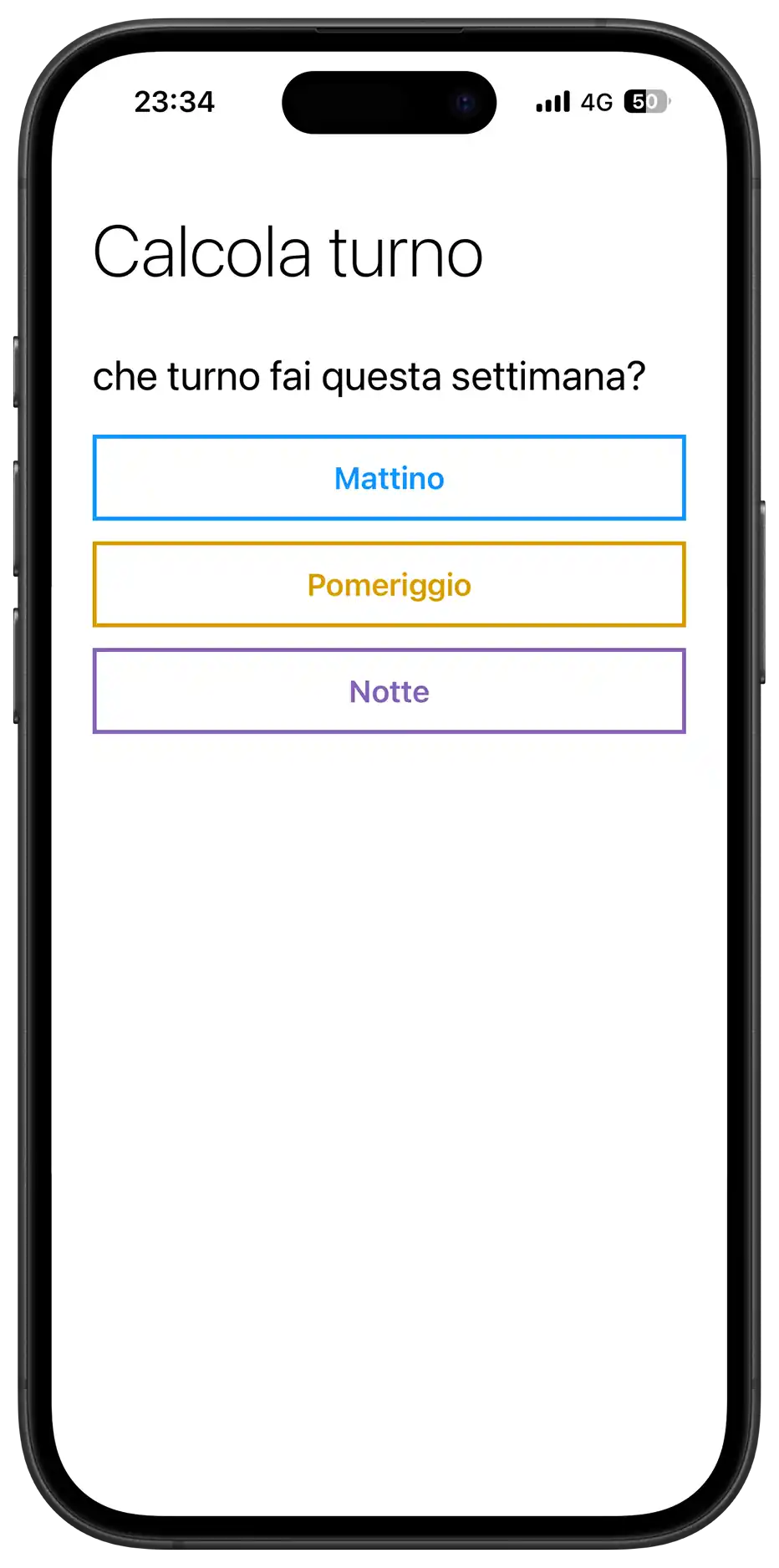
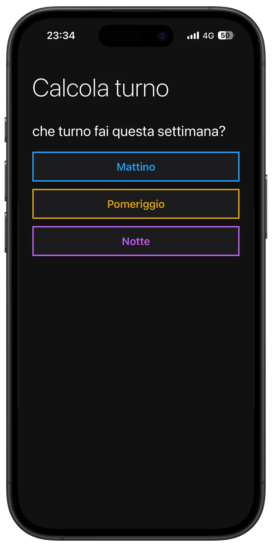
<h1>Calcola turno</h1>
<div class="section">
<div class="section-title">che turno fai questa settimana?</div>
<!--
* I used a flex/grid container for buttons to handle
* responsive alignment. The buttons utilize data-attributes
* for logic to keep the DOM clean from styling classes
-->
<div class="onboarding-buttons">
<!--
* Grid Stack Technique: inside the button, span and loader
* occupy the same grid area to allow seamless transition
* between text and loading spinner without layout shifts
-->
<button class="group-btn" data-select-shift="Mattino">
<span class="btn-text">Mattino</span>
<div class="loader"></div>
</button>
<button class="group-btn" data-select-shift="Pomeriggio">
<span class="btn-text">Pomeriggio</span>
<div class="loader"></div>
</button>
<button class="group-btn" data-select-shift="Notte">
<span class="btn-text">Notte</span>
<div class="loader"></div>
</button>
</div>
</div>
</div>
<!-- VIEW 2: MAIN APPLICATION
Hidden by default, toggled via JavaScript upon initialization
-->
<div id="main-view" class="hidden">
<h1>Calcola turno</h1>
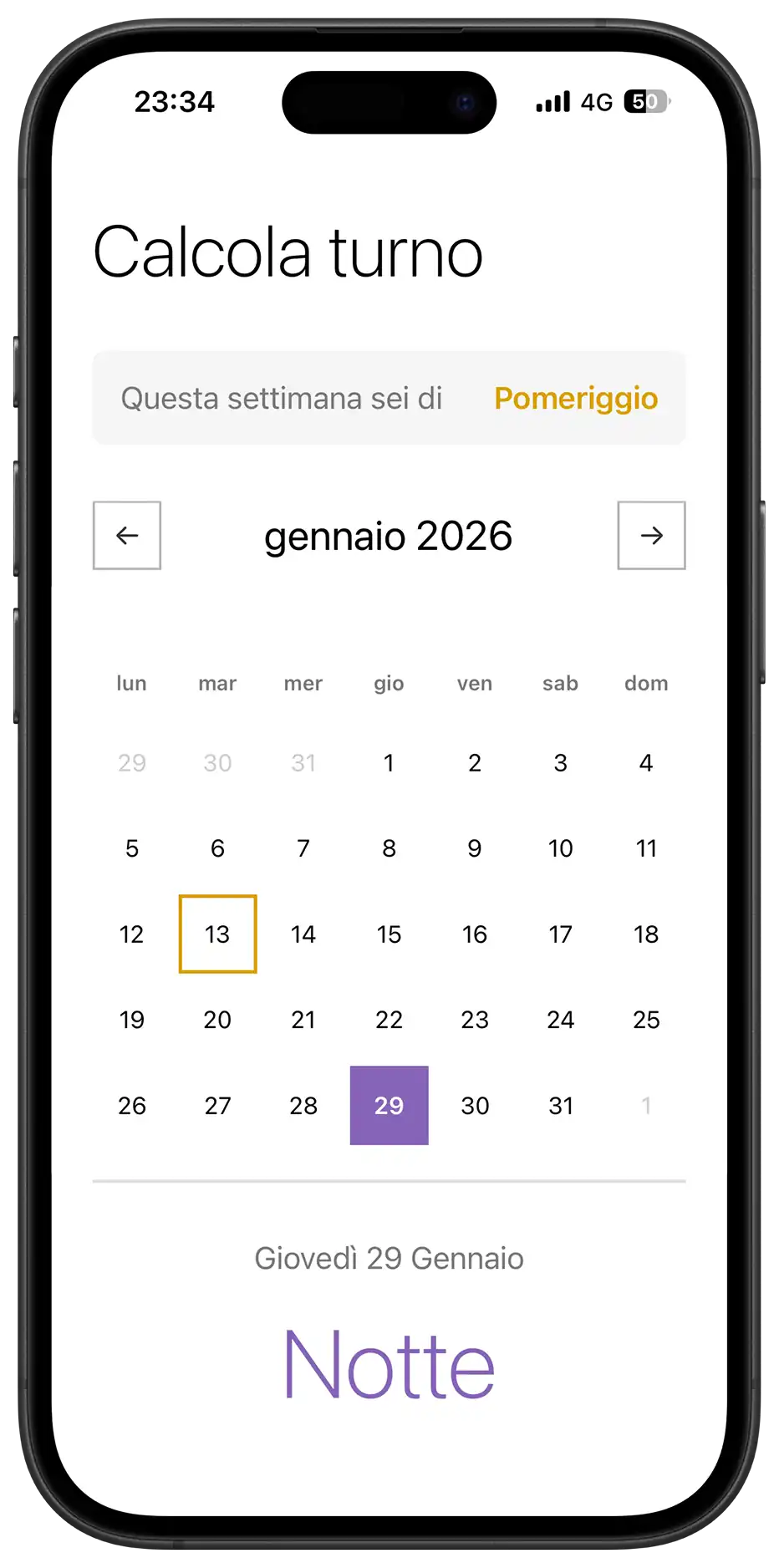
<!-- Information Card Component -->
<div class="section">
<div class="current-week-card">
<div class="card-label">Questa settimana sei di</div>
<div class="card-value" id="week-shift-display">-</div>
</div>
</div>
<!--
* Calendar Component
* Divided into Controls (Nav), Header (Weekdays) and Grid (Days)
-->
<div class="section">
<div class="calendar-controls">
<div class="calendar-header">
<button class="nav-btn" id="prev-month" aria-label="Mese precedente">←</button>
<!--
* Hybrid Input Wrapper: overlays a native transparent
* date input over a custom text div. This forces mobile
* browsers to open their native date scrollers (wheel),
* improving UX over a custom-built JS picker
-->
<div class="month-picker-wrapper">
<div class="month-year" id="month-year"></div>
<input type="month" id="native-month-picker" aria-label="Seleziona mese">
</div>
<button class="nav-btn" id="next-month" aria-label="Mese successivo">→</button>
</div>
<button id="today-btn" class="today-btn">Torna a oggi</button>
</div>
<div class="weekdays">
<div class="weekday">lun</div>
<div class="weekday">mar</div>
<div class="weekday">mer</div>
<div class="weekday">gio</div>
<div class="weekday">ven</div>
<div class="weekday">sab</div>
<div class="weekday">dom</div>
</div>
<!-- Grid container populated dynamically by JavaScript -->
<div class="days" id="calendar-days"></div>
</div>
<!-- Result Feedback Area -->
<div class="result" id="result">
<div class="result-date" id="result-date">oggi</div>
<div class="result-shift" id="result-shift">-</div>
</div>
<div class="footer-actions">
<button id="reset-btn" class="text-btn">Non è corretto? Reimposta</button>
</div>
</div>
</div>
</div>
</div>
<!--
* Install Banner Component
* Positioned fixed at the bottom, separate from the main flow
* Visibility is managed by localStorage and device type detection in JS
-->
<div id="install-banner" class="install-banner hidden">
<div class="install-content">
<img src="icon.png" alt="Icona" class="install-icon">
<div class="install-text">
<span class="install-title">Installa l'App</span>
<span class="install-desc" id="install-instructions">Per un'esperienza migliore</span>
</div>
<button id="install-btn-action" class="install-action-btn">Installa</button>
<button id="close-install" class="install-close" aria-label="Chiudi banner">✕</button>
</div>
</div>
<div id="update-toast" class="update-toast hidden">
<div class="update-content">
<span class="update-text">È disponibile un aggiornamento</span>
<button id="refresh-btn" class="update-action-btn">AGGIORNA</button>
</div>
</div>
<script src="script.js"></script>
</body>
</html>
/* DESIGN
   ------
   * The styling philosophy follows a "Metro UI" inspired direction, characterized by:
   * - High contrast and bold typography (Segoe UI/San Francisco stack)
   * - "Alive" interactivity: elements react with tactile feedback
   * - Mobile-First approach: The base CSS renders the mobile app to ensure
   *   maximum performance on weaker devices
   *
   * The architecture is a "Utility-First Variables" system:
   * - All values (fonts, margins, sizes, colors) are centralized in :root variables,
   *   organized by UNIVERSAL and MOBILE (default)
   * - The DESKTOP media query overrides these variables and applies the
   *   CSS Grid structure for the dashboard layout.
*/


/* UNIVERSAL (Shared logic across all views) */

:root {
    /* Typography */
    --font-family: "Segoe UI", -apple-system, system-ui, sans-serif;
    --font-weight-light: 200;
    --font-weight-regular: 400;
    --font-weight-semibold: 600;

    /* Palette - Base (Light Mode Default) */
    --background-color: #FFF;
    --font-color: #000;
    --text-secondary: #787878;
    --text-disabled: #CCCCCC;
    --white: #FFF;
    --light-bg: #F5F5F5;
    --border-color: #E1E1E1;

    /* Palette - Controls (Neutral Gray Scale) */
    --control-color: #333333; /* Dark Gray for arrows/borders */
    --control-active-bg: #333333; /* Background when pressed */
    --control-active-text: #FFFFFF;

    /* Palette - Shifts (Immutable) */
    --color-mattino: #1196fd;
    --color-pomeriggio: #d99f00;
    --color-notte: #8764B8;

    /* Animations */
    --slide-animation: softPivot 0.25s ease-out;
}


/* MOBILE (Default View Configuration) */

:root {
    /* Layout & Spacing */
    --container-max-width: 480px;
    --container-padding: 0 24px;

    --title-margin-top: 32px;
    --section-margin-top: 32px;
    --element-margin-top: 20px;

    /* Font Sizes */
    --font-size-title: 42px;
    --font-size-section: 24px;
    --font-size-text: 18px;
    --font-size-result: 56px;

    /* Components */
    --button-height: 50px;
    --nav-btn-size: 40px;
    --calendar-min-height: auto; /* Flexible on mobile */

    /* Borders */
    --border-thickness: 1.5px;
    --button-border: 2.373px solid #373737;
    --result-border-top: 2px solid var(--border-color);
}


/* BASE RESET & GLOBAL STYLES */

* {
    margin: 0;
    padding: 0;
    box-sizing: border-box;
    scrollbar-width: none;
    -ms-overflow-style: none;
}

*::-webkit-scrollbar {
    display: none;
    width: 0;
    height: 0;
    background: transparent;
}

button, .nav-btn, .group-btn, .day, .today-btn {
    touch-action: manipulation;
    -webkit-tap-highlight-color: transparent;
}

body {
    background-color: var(--background-color);
    font-family: var(--font-family);
    color: var(--font-color);
    overflow-x: hidden;
}

.hidden {
    display: none !important;
}


/* LAYOUT STRUCTURE */

.container {
    padding: var(--container-padding);
    min-height: 100vh;
    min-height: 100dvh;
    max-width: var(--container-max-width);
    margin: 0 auto;
    width: 100%;
}


/* TYPOGRAPHY COMPONENTS */

h1 {
    margin-top: var(--title-margin-top);
    font-size: var(--font-size-title);
    font-weight: var(--font-weight-light);
}

.section {
    margin-top: var(--section-margin-top);
}

.section-title {
    font-size: var(--font-size-section);
    font-weight: var(--font-weight-regular);
    margin-bottom: var(--element-margin-top);
}

.helper-text {
    margin-top: 16px;
    font-size: 14px;
    color: var(--text-secondary);
    text-align: center;
}


/* COMPONENT: ONBOARDING BUTTONS */

.onboarding-buttons {
    display: flex;
    flex-direction: column;
    gap: 12px;
}

.group-btn {
    width: 100%;
    height: var(--button-height);
    border: var(--button-border);
    background-color: var(--white);
    font-size: var(--font-size-text);
    font-weight: var(--font-weight-regular);
    cursor: pointer;
    transition: all 0.1s;
    display: grid;
    place-items: center;
    grid-template-areas: "stack";
}

.group-btn:hover {
    border-color: var(--control-color);
}

.btn-text {
    grid-area: stack;
    transition: opacity 0.2s ease;
}

/* Loader Logic */
.loader {
    grid-area: stack;
    width: 20px;
    height: 20px;
    border: 2px solid var(--white);
    border-bottom-color: transparent;
    border-radius: 50%;
    visibility: hidden;
    opacity: 0;
    transition: opacity 0.2s ease;
    animation: rotation 0.6s linear infinite;
}

@keyframes rotation {
    0% { transform: rotate(0deg); }
    100% { transform: rotate(360deg); }
}

.group-btn.loading {
    pointer-events: none;
    cursor: wait;
}
.group-btn.loading .btn-text {
    visibility: hidden;
    opacity: 0;
}
.group-btn.loading .loader {
    visibility: visible;
    opacity: 1;
}

/* Shift Colors (Data Attributes) */
.group-btn[data-select-shift="Mattino"] {
    color: var(--color-mattino);
    border-color: var(--color-mattino);
    font-weight: 600;
}
.group-btn[data-select-shift="Mattino"]:hover {
    background-color: rgba(17, 150, 253, 0.1); }
.group-btn[data-select-shift="Mattino"].loading {
    background-color: var(--color-mattino);
    color: #FFF;
}

.group-btn[data-select-shift="Pomeriggio"] {
    color: var(--color-pomeriggio);
    border-color: var(--color-pomeriggio);
    font-weight: 600;
}
.group-btn[data-select-shift="Pomeriggio"]:hover {
    background-color: rgba(217, 159, 0, 0.1);
}
.group-btn[data-select-shift="Pomeriggio"].loading {
    background-color: var(--color-pomeriggio);
    color: #FFF;
}

.group-btn[data-select-shift="Notte"] {
    color: var(--color-notte);
    border-color: var(--color-notte);
    font-weight: 600;
}
.group-btn[data-select-shift="Notte"]:hover {
    background-color: rgba(135, 100, 184, 0.1);
}
.group-btn[data-select-shift="Notte"].loading {
    background-color: var(--color-notte);
    color: #FFF;
}


/* COMPONENT: CURRENT WEEK CARD */

.current-week-card {
    background-color: var(--light-bg);
    padding: 16px;
    border-radius: 8px;
    display: flex;
    justify-content: space-between;
    align-items: center;
}

.card-label {
    font-size: var(--font-size-text);
    color: var(--text-secondary);
}
.card-value {
    font-size: var(--font-size-text);
    font-weight: var(--font-weight-semibold);
}

.card-value.mattino {
    color: var(--color-mattino);
}
.card-value.pomeriggio {
    color: var(--color-pomeriggio);
}
.card-value.notte {
    color: var(--color-notte);
}


/* COMPONENT: CALENDAR CONTROLS */

.calendar-controls {
    display: flex;
    flex-direction: column;
    align-items: center;
    margin-bottom: 16px;
    gap: 8px;
}

.calendar-header {
    display: flex;
    justify-content: space-between;
    align-items: center;
    width: 100%;
}

.month-picker-wrapper {
    position: relative;
    display: flex;
    align-items: center;
    justify-content: center;
    padding: 6px 16px;
    border-radius: 8px;
    transition: background-color 0.2s;
}

.month-year {
    font-size: var(--font-size-section);
    font-weight: var(--font-weight-regular);
    cursor: pointer;
    transition: color 0.2s;
}

/* Native Picker Overlay */
#native-month-picker {
    position: absolute;
    top: 0;
    left: 0;
    width: 100%;
    height: 100%;
    opacity: 0;
    cursor: default;
    z-index: 10;
}

/* Nav Button Styling (Neutral Gray) */
.nav-btn {
    width: var(--nav-btn-size);
    height: var(--nav-btn-size);
    background-color: var(--white);
    border: var(--border-thickness) solid #b6b6b6;
    color: var(--control-color);
    font-size: 18px;
    cursor: pointer;

    /* Ensure smooth return animation */
    transition: background-color 0.1s, transform 0.1s ease-out;
}

/* Active State (3D Tactile Feedback) */
/* Applies the specific perspective tilt when pressed */
.nav-btn:active,
.nav-btn.clicked {
    transform: perspective(400px) rotateX(2deg) rotateY(-2deg) scale(0.98);

    /* Visual feedback coloring */
    background-color: var(--control-active-bg);
    border-color: var(--control-active-bg);
    color: var(--control-active-text);
}

.today-btn {
    background: transparent;
    border: 1.5px solid #b6b6b6;
    border-radius: 20px;
    padding: 4px 12px;
    font-size: 12px;
    color: #5b5b5b;
    font-weight: var(--font-weight-semibold);
    cursor: pointer;
    transition: all 0.2s;
    opacity: 0;
    transform: translateY(-5px);
    pointer-events: none;
}

.today-btn.visible { opacity: 1;
    transform: translateY(0);
    pointer-events: auto;
}
.today-btn:hover {
    background-color: var(--control-color);
    color: var(--white);
    border-color: var(--control-color);
}


/* COMPONENT: CALENDAR GRID */

.weekdays {
    display: grid;
    grid-template-columns: repeat(7, 1fr);
    gap: 4px;
    margin-bottom: 8px;
}

.weekday {
    text-align: center;
    font-size: 12px;
    font-weight: var(--font-weight-semibold);
    color: var(--text-secondary);
    padding: 8px 0;
}

.days {
    display: grid;
    grid-template-columns: repeat(7, 1fr);
    gap: 4px;
    margin-bottom: var(--element-margin-top);
    min-height: var(--calendar-min-height);
    align-content: start;
}

.day {
    aspect-ratio: 1;
    display: flex;
    align-items: center;
    justify-content: center;
    font-size: 14px;
    font-weight: var(--font-weight-regular);
    cursor: pointer;
    border: 2px solid transparent;
    transition: transform 0.2s, background-color 0.2s;
}

.day.other-month {
    color: var(--text-disabled);
    cursor: default;
}

/* Day Selection Logic */
.day.selected {
    color: #FFF;
    font-weight: var(--font-weight-semibold);
    background-color: var(--control-color);
    border-color: transparent;
}
.day.selected.mattino {
    background-color: var(--color-mattino);
    color: #FFF;
}
.day.selected.pomeriggio {
    background-color: var(--color-pomeriggio);
    color: #000;
}
.day.selected.notte {
    background-color: var(--color-notte);
    color: #FFF;
}

.day.today {
    border-color: var(--control-color);
}
.day.today.mattino {
    border-color: var(--color-mattino);
}
.day.today.pomeriggio {
    border-color: var(--color-pomeriggio);
}
.day.today.notte {
    border-color: var(--color-notte);
}


/* COMPONENT: RESULT AREA */

.result {
    text-align: center;
    padding: 32px 0;
    border-top: var(--result-border-top);
    animation: var(--slide-animation);
}

.result-date {
    font-size: var(--font-size-text);
    font-weight: var(--font-weight-regular);
    color: var(--text-secondary);
    margin-bottom: 16px;
    text-transform: capitalize;
}

.result-shift {
    font-size: var(--font-size-result);
    font-weight: var(--font-weight-light);
    margin-bottom: 8px;
}

.result-shift.mattino {
    color: var(--color-mattino);
}
.result-shift.pomeriggio {
    color: var(--color-pomeriggio);
}
.result-shift.notte {
    color: var(--color-notte);
}

/* Footer */
.footer-actions {
    margin-top: 20px;
    text-align: center;
    padding-bottom: 40px;
}

.text-btn {
    background: none;
    border: none;
    color: var(--text-secondary);
    text-decoration: underline; font-size: 14px; cursor: pointer;
}


/* GLOBAL COMPONENTS: TOAST & BANNER */

.install-banner, .update-toast {
    position: fixed;
    left: 50%;
    transform: translateX(-50%) translateY(150%);
    background-color: var(--white);
    transition: transform 0.4s cubic-bezier(0.175, 0.885, 0.32, 1.275);
    z-index: 1000;
}

/* Specific Banner Styles */
.install-banner {
    bottom: 20px;
    left: 20px;
    right: 20px;
    width: auto;
    transform: translateY(150%);
    border: var(--button-border);
    border-radius: 12px;
    padding: 12px;
    box-shadow: 0 10px 30px rgba(0,0,0,0.15);
}

.update-toast {
    bottom: 80px;
    width: max-content;
    max-width: 90%;
    background-color: #323232;
    color: #FFF;
    padding: 12px 20px;
    border-radius: 50px;
    box-shadow: 0 4px 12px rgba(0,0,0,0.3);
    z-index: 2000;
}

.install-banner.visible {
    transform: translateY(0);
}
.update-toast.visible {
    transform: translateX(-50%) translateY(0);
}

/* Toast/Banner Internals */
.install-content, .update-content {
    display: flex;
    align-items: center;
    gap: 12px;
}
.install-icon {
    width: 40px;
    height: 40px;
    border-radius: 8px;
}
.install-text { flex: 1;
    display: flex;
    flex-direction: column;
}
.install-title {
    font-weight: 600;
    font-size: 14px;
}
.install-desc {
    font-size: 12px;
    color: var(--text-secondary);
}
.update-text {
    font-size: 14px;
    font-weight: 500;
    color: #FFF;
}

.install-action-btn, .update-action-btn {
    background-color: var(--control-color);
    color: #FFF;
    border: none;
    padding: 6px 12px;
    border-radius: 20px;
    font-size: 12px;
    font-weight: 600;
    cursor: pointer;
}
.install-close {
    background: transparent;
    border: none;
    color: var(--text-secondary);
    cursor: pointer;
    padding: 4px;
}


/* ANIMATIONS */

.group-btn.clicked, .day.clicked {
    transform: perspective(400px) rotateX(2deg) rotateY(-2deg) scale(0.98);
    transition: transform 0.1s ease-out;
}

@keyframes softPivot {
    0% {
        opacity: 0;
        transform: perspective(400px) rotateX(7deg) translateY(-2px);
    }
    100% {
        opacity: 1;
        transform: perspective(400px) rotateX(0deg) translateY(0);
    }
}


/* MEDIA QUERY: DARK MODE */

@media (prefers-color-scheme: dark) {
    :root {
        --background-color: #121212;
        --font-color: #FFFFFF;
        --white: #1C1C1E;
        --light-bg: #2C2C2E;
        --border-color: #3A3A3C;
        --text-secondary: #98989F;
        --text-disabled: #474747;

        /* Controls shift to Light Gray for visibility */
        --control-color: #E1E1E1;
        --control-active-bg: #E1E1E1;
        --control-active-text: #000000;

        /* Adjustments for readability */
        --color-mattino: #209efe;
        --color-pomeriggio: #d99f00;
        --color-notte: #BF5AF2;
    }

    body { color-scheme: dark; }

    .day.selected {
        color: #000;
    }
    .today-btn {
        color: #ababab;
    }
    .install-banner {
        background-color: #1C1C1E;
        border-color: #333;
    }
    .update-toast { background-color: #4A4A4A;
        border: 1px solid #666;
    }

    .group-btn[data-select-shift="Mattino"].loading .loader,
    .group-btn[data-select-shift="Pomeriggio"].loading .loader {
        border-color: #000; border-bottom-color: transparent;
    }
}


/* DESKTOP DASHBOARD (Overriding variables & Structural Grid) */
/* Triggered on screens wider than 950px (Desktop & Large Tablets Landscape) */

@media (min-width: 950px) {

    :root {
        /* Override Base Colors for "Dashboard" Look */
        /* Note: We do not set the dark background here as a default
           We let the specific body rules below handle the mode distinction */

        /* Layout & Dimensions Overrides */
        --container-max-width: 900px;
        --container-padding: 50px 70px;
        --calendar-min-height: 290px;

        /* Typography Overrides */
        --font-size-title: 36px;
        --font-size-result: 64px;
        --font-size-text: 16px;

        /* Remove Borders for desktop layout as the card provides the structure */
        --result-border-top: none;
    }

    /* 1. Global Background - LIGHT MODE DEFAULT */
    body {
        display: flex;
        align-items: center;
        justify-content: center;
        height: 100vh;
        background-color: #00457a;
        background-image: radial-gradient(circle at top right, #051c2f 0%, rgb(0, 63, 110) 100%);
    }

    /* 2. Neutralize Phone Wrappers */
    /* We use 'display: contents' to make these divs virtually disappear from the DOM tree */
    .device-frame, .device-screen {
        display: contents;
    }

    /* 3. Main Card Style */
    .container {
        height: auto; min-height: 550px;
        background-color: var(--white);
        border-radius: 24px;
        margin: 0; position: relative;
        border: 1px solid #535353;
    }

    /* 4. GRID LAYOUT SYSTEM */
    #main-view {
        display: grid;
        width: 100%;
        height: 100%;
        grid-template-columns: 1fr 1.2fr;
        grid-template-rows: auto auto 1fr auto;
        grid-template-areas:
            "title    calendar"
            "week     calendar"
            "result   calendar"
            "footer   calendar";
        gap: 0 60px;
        align-items: stretch; /* Prevents vertical resizing issues */
    }

    /* 5. Structural Adjustments (Grid Area assignments) */

    h1 {
        grid-area: title;
        margin-top: 0;
        margin-bottom: 20px;
        text-align: left;
    }

    .section:nth-of-type(1) { /* Week Card */
        grid-area: week;
        margin-top: 0;
        display: flex;
        flex-direction: column;
        justify-content: center;
    }

    .current-week-card {
        height: 100%;
    }

    .result {
        grid-area: result;
        padding: 0;
        margin: 0;
        text-align: center;
        animation: none;
        display: flex;
        flex-direction: column;
        justify-content: center;
    }
    .result-shift {
        line-height: 1.1;
        letter-spacing: -1px;
    }

    .footer-actions {
        grid-area: footer;
        text-align: left;
        padding: 0;
        margin: 0;
        display: flex;
        flex-direction: column;
        justify-content: center;
    }

    .section:nth-of-type(2) {
        grid-area: calendar;
        margin-top: 0;
        height: auto;
        min-height: 100%;
        display: flex;
        flex-direction: column;
        justify-content: center;
        border-left: 1px solid var(--border-color);
        padding-left: 60px;
    }

    /* Desktop Interactions */
    /* Fix: We use :not(:active) and :not(.clicked) to ensure the hover color
       doesn't override the dark click feedback color when pressed. */

    .nav-btn:hover:not(:active):not(.clicked) {
        background-color: var(--light-bg);
        border-color: #999;
    }

    .day:hover:not(.selected):not(.other-month):not(:active):not(.clicked) {
        background-color: var(--light-bg);
    }

    .days { gap: 8px; }

    /* Onboarding Overrides */
    #onboarding-view {
        max-width: 400px;
        margin: 0 auto;
        padding-top: 40px; }
    .onboarding-buttons {
        gap: 20px;
    }
    .group-btn {
        height: 60px;
        font-size: 20px;
    }
    .group-btn:hover {
        transform: translateY(-2px);
        box-shadow: 0 4px 12px rgba(0,0,0,0.1);
    }


    /* DARK MODE DESKTOP OVERRIDES */
    @media (prefers-color-scheme: dark) {
        body {
            background-color: #1a1a1a;
            background-image: radial-gradient(circle at top right, #000000 0%, #242424 100%);
        }

        .container {
            border: 1px solid #404040;
        }
        .section:nth-of-type(2) {
            border-left-color: #333;
        }
        .month-picker-wrapper:hover, .day:hover:not(.selected):not(.other-month) {
            background-color: #333;
        }
    }
}


/* TABLET TWEAKS (Intermediate view) */
/* Bridging the gap between Mobile and Desktop Card */

@media (min-width: 550px) and (max-width: 949px) {

    :root {
        /* Relaxed spacing for larger touch screens */
        --container-max-width: 530px;

        /* Slightly larger typography to fill the space */
        --font-size-title: 48px;
        --font-size-result: 72px;

        /* Bigger touch targets for easier interaction */
        --button-height: 60px;
    }

    /* Center the vertical container for elegance */
    .container {
        margin-top: 5vh;
        border-radius: 24px; /* Introduces a polished rounded look */
    }
}


/* MEDIA QUERY: LANDSCAPE MOBILE (Dashboard Mode) */

@media (orientation: landscape) and (max-height: 600px) {
    .container {
        max-width: 100%;
        padding: 10px 40px;
        height: 100vh;
        display: flex;
        align-items: center;
        overflow: hidden;
    }
    #main-view {
        width: 100%;
        height: 100%;
        display: grid;
        grid-template-columns: 0.8fr 1.2fr;
        grid-template-rows: auto auto 1fr auto;
        grid-template-areas: "title calendar" "week calendar" "result calendar" "footer calendar";
        gap: 0 40px; align-content: center;
    }
    h1 {
        grid-area: title;
        margin-top: 0;
        font-size: 28px;
        text-align: left;
    }
    .section:nth-of-type(1) {
        grid-area: week;
        margin-top: 10px;
    }
    .result {
        grid-area: result;
        border-top: none;
        padding: 20px 0;
        text-align: left;
        display: flex;
        flex-direction: column;
        align-items: flex-start;
        justify-content: center;
    }
    .result-date {
        margin-bottom: 5px;
    }
    .result-label {
        order: -1;
        margin-bottom: 5px;
        font-size: 12px;
    }
    .result-shift { font-size: 42px;
        line-height: 1;
    }
    .footer-actions { grid-area: footer;
        text-align: left;
        margin-top: 0;
        padding-bottom: 0;
    }
    .section:nth-of-type(2) {
        grid-area: calendar;
        margin-top: 0;
        height: auto;
        min-height: 100%;
        display: flex;
        flex-direction: column;
        justify-content: center;
        border-left: 1px solid var(--border-color);
        padding-left: 60px;
    }
    .days {
        gap: 2px;
    }
    .day {
        font-size: 13px;
        width: 100%;
        max-width: 40px;
        margin: 0 auto;
    }
    #onboarding-view {
        overflow-y: auto;
        max-height: 100vh;
    }
}
/* DESIGN
   ------
   * The JavaScript logic is built around a deterministic mathematical model
   * rather than a stored database of dates
   * It is characterized by:
   * - A reference date (Epoch) approach: calculation of shifts is based on
   *   the delta of weeks from a fixed point in time (Jan 5, 2025)
   * - Separation of Concerns: pure functions handle the date math, while
   *   DOM functions handle the rendering, ensuring the logic is testable
   * - A "Tactile" UX philosophy: The code intentionally introduces small
   *   delays (setTimeout) during interactions to allow CSS 3D animations
   *   to complete, giving the interface a physical feel
   * - PWA Bifurcation: distinct handling for iOS (manual instructions) and
   *   Android (native prompt interception) to maximize installation rates.
*/


// --- CONFIGURATION & STATE ---

/* * I use localStorage to persist the user's shift group (A, B, or C)
   * This ensures the user doesn't need to onboarding every time they open the app
*/
let selectedGroup = localStorage.getItem('userGroup');

/* * State variables for the calendar navigation.
   * selectedDate tracks the user's click, currentMonth tracks the visible grid
*/
let selectedDate = new Date();
let currentMonth = new Date();

const months = ['gennaio', 'febbraio', 'marzo', 'aprile', 'maggio', 'giugno',
                'luglio', 'agosto', 'settembre', 'ottobre', 'novembre', 'dicembre'];

/* * The Epoch: Sunday, Jan 5th, 2025
   * This is the mathematical anchor for the modulo-3 cycle calculation
*/
const referenceDate = new Date(2025, 0, 5);


// --- HELPER ANIMATION ---

/* * This helper function manages the class-based state for CSS animations
   * It adds a class to trigger the transform, then removes it after 150ms
   * to reset the state for the next interaction.
*/
const animateButton = (element) => {
    if (!element) return;
    element.classList.add('clicked');
    setTimeout(() => {
        element.classList.remove('clicked');
    }, 150);
};


// --- SERVICE WORKER & UPDATES ---

/* * Advanced Registration Logic:
   * Instead of just registering, we actively listen for the 'updatefound' event
   * This allows us to detect when a new version (sw.js) is being installed
   * and prompt the user to refresh, ensuring they always have the latest math logic.
*/
if ('serviceWorker' in navigator) {
    window.addEventListener('load', () => {
        navigator.serviceWorker.register('./sw.js').then(reg => {

            // 1. Listen for new updates found on the server
            reg.addEventListener('updatefound', () => {
                const newWorker = reg.installing;

                newWorker.addEventListener('statechange', () => {
                    // Has the new worker finished installing?
                    if (newWorker.state === 'installed') {

                        // Check if there is ALREADY a controller (old version running)
                        // If yes, it means this is an update, not the first visit.
                        if (navigator.serviceWorker.controller) {
                            showUpdateToast();
                        }
                    }
                });
            });

        }).catch(err => console.log('SW errore:', err));

        // 2. Fallback: Detect if the controller changed (e.g. via skipWaiting)
        // This handles cases where the update happened silently in background
        navigator.serviceWorker.addEventListener('controllerchange', () => {
             // We can optionally auto-reload here, but showing the toast is safer UX
             showUpdateToast();
        });
    });
}

// --- UPDATE TOAST UI LOGIC ---

const updateToast = document.getElementById('update-toast');
const refreshBtn = document.getElementById('refresh-btn');

const showUpdateToast = () => {
    updateToast.classList.remove('hidden');
    // Small delay for animation
    setTimeout(() => {
        updateToast.classList.add('visible');
    }, 100);
};

refreshBtn.addEventListener('click', () => {
    // Simply reloading the page will load the new Service Worker (already active via skipWaiting)
    window.location.reload();
});


// --- CALCULATION LOGIC (PURE FUNCTIONS) ---

/* * To determine the shift, we first need to know how many full weeks have passed
   * since our reference date
   * I normalize hours to 0 to avoid daylight saving time bugs impacting the diff.
*/
const getWeekNumber = (date) => {
    const weekStart = new Date(date);
    const day = weekStart.getDay();
    // Adjust to start of week (Monday or Sunday based on preference, here logic aligns with Ref)
    const diff = weekStart.getDate() - day + (day === 0 ? -6 : 1);
    weekStart.setDate(diff);
    weekStart.setHours(0, 0, 0, 0);

    const refWeekStart = new Date(referenceDate);
    const refDay = refWeekStart.getDay();
    const refDiff = refWeekStart.getDate() - refDay + (refDay === 0 ? -6 : 1);
    refWeekStart.setDate(refDiff);
    refWeekStart.setHours(0, 0, 0, 0);

    const diffTime = weekStart - refWeekStart;

    /* * BUG FIX (Daylight Saving Time):
       * I changed Math.floor to Math.round
       * When DST starts/ends, a week might have 1 hour less/more
       * Division leads to 9.99 or 10.01 weeks. Math.floor would break logic (9 instead of 10)
       * Math.round safely handles the +/- 1 hour offset.
    */
    const diffWeeks = Math.round(diffTime / (7 * 24 * 60 * 60 * 1000));

    return diffWeeks;
};

/* * The core algorithm:
   * The shift pattern repeats every 3 weeks. By using the modulo operator (%)
   * on the week difference, we determine the position in the cycle (0, 1, or 2)
   * The ((x % n) + n) % n formula handles negative differences correctly (past dates).
*/
const calculateShift = (group, date) => {
    const weeksDiff = getWeekNumber(date);
    const cyclePosition = ((weeksDiff % 3) + 3) % 3;

    const shifts = {
        'A': ['Pomeriggio', 'Mattino', 'Notte'],
        'B': ['Notte', 'Pomeriggio', 'Mattino'],
        'C': ['Mattino', 'Notte', 'Pomeriggio']
    };

    return shifts[group][cyclePosition];
};

/* * Reverse lookup for Onboarding:
   * When a user says "I am working Morning today", we check which group (A, B, or C)
   * would actually have Morning today, and assign that group to the user.
*/
const findGroupFromCurrentShift = (shiftName) => {
    const today = new Date();
    const groups = ['A', 'B', 'C'];

    for (let g of groups) {
        if (calculateShift(g, today) === shiftName) {
            return g;
        }
    }
    return 'A'; // Fallback safety
};


// --- UI RENDERING & DOM MANIPULATION ---

/* * Improves UX by only showing the "Back to Today" button when the user
   * has navigated away from the current month/year view.
*/
const checkTodayButtonVisibility = () => {
    const today = new Date();
    const btn = document.getElementById('today-btn');

    if (currentMonth.getMonth() !== today.getMonth() ||
        currentMonth.getFullYear() !== today.getFullYear()) {
        btn.classList.add('visible');
    } else {
        btn.classList.remove('visible');
    }
};

const updateResult = () => {
    const shift = calculateShift(selectedGroup, selectedDate);
    const today = new Date();
    let dateStr;

    if (selectedDate.toDateString() === today.toDateString()) {
        dateStr = 'oggi';
    } else {
        dateStr = selectedDate.toLocaleDateString('it-IT', {
            weekday: 'long',
            day: 'numeric',
            month: 'long'
        });
    }

    document.getElementById('result-date').textContent = dateStr;
    const shiftEl = document.getElementById('result-shift');
    shiftEl.textContent = shift;

    // Dynamic styling: applying the class (e.g., .mattino) colors the text
    shiftEl.className = 'result-shift ' + shift.toLowerCase();

    /* * Animation Trigger:
       * Removing and re-adding the animation property forces the browser
       * to reflow and restart the CSS animation on the result text.
    */
    const resultEl = document.getElementById('result');
    resultEl.style.animation = 'none';
    setTimeout(() => {
        resultEl.style.animation = '';
    }, 10);
};

const renderCalendar = () => {
    const year = currentMonth.getFullYear();
    const month = currentMonth.getMonth();

    document.getElementById('month-year').textContent = `${months[month]} ${year}`;

    /* * Synchronization with Native Input:
       * We update the invisible <input type="month"> value so that if the user
       * clicks the label, the native picker opens on the correct month.
    */
    const pickerInput = document.getElementById('native-month-picker');
    const monthStr = (month + 1).toString().padStart(2, '0');
    pickerInput.value = `${year}-${monthStr}`;

    const firstDay = new Date(year, month, 1);
    const lastDay = new Date(year, month + 1, 0);
    const prevLastDay = new Date(year, month, 0);

    const firstDayWeek = firstDay.getDay();
    // Convert Sunday (0) to 6 (European week start)
    const startDay = firstDayWeek === 0 ? 6 : firstDayWeek - 1;

    const daysContainer = document.getElementById('calendar-days');
    daysContainer.innerHTML = '';

    // 1. Rendering padding days from previous month
    for (let i = startDay - 1; i >= 0; i--) {
        const day = document.createElement('div');
        day.className = 'day other-month';
        day.textContent = prevLastDay.getDate() - i;
        daysContainer.appendChild(day);
    }

    const today = new Date();

    // 2. Rendering current month days
    for (let i = 1; i <= lastDay.getDate(); i++) {
        const day = document.createElement('div');
        day.className = 'day';
        day.textContent = i;

        const dayDate = new Date(year, month, i);

        // Calculate shift for this specific cell to apply color indicators
        const shiftForThisDay = calculateShift(selectedGroup, dayDate);

        /* * State Visualization:
           * We combine 'today/selected' classes with 'shift' classes (mattino/pomeriggio)
           * to allow CSS to render border-colors or background-colors dynamically.
        */

        // CASE 1: IS IT TODAY?
        if (today.toDateString() === dayDate.toDateString()) {
            day.classList.add('today');
            day.classList.add(shiftForThisDay.toLowerCase());
        }

        // CASE 2: IS IT SELECTED?
        if (selectedDate.toDateString() === dayDate.toDateString()) {
            day.classList.add('selected');
            day.classList.add(shiftForThisDay.toLowerCase());
        }

        /* * Interaction Logic:
           * The click event triggers the 3D animation first.
           * Crucially, we use a setTimeout matching the animation duration (150ms)
           * before re-rendering. This prevents the DOM rewrite from cutting off
           * the visual feedback, making the app feel "broken" or laggy.
        */
        day.addEventListener('click', () => {
            animateButton(day);

            setTimeout(() => {
                selectedDate = dayDate;
                renderCalendar();
                updateResult();
            }, 150);
        });

        daysContainer.appendChild(day);
    }

    // 3. Rendering padding days for next month to fill the grid
    const totalCellsSoFar = daysContainer.children.length;
    const remainingDays = (7 - (totalCellsSoFar % 7)) % 7;

    for (let i = 1; i <= remainingDays; i++) {
        const day = document.createElement('div');
        day.className = 'day other-month';
        day.textContent = i;
        daysContainer.appendChild(day);
    }

    checkTodayButtonVisibility();
};

const renderMainView = () => {
    // 1. Header update (Current Week Status)
    const today = new Date();
    const currentShift = calculateShift(selectedGroup, today);
    const weekDisplay = document.getElementById('week-shift-display');
    weekDisplay.textContent = currentShift;
    weekDisplay.className = 'card-value ' + currentShift.toLowerCase();

    // 2. Main Render components
    renderCalendar();
    updateResult();

    // 3. UI Check
    checkTodayButtonVisibility();
};

/* * Initialization Router:
   * Checks if userGroup exists in localStorage to decide between
   * the Onboarding View or the Main Application View.
*/
const initApp = () => {
    const onboardingView = document.getElementById('onboarding-view');
    const mainView = document.getElementById('main-view');

    if (selectedGroup) {
        onboardingView.classList.add('hidden');
        mainView.classList.remove('hidden');
        renderMainView();
    } else {
        onboardingView.classList.remove('hidden');
        mainView.classList.add('hidden');
    }
};


// --- EVENT LISTENERS ---

// 1. Onboarding Selection
document.querySelectorAll('.group-btn').forEach(btn => {
    btn.addEventListener('click', () => {
        if (btn.classList.contains('loading')) return;

        // Visual Feedback (3D Tilt)
        animateButton(btn);

        // State: Loading
        btn.classList.add('loading');

        /* * Artificial Delay (400ms):
           * Even though calculation is instant, adding a delay communicates
           * to the user that "work is being done" (saving settings),
           * providing a smoother transition to the main view.
        */
        setTimeout(() => {
            const shiftChosen = btn.dataset.selectShift;
            selectedGroup = findGroupFromCurrentShift(shiftChosen);
            localStorage.setItem('userGroup', selectedGroup);
            btn.classList.remove('loading');
            initApp();
        }, 400);
    });
});

// 2. Navigation (Previous Month)
document.getElementById('prev-month').addEventListener('click', () => {
    const btn = document.getElementById('prev-month');
    animateButton(btn);
    currentMonth.setMonth(currentMonth.getMonth() - 1);
    renderCalendar();
});

// 3. Navigation (Next Month)
document.getElementById('next-month').addEventListener('click', () => {
    const btn = document.getElementById('next-month');
    animateButton(btn);
    currentMonth.setMonth(currentMonth.getMonth() + 1);
    renderCalendar();
});

// 4. Navigation (Native Picker Input)
document.getElementById('native-month-picker').addEventListener('input', (e) => {
    if (e.target.value) {
        const [y, m] = e.target.value.split('-');
        currentMonth.setFullYear(parseInt(y));
        currentMonth.setMonth(parseInt(m) - 1);
        renderCalendar();
    }
});

// 5. Navigation (Reset to Today)
document.getElementById('today-btn').addEventListener('click', () => {
    const now = new Date();
    currentMonth = new Date(now);
    selectedDate = new Date(now);
    renderCalendar();
    updateResult();
});

// 6. Reset Settings
document.getElementById('reset-btn').addEventListener('click', () => {
    if(confirm('Vuoi reimpostare il tuo turno?')) {
        localStorage.removeItem('userGroup');
        selectedGroup = null;
        location.reload();
    }
});

// 7. Keyboard Navigation (Advanced Grid Mode)
/* * State variable to track Keyboard Interaction Mode:
   * false = Month Navigation (Left/Right changes month).
   * true  = Day Navigation (Arrows move inside the grid).
*/
let isDayNavigationMode = false;

document.addEventListener('keydown', (e) => {
    // Safety check: Only navigate if we are in the Main View
    const mainView = document.getElementById('main-view');
    if (mainView.classList.contains('hidden')) return;

    const daysContainer = document.getElementById('calendar-days');

    // --- ACTIVATION: Enter Day Mode ---
    // If not active, ArrowDown activates it.
    if (!isDayNavigationMode && e.key === 'ArrowDown') {
        e.preventDefault();
        isDayNavigationMode = true;
        daysContainer.classList.add('keyboard-active'); // Enable visual CSS ring

        /* * SYNC FIX:
           * We check if the currently visible month differs from the
           * internal 'selectedDate' (which might still be set to Today).
        */
        if (currentMonth.getMonth() !== selectedDate.getMonth() ||
            currentMonth.getFullYear() !== selectedDate.getFullYear()) {

            // If we are viewing a different month, we "land" on the 1st day of that month
            selectedDate = new Date(currentMonth.getFullYear(), currentMonth.getMonth(), 1);

            // Update the view to highlight the 1st day
            renderMainView();

            /* * STOP EXECUTION:
               * We return here so we don't immediately jump 7 days forward.
               * The user now sees the 1st day selected and is ready to navigate.
            */
            return;
        }

        // If we were already in the correct month, the code falls through
        // and applies the standard ArrowDown logic (+7 days) below.
    }

    // --- DEACTIVATION: Exit Day Mode ---
    if ((e.key === 'Enter' || e.key === 'Tab' || e.key === 'Escape') && isDayNavigationMode) {
        e.preventDefault();
        isDayNavigationMode = false;
        daysContainer.classList.remove('keyboard-active');
        return;
    }

    // --- NAVIGATION LOGIC ---
    if (isDayNavigationMode) {
        // MODE A: DAY NAVIGATION (Grid Movement)

        let dayChanged = false;

        if (e.key === 'ArrowLeft') {
            selectedDate.setDate(selectedDate.getDate() - 1); // Previous Day
            dayChanged = true;
        } else if (e.key === 'ArrowRight') {
            selectedDate.setDate(selectedDate.getDate() + 1); // Next Day
            dayChanged = true;
        } else if (e.key === 'ArrowUp') {
            selectedDate.setDate(selectedDate.getDate() - 7); // Previous Week
            dayChanged = true;
        } else if (e.key === 'ArrowDown') {
            selectedDate.setDate(selectedDate.getDate() + 7); // Next Week
            dayChanged = true;
        }

        if (dayChanged) {
            e.preventDefault(); // Stop scrolling the page

            // Check if we crossed into a different month
            if (selectedDate.getMonth() !== currentMonth.getMonth() ||
                selectedDate.getFullYear() !== currentMonth.getFullYear()) {
                currentMonth = new Date(selectedDate);
            }

            renderMainView();
        }

    } else {
        // MODE B: STANDARD NAVIGATION (Default)

        if (e.key === 'ArrowLeft') {
            document.getElementById('prev-month').click();
        } else if (e.key === 'ArrowRight') {
            document.getElementById('next-month').click();
        } else if (e.key === 'Enter') {
            document.getElementById('today-btn').click();
        }
    }
});

// Boot the Application
initApp();


// --- PWA INSTALLATION LOGIC ---

/* DESIGN NOTE:
 * The installation logic is bifurcated because iOS and Android handle
 * PWA installation differently.
 * - Android: Supports 'beforeinstallprompt' to trigger a native modal.
 * - iOS: Requires manual user action (Share -> Add to Home), so we must
 * show educational UI instructions instead of a functional button.
*/

let deferredPrompt; // Stores the event for Android
const installBanner = document.getElementById('install-banner');
const installBtn = document.getElementById('install-btn-action');
const closeInstallBtn = document.getElementById('close-install');
const instructionsText = document.getElementById('install-instructions');

// Check if app is already running in standalone mode (Installed)
const isStandalone = window.matchMedia('(display-mode: standalone)').matches || window.navigator.standalone;

// Check user preference persistence
const hasSeenBanner = localStorage.getItem('installBannerDismissed');

const showBanner = () => {
    if (hasSeenBanner || isStandalone) return;

    installBanner.classList.remove('hidden');
    // Delay for CSS enter animation
    setTimeout(() => {
        installBanner.classList.add('visible');
    }, 2000);
};

// 1. ANDROID HANDLING
window.addEventListener('beforeinstallprompt', (e) => {
    e.preventDefault(); // Prevent Chrome's mini-infobar
    deferredPrompt = e;

    instructionsText.textContent = "Aggiungi alla Home per usarla offline";
    installBtn.style.display = 'block';

    showBanner();
});

// 2. iOS HANDLING
const isIos = /iPad|iPhone|iPod/.test(navigator.userAgent) && !window.MSStream;

if (isIos && !isStandalone) {
    // Educational Mode: Instructions only, button hidden
    instructionsText.textContent = "Premi Condividi ⏍ e poi 'Aggiungi a Home'";
    installBtn.style.display = 'none';

    showBanner();
}

// 3. INSTALL ACTION (Android Only)
installBtn.addEventListener('click', async () => {
    if (deferredPrompt) {
        deferredPrompt.prompt();
        const { outcome } = await deferredPrompt.userChoice;
        console.log(`Installation outcome: ${outcome}`);
        deferredPrompt = null;

        installBanner.classList.remove('visible');
    }
});

// 4. DISMISS LOGIC
closeInstallBtn.addEventListener('click', () => {
    installBanner.classList.remove('visible');

    // Persist dismissal so we don't annoy the user
    localStorage.setItem('installBannerDismissed', 'true');

    setTimeout(() => {
        installBanner.classList.add('hidden');
    }, 500);
});

// --- AUTO-REFRESH DATA (MIDNIGHT HANDLER) ---

let lastKnownDay = new Date().getDate();

const checkDateChange = () => {
    // Prevent errors if the app is still in the setup phase
    if (!selectedGroup) return;

    const now = new Date();
    const currentDay = now.getDate();

    if (currentDay !== lastKnownDay) {
        console.log('Midnight passed! Refreshing view...');

        lastKnownDay = currentDay;

        // Update Global State to "Today" and re-render
        selectedDate = new Date(now);
        currentMonth = new Date(now);
        renderMainView();
    }
};

// 1. Periodic check every 60 seconds (active usage)
setInterval(checkDateChange, 60000);

// 2. Immediate check when app returns to foreground (handles background/sleep scenarios)
document.addEventListener('visibilitychange', () => {
    if (document.visibilityState === 'visible') {
        checkDateChange();
    }
});
/* DESIGN
   ------
   * Service Worker Strategy: Cache First, Network Fallback.
   * This configuration ensures the app loads instantly even without internet
   * (Offline First philosophy).
   *
   * Update Logic:
   * It uses 'skipWaiting' and 'clients.claim' to force the new version
   * to take control immediately after installation, preventing the
   * common issue where PWA users are stuck on an old version until restart.
*/

/* * VERSION CONTROL:
   * I must increment this string (e.g. v9 -> v10) every time I modify any file
   * This triggers the update process on the user's device
*/
const CACHE_NAME = 'turni-app-v10';

const ASSETS = [
  './',
  './index.html',
  './styles.css',
  './script.js',
  './manifest.json',
  './icon.png'
];

/* 1. INSTALL PHASE
   * Triggers when the browser sees a change in this file (byte-difference)
   * We force the download of all assets into the new cache bucket.
*/
self.addEventListener('install', (e) => {
  // Forces the waiting service worker to become the active service worker
  self.skipWaiting();

  e.waitUntil(
    caches.open(CACHE_NAME).then((cache) => {
      console.log('[SW] Caching new assets...');
      return cache.addAll(ASSETS);
    })
  );
});

/* 2. ACTIVATE PHASE
   * Triggers after the new SW is installed and the old one is gone
   * Here we perform "Housekeeping": deleting old cache buckets (v8, v7...)
   * to respect the user's storage space.
*/
self.addEventListener('activate', (e) => {
    e.waitUntil(
        caches.keys().then((keyList) => {
            return Promise.all(keyList.map((key) => {
                if (key !== CACHE_NAME) {
                    console.log('[SW] Cleaning old cache:', key);
                    return caches.delete(key);
                }
            }));
        })
    );
    // Tells the SW to take control of the page immediately without reloading
    return self.clients.claim();
});

/* 3. FETCH PHASE
   * Intercepts every network request (HTML, CSS, Images)
   * Strategy: "Cache First" -> If found in cache, serve it (Fast!)
   * If not, go to the network.
*/
self.addEventListener('fetch', (e) => {
  e.respondWith(
    caches.match(e.request).then((response) => {
      // Return cached version or fall back to network
      return response || fetch(e.request);
    })
  );
});
{
  "name": "Calcola Turno",
  "short_name": "Turni",
  "description": "Calcola e visualizza i tuoi turni di lavoro con un calendario perpetuo intelligente.",
  "lang": "it-IT",
  "dir": "ltr",
  "start_url": "./index.html",
  "display": "standalone",
  "orientation": "any",
  "background_color": "#ffffff",
  "theme_color": "#0078D4",
  "categories": [
    "productivity",
    "utilities"
  ],
  "icons": [
    {
      "src": "icon.png",
      "sizes": "192x192",
      "type": "image/png",
      "purpose": "any maskable"
    },
    {
      "src": "icon.png",
      "sizes": "512x512",
      "type": "image/png",
      "purpose": "any maskable"
    },
    {
      "src": "icon.png",
      "sizes": "1024x1024",
      "type": "image/png",
      "purpose": "any maskable"
    }
  ]
}
Second Version
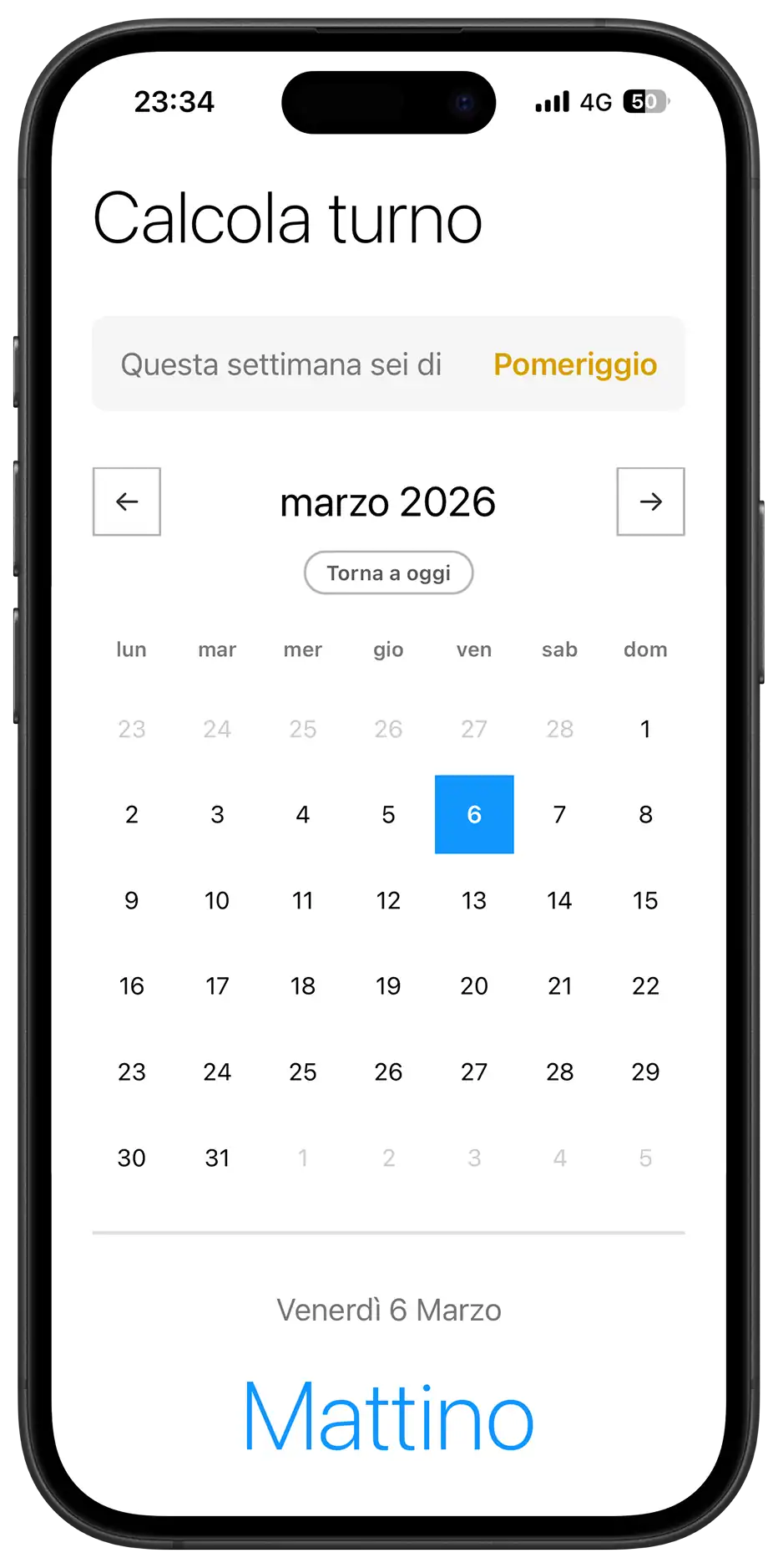
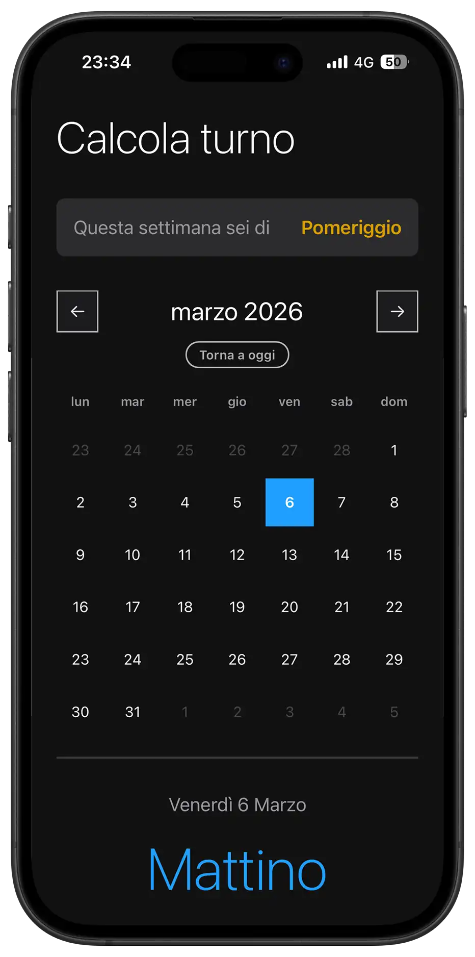
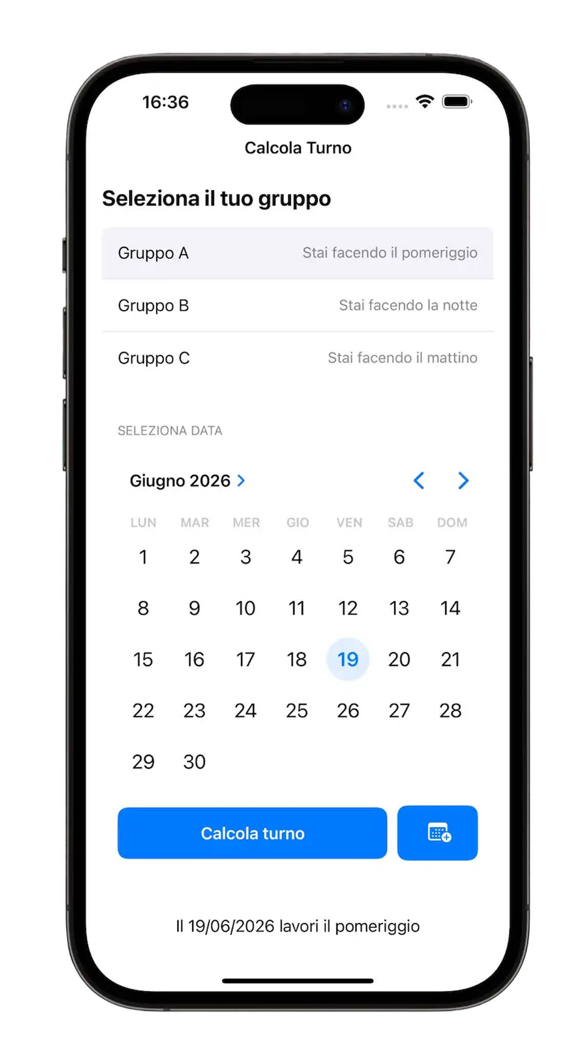
This is the second version of Calcola Turno. I had built the first one a year and a half ago, long before starting this journey, using AI exclusively in “Vibe Coding” mode (a term that didn’t even exist “back then”) without really understanding what was happening under the hood. It took me several days, I don’t remember exactly how many, but I had no skills, only the desire to build it at any cost.
It worked: the app spread around the factory and solved a real problem for people working on 3 shifts.
This time it’s different. I rebuilt the app from scratch in a total of 5 hours (2 hours for the working core + 3 hours for polish and responsiveness), applying everything I’ve learned in the last few months.
Version 1.0 (2024)
Why Rebuild It?
The night before going back to work I was anxious. I didn’t know if I would stay in the same department, and just the thought of not being able to keep learning and dedicating myself to projects was “killing” me. I calmed that anxiety by doing the only thing I truly love: building something. I picked up the Calcola Turno idea again, but this time with a completely different level of awareness. I wasn’t just “making an app work” with the help of AI. I was orchestrating the AI, telling it exactly what I needed, asking for confirmation on every choice, and checking that I wasn’t missing anything important.
The Design System: A Reimagined Windows Phone 8
I used the design system created for Telephone Number Validator, heavily inspired by Windows Phone 8, but with one particular choice: no primary color in the traditional sense.
Since it’s an app meant for the factory workers where I work, I knew the Windows aesthetic would feel familiar: all company computers run Windows, so the Metro/Modern UI visual language is immediate and recognizable for them.
I wanted the user to have only 3 colors in mind while using the app:
- Light Blue = Morning
- Yellow = Afternoon
- Purple = Night
It’s a colorful app, but with neutral primary colors. Paradoxical, but it works: here colors don’t serve as decoration, they act as direct information.
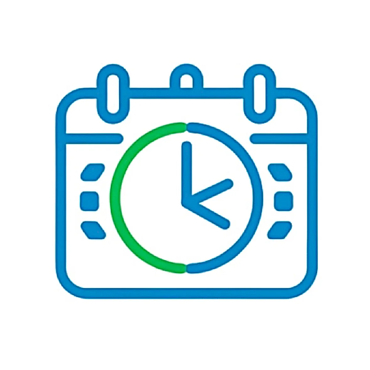
Icon Design: From the Calendar to the Three Shifts
Mentally, I was stuck on the idea of a calendar with a clock inside it, which defined the very first version.
I wanted something different, and by looking at other apps on my phone I realized something: the best icons are the ones with absolute simplicity. No complex overlays, no details that get lost at 60×60 pixels.
I made several versions in Figma, iterating continuously: a calendar made of 3 puzzle pieces representing the 3 shifts, then a clock with an arrow rotating around it. None of them fully convinced me.
I reopened the app and found the answer right in front of me: the 3 onboarding rectangles, the ones that represent the 3 shifts (Morning, Afternoon, Night).
That guaranteed three fundamental things:
- Visual consistency with the app’s internal interface
- Immediate recognizability for users
- Absolute visual cleanliness, with no redundant elements
The icon of the very first version was completely different, it was more detailed, but (maybe) less effective. This time I chose the essential. After all, the app promises to do just one thing: tell you which of the 3 shifts you’ll work.
2024
→

2025
Architecture: Offline-First and Cache Management
From the beginning I thought about the architecture and what I would need for the backend, in particular localStorage and cache management. I wanted it to work offline and remember the shift chosen by the user during onboarding. I wanted it working that same evening, so I orchestrated the AI by sharing my ideas and asking it to confirm whether I was missing something or if there were better ways to reach the solution.
The midnight problem
An interesting point was the algorithm to automatically switch the calendar day at exactly midnight.
At first I had an approach I thought was elegant: a Timer that calculated exactly how much time was left until midnight. When opening the app, JavaScript would check how long remained before midnight and set itself up accordingly for the day change.
The problem? I would have run into iOS and Android behavior where they freeze browsers in the background to save battery. The timer would stop.
I went with a truly simple, almost trivial solution: a 60-second Interval. Every 60 seconds JavaScript checks, put simply, whether today != yesterday (today is different from yesterday).
I cared about battery impact and found it to be extremely low. That’s because the CPU wakes up for a micro-instant, compares a number, sees nothing changed, and goes “back to sleep.” It’s far more expensive for the battery to handle graphical rendering or a network connection.
So the “precise midnight timer” idea would have risked bugs where the app doesn’t update if the phone goes into standby, while the energy savings would be so tiny as to be basically unmeasurable.
And so, in 2 hours I had a working app. I spent another 2 hours the next day polishing details and designing the desktop and smartphone landscape experience.
Responsive Layout: From Mobile to Dashboard
The landscape experience turns the app into a dashboard: shifts are laid out horizontally, making the most of the available space and offering a broader view of the calendar.
It was a super fun project. I stopped because I would have gotten lost in the details.
Reflections: Empathy, Process, and Control
I’m not cynical, otherwise I wouldn’t aim to do this job, but I believe people don’t really care to hear that you can do this or that; they care about what you can actually do in practice and, to be even more specific, what you can concretely do that benefits them.
I think it’s the same theme as public speaking. Carlo Loiudice used to say (I don’t remember whether in one of his courses or in his podcasts) that the audience is selfish: they don’t care who you are, what you’ve done, or why you’re there talking, they care about what they take home from what you say.
That’s exactly why I believe it’s vital that you like what you do not only for the results you get and other people’s feedback, but for the process itself.
The best feeling wasn’t from colleagues who complimented me and added the app to their home screen; it was the feeling that even though I was using AI much more than usual, I knew exactly what we were doing and why.
That’s what allowed me to do better work, far more fun and educational than the previous version, in 1/10 of the time.
What I Learned
Frameworkless SPA architecture:
- Implemented a pure Single Page Application pattern by toggling visibility (
.hidden) between onboarding and the main view, eliminating navigation and page reloads for a “native app” feel. - Minimal app-state management with
localStoragefor user group persistence and global variables (selectedDate,currentMonth) for current UI state.
Deterministic algorithm for cyclical shifts:
- Built a shift calculation system based on an epoch (January 5, 2025) and a modular 3-week cycle, completely avoiding databases or external APIs.
- Implemented
getWeekNumber()with European normalization (Monday as the start of the week) and Sunday edge-case handling. - Fixed a DST (Daylight Saving Time) bug by using
Math.roundinstead ofMath.floorto compensate for 167.9 or 168.1-hour “weeks” during clock changes. - Reverse lookup pattern: automatic deduction of group A/B/C from the user’s current shift, making onboarding more intuitive (“what shift are you on today?” instead of “are you in group A?”).
PWA and offline-first architecture:
- Service Worker with a “cache-first, network fallback” strategy and aggressive precaching of all critical assets.
- Lifecycle handled with
skipWaiting()andclients.claim()for immediate updates, but with user-side UI control (toast + manual reload). - Split install handling: native
beforeinstallpromptfor Android/desktop and a fallback with manual instructions for iOS (which ignores part of the standard manifest). - Manual cache versioning (
turni-app-v10) with automatic cleanup of older versions duringactivate.
App-like mobile UX:
- Viewport meta with
maximum-scale=1.0anduser-scalable=noto prevent accidental zoom from double-tap. - iOS-specific:
apple-mobile-web-app-capable,apple-touch-icon, media-query-driventheme-colorfor a status bar consistent with the theme. - Tactile feedback via a
.clickedclass with intentional delays (setTimeout) to avoid cutting off animations during fast interactions. - Native
type="month"input kept invisible and layered over a custom label: on mobile it opens the native picker (iOS wheel, Android spinner) instead of a less performant custom HTML datepicker.
Utility-first CSS with responsive variables:
- Centralized design system in
:rootfor colors, spacing, typography, and component sizes, with overrides via media queries (dark mode, desktop, tablet, landscape). - Grid “stack technique” to overlay button text and loader without layout shifts during loading state.
- Advanced responsiveness: desktop (min-width: 950px) turns the app into a two-column dashboard using
display: contentsto neutralize semantic wrappers andgrid-template-areasto fully reorganize the layout. - CSS animations (
@keyframes softPivot) retriggered via JavaScript (trick:animation='none'→ reflow → restore) for a synchronized restart on state change.
Accessible keyboard navigation:
- “Day navigation” mode toggled with
ArrowDown: arrows navigate day-by-day (±1 or ±7), with automatic month scrolling when crossing boundaries. - Clear separation between “month navigation” (ArrowLeft/Right change month) and “day navigation” to avoid input conflicts.
- Handling for
Enter,Tab, andEscapeto enter/exit day mode and return to today.
Real-time time handling and lifecycle:
- Midnight auto-refresh with a 60s check (
setInterval) comparinglastKnownDayto the current date. visibilitychangelistener to re-check state when the app returns to the foreground after long standby (prevents the “app stayed open all night” bug).- DST-safe checks to avoid being off by one day during clock changes.
Performance and thermal management:
- No external fonts, hidden scrollbar,
touch-action: manipulation,-webkit-tap-highlight-color: transparentto reduce rendering overhead and improve tactile feel. - Strategic use of
pointer-events: noneduring loading states to prevent double clicks and race conditions. - “Silent Mac” approach: the 60s interval has battery impact that’s hard to measure because the CPU wakes only to compare a number, not for rendering or networking.
Advanced UI patterns:
- Calendar with smart padding: previous/next month days (
.other-month) are disabled but visible, completing the 7-column grid without visual gaps. - Dynamic classes based on shift (
.mattino,.pomeriggio,.notte) applied to both.todayand.selectedfor immediate semantic color-coding. - Click animation with a delay before state change (
setTimeout 150ms) to deliver full visual feedback before triggering a heavier rerender.
Next:
Right now the priority is learning React. I started today, thanks to the fact that I got quite ahead with university over the last month.
But the challenge now isn’t learning a new library, because I’m confident I can do it, just like I managed to learn JavaScript, it’s balancing work, university, and this path I’d like to pursue full-time.