Refactoring UI
The Project
A practical case study on the book Refactoring UI by Adam Wathan and Steve Schoger: each component is built by directly translating a principle from the book into code.
No framework, no build step, three simple files: index.html, styles.css, script.js.
Source Code
- index.html
- styles.css
- script.js
<!DOCTYPE html>
<html lang="en">
<head>
<meta charset="UTF-8">
<meta name="viewport" content="width=device-width, initial-scale=1.0">
<title>Refactoring UI Study | UX Engineer Log</title>
<link rel="preconnect" href="https://fonts.googleapis.com">
<link rel="preconnect" href="https://fonts.gstatic.com" crossorigin>
<link rel="stylesheet" href="https://fonts.googleapis.com/css2?family=Ubuntu:wght@400;500;700&display=swap">
<link rel="stylesheet" href="styles.css">
</head>
<body>
<!--
DESIGN
------
* This is a single-page component showcase built to explore and apply the concepts
* learned from Refactoring UI (Adam Wathan and Steve Schoger).
* It has no build step, just three plain files: this one, styles.css, and script.js
* The architecture follows a strict separation of concerns:
* - index.html (this file) contains only the structure and content
* - styles.css handles every visual rule, token, and state
* - script.js implements the copy-to-clipboard behavior and checkmark animation
*
* SVG SPRITE PATTERN (<symbol id="icon-copy">):
* - A "sprite" acts as a hidden catalog of reusable graphics.
* Here, I define the copy icon's path only once at the top of the <body>,
* inside a visually hidden <svg> definition
* - Maintainability and performance: All 16 copy buttons reference this single
* definition via <use href="#icon-copy">. This keeps the DOM clean and
* creates a Single Source of Truth. If the icon design changes, I only
* need to update that one hidden symbol
* - Coordinate space stability: The outer <svg> wrapper on each button strictly
* enforces viewBox="0 0 26 26". This guarantees a stable drawing canvas,
* ensuring the icon never warps or shifts, even when JavaScript dynamically
* swaps the SVG content (from the copy icon to the success checkmark)
*
* ACCESSIBILITY:
* - Hidden labels: Every input has a <label for="..."> with class="sr-only".
* While sighted users understand the input's purpose from the visual layout,
* screen readers need real text. The 'for' attribute links the label to the
* input so blind users know exactly what the field is for
* - Semantic grouping: The radio buttons are wrapped in a <fieldset> with a
* hidden <legend>. Without this, a screen reader would just announce the
* options without explaining the main topic. The <legend> acts as a title
* for the group, telling the user exactly what choice they are making
* - Decorative elements: SVGs used only for visual appeal carry aria-hidden="true".
* Without this, screen readers might announce meaningless "image" or "graphic"
* labels. This attribute hides the icon from the accessibility tree, eliminating
* audio clutter and keeping the focus on the actual text or action
* - Contextual actions: Every copy button has a unique aria-label (e.g.
* "Copy primary button color"). If we just used "Copy" for all 16 buttons,
* a blind user tabbing through the page wouldn't know what they are copying
*
* PAGE STRUCTURE:
* 0. STYLESHEET: components.css preview and one-click copy
* 1. BUTTON: Primary, Secondary, Tertiary
* 2. INPUT: Alone, With Checkbox
* 3. RADIO BUTTON
* 4. CARD: 5 shadow levels
* 5. ICON: Original (128px), Simplified (128px), Shrunk (16px in frame)
* 6. EMPTY STATE
-->
<!--
Shared SVG sprite:
Defines the copy icon paths once to keep the DOM clean. All copy buttons
reference it dynamically via <use href="#icon-copy">. While 'display: none'
removes it from the visual layout, 'aria-hidden="true"' acts as a defensive
fallback to ensure screen readers never announce it
-->
<svg aria-hidden="true" style="display:none">
<defs>
<symbol id="icon-copy" viewBox="0 0 26 26" fill="none">
<path d="M22.6 8.20001H10.6C9.2745 8.20001 8.19998 9.27453 8.19998 10.6V22.6C8.19998 23.9255 9.2745 25 10.6 25H22.6C23.9255 25 25 23.9255 25 22.6V10.6C25 9.27453 23.9255 8.20001 22.6 8.20001Z"
stroke="var(--copy-icon-stroke)" stroke-width="2" stroke-linecap="round" stroke-linejoin="round"/>
<path d="M3.4 17.8C2.08 17.8 1 16.72 1 15.4V3.4C1 2.08 2.08 1 3.4 1H15.4C16.72 1 17.8 2.08 17.8 3.4"
stroke="var(--copy-icon-stroke)" stroke-width="2" stroke-linecap="round" stroke-linejoin="round"/>
</symbol>
</defs>
</svg>
<main class="main-container">
<!-- STYLESHEET PREVIEW -->
<section class="flex-col items-start" style="gap: var(--space-15); width: var(--container-width);">
<div class="flex-col items-start" style="gap: var(--space-3);">
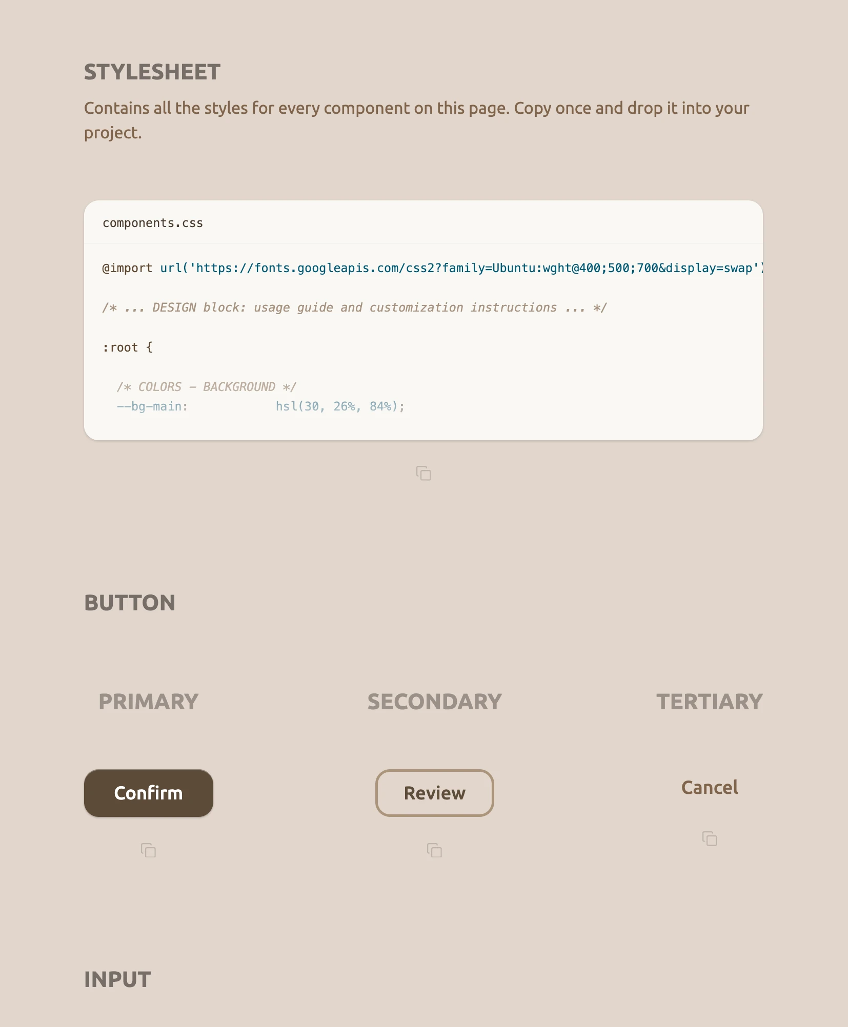
<h2 class="section-title">STYLESHEET</h2>
<p class="stylesheet-desc">Contains all the styles for every component on this page. Copy once and drop it into your project.</p>
</div>
<div class="flex-col items-center" style="gap: var(--space-7); width: 100%;">
<div class="css-preview">
<div class="css-preview-header">
<span class="css-preview-filename">components.css</span>
</div>
<pre class="css-preview-code"><span class="syntax-keyword">@import</span> <span class="syntax-token">url('https://fonts.googleapis.com/css2?family=Ubuntu:wght@400;500;700&display=swap')</span>;
<span class="syntax-comment">/* ... DESIGN block: usage guide and customization instructions ... */</span>
<span class="syntax-keyword">:root</span> {
<span class="syntax-comment">/* COLORS - BACKGROUND */</span>
<span class="syntax-token">--bg-main</span>: <span class="syntax-token">hsl(30, 26%, 84%)</span>;
<span class="syntax-comment">/* COLORS - PRIMARY ACTION */</span>
<span class="syntax-token">--primary-bg</span>: <span class="syntax-token">hsl(32, 25%, 29%)</span>;
<span class="syntax-token">--primary-text</span>: <span class="syntax-token">hsl(0, 0%, 100%)</span>;</pre>
<div class="css-preview-fade"></div>
</div>
<!--
JS hook: Instead of relying on fragile CSS classes, 'data-component' acts as a
robust bridge. It passes the exact object key (e.g., "css", "btn-primary")
to our script, allowing a single JavaScript function to handle all 16 buttons
-->
<button class="btn-copy" aria-label="Copy stylesheet" data-component="css">
<svg width="16" height="16" viewBox="0 0 26 26" fill="none" aria-hidden="true"><use href="#icon-copy"/></svg>
</button>
</div>
</section>
<!-- SECTION 1: BUTTONS -->
<section class="flex-col items-start" style="gap: var(--space-20); width: var(--container-width);">
<h2 class="section-title">BUTTON</h2>
<div class="flex-row items-start justify-between components-row" style="width: 100%;">
<!-- Primary -->
<div class="flex-col items-center" style="gap: var(--space-15);">
<h3 class="component-label">PRIMARY</h3>
<div class="flex-col items-center" style="gap: var(--space-7);">
<button class="btn-primary">Confirm</button>
<button class="btn-copy" aria-label="Copy primary button" data-component="btn-primary">
<svg width="16" height="16" viewBox="0 0 26 26" fill="none" aria-hidden="true"><use href="#icon-copy"/></svg>
</button>
</div>
</div>
<!-- Secondary -->
<div class="flex-col items-center" style="gap: var(--space-15);">
<h3 class="component-label">SECONDARY</h3>
<div class="flex-col items-center" style="gap: var(--space-7);">
<button class="btn-secondary">Review</button>
<button class="btn-copy" aria-label="Copy secondary button" data-component="btn-secondary">
<svg width="16" height="16" viewBox="0 0 26 26" fill="none" aria-hidden="true"><use href="#icon-copy"/></svg>
</button>
</div>
</div>
<!-- Tertiary -->
<div class="flex-col items-center" style="gap: var(--space-15);">
<h3 class="component-label">TERTIARY</h3>
<div class="flex-col items-center" style="gap: var(--space-7);">
<button class="btn-tertiary">Cancel</button>
<button class="btn-copy" aria-label="Copy tertiary button" data-component="btn-tertiary">
<svg width="16" height="16" viewBox="0 0 26 26" fill="none" aria-hidden="true"><use href="#icon-copy"/></svg>
</button>
</div>
</div>
</div>
</section>
<!-- SECTION 2: INPUT -->
<section class="flex-col items-start" style="gap: var(--space-20); width: var(--container-width);">
<h2 class="section-title">INPUT</h2>
<div class="flex-row items-start justify-between components-row" style="width: 100%;">
<!-- Alone -->
<div class="flex-col items-center" style="gap: var(--space-15);">
<h3 class="component-label">ALONE</h3>
<div class="flex-col items-center" style="gap: var(--space-7);">
<label for="input-alone" class="sr-only">Details</label>
<input type="text" id="input-alone" class="input-alone" placeholder="Add optional details...">
<button class="btn-copy" aria-label="Copy input" data-component="input">
<svg width="16" height="16" viewBox="0 0 26 26" fill="none" aria-hidden="true"><use href="#icon-copy"/></svg>
</button>
</div>
</div>
<!-- With Checkbox -->
<div class="flex-col items-center" style="gap: var(--space-15);">
<h3 class="component-label">WITH CHECKBOX</h3>
<div class="flex-col items-center" style="gap: var(--space-7);">
<div class="flex-col items-start" style="gap: var(--space-3);">
<label for="input-with-cbx" class="sr-only">Details</label>
<input type="text" id="input-with-cbx" class="input-alone" placeholder="Add optional details...">
<label class="flex-row items-center" style="gap: var(--space-3); cursor: pointer;">
<input type="checkbox" class="cbx-custom sr-only">
<div class="cbx-box"></div>
<span class="cbx-label">I understand this will submit</span>
</label>
</div>
<button class="btn-copy" aria-label="Copy input with checkbox" data-component="input-checkbox">
<svg width="16" height="16" viewBox="0 0 26 26" fill="none" aria-hidden="true"><use href="#icon-copy"/></svg>
</button>
</div>
</div>
</div>
</section>
<!-- SECTION 3: RADIO BUTTON -->
<section class="flex-col items-start section-content" style="gap: var(--space-15);">
<h2 class="section-title">RADIO BUTTON</h2>
<div class="flex-col items-center" style="gap: var(--space-7);">
<fieldset>
<legend class="sr-only">Sync options</legend>
<div class="flex-col justify-center items-start" style="gap: var(--space-3);">
<!-- Radio 1 -->
<label class="flex-row items-center" style="gap: var(--space-3); cursor: pointer;">
<input type="radio" name="sync" class="native-radio sr-only" checked>
<svg class="custom-radio-svg" xmlns="http://www.w3.org/2000/svg" width="24" height="24"
viewBox="0 0 40 40" fill="none" aria-hidden="true">
<circle cx="20" cy="20" r="18" stroke="var(--radio-stroke)" stroke-width="4" />
<circle cx="20" cy="20" r="12" fill="var(--radio-stroke)" class="radio-dot" />
</svg>
<span class="radio-label-text">Sync automatically</span>
</label>
<!-- Radio 2 -->
<label class="flex-row items-center" style="gap: var(--space-3); cursor: pointer;">
<input type="radio" name="sync" class="native-radio sr-only">
<svg class="custom-radio-svg" xmlns="http://www.w3.org/2000/svg" width="24" height="24"
viewBox="0 0 40 40" fill="none" aria-hidden="true">
<circle cx="20" cy="20" r="18" stroke="var(--radio-stroke)" stroke-width="4" />
<circle cx="20" cy="20" r="12" fill="var(--radio-stroke)" class="radio-dot" />
</svg>
<span class="radio-label-text">Manual sync only</span>
</label>
</div>
</fieldset>
<button class="btn-copy" aria-label="Copy radio buttons" data-component="radio">
<svg width="16" height="16" viewBox="0 0 26 26" fill="none" aria-hidden="true"><use href="#icon-copy"/></svg>
</button>
</div>
</section>
<!-- SECTION 4: CARD -->
<section class="flex-col items-start section-content" style="gap: var(--space-15);">
<h2 class="section-title">CARD</h2>
<div class="flex-col items-start cards-outer" style="gap: var(--space-10);">
<!-- Row 1 -->
<div class="flex-row items-start cards-row-1" style="gap: var(--space-8);">
<!-- Card 1 -->
<div class="flex-col items-center" style="gap: var(--space-7);">
<h3 class="component-label">1</h3>
<div class="flex-col items-center" style="gap: var(--space-7);">
<div class="card card-1" aria-hidden="true"></div>
<button class="btn-copy" aria-label="Copy card level 1" data-component="card-1">
<svg width="16" height="16" viewBox="0 0 26 26" fill="none" aria-hidden="true"><use href="#icon-copy"/></svg>
</button>
</div>
</div>
<!-- Card 2 -->
<div class="flex-col items-center" style="gap: var(--space-7);">
<h3 class="component-label">2</h3>
<div class="flex-col items-center" style="gap: var(--space-7);">
<div class="card card-2" aria-hidden="true"></div>
<button class="btn-copy" aria-label="Copy card level 2" data-component="card-2">
<svg width="16" height="16" viewBox="0 0 26 26" fill="none" aria-hidden="true"><use href="#icon-copy"/></svg>
</button>
</div>
</div>
<!-- Card 3 -->
<div class="flex-col items-center" style="gap: var(--space-7);">
<h3 class="component-label">3</h3>
<div class="flex-col items-center" style="gap: var(--space-7);">
<div class="card card-3" aria-hidden="true"></div>
<button class="btn-copy" aria-label="Copy card level 3" data-component="card-3">
<svg width="16" height="16" viewBox="0 0 26 26" fill="none" aria-hidden="true"><use href="#icon-copy"/></svg>
</button>
</div>
</div>
</div>
<!-- Row 2 -->
<div class="cards-row-center" style="gap: var(--space-8);">
<!-- Card 4 -->
<div class="flex-col items-center" style="gap: var(--space-7);">
<h3 class="component-label">4</h3>
<div class="flex-col items-center" style="gap: var(--space-7);">
<div class="card card-4" aria-hidden="true"></div>
<button class="btn-copy" aria-label="Copy card level 4" data-component="card-4">
<svg width="16" height="16" viewBox="0 0 26 26" fill="none" aria-hidden="true"><use href="#icon-copy"/></svg>
</button>
</div>
</div>
<!-- Card 5 -->
<div class="flex-col items-center" style="gap: var(--space-7);">
<h3 class="component-label">5</h3>
<div class="flex-col items-center" style="gap: var(--space-7);">
<div class="card card-5" aria-hidden="true"></div>
<button class="btn-copy" aria-label="Copy card level 5" data-component="card-5">
<svg width="16" height="16" viewBox="0 0 26 26" fill="none" aria-hidden="true"><use href="#icon-copy"/></svg>
</button>
</div>
</div>
</div>
</div>
</section>
<!-- SECTION 5: ICON -->
<section class="flex-col items-start" style="gap: var(--space-20); width: var(--container-width);">
<h2 class="section-title">ICON</h2>
<div class="flex-row items-start justify-between components-row" style="width: 100%;">
<!-- Original -->
<div class="flex-col items-center" style="gap: var(--space-15);">
<h3 class="component-label">ORIGINAL</h3>
<span class="sr-only">Shows the base icon design at 128 pixels with thin strokes, meant for large display.</span>
<div class="flex-col items-center" style="gap: var(--space-7);">
<svg xmlns="http://www.w3.org/2000/svg" width="128" height="128" viewBox="0 0 128 128"
fill="none" aria-hidden="true">
<rect width="128" height="128" rx="20" fill="url(#paint0_linear_40_145)" />
<path d="M77.0004 83.5006L96.5011 63.9999L77.0004 44.4993" stroke="#FFF9F2" stroke-width="8"
stroke-linecap="round" stroke-linejoin="round" />
<path d="M50.9996 44.4993L31.4989 63.9999L50.9996 83.5006" stroke="#FFF9F2" stroke-width="8"
stroke-linecap="round" stroke-linejoin="round" />
<defs>
<linearGradient id="paint0_linear_40_145" x1="64" y1="128" x2="64" y2="0"
gradientUnits="userSpaceOnUse">
<stop stop-color="#7A6249" />
<stop offset="1" stop-color="#C29A6F" />
</linearGradient>
</defs>
</svg>
<button class="btn-copy" aria-label="Copy original icon" data-component="icon-original">
<svg width="16" height="16" viewBox="0 0 26 26" fill="none" aria-hidden="true"><use href="#icon-copy"/></svg>
</button>
</div>
</div>
<!-- Simplified -->
<div class="flex-col items-center" style="gap: var(--space-15);">
<h3 class="component-label">SIMPLIFIED</h3>
<span class="sr-only">Shows the icon at 128 pixels but intentionally simplified with thicker internal lines to prepare for downscaling.</span>
<div class="flex-col items-center" style="gap: var(--space-7);">
<svg xmlns="http://www.w3.org/2000/svg" width="128" height="128" viewBox="0 0 128 128"
fill="none" aria-hidden="true">
<rect width="128" height="128" rx="20" fill="url(#paint0_linear_40_155)" />
<path d="M80.9159 89.3738L106.29 64L80.9159 38.6262" stroke="#FFF9F2" stroke-width="14"
stroke-linecap="round" stroke-linejoin="round" />
<path d="M47.0841 38.6262L21.7103 64L47.0841 89.3738" stroke="#FFF9F2" stroke-width="14"
stroke-linecap="round" stroke-linejoin="round" />
<defs>
<linearGradient id="paint0_linear_40_155" x1="64" y1="128" x2="64" y2="0"
gradientUnits="userSpaceOnUse">
<stop stop-color="#7A6249" />
<stop offset="1" stop-color="#C29A6F" />
</linearGradient>
</defs>
</svg>
<button class="btn-copy" aria-label="Copy simplified icon" data-component="icon-simplified">
<svg width="16" height="16" viewBox="0 0 26 26" fill="none" aria-hidden="true"><use href="#icon-copy"/></svg>
</button>
</div>
</div>
<!-- Shrunk -->
<div class="flex-col items-center" style="gap: var(--space-15);">
<h3 class="component-label">SHRUNK</h3>
<span class="sr-only">Shows the simplified icon scaled down to 16 pixels for a favicon. The thicker lines ensure it remains perfectly legible at this tiny size.</span>
<div class="flex-col items-center" style="gap: var(--space-7);">
<div class="icon-frame">
<svg xmlns="http://www.w3.org/2000/svg" width="16" height="16" viewBox="0 0 16 16"
fill="none" aria-hidden="true">
<rect width="16" height="16" rx="2.5" fill="url(#paint0_linear_40_165)" />
<path d="M10.1145 11.1718L13.2862 8.0001L10.1145 4.82837" stroke="#FFF9F2"
stroke-width="1.75" stroke-linecap="round" stroke-linejoin="round" />
<path d="M5.88553 4.82837L2.71381 8.0001L5.88553 11.1718" stroke="#FFF9F2"
stroke-width="1.75" stroke-linecap="round" stroke-linejoin="round" />
<defs>
<linearGradient id="paint0_linear_40_165" x1="8" y1="16" x2="8" y2="0"
gradientUnits="userSpaceOnUse">
<stop stop-color="#7A6249" />
<stop offset="1" stop-color="#C29A6F" />
</linearGradient>
</defs>
</svg>
</div>
<button class="btn-copy" aria-label="Copy shrunk icon" data-component="icon-shrunk">
<svg width="16" height="16" viewBox="0 0 26 26" fill="none" aria-hidden="true"><use href="#icon-copy"/></svg>
</button>
</div>
</div>
</div>
</section>
<!-- SECTION 6: EMPTY STATE -->
<section class="flex-col items-start section-content" style="gap: var(--space-15);">
<h2 class="section-title">EMPTY STATE</h2>
<div class="flex-col items-center" style="gap: var(--space-7);">
<div class="flex-col items-start" style="gap: var(--space-11);">
<div class="flex-col items-start" style="gap: var(--space-3);">
<h3 class="title-empty">Ready when you are</h3>
<p class="subtitle-empty">Everything you create will show up here.</p>
</div>
<button class="btn-primary">New item</button>
</div>
<button class="btn-copy" aria-label="Copy empty state" data-component="empty-state">
<svg width="16" height="16" viewBox="0 0 26 26" fill="none" aria-hidden="true"><use href="#icon-copy"/></svg>
</button>
</div>
</section>
</main>
<!--
Dynamic audio feedback:
- The problem: When JavaScript injects a success message ("Copied!") into the DOM,
screen readers ignore it unless the element receives focus. A "live region"
forces the software to monitor this <div> and announce any text changes
- Polite vs. assertive: 'aria-live="polite"' tells the screen reader to finish
its current sentence before speaking. It gracefully respects the user's flow
- Why not assertive? 'aria-live="assertive"' violently interrupts and cuts off
the current audio. It should be strictly reserved for critical errors or
time-sensitive warnings (e.g. "Session expired"), never for simple success states
-->
<div id="copy-status" aria-live="polite" class="sr-only"></div>
<script src="script.js"></script>
</body>
</html>
/* DESIGN
   ------
   * This stylesheet is the single source of truth for a Refactoring UI case study
   * (Adam Wathan and Steve Schoger). Built as a design system reference: every value
   * is intentional, documented, and traceable back to a core principle from the book.
   * Full case study at simoneamico.com.
   *
   * Philosophy:
   * - Context-driven approach (Desktop-first): Back when I built the Telephone Number Validator,
   *   I strictly followed the "mobile-first" dogma, but I wrote a note questioning it: shouldn't
   *   we build for the primary device our users actually use? This project is the materialization
   *   of that insight. Since this showcase is a UI study built as a functional developer tool
   *   for side-by-side comparisons, the audience will view it on desktop screens. Therefore,
   *   I consciously built it desktop-first. Mobile is handled gracefully as a fallback, proving
   *   that "audience-first" takes precedence over rigid rules
   * - Token-driven architecture: I chose CSS custom properties for every value so the
   *   system is trivially themeable. Changing one token propagates everywhere, eliminating
   *   the need to manually update hardcoded values across the file
   * - Tinted grays: I deliberately avoided pure, neutral grays (0% saturation).
   *   Instead, every "gray" carries a hue of 31° to harmonize with the warm background (30°).
   *   This prevents neutral elements from feeling disconnected, ensuring they blend naturally
   *   into the surrounding color palette
   * - Light-based elevation: The shadow system uses two layers for each component.
   *   The first shadow is small and dark, like a direct light shining from above.
   *   The second shadow is large and blurred, like natural light spreading in a room.
   *   To create a realistic sense of height, the vertical shadow distance (y-offset)
   *   doubles at each new elevation level
   * - Physical interactive states: UI components behave like real physical objects.
   *   For example, buttons visibly press down into the page when clicked (:active state).
   *   Inputs look like holes cut into the page, and when you click them (focus), they
   *   look even deeper inside, rather than just adding a colored ring around the border
   * - Asymmetric transitions: I used a timing trick to make clicking feel fast and
   *   responsive. When you press a button, it goes down almost instantly (60ms).
   *   But when you release the mouse, it comes back up a bit slower (160ms).
   *   This difference in speed feels much more natural than a uniform animation
   *
   * Stylesheet order:
   *    1. UNIVERSAL (Design Tokens)    — the single source of truth for every value
   *    2. BASE & RESET                 — body, fieldset
   *    3. FLEX UTILITIES               — reusable layout helpers
   *    4. PAGE LAYOUT                  — main container
   *    5. TYPOGRAPHY                   — section titles, component labels
   *    6. STYLESHEET PREVIEW           — css preview block, description text
   *    7. COMPONENT: BUTTONS           — primary, secondary, tertiary, copy
   *    8. COMPONENT: INPUTS            — text input, checkbox, radio
   *    9. COMPONENT: ICON FRAME        — ghost container for size normalization
   *   10. COMPONENT: CARDS             — five shadow elevation levels
   *   11. COMPONENT: EMPTY STATE       — title, subtitle
   *   12. INTERACTIVE STATES           — hover, active, focus-visible
   *   13. RESPONSIVE                   — mobile breakpoint, landscape, carousel
   *   14. MOTION PREFERENCE            — respects prefers-reduced-motion
*/


/* UNIVERSAL (Design Tokens) */

:root {

  /* COLORS - BACKGROUND */
  --bg-main:            hsl(30, 26%, 84%);          /* Warm sand — the page canvas */

  /* COLORS - TEXT */
  --text-title:         hsla(31, 12%, 14%, 0.60);   /* Section headings — warm hue, 60% opacity */
  --text-label:         hsla(31, 12%, 14%, 0.40);   /* Component labels */

  /* COLORS - PRIMARY */
  --primary-bg:         hsl(32, 25%, 29%);          /* Dark warm brown — main action color */
  --primary-text:       hsl(0, 0%, 100%);           /* White text on primary */

  /* COLORS - SECONDARY */
  --secondary-border:   hsla(31, 26%, 46%, 0.70);   /* Warm mid-brown border at 70% */
  --secondary-text:     hsl(31, 25%, 30%);          /* Secondary labels and strokes */

  /* COLORS - TERTIARY */
  --tertiary-text:      hsl(30, 26%, 40%);          /* Subtle text button color */

  /* COLORS - INPUTS */
  --input-bg:           hsl(30, 26%, 78%);          /* Cavity effect background */
  --input-shadow-color: hsl(30, 75%, 91%);          /* Bottom-edge highlight (simulates upward light reflection) */
  --input-placeholder:  hsla(31, 25%, 30%, 0.55);   /* Muted placeholder — 55% opacity of secondary-text */

  /* COLORS - FORM LABELS */
  --form-label:         hsl(31, 22%, 24%);          /* Unified token: input text, checkbox label, radio label */
  --radio-stroke:       var(--secondary-text);        /* Single source of truth — references secondary-text */

  /* COLORS - CARDS */
  --card-bg:            hsl(36, 31%, 97%);          /* Near-white warm card surface */

  /* COLORS - EMPTY STATE */
  --empty-title:        hsl(30, 15%, 10%);          /* Warm near-black (avoids cold neutral black) */
  --empty-subtitle:     hsl(31, 17%, 39%);          /* Muted warm subtitle */

  /* COLORS - COPY ICON */
  --copy-icon-stroke:   hsl(29, 13%, 71%);          /* Deliberately subtle — copy is secondary UI */

  /* LAYOUT */
  --container-width:    736px;                        /* Max width of the showcase columns */

  /*
   * SPACING SCALE (4px base unit)
   * Following the Refactoring UI methodology, the naming convention uses
   * a multiplier index (e.g. space-3 = 3 × 4px = 12px). This creates a
   * predictable rhythm and discourages arbitrary pixel values
   */
  --space-3:   12px;  /* [xs]  — Tight grouping   (radio items, label + subtitle) */
  --space-7:   28px;  /* [sm]  — Element grouping (component + copy button) */
  --space-8:   32px;  /* [md]  — Inner section    (card column gap) */
  --space-10:  40px;  /* [lg]  — Outer section    (card grid outer gap) */
  --space-11:  44px;  /* [xl]  — Loose grouping   (empty state internal gap) */
  --space-15:  60px;  /* [2xl] — Content block    (section items without title) */
  --space-20:  80px;  /* [3xl] — Major block      (section title + content) */
  --space-26: 104px;  /* [4xl] — Page layout      (gap between main sections) */
}


/* BASE & RESET */

/*
 * Universal reset
 * - box-sizing: border-box ensures padding and borders are included in an
 *    element's total width/height, preventing layout math headaches
 * - -webkit-tap-highlight-color removes the default translucent square
 *    browsers (especially iOS Safari) draw over tapped elements.
 *    We rely on our custom :active and :focus-visible states for feedback instead
 */
*,
*::before,
*::after {
  box-sizing: border-box;
  -webkit-tap-highlight-color: transparent;
}

body {
  font-family: 'Ubuntu', sans-serif;
  background-color: var(--bg-main);
  margin: 0;
  padding: 64px 32px;
  display: flex;
  flex-direction: column;
  align-items: center;
}


/*
 * Browser default fix for fieldset
 * I wrap the radio group in a <fieldset> and <legend> to comply with accessibility
 * standards (WCAG 1.3.1), ensuring screen readers understand they are related options.
 * However, browsers apply thick borders and padding to fieldsets by default.
 * Resetting them here keeps the A11y semantics intact without breaking the visual layout
 */
fieldset {
  border: none;
  padding: 0;
  margin: 0;
}


/* FLEX UTILITIES */

.flex-col {
  display: flex;
  flex-direction: column;
}

.flex-row {
  display: flex;
  flex-direction: row;
}

.items-center {
  align-items: center;
}

.items-start {
  align-items: flex-start;
}

.justify-center {
  justify-content: center;
}

.justify-between {
  justify-content: space-between;
}


/* PAGE LAYOUT */

.main-container {
  display: flex;
  flex-direction: column;
  gap: var(--space-26);
  width: max-content;
  max-width: var(--container-width);
  align-items: flex-start;
}


/* TYPOGRAPHY */

.section-title {
  color: var(--text-title);
  font-size: 24px;
  font-weight: 700;
  line-height: normal;
  margin: 0;
}

.component-label {
  color: var(--text-label);
  font-size: 24px;
  font-weight: 700;
  line-height: normal;
  margin: 0;
}


/* STYLESHEET PREVIEW */

.stylesheet-desc {
  color: var(--tertiary-text);
  font-size: 18px;
  font-weight: 400;
  line-height: 1.5;
  margin: 0;
}

/*
 * Code Preview Window
 * Instead of showing a massive block of code, I set a fixed height to give users
 * a quick look at the file structure. I added position relative to create a
 * boundary for its children. This tells the absolute-positioned fade overlay
 * to stay locked exactly at the bottom of this box, rather than escaping
 * out into the main page
 */
.css-preview {
  position: relative;
  width: 100%;
  height: 260px;
  overflow: hidden;
  background: var(--card-bg);
  border-radius: 16px;
  box-shadow:
    0 1px 3px 0 rgba(0, 0, 0, 0.10),
    0 1px 2px 0 rgba(0, 0, 0, 0.06);
}

.css-preview-header {
  padding: 14px 20px;
  border-bottom: 1px solid hsla(31, 26%, 46%, 0.12);
}

.css-preview-filename {
  font-family: 'Menlo', 'Monaco', 'Courier New', monospace;
  font-size: 13px;
  color: var(--form-label);
}

.css-preview-code {
  margin: 0;
  padding: 16px 20px 0;
  font-family: 'Menlo', 'Monaco', 'Courier New', monospace;
  font-size: 13px;
  line-height: 1.65;
  color: var(--secondary-text);
  white-space: pre; /* Preserves spaces and line breaks just like an IDE */
}

/*
 * Smooth fade effect
 * This creates a gradient at the bottom so the code fades out gently, instead
 * of ending with a sharp cut. Since this gradient sits on top of the text, I
 * added pointer-events none to make it "click-through". Without this property,
 * the gradient would block the mouse, and users wouldn't be able to select or
 * copy the code below it
 */
.css-preview-fade {
  position: absolute;
  bottom: 0;
  left: 0;
  right: 0;
  height: 80px;
  background: linear-gradient(to bottom, transparent, var(--card-bg));
  pointer-events: none;
}

/*
 * Syntax highlighting colors
 * I pulled these colors directly from the Docusaurus light theme of my site
 * (simoneamico.com) because this project will be hosted there. This keeps the
 * design perfectly consistent. The keywords use a warm brown that matches the
 * primary "brand" color. The code tokens (like property names and numbers) use
 * a dark petrol blue for strong contrast. Finally, the comments are styled
 * with a warm muted gray and italics, ensuring they stay visually in the
 * background without competing with the actual code
 */
.syntax-keyword {
  color: #614a33;
}
.syntax-token {
  color: #005a75;
}
.syntax-comment {
  color: hsl(30, 18%, 58%);
  font-style: italic;
}


/* COMPONENT: BUTTONS */

/*
 * Why explicit font-family on buttons:
 * Unlike most HTML elements, the <button> tag does not automatically inherit
 * the font family from the body. Browsers apply their own ugly default styles
 * to forms and buttons. I declare the font explicitly here on the shared rule
 * to guarantee that 'Ubuntu' renders everywhere, preventing broken UI
 *
 * Why min-width instead of fixed width:
 * I use min-width paired with horizontal padding to create a flexible system.
 * This ensures the button respects its minimum visual size for short labels
 * (like "Save"), but automatically expands horizontally if a longer label
 * (like "Confirm changes") is used. A fixed width would eventually cause text
 * to overflow or clip in real-world scenarios
 *
 * Native feels on mobile:
 * I added touch-action: manipulation to disable the default "double-tap to zoom"
 * behavior on mobile browsers. This makes clicks register instantly without any
 * 300ms delay. I also used user-select: none (and its -webkit- prefix for Safari)
 * to prevent the text from being accidentally highlighted or copied if the user
 * long-presses the button. These two rules combined make the web button feel
 * like a real, physical app control
 */
.btn-primary,
.btn-secondary,
.btn-tertiary {
  font-family: 'Ubuntu', sans-serif;
  font-size: 20px;
  font-weight: 500;
  cursor: pointer;
  display: inline-flex;
  align-items: center;
  justify-content: center;
  text-align: center;
  box-sizing: border-box;
  padding: 0;
  touch-action: manipulation;
  user-select: none;
  -webkit-user-select: none;
}

/*
 * Primary Button
 * To make the button look like a physical object protruding from the page, I
 * used two subtle drop shadows for depth, plus a pure white inset shadow pushed
 * 1px from the top. This acts as an "inner highlight", simulating an overhead
 * light source hitting the top edge of the button
 */
.btn-primary {
  min-width: 140px;
  height: 52px;
  padding: 0 28px;
  border-radius: 16px;
  background: var(--primary-bg);
  box-shadow:
    0 1px 2px 0 rgba(0, 0, 0, 0.20),
    0 0.5px 1px 0 rgba(0, 0, 0, 0.10),
    0 1px 0 0 rgba(255, 255, 255, 0.30) inset;
  color: var(--primary-text);
  border: none;
  transition: filter 160ms ease, box-shadow 160ms ease, transform 160ms ease;
}

/*
 * Secondary Button
 * Why a smaller min-width for the secondary button?
 * This is a deliberate choice for visual hierarchy. The primary button represents
 * the main call-to-action and must carry the most visual weight. By giving the
 * secondary button a slightly smaller minimum width (128px vs 140px), it naturally
 * feels subordinate when placed side-by-side with a primary button (e.g., "Cancel"
 * next to "Confirm"). This subtly guides the user's eye toward the primary action
 */
.btn-secondary {
  min-width: 128px;
  height: 52px;
  padding: 0 28px;
  border-radius: 16px;
  border: 3px solid var(--secondary-border);
  background: transparent;
  color: var(--secondary-text);
  transition: background-color 160ms ease, transform 160ms ease;
}

/*
 * Tertiary Button
 * Unlike the others, this button is sized strictly by its content (width: auto).
 * The padding provides just enough invisible hit area for the user's mouse
 */
.btn-tertiary {
  width: auto;
  height: auto;
  padding: 8px 12px;
  color: var(--tertiary-text);
  background: transparent;
  border: none;
  transition: filter 160ms ease;
}

/* Copy Button */

/*
 * UX Note on hit area:
 * The copy icon is visually 16x16px, which is far below the WCAG 2.5.5
 * minimum touch target of 44x44px. I expanded the hit area to 44x44px via
 * padding: 14px, then applied margin-top: -14px to compensate. This trick
 * ensures the icon sits at the exact same visual distance from the component
 * above it, while providing a massive invisible hit area for mobile users.
 * The flex properties ensure the SVG remains perfectly centered within
 * this new enlarged hit area
 */
.btn-copy {
  display: flex;
  justify-content: center;
  align-items: center;
  padding: 14px;
  margin-top: -14px; /* Compensates top padding -> preserves visual spacing */
  background: transparent;
  border: none;
  cursor: pointer;
}

.btn-copy svg {
  width: 16px;
  height: 16px;
  flex-shrink: 0; /* Safeguard: keeps exact 16x16px proportions, preventing flex distortion */
  transition: opacity 120ms ease;
}


/* COMPONENT: INPUTS */

/*
 * Cavity effect:
 * Following Refactoring UI principles, I use two shadow layers to simulate a
 * physical inset. The bottom shadow acts as a highlight (light hitting the lower
 * edge), while the top inset shadow represents the area blocked from overhead light.
 * This makes the input feel recessed into the page, signaling "place content here"
 * as opposed to a button which protrudes and signals "press me"
 *
 * I removed the browser's default outline because the custom focus ring will be
 * handled intentionally via dedicated pseudo-classes, keeping the "brand" consistent
 */
.input-alone {
  width: 352px;
  height: 56px;
  border-radius: 16px;
  background: var(--input-bg);
  box-shadow:
    0 1px 0 0 var(--input-shadow-color),
    0 1px 1px 0 rgba(0, 0, 0, 0.20) inset;
  border: none;
  outline: none; /* Suppresses browser default custom focus ring handled below */
  padding: 0 20px;
  box-sizing: border-box;
  color: var(--form-label);
  font-size: 18px;
  font-weight: 400;
  transition: box-shadow 160ms ease;
}

.input-alone::placeholder {
  color: var(--input-placeholder);
}

/* Checkbox */

/*
 * I sized the checkbox at 20×20px with border-radius: 6px. The ratio (6/20 = 30%)
 * mirrors the input's ratio (16/56 = ~29%), keeping the two controls visually
 * "from the same family". They feel concentric at their respective scales
 */
.cbx-box {
  width: 20px;
  height: 20px;
  border-radius: 6px;
  background: var(--input-bg);
  box-shadow:
    0 1px 0 0 var(--input-shadow-color),
    0 1px 1px 0 rgba(0, 0, 0, 0.20) inset;
  flex-shrink: 0;
  transition: background-color 120ms ease, box-shadow 120ms ease;
}

.cbx-label {
  color: var(--form-label);
  font-size: 18px;
  font-weight: 400;
}

/*
 * Screen-reader only utility (visually hidden, still accessible):
 * - Purpose: Hide text visually without removing it from the accessibility tree
 *   (Unlike display:none/visibility:hidden, which screen readers typically ignore)
 * - Technique:
 *   1. Collapse the element to a 1x1px box and take it out of normal layout flow.
 *   2. Use a negative margin (-1px) to pull that single remaining pixel back
 *      onto itself, completely neutralizing its physical footprint so it won't
 *      disturb the layout of surrounding elements
 *   3. Apply a clip/clip-path to act as a 0px mask. This ensures that any long
 *       text inside the 1px box is strictly contained and cannot spill out to
 *       become visually rendered on the screen
 * - Compatibility: clip is a legacy fallback; clip-path is the modern equivalent,
 *   guaranteeing this trick works on both ancient and modern browsers
 */
.sr-only {
  position: absolute;
  width: 1px;
  height: 1px;
  padding: 0;
  margin: -1px;
  overflow: hidden;
  clip: rect(0, 0, 0, 0);
  clip-path: inset(50%);
  white-space: nowrap;
  border: 0;
}

/*
 * We target the custom box (.cbx-box) only when the hidden native checkbox
 * before it is selected. To keep the HTML clean and avoid extra DOM elements,
 * the checkmark is injected directly via CSS as a URL-encoded SVG
 *
 * The %23 URL encoding trick
 * In a standard SVG, the stroke color would be written as "#D5C7B8". However,
 * inside a Data URI, the hashtag symbol (#) breaks the code because browsers
 * interpret it as a jump link (anchor). To safely pass the hex color, we must
 * mask the hashtag using its URL-encoded percentage equivalent: "%23"
 *
 * The color itself (#D5C7B8) perfectly matches the input's default background
 * When the checkbox turns solid, this specific color creates a negative space
 * effect, making the checkmark look like it was physically cut out of the
 * colored background
 */
.cbx-custom:checked + .cbx-box {
  background-color: var(--primary-bg);
  background-image: url("data:image/svg+xml,%3Csvg xmlns='http://www.w3.org/2000/svg' viewBox='0 0 10 8' fill='none'%3E%3Cpath d='M1 4L4 7L9 1' stroke='%23D5C7B8' stroke-width='1.8' stroke-linecap='round' stroke-linejoin='round'/%3E%3C/svg%3E");
  background-repeat: no-repeat;
  background-position: center 54%; /* I noticed true center (50%) looked too high, so I iterated down to 54% for a perfect optical balance */
  background-size: 10px 8px;
  box-shadow: none;
}

/* Radio */

.radio-label-text {
  color: var(--form-label);
  font-size: 18px;
  font-weight: 400;
}

/*
 * Contextual scaling and Separation of Concerns:
 * The source SVG in the HTML retains its native 24x24px dimensions to match
 * its original viewBox grid. This acts as a standard, reusable baseline across
 * the project. I handle the actual sizing strictly via CSS because an icon's
 * scale depends on its context, not its markup. This prevents giant icons if
 * the stylesheet fails to load, while keeping the HTML modular
 *
 * Typography matching (Cap-height alignment):
 * In this specific context, I override the size to 20x20px to deliberately
 * match the typography. I found that alongside an 18px font, a 20px control
 * sits perfectly flush with the text's cap-height (the height of capital letters),
 * ensuring a crisp, professional horizontal alignment
 */
.custom-radio-svg {
  width: 20px;
  height: 20px;
  flex-shrink: 0;
  transition: filter 120ms ease;
}

.radio-dot { display: none; } /* Hidden by default — shown via :checked below */

.native-radio:checked + .custom-radio-svg .radio-dot {
  display: block;
}


/* COMPONENT: ICON FRAME */

/*
 * Ghost container for icon size normalization:
 * The three icon variants have different sizes (128px vs 16px). Without a fixed
 * container, the 16px variant would collapse its column and break the grid layout.
 * I wrapped all icons in this invisible 128x128px frame so every column maintains
 * the exact same footprint (the physical space occupied on the screen), regardless
 * of the actual icon size inside it
 */
.icon-frame {
  width: 128px;
  height: 128px;
  display: flex;
  align-items: flex-end; /* Keeps smaller icons anchored to the bottom baseline */
  justify-content: center;
}


/* COMPONENT: CARDS */

.cards-row-center {
  display: flex;
  flex-direction: row;
  justify-content: center;
  width: 100%;
}

.card {
  width: 224px;
  height: 224px;
  border-radius: 12px;
  background: var(--card-bg);
}

/*
 * Five-level shadow system (Two-layer model):
 * I built this elevation system based on Refactoring UI principles.
 * Realistic shadows require two distinct layers to feel natural:
 * 1. A sharp layer (low blur, higher opacity) to simulate direct overhead light
 * 2. A soft layer (high blur, lower opacity) to simulate ambient, diffuse light
 *
 * The mathematical scale (Soft Layer):
 * I double the y-offset at each step to create a predictable sense of depth.
 * For the blur radius, I use a sliding multiplier applied to the y-offset.
 * The multiplier smoothly tightens from 3.0x down to 2.0x as elevation increases,
 * preventing high shadows from blowing out too widely:
 *
 * Level | y-offset | Multiplier | Blur Result
 * ------|----------|------------|------------
 *   1   |   1px    |    3.0x    |    3px
 *   2   |   2px    |    3.0x    |    6px
 *   3   |   4px    |    2.5x    |   10px
 *   4   |   8px    |    2.25x   |   18px
 *   5   |  16px    |    2.0x    |   32px
 */
.card-1 {
  box-shadow:
    0 1px 3px 0 rgba(0, 0, 0, 0.10), /* Soft layer */
    0 1px 2px 0 rgba(0, 0, 0, 0.06); /* Sharp layer */
}

.card-2 {
  box-shadow:
    0 2px 6px 0 rgba(0, 0, 0, 0.10),
    0 1px 3px 0 rgba(0, 0, 0, 0.06);
}

.card-3 {
  box-shadow:
    0 4px 10px 0 rgba(0, 0, 0, 0.10),
    0 2px 6px 0 rgba(0, 0, 0, 0.07);
}

.card-4 {
  box-shadow:
    0 8px 18px 0 rgba(0, 0, 0, 0.11),
    0 4px 10px 0 rgba(0, 0, 0, 0.07);
}

.card-5 {
  box-shadow:
    0 16px 32px 0 rgba(0, 0, 0, 0.12),
    0 8px 16px 0 rgba(0, 0, 0, 0.08);
}


/* COMPONENT: EMPTY STATE */

.title-empty {
  color: var(--empty-title);
  font-size: 40px;
  font-weight: 500;
  margin: 0;
}

.subtitle-empty {
  width: 372px;
  color: var(--empty-subtitle);
  font-size: 24px;
  font-weight: 400;
  line-height: 40px;
  margin: 0;
}


/* INTERACTIVE STATES */

/*
 * Asymmetric timing for physical feel:
 * CSS transition durations usually apply symmetrically (same speed in and out).
 * However, physical buttons don't work like that. They press down instantly but
 * spring back up slightly slower. I recreated this by setting a fast 60ms
 * transition on the :active state (for a snappy press) and relying on the
 * slower 160ms transition declared on the base rule for a satisfying release
 *
 * On mobile touch devices, applying standard :hover and :active pseudo-classes
 * creates a notorious bug where the button stays highlighted even after the finger
 * is lifted. To prevent this, I wrapped all mouse-specific states inside a
 * @media (hover: hover) query. For touch devices, a small JS script manually
 * adds/removes an .is-pressed class, giving us exact control over the touch duration
 */

/* Primary button */
@media (hover: hover) {
  .btn-primary:hover { filter: brightness(0.90); }

  .btn-primary:active {
    filter: brightness(0.82); /* Progressive pressure model: darker than hover */
    box-shadow: none;
    transform: translateY(1px);
    transition: filter 60ms ease, box-shadow 60ms ease, transform 60ms ease;
  }
}

.btn-primary.is-pressed {
  filter: brightness(0.82);
  box-shadow: none;
  transform: translateY(1px);
  transition: filter 60ms ease, box-shadow 60ms ease, transform 60ms ease;
}

.btn-primary:focus-visible {
  outline: 3px solid hsla(31, 26%, 46%, 0.55);
  outline-offset: 3px;
}

/* Secondary button */
@media (hover: hover) {
  .btn-secondary:hover { background-color: hsla(31, 26%, 46%, 0.10); }

  .btn-secondary:active {
    background-color: hsla(31, 26%, 46%, 0.18);
    transform: translateY(1px);
    transition: background-color 60ms ease, transform 60ms ease;
  }
}

.btn-secondary.is-pressed {
  background-color: hsla(31, 26%, 46%, 0.18);
  transform: translateY(1px);
  transition: background-color 60ms ease, transform 60ms ease;
}

.btn-secondary:focus-visible {
  outline: 3px solid hsla(31, 26%, 46%, 0.55);
  outline-offset: 3px;
}

/* Tertiary button */
@media (hover: hover) {
  .btn-tertiary:hover { filter: brightness(0.87); }

  .btn-tertiary:active {
    filter: brightness(0.65);
    transition: filter 60ms ease;
  }
}

.btn-tertiary.is-pressed {
  filter: brightness(0.65);
  transition: filter 60ms ease;
}

.btn-tertiary:focus-visible {
  outline: 3px solid hsla(31, 26%, 46%, 0.55);
  outline-offset: 3px;
  border-radius: 8px;
}

/* Copy button */
@media (hover: hover) {
  .btn-copy:hover svg  { opacity: 0.65; }
  .btn-copy:active svg { opacity: 0.40; }
}

.btn-copy:focus-visible {
  outline: 3px solid hsla(31, 26%, 46%, 0.55);
  outline-offset: 2px;
  border-radius: 6px;
}

/* Input */

/*
 * Preserving the inset cavity effect on focus
 * A standard solid outline would destroy the input's physical inset appearance
 * Instead, I kept the two original shadow layers (the bottom edge and top inset)
 * and injected a 2px primary-color ring as a third composite layer. This clearly
 * signals focus to the user without breaking the illusion of the carved-in field
 */
.input-alone:focus {
  outline: none;
  box-shadow:
    0 1px 0 0 var(--input-shadow-color),
    0 1px 1px 0 rgba(0, 0, 0, 0.20) inset,
    0 0 0 2px var(--primary-bg);
}

/* Checkbox */
.cbx-custom:focus-visible + .cbx-box {
  box-shadow:
    0 1px 0 0 var(--input-shadow-color),
    0 1px 1px 0 rgba(0, 0, 0, 0.20) inset,
    0 0 0 2px var(--primary-bg);
}

.cbx-custom:checked:focus-visible + .cbx-box {
  box-shadow: 0 0 0 2px var(--primary-bg); /* Overrides default focus to prevent inset shadows on solid background */
}

/* Radio */

/*
 * Full-row hover targeting
 * Applying the hover effect strictly to the SVG makes it hard to trigger
 * By targeting the parent <label:hover>, the brightness effect activates even
 * if the user hovers over the text label, making the whole row highly responsive
 */
@media (hover: hover) {
  label:hover > .custom-radio-svg { filter: brightness(0.82); }
}

.native-radio:focus-visible + .custom-radio-svg {
  outline: 2px solid var(--primary-bg);
  outline-offset: 2px;
  border-radius: 50%; /* Forces the square outline to become a circle, simulating a native radio focus ring (since the custom element is an SVG) */
}


/* RESPONSIVE */

/*
 * Mobile Breakpoint Strategy (760px)
 * This single breakpoint triggers just above our 736px container width.
 * Below this threshold, multi-column rows would break the layout.
 * The mobile strategy focuses on 5 core adjustments:
 * - Fluid sizing: Redefining --container-width to 100% and using min() for inputs
 * - Vertical stacking: Switching flex rows (.components-row) to columns
 * - Card Carousel: Converting the static card grid into a horizontal scrolling container
 * - Proportional scaling: Reducing the size of cards and icons by exactly 0.625x
 * - Hardware safety: Respecting iOS notch safe areas via env() variables
 */
@media (max-width: 760px) {

  :root {
    --container-width: 100%;
    --space-7:   20px;  /* component to copy gap: 28px -> 20px */
    --space-10:  24px;  /* inner section gap:     40px -> 24px */
    --space-11:  32px;  /* empty state inner gap: 44px -> 32px */
    --space-15:  36px;  /* section content gap:   60px -> 36px */
    --space-20:  48px;  /* section title to row:  80px -> 48px */
    --space-26:  52px;  /* main section gap:     104px -> 52px */
  }

  body {
    padding: 32px max(16px, env(safe-area-inset-right)) 32px max(16px, env(safe-area-inset-left));
    overscroll-behavior-x: none;
    touch-action: manipulation;
  }

  html {
    overflow-x: clip;
  }

  .main-container {
    width: 100%;
  }

  .section-content {
    width: 100%; /* Sections that wrap content on desktop must fill the screen on mobile */
  }

  /*
   * Component groups (e.g. Primary, Secondary, Tertiary buttons)
   * Switch from a side-by-side horizontal layout to a vertical stack
   * to prevent elements from overflowing the narrow mobile screen
   */
  .components-row {
    flex-direction: column;
    align-items: center;
    gap: var(--space-10);
  }

  /*
   * Card Carousel DESIGN:
   * 1. Flattening the DOM: Applying `display: contents` to the desktop row wrappers
   *    (.cards-row-1, .cards-row-center) dissolves their physical boxes from the layout
   *    This allows their inner cards to bypass their direct parents and become direct
   *    flex children of this horizontal carousel container
   * 2. Scroll and Snap: `overflow-x: auto` establishes a horizontal scroll container
   *    Applying `scroll-snap-type: x mandatory` intercepts the user's swipe momentum,
   *    forcing the viewport to cleanly dock at the start of each card rather than
   *    stopping mid-scroll
   * 3. Shadow Protection: Elements with `overflow` create a strict clipping mask
   *    that truncates overflowing visuals like `box-shadow`. Injecting `padding-bottom`
   *    artificially expands the container's internal rendering space, giving shadows
   *    the exact pixel room they need to paint
   * 4. Full-bleed Layout: Negative margins pull the container outside the body's padding,
   *    allowing cards to swipe from edge to edge of the screen. Inner padding pushes
   *    the cards back into place, while `scroll-padding-left` makes sure the first card
   *    snaps perfectly in line with the rest of the page layout
   */
  .cards-outer {
    flex-direction: row;
    overflow-x: auto;
    -webkit-overflow-scrolling: touch; /* Smooth native momentum scrolling on iOS */
    scrollbar-width: none;             /* Hides the visual scrollbar but keeps swipe active */
    align-items: flex-start;
    gap: 16px !important;

    /* 2. Scroll and Snap */
    scroll-snap-type: x mandatory;

    /* 3. Shadow Protection */
    padding-bottom: 8px;

    /* 4. Full-bleed Overflow */
    box-sizing: border-box;
    width: calc(100% + 32px);  /* 100% + 16px left + 16px right */
    margin-left: -16px;        /* Pulls container to the left glass edge */
    padding-left: 16px;        /* Pushes the first card back into visual alignment */
    padding-right: 16px;       /* Prevents the last card from sticking to the right edge */
    scroll-padding-left: 16px; /* Offsets the snap position by 16px so the first card aligns with the page layout */
  }

  .cards-outer::-webkit-scrollbar {
    display: none;
  }

  /* 1. Flattening the DOM: Removes the wrapper's box model, making the cards direct flex items of the carousel */
  .cards-row-1,
  .cards-row-center {
    display: contents;
  }

  /* 2. Scroll and Snap: Forces the scroll position to stop exactly at the start edge of each card */
  .cards-row-1 > div,
  .cards-row-center > div {
    scroll-snap-align: start;
    flex-shrink: 0;
  }

  /* Cards scaled down to 0.625x (224px -> 140px) to fit mobile screens */
  .card {
    width: 140px;
    height: 140px;
  }

  /* Icons scaled down to match the cards' 0.625x ratio (128px -> 80px) */
  .components-row svg[width="128"] {
    width: 80px;
    height: 80px;
  }

  .icon-frame {
    width: 80px;
    height: 80px;
  }

  /* Restricts the code block height to 200px and hides long text lines to prevent the mobile layout from breaking horizontally */
  .css-preview {
    height: 200px;
    overflow-x: hidden;
  }

  /* Input: Scales width to the viewport while setting a maximum limit of 352px (original desktop size) */
  .input-alone {
    width: min(352px, calc(100vw - 40px));
  }

  /* Empty state: Reduces title font size and constrains subtitle width to prevent text overflow */
  .title-empty {
    font-size: 32px;
  }

  .subtitle-empty {
    width: min(372px, calc(100vw - 40px));
    font-size: 20px;
    line-height: 32px;
  }
}

/*
 * Mobile Landscape
 * When a phone is horizontal, the camera notch can cover the content on the left or right.
 * To fix this, `env(safe-area-inset)` directly asks the device for the exact pixel size
 * of that hardware notch. We then use `max(24px, env(...))` to tell the browser:
 * "Always keep at least 24px of padding, but if the notch is bigger than 24px,
 * use the notch size so nothing gets hidden"
 */
@media (orientation: landscape) and (max-height: 600px) {
  body {
    padding-top: 24px;
    padding-bottom: 24px;
    padding-left: max(24px, env(safe-area-inset-left));
    padding-right: max(24px, env(safe-area-inset-right));
  }

  /* Input: slightly narrower in landscape since the vertical height is restricted */
  .input-alone {
    width: min(310px, calc(100vw - 48px));
  }

  /* Restore horizontal layout: landscape is wide enough for side-by-side components */
  .components-row {
    flex-direction: row;
    align-items: flex-start;
  }

  /* 4. Full-bleed Overflow (Landscape)
   * Recalibrate to match the wider landscape body padding (16px -> 24px)
   */
  .cards-outer {
    width: calc(100% + 48px);
    margin-left: -24px;
    padding-left: 24px;
    padding-right: 24px;
    scroll-padding-left: 24px;
  }
}


/* MOTION PREFERENCE */

/*
 * Accessibility fix for vestibular disorders:
 * I apply prefers-reduced-motion at the end so it overrides all transitions
 * defined above. I discovered that 0.01ms duration (instead of 0) avoids a
 * browser behavior where 0ms transitions can skip JS transitionend event listeners
 */
@media (prefers-reduced-motion: reduce) {
  *,
  *::before,
  *::after {
    transition-duration: 0.01ms !important;
    animation-duration: 0.01ms !important;
  }
}
/* DESIGN
   ------
   * This script handles all interactive behavior for a Refactoring UI case study
   * (Adam Wathan and Steve Schoger). Full case study at simoneamico.com.
   * I deliberately kept it as a single, flat file with no dependencies, no build step,
   * no framework, just vanilla JS that runs after the DOM is ready
   *
   * Three responsibilities:
   *
   * 1. SNIPPETS (component HTML map + full stylesheet):
   *   - Every copy button in the HTML carries a `data-component` attribute (e.g.
   *     data-component="btn-primary"). SNIPPETS is a plain object that maps each
   *     of those keys to a paste-ready HTML or CSS string
   *   - I chose this approach over embedding snippets directly in the HTML as
   *     `data-snippet` attributes because it keeps the markup clean and centralizes
   *     all copyable content here: if a snippet changes, I only touch this file
   *   - The `css` key holds the full components.css content as a template literal.
   *     I initially tried fetch() to load the file dynamically, but it silently
   *     broke in testing. I asked the Code Tutor to explain why, and discovered
   *     two root causes: first, fetch() is blocked on file:// protocol (https only),
   *     the browser treats local files as untrusted origins and refuses the request
   *     entirely; second, even when served normally, chaining fetch() before
   *     writeText() breaks clipboard access, the browser only allows it immediately
   *     after a click, and by the time fetch() resolves and reaches writeText(),
   *     that window has already closed. The solution was to embed the content
   *     directly as a template literal in this file
   *
   * 2. COPY + FEEDBACK (navigator.clipboard + checkmark animation):
   *   - On click, I read `data-component` from the clicked button, look up its
   *     matching string in SNIPPETS, then pass it to `navigator.clipboard.writeText()`.
   *     This is a Promise-based browser API: it asks the browser to write text to
   *     the clipboard asynchronously and returns success or failure so we can react.
   *     On failure (e.g. mobile Safari on file://), the execCommand fallback creates
   *     an invisible textarea, selects its content, and fires the system copy command.
   *     It is deprecated, but I learned that it is still the most reliable option for these
   *     edge cases
   *   - The visual feedback is driven entirely by the CSS `opacity` transition already
   *     declared on `.btn-copy svg` in styles.css. JS does not animate anything directly:
   *     it sets opacity to 0, waits for the transition to finish, swaps the SVG path,
   *     then sets opacity back to 1. The 120ms delay in each setTimeout matches that
   *     CSS transition duration exactly. If they get out of sync, the icon swaps while
   *     still visible and the animation looks broken
   *   - The checkmark uses a slightly darker stroke (hsl 30, 22%, 52%) than the copy
   *     icon (hsl 29, 13%, 71%) to signal a positive state: same warm color family
   *     so it does not feel jarring, but clearly distinct enough to register as done
   *   - I guard against double-clicks by setting `dataset.copied` on the button the
   *     moment the animation starts. `dataset` is a built-in browser API that lets
   *     you read and write `data-...` attributes directly in JS. The handler checks
   *     this flag at the top of every click and returns immediately if it is already
   *     set, so the animation cannot be re-triggered while it is already running
   *   - I extracted the full animation sequence into `animateCopy(btn)` so every
   *     copy button calls the same function, keeping the click handler short and
   *     avoiding duplicated code across all 16 buttons on the page
   *
   * 3. TOUCH STATES (.is-pressed class via touchstart / touchend):
   *   - On touch devices, CSS :active is intentionally suppressed via
   *     @media (hover: hover) to prevent buttons from staying highlighted after
   *     a tap. To preserve press feedback on mobile, I manually add .is-pressed
   *     on touchstart and remove it on touchend or touchcancel. The base 160ms
   *     CSS transition on each button then handles the visual release
*/


/*
 * Checkmark path: reuses the same <svg> container as the copy icon.
 * The stroke color (hsl 30, 22%, 52%) is intentionally darker than
 * --copy-icon-stroke (hsl 29, 13%, 71%) to read as a positive state
 */
const CHECKMARK = `<path d="M4 13L10 19L22 7" stroke="hsl(30, 22%, 52%)" stroke-width="2.5" stroke-linecap="round" stroke-linejoin="round"/>`;


/* SNIPPETS */

/*
 * Each key matches a `data-component` attribute in index.html.
 * The values are clean, paste-ready HTML with no wrapper divs from the showcase
 * layout, no stylesheet references (that's a shared asset the user imports once)
 *
 * Input snippets use `id="your-id"` as an explicit placeholder to replace,
 * since the id must be unique per project
 *
 * Icon snippets use `id="icon-gradient"`, a generic name vs. the page-specific
 * ids used in the showcase (paint0_linear_40_145 etc.)
 */
const SNIPPETS = {

  'btn-primary':   `<button class="btn-primary">Confirm</button>`,

  'btn-secondary': `<button class="btn-secondary">Review</button>`,

  'btn-tertiary':  `<button class="btn-tertiary">Cancel</button>`,

  'input': `<label for="your-id" class="sr-only">Details</label>
<input type="text" id="your-id" class="input-alone" placeholder="Add optional details...">`,

  'input-checkbox': `<div class="flex-col items-start" style="gap: var(--space-3);">
  <label for="your-id" class="sr-only">Details</label>
  <input type="text" id="your-id" class="input-alone" placeholder="Add optional details...">
  <label class="flex-row items-center" style="gap: var(--space-3); cursor: pointer;">
    <input type="checkbox" class="cbx-custom sr-only">
    <div class="cbx-box"></div>
    <span class="cbx-label">I understand this will submit</span>
  </label>
</div>`,

  'radio': `<fieldset>
  <legend class="sr-only">Sync options</legend>
  <div class="flex-col items-start" style="gap: var(--space-3);">
    <label class="flex-row items-center" style="gap: var(--space-3); cursor: pointer;">
      <input type="radio" name="sync" class="native-radio sr-only" checked>
      <svg class="custom-radio-svg" xmlns="http://www.w3.org/2000/svg" width="24" height="24" viewBox="0 0 40 40" fill="none" aria-hidden="true">
        <circle cx="20" cy="20" r="18" stroke="var(--radio-stroke)" stroke-width="4"/>
        <circle cx="20" cy="20" r="12" fill="var(--radio-stroke)" class="radio-dot"/>
      </svg>
      <span class="radio-label-text">Sync automatically</span>
    </label>
    <label class="flex-row items-center" style="gap: var(--space-3); cursor: pointer;">
      <input type="radio" name="sync" class="native-radio sr-only">
      <svg class="custom-radio-svg" xmlns="http://www.w3.org/2000/svg" width="24" height="24" viewBox="0 0 40 40" fill="none" aria-hidden="true">
        <circle cx="20" cy="20" r="18" stroke="var(--radio-stroke)" stroke-width="4"/>
        <circle cx="20" cy="20" r="12" fill="var(--radio-stroke)" class="radio-dot"/>
      </svg>
      <span class="radio-label-text">Manual sync only</span>
    </label>
  </div>
</fieldset>`,

  'card-1': `<div class="card card-1"></div>`,
  'card-2': `<div class="card card-2"></div>`,
  'card-3': `<div class="card card-3"></div>`,
  'card-4': `<div class="card card-4"></div>`,
  'card-5': `<div class="card card-5"></div>`,

  'icon-original': `<svg xmlns="http://www.w3.org/2000/svg" width="128" height="128" viewBox="0 0 128 128" fill="none">
  <rect width="128" height="128" rx="20" fill="url(#icon-gradient)"/>
  <path d="M77.0004 83.5006L96.5011 63.9999L77.0004 44.4993" stroke="#FFF9F2" stroke-width="8" stroke-linecap="round" stroke-linejoin="round"/>
  <path d="M50.9996 44.4993L31.4989 63.9999L50.9996 83.5006" stroke="#FFF9F2" stroke-width="8" stroke-linecap="round" stroke-linejoin="round"/>
  <defs>
    <linearGradient id="icon-gradient" x1="64" y1="128" x2="64" y2="0" gradientUnits="userSpaceOnUse">
      <stop stop-color="#7A6249"/>
      <stop offset="1" stop-color="#C29A6F"/>
    </linearGradient>
  </defs>
</svg>`,

  'icon-simplified': `<svg xmlns="http://www.w3.org/2000/svg" width="128" height="128" viewBox="0 0 128 128" fill="none">
  <rect width="128" height="128" rx="20" fill="url(#icon-gradient)"/>
  <path d="M80.9159 89.3738L106.29 64L80.9159 38.6262" stroke="#FFF9F2" stroke-width="14" stroke-linecap="round" stroke-linejoin="round"/>
  <path d="M47.0841 38.6262L21.7103 64L47.0841 89.3738" stroke="#FFF9F2" stroke-width="14" stroke-linecap="round" stroke-linejoin="round"/>
  <defs>
    <linearGradient id="icon-gradient" x1="64" y1="128" x2="64" y2="0" gradientUnits="userSpaceOnUse">
      <stop stop-color="#7A6249"/>
      <stop offset="1" stop-color="#C29A6F"/>
    </linearGradient>
  </defs>
</svg>`,

  'icon-shrunk': `<svg xmlns="http://www.w3.org/2000/svg" width="16" height="16" viewBox="0 0 16 16" fill="none">
  <rect width="16" height="16" rx="2.5" fill="url(#icon-gradient)"/>
  <path d="M10.1145 11.1718L13.2862 8.0001L10.1145 4.82837" stroke="#FFF9F2" stroke-width="1.75" stroke-linecap="round" stroke-linejoin="round"/>
  <path d="M5.88553 4.82837L2.71381 8.0001L5.88553 11.1718" stroke="#FFF9F2" stroke-width="1.75" stroke-linecap="round" stroke-linejoin="round"/>
  <defs>
    <linearGradient id="icon-gradient" x1="8" y1="16" x2="8" y2="0" gradientUnits="userSpaceOnUse">
      <stop stop-color="#7A6249"/>
      <stop offset="1" stop-color="#C29A6F"/>
    </linearGradient>
  </defs>
</svg>`,

  'empty-state': `<div class="flex-col items-start" style="gap: var(--space-11);">
  <div class="flex-col items-start" style="gap: var(--space-3);">
    <h3 class="title-empty">Ready when you are</h3>
    <p class="subtitle-empty">Everything you create will show up here.</p>
  </div>
  <button class="btn-primary">New item</button>
</div>`,

  'css': `@import url('https://fonts.googleapis.com/css2?family=Ubuntu:wght@400;500;700&display=swap');


/* DESIGN
   ------
   * This file contains all the CSS for a reinterpretation of select principles
   * from Refactoring UI by Adam Wathan and Steve Schoger.
   * Full case study at simoneamico.com. Add this line to your HTML <head> and you're ready to go:
   *
   *   <link rel="stylesheet" href="components.css">
   *
   * FONT:
   * - Components use the Ubuntu font (weights 400, 500, 700).
   * - The @import at the top loads it automatically from Google Fonts.
   * - If you already manage fonts yourself, remove the @import and make
   *   sure Ubuntu is available in your project.
   *
   * HOW TO CUSTOMIZE:
   * - Every color, size, and spacing value lives in :root as a CSS variable.
   * - To change something (e.g. swap in your brand color), override the
   *   variable in your own stylesheet — no need to edit this file directly:
   *
   *     :root { --primary-bg: hsl(220, 90%, 50%); }
   *
   * WHAT'S INCLUDED:
   * - Utility classes used in the component HTML (.flex-row, .flex-col, .sr-only ...)
   * - All six components: Buttons, Input, Checkbox, Radio, Cards, Empty State
   * - Hover, active, and focus states for every interactive element
   * - A prefers-reduced-motion rule so animations respect the user's system setting
   *
   * WHAT'S NOT INCLUDED:
   * - Showcase page layout (.main-container, .section-title, etc.) — those
   *   styles are specific to the demo page, not the components themselves.
   *
   * Stylesheet order:
   *   1. UNIVERSAL (Design Tokens)  — all values defined in one place
   *   2. BASE & RESET               — minimal body defaults and fieldset reset
   *   3. UTILITIES                  — layout helpers used in component markup
   *   4. COMPONENT: BUTTONS         — primary, secondary, tertiary
   *   5. COMPONENT: INPUTS          — text input, checkbox, radio
   *   6. COMPONENT: CARDS           — five shadow elevation levels
   *   7. COMPONENT: EMPTY STATE     — title and subtitle
   *   8. INTERACTIVE STATES         — hover, active, focus-visible
   *   9. MOTION PREFERENCE          — respects prefers-reduced-motion
*/


/* UNIVERSAL (Design Tokens) */

:root {

  /* All "neutral" colors use hue 31° to harmonize with --bg-main (30°).
   * Avoid substituting pure neutral grays (0% saturation) — they will feel
   * visually disconnected from the warm background. */

  /* COLORS - BACKGROUND */
  --bg-main:            hsl(30, 26%, 84%);          /* Page background color */

  /* COLORS - PRIMARY ACTION */
  --primary-bg:         hsl(32, 25%, 29%);          /* Primary button background */
  --primary-text:       hsl(0, 0%, 100%);           /* Text on primary button */

  /* COLORS - SECONDARY ACTION */
  --secondary-border:   hsla(31, 26%, 46%, 0.70);  /* Secondary button border */
  --secondary-text:     hsl(31, 25%, 30%);          /* Secondary button text */

  /* COLORS - TERTIARY ACTION */
  --tertiary-text:      hsl(30, 26%, 40%);          /* Tertiary (text-only) button color */

  /* COLORS - INPUTS */
  --input-bg:           hsl(30, 26%, 78%);          /* Input and checkbox background */
  --input-shadow-color: hsl(30, 75%, 91%);          /* Subtle bottom-edge glow on inputs and checkbox */
  --input-placeholder:  hsla(31, 25%, 30%, 0.55);  /* Placeholder text color */
  --form-label:         hsl(31, 22%, 24%);          /* Text color for typed input, checkbox label, radio label */
  --radio-stroke:       var(--secondary-text);      /* Radio circle color — shares the secondary color */

  /* COLORS - CARDS */
  --card-bg:            hsl(36, 31%, 97%);          /* Card surface */

  /* COLORS - EMPTY STATE */
  --empty-title:        hsl(30, 15%, 10%);          /* Empty state heading */
  --empty-subtitle:     hsl(31, 17%, 39%);          /* Empty state subtext */

  /* SPACING (4px base unit)
   * These tokens are referenced by component HTML via inline style attributes.
   * If you remove them, update the component markup to use your own values. */
  --space-3:   12px;  /* Tight gap — e.g. between checkbox and its label */
  --space-11:  44px;  /* Wider gap — e.g. inside the empty state */
}


/* BASE & RESET */

/*
 * font-family is declared on body so all components inherit it automatically.
 * Background color uses the --bg-main token — override it to change the page color.
 */
body {
  font-family: 'Ubuntu', sans-serif;
  background-color: var(--bg-main);
  margin: 0;
}

/*
 * The radio group uses <fieldset> + <legend> for accessibility (WCAG 1.3.1).
 * Browsers add a default border and padding to fieldset — reset here to
 * keep the layout clean without losing the semantic grouping.
 */
fieldset {
  border: none;
  padding: 0;
  margin: 0;
}


/* UTILITIES */

/*
 * Small flex helpers used inside component markup.
 * They're intentionally minimal — just enough to wire up the components.
 */
.flex-col  { display: flex; flex-direction: column; }
.flex-row  { display: flex; flex-direction: row; }

.items-center    { align-items: center; }
.items-start     { align-items: flex-start; }
.justify-center  { justify-content: center; }
.justify-between { justify-content: space-between; }

/*
 * Hides an element visually while keeping it accessible to screen readers.
 * Apply to <label> elements and to native <input type="radio"> and
 * <input type="checkbox"> — assistive technology still announces them even
 * when a custom visual control is rendered instead.
 */
.sr-only {
  position: absolute;
  width: 1px;
  height: 1px;
  padding: 0;
  margin: -1px;
  overflow: hidden;
  clip: rect(0, 0, 0, 0);
  clip-path: inset(50%);
  white-space: nowrap;
  border: 0;
}


/* COMPONENT: BUTTONS */

/*
 * All three button variants share this base rule.
 *
 * Why font-family must be declared explicitly:
 * Browsers don't automatically inherit font-family on <button> — they apply
 * their own system default. Declaring it here guarantees Ubuntu renders.
 *
 * Why min-width instead of a fixed width:
 * min-width + horizontal padding lets the button grow naturally for longer
 * labels, while still respecting the designed minimum size for short ones.
 */
.btn-primary,
.btn-secondary,
.btn-tertiary {
  font-family: 'Ubuntu', sans-serif;
  font-size: 20px;
  font-weight: 500;
  cursor: pointer;
  display: inline-flex;
  align-items: center;
  justify-content: center;
  text-align: center;
  box-sizing: border-box;
  padding: 0;
  touch-action: manipulation;      /* Disables double-tap zoom on mobile */
  user-select: none;               /* Prevents text selection on long-press */
  -webkit-user-select: none;
  -webkit-tap-highlight-color: transparent; /* Removes the native tap square on iOS */
}

.btn-primary {
  min-width: 140px;
  height: 52px;
  padding: 0 28px;
  border-radius: 16px;
  background: var(--primary-bg);
  color: var(--primary-text);
  border: none;
  box-shadow:
    0 1px 2px 0 rgba(0, 0, 0, 0.20),
    0 0.5px 1px 0 rgba(0, 0, 0, 0.10),
    0 1px 0 0 rgba(255, 255, 255, 0.30) inset; /* Top inner highlight — simulates light on a raised surface */
  transition: filter 160ms ease, box-shadow 160ms ease, transform 160ms ease;
}

/*
 * Secondary uses 128px min-width vs 140px for primary — intentionally smaller.
 * When both appear side by side, the size difference signals hierarchy:
 * the primary action carries more visual weight.
 */
.btn-secondary {
  min-width: 128px;
  height: 52px;
  padding: 0 28px;
  border-radius: 16px;
  border: 3px solid var(--secondary-border);
  background: transparent;
  color: var(--secondary-text);
  transition: background-color 160ms ease, transform 160ms ease;
}

/* Tertiary is a text-only button — no background, no border, sized by its label */
.btn-tertiary {
  width: auto;
  height: auto;
  padding: 8px 12px;
  color: var(--tertiary-text);
  background: transparent;
  border: none;
  transition: filter 160ms ease;
}


/* COMPONENT: INPUTS */

/*
 * The input uses an "inset well" effect — two shadow layers simulate a
 * surface dug into the page:
 *   - A faint glow on the bottom edge (light reflecting off the lower rim)
 *   - A dark shadow at the top inside (the area blocked from overhead light)
 *
 * This signals "place content here", the visual opposite of a button
 * which protrudes and says "press me".
 */
.input-alone {
  width: 352px;
  height: 56px;
  border-radius: 16px;
  background: var(--input-bg);
  box-shadow:
    0 1px 0 0 var(--input-shadow-color),    /* Bottom edge glow */
    0 1px 1px 0 rgba(0, 0, 0, 0.20) inset; /* Top inset shadow */
  border: none;
  outline: none; /* We define a custom focus ring in the interactive states section */
  padding: 0 20px;
  box-sizing: border-box;
  color: var(--form-label);
  font-size: 18px;
  font-weight: 400;
  transition: box-shadow 160ms ease;
}

.input-alone::placeholder {
  color: var(--input-placeholder);
}


/* Checkbox */

/*
 * The checkbox box reuses the same inset well effect as the input.
 * The corner radius (6px on a 20px box = 30%) matches the input's ratio
 * (16px on 56px ≈ 29%), so the two controls feel like they belong together.
 */
.cbx-box {
  width: 20px;
  height: 20px;
  border-radius: 6px;
  background: var(--input-bg);
  box-shadow:
    0 1px 0 0 var(--input-shadow-color),
    0 1px 1px 0 rgba(0, 0, 0, 0.20) inset;
  flex-shrink: 0;
  transition: background-color 120ms ease, box-shadow 120ms ease;
}

.cbx-label {
  color: var(--form-label);
  font-size: 18px;
  font-weight: 400;
}

/*
 * Checked state — SVG checkmark via data URI:
 * A sibling SVG can't be used for the checkmark because CSS has no way to
 * target a later sibling based on an earlier element's :checked state.
 * The workaround: embed the checkmark as a URL-encoded SVG in background-image.
 * The stroke color (#D5C7B8) matches --input-bg so the mark looks natural
 * against the --primary-bg background behind it.
 */
.cbx-custom:checked + .cbx-box {
  background-color: var(--primary-bg);
  background-image: url("data:image/svg+xml,%3Csvg xmlns='http://www.w3.org/2000/svg' viewBox='0 0 10 8' fill='none'%3E%3Cpath d='M1 4L4 7L9 1' stroke='%23D5C7B8' stroke-width='1.8' stroke-linecap='round' stroke-linejoin='round'/%3E%3C/svg%3E");
  background-repeat: no-repeat;
  background-position: center 54%; /* 54% instead of 50% — true center reads optically high */
  background-size: 10px 8px;
  box-shadow: none; /* Checked box is raised — no inset shadow needed */
}


/* Radio */

.radio-label-text {
  color: var(--form-label);
  font-size: 18px;
  font-weight: 400;
}

/*
 * The SVG has width="24" height="24" in the HTML as a fallback for cases
 * where CSS fails to load. CSS overrides to 20px — at 18px font-size,
 * a 20px control aligns flush with the capital letter height, which is the
 * standard size for inline form controls.
 */
.custom-radio-svg {
  width: 20px;
  height: 20px;
  flex-shrink: 0;
  transition: filter 120ms ease;
}

.radio-dot { display: none; } /* Hidden by default — shown when the radio is checked */

.native-radio:checked + .custom-radio-svg .radio-dot {
  display: block;
}


/* COMPONENT: CARDS */

/*
 * The .card class is a surface container — it provides the background
 * and shadow, but carries no content or semantic meaning on its own.
 * Accessibility depends entirely on what you place inside:
 * add a heading, text, or role="img" with aria-label based on your use case.
 * Do not add aria-hidden="true" to cards that contain real content.
 */
.card {
  width: 224px;
  height: 224px;
  border-radius: 12px;
  background: var(--card-bg);
}

/*
 * Five-step shadow system — two layers at each level.
 *
 * Each box-shadow has two layers:
 *   - A sharper one with less blur — simulates direct overhead light
 *   - A softer one with more blur — simulates ambient/diffuse light
 *
 * The y-offset doubles at each step (1 -> 2 -> 4 -> 8 -> 16px).
 * Two layers instead of one makes the shadow look physically realistic
 * rather than flat and uniform.
 */
.card-1 {
  box-shadow:
    0 1px 3px 0 rgba(0, 0, 0, 0.10),
    0 1px 2px 0 rgba(0, 0, 0, 0.06);
}

.card-2 {
  box-shadow:
    0 2px 6px 0 rgba(0, 0, 0, 0.10),
    0 1px 3px 0 rgba(0, 0, 0, 0.06);
}

.card-3 {
  box-shadow:
    0 4px 10px 0 rgba(0, 0, 0, 0.10),
    0 2px 6px 0 rgba(0, 0, 0, 0.07);
}

.card-4 {
  box-shadow:
    0 8px 18px 0 rgba(0, 0, 0, 0.11),
    0 4px 10px 0 rgba(0, 0, 0, 0.07);
}

.card-5 {
  box-shadow:
    0 16px 32px 0 rgba(0, 0, 0, 0.12),
    0 8px 16px 0 rgba(0, 0, 0, 0.08);
}


/* COMPONENT: EMPTY STATE */

.title-empty {
  color: var(--empty-title);
  font-size: 40px;
  font-weight: 500;
  margin: 0;
}

.subtitle-empty {
  width: 372px;
  color: var(--empty-subtitle);
  font-size: 24px;
  font-weight: 400;
  line-height: 40px;
  margin: 0;
}


/* INTERACTIVE STATES */

/*
 * Press and release — asymmetric timing:
 *
 * The transition on the base rule controls how fast the style goes BACK to
 * normal after you release (160ms — slow and smooth, like a spring).
 * The transition on :active controls how fast the pressed style applies
 * (60ms — nearly instant, like a physical click).
 *
 * This works because CSS applies the transition from the state you're LEAVING:
 * - When you press down, you leave the base state -> :active's 60ms fires.
 * - When you release, you leave :active -> the base 160ms fires.
 *
 * Touch devices:
 * :hover and :active are scoped to @media (hover: hover) to prevent sticky
 * highlighted states after a tap on mobile. For touch press feedback,
 * apply and remove an .is-pressed class via JavaScript on touchstart/touchend.
 */

/* Primary button */
@media (hover: hover) {
  .btn-primary:hover { filter: brightness(0.90); }

  .btn-primary:active {
    filter: brightness(0.82); /* Darkens on press — progressive pressure model */
    box-shadow: none;
    transform: translateY(1px);
    transition: filter 60ms ease, box-shadow 60ms ease, transform 60ms ease;
  }
}

.btn-primary.is-pressed {
  filter: brightness(0.82);
  box-shadow: none;
  transform: translateY(1px);
  transition: filter 60ms ease, box-shadow 60ms ease, transform 60ms ease;
}

.btn-primary:focus-visible {
  outline: 3px solid hsla(31, 26%, 46%, 0.55);
  outline-offset: 3px;
}

/* Secondary button */
@media (hover: hover) {
  .btn-secondary:hover { background-color: hsla(31, 26%, 46%, 0.10); }

  .btn-secondary:active {
    background-color: hsla(31, 26%, 46%, 0.18);
    transform: translateY(1px);
    transition: background-color 60ms ease, transform 60ms ease;
  }
}

.btn-secondary.is-pressed {
  background-color: hsla(31, 26%, 46%, 0.18);
  transform: translateY(1px);
  transition: background-color 60ms ease, transform 60ms ease;
}

.btn-secondary:focus-visible {
  outline: 3px solid hsla(31, 26%, 46%, 0.55);
  outline-offset: 3px;
}

/* Tertiary button */
@media (hover: hover) {
  .btn-tertiary:hover { filter: brightness(0.87); }

  .btn-tertiary:active {
    filter: brightness(0.65);
    transition: filter 60ms ease;
  }
}

.btn-tertiary.is-pressed {
  filter: brightness(0.65);
  transition: filter 60ms ease;
}

.btn-tertiary:focus-visible {
  outline: 3px solid hsla(31, 26%, 46%, 0.55);
  outline-offset: 3px;
  border-radius: 8px;
}

/* Input */

/*
 * On focus I keep both inset well layers and add the primary color as a
 * third ring around the outside. This preserves the "recessed" character of
 * the input while clearly signalling that it's active — the form control
 * doesn't change its physical nature, it just gets a strong outline.
 */
.input-alone:focus {
  outline: none;
  box-shadow:
    0 1px 0 0 var(--input-shadow-color),
    0 1px 1px 0 rgba(0, 0, 0, 0.20) inset,
    0 0 0 2px var(--primary-bg);
}

/* Checkbox — same focus ring treatment as the input */
.cbx-custom:focus-visible + .cbx-box {
  box-shadow:
    0 1px 0 0 var(--input-shadow-color),
    0 1px 1px 0 rgba(0, 0, 0, 0.20) inset,
    0 0 0 2px var(--primary-bg);
}

.cbx-custom:checked:focus-visible + .cbx-box {
  box-shadow: 0 0 0 2px var(--primary-bg); /* No inset shadow when checked — only the ring remains */
}

/* Radio — hover targets the parent label so the full row (SVG + text) triggers the effect */
@media (hover: hover) {
  label:hover > .custom-radio-svg { filter: brightness(0.82); }
}

.native-radio:focus-visible + .custom-radio-svg {
  outline: 2px solid var(--primary-bg);
  outline-offset: 2px;
  border-radius: 50%; /* Rounds the focus outline to follow the circular SVG shape */
}


/* MOTION PREFERENCE */

/*
 * Some users have motion sensitivity and configure their system to reduce
 * animations. This media query detects that setting and cuts all transition
 * durations to near-zero across the whole file.
 *
 * We use 0.01ms instead of 0 to avoid a Firefox bug where 0ms transitions
 * can cause JavaScript listeners waiting for transitionend to never fire.
 */
@media (prefers-reduced-motion: reduce) {
  *,
  *::before,
  *::after {
    transition-duration: 0.01ms !important;
    animation-duration: 0.01ms !important;
  }
}`,

};


/* ANIMATE COPY */

/*
 * Extracted into its own function so every call site triggers the same
 * sequence without duplicating code: lock button -> swap aria-label ->
 * fade icon out -> swap to checkmark -> fade back in -> wait 1.5s -> reverse
 */
function animateCopy(btn) {
  btn.dataset.copied = 'true'; // Locks the button and prevents re-triggering while the animation is running

  const originalLabel = btn.getAttribute('aria-label');
  btn.setAttribute('aria-label', 'Copied!');

  // Announce to screen readers via the aria-live region
  const liveRegion = document.getElementById('copy-status');
  if (liveRegion) liveRegion.textContent = 'Copied!';

  const svg = btn.querySelector('svg');
  const originalInner = svg.innerHTML;

  // Fade out copy icon, swap to checkmark, fade back in
  svg.style.opacity = '0';
  setTimeout(() => {
    svg.innerHTML = CHECKMARK;
    svg.style.opacity = '1';
  }, 120); // 120ms matches the opacity transition on .btn-copy svg in styles.css

  // After 1.5s: fade out checkmark, restore copy icon, fade back in
  setTimeout(() => {
    svg.style.opacity = '0';
    setTimeout(() => {
      svg.innerHTML = originalInner;
      svg.style.opacity = ''; // '' removes the inline style; I found that '1' left a residual opacity that overrode the CSS hover rule, silently breaking hover on every click after the first
      btn.setAttribute('aria-label', originalLabel);
      if (liveRegion) liveRegion.textContent = '';
      delete btn.dataset.copied;
    }, 120); // 120ms matches the opacity transition on .btn-copy svg in styles.css
  }, 1500);
}


/* CLIPBOARD HELPER */

/*
 * Tries the modern async Clipboard API first, then falls back to the
 * legacy execCommand approach for mobile Safari on file:// protocol.
 */
function copyText(text) {
  if (navigator.clipboard && navigator.clipboard.writeText) {
    return navigator.clipboard.writeText(text);
  }
  // execCommand fallback: deprecated but still works on mobile Safari/file://
  return new Promise((resolve, reject) => {
    const el = document.createElement('textarea');
    el.value = text;
    el.style.cssText = 'position:fixed;top:0;left:0;opacity:0;pointer-events:none;'; // Invisible and out of flow, prevents visual flash while execCommand requires a selected element
    document.body.appendChild(el);
    el.focus();
    el.select();
    try { document.execCommand('copy'); resolve(); }
    catch (e) { reject(e); }
    finally { document.body.removeChild(el); }
  });
}

/* EVENT LISTENERS */

/*
 * One listener per copy button:
 *   1. Guards against double-click with dataset.copied
 *   2. Looks up the snippet in SNIPPETS; bails silently if none found
 *   3. Calls copyText(), then triggers the checkmark animation
 *   In both success and failure, blur() releases the iOS sticky :active state
 */
document.querySelectorAll('.btn-copy').forEach(btn => {
  btn.addEventListener('click', () => {
    if (btn.dataset.copied) return;

    const snippet = SNIPPETS[btn.dataset.component];
    if (!snippet) return;

    copyText(snippet)
      .then(() => { btn.blur(); animateCopy(btn); })
      .catch(() => { btn.blur(); animateCopy(btn); }); // Show feedback even if copy failed
  });
});

/* TOUCH STATES */

/*
 * CSS :active is suppressed on touch via @media (hover: hover) to prevent
 * sticky highlights. We drive the pressed state manually: .is-pressed is
 * added on touchstart and removed on touchend or touchcancel.
 * The base 160ms transition handles the visual release
 */
document.querySelectorAll('.btn-primary, .btn-secondary, .btn-tertiary').forEach(btn => {
  btn.addEventListener('touchstart',  () => btn.classList.add('is-pressed'),    { passive: true }); // passive: true tells the browser this handler won't block scrolling
  btn.addEventListener('touchend',    () => btn.classList.remove('is-pressed'), { passive: true });
  btn.addEventListener('touchcancel', () => btn.classList.remove('is-pressed'), { passive: true }); // touch got interrupted/canceled (e.g., scroll/gesture): ensure pressed state is always released
});
The Book
The time has come to talk about the book that more than any other improved and accelerated my journey. I experienced it in two phases.
The first was when I was working in a factory: I read it in the canteen and during every available break, managing to read and study 15 pages a day, as I wrote in the project Balance Sheet, in which I found myself right in the middle of that moment. I had read 60% of it during those months. At the beginning of my journey I had drawn up a list of books to read and, even though the Code Tutor had suggested I read it later, I was too curious to wait. Reading the first part at the very beginning helped me avoid right away the classic mistakes beginners make: random spacing, equally random proportions, visual hierarchies built on font size alone instead of weight and brightness, and that conditioned reflex of making every destructive action red and threatening even when it isn't.
The second phase came now that I've left my job: in two days I finished the remaining part. I adopted the same approach as always: asking questions, going further, "pushing back" on what was being taught and letting it "push back" on me in return. I took many notes and added everything to the UX & UI Vademecum, not the one available here on the site but my private one, which unfortunately I can't publish because it would violate the intellectual property of many resources I studied from.
How the Project Came to Be
The First Attempt (Discarded)
I didn't draw inspiration from anything already existing when creating this project. For a few days I had been picturing the interface clearly in my mind: small buttons to copy the code, a copy icon not too prominent in each component so as not to disturb with its repetition, a theme that mirrored this very site. In this project the Code Tutor transformed into Claude Code Tutor: I had used it for just a few experiments before, but this is the first time I used it seriously.
The first version had been set up in a Vite + React environment. I did something I immediately regretted: once I had decided on the topics to cover, I started giving the specifications directly to Claude Code, asking it to implement everything based on the notes I had taken on the book, while still providing precise specifications on the expected result. The outcome was poor, despite several iterations:
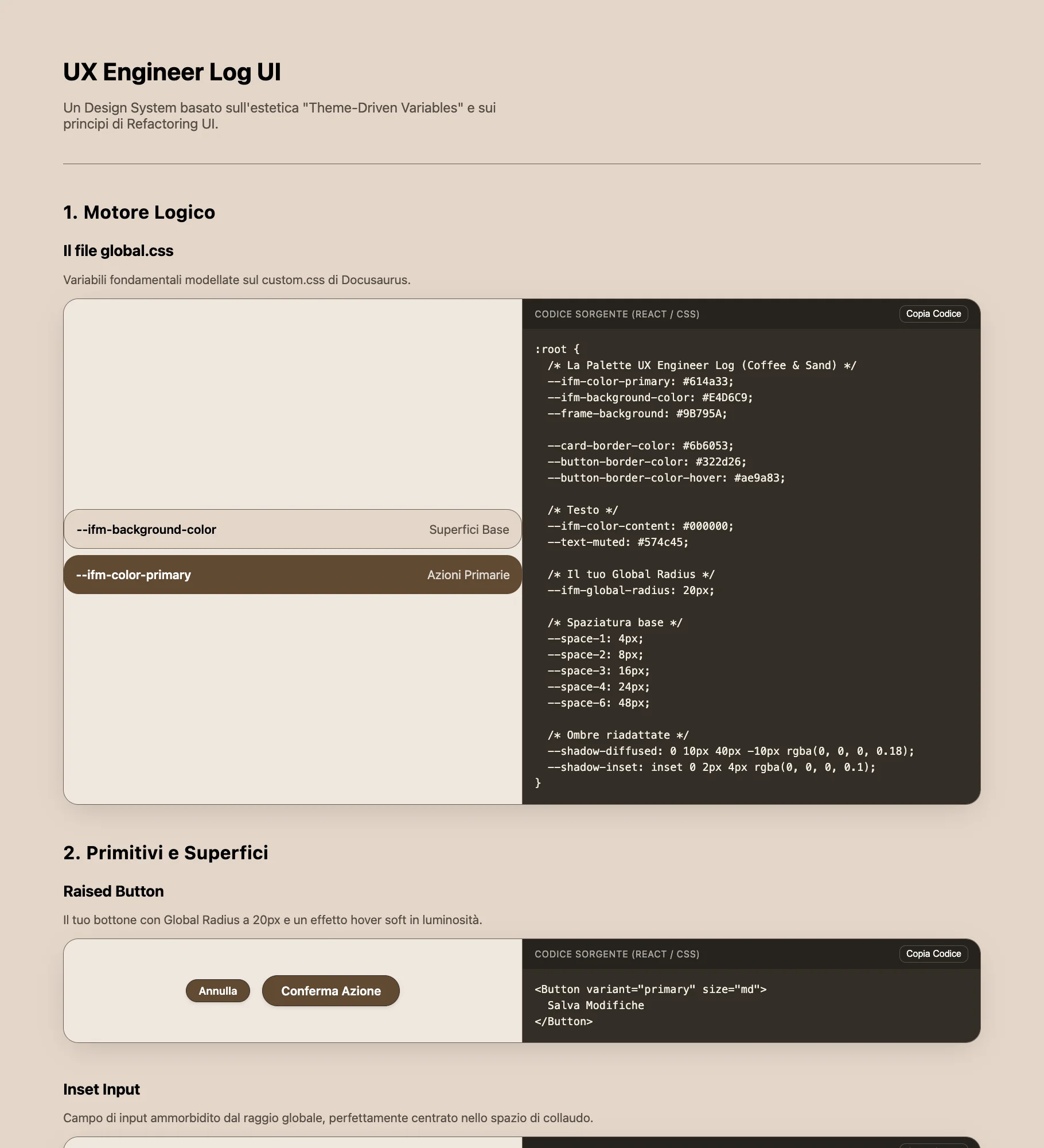
By this I don't mean the tool is poor: I could have used even more specific prompts. But that wasn't the only problem. I felt that in the long run I wouldn't have contributed anything at all, ending up with a project where my only input had been instructions and notes, nothing more; and, no less importantly, I was taking away from myself the most rewarding part of this work. On top of that came the complexity I perceived as utterly pointless and the repulsion I still feel toward external libraries. Above all, I couldn't find any sense in the approach, since the goal was simply to apply the most useful concepts that emerged from the reading. I could have done it in React, since I had just finished the Superhero Application Form, and therefore not starting from scratch, but I preferred to go back to basics.
I threw everything in the bin: half a day's work.
Figma First, Code After
I opened Figma and designed everything from scratch. Now that I had seen the result I didn't want, I knew exactly what I did want. I adopted the same approach I used in the web chat: an iterative process based on shared planning. Instead of writing "don't write a single line of code yet" in the chat, as I used to do before, I now wrote it in the terminal; the principle I applied was: no implementation until I had a shared and approved plan, in order to eliminate the technical debt that would inevitably have emerged from solutions not thought through from the start. I started from the Figma mockup, which is very close to the version implemented on the site. The differences you can notice concern (beyond the absence of the css preview) almost exclusively the dimensions, issues that emerged when those values were translated into CSS.
I would never have managed to do it without making that vision concrete. I made my own the authors' words:
Don't get overwhelmed working in the abstract. Build the real thing as early as possible so your imagination doesn't have to do all the heavy lifting.
~ Adam Wathan and Steve Schoger
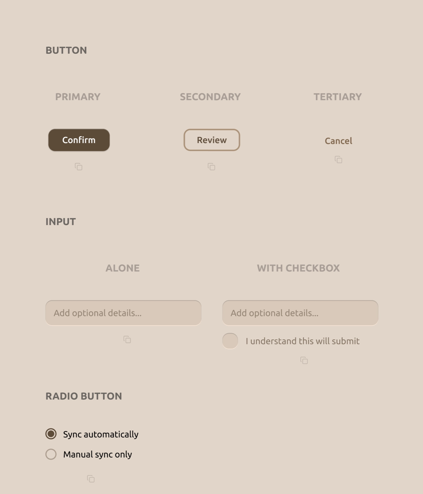
I then extracted every single property from all 15 components from Figma using Dev Mode, recording them in a .txt file with the specifications for titles, subtitles and spacing.
Claude Code
One problem I had to solve was the CSS file: how to let the user copy it entirely with a single click? So that they would be free to paste it into whichever file they wanted without being forced to start from mine? I wanted a specific component, a sort of preview at the top to copy the CSS. It's the element I contributed to only with the idea: Claude Code executed it perfectly on the first attempt. We then fixed the entire responsive side of the site. I tested it on an iPhone 15 Pro, which I recently bought to test the technical feasibility of Mosaic, an iPhone 12 mini and an Honor Magic V2 (the foldable), landscape mode included: the site is perfectly navigable even on a small phone like the 12 mini in landscape.
There were some issues during the implementation phase that opened up such interesting scenarios that I kept going deeper into the various concepts instead of moving forward.
One example above all: initially I had tried to load components.css dynamically with fetch() instead of embedding it in the JS file, but I discovered two fundamental problems.
The first: fetch() is blocked on the file:// protocol. The browser treats local files as untrusted origins and rejects the request.
The second, more subtle: even when served normally, chaining fetch() before writeText() breaks clipboard access.
The browser only allows writing to the clipboard immediately after a user click, and by the time fetch() resolves and reaches writeText(), that window has already closed.
The solution was to embed everything as a template literal directly in script.js.
I also tried Antigravity as an alternative, but after 2-3 errors that rippled through the UI I went back to Claude Code. For all tasks I used Sonnet; I only used Opus for two overall checks to compare against production standards, giving me scores across various areas throughout the project, actively choosing what to fix and what to leave considering the nature of this project.
Web Chat vs Agent
Initially I thought the web chat was, at least at this stage of learning, the better choice. I was wrong. In the web chat I had additional tasks that turned into friction. With Claude Code I was in a state of total flow, and as soon as I understood that before every change I needed to have the available options listed, dissect them and understand their pros and cons before touching the code, I realised I wasn't losing anything compared to what I was doing in the web chat. I remain torn on one point though: that friction of manually copying or rewriting in my own hand the block of code from the chat, perhaps it wasn't a process that was consolidating the concept just explained. It was simply a repetitive task to which the brain no longer paid attention and carried out on autopilot, or at least that's how it seems looking back. The price I'll probably pay in the future is forgetting the syntax.
That said, I'm convinced, as I learned in Raffaele Gaito's video in which university professor Vittorio Scarano talks about responsibility in the use of AI tools, that the use of these tools will always fall back on whoever used them. No one can say "Claude made a mistake": you made a mistake because you trusted that output without understanding it, grasping it, and verifying whether more efficient and secure alternatives existed. I think this is a concept that is by no means obvious, even if in hindsight it may seem so.
Design Choices
Buttons
I decided not to go with the classic button that transitions from primary to tertiary with the same text, as shown in most educational materials, but to assign different labels: Confirm for the primary, Review for the secondary and Cancel for the tertiary. This to be more efficient in terms of message: the primary contains the call to action, the secondary with "Review" implies a button to revisit something previously written (a review, an order on an e-commerce site), while the tertiary, counterintuitively, is Cancel.
Why Cancel in the tertiary? Refactoring UI teaches that a destructive action doesn't have to be red and prominent if it isn't the primary action. If it were, then yes: red, not blinding, but with the primary style clearly visible. In cases where it isn't, it makes sense to treat it like any ordinary button. I found this concept revolutionary: in the courses I had attended (Talent Garden, Google UX), the destructive action was seen as a danger to be flagged loudly, whereas it isn't, or at least not in every case.
In the primary I added a subtle translucent white inset box-shadow on the top edge to simulate light hitting the border of a physical object rising from the page.
The secondary uses a min-width slightly smaller than the primary (128px vs 140px), because I discovered that when the two appear side by side, the difference in width further accentuates the visual hierarchy between them, guiding the eye toward the main action.
All without the user noticing.
Input
I used two box-shadows: an inset one coming down from the top to simulate depth, and an external one on the bottom edge that simulates the light reflection.
The book argues that the input must communicate that it is an inner container where the user types - a "cavity" effect that is the physical opposite of the button, which instead rises from the screen.
The WITH CHECKBOX version has the checkbox with the same proportional border-radius as the input box: 6px on 20px is 30%, versus 16px on 56px which is ~29%.
The checkmark is inserted in the CSS as an SVG in data URI, with the mark color (#D5C7B8) matching exactly the input background: when the checkbox fills, the mark appears physically carved into the color.
Radio Button
I included only one type of radio button, because the goal was to communicate that native browser ones should not be used, but rather made consistent with the app's UI through a few targeted styles.
Card
I used 5 distinct shadow levels, each with two overlapping layers: a sharper one simulating direct light from above, a more diffused one simulating ambient light. The y-offset doubles at each level (1px, 2px, 4px, 8px, 16px) to create a predictable and mathematically consistent depth progression.
Icon
I included the 3 versions as Refactoring UI does, to show that the logo inside the icon needs to be "thickened" to remain recognisable at the small dimensions of a browser tab.
The original icon has a stroke-width of 8px, the simplified one 14px: they therefore have the same shape but with nearly double the stroke width.
I put this principle into practice immediately after reading it, by creating the icon for this very site: the letters UX with very thick strokes to remain legible even at 16px in the browser tab.
Empty State
A simple Empty State with the primary button already created earlier, as a reminder that there must always be a call to action when there is no data to display.
Capito, li evito del tutto. Ri-traduco il documento:
What I Learned
Architecture and Accessibility
Desktop-first based on the target: I applied here the note I had written in the Telephone Number Validator: "we should evaluate based on the device that will be used predominantly". This is a UI comparison tool designed for developers in front of a large screen. Building it mobile-first would have followed the rule, but ignored the real user. I made a conscious choice to go desktop-first, handling mobile as a fallback.
Tinted greys vs neutral greys: One of the most specific concepts from the book applied in the code. Every "grey" in the project has saturation at hue 31° to harmonise with the background at 30°. A pure neutral grey (0% saturation) would appear visually disconnected from the rest of the palette, like an element imported from another UI.
Hit area without disrupting the layout:
The copy icon is visually 16x16px, but the clickable area is 44x44px via padding: 14px. To keep the visual spacing unchanged, a margin-top: -14px exactly compensates for the added padding.
The component occupies the same visual space as before, but is much easier to tap on mobile.
Cap-height alignment:
The SVG radio is declared width="24" in the HTML as a fallback, but CSS overrides it to 20px.
At 18px font-size, 20px aligns the control exactly to the cap-height of the adjacent text.
This is the correct criterion for aligning inline icons with typography, not the font-size itself.
JavaScript and DOM
data-component as a robust bridge:
Instead of reading which snippet to copy from the button's CSS classes, each button carries a data-component attribute that maps exactly to a key in the SNIPPETS object.
HTML and JS communicate via dedicated semantic attributes, not via classes that already serve another purpose.
If the CSS classes change for styling reasons, the copy logic doesn't break.
fetch() and the click window:
The browser only allows writing to the clipboard immediately after a user action.
fetch() is asynchronous: by the time it resolves, that window has already closed and writeText() is rejected.
The solution is not to work around the browser, but to never stray from the click: the content to be copied must already be in memory at the exact moment of the click.
execCommand as a fallback:
navigator.clipboard.writeText() is blocked on file:// and in some mobile Safari contexts.
The fallback creates an invisible <textarea> outside the flow, selects it and triggers the system command.
It's deprecated, but I discovered it to be the most reliable option in these specific edge cases.
SVG Sprite Pattern:
Defining the icon once as a hidden <symbol> and referencing it everywhere via <use href="#icon-copy"> keeps the DOM clean and creates a single Source of Truth: when JavaScript replaces the SVG content to show the checkmark, it does so in one place instead of updating 16 separate elements.
If the icon design changes, only one point in the code needs to be touched.
CSS and Interactions
opacity: '' instead of opacity: '1':
After the copy animation, resetting svg.style.opacity = '1' leaves an inline value that silently overrides the CSS hover.
The result: hover stops working after the first click, with no error in the console.
Removing the inline attribute with '' returns control to the stylesheet.
pointer-events: none on the gradient fade:
The gradient that fades the CSS code in the preview is in position: absolute above the text.
Without pointer-events: none it would block all clicks and selections in the area below, an invisible problem that generates no error and is difficult to find without knowing where to look.
Asymmetric transitions:
The transition on the base rule (the CSS rule that applies to the element at rest, with no active pseudo-classes) controls the speed of return to the normal state (160ms, fluid like a spring).
The transition on :active controls the press speed (60ms, nearly instantaneous). The reason it works: CSS applies the transition from the state being left.
On press, the base state is left and the 60ms kicks in. On release, :active is left and the 160ms kicks in.
display: contents in the mobile carousel:
To transform the card grid into a horizontal carousel on mobile, the .cards-row-1 and .cards-row-center wrappers are dissolved with display: contents.
This flattens the DOM: the children bypass their direct parent and become flex items of the carousel container.
Without this, the wrappers would have broken the flex chain and disrupted the layout.
{ passive: true } on touch listeners:
Adding passive: true to the touchstart and touchend event listeners explicitly tells the browser that the handler will never call preventDefault().
The browser can therefore begin scrolling immediately without waiting for the JavaScript to finish, eliminating the noticeable delay on mobile.
btn.blur() for iOS:
After copying, calling btn.blur() releases the :active state on iOS, which would otherwise remain visually active until the next tap on another element.
This applies both in the case of clipboard success and failure.
prefers-reduced-motion with 0.01ms:
Using 0ms to zero out transitions causes a bug in some browsers: JavaScript listeners waiting for the transitionend event never fire, blocking any logic that depends on that callback.
0.01ms is short enough to be imperceptible, but long enough for the event to fire correctly.
Reflection
In the previous project on The Design of Everyday Things I had written that if a user notices one of my buttons for its aesthetics I've done graphic work, but if they click it without thinking I've done engineering work. Refactoring UI has been for me the manual of that engineering. If Norman taught me the psychology of interaction and the why of eliminating cognitive load, this book gave me the mathematics and the how to write it in CSS. My goal remains always the same: to not dazzle the eye and to free the mind. But if before I only knew that I had to answer the user's question before it was even asked, now I finally have the formulas, the tokens and the code to build that answer.
Next: Reading "Show Your Work!" by Austin Kleon, I discovered it teaches many of the patterns I used throughout this journey.