Telephone Number Validator
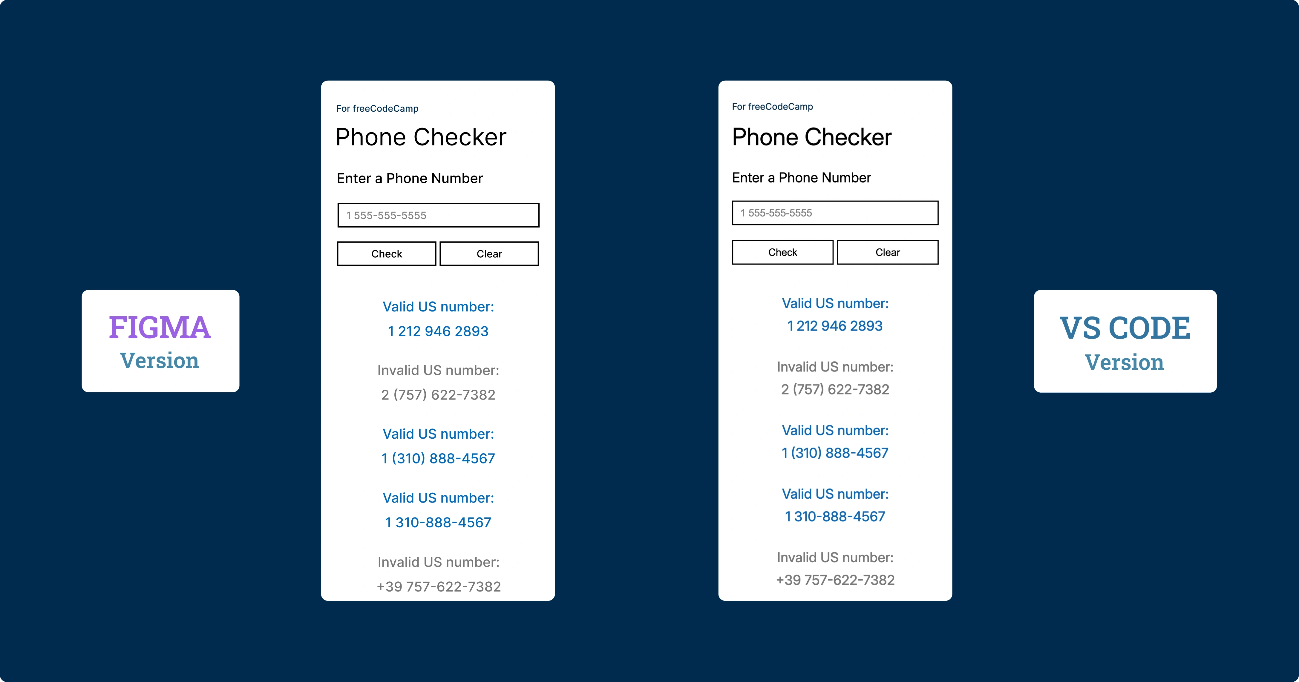
The Project
US phone number validator developed with Regular Expressions, responsive mobile-first design and performance-oriented architecture. An application that demonstrates the power of regex in validating complex patterns.
Source Code
- index.html
- styles.css
- script.js
<!-- DESIGN
   ------
   * This file contains the HTML structure of the Phone Checker application.

   * The structure follows this flow:
   * - Head with meta tags, CSS link, and preconnection to Google Fonts.
   * - Body with main containing the primary container.
   * - Container with device-frame (device bezel) that appears only on the
   *   desktop version.
   * - Device-screen (internal screen) that contains the entire application's UI.
   * - Form with input, buttons, and results area
-->

<!DOCTYPE html>
<html lang="en">
    <head>
        <title>Phone Checker</title>
        <meta charset="UTF-8" />
        <meta name="viewport" content="width=device-width, initial-scale=1.0">
        <link rel="stylesheet" href="styles.css">
        <link rel="preconnect" href="https://fonts.googleapis.com">
        <link rel="preconnect" href="https://fonts.gstatic.com" crossorigin>
        <link href="https://fonts.googleapis.com/css2?family=Inter:ital,opsz,wght@0,14..32,100..900;1,14..32,100..900&display=swap" rel="stylesheet">
    </head>

    <body>

        <!--
            * freeCodeCamp instructions:
            * - You should have an input element with an id of "user-input". ✔️
            * - You should have a button element with an id of "check-btn". ✔️
            * - You should have a button element with an id of "clear-btn". ✔️
            * - You should have a div, span or p element with an id of "results-div" ✔️
        -->

        <!--
            * I discovered that the modern approach uses classes for CSS and IDs for
            * elements primarily used in JavaScript. Performance is the same, and
            * counterintuitively, classes even seem faster as this article explains:
            * (https://csswizardry.com/2011/09/writing-efficient-css-selectors/)
        -->

        <main>

            <div class="container">
                <div class="device-frame">
                    <div class="device-screen">
                        <p class="tribute"><a href="https://www.freecodecamp.org/" target="_blank" rel="noopener noreferrer" aria-label="Visit freeCodeCamp website (opens in new tab)">For freeCodeCamp</a></p>
                        <h1>Phone Checker</h1>
                        <form id="phone-form">
                            <label for="user-input">Enter a Phone Number</label>
                            <input type="tel" id="user-input" placeholder="1 555-555-5555" />
                            <div class="button-group">
                                <button type="submit" id="check-btn">Check</button> <!-- I must remember to add e.preventDefault() in JS -->
                                <button type="button" id="clear-btn">Clear</button>
                            </div>
                            <div id="results-div"></div>
                        </form>
                    </div>
                 </div>
            </div>

        </main>

        <script src="script.js"></script>
    </body>

</html>
/* DESIGN
   ------
   * I chose to make the mobile version the default, meaning without
   * a dedicated media query, unlike the desktop version
   * The reasons are twofold:
   * - mobile traffic has now surpassed desktop traffic
   * - mobile devices load only the base CSS without the elaborate
   *   device-frame bezel, thus reducing loading time, also considering
   *   that mobile users often have slower connections
*/


/* UNIVERSAL (common variables to mobile and desktop) */

:root {
    /* Font */
    --font-family: "Inter", Arial, sans-serif;
    --font-color: #000;
    --font-weight-primary: 400;
    --result-font-weight: 450;
    /* the value above (450) is unusual but it's the right middle ground
     * between normal and bold, it's also the closest to the prototype made
     * in Figma, which indicates 500 but in my opinion overestimates by 50 */

    /* Color */
    --tribute-font-color: #002B4E;
    --user-input-placeholder-font-color: #808080;
    --user-input-color-fill: #FFF;
    --button-color-fill: #FFF;
    --button-color-fill-hover: #0369BC;
    --button-font-color-hover: #fff;
    --result-valid-font-color: #0369BC;
    --result-invalid-font-color: #787878;

    /* Animation */
    --result-animation: slideInFade 0.4s cubic-bezier(0.2, 1, 0.3, 1);
}


/* MOBILE (default version) */

:root {
    /* Background */
    --background-color: #FFF;

    /* Position*/
    --tribute-margin-top: 36px;
    --title-margin-top: 18px;
    --label-margin-top: 32px;
    --user-input-margin-top: 26px;
    --button-group-margin-top: 26px;
    --result-margin-top-first: 48px;
    --result-margin-bottom: 32px;

    /* tribute */
    --tribute-font-size: 16px;

    /* title */
    --title-font-size: 42px;

    /* label, result*/
    --label-result-font-size: 24px;

    /* input, button*/
    --user-input-placeholder-button-font-size: 18px;
    --user-input-button-border: 2.373px solid #000;

    /* input */
    --user-input-padding-left-right: 0 12px;
    --user-input-height: 43.5px;
    --user-input-border-hover-active: 2.373px solid #0369BC;

    /* button */
    --button-group-gap: 6px;
    --button-height: 43.5px;

    /* Result */
    --result-font-size: 24px;
    --result-line-height: 40px;

}


/* DESKTOP (override of mobile variables and addition of device-frame) */

@media (min-width: 560px) and (min-height: 730px) {

:root {
    /* Background */
    --background-color: #002B4E;

    /* Position*/
    --tribute-margin-top: 20px;
    --title-margin-top: 8px;
    --label-margin-top: 18px;
    --user-input-margin-top: 18px;
    --button-group-margin-top: 18px;
    --result-margin-top-first: 40px;
    --result-margin-bottom: 22px;

    /* tribute */
    --tribute-font-size: 12px;

    /* title */
    --title-font-size: 32px;

    /* label, result*/
    --label-result-font-size: 18px;

    /* input, button*/
    --user-input-placeholder-button-font-size: 14px;
    --user-input-button-border: 1.7px solid #000;

    /* input */
    --user-input-padding-left-right: 0 10px;
    --user-input-height: 31px;
    --user-input-border-hover-active: 1.7px solid #0369BC;

    /* button */
    --button-group-gap: 4px;
    --button-height: 31px;

    /* Device frame */
    --device-frame-width: 332px;
    --device-frame-height: 680px;
    --device-frame-background: url("https://github.com/user-attachments/assets/817a409b-2181-4eab-8c9c-8ed38ad5e080");

    /* Device screen */
    --device-screen-width: 294px;
    --device-screen-height: 521px;
    --device-screen-background: #fff;
    --device-screen-top: 72px;
    --device-screen-left: 19px;
    --device-screen-padding: 0 20px;

    /* Result */
    --result-font-size: 18px;
    --result-line-height: 30px;
}

.device-frame {
    position: absolute;
    top: 49%;
    /* For the top position, I chose 49% instead of 50% for better visual balance */
    left: 50%;
    transform: translate(-50%, -50%);
    display: flex;
    flex-direction: column;
    align-items: center;
    text-align: center;
    width: var(--device-frame-width);
    height: var(--device-frame-height);
    background-image: var(--device-frame-background);
}

.device-screen {
    width: var(--device-screen-width);
    height: var(--device-screen-height);
    background-color: var(--device-screen-background);
    top: var(--device-screen-top);
    left: var(--device-screen-left);
    padding: var(--device-screen-padding);
    position: absolute;
    text-align: left;
    overflow-y: auto;
    overflow-x: hidden;
    scrollbar-color: transparent transparent;
}

button:hover {
    background-color: var(--button-color-fill-hover);
    color: var(--button-font-color-hover);
}

}


/* Total CSS reset to avoid unexpected behavior across different browsers */
* {
    margin: 0;
    padding: 0;
    box-sizing: border-box;
}

body {
    background-color: var(--background-color);
    font-family: var(--font-family);
    color: var(--font-color);
}

.container {
    display: flex;
    flex-direction: column;
    padding: 0 24px;
    min-height: 100vh; /* Fallback for browsers not supporting dvh */
    min-height: 100dvh; /* It is a dynamic viewport: prevents jump when mobile browser's URL bar toggles */
}

.tribute, label, #user-input, button {
    font-weight: var(--font-weight-primary);
}


.tribute {
    margin-top: var(--tribute-margin-top);
    font-size: var(--tribute-font-size);
}

.tribute a {
    position: relative;
    color: var(--tribute-font-color);
    text-decoration: none;
}

h1 {
    margin-top: var(--title-margin-top);
    font-weight: var(--font-weight-primary);
    font-size: var(--title-font-size);
}

label {
    margin-top: var(--label-margin-top);
    display: block;
    font-size: var(--label-result-font-size);
}

#user-input, button {
    font-size: var(--user-input-placeholder-button-font-size);
    border: var(--user-input-button-border);
}

#user-input {
    margin-top: var(--user-input-margin-top);
    width: 100%;
    height: var(--user-input-height);
    background-color: var(--user-input-color-fill);
    padding: var(--user-input-padding-left-right);
}

#user-input::placeholder {
    color: var(--user-input-placeholder-font-color);
}


#user-input:active, #user-input:focus {
    border: var(--user-input-border-hover-active);
    outline: none;
}

.button-group {
    margin-top: var(--button-group-margin-top);
    display: flex;
    gap: var(--button-group-gap);
}

button {
    flex: 1;
    height: var(--button-height);
    background-color: var(--button-color-fill);
    border: var(--user-input-button-border);
    cursor: pointer;
    color: var(--font-color);
}

button.clicked {
    background-color: var(--button-color-fill-hover);
    color: var(--button-font-color-hover);
    transform: perspective(400px) rotateX(2deg) rotateY(-2deg) scale(0.98);
}

.phone-result {
    text-align: center;
    font-size: var(--result-font-size);
    line-height: var(--result-line-height);
    margin-bottom: var(--result-margin-bottom);
    font-weight: var(--result-font-weight);
    animation: var(--result-animation);
}

.phone-result::after {
    content: "";
    display: block;
}

.phone-result:first-child {
    margin-top: var(--result-margin-top-first);
}

.phone-result.result-valid {
    color: var(--result-valid-font-color);
}
.phone-result.result-invalid {
    color: var(--result-invalid-font-color);
}

@keyframes slideInFade {
    0% {
        opacity: 0;
        transform: translateY(-10px) scale(0.95);
    }
    100% {
        opacity: 1;
        transform: translateY(0) scale(1);
    }
}
/* DESIGN
   ------
   * This file contains the validation logic for US phone numbers

   * Flow:
   * - Definition of constants that include input limits, the regex
   *   for validation, and DOM references.
   * - Prevention of the form's default behavior which would otherwise
   *   cause the page to refresh.
   * - Management of the Check button click with preliminary validations (empty
   *   field and excessive length).
   * - Main function checkNumber(), which executes validation via
   *   regex and handles the display of results.
   * - Visual feedback on buttons with a temporary click effect.
   * - Function limitResults() that maintains a maximum number of displayed
   *   results.
   * - Clear button that clears the interface

   * I've named functions only when reused, such as checkNumber and
   * limitResults

   * I don't add Enter key support for quick validation, because it is
   * redundant. Since the HTML is structured as a form, the default browser
   * behavior already triggers the button click when Enter is pressed
*/

/* freeCodeCamp instructions:
    * - When you click on the #check-btn element without entering a value
    *   into the #user-input element, an alert should appear with the text
    *   "Please provide a phone number". ✔️
    * - When you click on the #clear-btn element, the content within the
    *   #results-div element should be removed. ✔️
    * I've summarized the other 30 requirements in these points:
    * - Valid numbers: must have 10 digits total, country prefix
    *   1 (optional), spaces, hyphens, parentheses allowed in the input area ✔️
    * - Invalid numbers: anything that doesn't have 10 digits, prefix different
    *   from 1, malformed parentheses, or "strange" characters ✔️
*/

const maxInputLength = 20;
const maxResult = 50; // Limit to prevent DOM performance issues with too many results
const phoneRegex = /^(1\s?)?(\(\d{3}\)|\d{3})[\s\-]?\d{3}[\s\-]?\d{4}$/;
/* Above regex validates US phone numbers in their standard formats:
   * ^(1\s?)? : Optional country code 1 with optional space.
   *    The entire group is optional, allowing numbers to start with or without it.
   * (\(\d{3}\)|\d{3}) : Area code (3 digits) with or without parentheses.
   *    The OR operator (|) allows both formats, thus (555) or 555.
   * [\s\-]? : Optional separator (space or hyphen) after the area code.
   *    Square brackets create a character class, ? makes it optional.
   * \d{3} : Exchange code: exactly 3 digits of the local number.
   * [\s\-]? : Another optional separator between number groups.
   * \d{4}$ : Subscriber number: exactly 4 digits.
   *   The $ anchor ensures the string ends here, preventing extra characters
*/

const input = document.getElementById("user-input");
const checkBtn = document.getElementById("check-btn");
const clearBtn = document.getElementById("clear-btn");
const resultsDiv = document.getElementById("results-div");
const buttons = document.querySelectorAll("button");

document.querySelector("form").addEventListener("submit", (e) => e.preventDefault());

checkBtn.addEventListener("click", (e) => {
    e.preventDefault();
    if (input.value === "") {
        alert("Please provide a phone number");
        return;
    } else if (input.value.length > maxInputLength) {
        alert("Phone number too long");
        return;
    } else {
        checkNumber()
    }
});

const checkNumber = () => {
    const phoneNumber = input.value;
    const phoneResult = document.createElement("div");
    phoneResult.classList.add("phone-result");


   /* For inserting the <br> I used a particular approach, first textContent
    * to sanitize against XSS, then innerHTML to modify only the colon
    * character (: ) already validated. This way the content is already safe
    * before the HTML conversion */

    if (phoneRegex.test(phoneNumber)) {
        phoneResult.textContent = `Valid US number: ${phoneNumber}`;
        phoneResult.innerHTML = phoneResult.innerHTML.replace(': ', ':<br>');
        phoneResult.classList.add("result-valid");

    } else {
        phoneResult.textContent = `Invalid US number: ${phoneNumber}`;
        phoneResult.innerHTML = phoneResult.innerHTML.replace(': ', ':<br>');
        phoneResult.classList.add("result-invalid");

    }

    resultsDiv.insertBefore(phoneResult, resultsDiv.firstChild);
    limitResults();
    input.value = "";
}

buttons.forEach(button => {
    button.addEventListener("click", () => {
        button.classList.add("clicked");
        setTimeout(() => button.classList.remove("clicked"), 200);
    });
});

const limitResults = () => {
    const results = resultsDiv.children;
    while (results.length > maxResult) {
        resultsDiv.removeChild(results[results.length - 1]);
    }
}

clearBtn.addEventListener("click", (e) => {
    e.preventDefault();
    input.value = "";
    resultsDiv.innerHTML = "";
});
The Best Project So Far
This has been the best project I've done so far. The regex was by far the most difficult part.
I didn't try other approaches: I could have handled phone number validation in alternative ways, such as a cascade of if statements. The code would have been easier to write and even easier to read, but it would have been tremendously long. Opting for regex was also a way to strengthen my understanding of it. I wrote a detailed explanation of the regex inside script.js, both to help anyone understand what each piece does and to consolidate what I learned.
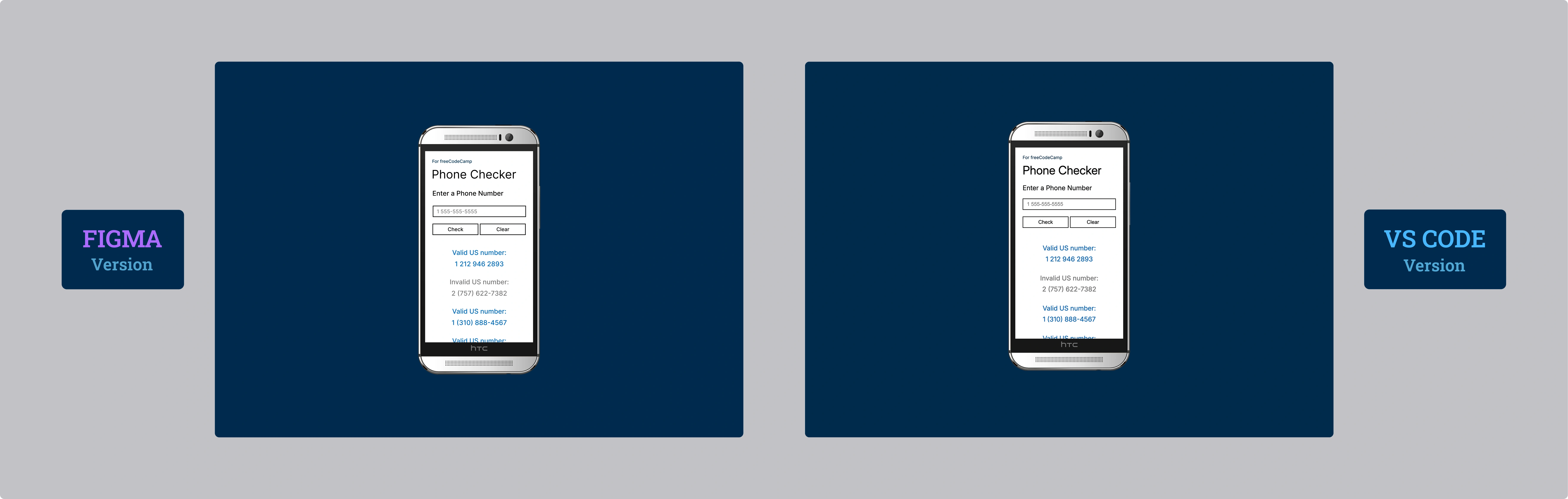
The Design: HTC One M8 and Windows Phone Aesthetic
As for the design, I decided to place an HTC One M8 for Windows (the Verizon version) on a simple Windows Phone-style blue background. It turned out better than I had imagined. I tried the gold and black versions, but this silver one pairs best with the background.
Mobile-First (Really): A Conscious Choice
The mobile version is the default version. As I wrote in the styles.css comments, I chose to create a media query for desktop and no longer putting the mobile version in a media query, as I did in the past.
The reasons are twofold:
- Adoption: Mobile has surpassed desktop traffic for years now.
- Performance: By setting it as default, the device frame (the HTC) loads only when viewed from desktop. Additionally, desktop users generally have faster internet connections, so it made even more sense.
The Reflection: Mobile-First is not a Dogma
This is rarely discussed, but I believe that beyond the "mobile-first" gold standard, we should evaluate based on the device that will predominantly be used to navigate our application.
If you're creating an application primarily intended for desktop, perhaps it makes more sense to adopt the old method of dedicating a media query to mobile.
In this project, I still chose the mobile-first approach also to get used to this way of thinking, a skill I want to consolidate.
I could be wrong, but I always get red flags when I hear "that's just how it is". There are always a thousand nuances and "it depends" that often go unmentioned.
The Philosophy of Comments
As I did in the previous certification project, I paid particular attention to comments in the code. I wrote everything there: the logic, architectural choices, patterns used. Repeating it here would be redundant and, above all, difficult to understand without having the code at hand.
In this project, I decided to reduce useless comments, what antirez calls "Trivial Comments," in order to make the code cleaner. I concentrated most of the comments at the beginning of each document, creating a sort of map that guides the reading of the code without weighing it down.
I just want to say that with each passing project, my self-confidence increases and, at the same pace, my enjoyment.
What I Learned
Regular Expressions:
- Complex patterns for US phone number validation:
/^(1\s?)?(\(\d{3}\)|\d{3})[\s\-]?\d{3}[\s\-]?\d{4}$/ - Handling optional prefixes (country code 1)
- Alternation between formats with parentheses
(\d{3})and without\d{3} - Character classes
[\s\-]for multiple separators - Anchors
^and$for strict validation without extra characters
Conscious Mobile-First Strategy:
- Default CSS without media query for mobile
- Media query
@media (min-width: 560px) and (min-height: 730px)only for desktop and tablet - Conditional loading of device-frame (bezel) only on desktop and tablet
- Optimization for slower mobile connections
Advanced CSS Variables:
- Overriding CSS variables in media queries for responsive design
- Scalable design system with semantic variables
- Management of two complete themes (mobile/desktop) with the same set of variables
Safe DOM Manipulation:
.textContentfor XSS sanitization before any modification.innerHTMLonly after content validation- Safe pattern: sanitize → modify → insert
Dynamic Viewport:
min-height: 100dvhto handle dynamic mobile URL bar- Fallback
100vhfor unsupported browsers
Performance and UX:
- Limit
maxResult = 50to prevent DOM performance issues .insertBefore()for LIFO stack of results- Animation
@keyframes slideInFadewith cubic-bezier for smooth feedback - Click effect with
transform: perspective()for tactile feedback
Form Handling:
e.preventDefault()for complete control of form behavior- Input length validation with
maxInputLength - Alert for immediate feedback on input errors
Code Architecture:
- Logical separation between validation, display, and interaction
- Structured comments with DESIGN section for architectural overview
- Semantic naming for reusable functions
Reflection
It was essential, in creating the HTML, to test iteratively on my favorite edge case: the iPhone 12 mini and, surprisingly, also on an HTC One M8 (Android version).
I recently discovered the "ipconfig getifaddr en0" command (on macOS) in the terminal, which opened up a world to me. I added a text file to my desktop with the procedure I summarized:
- Run ipconfig getifaddr en0 in the terminal
- It will give you a number (n), your local IP
- In VS Code, after clicking on Live Server, there will be the port number (p)
- On the desired device, type in the address bar: n:p
I always close the Live Server when I'm done. Although the risk is actually low, considering that to access the port you must be on my same wifi network anyway.
Next Project: Learn Basic OOP by Building a Shopping Cart