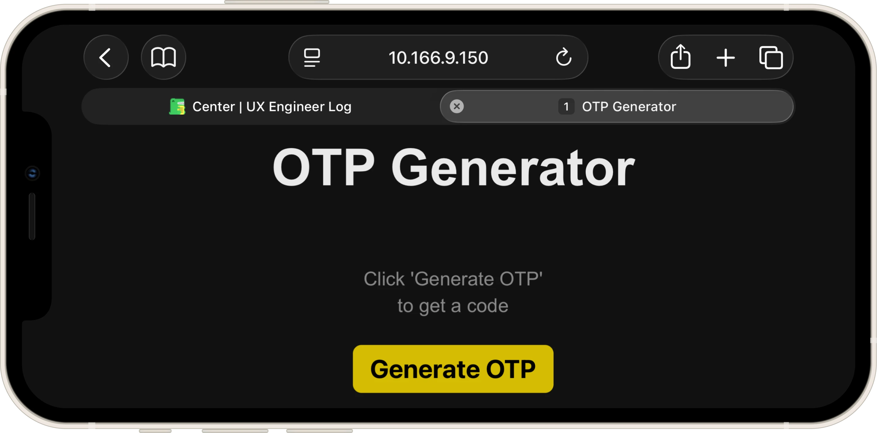
One-Time Password Generator
The Project
A freeCodeCamp Lab that turned out to be more of a conscious review than a discovery: useState, useEffect, conditional rendering. All already seen. But the freedom on the CSS and a question to the Code Tutor about cryptographic security made the exercise more interesting than I expected.
Source Code
- index.jsx
- index.html
- styles.css
/* DESIGN
------
* This file contains the React logic for the OTP Generator application
* The architecture focuses on the "Side Effect" pattern and secure randomness:
*
* The Generation Logic (Cryptographic Randomness):
* - I used `window.crypto.getRandomValues()` instead of `Math.random()` because
* Math.random is pseudo-random (predictable), while the Web Crypto API pulls
* entropy from the operating system, making the OTP genuinely unpredictable
* - The modulo trick (`% 1000000`) extracts exactly 6 digits from a 32-bit integer,
* and `padStart(6, "0")` ensures codes like "000042" aren't truncated to "42"
*
* The Timer System (useEffect + setInterval):
* - I implemented a countdown using `useEffect` that watches two dependencies:
* `isActive` (whether the timer is running) and `timeLeft` (remaining seconds)
* - The effect contains a Guard Clause pattern: if the timer isn't active or has
* reached zero, it exits early and resets `isActive` to re-enable the button
* - When active, a `setInterval` decrements `timeLeft` every second
* - The cleanup function (`return () => clearInterval(...)`) is critical because
* this effect re-runs every time `timeLeft` changes (it's in the dependency array:
* `[isActive, timeLeft]`)
* Without cleanup:
* - Second 1: interval #1 created → decrements timeLeft to 4
* - Second 2: effect re-runs → interval #1 still active + interval #2 created
* - Second 3: intervals #1, #2, #3 all active → timeLeft decrements by 3 at once
* - Result: the countdown accelerates exponentially until the timer completes
* The cleanup ensures the old interval is destroyed before creating a new one,
* maintaining exactly one active interval at any time
*
* The UI State Machine:
* - The display cycles through three visual states driven by two boolean conditions:
* 1. No OTP yet → placeholder message (styled with `.empty` class)
* 2. OTP active → large 6-digit code with live countdown
* 3. OTP expired → same code visible, but timer shows expiration message
* - The button's `disabled` prop is bound directly to `isActive`, creating a
* self-regulating loop: generate → disable → countdown → enable.
*/
/* freeCodeCamp instructions:
* 1. You should use the useEffect hook to manage the countdown timer. ✔️
* 2. Your OTPGenerator component should return a div element with the class name container. ✔️
* 3. The div having the class container should include the following elements:
* - An h1 element with the ID otp-title and text "OTP Generator". ✔️
* - An h2 element with the ID otp-display that either displays the message "Click 'Generate OTP' to get a code"
* or shows the generated OTP if one is available. ✔️
* - A p element with the ID otp-timer and aria-live attribute set to a valid value that:
* - Starts off empty. ✔️
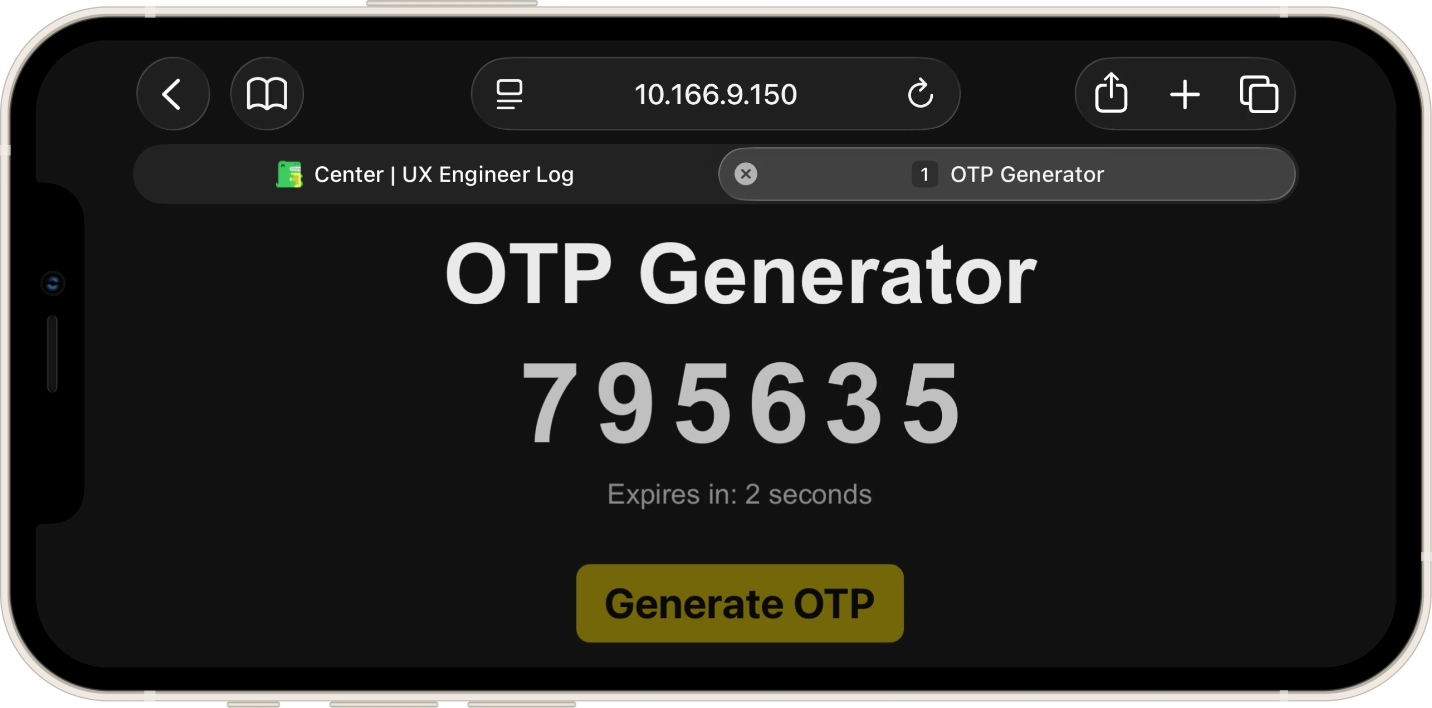
* - Displays "Expires in: X seconds" after the button is clicked, where X represents the remaining time
* before the OTP expires. ✔️
* - Shows the message "OTP expired. Click the button to generate a new OTP." once the countdown reaches 0. ✔️
* - A button element with the ID generate-otp-button labeled "Generate OTP". When clicked, it should generate a
* new OTP and start a 5-second countdown. ✔️
* - The "Generate OTP" button must be disabled while the countdown is active. ✔️
* 4. You should ensure the countdown timer stops automatically once it reaches 0 seconds to prevent unnecessary updates. ✔️
* 5. The generated OTP should be 6 digits long. ✔️
*/
const { useState, useEffect, useRef } = React;
export const OTPGenerator = () => {
const [otp, setOtp] = useState("");
const [timeLeft, setTimeLeft] = useState(0);
const [isActive, setIsActive] = useState(false);
const generateOTP = () => {
/*
* I chose the Web Crypto API over Math.random() for security reasons and to gain
* hands-on experience with the API
* `Uint32Array(1)` creates a typed array that holds one 32-bit unsigned integer,
* and `getRandomValues` fills it with cryptographically strong random data
* from the OS entropy pool (e.g. 2,567,523,558)
* The modulo operation (`% 1000000`) extracts the last 6 digits (e.g. 523,558),
* and `padStart` ensures we always get exactly 6 characters, even if the result
* starts with zeros (e.g. 4,821 becomes "004821")
*/
const array = new Uint32Array(1);
window.crypto.getRandomValues(array);
const sixDigits = array[0] % 1000000;
const secureOtp = sixDigits.toString().padStart(6, "0");
setOtp(secureOtp);
setTimeLeft(5);
setIsActive(true);
};
useEffect(() => {
/*
* Guard Clause pattern: I check the "stop conditions" first and exit early
* If the timer isn't active OR has reached zero, there's nothing to do
* Important detail: when `timeLeft` hits 0, I must also set `isActive` to false,
* otherwise the button would stay disabled forever since nothing would reset it
*/
if (!isActive || timeLeft === 0) {
if (timeLeft === 0) setIsActive(false);
return;
}
/*
* The interval engine: if we reach this point, the timer is active and has
* seconds remaining. I set up a `setInterval` that decrements `timeLeft` by 1
* every 1000ms
*
* The cleanup function (the returned arrow function) is critical here:
* because `useEffect` re-runs every time `timeLeft` changes, without cleanup
* each re-render would stack a NEW interval on top of the old one, causing
* the countdown to accelerate exponentially. The cleanup kills the previous
* interval before the next one starts
*/
const intervalId = setInterval(() => {
setTimeLeft(timeLeft - 1);
}, 1000);
return () => clearInterval(intervalId);
}, [isActive, timeLeft]); // Re-run when timer state or countdown value changes
return (
<div className="container">
<h1 id="otp-title" className="title">OTP Generator</h1>
{/*
* Conditional rendering with ternary:
* If `otp` has a value, I display the 6-digit code; otherwise, I show
* the placeholder message. The `.empty` class is toggled dynamically
* to switch between the large monospace OTP style and the smaller
* instructional text style
*/}
<h2 id="otp-display" className={`display ${!otp ? "empty" : ""}`}>
{otp ? otp : "Click 'Generate OTP' to get a code"}
</h2>
{/*
* The timer display uses a nested ternary to handle three states:
* 1. No OTP generated yet (`!otp`) → empty string (aria-live region stays silent)
* 2. OTP active (`isActive`) → "Expires in: X seconds" (live countdown)
* 3. OTP expired (`!isActive`) → expiration message prompting regeneration
*
* I set `aria-live="polite"` so screen readers announce countdown changes
* without interrupting the user's current focus
*/}
<p id="otp-timer" className="timer-text" aria-live="polite">
{otp ? (isActive ? `Expires in: ${timeLeft} seconds` : "OTP expired. Click the button to generate a new OTP.") : ""}
</p>
{/*
* The button's `disabled` prop is bound directly to `isActive`, creating
* a self-regulating cycle: clicking generates an OTP and disables the button,
* the countdown runs, and when it expires `isActive` becomes false,
* automatically re-enabling the button
*/}
<button
id="generate-otp-button"
className="generate-btn"
onClick={generateOTP}
disabled={isActive}
>
Generate OTP
</button>
</div>
);
};
<!DOCTYPE html>
<html>
<head>

<!-- DESIGN
     ------
     * File Origin: Pre-packaged environment by freeCodeCamp
     * Role: The "Engine Room" (Host Environment)
     *
     * How it works (In-browser Compilation):
     * This file differs from standard professional workflows (like Vite/Next.js).
     * Usually, we "cook" (compile) the code on our computer before sending it to the browser.
     * Here, the "cooking" happens directly inside the user's browser via Babel.
     *
     * The Ingredients (CDNs):
     * Instead of installing React via terminal (npm install), this file pulls React (the logic)
     * and ReactDOM (the rendering) directly from the internet via <script> tags.
     * It's like streaming a movie instead of downloading it.
     *
     * The Live Translator (Babel Standalone):
     * Browsers don't understand React/JSX natively. This file loads "Babel", a tool that acts
     * as a simultaneous interpreter. It reads the code inside "index.jsx", translates it
     * instantly into standard JavaScript, and executes it.
     *
     * The Canvas (#root):
     * The <body> is intentionally empty except for a single <div id="root">.
     * This is the "mounting point" where React will paint the entire OTP Generator application.
     *
     * The Spark (Bootstrapping):
     * The script at the very bottom connects the dots.
     * - It uses `type="text/babel"` and `data-type="module"` to enable modern JavaScript features (ES6 Imports).
     * - It grabs the 'root' div and tells React: "Import the { OTPGenerator } from our file and draw it here".
-->

    <meta charset="UTF-8" />
    <meta name="viewport" content="width=device-width, initial-scale=1.0" />
    <title>OTP Generator</title>
    <link rel="stylesheet" href="styles.css" />
    <script src="https://cdnjs.cloudflare.com/ajax/libs/react/18.3.1/umd/react.development.min.js"></script>
    <script src="https://cdnjs.cloudflare.com/ajax/libs/react-dom/18.3.1/umd/react-dom.development.min.js"></script>
    <script src="https://cdnjs.cloudflare.com/ajax/libs/babel-standalone/7.26.5/babel.min.js"></script>
    <script
      data-plugins="transform-modules-umd"
      type="text/babel"
      src="index.jsx"
    ></script>
</head>

<body>
    <div id="root"></div>
    <script
      data-plugins="transform-modules-umd"
      type="text/babel"
      data-presets="react"
      data-type="module"
    >
      import { OTPGenerator } from './index.jsx';
      ReactDOM.createRoot(document.getElementById('root')).render(<OTPGenerator />);
    </script>
</body>

</html>
/* DESIGN
   ------
   * This file contains all the styling for the OTP Generator application
   *
   * Design philosophy "Minimal Dark Mode":
   * I chose a dark theme (#121212) paired with high-contrast typography to create
   * a clean, focused interface. The design avoids decorative elements entirely:
   * no shadows, no gradients, no borders. The only visual "personality" comes from
   * the golden-yellow button (#d4bc03), which acts as the single accent color
   * and the only interactive element on screen
   *
   * I added a subtle "alive" interaction to the button: on press, the border-radius
   * morphs from sharp (8px) to pill-shaped (30px), giving tactile feedback that
   * confirms the user's action without any color flash or scale animation
   *
   * Mobile-First approach:
   * The base CSS targets mobile devices with generous vertical spacing and
   * touch-optimized button sizes. On desktop (768px+), the layout transforms
   * from a full-screen experience into a centered floating card with a darker background
   *
   * The architecture is a "Utility-First Variables" system:
   * I centralized all values in :root variables, organized by UNIVERSAL and MOBILE (default)
   * The DESKTOP and LANDSCAPE media queries only override these variables,
   * keeping the actual CSS rules minimal and avoiding property duplication
   *
   * The UNIVERSAL :root holds the tokens that never change across breakpoints:
   * - Typography (font-family, weights)
   * - Palette (background, text colors, button colors)
   * - Animation curves (duration, easing, button transition shorthand)
   * - OTP display tokens (letter-spacing, line-heights for display/timer/empty states)
   * - UI radius (card border-radius)
   * - Interaction tokens (disabled opacity)
   *
   * The MOBILE :root holds the tokens that get overridden by media queries:
   * - Layout spacing (container padding, granular element-to-element gaps)
   * - Font sizes (title, display, display-empty, timer, button)
   * - Anti-CLS structure (fixed heights and max-widths for display/timer areas)
   * - Component tokens (button padding, border-radius, active pill radius)
   * - Empty state tokens (translateY offset, horizontal padding for text squeeze)
   * - Desktop-only tokens (card background, card padding, card width)
   *
   * The stylesheet follows this flow:
   * - :root block with UNIVERSAL design tokens (typography, palette, animations, display,
   *   radius, interaction)
   * - A second :root block for MOBILE-specific variables (layout, spacing, font sizes,
   *   anti-CLS, components, empty state)
   * - Global reset and normalization rules
   * - Layout structure (container)
   * - Typography components (title, display, timer)
   * - Action button with hover/active/disabled states
   * - @media (max-height: 500px) for mobile landscape adjustments
   * - @media (min-width: 768px) for desktop card transformation.
*/


/* UNIVERSAL (Design Tokens) */

:root {
    /* TYPOGRAPHY STACK */
    --font-family: Arial, sans-serif;

    /* TYPOGRAPHY WEIGHTS */
    --font-weight-regular: 400;
    --font-weight-bold: 800;

    /* PALETTE - DARK THEME BASE */
    --background-color: #121212;         /* Main Background */
    --title-color: #ebeaea;              /* Primary Text */
    --display-color: #c0c0c0;            /* OTP Code Text */
    --timer-color: #888888;              /* Secondary Text (timer, placeholder) */

    /* PALETTE - CONTROLS */
    --btn-text: #000000;                 /* Button Label */
    --btn-bg: #d4bc03;                   /* Button Background (Golden Yellow) */
    --btn-bg-hover: #b49f02;             /* Button Hover State */
    --btn-bg-active: #ab9703;            /* Button Active State */

    /* ANIMATION CURVES */
    --duration-fast: 0.2s;
    --ease-default: ease;
    --btn-transition: border-radius var(--duration-fast) var(--ease-default), background-color var(--duration-fast) var(--ease-default), opacity var(--duration-fast) var(--ease-default);

    /* OTP DISPLAY TOKENS */
    --otp-letter-spacing: 8px;          /* "Security code" digit separation */
    --otp-line-height: 1;               /* Tight line-height so text doesn't exceed reserved box */
    --timer-line-height: 1.5;
    --empty-line-height: 1.4;

    /* UI RADIUS */
    --radius-card: 32px;                 /* Desktop card corners */

    /* INTERACTION TOKENS */
    --btn-disabled-opacity: 0.5;
}


/* MOBILE DEFAULT (Base Configuration) */

:root {
    /* LAYOUT SPACING */
    --container-padding-top: 14vh;
    --container-padding-x: 24px;

    /*
     * Granular Spacing System:
     * I defined individual spacing variables for each gap between elements instead of
     * using a generic spacing scale. This gives me absolute control over the vertical
     * rhythm, which matters because the OTP display and timer have very different
     * visual weights and need asymmetric spacing to feel balanced
    */
    --space-title-to-display: 48px;
    --space-display-to-timer: 24px;
    --space-timer-to-button: 48px;

    /* FONT SIZES */
    --font-size-title: 40px;
    --font-size-display: 64px;           /* Large monospace-style size for OTP code */
    --font-size-display-empty: 22px;     /* Smaller size for placeholder message */
    --font-size-timer: 16px;
    --font-size-btn: 20px;

    /*
     * Anti-CLS (Cumulative Layout Shift) Strategy:
     * The problem: this app has elements that change content dynamically. The OTP display
     * switches between a small placeholder sentence ("Click 'Generate OTP'...") and a large
     * 64px 6-digit code. The timer switches between empty, "Expires in: X seconds", and a
     * longer expiration message that may wrap to two lines. Every time these text sizes change,
     * the browser recalculates the element's height, which pushes everything below it
     * (the button, the timer) up or down, this visible "jump" is called Layout Shift
     *
     * The solution: I lock each area to a fixed `height` (not `min-height`, which would still
     * allow growth). This creates invisible "reserved boxes" that stay the same size regardless
     * of what's inside them. The content is then vertically centered within the box using
     * `display: flex` + `align-items: center`, so whether the text is tall or short, the box
     * never changes shape and nothing around it moves
     *
     * The `max-width` on the timer serves a related purpose: by setting a maximum line length,
     * I force the longer expiration message to wrap predictably into two lines instead of
     * stretching into one long line on wide screens and wrapping unpredictably on narrow ones
     * This prevents the layout from shifting when the message changes
     *
     * These three values change per breakpoint (mobile, landscape, desktop) because the font
     * sizes change, a 64px OTP on mobile needs 60px of reserved space, while on desktop with
     * more breathing room I reserve 80px
    */
    --timer-max-width: 250px;            /* Forces long timer text to wrap predictably */
    --display-min-height: 60px;          /* Reserved space for 64px OTP code */
    --timer-min-height: 48px;            /* Reserved space for timer text (up to 2 lines) */

    /* COMPONENT TOKENS */
    --btn-padding: 12px 20px;
    --btn-radius: 8px;
    --btn-radius-active: 30px;           /* Pill shape on press */

    /* EMPTY STATE TOKENS */
    --empty-transform-y: 82px;           /* Pushes placeholder text toward button */
    --empty-padding-x: 58px;             /* Squeezes text to force line breaks */
}


/* RESET & GLOBAL STYLES */

* {
    margin: 0;
    padding: 0;
    box-sizing: border-box;
}

body {
    background-color: var(--background-color);
    font-family: var(--font-family);
    color: var(--title-color);
}


/* LAYOUT STRUCTURE */

.container {
    display: flex;
    flex-direction: column;
    align-items: center;
    text-align: center;
    padding: var(--container-padding-top) var(--container-padding-x) 40px;
    max-width: 600px;
    margin: 0 auto;
}


/* COMPONENT: TYPOGRAPHY */

.title {
    color: var(--title-color);
    font-size: var(--font-size-title);
    font-weight: var(--font-weight-bold);
}

/*
 * OTP Display Area:
 * This is where the Anti-CLS strategy (explained in the :root block above) gets applied
 * I used `height` (not `min-height`) to create an absolutely rigid box: it won't grow
 * when the 64px OTP code appears, and it won't shrink when the small placeholder text
 * is shown. Combined with `display: flex` + `align-items: center`, the content floats
 * vertically centered inside this fixed box, so nothing below it ever moves
 *
 * The `letter-spacing` improves readability by adding space between the digits, and it
 * also gives a cleaner, more professional look.
 * Side effect: CSS adds the spacing after every character, including the last one, which
 * makes the whole block look shifted to the left. I compensate with a negative `margin-right`
 * equal to the letter-spacing (calculated via `calc(var(...) * -1)`) to re-center it visually
*/
.display {
    color: var(--display-color);
    font-size: var(--font-size-display);
    letter-spacing: var(--otp-letter-spacing);
    font-weight: var(--font-weight-bold);
    margin-top: var(--space-title-to-display);
    transition: all var(--duration-fast) var(--ease-default);
    margin-right: calc(var(--otp-letter-spacing) * -1);

    display: flex;
    align-items: center;
    justify-content: center;

    height: var(--display-min-height);
    line-height: var(--otp-line-height);
    overflow: visible;
}

.timer, .timer-text {
    color: var(--timer-color);
    font-size: var(--font-size-timer);
    margin-top: var(--space-display-to-timer);
    max-width: var(--timer-max-width);

    display: flex;
    align-items: center;
    justify-content: center;

    height: var(--timer-min-height);
    line-height: var(--timer-line-height);
}

/*
 * Empty State (Placeholder Message):
 * When no OTP has been generated, I switch to a smaller font, remove the letter-spacing,
 * and apply `transform: translateY(82px)` to visually push the placeholder text downward,
 * closer to the button. This creates the illusion that the text "lives" near the button
 * rather than floating in the empty OTP area. The horizontal `padding` squeezes the text
 * to force line breaks at a comfortable width on mobile screens
*/
.display.empty {
    font-size: var(--font-size-display-empty);
    letter-spacing: normal;
    font-weight: var(--font-weight-regular);
    color: var(--timer-color);
    margin-right: 0;

    transform: translateY(var(--empty-transform-y));
    padding: 0 var(--empty-padding-x);
    line-height: var(--empty-line-height);
}


/* COMPONENT: ACTION BUTTON */

.generate-btn {
    color: var(--btn-text);
    background-color: var(--btn-bg);
    border: none;
    padding: var(--btn-padding);
    font-size: var(--font-size-btn);
    font-weight: var(--font-weight-bold);
    border-radius: var(--btn-radius);
    cursor: pointer;
    transition: var(--btn-transition);
    margin-top: var(--space-timer-to-button);
    -webkit-tap-highlight-color: transparent; /* Removes the blue flash on iOS tap */
}

/* Desktop-only hover (disabled on touch devices to prevent sticky hover states) */
@media (hover: hover) {
    .generate-btn:hover:not(:disabled) {
        background-color: var(--btn-bg-hover);
    }
}

/*
 * Active State (Button Press):
 * I animated the `border-radius` instead of using `transform: scale()` because
 * I was inspired by the button in my Roman Number Converter project, which follows
 * Google's Material Design approach
*/
.generate-btn:active:not(:disabled) {
    border-radius: var(--btn-radius-active);
    background-color: var(--btn-bg-active);
}

.generate-btn:disabled {
    opacity: var(--btn-disabled-opacity);
    cursor: not-allowed;
}


/* MOBILE LANDSCAPE (Phone rotated horizontally) */

/*
 * Landscape optimization: after noticing how many major sites neglect this orientation,
 * I tested extensively on my iPhone 12 mini (with two Safari tabs for maximum vertical
 * compression) and fine-tuned every value below
 * My strategy was to compress vertical rhythm, reduce typography to avoid scrolling,
 * exploit horizontal space with a wider timer, and match Anti-CLS heights to smaller fonts
*/
@media (max-height: 500px) and (orientation: landscape) {
    :root {
        --container-padding-top: 5vh;

        /* Compacted vertical rhythm */
        --space-title-to-display: 22px;
        --space-display-to-timer: 16px;
        --space-timer-to-button: 28px;

        /* Slightly reduced typography */
        --font-size-title: 48px;
        --font-size-display-empty: 18px;
        --font-size-timer: 16px;
        --font-size-btn: 24px;
        --font-weight-bold: 700;

        /* Wider timer to exploit landscape width */
        --timer-max-width: 80vw;

        /* Reduced Anti-CLS boxes for smaller fonts */
        --display-min-height: 48px;
        --timer-min-height: 24px;

        --btn-padding: 8px 16px;

        /* Landscape empty state overrides */
        --empty-transform-y: 42px;
        --empty-padding-x: 190px;
    }
}


/* DESKTOP DASHBOARD (Card Transformation) */

/*
 * On screens wider than 768px, I transform the full-bleed mobile layout into a
 * centered floating card. The body becomes a flexbox container that vertically
 * centers the card, and the `.container` gains a darker background (#060500),
 * rounded corners, and fixed dimensions, creating a "device-within-device" effect
 * that feels more like a native app widget on large screens
*/
@media (min-width: 768px) {
    :root {
        --card-bg-color: #060500;
        --container-padding-top: 5vh;

        /* Desktop vertical rhythm */
        --space-title-to-display: 32px;
        --space-display-to-timer: 24px;
        --space-timer-to-button: 64px;

        /* Desktop typography */
        --font-size-title: 38px;
        --font-size-display: 64px;
        --font-size-display-empty: 24px;
        --font-size-timer: 18px;
        --font-size-btn: 20px;

        /* Larger Anti-CLS boxes for desktop fonts */
        --timer-max-width: 320px;
        --display-min-height: 80px;
        --timer-min-height: 56px;

        /* Larger button for mouse interaction */
        --btn-padding: 18px 36px;
        --btn-radius: 12px;
        --btn-radius-active: 40px;

        /* Desktop card dimensions */
        --card-padding: 60px 50px;
        --card-width: 420px;

        /* Desktop empty state overrides */
        --empty-transform-y: 110px;
        --empty-padding-x: 40px;
    }

    body {
        display: flex;
        justify-content: center;
        align-items: center;
        min-height: 100vh;
    }

    /* Card transformation: from transparent full-bleed to floating dark card */
    .container {
        background-color: var(--card-bg-color);
        border-radius: var(--radius-card);
        padding: var(--card-padding);
        max-width: 100%;
        width: var(--card-width);
        margin: 0;
    }

    .display.empty {
        text-align: center;
    }
}
crypto.getRandomValues(): The Right Question at the Right Time
The very first thing I thought before starting was: can I use crypto.randomUUID() that I had explored in depth in the Profile Card?
The problem is that randomUUID() generates a string like c90d075d-53a1-..., and to extract 6 digits from it I would have had to remove the dashes, filter out the letters, extract the numbers, hope there were enough of them and, otherwise, regenerate. A hack. I asked the Code Tutor, who explained that there's a more direct tool, crypto.getRandomValues(), built exactly for this.
I didn't want to use Math.random(): I had learned that it's pseudo-random and therefore predictable. Even though it was over-engineering for a didactic exercise focused on applying useState, useEffect and conditional rendering, the way this API works fascinated me so much that I couldn't wait to apply it.
Design: Obsidian + Roman Numeral Converter
I didn't focus on the design and I didn't prototype in Figma, but having a blank canvas on the CSS I decided to keep it simple. While looking for AppFlowy alternatives this morning, I had stumbled upon the Obsidian website: dark, minimal, no superfluous decorative elements. I decided to start from that style and combine it with a detail I had used in the Roman Numeral Converter: the Material Design-inspired button that in active state transitions from square corners to pill-shaped via border-radius animation, giving pleasant tactile feedback.
Landscape: The Favorite Edge Case
I dedicated more attention than usual to landscape, after realizing how even major websites treat it as a secondary case. I picked up my favorite edge case, the iPhone 12 mini, and optimized every spacing for that extremely narrow vertical viewport. I also added another tab in Safari to simulate the maximum possible constraint.
Here's the result:
This attention didn't come about randomly: three days before I had added a media query to this site's custom.css to handle landscape on iPhone. The problem was the colored side bars that the browser adds by default to avoid the notch. They're functional, but horrible to look at. Looking at how the best handle it, I noticed two opposite approaches:
- Apple and Google: the navbar extends to the physical edges of the screen ("Full Bleed"), while the content stays aligned within the safe margins, as is very evident on Apple.com.
- Wikipedia: the navbar stays compressed within the margins, creating a "boxed in" effect that breaks the visual continuity, exactly the effect my site had.
I chose the Apple.com approach. The pattern I used is calc(env(safe-area-inset-left) + 12px): this always guarantees at least 12px of padding, adding the notch size on top of that for devices that have one. On devices without a notch, env(safe-area-inset-left) is zero, so the result is simply 12px, also solving the "content glued to the edge" problem on foldables, the second edge case I'm lucky enough to be able to test on.
Anti-CLS
A problem I hadn't considered from the start, but that turned out to be interesting to solve: CLS (Cumulative Layout Shift), those visual "jumps" that occur when an element changes size and drags everything else up or down with it.
The OTP display changes content dynamically: first it shows a placeholder with a small font, then a 6-digit code with a font almost three times larger.
Same for the timer: it starts empty, then shows the countdown, then an expiration message that takes up two lines. Every time the text changes, the browser recalculates how much space that element takes up, and everything below it shifts accordingly.
The solution was to reserve the necessary space in advance with a fixed height. I chose height and not min-height because min-height still allows the element to grow. The box has to be rigid. The content centers inside it with flexbox and the layout doesn't move, whatever is inside it.
.display {
    height: var(--display-min-height); /* Rigid box: doesn't grow, doesn't shrink */
    display: flex;
    align-items: center;
    justify-content: center;
}
Another thing I discovered while working on letter-spacing: CSS adds space after every character, including the last one, visually shifting the entire block to the left. I compensated with a margin-right: calc(var(--otp-letter-spacing) * -1) that brings everything back exactly on axis.
What I Learned
Guard Clause in useEffect:
Checking exit conditions at the beginning of the effect, before any logic, keeps the code flat and readable. Without the setIsActive(false) when timeLeft reaches zero, the button would remain disabled forever: nothing resets the state, the cycle gets stuck.
Interval Stacking:
Without the cleanup function (return () => clearInterval(intervalId)), every re-render caused by the timeLeft change would start a new setInterval without stopping the previous one. The countdown would accelerate exponentially. The cleanup kills the previous interval before a new one starts.
aria-live="polite":
Adding aria-live to the timer means a screen reader announces every countdown update without interrupting the user's current focus. "Polite" waits for the user to finish what they're doing before speaking. It's a minimal detail in the code, but it makes a difference for those who can't see the screen.
hover: hover:
Wrapping hover styles inside @media (hover: hover) prevents the so-called "sticky hover" on touch screens: on iOS, after a tap, the :hover state remains visually active until something else is touched. By limiting hover to devices that support a pointer, this artifact is avoided without giving up feedback for mouse users.
Next:
Consolidate everything with the React State and Hooks Review and the React State and Hooks Quiz, then work through the Working with Forms in React theory on how forms work in React and the new useActionState hook, which I'll apply in the Superhero Application Form (Workshop).