Roman Numeral Converter
The Project
Arabic to Roman numeral converter developed with vanilla JavaScript, advanced input validation and component-based architecture. A complete application with Material Design 3 UI and professional commenting system.
Source Code
- index.html
- styles.css
- script.js
<!-- DESIGN
   ------
   * This HTML is characterized by:
   * - importing Roboto Slab and Roboto fonts from Google Fonts.
   *   I chose these fonts because Roboto Slab has classic shapes
   *   that evoke ancient Rome,
   *   Roboto (for input and button) provides modernity,
   *   readability and consistency with Material Design 3
   * - a div structure with exception of the card container, where
   *   I chose <main> for semantic purposes
-->

<!DOCTYPE html>
<html lang="en">
    <head>
        <title>Roman Numeral Converter</title>
        <meta charset="UTF-8" />
        <meta name="viewport" content="width=device-width, initial-scale=1.0" />
        <link rel="stylesheet" href="styles.css">
        <link rel="preconnect" href="https://fonts.googleapis.com">
        <link rel="preconnect" href="https://fonts.gstatic.com" crossorigin>
        <link href="https://fonts.googleapis.com/css2?family=Roboto+Slab:wght@100..900&family=Roboto:ital,wght@0,100..900;1,100..900&display=swap" rel="stylesheet">
    </head>

    <body>

        <!-- * freeCodeCamp instructions:
             * - You should have an input element with an id of "number".
             * - You should have a button element with an id of "convert-btn".
             * - You should have a div, span or p element with an id of output.

             * I'll create separate divs to allow me in CSS phase to position
             * each component exactly as in Figma

             * I must remember to write "number" for type of input to restrict
             * input to numeric characters, which is more efficient than using
             * regex in JavaScript
             * I did some research and found out that input type="number" uses
             * browser native validation operating with an underlying C/C++ engine,
             * while regex is executed by the JavaScript interpreter.
             * However, I still need to use JavaScript to avoid "e" and ","
        -->

        <main id="card-container">
            <div id="title-container">
                <h1 id="first-h1">Roman Numeral <span id="second-h1">Converter</span></h1>
            </div>
            <div id="output-container">
                <p id="output"></p>
            </div>

            <!-- * Adding min/max attributes provides defense in depth.
                 * Although this approach is typically used in more complex,
                 * cybersecurity scenarios, it provides a fallback in case JavaScript
                 * rule validation fails or is disabled.
            -->

            <div id="input-container">
                <input value="" type="number" name="arabic-number-input" class="number" id="number" placeholder="Enter a Number" min="1" max="3999" autocomplete="off">
            </div>
            <div id="convert-btn-container">
                <button id="convert-btn">Convert</button>
            </div>
        </main>

        <script src="script.js"></script>
    </body>

</html>
/* DESIGN
   ------
   * The structure I propose is a mix from Component-Based Architecture,
   * Utility-First Variables and Flat Component Hierarchy, for this reason:
   * - Component-Based Architecture because I organized it into components (card,
   *   title, output, input, button)
   * - Utility-First Variables because all changes (almost) are centralized
   *   in :root and organized as atomic terms (--button-width , --input-height).
   *   This approach made it very quick to create the media query for mobile
   * - Flat Component Hierarchy because the primary use of ID-based selectors
   *   predominates
*/


:root {

    /*  * I have an internal conflict:  follow DRY rule or add same property in
        * all component which avoids the DRY rule? With the first approach I would
        * guarantee for anyone to understand exactly which property to modify for
        * each specific element
    */


    /* Background */

    /* * When exporting the background I created in Figma (with Material 3 shapes
       * and Android logo), SVG was 56KB, PNG 175KB, and JPEG 441KB.
       * PNG is lighter than JPEG because geometric shapes and flat colors compress
       * better with PNG's lossless algorithm, while JPEG is optimized for photographs
       * with continuous gradients
   */
    --background-image: url("https://github.com/user-attachments/assets/a44f66ec-c760-4df1-8ac4-3afa104c4ebb");

    /* Position */
    --title-margin-top: 65px;
    --output-margin-top: 150px;
    --output-margin-top-alert-1: 134px;
    --output-margin-top-alert-2: 138px;
    --input-margin-top: 261px;
    --button-margin-top: 349px;

    /* Card */
    --card-color: #13140D;
    --card-size: 480px; /* perfect square, use it for width and height */
    --card-border-radius: 28px;


    /* title and output*/
    --title-output-font-family: "Roboto Slab", sans-serif;
    --title-output-font-color: #FFF;

    /* title */
    --title-font-size: 28px;
    --title-font-weight: 400;
    --title-font-color-secondary: #C7C8B9;


    /* output */
    --output-font-weight: 800;
    --output-font-size: 48px;
    --output-font-size-alert-1: 32px;
    --output-font-size-alert-2: 28px;
    --output-padding-alert: 0 48px;


    /* input and button */
    --input-button-font-family: "Roboto", sans-serif;

    /* input */
    --input-font-weight: 400;
    --input-font-size: 16px;
    --input-width: 210px;
    --input-height: 56px;
    --input-border-radius: 4px 4px 0 0;
    --input-box-color: #23241B;
    --input-border-bottom: 2px solid #444830;
    --input-border-bottom-active: 2px solid #71774f;
    --input-font-color: #CED2B3;


    /* button */
    --button-font-size: 18px;
    --button-font-weight: 500;
    --button-font-weight-active: 400;
    --button-width: 156px;
    --button-height: 56px;
    --button-border-radius: 28px;
    --button-font-color: #2B3400;
    --button-box-color: #BFCD7F;
    --button-box-color-hover: #CFDD8B;
    --button-border-radius-active: 16px;
}


body {
    background-image: var(--background-image);
    background-size: cover;
    background-position: center;
    background-repeat: no-repeat;
    background-attachment: fixed;
}

#card-container {
    background-color: var(--card-color);
    width: var(--card-size);
    height: var(--card-size);
    border-radius: var(--card-border-radius);
    position: absolute;
    top: 50%;
    left: 50%;
    transform: translate(-50%, -50%);
    display: flex;
    flex-direction: column;
    align-items: center;
    text-align: center;
}

#title-container {
    margin-top: var(--title-margin-top);
    position: absolute;
}

h1, #output {
    font-family: var(--title-output-font-family);
}

#first-h1, #output {
    color: var(--title-output-font-color);
}

h1 {
    margin: 0;
    font-size: var(--title-font-size);
    font-weight: var(--title-font-weight);
}

#second-h1 {
    color: var(--title-font-color-secondary);
}

#output-container {
    position: absolute;
}

#output {
    margin: 0;
    margin-top: var(--output-margin-top);
    font-weight: var(--output-font-weight);
    font-size: var(--output-font-size);
    color: var(--title-output-font-color);
}

#output.empty {
    color: var(--title-font-color-secondary);
}

#output.alert-1, #output.alert-2 {
    padding: var(--output-padding-alert);
    color: var(--title-output-font-color);
}

#output.alert-1 {
    margin-top: var(--output-margin-top-alert-1);
    font-size: var(--output-font-size-alert-1);
}

#output.alert-2 {
    margin-top: var(--output-margin-top-alert-2);
    font-size: var(--output-font-size-alert-2);
}

#input-container {
    margin-top: var(--input-margin-top);
    position: absolute;
}

#number, #convert-btn {
    font-family: var(--input-button-font-family);
}

#number {
    width: var(--input-width);
    height: var(--input-height);
    box-sizing: border-box;
    font-weight: var(--input-font-weight);
    font-size: var(--input-font-size);
    text-align: center;
    color: var(--input-font-color);
    border-radius: var(--input-border-radius);
    background-color: var(--input-box-color);
    border: none;
    border-bottom: var(--input-border-bottom);
    outline: none;
    transition: border-bottom-color 0.15s ease;
}

#number::placeholder {
    color: #ced2b36b;
}

#number:focus {
    border-bottom: var(--input-border-bottom-active);
}


#convert-btn-container {
    margin-top: var(--button-margin-top);
    position: absolute;
}

#convert-btn {
    width: var(--button-width);
    height: var(--button-height);
    border: none;
    font-weight: var(--button-font-weight);
    font-size: var(--button-font-size);
    color: var(--button-font-color);
    border-radius: var(--button-border-radius);
    background-color: var(--button-box-color);
    cursor: pointer;
    transition: background-color 0.15s ease;
}

#convert-btn:hover {
    background-color: var(--button-box-color-hover);
}

#convert-btn:active {
    border-radius: var(--button-border-radius-active);
    font-weight: var(--button-font-weight-active);
}

@media (max-width: 768px) {
    :root {

    /* Position */
    --title-margin-top: 51px;
    --output-margin-top: 117px;
    --output-margin-top-alert-1: 103px;
    --output-margin-top-alert-2: 107px;
    --input-margin-top: 199px;
    --button-margin-top: 265px;

    /* Card */
    --card-size: 360px; /* perfect square, use it for width and height */
    --card-border-radius: 21px;

    /* title */
    --title-font-size: 20px;

    /* output */
    --output-font-size: 32px;
    --output-font-size-alert-1: 24px;
    --output-font-size-alert-2: 20px;

    /* input */
    --input-font-size: 14px;
    --input-width: 157px;
    --input-height: 42px;
    --input-border-radius: 3px 3px 0 0;


    /* button */
    --button-font-size: 16px;
    --button-width: 117px;
    --button-height: 42px;
    --button-border-radius: 21px;
    --button-border-radius-active: 9px;

    }
}
/* DESIGN
   ------
   * After different paradigm changes, this is the most concise
   * JavaScript solution I managed to create.
   * It is characterized by:
   * - declaration based on name required from freeCodeCamp
   * - arabic to roman map for more efficiency with a single-source
   *   declaration
   * - a short while loop that "translates" arabic numbers to roman
   *   numerals
   * - the logic is simple, with .reduce JavaScript takes each
   *   array value and accumulates all the results that come out
   *   of the loop, we start from "" (empty string) which is the
   *   the second argument.
   *   Writing [arabicNumber, romanNumber] we are destructuring the
   *   array.
   *   Inside the while loop we say to JavaScript: as long as the
   *   user's input number is big enough to contain this Roman number,
   *   continue the iteration.
   * - Next, we handle everything related to input, so the logic of
   *   allowed input, allow clicking the enter button to submit.
   *   I modify the default behavior of keyboard with an e.preventDefault(),
   *   which doesn't even let you write values that aren't numeric, in order
   *   to improve the UX,
   *   and finally assign convert button to the user input checking function
*/


/*  * JavaScript must avoid "e" and "," in the input label

    * I need to assign number, convert-btn and output
    * to the equivalent id
    * and have the following text as alert if nothing is entered
    * in the input field: "Please enter a valid number"
*/


const numberInput = document.getElementById("number");
const convertBtn = document.getElementById("convert-btn");
const output = document.getElementById("output");
output.textContent = "------"; // Without this default value we have a perceptual void
output.classList.add("empty"); // With this class we have a duller color, because default value it must symbolize a dull value

/*  * It is more efficient to create a unique map than two split
    * arabicNumber and romanNumber
    * This approach makes possible the next DRY function
*/

const arabicToRomanMap = [[1000, "M"], [900, "CM"], [500, "D"], [400, "CD"], [100, "C"], [90, "XC"], [50, "L"], [40, "XL"], [10, "X"], [9, "IX"], [5, "V"], [4, "IV"], [1, "I"]];


/*  * After a long time to create for loops and switch statements,
    * I realized (with my code tutor) that there is a simple
    * way to get the same result which perfectly matches with
    * DRY principle (Don't Repeat Yourself)
*/

const arabicToRoman = (number) => {
    return arabicToRomanMap.reduce((result, [arabicNumber, romanNumber]) =>{
        while (number >= arabicNumber) {
            result += romanNumber;
            number -= arabicNumber;
        }
        return result;

    }, "");
}


/*  * Following SRP rule (Single Responsibility Principle)
    * I'll create a checker of input that has as only function
    * "bounce" not appropriate input
    * I'll start by not allowing any character different from decimal
    * number, then I'll write a clear checker of user input
    * arrow function
*/

    numberInput.addEventListener("keydown", (e) => {
        if (["e", "E", "+", "-"].includes(e.key)) {
        e.preventDefault();
        }
    });

    numberInput.addEventListener("keydown", (e) => {
        if (e.key === "Enter") {
            checkUserInput();
        }
    });

const checkUserInput = () => {
    const inputInt = parseInt(numberInput.value, 10); // I wrote 10 to specify that it is a decimal number
    output.classList.remove("alert-1", "alert-2", "empty") // Let's reset special cases and removing empty class now we have a lit value as a result

    if (!numberInput.value || isNaN(inputInt)) { // Then if there is no user input value or it is not a numeral value
        output.textContent = "Please enter a valid number";
        output.classList.add("alert-1");
        return;
    }

    if (inputInt < 1) {
        output.textContent = "Please enter a number greater than or equal to 1";
        output.classList.add("alert-2");
        return;
    }

    if (inputInt > 3999) {
        output.textContent = "Please enter a number less than or equal to 3999";
        output.classList.add("alert-2");
        return;
    }

    const romanConverted = arabicToRoman(inputInt);
    output.textContent = romanConverted;
};

convertBtn.addEventListener("click", checkUserInput);
The Art of Comments
Incredibly, I have very few things to say about this project, because I said everything in the comments. Nevertheless, those comments are for programmers who read them, these READMEs are for everyone.
After thoroughly internalizing Salvatore Sanfilippo's article (https://antirez.com/news/124) it's as if in this project I wrote comments for the first time. Previously I only used them in CSS to divide different components. This time I integrated design comments as well as the long introductory comment that explains the file architecture, so that anyone who reads it will have a general overview right from the start. This is useful in long projects, in my case I added this type of comment also in the HTML but I recognize that for such small files it's quite useless, nevertheless, since I want to practice right away, I decided to add it.
The "Why Comments"
I found the "why comments" amazing, as well as all those comments that explain the reasons why one choice was made rather than another and if this is very trivial then explain why it was the best choice at that moment. I say amazing because they forced me to reflect and research a lot in order to affirm certain choices. This gave me an understanding that I could never have received by writing only code.
The "Trivial Comments" with Culture
Then come the trivial comments, which should be all those comments dedicated to concepts that any programmer takes for granted, but which Salvatore Sanfilippo says he loves anyway. I wanted to add a pinch of culture inside.
For example in the HTML at a certain point I state: "I did some research and found out that input type="number" uses browser native validation operating with an underlying C/C++ engine, while regex is executed by the JavaScript interpreter."
Or again: "Adding min/max attributes provides defense in depth. Although this approach is typically used in more complex, cybersecurity scenarios, it provides a fallback in case JavaScript rule validation fails or is disabled."
Two concepts completely useless to include for any programmer, but still concepts worth rereading. For example, I, an absolute beginner, would be very happy to find similar comments in someone else's project.
The "Checklist Comments"
Subsequently I added warning comments, Salvatore calls them "checklist comments" that is, comments that helped me remember exactly what the freeCodeCamp instructions said and I'm not exaggerating if I say that it's precisely thanks to these that I managed to pass a certification project on the first attempt for the first time.
The Design: Material Design 3
Let's now talk about the design of this project. This time I chose to delve into the world of Material Design 3.
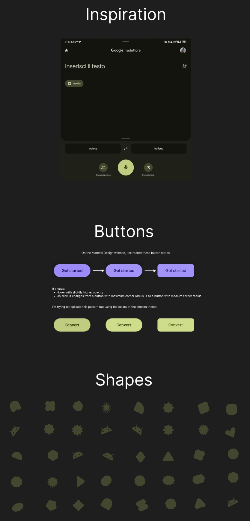
I was inspired by the Google Translate application on my smartphone, I've always liked the style, although "acidic" I find its style unique. I started studying this design current and after getting a general overview from a YouTube video, I dedicated myself to exploring the official website. Here I got all the answers, from the style and stylistic choices to a Figma file with all the main components.
I took from this the various "shapes", that is all the shapes of Material Design 3 and scattered them on the background, adding an emoji depicting Android, also taken from the Material site.
A New Approach: Side Notes
Here's an image of the notes I wrote alongside the project to help me. I had never adopted this approach. Did Salvatore even manage to change my way of using Figma?
Personal Reinterpretation of the Style
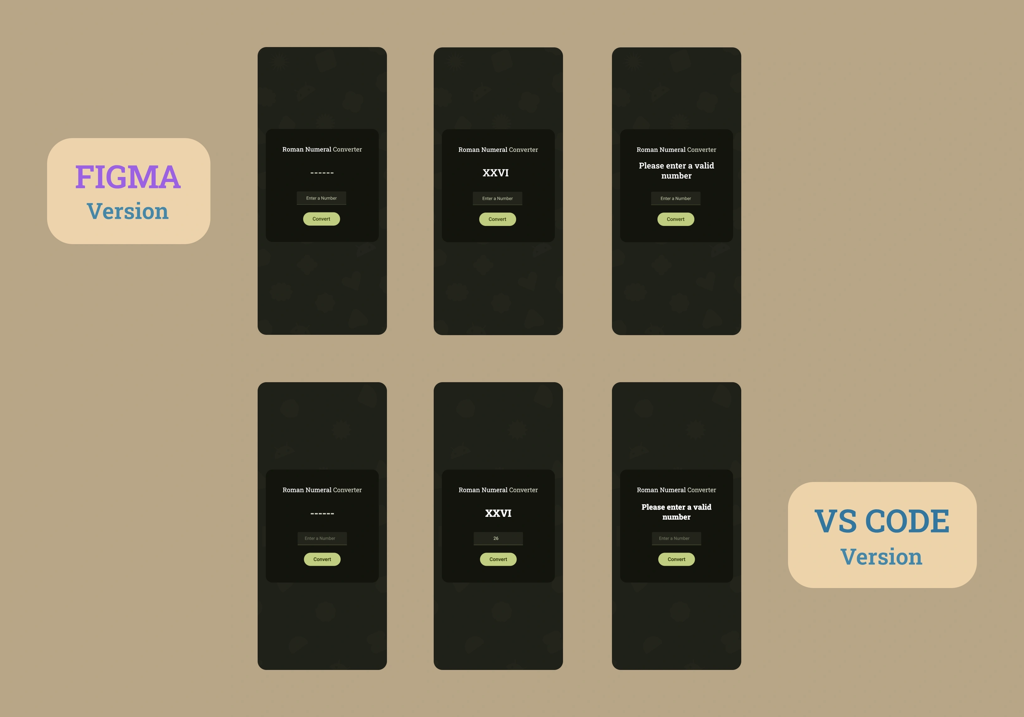
I took the liberty of reinterpreting this style. In fact, for the input box I decided to position the placeholder centered horizontally instead of left-aligned, with a slightly higher opacity than Google would have done and at the same time with a color analogous to the overall theme. I also inserted dashes, precisely 6, which are displayed when opening the application, before getting the output. Google would never have done this, it would have left it empty instead to emphasize that that field would be filled with the call to action by the user (pressing the "Convert" button).
I made all these choices for a mere aesthetic reason, they brought me to the feeling that everything was in the right place.
Typography: Roboto Slab and Roboto
Beyond the style, I also kept the typical consistency pattern that Google dedicates to interactive elements (input, buttons) which must be immediately recognizable. For this reason I opted for the Roboto Slab font for the title and for the output, which had the objective of invoking classic characters, akin to ancient Rome, a sort of "thematic accent". While for input and button the Roboto font that follows modernity, has excellent readability and follows consolidated patterns that the user knows, characteristics central to Google's philosophy.
What I Learned
Advanced CSS Architecture:
- Component-Based Architecture for organization into components (card, title, output, input, button)
- Utility-First Variables with centralization in
:root - Flat Component Hierarchy with ID-based selectors
- Responsive media queries for mobile
Conversion Algorithm:
- Array map with Arabic-Roman pairs
[[1000, "M"], [900, "CM"]...] .reduce()for result accumulation- While loop for iteration on Roman values
- Array destructuring for concise code
Professional Input Validation:
type="number"for native browser validation (C/C++ engine)min/maxattributes for defense in depthe.preventDefault()to block non-numeric characters- Edge case handling: empty values, NaN, invalid ranges
Event Handling:
addEventListener("keydown")for character control- Enter key for alternative submit
.includes()for blocking specific characters (["e", "E", "+", "-"])
Comment Best Practices:
- Design comments for general architecture
- Why comments to explain technical choices
- Trivial comments with cultural insights
- Checklist comments for freeCodeCamp requirements
Material Design 3:
- Shapes and Material components
- Color system with thematic palettes
- Typography hierarchy (Roboto Slab + Roboto)
- Interactive states and transitions
Programming Principles:
- SRP (Single Responsibility Principle)
- DRY (Don't Repeat Yourself)
- Defense in depth approach
- Semantic HTML
Reflection
Salvatore Sanfilippo taught me that comments are not a burden, but an art. Every technical choice has a reason, every discarded alternative has its why. Documenting this process is not wasting time, after all it led me to pass a certification project on the first attempt for the first time.
Next Project: Learn Regular Expressions by Building a Spam Filter