Color Picker App


The Project
A freeCodeCamp Lab exercise focused on States in React, transformed into an opportunity to explore the boundaries between exercise purity and over-engineering. Born as a simple color picker, it mentally evolved into a "Color Harmony Tool" before being deliberately brought back to the essential.
Source Code
- index.jsx
- styles.css
- index.html
/* DESIGN
------
* This file contains the React logic for the Color Picker application
* The architecture focuses on the "Controlled Component" pattern and accessibility logic:
*
* The Logic Layer (Helper Function):
* - I defined a `getContrastColor` function outside the component to keep the math separate
* from the UI
* - It implements the YIQ biological formula (weighing Green > Red > Blue) to determine if
* the text should be black or white based on the background brightness (WCAG compliance)
*
* The Component State (Single Source of Truth):
* - The app uses a single state variable `color` initialized to "#ffffff"
* - This state acts as the absolute truth (meaning there is only one place where data exists,
* preventing conflicts): it drives both the visual background color and the value inside the
* input field
*
* The "Controlled Component" Pattern:
* - Unlike standard HTML inputs, the <input> here does not manage its own state
* - Its value is locked to the React state (`value={color}`)
* - Updates only happen via the `onChange` handler, which captures the user's continuous input
* and updates the Single Source of Truth
*
* The UI Rendering:
* - Dynamic styling is applied via the `style` attribute (inline styles)
* - This was necessary because freeCodeCamp provides a pre-packaged CSS file;
* inline styles have higher specificity, allowing us to override the static background color
* - The hex code is displayed in uppercase for better aesthetics (Presentation Layer),
* while the internal logic keeps it lowercase for browser compatibility (Data Layer)
*/
/* freeCodeCamp instructions:
* 1. You should define and export a ColorPicker component. ✔️
* 2. You should use the useState hook. ✔️
* 3. You should have a #color-picker-container element with a white background. ✔️
* 4. You should have a #color-input element which should be a color input. ✔️
* 5. Your #color-input should be a child of #color-picker-container. ✔️
* 6. When #color-input is changed, #color-picker-container should have its background set to that new value. ✔️
*/
const { useState } = React;
// Logic to change text color based on background shade, in order to respect WCAG contrast
const getContrastColor = (hex) => {
const cleanHex = hex.replace("#", ""); // Remove the hash if present, because having it at the start of the hex code isn't useful for RGB conversion and can cause issues in subsequent calculations
/* Now that we have clean values, we convert the chunks into integers (R, G, B)
I use parseInt specifying base 16 (hexadecimal) otherwise the computer wouldn't understand that "FF" equals 255 */
const r = parseInt(cleanHex.slice(0, 2), 16);
const g = parseInt(cleanHex.slice(2, 4), 16);
const b = parseInt(cleanHex.slice(4, 6), 16);
/* We calculate the perceived brightness (standard YIQ formula)
We don't do a simple average divided by 3 because the human eye is biologically more sensitive to green,
so it carries more weight in the calculation. This is because the human eye evolved in nature (forests, savanna).
We developed a monstrous sensitivity for shades of Green (to distinguish plants, predators in the grass)
and Red/Yellow (ripe fruit, meat). Blue, in nature, is rare (sky, water) and it's not vital to see it "strongly".
For this reason, to fully understand the formula, it's as if the numbers were a pie divided into 1000 slices:
- Green (587 slices out of 1000): Green accounts for 59% of the light you see. If you remove green, the image becomes very dark
- Red (299 slices out of 1000): Red accounts for 30%. It's important, but less than green
- Blue (114 slices out of 1000): Blue accounts for only 11% */
const yiq = ((r * 299) + (g * 587) + (b * 114)) / 1000;
return (yiq >= 128) ? "black" : "white";
}
export const ColorPicker = () => {
const [color, setColor] = useState("#ffffff"); // Initialized to white as strictly required by freeCodeCamp tests
const textColor = getContrastColor(color); // I calculate the text color based on the current state
const handleColorChange = (e) => {
setColor(e.target.value); // I capture the change in the input and update the state from the current #ffffff
};
return (
<div id="color-picker-container" style={{
backgroundColor: color,
color: textColor
}}>
<div style={{
textAlign: "center",
marginBottom: "72px"
}}>
{/* I visualize the HEX by transforming it to uppercase ONLY at render time
In this way the user sees "#FFFFFF", but the underlying data remains "#ffffff" (the only one compatible with the browser) */}
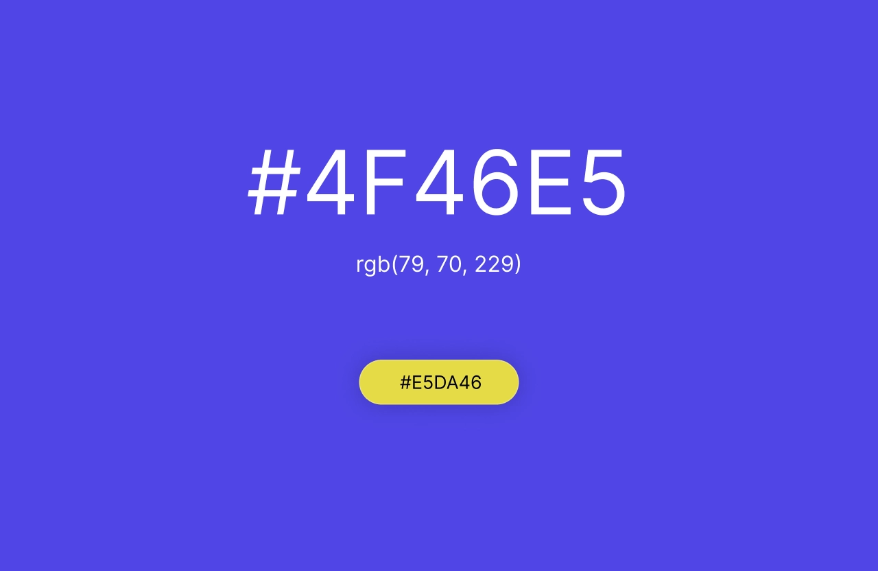
<h1>{color.toUpperCase()}</h1>
</div>
<input
id="color-input"
type="color"
value={color}
onChange={handleColorChange} // We don't use onClick because I discovered that when I want to know what the user wrote/chose, onChange is used, whereas onClick is used only when I want to trigger an immediate command (like in the Toggle Text App)
/>
</div>
);
};
/* DESIGN
   ------
   * File Origin: Pre-packaged styling by freeCodeCamp
   * Role: The "Visual Contract" (Global Constraints)
   *
   * Architectural analysis of the provided styles:
   * I analyzed this file to understand the boundaries within which my React component must live
   *
   * The Layout Strategy (#color-picker-container):
   * - Uses Flexbox (`display: flex`, centered) to ensure the content stays perfectly in the middle of the viewport
   * - Sets a static background (`#ffffff`)
   * - IMPACT ON REACT: This is the critical constraint. Since this file is read-only,
   *   I realized I must use inline styles (`style={{ backgroundColor... }}`) in my JSX
   *   to effectively override this static color with the dynamic state
   *
   * Input Positioning (input[type="color"]):
   * - Uses `position: absolute` with a top margin
   * - This intentionally separates the input control from the text flow, placing it
   *   visually below the hex code display without affecting the Flexbox alignment
*/

body,
html {
    margin: 0;
    padding: 0;
    height: 100%;
    font-family: Arial, sans-serif;
}

#color-picker-container {
    height: 100vh;
    display: flex;
    justify-content: center;
    align-items: center;
    flex-direction: column;
    background-color: #ffffff;
}

input[type="color"] {
    position: absolute;
    margin-top: 50px;
    height: 40px;
}
<!DOCTYPE html>
<html>
<head>

<!-- DESIGN
     ------
     * File Origin: Pre-packaged environment by freeCodeCamp
     * Role: The "Engine Room" (Host Environment)
     *
     * How it works (In-browser Compilation):
     * I realized that this file differs from standard professional workflows (like Vite/Next.js).
     * Usually, we "cook" (compile) the code on our computer before sending it to the browser.
     * Here, the "cooking" happens directly inside the user's browser via Babel.
     *
     * The Ingredients (CDNs):
     * Instead of installing React via terminal (npm install), this file pulls React (the logic)
     * and ReactDOM (the rendering) directly from the internet via <script> tags.
     * It's like streaming a movie instead of downloading it.
     *
     * The Live Translator (Babel Standalone):
     * Browsers don't understand React/JSX natively. This file loads "Babel", a tool that acts
     * as a simultaneous interpreter. It reads the code inside "index.jsx", translates it
     * instantly into standard JavaScript, and executes it.
     *
     * The Canvas (#root):
     * The <body> is intentionally empty except for a single <div id="root">.
     * This is the "mounting point" where React will paint the entire Color Picker application.
     *
     * The Spark (Bootstrapping):
     * The script at the very bottom connects the dots.
     * - It uses `type="text/babel"` and `data-type="module"` to enable modern JavaScript features (ES6 Imports).
     * - It grabs the 'root' div and tells React: "Import the { ColorPicker } from our file and draw it here".
-->

    <meta charset="UTF-8" />
    <title>Color Picker</title>
    <link rel="stylesheet" href="styles.css" />
    <script src="https://cdnjs.cloudflare.com/ajax/libs/react/18.3.1/umd/react.development.min.js"></script>
    <script src="https://cdnjs.cloudflare.com/ajax/libs/react-dom/18.3.1/umd/react-dom.development.min.js"></script>
    <script src="https://cdnjs.cloudflare.com/ajax/libs/babel-standalone/7.26.5/babel.min.js"></script>
    <script
      data-plugins="transform-modules-umd"
      type="text/babel"
      src="index.jsx"
    ></script>
</head>

<body>
    <div id="root"></div>
    <script
      data-plugins="transform-modules-umd"
      type="text/babel"
      data-presets="react"
      data-type="module"
    >
      import { ColorPicker } from './index.jsx';
      ReactDOM.createRoot(document.getElementById('root')).render(<ColorPicker />);
    </script>
</body>

</html>
The 70% Rule: When the Superpower Becomes an Obstacle
After writing Center's README, I focused on continuing the React path. It was at that moment that the 70% rule saved me from the over-engineering I was falling into.
The freeCodeCamp exercise simply asked to:
- Leave
index.htmlandstyles.cssunchanged - Modify
index.jsxto implement a state that controlled the background color
But I started imagining something else.
The Idea That Never Became Reality
I wanted to build a tool to derive the exact complementary of a color. Not a simple opposite calculated with hex inversion (the one you do with a programmer's calculator), but a complementary that preserved brightness and saturation.
I had learned that procedure a few months ago, but it was an end in itself: by inverting the hex values, brightness and saturation were also inverted, making the result unusable.
With the help of Code Tutor, we imagined an algorithm that followed this path:
HEX → RGB → HSL → RGB → HEX
To make an analogy, with the RGB method (Subtraction) it would have been like saying: "Take your current GPS coordinates and invert them." You risk ending up in the middle of the ocean or underground.
While with the HSL method it would have been "Turn around 180 degrees." You're at the same point, but looking in the opposite direction.
The formula therefore was:
H' = (H + 180) % 360
Where H is the hue of the color (an angle from 0° to 360° on the color wheel):
- 0° = Red
- 120° = Green
- 240° = Blue
Examples:
- Red (H = 0°): 0 + 180 = 180° → Cyan (perfect complementary)
- Blue (H = 200°): 200 + 180 = 380° → 380 % 360 = 20° → Orange
The Mockup That Never Saw The Light
I imagined an interface with:
- Main Background: The color chosen by the user
- Central Text: The HEX code (black or white based on YIQ contrast)
- Badge/Button: Colored with the Calculated Complementary I took a few minutes to prototype the screen in Figma. Clicking on the single button would change the background color, and the complementary hex would appear.
The UX paradox that blocked me: I had two possible scenarios, both with cognitive friction:
-
Scenario A (Button → Background): I click the button, but the HEX value appears on the background as an
<h1>title, not on the button itself. The user clicks on an element but the visual feedback appears elsewhere. There was a spatial disconnect between action and result. -
Scenario B (Button → Button): The button shows its own complementary HEX. Logical from a color perspective (I see the result of the HSL algorithm), but confusing from an interaction perspective: "I clicked to change the background, why is the button telling me its color instead of the one I chose?"
Both violated the principle of clear affordance: the user wouldn't have immediately understood what they were setting. I should have done usability tests to validate which pattern generated less friction, or simply reflected on it, but...
I was moving away from the exercise's focus: autonomously applying States in React. A vision like that works great in projects like Center or Mosaic, but here it would have taken time writing HSL JavaScript logic that wasn't the focus of the current React learning path.
I found great pleasure in immersing myself in index.jsx trying to guarantee a minimum of UX and WCAG accessibility, while respecting the exercise's constraints.
Key improvements:
-
Permanent HEX Display
In the freeCodeCamp example, to know the background's hex code you had to open the color picker. I added an<h1>that always shows the current value in uppercase. -
Dynamic WCAG Contrast
I implemented the YIQ formula to automatically calculate whether the text should be black or white based on the background's brightness. A critical shortcoming of the original example: the "Choose a color..." label was black, therefore illegible on dark backgrounds. -
"Controlled Component" Architecture
The input doesn't manage its own state internally. Itsvalueis bound to the React state (value={color}), and updates happen only throughonChange, which captures the user's continuous input.
The YIQ Formula: Why Our Eyes Prefer Green
In the code I extensively commented on the formula:
yiq = ((r * 299) + (g * 587) + (b * 114)) / 1000
Why these weights? The human eye is biologically more sensitive to green. We evolved in nature (forests, savanna), developing monstrous sensitivity for:
- Green (587/1000 = 59%): Distinguishing plants, predators in the grass
- Red (299/1000 = 30%): Ripe fruit, meat
- Blue (114/1000 = 11%): In nature it's rare (sky, water), not vital to see it "strongly"
In fact, if we remove green from an image, it becomes very dark. This is why green dominates the perceived brightness calculation.
onClick vs onChange: A Fundamental Discovery
In the comments I documented a very important distinction I learned:
| Event | When to use it? | Typical elements | What do we care about? |
|---|---|---|---|
onClick | I want to launch an immediate command | <button>, <a>, <div> | The action itself ("Do it now!") |
onChange | I want to know what the user wrote/chose | <input>, <textarea>, <select> | The Data (e.target.value) |
This is why I used onChange on the color input: I don't care about the click action, but the value that the user is selecting in real time.
What I Learned
Controlled Component Pattern:
The input doesn't manage its own state. Its value is bound to the React state (value={color}), updates happen only through onChange. This is "Single Source of Truth": there exists only one point where the data lives, preventing conflicts.
Inline Styles by Necessity (Specificity Warfare):
The freeCodeCamp CSS enforces static background-color: #ffffff. Since the file is read-only, I used style={{ backgroundColor: color }} to obtain the necessary specificity to override it dynamically. Inline styles (1,0,0,0) beat classes (0,0,1,0).
In CSS there exists a power hierarchy called specificity. Whoever has the highest score wins:
| Method | Specificity | Example |
|---|---|---|
| Inline style | 1,0,0,0 | <div style="color: red"> |
| ID | 0,1,0,0 | #myId { color: blue } |
| Class | 0,0,1,0 | .myClass { color: green } |
| Tag | 0,0,0,1 | div { color: yellow } |
Separation Presentation Layer / Data Layer:
I display the HEX in uppercase (color.toUpperCase()) only at render for aesthetics, but the internal state remains lowercase (#ffffff) for browser compatibility. The "true" data is separated from its visual representation.
WCAG Is Not Optional:
Even in a 30-line exercise, guaranteeing 4.5:1 contrast is the responsibility of a UX Engineer. The YIQ formula is a pattern I will bring to every future project.
The 70% Rule Works:
Knowing how to say "no" to fancy features (complete Color Harmony Tool) when the goal is to master React States, not build a complex product.
Next: Consolidate useEffect, useRef and Custom Hooks, to then apply everything in the Fruit Search App where I will learn to understand Effects, reference values through Refs and create reusable Hooks.
P.S. Center's Legacy
From now on, in index.html files, I will position documentation comments inside the <head> tag, right after the <!DOCTYPE html>.
This choice stems from the experience with Center. Being software for a real company, I felt the responsibility to deliver a "bulletproof" product and investigated deeply into rendering stability.
I discovered that any content (even a comment) positioned before the DOCTYPE risks triggering Quirks Mode, forcing the browser to emulate obsolete behaviors and potentially breaking the CSS layout.
Even though modern browsers often tolerate this practice, I prefer not to rely on chance. It's a zero-cost precaution that guarantees total rendering stability.