Refactoring UI
Il Progetto
Un caso studio pratico sul libro Refactoring UI di Adam Wathan e Steve Schoger: ogni componente è costruito traducendo direttamente un principio del libro in codice.
Nessun framework, nessun build step, tre semplici file: index.html, styles.css, script.js.
Codice Sorgente
- index.html
- styles.css
- script.js
<!DOCTYPE html>
<html lang="en">
<head>
<meta charset="UTF-8">
<meta name="viewport" content="width=device-width, initial-scale=1.0">
<title>Refactoring UI Study | UX Engineer Log</title>
<link rel="preconnect" href="https://fonts.googleapis.com">
<link rel="preconnect" href="https://fonts.gstatic.com" crossorigin>
<link rel="stylesheet" href="https://fonts.googleapis.com/css2?family=Ubuntu:wght@400;500;700&display=swap">
<link rel="stylesheet" href="styles.css">
</head>
<body>
<!--
DESIGN
------
* This is a single-page component showcase built to explore and apply the concepts
* learned from Refactoring UI (Adam Wathan and Steve Schoger).
* It has no build step, just three plain files: this one, styles.css, and script.js
* The architecture follows a strict separation of concerns:
* - index.html (this file) contains only the structure and content
* - styles.css handles every visual rule, token, and state
* - script.js implements the copy-to-clipboard behavior and checkmark animation
*
* SVG SPRITE PATTERN (<symbol id="icon-copy">):
* - A "sprite" acts as a hidden catalog of reusable graphics.
* Here, I define the copy icon's path only once at the top of the <body>,
* inside a visually hidden <svg> definition
* - Maintainability and performance: All 16 copy buttons reference this single
* definition via <use href="#icon-copy">. This keeps the DOM clean and
* creates a Single Source of Truth. If the icon design changes, I only
* need to update that one hidden symbol
* - Coordinate space stability: The outer <svg> wrapper on each button strictly
* enforces viewBox="0 0 26 26". This guarantees a stable drawing canvas,
* ensuring the icon never warps or shifts, even when JavaScript dynamically
* swaps the SVG content (from the copy icon to the success checkmark)
*
* ACCESSIBILITY:
* - Hidden labels: Every input has a <label for="..."> with class="sr-only".
* While sighted users understand the input's purpose from the visual layout,
* screen readers need real text. The 'for' attribute links the label to the
* input so blind users know exactly what the field is for
* - Semantic grouping: The radio buttons are wrapped in a <fieldset> with a
* hidden <legend>. Without this, a screen reader would just announce the
* options without explaining the main topic. The <legend> acts as a title
* for the group, telling the user exactly what choice they are making
* - Decorative elements: SVGs used only for visual appeal carry aria-hidden="true".
* Without this, screen readers might announce meaningless "image" or "graphic"
* labels. This attribute hides the icon from the accessibility tree, eliminating
* audio clutter and keeping the focus on the actual text or action
* - Contextual actions: Every copy button has a unique aria-label (e.g.
* "Copy primary button color"). If we just used "Copy" for all 16 buttons,
* a blind user tabbing through the page wouldn't know what they are copying
*
* PAGE STRUCTURE:
* 0. STYLESHEET: components.css preview and one-click copy
* 1. BUTTON: Primary, Secondary, Tertiary
* 2. INPUT: Alone, With Checkbox
* 3. RADIO BUTTON
* 4. CARD: 5 shadow levels
* 5. ICON: Original (128px), Simplified (128px), Shrunk (16px in frame)
* 6. EMPTY STATE
-->
<!--
Shared SVG sprite:
Defines the copy icon paths once to keep the DOM clean. All copy buttons
reference it dynamically via <use href="#icon-copy">. While 'display: none'
removes it from the visual layout, 'aria-hidden="true"' acts as a defensive
fallback to ensure screen readers never announce it
-->
<svg aria-hidden="true" style="display:none">
<defs>
<symbol id="icon-copy" viewBox="0 0 26 26" fill="none">
<path d="M22.6 8.20001H10.6C9.2745 8.20001 8.19998 9.27453 8.19998 10.6V22.6C8.19998 23.9255 9.2745 25 10.6 25H22.6C23.9255 25 25 23.9255 25 22.6V10.6C25 9.27453 23.9255 8.20001 22.6 8.20001Z"
stroke="var(--copy-icon-stroke)" stroke-width="2" stroke-linecap="round" stroke-linejoin="round"/>
<path d="M3.4 17.8C2.08 17.8 1 16.72 1 15.4V3.4C1 2.08 2.08 1 3.4 1H15.4C16.72 1 17.8 2.08 17.8 3.4"
stroke="var(--copy-icon-stroke)" stroke-width="2" stroke-linecap="round" stroke-linejoin="round"/>
</symbol>
</defs>
</svg>
<main class="main-container">
<!-- STYLESHEET PREVIEW -->
<section class="flex-col items-start" style="gap: var(--space-15); width: var(--container-width);">
<div class="flex-col items-start" style="gap: var(--space-3);">
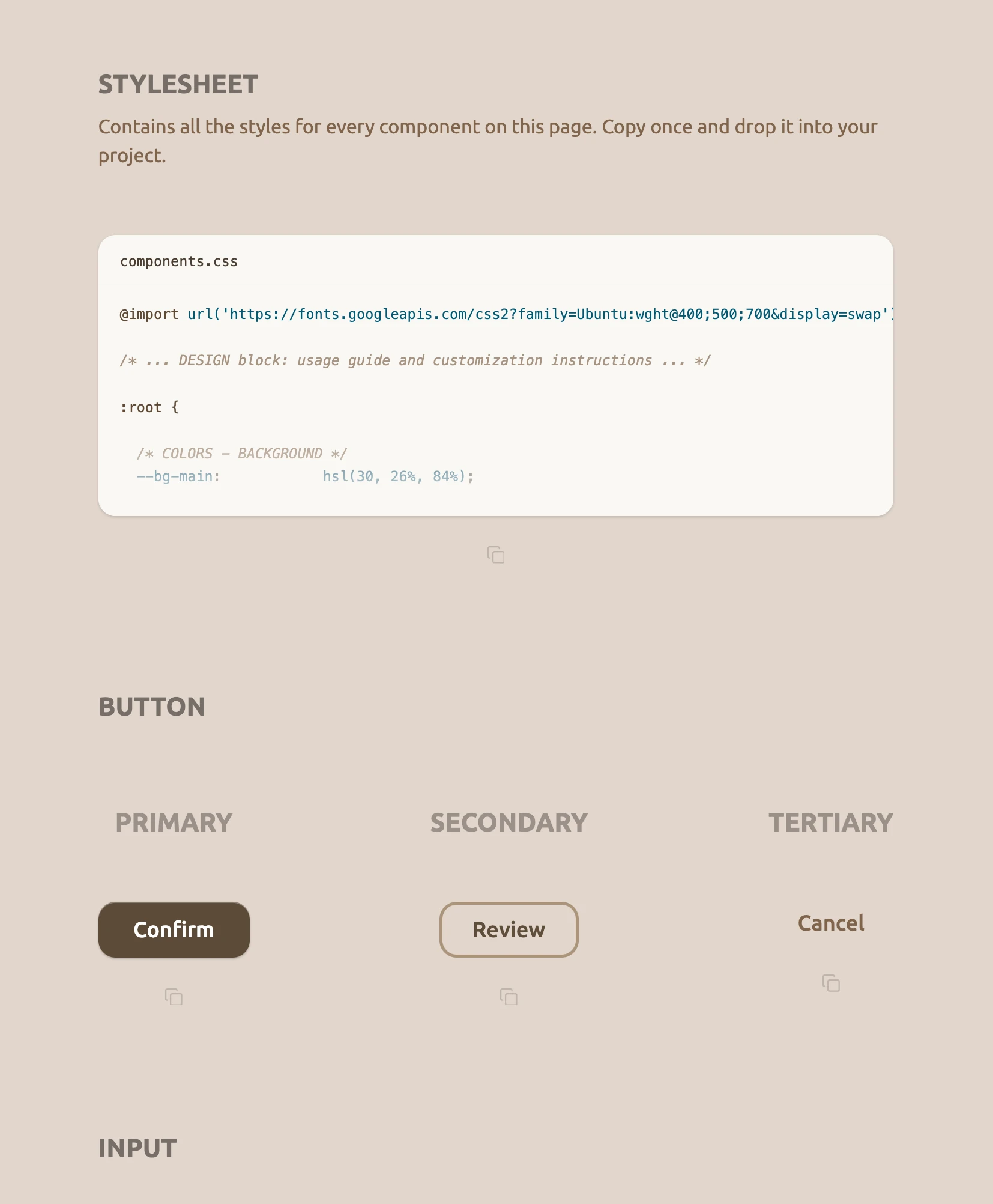
<h2 class="section-title">STYLESHEET</h2>
<p class="stylesheet-desc">Contains all the styles for every component on this page. Copy once and drop it into your project.</p>
</div>
<div class="flex-col items-center" style="gap: var(--space-7); width: 100%;">
<div class="css-preview">
<div class="css-preview-header">
<span class="css-preview-filename">components.css</span>
</div>
<pre class="css-preview-code"><span class="syntax-keyword">@import</span> <span class="syntax-token">url('https://fonts.googleapis.com/css2?family=Ubuntu:wght@400;500;700&display=swap')</span>;
<span class="syntax-comment">/* ... DESIGN block: usage guide and customization instructions ... */</span>
<span class="syntax-keyword">:root</span> {
<span class="syntax-comment">/* COLORS - BACKGROUND */</span>
<span class="syntax-token">--bg-main</span>: <span class="syntax-token">hsl(30, 26%, 84%)</span>;
<span class="syntax-comment">/* COLORS - PRIMARY ACTION */</span>
<span class="syntax-token">--primary-bg</span>: <span class="syntax-token">hsl(32, 25%, 29%)</span>;
<span class="syntax-token">--primary-text</span>: <span class="syntax-token">hsl(0, 0%, 100%)</span>;</pre>
<div class="css-preview-fade"></div>
</div>
<!--
JS hook: Instead of relying on fragile CSS classes, 'data-component' acts as a
robust bridge. It passes the exact object key (e.g., "css", "btn-primary")
to our script, allowing a single JavaScript function to handle all 16 buttons
-->
<button class="btn-copy" aria-label="Copy stylesheet" data-component="css">
<svg width="16" height="16" viewBox="0 0 26 26" fill="none" aria-hidden="true"><use href="#icon-copy"/></svg>
</button>
</div>
</section>
<!-- SECTION 1: BUTTONS -->
<section class="flex-col items-start" style="gap: var(--space-20); width: var(--container-width);">
<h2 class="section-title">BUTTON</h2>
<div class="flex-row items-start justify-between components-row" style="width: 100%;">
<!-- Primary -->
<div class="flex-col items-center" style="gap: var(--space-15);">
<h3 class="component-label">PRIMARY</h3>
<div class="flex-col items-center" style="gap: var(--space-7);">
<button class="btn-primary">Confirm</button>
<button class="btn-copy" aria-label="Copy primary button" data-component="btn-primary">
<svg width="16" height="16" viewBox="0 0 26 26" fill="none" aria-hidden="true"><use href="#icon-copy"/></svg>
</button>
</div>
</div>
<!-- Secondary -->
<div class="flex-col items-center" style="gap: var(--space-15);">
<h3 class="component-label">SECONDARY</h3>
<div class="flex-col items-center" style="gap: var(--space-7);">
<button class="btn-secondary">Review</button>
<button class="btn-copy" aria-label="Copy secondary button" data-component="btn-secondary">
<svg width="16" height="16" viewBox="0 0 26 26" fill="none" aria-hidden="true"><use href="#icon-copy"/></svg>
</button>
</div>
</div>
<!-- Tertiary -->
<div class="flex-col items-center" style="gap: var(--space-15);">
<h3 class="component-label">TERTIARY</h3>
<div class="flex-col items-center" style="gap: var(--space-7);">
<button class="btn-tertiary">Cancel</button>
<button class="btn-copy" aria-label="Copy tertiary button" data-component="btn-tertiary">
<svg width="16" height="16" viewBox="0 0 26 26" fill="none" aria-hidden="true"><use href="#icon-copy"/></svg>
</button>
</div>
</div>
</div>
</section>
<!-- SECTION 2: INPUT -->
<section class="flex-col items-start" style="gap: var(--space-20); width: var(--container-width);">
<h2 class="section-title">INPUT</h2>
<div class="flex-row items-start justify-between components-row" style="width: 100%;">
<!-- Alone -->
<div class="flex-col items-center" style="gap: var(--space-15);">
<h3 class="component-label">ALONE</h3>
<div class="flex-col items-center" style="gap: var(--space-7);">
<label for="input-alone" class="sr-only">Details</label>
<input type="text" id="input-alone" class="input-alone" placeholder="Add optional details...">
<button class="btn-copy" aria-label="Copy input" data-component="input">
<svg width="16" height="16" viewBox="0 0 26 26" fill="none" aria-hidden="true"><use href="#icon-copy"/></svg>
</button>
</div>
</div>
<!-- With Checkbox -->
<div class="flex-col items-center" style="gap: var(--space-15);">
<h3 class="component-label">WITH CHECKBOX</h3>
<div class="flex-col items-center" style="gap: var(--space-7);">
<div class="flex-col items-start" style="gap: var(--space-3);">
<label for="input-with-cbx" class="sr-only">Details</label>
<input type="text" id="input-with-cbx" class="input-alone" placeholder="Add optional details...">
<label class="flex-row items-center" style="gap: var(--space-3); cursor: pointer;">
<input type="checkbox" class="cbx-custom sr-only">
<div class="cbx-box"></div>
<span class="cbx-label">I understand this will submit</span>
</label>
</div>
<button class="btn-copy" aria-label="Copy input with checkbox" data-component="input-checkbox">
<svg width="16" height="16" viewBox="0 0 26 26" fill="none" aria-hidden="true"><use href="#icon-copy"/></svg>
</button>
</div>
</div>
</div>
</section>
<!-- SECTION 3: RADIO BUTTON -->
<section class="flex-col items-start section-content" style="gap: var(--space-15);">
<h2 class="section-title">RADIO BUTTON</h2>
<div class="flex-col items-center" style="gap: var(--space-7);">
<fieldset>
<legend class="sr-only">Sync options</legend>
<div class="flex-col justify-center items-start" style="gap: var(--space-3);">
<!-- Radio 1 -->
<label class="flex-row items-center" style="gap: var(--space-3); cursor: pointer;">
<input type="radio" name="sync" class="native-radio sr-only" checked>
<svg class="custom-radio-svg" xmlns="http://www.w3.org/2000/svg" width="24" height="24"
viewBox="0 0 40 40" fill="none" aria-hidden="true">
<circle cx="20" cy="20" r="18" stroke="var(--radio-stroke)" stroke-width="4" />
<circle cx="20" cy="20" r="12" fill="var(--radio-stroke)" class="radio-dot" />
</svg>
<span class="radio-label-text">Sync automatically</span>
</label>
<!-- Radio 2 -->
<label class="flex-row items-center" style="gap: var(--space-3); cursor: pointer;">
<input type="radio" name="sync" class="native-radio sr-only">
<svg class="custom-radio-svg" xmlns="http://www.w3.org/2000/svg" width="24" height="24"
viewBox="0 0 40 40" fill="none" aria-hidden="true">
<circle cx="20" cy="20" r="18" stroke="var(--radio-stroke)" stroke-width="4" />
<circle cx="20" cy="20" r="12" fill="var(--radio-stroke)" class="radio-dot" />
</svg>
<span class="radio-label-text">Manual sync only</span>
</label>
</div>
</fieldset>
<button class="btn-copy" aria-label="Copy radio buttons" data-component="radio">
<svg width="16" height="16" viewBox="0 0 26 26" fill="none" aria-hidden="true"><use href="#icon-copy"/></svg>
</button>
</div>
</section>
<!-- SECTION 4: CARD -->
<section class="flex-col items-start section-content" style="gap: var(--space-15);">
<h2 class="section-title">CARD</h2>
<div class="flex-col items-start cards-outer" style="gap: var(--space-10);">
<!-- Row 1 -->
<div class="flex-row items-start cards-row-1" style="gap: var(--space-8);">
<!-- Card 1 -->
<div class="flex-col items-center" style="gap: var(--space-7);">
<h3 class="component-label">1</h3>
<div class="flex-col items-center" style="gap: var(--space-7);">
<div class="card card-1" aria-hidden="true"></div>
<button class="btn-copy" aria-label="Copy card level 1" data-component="card-1">
<svg width="16" height="16" viewBox="0 0 26 26" fill="none" aria-hidden="true"><use href="#icon-copy"/></svg>
</button>
</div>
</div>
<!-- Card 2 -->
<div class="flex-col items-center" style="gap: var(--space-7);">
<h3 class="component-label">2</h3>
<div class="flex-col items-center" style="gap: var(--space-7);">
<div class="card card-2" aria-hidden="true"></div>
<button class="btn-copy" aria-label="Copy card level 2" data-component="card-2">
<svg width="16" height="16" viewBox="0 0 26 26" fill="none" aria-hidden="true"><use href="#icon-copy"/></svg>
</button>
</div>
</div>
<!-- Card 3 -->
<div class="flex-col items-center" style="gap: var(--space-7);">
<h3 class="component-label">3</h3>
<div class="flex-col items-center" style="gap: var(--space-7);">
<div class="card card-3" aria-hidden="true"></div>
<button class="btn-copy" aria-label="Copy card level 3" data-component="card-3">
<svg width="16" height="16" viewBox="0 0 26 26" fill="none" aria-hidden="true"><use href="#icon-copy"/></svg>
</button>
</div>
</div>
</div>
<!-- Row 2 -->
<div class="cards-row-center" style="gap: var(--space-8);">
<!-- Card 4 -->
<div class="flex-col items-center" style="gap: var(--space-7);">
<h3 class="component-label">4</h3>
<div class="flex-col items-center" style="gap: var(--space-7);">
<div class="card card-4" aria-hidden="true"></div>
<button class="btn-copy" aria-label="Copy card level 4" data-component="card-4">
<svg width="16" height="16" viewBox="0 0 26 26" fill="none" aria-hidden="true"><use href="#icon-copy"/></svg>
</button>
</div>
</div>
<!-- Card 5 -->
<div class="flex-col items-center" style="gap: var(--space-7);">
<h3 class="component-label">5</h3>
<div class="flex-col items-center" style="gap: var(--space-7);">
<div class="card card-5" aria-hidden="true"></div>
<button class="btn-copy" aria-label="Copy card level 5" data-component="card-5">
<svg width="16" height="16" viewBox="0 0 26 26" fill="none" aria-hidden="true"><use href="#icon-copy"/></svg>
</button>
</div>
</div>
</div>
</div>
</section>
<!-- SECTION 5: ICON -->
<section class="flex-col items-start" style="gap: var(--space-20); width: var(--container-width);">
<h2 class="section-title">ICON</h2>
<div class="flex-row items-start justify-between components-row" style="width: 100%;">
<!-- Original -->
<div class="flex-col items-center" style="gap: var(--space-15);">
<h3 class="component-label">ORIGINAL</h3>
<span class="sr-only">Shows the base icon design at 128 pixels with thin strokes, meant for large display.</span>
<div class="flex-col items-center" style="gap: var(--space-7);">
<svg xmlns="http://www.w3.org/2000/svg" width="128" height="128" viewBox="0 0 128 128"
fill="none" aria-hidden="true">
<rect width="128" height="128" rx="20" fill="url(#paint0_linear_40_145)" />
<path d="M77.0004 83.5006L96.5011 63.9999L77.0004 44.4993" stroke="#FFF9F2" stroke-width="8"
stroke-linecap="round" stroke-linejoin="round" />
<path d="M50.9996 44.4993L31.4989 63.9999L50.9996 83.5006" stroke="#FFF9F2" stroke-width="8"
stroke-linecap="round" stroke-linejoin="round" />
<defs>
<linearGradient id="paint0_linear_40_145" x1="64" y1="128" x2="64" y2="0"
gradientUnits="userSpaceOnUse">
<stop stop-color="#7A6249" />
<stop offset="1" stop-color="#C29A6F" />
</linearGradient>
</defs>
</svg>
<button class="btn-copy" aria-label="Copy original icon" data-component="icon-original">
<svg width="16" height="16" viewBox="0 0 26 26" fill="none" aria-hidden="true"><use href="#icon-copy"/></svg>
</button>
</div>
</div>
<!-- Simplified -->
<div class="flex-col items-center" style="gap: var(--space-15);">
<h3 class="component-label">SIMPLIFIED</h3>
<span class="sr-only">Shows the icon at 128 pixels but intentionally simplified with thicker internal lines to prepare for downscaling.</span>
<div class="flex-col items-center" style="gap: var(--space-7);">
<svg xmlns="http://www.w3.org/2000/svg" width="128" height="128" viewBox="0 0 128 128"
fill="none" aria-hidden="true">
<rect width="128" height="128" rx="20" fill="url(#paint0_linear_40_155)" />
<path d="M80.9159 89.3738L106.29 64L80.9159 38.6262" stroke="#FFF9F2" stroke-width="14"
stroke-linecap="round" stroke-linejoin="round" />
<path d="M47.0841 38.6262L21.7103 64L47.0841 89.3738" stroke="#FFF9F2" stroke-width="14"
stroke-linecap="round" stroke-linejoin="round" />
<defs>
<linearGradient id="paint0_linear_40_155" x1="64" y1="128" x2="64" y2="0"
gradientUnits="userSpaceOnUse">
<stop stop-color="#7A6249" />
<stop offset="1" stop-color="#C29A6F" />
</linearGradient>
</defs>
</svg>
<button class="btn-copy" aria-label="Copy simplified icon" data-component="icon-simplified">
<svg width="16" height="16" viewBox="0 0 26 26" fill="none" aria-hidden="true"><use href="#icon-copy"/></svg>
</button>
</div>
</div>
<!-- Shrunk -->
<div class="flex-col items-center" style="gap: var(--space-15);">
<h3 class="component-label">SHRUNK</h3>
<span class="sr-only">Shows the simplified icon scaled down to 16 pixels for a favicon. The thicker lines ensure it remains perfectly legible at this tiny size.</span>
<div class="flex-col items-center" style="gap: var(--space-7);">
<div class="icon-frame">
<svg xmlns="http://www.w3.org/2000/svg" width="16" height="16" viewBox="0 0 16 16"
fill="none" aria-hidden="true">
<rect width="16" height="16" rx="2.5" fill="url(#paint0_linear_40_165)" />
<path d="M10.1145 11.1718L13.2862 8.0001L10.1145 4.82837" stroke="#FFF9F2"
stroke-width="1.75" stroke-linecap="round" stroke-linejoin="round" />
<path d="M5.88553 4.82837L2.71381 8.0001L5.88553 11.1718" stroke="#FFF9F2"
stroke-width="1.75" stroke-linecap="round" stroke-linejoin="round" />
<defs>
<linearGradient id="paint0_linear_40_165" x1="8" y1="16" x2="8" y2="0"
gradientUnits="userSpaceOnUse">
<stop stop-color="#7A6249" />
<stop offset="1" stop-color="#C29A6F" />
</linearGradient>
</defs>
</svg>
</div>
<button class="btn-copy" aria-label="Copy shrunk icon" data-component="icon-shrunk">
<svg width="16" height="16" viewBox="0 0 26 26" fill="none" aria-hidden="true"><use href="#icon-copy"/></svg>
</button>
</div>
</div>
</div>
</section>
<!-- SECTION 6: EMPTY STATE -->
<section class="flex-col items-start section-content" style="gap: var(--space-15);">
<h2 class="section-title">EMPTY STATE</h2>
<div class="flex-col items-center" style="gap: var(--space-7);">
<div class="flex-col items-start" style="gap: var(--space-11);">
<div class="flex-col items-start" style="gap: var(--space-3);">
<h3 class="title-empty">Ready when you are</h3>
<p class="subtitle-empty">Everything you create will show up here.</p>
</div>
<button class="btn-primary">New item</button>
</div>
<button class="btn-copy" aria-label="Copy empty state" data-component="empty-state">
<svg width="16" height="16" viewBox="0 0 26 26" fill="none" aria-hidden="true"><use href="#icon-copy"/></svg>
</button>
</div>
</section>
</main>
<!--
Dynamic audio feedback:
- The problem: When JavaScript injects a success message ("Copied!") into the DOM,
screen readers ignore it unless the element receives focus. A "live region"
forces the software to monitor this <div> and announce any text changes
- Polite vs. assertive: 'aria-live="polite"' tells the screen reader to finish
its current sentence before speaking. It gracefully respects the user's flow
- Why not assertive? 'aria-live="assertive"' violently interrupts and cuts off
the current audio. It should be strictly reserved for critical errors or
time-sensitive warnings (e.g. "Session expired"), never for simple success states
-->
<div id="copy-status" aria-live="polite" class="sr-only"></div>
<script src="script.js"></script>
</body>
</html>
/* DESIGN
   ------
   * This stylesheet is the single source of truth for a Refactoring UI case study
   * (Adam Wathan and Steve Schoger). Built as a design system reference: every value
   * is intentional, documented, and traceable back to a core principle from the book.
   * Full case study at simoneamico.com.
   *
   * Philosophy:
   * - Context-driven approach (Desktop-first): Back when I built the Telephone Number Validator,
   *   I strictly followed the "mobile-first" dogma, but I wrote a note questioning it: shouldn't
   *   we build for the primary device our users actually use? This project is the materialization
   *   of that insight. Since this showcase is a UI study built as a functional developer tool
   *   for side-by-side comparisons, the audience will view it on desktop screens. Therefore,
   *   I consciously built it desktop-first. Mobile is handled gracefully as a fallback, proving
   *   that "audience-first" takes precedence over rigid rules
   * - Token-driven architecture: I chose CSS custom properties for every value so the
   *   system is trivially themeable. Changing one token propagates everywhere, eliminating
   *   the need to manually update hardcoded values across the file
   * - Tinted grays: I deliberately avoided pure, neutral grays (0% saturation).
   *   Instead, every "gray" carries a hue of 31° to harmonize with the warm background (30°).
   *   This prevents neutral elements from feeling disconnected, ensuring they blend naturally
   *   into the surrounding color palette
   * - Light-based elevation: The shadow system uses two layers for each component.
   *   The first shadow is small and dark, like a direct light shining from above.
   *   The second shadow is large and blurred, like natural light spreading in a room.
   *   To create a realistic sense of height, the vertical shadow distance (y-offset)
   *   doubles at each new elevation level
   * - Physical interactive states: UI components behave like real physical objects.
   *   For example, buttons visibly press down into the page when clicked (:active state).
   *   Inputs look like holes cut into the page, and when you click them (focus), they
   *   look even deeper inside, rather than just adding a colored ring around the border
   * - Asymmetric transitions: I used a timing trick to make clicking feel fast and
   *   responsive. When you press a button, it goes down almost instantly (60ms).
   *   But when you release the mouse, it comes back up a bit slower (160ms).
   *   This difference in speed feels much more natural than a uniform animation
   *
   * Stylesheet order:
   *    1. UNIVERSAL (Design Tokens)    — the single source of truth for every value
   *    2. BASE & RESET                 — body, fieldset
   *    3. FLEX UTILITIES               — reusable layout helpers
   *    4. PAGE LAYOUT                  — main container
   *    5. TYPOGRAPHY                   — section titles, component labels
   *    6. STYLESHEET PREVIEW           — css preview block, description text
   *    7. COMPONENT: BUTTONS           — primary, secondary, tertiary, copy
   *    8. COMPONENT: INPUTS            — text input, checkbox, radio
   *    9. COMPONENT: ICON FRAME        — ghost container for size normalization
   *   10. COMPONENT: CARDS             — five shadow elevation levels
   *   11. COMPONENT: EMPTY STATE       — title, subtitle
   *   12. INTERACTIVE STATES           — hover, active, focus-visible
   *   13. RESPONSIVE                   — mobile breakpoint, landscape, carousel
   *   14. MOTION PREFERENCE            — respects prefers-reduced-motion
*/


/* UNIVERSAL (Design Tokens) */

:root {

  /* COLORS - BACKGROUND */
  --bg-main:            hsl(30, 26%, 84%);          /* Warm sand — the page canvas */

  /* COLORS - TEXT */
  --text-title:         hsla(31, 12%, 14%, 0.60);   /* Section headings — warm hue, 60% opacity */
  --text-label:         hsla(31, 12%, 14%, 0.40);   /* Component labels */

  /* COLORS - PRIMARY */
  --primary-bg:         hsl(32, 25%, 29%);          /* Dark warm brown — main action color */
  --primary-text:       hsl(0, 0%, 100%);           /* White text on primary */

  /* COLORS - SECONDARY */
  --secondary-border:   hsla(31, 26%, 46%, 0.70);   /* Warm mid-brown border at 70% */
  --secondary-text:     hsl(31, 25%, 30%);          /* Secondary labels and strokes */

  /* COLORS - TERTIARY */
  --tertiary-text:      hsl(30, 26%, 40%);          /* Subtle text button color */

  /* COLORS - INPUTS */
  --input-bg:           hsl(30, 26%, 78%);          /* Cavity effect background */
  --input-shadow-color: hsl(30, 75%, 91%);          /* Bottom-edge highlight (simulates upward light reflection) */
  --input-placeholder:  hsla(31, 25%, 30%, 0.55);   /* Muted placeholder — 55% opacity of secondary-text */

  /* COLORS - FORM LABELS */
  --form-label:         hsl(31, 22%, 24%);          /* Unified token: input text, checkbox label, radio label */
  --radio-stroke:       var(--secondary-text);        /* Single source of truth — references secondary-text */

  /* COLORS - CARDS */
  --card-bg:            hsl(36, 31%, 97%);          /* Near-white warm card surface */

  /* COLORS - EMPTY STATE */
  --empty-title:        hsl(30, 15%, 10%);          /* Warm near-black (avoids cold neutral black) */
  --empty-subtitle:     hsl(31, 17%, 39%);          /* Muted warm subtitle */

  /* COLORS - COPY ICON */
  --copy-icon-stroke:   hsl(29, 13%, 71%);          /* Deliberately subtle — copy is secondary UI */

  /* LAYOUT */
  --container-width:    736px;                        /* Max width of the showcase columns */

  /*
   * SPACING SCALE (4px base unit)
   * Following the Refactoring UI methodology, the naming convention uses
   * a multiplier index (e.g. space-3 = 3 × 4px = 12px). This creates a
   * predictable rhythm and discourages arbitrary pixel values
   */
  --space-3:   12px;  /* [xs]  — Tight grouping   (radio items, label + subtitle) */
  --space-7:   28px;  /* [sm]  — Element grouping (component + copy button) */
  --space-8:   32px;  /* [md]  — Inner section    (card column gap) */
  --space-10:  40px;  /* [lg]  — Outer section    (card grid outer gap) */
  --space-11:  44px;  /* [xl]  — Loose grouping   (empty state internal gap) */
  --space-15:  60px;  /* [2xl] — Content block    (section items without title) */
  --space-20:  80px;  /* [3xl] — Major block      (section title + content) */
  --space-26: 104px;  /* [4xl] — Page layout      (gap between main sections) */
}


/* BASE & RESET */

/*
 * Universal reset
 * - box-sizing: border-box ensures padding and borders are included in an
 *    element's total width/height, preventing layout math headaches
 * - -webkit-tap-highlight-color removes the default translucent square
 *    browsers (especially iOS Safari) draw over tapped elements.
 *    We rely on our custom :active and :focus-visible states for feedback instead
 */
*,
*::before,
*::after {
  box-sizing: border-box;
  -webkit-tap-highlight-color: transparent;
}

body {
  font-family: 'Ubuntu', sans-serif;
  background-color: var(--bg-main);
  margin: 0;
  padding: 64px 32px;
  display: flex;
  flex-direction: column;
  align-items: center;
}


/*
 * Browser default fix for fieldset
 * I wrap the radio group in a <fieldset> and <legend> to comply with accessibility
 * standards (WCAG 1.3.1), ensuring screen readers understand they are related options.
 * However, browsers apply thick borders and padding to fieldsets by default.
 * Resetting them here keeps the A11y semantics intact without breaking the visual layout
 */
fieldset {
  border: none;
  padding: 0;
  margin: 0;
}


/* FLEX UTILITIES */

.flex-col {
  display: flex;
  flex-direction: column;
}

.flex-row {
  display: flex;
  flex-direction: row;
}

.items-center {
  align-items: center;
}

.items-start {
  align-items: flex-start;
}

.justify-center {
  justify-content: center;
}

.justify-between {
  justify-content: space-between;
}


/* PAGE LAYOUT */

.main-container {
  display: flex;
  flex-direction: column;
  gap: var(--space-26);
  width: max-content;
  max-width: var(--container-width);
  align-items: flex-start;
}


/* TYPOGRAPHY */

.section-title {
  color: var(--text-title);
  font-size: 24px;
  font-weight: 700;
  line-height: normal;
  margin: 0;
}

.component-label {
  color: var(--text-label);
  font-size: 24px;
  font-weight: 700;
  line-height: normal;
  margin: 0;
}


/* STYLESHEET PREVIEW */

.stylesheet-desc {
  color: var(--tertiary-text);
  font-size: 18px;
  font-weight: 400;
  line-height: 1.5;
  margin: 0;
}

/*
 * Code Preview Window
 * Instead of showing a massive block of code, I set a fixed height to give users
 * a quick look at the file structure. I added position relative to create a
 * boundary for its children. This tells the absolute-positioned fade overlay
 * to stay locked exactly at the bottom of this box, rather than escaping
 * out into the main page
 */
.css-preview {
  position: relative;
  width: 100%;
  height: 260px;
  overflow: hidden;
  background: var(--card-bg);
  border-radius: 16px;
  box-shadow:
    0 1px 3px 0 rgba(0, 0, 0, 0.10),
    0 1px 2px 0 rgba(0, 0, 0, 0.06);
}

.css-preview-header {
  padding: 14px 20px;
  border-bottom: 1px solid hsla(31, 26%, 46%, 0.12);
}

.css-preview-filename {
  font-family: 'Menlo', 'Monaco', 'Courier New', monospace;
  font-size: 13px;
  color: var(--form-label);
}

.css-preview-code {
  margin: 0;
  padding: 16px 20px 0;
  font-family: 'Menlo', 'Monaco', 'Courier New', monospace;
  font-size: 13px;
  line-height: 1.65;
  color: var(--secondary-text);
  white-space: pre; /* Preserves spaces and line breaks just like an IDE */
}

/*
 * Smooth fade effect
 * This creates a gradient at the bottom so the code fades out gently, instead
 * of ending with a sharp cut. Since this gradient sits on top of the text, I
 * added pointer-events none to make it "click-through". Without this property,
 * the gradient would block the mouse, and users wouldn't be able to select or
 * copy the code below it
 */
.css-preview-fade {
  position: absolute;
  bottom: 0;
  left: 0;
  right: 0;
  height: 80px;
  background: linear-gradient(to bottom, transparent, var(--card-bg));
  pointer-events: none;
}

/*
 * Syntax highlighting colors
 * I pulled these colors directly from the Docusaurus light theme of my site
 * (simoneamico.com) because this project will be hosted there. This keeps the
 * design perfectly consistent. The keywords use a warm brown that matches the
 * primary "brand" color. The code tokens (like property names and numbers) use
 * a dark petrol blue for strong contrast. Finally, the comments are styled
 * with a warm muted gray and italics, ensuring they stay visually in the
 * background without competing with the actual code
 */
.syntax-keyword {
  color: #614a33;
}
.syntax-token {
  color: #005a75;
}
.syntax-comment {
  color: hsl(30, 18%, 58%);
  font-style: italic;
}


/* COMPONENT: BUTTONS */

/*
 * Why explicit font-family on buttons:
 * Unlike most HTML elements, the <button> tag does not automatically inherit
 * the font family from the body. Browsers apply their own ugly default styles
 * to forms and buttons. I declare the font explicitly here on the shared rule
 * to guarantee that 'Ubuntu' renders everywhere, preventing broken UI
 *
 * Why min-width instead of fixed width:
 * I use min-width paired with horizontal padding to create a flexible system.
 * This ensures the button respects its minimum visual size for short labels
 * (like "Save"), but automatically expands horizontally if a longer label
 * (like "Confirm changes") is used. A fixed width would eventually cause text
 * to overflow or clip in real-world scenarios
 *
 * Native feels on mobile:
 * I added touch-action: manipulation to disable the default "double-tap to zoom"
 * behavior on mobile browsers. This makes clicks register instantly without any
 * 300ms delay. I also used user-select: none (and its -webkit- prefix for Safari)
 * to prevent the text from being accidentally highlighted or copied if the user
 * long-presses the button. These two rules combined make the web button feel
 * like a real, physical app control
 */
.btn-primary,
.btn-secondary,
.btn-tertiary {
  font-family: 'Ubuntu', sans-serif;
  font-size: 20px;
  font-weight: 500;
  cursor: pointer;
  display: inline-flex;
  align-items: center;
  justify-content: center;
  text-align: center;
  box-sizing: border-box;
  padding: 0;
  touch-action: manipulation;
  user-select: none;
  -webkit-user-select: none;
}

/*
 * Primary Button
 * To make the button look like a physical object protruding from the page, I
 * used two subtle drop shadows for depth, plus a pure white inset shadow pushed
 * 1px from the top. This acts as an "inner highlight", simulating an overhead
 * light source hitting the top edge of the button
 */
.btn-primary {
  min-width: 140px;
  height: 52px;
  padding: 0 28px;
  border-radius: 16px;
  background: var(--primary-bg);
  box-shadow:
    0 1px 2px 0 rgba(0, 0, 0, 0.20),
    0 0.5px 1px 0 rgba(0, 0, 0, 0.10),
    0 1px 0 0 rgba(255, 255, 255, 0.30) inset;
  color: var(--primary-text);
  border: none;
  transition: filter 160ms ease, box-shadow 160ms ease, transform 160ms ease;
}

/*
 * Secondary Button
 * Why a smaller min-width for the secondary button?
 * This is a deliberate choice for visual hierarchy. The primary button represents
 * the main call-to-action and must carry the most visual weight. By giving the
 * secondary button a slightly smaller minimum width (128px vs 140px), it naturally
 * feels subordinate when placed side-by-side with a primary button (e.g., "Cancel"
 * next to "Confirm"). This subtly guides the user's eye toward the primary action
 */
.btn-secondary {
  min-width: 128px;
  height: 52px;
  padding: 0 28px;
  border-radius: 16px;
  border: 3px solid var(--secondary-border);
  background: transparent;
  color: var(--secondary-text);
  transition: background-color 160ms ease, transform 160ms ease;
}

/*
 * Tertiary Button
 * Unlike the others, this button is sized strictly by its content (width: auto).
 * The padding provides just enough invisible hit area for the user's mouse
 */
.btn-tertiary {
  width: auto;
  height: auto;
  padding: 8px 12px;
  color: var(--tertiary-text);
  background: transparent;
  border: none;
  transition: filter 160ms ease;
}

/* Copy Button */

/*
 * UX Note on hit area:
 * The copy icon is visually 16x16px, which is far below the WCAG 2.5.5
 * minimum touch target of 44x44px. I expanded the hit area to 44x44px via
 * padding: 14px, then applied margin-top: -14px to compensate. This trick
 * ensures the icon sits at the exact same visual distance from the component
 * above it, while providing a massive invisible hit area for mobile users.
 * The flex properties ensure the SVG remains perfectly centered within
 * this new enlarged hit area
 */
.btn-copy {
  display: flex;
  justify-content: center;
  align-items: center;
  padding: 14px;
  margin-top: -14px; /* Compensates top padding -> preserves visual spacing */
  background: transparent;
  border: none;
  cursor: pointer;
}

.btn-copy svg {
  width: 16px;
  height: 16px;
  flex-shrink: 0; /* Safeguard: keeps exact 16x16px proportions, preventing flex distortion */
  transition: opacity 120ms ease;
}


/* COMPONENT: INPUTS */

/*
 * Cavity effect:
 * Following Refactoring UI principles, I use two shadow layers to simulate a
 * physical inset. The bottom shadow acts as a highlight (light hitting the lower
 * edge), while the top inset shadow represents the area blocked from overhead light.
 * This makes the input feel recessed into the page, signaling "place content here"
 * as opposed to a button which protrudes and signals "press me"
 *
 * I removed the browser's default outline because the custom focus ring will be
 * handled intentionally via dedicated pseudo-classes, keeping the "brand" consistent
 */
.input-alone {
  width: 352px;
  height: 56px;
  border-radius: 16px;
  background: var(--input-bg);
  box-shadow:
    0 1px 0 0 var(--input-shadow-color),
    0 1px 1px 0 rgba(0, 0, 0, 0.20) inset;
  border: none;
  outline: none; /* Suppresses browser default custom focus ring handled below */
  padding: 0 20px;
  box-sizing: border-box;
  color: var(--form-label);
  font-size: 18px;
  font-weight: 400;
  transition: box-shadow 160ms ease;
}

.input-alone::placeholder {
  color: var(--input-placeholder);
}

/* Checkbox */

/*
 * I sized the checkbox at 20×20px with border-radius: 6px. The ratio (6/20 = 30%)
 * mirrors the input's ratio (16/56 = ~29%), keeping the two controls visually
 * "from the same family". They feel concentric at their respective scales
 */
.cbx-box {
  width: 20px;
  height: 20px;
  border-radius: 6px;
  background: var(--input-bg);
  box-shadow:
    0 1px 0 0 var(--input-shadow-color),
    0 1px 1px 0 rgba(0, 0, 0, 0.20) inset;
  flex-shrink: 0;
  transition: background-color 120ms ease, box-shadow 120ms ease;
}

.cbx-label {
  color: var(--form-label);
  font-size: 18px;
  font-weight: 400;
}

/*
 * Screen-reader only utility (visually hidden, still accessible):
 * - Purpose: Hide text visually without removing it from the accessibility tree
 *   (Unlike display:none/visibility:hidden, which screen readers typically ignore)
 * - Technique:
 *   1. Collapse the element to a 1x1px box and take it out of normal layout flow.
 *   2. Use a negative margin (-1px) to pull that single remaining pixel back
 *      onto itself, completely neutralizing its physical footprint so it won't
 *      disturb the layout of surrounding elements
 *   3. Apply a clip/clip-path to act as a 0px mask. This ensures that any long
 *       text inside the 1px box is strictly contained and cannot spill out to
 *       become visually rendered on the screen
 * - Compatibility: clip is a legacy fallback; clip-path is the modern equivalent,
 *   guaranteeing this trick works on both ancient and modern browsers
 */
.sr-only {
  position: absolute;
  width: 1px;
  height: 1px;
  padding: 0;
  margin: -1px;
  overflow: hidden;
  clip: rect(0, 0, 0, 0);
  clip-path: inset(50%);
  white-space: nowrap;
  border: 0;
}

/*
 * We target the custom box (.cbx-box) only when the hidden native checkbox
 * before it is selected. To keep the HTML clean and avoid extra DOM elements,
 * the checkmark is injected directly via CSS as a URL-encoded SVG
 *
 * The %23 URL encoding trick
 * In a standard SVG, the stroke color would be written as "#D5C7B8". However,
 * inside a Data URI, the hashtag symbol (#) breaks the code because browsers
 * interpret it as a jump link (anchor). To safely pass the hex color, we must
 * mask the hashtag using its URL-encoded percentage equivalent: "%23"
 *
 * The color itself (#D5C7B8) perfectly matches the input's default background
 * When the checkbox turns solid, this specific color creates a negative space
 * effect, making the checkmark look like it was physically cut out of the
 * colored background
 */
.cbx-custom:checked + .cbx-box {
  background-color: var(--primary-bg);
  background-image: url("data:image/svg+xml,%3Csvg xmlns='http://www.w3.org/2000/svg' viewBox='0 0 10 8' fill='none'%3E%3Cpath d='M1 4L4 7L9 1' stroke='%23D5C7B8' stroke-width='1.8' stroke-linecap='round' stroke-linejoin='round'/%3E%3C/svg%3E");
  background-repeat: no-repeat;
  background-position: center 54%; /* I noticed true center (50%) looked too high, so I iterated down to 54% for a perfect optical balance */
  background-size: 10px 8px;
  box-shadow: none;
}

/* Radio */

.radio-label-text {
  color: var(--form-label);
  font-size: 18px;
  font-weight: 400;
}

/*
 * Contextual scaling and Separation of Concerns:
 * The source SVG in the HTML retains its native 24x24px dimensions to match
 * its original viewBox grid. This acts as a standard, reusable baseline across
 * the project. I handle the actual sizing strictly via CSS because an icon's
 * scale depends on its context, not its markup. This prevents giant icons if
 * the stylesheet fails to load, while keeping the HTML modular
 *
 * Typography matching (Cap-height alignment):
 * In this specific context, I override the size to 20x20px to deliberately
 * match the typography. I found that alongside an 18px font, a 20px control
 * sits perfectly flush with the text's cap-height (the height of capital letters),
 * ensuring a crisp, professional horizontal alignment
 */
.custom-radio-svg {
  width: 20px;
  height: 20px;
  flex-shrink: 0;
  transition: filter 120ms ease;
}

.radio-dot { display: none; } /* Hidden by default — shown via :checked below */

.native-radio:checked + .custom-radio-svg .radio-dot {
  display: block;
}


/* COMPONENT: ICON FRAME */

/*
 * Ghost container for icon size normalization:
 * The three icon variants have different sizes (128px vs 16px). Without a fixed
 * container, the 16px variant would collapse its column and break the grid layout.
 * I wrapped all icons in this invisible 128x128px frame so every column maintains
 * the exact same footprint (the physical space occupied on the screen), regardless
 * of the actual icon size inside it
 */
.icon-frame {
  width: 128px;
  height: 128px;
  display: flex;
  align-items: flex-end; /* Keeps smaller icons anchored to the bottom baseline */
  justify-content: center;
}


/* COMPONENT: CARDS */

.cards-row-center {
  display: flex;
  flex-direction: row;
  justify-content: center;
  width: 100%;
}

.card {
  width: 224px;
  height: 224px;
  border-radius: 12px;
  background: var(--card-bg);
}

/*
 * Five-level shadow system (Two-layer model):
 * I built this elevation system based on Refactoring UI principles.
 * Realistic shadows require two distinct layers to feel natural:
 * 1. A sharp layer (low blur, higher opacity) to simulate direct overhead light
 * 2. A soft layer (high blur, lower opacity) to simulate ambient, diffuse light
 *
 * The mathematical scale (Soft Layer):
 * I double the y-offset at each step to create a predictable sense of depth.
 * For the blur radius, I use a sliding multiplier applied to the y-offset.
 * The multiplier smoothly tightens from 3.0x down to 2.0x as elevation increases,
 * preventing high shadows from blowing out too widely:
 *
 * Level | y-offset | Multiplier | Blur Result
 * ------|----------|------------|------------
 *   1   |   1px    |    3.0x    |    3px
 *   2   |   2px    |    3.0x    |    6px
 *   3   |   4px    |    2.5x    |   10px
 *   4   |   8px    |    2.25x   |   18px
 *   5   |  16px    |    2.0x    |   32px
 */
.card-1 {
  box-shadow:
    0 1px 3px 0 rgba(0, 0, 0, 0.10), /* Soft layer */
    0 1px 2px 0 rgba(0, 0, 0, 0.06); /* Sharp layer */
}

.card-2 {
  box-shadow:
    0 2px 6px 0 rgba(0, 0, 0, 0.10),
    0 1px 3px 0 rgba(0, 0, 0, 0.06);
}

.card-3 {
  box-shadow:
    0 4px 10px 0 rgba(0, 0, 0, 0.10),
    0 2px 6px 0 rgba(0, 0, 0, 0.07);
}

.card-4 {
  box-shadow:
    0 8px 18px 0 rgba(0, 0, 0, 0.11),
    0 4px 10px 0 rgba(0, 0, 0, 0.07);
}

.card-5 {
  box-shadow:
    0 16px 32px 0 rgba(0, 0, 0, 0.12),
    0 8px 16px 0 rgba(0, 0, 0, 0.08);
}


/* COMPONENT: EMPTY STATE */

.title-empty {
  color: var(--empty-title);
  font-size: 40px;
  font-weight: 500;
  margin: 0;
}

.subtitle-empty {
  width: 372px;
  color: var(--empty-subtitle);
  font-size: 24px;
  font-weight: 400;
  line-height: 40px;
  margin: 0;
}


/* INTERACTIVE STATES */

/*
 * Asymmetric timing for physical feel:
 * CSS transition durations usually apply symmetrically (same speed in and out).
 * However, physical buttons don't work like that. They press down instantly but
 * spring back up slightly slower. I recreated this by setting a fast 60ms
 * transition on the :active state (for a snappy press) and relying on the
 * slower 160ms transition declared on the base rule for a satisfying release
 *
 * On mobile touch devices, applying standard :hover and :active pseudo-classes
 * creates a notorious bug where the button stays highlighted even after the finger
 * is lifted. To prevent this, I wrapped all mouse-specific states inside a
 * @media (hover: hover) query. For touch devices, a small JS script manually
 * adds/removes an .is-pressed class, giving us exact control over the touch duration
 */

/* Primary button */
@media (hover: hover) {
  .btn-primary:hover { filter: brightness(0.90); }

  .btn-primary:active {
    filter: brightness(0.82); /* Progressive pressure model: darker than hover */
    box-shadow: none;
    transform: translateY(1px);
    transition: filter 60ms ease, box-shadow 60ms ease, transform 60ms ease;
  }
}

.btn-primary.is-pressed {
  filter: brightness(0.82);
  box-shadow: none;
  transform: translateY(1px);
  transition: filter 60ms ease, box-shadow 60ms ease, transform 60ms ease;
}

.btn-primary:focus-visible {
  outline: 3px solid hsla(31, 26%, 46%, 0.55);
  outline-offset: 3px;
}

/* Secondary button */
@media (hover: hover) {
  .btn-secondary:hover { background-color: hsla(31, 26%, 46%, 0.10); }

  .btn-secondary:active {
    background-color: hsla(31, 26%, 46%, 0.18);
    transform: translateY(1px);
    transition: background-color 60ms ease, transform 60ms ease;
  }
}

.btn-secondary.is-pressed {
  background-color: hsla(31, 26%, 46%, 0.18);
  transform: translateY(1px);
  transition: background-color 60ms ease, transform 60ms ease;
}

.btn-secondary:focus-visible {
  outline: 3px solid hsla(31, 26%, 46%, 0.55);
  outline-offset: 3px;
}

/* Tertiary button */
@media (hover: hover) {
  .btn-tertiary:hover { filter: brightness(0.87); }

  .btn-tertiary:active {
    filter: brightness(0.65);
    transition: filter 60ms ease;
  }
}

.btn-tertiary.is-pressed {
  filter: brightness(0.65);
  transition: filter 60ms ease;
}

.btn-tertiary:focus-visible {
  outline: 3px solid hsla(31, 26%, 46%, 0.55);
  outline-offset: 3px;
  border-radius: 8px;
}

/* Copy button */
@media (hover: hover) {
  .btn-copy:hover svg  { opacity: 0.65; }
  .btn-copy:active svg { opacity: 0.40; }
}

.btn-copy:focus-visible {
  outline: 3px solid hsla(31, 26%, 46%, 0.55);
  outline-offset: 2px;
  border-radius: 6px;
}

/* Input */

/*
 * Preserving the inset cavity effect on focus
 * A standard solid outline would destroy the input's physical inset appearance
 * Instead, I kept the two original shadow layers (the bottom edge and top inset)
 * and injected a 2px primary-color ring as a third composite layer. This clearly
 * signals focus to the user without breaking the illusion of the carved-in field
 */
.input-alone:focus {
  outline: none;
  box-shadow:
    0 1px 0 0 var(--input-shadow-color),
    0 1px 1px 0 rgba(0, 0, 0, 0.20) inset,
    0 0 0 2px var(--primary-bg);
}

/* Checkbox */
.cbx-custom:focus-visible + .cbx-box {
  box-shadow:
    0 1px 0 0 var(--input-shadow-color),
    0 1px 1px 0 rgba(0, 0, 0, 0.20) inset,
    0 0 0 2px var(--primary-bg);
}

.cbx-custom:checked:focus-visible + .cbx-box {
  box-shadow: 0 0 0 2px var(--primary-bg); /* Overrides default focus to prevent inset shadows on solid background */
}

/* Radio */

/*
 * Full-row hover targeting
 * Applying the hover effect strictly to the SVG makes it hard to trigger
 * By targeting the parent <label:hover>, the brightness effect activates even
 * if the user hovers over the text label, making the whole row highly responsive
 */
@media (hover: hover) {
  label:hover > .custom-radio-svg { filter: brightness(0.82); }
}

.native-radio:focus-visible + .custom-radio-svg {
  outline: 2px solid var(--primary-bg);
  outline-offset: 2px;
  border-radius: 50%; /* Forces the square outline to become a circle, simulating a native radio focus ring (since the custom element is an SVG) */
}


/* RESPONSIVE */

/*
 * Mobile Breakpoint Strategy (760px)
 * This single breakpoint triggers just above our 736px container width.
 * Below this threshold, multi-column rows would break the layout.
 * The mobile strategy focuses on 5 core adjustments:
 * - Fluid sizing: Redefining --container-width to 100% and using min() for inputs
 * - Vertical stacking: Switching flex rows (.components-row) to columns
 * - Card Carousel: Converting the static card grid into a horizontal scrolling container
 * - Proportional scaling: Reducing the size of cards and icons by exactly 0.625x
 * - Hardware safety: Respecting iOS notch safe areas via env() variables
 */
@media (max-width: 760px) {

  :root {
    --container-width: 100%;
    --space-7:   20px;  /* component to copy gap: 28px -> 20px */
    --space-10:  24px;  /* inner section gap:     40px -> 24px */
    --space-11:  32px;  /* empty state inner gap: 44px -> 32px */
    --space-15:  36px;  /* section content gap:   60px -> 36px */
    --space-20:  48px;  /* section title to row:  80px -> 48px */
    --space-26:  52px;  /* main section gap:     104px -> 52px */
  }

  body {
    padding: 32px max(16px, env(safe-area-inset-right)) 32px max(16px, env(safe-area-inset-left));
    overscroll-behavior-x: none;
    touch-action: manipulation;
  }

  html {
    overflow-x: clip;
  }

  .main-container {
    width: 100%;
  }

  .section-content {
    width: 100%; /* Sections that wrap content on desktop must fill the screen on mobile */
  }

  /*
   * Component groups (e.g. Primary, Secondary, Tertiary buttons)
   * Switch from a side-by-side horizontal layout to a vertical stack
   * to prevent elements from overflowing the narrow mobile screen
   */
  .components-row {
    flex-direction: column;
    align-items: center;
    gap: var(--space-10);
  }

  /*
   * Card Carousel DESIGN:
   * 1. Flattening the DOM: Applying `display: contents` to the desktop row wrappers
   *    (.cards-row-1, .cards-row-center) dissolves their physical boxes from the layout
   *    This allows their inner cards to bypass their direct parents and become direct
   *    flex children of this horizontal carousel container
   * 2. Scroll and Snap: `overflow-x: auto` establishes a horizontal scroll container
   *    Applying `scroll-snap-type: x mandatory` intercepts the user's swipe momentum,
   *    forcing the viewport to cleanly dock at the start of each card rather than
   *    stopping mid-scroll
   * 3. Shadow Protection: Elements with `overflow` create a strict clipping mask
   *    that truncates overflowing visuals like `box-shadow`. Injecting `padding-bottom`
   *    artificially expands the container's internal rendering space, giving shadows
   *    the exact pixel room they need to paint
   * 4. Full-bleed Layout: Negative margins pull the container outside the body's padding,
   *    allowing cards to swipe from edge to edge of the screen. Inner padding pushes
   *    the cards back into place, while `scroll-padding-left` makes sure the first card
   *    snaps perfectly in line with the rest of the page layout
   */
  .cards-outer {
    flex-direction: row;
    overflow-x: auto;
    -webkit-overflow-scrolling: touch; /* Smooth native momentum scrolling on iOS */
    scrollbar-width: none;             /* Hides the visual scrollbar but keeps swipe active */
    align-items: flex-start;
    gap: 16px !important;

    /* 2. Scroll and Snap */
    scroll-snap-type: x mandatory;

    /* 3. Shadow Protection */
    padding-bottom: 8px;

    /* 4. Full-bleed Overflow */
    box-sizing: border-box;
    width: calc(100% + 32px);  /* 100% + 16px left + 16px right */
    margin-left: -16px;        /* Pulls container to the left glass edge */
    padding-left: 16px;        /* Pushes the first card back into visual alignment */
    padding-right: 16px;       /* Prevents the last card from sticking to the right edge */
    scroll-padding-left: 16px; /* Offsets the snap position by 16px so the first card aligns with the page layout */
  }

  .cards-outer::-webkit-scrollbar {
    display: none;
  }

  /* 1. Flattening the DOM: Removes the wrapper's box model, making the cards direct flex items of the carousel */
  .cards-row-1,
  .cards-row-center {
    display: contents;
  }

  /* 2. Scroll and Snap: Forces the scroll position to stop exactly at the start edge of each card */
  .cards-row-1 > div,
  .cards-row-center > div {
    scroll-snap-align: start;
    flex-shrink: 0;
  }

  /* Cards scaled down to 0.625x (224px -> 140px) to fit mobile screens */
  .card {
    width: 140px;
    height: 140px;
  }

  /* Icons scaled down to match the cards' 0.625x ratio (128px -> 80px) */
  .components-row svg[width="128"] {
    width: 80px;
    height: 80px;
  }

  .icon-frame {
    width: 80px;
    height: 80px;
  }

  /* Restricts the code block height to 200px and hides long text lines to prevent the mobile layout from breaking horizontally */
  .css-preview {
    height: 200px;
    overflow-x: hidden;
  }

  /* Input: Scales width to the viewport while setting a maximum limit of 352px (original desktop size) */
  .input-alone {
    width: min(352px, calc(100vw - 40px));
  }

  /* Empty state: Reduces title font size and constrains subtitle width to prevent text overflow */
  .title-empty {
    font-size: 32px;
  }

  .subtitle-empty {
    width: min(372px, calc(100vw - 40px));
    font-size: 20px;
    line-height: 32px;
  }
}

/*
 * Mobile Landscape
 * When a phone is horizontal, the camera notch can cover the content on the left or right.
 * To fix this, `env(safe-area-inset)` directly asks the device for the exact pixel size
 * of that hardware notch. We then use `max(24px, env(...))` to tell the browser:
 * "Always keep at least 24px of padding, but if the notch is bigger than 24px,
 * use the notch size so nothing gets hidden"
 */
@media (orientation: landscape) and (max-height: 600px) {
  body {
    padding-top: 24px;
    padding-bottom: 24px;
    padding-left: max(24px, env(safe-area-inset-left));
    padding-right: max(24px, env(safe-area-inset-right));
  }

  /* Input: slightly narrower in landscape since the vertical height is restricted */
  .input-alone {
    width: min(310px, calc(100vw - 48px));
  }

  /* Restore horizontal layout: landscape is wide enough for side-by-side components */
  .components-row {
    flex-direction: row;
    align-items: flex-start;
  }

  /* 4. Full-bleed Overflow (Landscape)
   * Recalibrate to match the wider landscape body padding (16px -> 24px)
   */
  .cards-outer {
    width: calc(100% + 48px);
    margin-left: -24px;
    padding-left: 24px;
    padding-right: 24px;
    scroll-padding-left: 24px;
  }
}


/* MOTION PREFERENCE */

/*
 * Accessibility fix for vestibular disorders:
 * I apply prefers-reduced-motion at the end so it overrides all transitions
 * defined above. I discovered that 0.01ms duration (instead of 0) avoids a
 * browser behavior where 0ms transitions can skip JS transitionend event listeners
 */
@media (prefers-reduced-motion: reduce) {
  *,
  *::before,
  *::after {
    transition-duration: 0.01ms !important;
    animation-duration: 0.01ms !important;
  }
}
/* DESIGN
   ------
   * This script handles all interactive behavior for a Refactoring UI case study
   * (Adam Wathan and Steve Schoger). Full case study at simoneamico.com.
   * I deliberately kept it as a single, flat file with no dependencies, no build step,
   * no framework, just vanilla JS that runs after the DOM is ready
   *
   * Three responsibilities:
   *
   * 1. SNIPPETS (component HTML map + full stylesheet):
   *   - Every copy button in the HTML carries a `data-component` attribute (e.g.
   *     data-component="btn-primary"). SNIPPETS is a plain object that maps each
   *     of those keys to a paste-ready HTML or CSS string
   *   - I chose this approach over embedding snippets directly in the HTML as
   *     `data-snippet` attributes because it keeps the markup clean and centralizes
   *     all copyable content here: if a snippet changes, I only touch this file
   *   - The `css` key holds the full components.css content as a template literal.
   *     I initially tried fetch() to load the file dynamically, but it silently
   *     broke in testing. I asked the Code Tutor to explain why, and discovered
   *     two root causes: first, fetch() is blocked on file:// protocol (https only),
   *     the browser treats local files as untrusted origins and refuses the request
   *     entirely; second, even when served normally, chaining fetch() before
   *     writeText() breaks clipboard access, the browser only allows it immediately
   *     after a click, and by the time fetch() resolves and reaches writeText(),
   *     that window has already closed. The solution was to embed the content
   *     directly as a template literal in this file
   *
   * 2. COPY + FEEDBACK (navigator.clipboard + checkmark animation):
   *   - On click, I read `data-component` from the clicked button, look up its
   *     matching string in SNIPPETS, then pass it to `navigator.clipboard.writeText()`.
   *     This is a Promise-based browser API: it asks the browser to write text to
   *     the clipboard asynchronously and returns success or failure so we can react.
   *     On failure (e.g. mobile Safari on file://), the execCommand fallback creates
   *     an invisible textarea, selects its content, and fires the system copy command.
   *     It is deprecated, but I learned that it is still the most reliable option for these
   *     edge cases
   *   - The visual feedback is driven entirely by the CSS `opacity` transition already
   *     declared on `.btn-copy svg` in styles.css. JS does not animate anything directly:
   *     it sets opacity to 0, waits for the transition to finish, swaps the SVG path,
   *     then sets opacity back to 1. The 120ms delay in each setTimeout matches that
   *     CSS transition duration exactly. If they get out of sync, the icon swaps while
   *     still visible and the animation looks broken
   *   - The checkmark uses a slightly darker stroke (hsl 30, 22%, 52%) than the copy
   *     icon (hsl 29, 13%, 71%) to signal a positive state: same warm color family
   *     so it does not feel jarring, but clearly distinct enough to register as done
   *   - I guard against double-clicks by setting `dataset.copied` on the button the
   *     moment the animation starts. `dataset` is a built-in browser API that lets
   *     you read and write `data-...` attributes directly in JS. The handler checks
   *     this flag at the top of every click and returns immediately if it is already
   *     set, so the animation cannot be re-triggered while it is already running
   *   - I extracted the full animation sequence into `animateCopy(btn)` so every
   *     copy button calls the same function, keeping the click handler short and
   *     avoiding duplicated code across all 16 buttons on the page
   *
   * 3. TOUCH STATES (.is-pressed class via touchstart / touchend):
   *   - On touch devices, CSS :active is intentionally suppressed via
   *     @media (hover: hover) to prevent buttons from staying highlighted after
   *     a tap. To preserve press feedback on mobile, I manually add .is-pressed
   *     on touchstart and remove it on touchend or touchcancel. The base 160ms
   *     CSS transition on each button then handles the visual release
*/


/*
 * Checkmark path: reuses the same <svg> container as the copy icon.
 * The stroke color (hsl 30, 22%, 52%) is intentionally darker than
 * --copy-icon-stroke (hsl 29, 13%, 71%) to read as a positive state
 */
const CHECKMARK = `<path d="M4 13L10 19L22 7" stroke="hsl(30, 22%, 52%)" stroke-width="2.5" stroke-linecap="round" stroke-linejoin="round"/>`;


/* SNIPPETS */

/*
 * Each key matches a `data-component` attribute in index.html.
 * The values are clean, paste-ready HTML with no wrapper divs from the showcase
 * layout, no stylesheet references (that's a shared asset the user imports once)
 *
 * Input snippets use `id="your-id"` as an explicit placeholder to replace,
 * since the id must be unique per project
 *
 * Icon snippets use `id="icon-gradient"`, a generic name vs. the page-specific
 * ids used in the showcase (paint0_linear_40_145 etc.)
 */
const SNIPPETS = {

  'btn-primary':   `<button class="btn-primary">Confirm</button>`,

  'btn-secondary': `<button class="btn-secondary">Review</button>`,

  'btn-tertiary':  `<button class="btn-tertiary">Cancel</button>`,

  'input': `<label for="your-id" class="sr-only">Details</label>
<input type="text" id="your-id" class="input-alone" placeholder="Add optional details...">`,

  'input-checkbox': `<div class="flex-col items-start" style="gap: var(--space-3);">
  <label for="your-id" class="sr-only">Details</label>
  <input type="text" id="your-id" class="input-alone" placeholder="Add optional details...">
  <label class="flex-row items-center" style="gap: var(--space-3); cursor: pointer;">
    <input type="checkbox" class="cbx-custom sr-only">
    <div class="cbx-box"></div>
    <span class="cbx-label">I understand this will submit</span>
  </label>
</div>`,

  'radio': `<fieldset>
  <legend class="sr-only">Sync options</legend>
  <div class="flex-col items-start" style="gap: var(--space-3);">
    <label class="flex-row items-center" style="gap: var(--space-3); cursor: pointer;">
      <input type="radio" name="sync" class="native-radio sr-only" checked>
      <svg class="custom-radio-svg" xmlns="http://www.w3.org/2000/svg" width="24" height="24" viewBox="0 0 40 40" fill="none" aria-hidden="true">
        <circle cx="20" cy="20" r="18" stroke="var(--radio-stroke)" stroke-width="4"/>
        <circle cx="20" cy="20" r="12" fill="var(--radio-stroke)" class="radio-dot"/>
      </svg>
      <span class="radio-label-text">Sync automatically</span>
    </label>
    <label class="flex-row items-center" style="gap: var(--space-3); cursor: pointer;">
      <input type="radio" name="sync" class="native-radio sr-only">
      <svg class="custom-radio-svg" xmlns="http://www.w3.org/2000/svg" width="24" height="24" viewBox="0 0 40 40" fill="none" aria-hidden="true">
        <circle cx="20" cy="20" r="18" stroke="var(--radio-stroke)" stroke-width="4"/>
        <circle cx="20" cy="20" r="12" fill="var(--radio-stroke)" class="radio-dot"/>
      </svg>
      <span class="radio-label-text">Manual sync only</span>
    </label>
  </div>
</fieldset>`,

  'card-1': `<div class="card card-1"></div>`,
  'card-2': `<div class="card card-2"></div>`,
  'card-3': `<div class="card card-3"></div>`,
  'card-4': `<div class="card card-4"></div>`,
  'card-5': `<div class="card card-5"></div>`,

  'icon-original': `<svg xmlns="http://www.w3.org/2000/svg" width="128" height="128" viewBox="0 0 128 128" fill="none">
  <rect width="128" height="128" rx="20" fill="url(#icon-gradient)"/>
  <path d="M77.0004 83.5006L96.5011 63.9999L77.0004 44.4993" stroke="#FFF9F2" stroke-width="8" stroke-linecap="round" stroke-linejoin="round"/>
  <path d="M50.9996 44.4993L31.4989 63.9999L50.9996 83.5006" stroke="#FFF9F2" stroke-width="8" stroke-linecap="round" stroke-linejoin="round"/>
  <defs>
    <linearGradient id="icon-gradient" x1="64" y1="128" x2="64" y2="0" gradientUnits="userSpaceOnUse">
      <stop stop-color="#7A6249"/>
      <stop offset="1" stop-color="#C29A6F"/>
    </linearGradient>
  </defs>
</svg>`,

  'icon-simplified': `<svg xmlns="http://www.w3.org/2000/svg" width="128" height="128" viewBox="0 0 128 128" fill="none">
  <rect width="128" height="128" rx="20" fill="url(#icon-gradient)"/>
  <path d="M80.9159 89.3738L106.29 64L80.9159 38.6262" stroke="#FFF9F2" stroke-width="14" stroke-linecap="round" stroke-linejoin="round"/>
  <path d="M47.0841 38.6262L21.7103 64L47.0841 89.3738" stroke="#FFF9F2" stroke-width="14" stroke-linecap="round" stroke-linejoin="round"/>
  <defs>
    <linearGradient id="icon-gradient" x1="64" y1="128" x2="64" y2="0" gradientUnits="userSpaceOnUse">
      <stop stop-color="#7A6249"/>
      <stop offset="1" stop-color="#C29A6F"/>
    </linearGradient>
  </defs>
</svg>`,

  'icon-shrunk': `<svg xmlns="http://www.w3.org/2000/svg" width="16" height="16" viewBox="0 0 16 16" fill="none">
  <rect width="16" height="16" rx="2.5" fill="url(#icon-gradient)"/>
  <path d="M10.1145 11.1718L13.2862 8.0001L10.1145 4.82837" stroke="#FFF9F2" stroke-width="1.75" stroke-linecap="round" stroke-linejoin="round"/>
  <path d="M5.88553 4.82837L2.71381 8.0001L5.88553 11.1718" stroke="#FFF9F2" stroke-width="1.75" stroke-linecap="round" stroke-linejoin="round"/>
  <defs>
    <linearGradient id="icon-gradient" x1="8" y1="16" x2="8" y2="0" gradientUnits="userSpaceOnUse">
      <stop stop-color="#7A6249"/>
      <stop offset="1" stop-color="#C29A6F"/>
    </linearGradient>
  </defs>
</svg>`,

  'empty-state': `<div class="flex-col items-start" style="gap: var(--space-11);">
  <div class="flex-col items-start" style="gap: var(--space-3);">
    <h3 class="title-empty">Ready when you are</h3>
    <p class="subtitle-empty">Everything you create will show up here.</p>
  </div>
  <button class="btn-primary">New item</button>
</div>`,

  'css': `@import url('https://fonts.googleapis.com/css2?family=Ubuntu:wght@400;500;700&display=swap');


/* DESIGN
   ------
   * This file contains all the CSS for a reinterpretation of select principles
   * from Refactoring UI by Adam Wathan and Steve Schoger.
   * Full case study at simoneamico.com. Add this line to your HTML <head> and you're ready to go:
   *
   *   <link rel="stylesheet" href="components.css">
   *
   * FONT:
   * - Components use the Ubuntu font (weights 400, 500, 700).
   * - The @import at the top loads it automatically from Google Fonts.
   * - If you already manage fonts yourself, remove the @import and make
   *   sure Ubuntu is available in your project.
   *
   * HOW TO CUSTOMIZE:
   * - Every color, size, and spacing value lives in :root as a CSS variable.
   * - To change something (e.g. swap in your brand color), override the
   *   variable in your own stylesheet — no need to edit this file directly:
   *
   *     :root { --primary-bg: hsl(220, 90%, 50%); }
   *
   * WHAT'S INCLUDED:
   * - Utility classes used in the component HTML (.flex-row, .flex-col, .sr-only ...)
   * - All six components: Buttons, Input, Checkbox, Radio, Cards, Empty State
   * - Hover, active, and focus states for every interactive element
   * - A prefers-reduced-motion rule so animations respect the user's system setting
   *
   * WHAT'S NOT INCLUDED:
   * - Showcase page layout (.main-container, .section-title, etc.) — those
   *   styles are specific to the demo page, not the components themselves.
   *
   * Stylesheet order:
   *   1. UNIVERSAL (Design Tokens)  — all values defined in one place
   *   2. BASE & RESET               — minimal body defaults and fieldset reset
   *   3. UTILITIES                  — layout helpers used in component markup
   *   4. COMPONENT: BUTTONS         — primary, secondary, tertiary
   *   5. COMPONENT: INPUTS          — text input, checkbox, radio
   *   6. COMPONENT: CARDS           — five shadow elevation levels
   *   7. COMPONENT: EMPTY STATE     — title and subtitle
   *   8. INTERACTIVE STATES         — hover, active, focus-visible
   *   9. MOTION PREFERENCE          — respects prefers-reduced-motion
*/


/* UNIVERSAL (Design Tokens) */

:root {

  /* All "neutral" colors use hue 31° to harmonize with --bg-main (30°).
   * Avoid substituting pure neutral grays (0% saturation) — they will feel
   * visually disconnected from the warm background. */

  /* COLORS - BACKGROUND */
  --bg-main:            hsl(30, 26%, 84%);          /* Page background color */

  /* COLORS - PRIMARY ACTION */
  --primary-bg:         hsl(32, 25%, 29%);          /* Primary button background */
  --primary-text:       hsl(0, 0%, 100%);           /* Text on primary button */

  /* COLORS - SECONDARY ACTION */
  --secondary-border:   hsla(31, 26%, 46%, 0.70);  /* Secondary button border */
  --secondary-text:     hsl(31, 25%, 30%);          /* Secondary button text */

  /* COLORS - TERTIARY ACTION */
  --tertiary-text:      hsl(30, 26%, 40%);          /* Tertiary (text-only) button color */

  /* COLORS - INPUTS */
  --input-bg:           hsl(30, 26%, 78%);          /* Input and checkbox background */
  --input-shadow-color: hsl(30, 75%, 91%);          /* Subtle bottom-edge glow on inputs and checkbox */
  --input-placeholder:  hsla(31, 25%, 30%, 0.55);  /* Placeholder text color */
  --form-label:         hsl(31, 22%, 24%);          /* Text color for typed input, checkbox label, radio label */
  --radio-stroke:       var(--secondary-text);      /* Radio circle color — shares the secondary color */

  /* COLORS - CARDS */
  --card-bg:            hsl(36, 31%, 97%);          /* Card surface */

  /* COLORS - EMPTY STATE */
  --empty-title:        hsl(30, 15%, 10%);          /* Empty state heading */
  --empty-subtitle:     hsl(31, 17%, 39%);          /* Empty state subtext */

  /* SPACING (4px base unit)
   * These tokens are referenced by component HTML via inline style attributes.
   * If you remove them, update the component markup to use your own values. */
  --space-3:   12px;  /* Tight gap — e.g. between checkbox and its label */
  --space-11:  44px;  /* Wider gap — e.g. inside the empty state */
}


/* BASE & RESET */

/*
 * font-family is declared on body so all components inherit it automatically.
 * Background color uses the --bg-main token — override it to change the page color.
 */
body {
  font-family: 'Ubuntu', sans-serif;
  background-color: var(--bg-main);
  margin: 0;
}

/*
 * The radio group uses <fieldset> + <legend> for accessibility (WCAG 1.3.1).
 * Browsers add a default border and padding to fieldset — reset here to
 * keep the layout clean without losing the semantic grouping.
 */
fieldset {
  border: none;
  padding: 0;
  margin: 0;
}


/* UTILITIES */

/*
 * Small flex helpers used inside component markup.
 * They're intentionally minimal — just enough to wire up the components.
 */
.flex-col  { display: flex; flex-direction: column; }
.flex-row  { display: flex; flex-direction: row; }

.items-center    { align-items: center; }
.items-start     { align-items: flex-start; }
.justify-center  { justify-content: center; }
.justify-between { justify-content: space-between; }

/*
 * Hides an element visually while keeping it accessible to screen readers.
 * Apply to <label> elements and to native <input type="radio"> and
 * <input type="checkbox"> — assistive technology still announces them even
 * when a custom visual control is rendered instead.
 */
.sr-only {
  position: absolute;
  width: 1px;
  height: 1px;
  padding: 0;
  margin: -1px;
  overflow: hidden;
  clip: rect(0, 0, 0, 0);
  clip-path: inset(50%);
  white-space: nowrap;
  border: 0;
}


/* COMPONENT: BUTTONS */

/*
 * All three button variants share this base rule.
 *
 * Why font-family must be declared explicitly:
 * Browsers don't automatically inherit font-family on <button> — they apply
 * their own system default. Declaring it here guarantees Ubuntu renders.
 *
 * Why min-width instead of a fixed width:
 * min-width + horizontal padding lets the button grow naturally for longer
 * labels, while still respecting the designed minimum size for short ones.
 */
.btn-primary,
.btn-secondary,
.btn-tertiary {
  font-family: 'Ubuntu', sans-serif;
  font-size: 20px;
  font-weight: 500;
  cursor: pointer;
  display: inline-flex;
  align-items: center;
  justify-content: center;
  text-align: center;
  box-sizing: border-box;
  padding: 0;
  touch-action: manipulation;      /* Disables double-tap zoom on mobile */
  user-select: none;               /* Prevents text selection on long-press */
  -webkit-user-select: none;
  -webkit-tap-highlight-color: transparent; /* Removes the native tap square on iOS */
}

.btn-primary {
  min-width: 140px;
  height: 52px;
  padding: 0 28px;
  border-radius: 16px;
  background: var(--primary-bg);
  color: var(--primary-text);
  border: none;
  box-shadow:
    0 1px 2px 0 rgba(0, 0, 0, 0.20),
    0 0.5px 1px 0 rgba(0, 0, 0, 0.10),
    0 1px 0 0 rgba(255, 255, 255, 0.30) inset; /* Top inner highlight — simulates light on a raised surface */
  transition: filter 160ms ease, box-shadow 160ms ease, transform 160ms ease;
}

/*
 * Secondary uses 128px min-width vs 140px for primary — intentionally smaller.
 * When both appear side by side, the size difference signals hierarchy:
 * the primary action carries more visual weight.
 */
.btn-secondary {
  min-width: 128px;
  height: 52px;
  padding: 0 28px;
  border-radius: 16px;
  border: 3px solid var(--secondary-border);
  background: transparent;
  color: var(--secondary-text);
  transition: background-color 160ms ease, transform 160ms ease;
}

/* Tertiary is a text-only button — no background, no border, sized by its label */
.btn-tertiary {
  width: auto;
  height: auto;
  padding: 8px 12px;
  color: var(--tertiary-text);
  background: transparent;
  border: none;
  transition: filter 160ms ease;
}


/* COMPONENT: INPUTS */

/*
 * The input uses an "inset well" effect — two shadow layers simulate a
 * surface dug into the page:
 *   - A faint glow on the bottom edge (light reflecting off the lower rim)
 *   - A dark shadow at the top inside (the area blocked from overhead light)
 *
 * This signals "place content here", the visual opposite of a button
 * which protrudes and says "press me".
 */
.input-alone {
  width: 352px;
  height: 56px;
  border-radius: 16px;
  background: var(--input-bg);
  box-shadow:
    0 1px 0 0 var(--input-shadow-color),    /* Bottom edge glow */
    0 1px 1px 0 rgba(0, 0, 0, 0.20) inset; /* Top inset shadow */
  border: none;
  outline: none; /* We define a custom focus ring in the interactive states section */
  padding: 0 20px;
  box-sizing: border-box;
  color: var(--form-label);
  font-size: 18px;
  font-weight: 400;
  transition: box-shadow 160ms ease;
}

.input-alone::placeholder {
  color: var(--input-placeholder);
}


/* Checkbox */

/*
 * The checkbox box reuses the same inset well effect as the input.
 * The corner radius (6px on a 20px box = 30%) matches the input's ratio
 * (16px on 56px ≈ 29%), so the two controls feel like they belong together.
 */
.cbx-box {
  width: 20px;
  height: 20px;
  border-radius: 6px;
  background: var(--input-bg);
  box-shadow:
    0 1px 0 0 var(--input-shadow-color),
    0 1px 1px 0 rgba(0, 0, 0, 0.20) inset;
  flex-shrink: 0;
  transition: background-color 120ms ease, box-shadow 120ms ease;
}

.cbx-label {
  color: var(--form-label);
  font-size: 18px;
  font-weight: 400;
}

/*
 * Checked state — SVG checkmark via data URI:
 * A sibling SVG can't be used for the checkmark because CSS has no way to
 * target a later sibling based on an earlier element's :checked state.
 * The workaround: embed the checkmark as a URL-encoded SVG in background-image.
 * The stroke color (#D5C7B8) matches --input-bg so the mark looks natural
 * against the --primary-bg background behind it.
 */
.cbx-custom:checked + .cbx-box {
  background-color: var(--primary-bg);
  background-image: url("data:image/svg+xml,%3Csvg xmlns='http://www.w3.org/2000/svg' viewBox='0 0 10 8' fill='none'%3E%3Cpath d='M1 4L4 7L9 1' stroke='%23D5C7B8' stroke-width='1.8' stroke-linecap='round' stroke-linejoin='round'/%3E%3C/svg%3E");
  background-repeat: no-repeat;
  background-position: center 54%; /* 54% instead of 50% — true center reads optically high */
  background-size: 10px 8px;
  box-shadow: none; /* Checked box is raised — no inset shadow needed */
}


/* Radio */

.radio-label-text {
  color: var(--form-label);
  font-size: 18px;
  font-weight: 400;
}

/*
 * The SVG has width="24" height="24" in the HTML as a fallback for cases
 * where CSS fails to load. CSS overrides to 20px — at 18px font-size,
 * a 20px control aligns flush with the capital letter height, which is the
 * standard size for inline form controls.
 */
.custom-radio-svg {
  width: 20px;
  height: 20px;
  flex-shrink: 0;
  transition: filter 120ms ease;
}

.radio-dot { display: none; } /* Hidden by default — shown when the radio is checked */

.native-radio:checked + .custom-radio-svg .radio-dot {
  display: block;
}


/* COMPONENT: CARDS */

/*
 * The .card class is a surface container — it provides the background
 * and shadow, but carries no content or semantic meaning on its own.
 * Accessibility depends entirely on what you place inside:
 * add a heading, text, or role="img" with aria-label based on your use case.
 * Do not add aria-hidden="true" to cards that contain real content.
 */
.card {
  width: 224px;
  height: 224px;
  border-radius: 12px;
  background: var(--card-bg);
}

/*
 * Five-step shadow system — two layers at each level.
 *
 * Each box-shadow has two layers:
 *   - A sharper one with less blur — simulates direct overhead light
 *   - A softer one with more blur — simulates ambient/diffuse light
 *
 * The y-offset doubles at each step (1 -> 2 -> 4 -> 8 -> 16px).
 * Two layers instead of one makes the shadow look physically realistic
 * rather than flat and uniform.
 */
.card-1 {
  box-shadow:
    0 1px 3px 0 rgba(0, 0, 0, 0.10),
    0 1px 2px 0 rgba(0, 0, 0, 0.06);
}

.card-2 {
  box-shadow:
    0 2px 6px 0 rgba(0, 0, 0, 0.10),
    0 1px 3px 0 rgba(0, 0, 0, 0.06);
}

.card-3 {
  box-shadow:
    0 4px 10px 0 rgba(0, 0, 0, 0.10),
    0 2px 6px 0 rgba(0, 0, 0, 0.07);
}

.card-4 {
  box-shadow:
    0 8px 18px 0 rgba(0, 0, 0, 0.11),
    0 4px 10px 0 rgba(0, 0, 0, 0.07);
}

.card-5 {
  box-shadow:
    0 16px 32px 0 rgba(0, 0, 0, 0.12),
    0 8px 16px 0 rgba(0, 0, 0, 0.08);
}


/* COMPONENT: EMPTY STATE */

.title-empty {
  color: var(--empty-title);
  font-size: 40px;
  font-weight: 500;
  margin: 0;
}

.subtitle-empty {
  width: 372px;
  color: var(--empty-subtitle);
  font-size: 24px;
  font-weight: 400;
  line-height: 40px;
  margin: 0;
}


/* INTERACTIVE STATES */

/*
 * Press and release — asymmetric timing:
 *
 * The transition on the base rule controls how fast the style goes BACK to
 * normal after you release (160ms — slow and smooth, like a spring).
 * The transition on :active controls how fast the pressed style applies
 * (60ms — nearly instant, like a physical click).
 *
 * This works because CSS applies the transition from the state you're LEAVING:
 * - When you press down, you leave the base state -> :active's 60ms fires.
 * - When you release, you leave :active -> the base 160ms fires.
 *
 * Touch devices:
 * :hover and :active are scoped to @media (hover: hover) to prevent sticky
 * highlighted states after a tap on mobile. For touch press feedback,
 * apply and remove an .is-pressed class via JavaScript on touchstart/touchend.
 */

/* Primary button */
@media (hover: hover) {
  .btn-primary:hover { filter: brightness(0.90); }

  .btn-primary:active {
    filter: brightness(0.82); /* Darkens on press — progressive pressure model */
    box-shadow: none;
    transform: translateY(1px);
    transition: filter 60ms ease, box-shadow 60ms ease, transform 60ms ease;
  }
}

.btn-primary.is-pressed {
  filter: brightness(0.82);
  box-shadow: none;
  transform: translateY(1px);
  transition: filter 60ms ease, box-shadow 60ms ease, transform 60ms ease;
}

.btn-primary:focus-visible {
  outline: 3px solid hsla(31, 26%, 46%, 0.55);
  outline-offset: 3px;
}

/* Secondary button */
@media (hover: hover) {
  .btn-secondary:hover { background-color: hsla(31, 26%, 46%, 0.10); }

  .btn-secondary:active {
    background-color: hsla(31, 26%, 46%, 0.18);
    transform: translateY(1px);
    transition: background-color 60ms ease, transform 60ms ease;
  }
}

.btn-secondary.is-pressed {
  background-color: hsla(31, 26%, 46%, 0.18);
  transform: translateY(1px);
  transition: background-color 60ms ease, transform 60ms ease;
}

.btn-secondary:focus-visible {
  outline: 3px solid hsla(31, 26%, 46%, 0.55);
  outline-offset: 3px;
}

/* Tertiary button */
@media (hover: hover) {
  .btn-tertiary:hover { filter: brightness(0.87); }

  .btn-tertiary:active {
    filter: brightness(0.65);
    transition: filter 60ms ease;
  }
}

.btn-tertiary.is-pressed {
  filter: brightness(0.65);
  transition: filter 60ms ease;
}

.btn-tertiary:focus-visible {
  outline: 3px solid hsla(31, 26%, 46%, 0.55);
  outline-offset: 3px;
  border-radius: 8px;
}

/* Input */

/*
 * On focus I keep both inset well layers and add the primary color as a
 * third ring around the outside. This preserves the "recessed" character of
 * the input while clearly signalling that it's active — the form control
 * doesn't change its physical nature, it just gets a strong outline.
 */
.input-alone:focus {
  outline: none;
  box-shadow:
    0 1px 0 0 var(--input-shadow-color),
    0 1px 1px 0 rgba(0, 0, 0, 0.20) inset,
    0 0 0 2px var(--primary-bg);
}

/* Checkbox — same focus ring treatment as the input */
.cbx-custom:focus-visible + .cbx-box {
  box-shadow:
    0 1px 0 0 var(--input-shadow-color),
    0 1px 1px 0 rgba(0, 0, 0, 0.20) inset,
    0 0 0 2px var(--primary-bg);
}

.cbx-custom:checked:focus-visible + .cbx-box {
  box-shadow: 0 0 0 2px var(--primary-bg); /* No inset shadow when checked — only the ring remains */
}

/* Radio — hover targets the parent label so the full row (SVG + text) triggers the effect */
@media (hover: hover) {
  label:hover > .custom-radio-svg { filter: brightness(0.82); }
}

.native-radio:focus-visible + .custom-radio-svg {
  outline: 2px solid var(--primary-bg);
  outline-offset: 2px;
  border-radius: 50%; /* Rounds the focus outline to follow the circular SVG shape */
}


/* MOTION PREFERENCE */

/*
 * Some users have motion sensitivity and configure their system to reduce
 * animations. This media query detects that setting and cuts all transition
 * durations to near-zero across the whole file.
 *
 * We use 0.01ms instead of 0 to avoid a Firefox bug where 0ms transitions
 * can cause JavaScript listeners waiting for transitionend to never fire.
 */
@media (prefers-reduced-motion: reduce) {
  *,
  *::before,
  *::after {
    transition-duration: 0.01ms !important;
    animation-duration: 0.01ms !important;
  }
}`,

};


/* ANIMATE COPY */

/*
 * Extracted into its own function so every call site triggers the same
 * sequence without duplicating code: lock button -> swap aria-label ->
 * fade icon out -> swap to checkmark -> fade back in -> wait 1.5s -> reverse
 */
function animateCopy(btn) {
  btn.dataset.copied = 'true'; // Locks the button and prevents re-triggering while the animation is running

  const originalLabel = btn.getAttribute('aria-label');
  btn.setAttribute('aria-label', 'Copied!');

  // Announce to screen readers via the aria-live region
  const liveRegion = document.getElementById('copy-status');
  if (liveRegion) liveRegion.textContent = 'Copied!';

  const svg = btn.querySelector('svg');
  const originalInner = svg.innerHTML;

  // Fade out copy icon, swap to checkmark, fade back in
  svg.style.opacity = '0';
  setTimeout(() => {
    svg.innerHTML = CHECKMARK;
    svg.style.opacity = '1';
  }, 120); // 120ms matches the opacity transition on .btn-copy svg in styles.css

  // After 1.5s: fade out checkmark, restore copy icon, fade back in
  setTimeout(() => {
    svg.style.opacity = '0';
    setTimeout(() => {
      svg.innerHTML = originalInner;
      svg.style.opacity = ''; // '' removes the inline style; I found that '1' left a residual opacity that overrode the CSS hover rule, silently breaking hover on every click after the first
      btn.setAttribute('aria-label', originalLabel);
      if (liveRegion) liveRegion.textContent = '';
      delete btn.dataset.copied;
    }, 120); // 120ms matches the opacity transition on .btn-copy svg in styles.css
  }, 1500);
}


/* CLIPBOARD HELPER */

/*
 * Tries the modern async Clipboard API first, then falls back to the
 * legacy execCommand approach for mobile Safari on file:// protocol.
 */
function copyText(text) {
  if (navigator.clipboard && navigator.clipboard.writeText) {
    return navigator.clipboard.writeText(text);
  }
  // execCommand fallback: deprecated but still works on mobile Safari/file://
  return new Promise((resolve, reject) => {
    const el = document.createElement('textarea');
    el.value = text;
    el.style.cssText = 'position:fixed;top:0;left:0;opacity:0;pointer-events:none;'; // Invisible and out of flow, prevents visual flash while execCommand requires a selected element
    document.body.appendChild(el);
    el.focus();
    el.select();
    try { document.execCommand('copy'); resolve(); }
    catch (e) { reject(e); }
    finally { document.body.removeChild(el); }
  });
}

/* EVENT LISTENERS */

/*
 * One listener per copy button:
 *   1. Guards against double-click with dataset.copied
 *   2. Looks up the snippet in SNIPPETS; bails silently if none found
 *   3. Calls copyText(), then triggers the checkmark animation
 *   In both success and failure, blur() releases the iOS sticky :active state
 */
document.querySelectorAll('.btn-copy').forEach(btn => {
  btn.addEventListener('click', () => {
    if (btn.dataset.copied) return;

    const snippet = SNIPPETS[btn.dataset.component];
    if (!snippet) return;

    copyText(snippet)
      .then(() => { btn.blur(); animateCopy(btn); })
      .catch(() => { btn.blur(); animateCopy(btn); }); // Show feedback even if copy failed
  });
});

/* TOUCH STATES */

/*
 * CSS :active is suppressed on touch via @media (hover: hover) to prevent
 * sticky highlights. We drive the pressed state manually: .is-pressed is
 * added on touchstart and removed on touchend or touchcancel.
 * The base 160ms transition handles the visual release
 */
document.querySelectorAll('.btn-primary, .btn-secondary, .btn-tertiary').forEach(btn => {
  btn.addEventListener('touchstart',  () => btn.classList.add('is-pressed'),    { passive: true }); // passive: true tells the browser this handler won't block scrolling
  btn.addEventListener('touchend',    () => btn.classList.remove('is-pressed'), { passive: true });
  btn.addEventListener('touchcancel', () => btn.classList.remove('is-pressed'), { passive: true }); // touch got interrupted/canceled (e.g., scroll/gesture): ensure pressed state is always released
});
Il Libro
È giunto il momento di parlare del libro che più di tutti ha migliorato e accelerato il mio percorso. L'ho vissuto in due fasi.
La prima quando lavoravo in fabbrica: lo leggevo in mensa e in tutte le pause disponibili, riuscivo a leggere ed approfondire 15 pagine al giorno, come scrissi nel progetto Balance Sheet, nel quale mi trovavo nel vivo di quel momento. Avevo letto il 60% in quei mesi. All'inizio del percorso avevo fatto una scaletta dei libri da leggere e, nonostante il Code Tutor mi avesse suggerito di leggerlo più avanti, ero troppo curioso per aspettare. Leggerne la prima parte all'inizio mi ha fatto evitare fin da subito gli errori classici di chi inizia: spaziature date a caso, proporzioni anch'esse casuali, gerarchie visive affidate solo alle dimensioni del font invece che al peso e alla luminosità, e quel riflesso condizionato di rendere qualsiasi azione distruttiva rossa e minacciosa anche quando non lo è.
La seconda fase è stata ora che ho lasciato il lavoro: in due giorni ho finito la parte rimanente. Ho adottato lo stesso approccio di sempre, fare domande, andare oltre, "contrattaccare" ciò che veniva insegnato e farmi "contrattaccare" di conseguenza. Ho preso molti appunti ed aggiunto tutto nel Vademecum UX & UI, non quello reperibile qui sul sito ma il mio privato, che purtroppo non posso pubblicare perché violerebbe la proprietà intellettuale di molte risorse sulle quali ho studiato.
Come è Nato il Progetto
Il Primo Tentativo (Cestinato)
Non mi sono ispirato a niente di già esistente per la creazione di questo progetto.
Immaginavo da qualche giorno l'interfaccia con chiarezza: pulsanti piccoli per copiare il codice, un'icona di copia non troppo evidente in ogni componente per non disturbare con la sua ripetizione, un tema che rispecchiasse questo stesso sito. In questo progetto il Code Tutor si è tramutato in Claude Code Tutor: l'avevo usato per pochi esperimenti in precedenza, ma questa è la prima volta che l'ho usato seriamente.
La prima versione l'avevo configurata in ambiente Vite + React. Ho fatto una cosa di cui mi sono pentito subito dopo: una volta decisi gli argomenti da trattare, ho iniziato a dare le specifiche direttamente a Claude Code, chiedendogli di implementare tutto basandosi sugli appunti che avevo preso sul libro, pur fornendogli specifiche precise sul risultato atteso. Il risultato fu pessimo, nonostante diverse iterazioni:
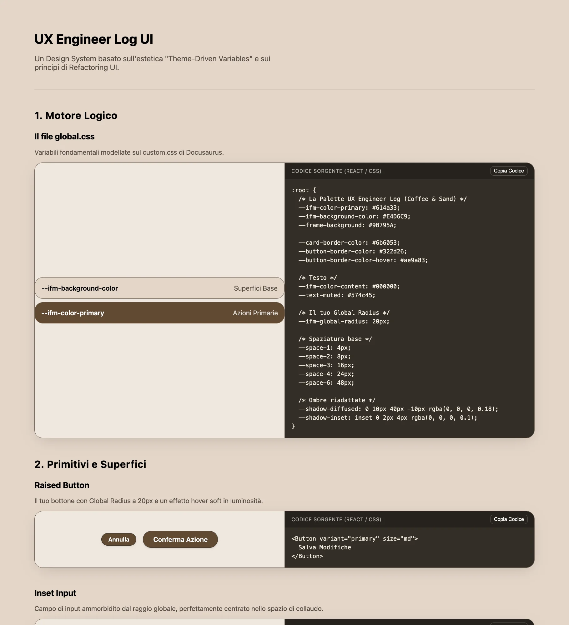
Con questo non voglio dire che lo strumento sia pessimo: avrei potuto usare prompt ancora più specifici. Ma non era solo quello il problema. Sentivo che alla lunga non avrei contribuito per niente, creando un progetto dove avevo contribuito solo con istruzioni e appunti, nulla di più; e, non meno importante, mi stavo togliendo la parte più gratificante di questo lavoro. A ciò si aggiungeva la complessità che percepivo come totalmente inutile e la repulsione che provo ancora per le librerie esterne. Non trovavo soprattutto senso nell'approccio, dato che l'obiettivo era semplicemente applicare i concetti più utili emersi dalla lettura. Avrei potuto farlo in React, dato che avevo appena finito il Superhero Application Form, e quindi non partendo da zero, ma ho preferito tornare alle basi.
Ho buttato tutto nel cestino: mezza giornata di lavoro.
Figma Prima, Codice Dopo
Ho aperto Figma e ho disegnato tutto da zero. Ora che avevo visto il risultato che non volevo, sapevo esattamente cosa volevo.
Ho adottato lo stesso approccio che applicavo nella chat web: un processo iterativo basato su una pianificazione condivisa.
Al posto di scrivere "non scrivere ancora una riga di codice" in chat, come facevo prima, ora lo scrivevo nel terminale, il principio che ho usato è stato: nessuna implementazione finché non avevo una pianificazione condivisa e approvata, al fine di azzerare il debito tecnico che sarebbe inevitabilmente emerso con soluzioni non pensate fin dall'inizio.
Sono partito dal mockup Figma, che è molto simile alla versione implementata sul sito. Le differenze che si notano riguardano (al di là della mancanza del css preview) quasi esclusivamente le dimensioni, problematiche emerse quando quei valori si sono tramutati in CSS.
Non sarei mai riuscito a farlo senza rendere concreta quella visione. Ho fatto mia la frase degli autori:
Don't get overwhelmed working in the abstract. Build the real thing as early as possible so your imagination doesn't have to do all the heavy lifting.
~ Adam Wathan e Steve Schoger
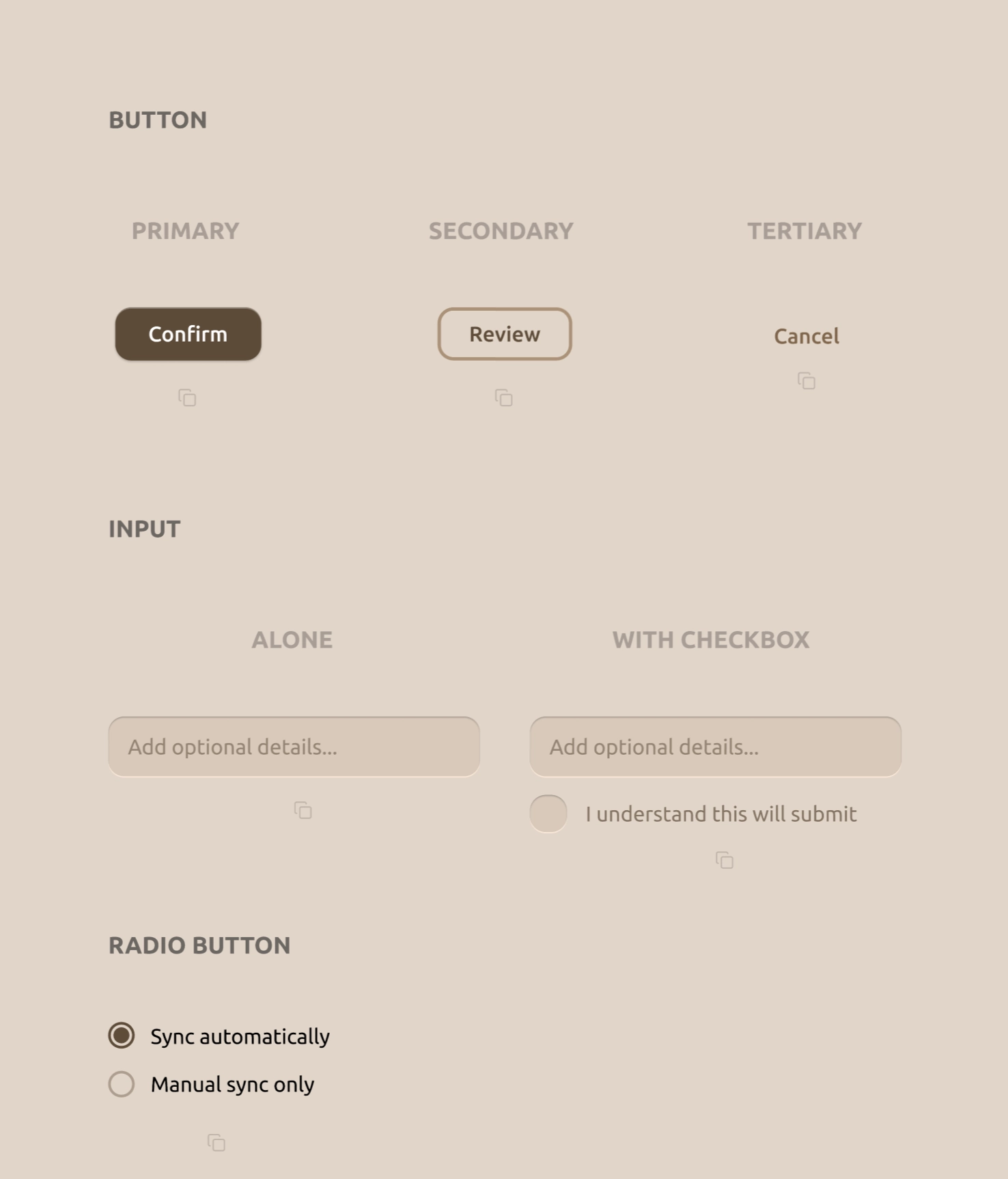
Ho poi estratto ogni singola proprietà da tutti i 15 componenti da Figma tramite la Dev Mode, riportandola in un file .txt con le specifiche di titoli, sottotitoli e spaziature.
Claude Code
Un problema che dovevo risolvere era il file CSS: come permettere all'utente di copiarlo interamente con un click? Così che sarebbe stato lui libero di incollarlo nel file che avrebbe desiderato senza trovarsi obbligato a partire dal mio? Volevo un componente specifico, una sorta di preview in alto per copiare il CSS. È l'elemento a cui ho contribuito solo con l'idea: Claude Code lo ha realizzato benissimo al primo tentativo. Abbiamo poi sistemato tutto il lato responsive del sito. Ho testato su iPhone 15 Pro, che ho comprato di recente per testare la fattibilità tecnica di Mosaic, iPhone 12 mini e Honor Magic V2 (il foldable), incluso il landscape: il sito è navigabile perfettamente anche da un telefono piccolo come il 12 mini in modalità landscape.
Ci sono stati alcuni problemi nella fase di implementazione che mi hanno aperto scenari così interessanti che finivo per approfondire i diversi concetti invece di andare avanti.
Un esempio su tutti: inizialmente avevo provato a caricare il components.css dinamicamente con fetch() invece di incorporarlo nel file JS, ma ho scoperto due problemi fondamentali.
Il primo: fetch() è bloccato sul protocollo file://, il browser tratta i file locali come origini non attendibili e rifiuta la richiesta.
Il secondo, più sottile: anche quando servito normalmente, concatenare fetch() prima di writeText() rompe l'accesso agli appunti.
Il browser permette la scrittura nella clipboard solo immediatamente dopo un click dell'utente, e nel momento in cui fetch() risolve e raggiunge writeText(), quella finestra si è già chiusa.
La soluzione è stata incorporare tutto come template literal direttamente in script.js.
Ho provato come alternativa anche Antigravity, ma dopo 2-3 errori che si ripercuotevano sulla UI sono tornato a Claude Code. Per tutti i task ho usato Sonnet; Opus l'ho usato solo per due check complessivi per confrontare con gli standard di produzione, dandomi punteggi nelle varie aree nel corso del progetto, scegliendo quindi attivamente cosa risolvere e cosa lasciare considerando la natura di questo progetto.
Chat Web vs Agente
Inizialmente pensavo che la chat web fosse, almeno in questa fase di apprendimento, la scelta migliore.
Mi sbagliavo. Nella chat web avevo compiti aggiuntivi che si tramutavano in frizioni.
Con Claude Code ero nel flusso più totale, e appena ho capito che prima di ogni modifica dovevo farmi elencare le opzioni disponibili, sviscerarle e capirne pro e contro prima di toccare il codice, ho capito che non stavo perdendo nulla rispetto a ciò che facevo nella chat web.
Rimango comunque combattuto su un punto: quella frizione di copiare manualmente o riscrivere di proprio pugno il blocco di codice dalla chat, forse non era un processo che consolidava il concetto appena spiegato.
Era semplicemente un compito ripetitivo a cui il cervello non prestava più attenzione e svolgeva col pilota automatico, o almeno così mi sembra guardando indietro. Il prezzo che probabilmente pagherò in futuro è il dimenticarmi la sintassi.
Detto ciò, sono convinto, come ho imparato nel video di Raffaele Gaito nel quale il docente universitario Vittorio Scarano parla di responsabilità nell'uso degli strumenti AI, che l'uso di questi strumenti ricadrà sempre su chi li ha usati. Nessuno può dire "ha sbagliato Claude": hai sbagliato tu perché ti sei fidato di quell'output senza capirlo, comprenderlo e verificare se esistessero alternative più efficienti e sicure. Penso che sia un concetto per nulla scontato, seppur a posteriori sembri ovvio.
Le Scelte di Design
Bottoni
Ho deciso di non fare il classico pulsante che passa dal primary al tertiary con lo stesso testo, come viene mostrato nella maggior parte dei materiali didattici, ma di assegnare testi diversi: Confirm per il primary, Review per il secondary e Cancel per il tertiary. Questo per essere più efficiente in termini di messaggio: il primary contiene la call to action, il secondary con "Review" sottintende un pulsante per rivedere qualcosa di precedentemente scritto (una recensione, un ordine su un e-commerce), mentre il tertiary, controintuitivamente, è Cancel.
Perché Cancel nel tertiary? Refactoring UI insegna che un'azione distruttiva non deve per forza essere rossa ed evidente se non è l'azione primaria. Se lo fosse, allora sì: rossa, non accecante, ma con lo stile primary ben visibile. Nei casi in cui non lo fosse, ha senso trattarla come un pulsante qualunque. Ho trovato questo concetto rivoluzionario: nei corsi che avevo frequentato (Talent Garden, Google UX), l'azione distruttiva era vista come un pericolo da sbandierare, mentre invece no, o perlomeno non in tutti i casi.
Nel primary ho aggiunto un sottile inset box-shadow bianco traslucido sul bordo superiore per simulare la luce che colpisce il bordo di un oggetto fisico che esce dalla pagina.
Il secondary usa un min-width leggermente inferiore al primary (128px vs 140px), questo perché ho scoperto che quando i due appaiono fianco a fianco, la differenza di larghezza accentua ulteriormente la gerarchia visiva tra i due, guidando quindi l'occhio verso l'azione principale.
Il tutto senza che l'utente se ne accorga.
Input
Ho usato due box-shadow: una inset che scende dall'alto per simulare la profondità, e una esterna sul bordo inferiore che simula il riflesso della luce.
Il libro sostiene che l'input deve comunicare che è un contenitore interno dove l'utente scrive, un effetto "cavità" che è l'opposto fisico del bottone che invece esce dallo schermo.
La versione WITH CHECKBOX ha il checkbox con lo stesso border-radius proporzionale della casella di input: 6px su 20px fa il 30%, contro 16px su 56px che fa il ~29%.
Il checkmark è inserito nel CSS come SVG in data URI, con il colore del segno (#D5C7B8) che corrisponde esattamente al background dell'input: quando il checkbox diventa pieno, il segno sembra fisicamente scavato nel colore.
Radio Button
Ho inserito un solo tipo di radio button, perché l'obiettivo era comunicare che non bisogna usare quelli nativi del browser, ma renderli coerenti con la UI dell'app tramite pochi stili mirati.
Card
Ho usato 5 livelli di ombra distinti, ognuno con due layer sovrapposti: uno più netto che simula la luce diretta dall'alto, uno più diffuso che simula la luce ambientale. Il y-offset raddoppia ad ogni livello (1px, 2px, 4px, 8px, 16px) per creare una progressione di profondità prevedibile e matematicamente coerente.
Icon
Ho inserito le 3 versioni come fa Refactoring UI, per mostrare che il logo interno all'icona va "inspessito" per rimanere riconoscibile nelle dimensioni ridotte del tab del browser.
L'icona originale ha un stroke-width di 8px, quella semplificata di 14px, hanno quindi la stessa forma ma con tratti quasi doppi.
Questo principio l'ho messo subito in pratica dopo averlo letto, creando l'icona di questo stesso sito: le lettere UX con tratti molto spessi per restare leggibili anche a 16px nel tab del browser.
Empty State
Un semplice Empty State con il primary button già creato in precedenza, per ricordare che deve esserci sempre un invito all'azione quando non ci sono dati da mostrare.
Cosa Ho Imparato
Architettura e Accessibilità
Desktop-first basato sul target: Ho applicato qui la nota che avevo scritto nel Telephone Number Validator: "dovremmo valutare in base al dispositivo che verrà utilizzato prevalentemente". Questo è un tool di confronto UI pensato per sviluppatori davanti a uno schermo grande. Costruirlo mobile-first avrebbe rispettato la regola, ma ignorato l'utente reale. Ho scelto consapevolmente desktop-first, gestendo il mobile come fallback.
Grigi tinti vs grigi neutri: Uno dei concetti più specifici del libro applicati nel codice. Ogni "grigio" del progetto ha saturazione al hue 31° per armonizzare con il background a 30°. Un grigio neutro puro (0% saturazione) apparirebbe visivamente scollegato dal resto della palette, come un elemento importato da un'altra UI.
Hit area senza disturbare il layout:
L'icona di copia è visivamente 16×16px, ma l'area cliccabile è 44×44px tramite padding: 14px. Per mantenere la spaziatura visiva invariata, un margin-top: -14px compensa esattamente il padding aggiunto.
Il componente occupa lo stesso spazio visivo di prima, ma è molto più semplice da toccare su mobile.
Cap-height alignment:
Il radio SVG è dichiarato width="24" nell'HTML come fallback, ma CSS lo sovrascrive a 20px.
A 18px di font-size, 20px allinea il controllo esattamente all'altezza delle lettere maiuscole del testo accanto.
È il criterio corretto per allineare icone inline con tipografia, non il font-size stesso.
JavaScript e DOM
data-component come bridge robusto:
Invece di leggere quale snippet copiare dalle classi CSS del bottone, ogni bottone porta un attributo data-component che mappa esattamente una chiave nell'oggetto SNIPPETS.
HTML e JS comunicano tramite attributi semantici dedicati, non tramite classi che hanno già un altro scopo.
Se le classi CSS cambiano per motivi di stile, la logica di copia non si rompe.
fetch() e la finestra del click:
Il browser permette la scrittura nella clipboard solo immediatamente dopo un'azione dell'utente.
fetch() è asincrono: nel momento in cui risolve, quella finestra si è già chiusa e writeText() viene rifiutato.
La soluzione non è aggirare il browser, ma non allontanarsi mai dal click: il contenuto da copiare deve essere già in memoria nel momento esatto del click.
execCommand come fallback:
navigator.clipboard.writeText() è bloccato su file:// e in alcuni contesti mobile Safari.
Il fallback crea un <textarea> invisibile fuori dal flusso, lo seleziona e innesca il comando di sistema.
È deprecato, ma ho scoperto essere l'opzione più affidabile in questi edge case specifici.
SVG Sprite Pattern:
Definire l'icona una volta sola come <symbol> nascosto e referenziarla ovunque tramite <use href="#icon-copy"> mantiene il DOM pulito e crea un'unica Source of Truth: quando JavaScript sostituisce il contenuto dell'SVG per mostrare il checkmark, lo fa in un solo punto invece di aggiornare 16 elementi separati.
Se il design dell'icona cambia, si tocca un solo punto nel codice.
CSS e Interazioni
opacity: '' invece di opacity: '1':
Dopo l'animazione di copia, reimpostare svg.style.opacity = '1' lascia un valore inline che sovrascrive silenziosamente il CSS hover.
Il risultato: l'hover smette di funzionare dopo il primo click, senza nessun errore in console.
Rimuovere l'attributo inline con '' restituisce il controllo allo stylesheet.
pointer-events: none sul gradient fade:
Il gradiente che sfuma il codice CSS nella preview è in position: absolute sopra il testo.
Senza pointer-events: none bloccherebbe tutti i click e le selezioni nell'area sottostante: un problema invisibile che non genera nessun errore, difficile da trovare senza sapere dove cercare.
Transizioni asimmetriche:
La transizione sul base rule (la regola CSS che si applica all'elemento a riposo, senza pseudo-classi attive) controlla la velocità di ritorno allo stato normale (160ms, fluido come una molla).
La transizione sull':active controlla la velocità di pressione (60ms, quasi istantanea). Il motivo per cui funziona: CSS applica la transizione dallo stato che si sta lasciando.
Premendo, si lascia il base state e scatta il 60ms. Rilasciando, si lascia l':active e scatta il 160ms.
display: contents nel carousel mobile:
Per trasformare la griglia di card in un carousel orizzontale su mobile, i wrapper .cards-row-1 e .cards-row-center vengono dissolti con display: contents.
Questo appiattisce il DOM: i figli bypassano il loro genitore diretto e diventano flex item del container carousel.
Senza questo, i wrapper avrebbero interrotto la catena flex e rotto il layout.
{ passive: true } sui touch listener:
Aggiungere passive: true agli event listener di touchstart e touchend comunica esplicitamente al browser che il handler non chiamerà mai preventDefault().
Il browser può quindi avviare lo scroll immediatamente senza aspettare che il JavaScript finisca, eliminando il ritardo percepibile su mobile.
btn.blur() per iOS:
Dopo la copia, chiamare btn.blur() rilascia lo stato :active su iOS, che altrimenti resterebbe attivo visivamente fino al prossimo tap su un altro elemento.
Vale sia in caso di successo che di errore della clipboard.
prefers-reduced-motion con 0.01ms:
Usare 0ms per azzerare le transizioni causa un bug in alcuni browser: i listener JavaScript in attesa dell'evento transitionend non scattano mai, bloccando la logica che dipende da quel callback.
0.01ms è abbastanza corto da essere impercettibile, ma abbastanza lungo da far scattare l'evento correttamente.
Riflessione
Nel precedente progetto su The Design of Everyday Things avevo scritto che se un utente nota un mio bottone per la sua estetica ho fatto un lavoro grafico, ma se lo clicca senza pensarci ho fatto un lavoro di ingegneria.
Refactoring UI è stato per me il manuale di quell'ingegneria.
Se Norman mi ha insegnato la psicologia dell'interazione e il perché eliminare i carichi cognitivi, questo libro mi ha dato la matematica e il come per scriverla in CSS.
Il mio compito rimane sempre quello di non stupire l'occhio e di liberare la mente.
Ma se prima sapevo solo che dovevo rispondere alla domanda dell'utente prima ancora che venisse formulata, ora ho finalmente le formule, i token e il codice per costruire quella risposta.
Next: Leggere "Show Your Work!" di Austin Kleon, ho scoperto che insegna molti dei pattern che ho usato in questo percorso.