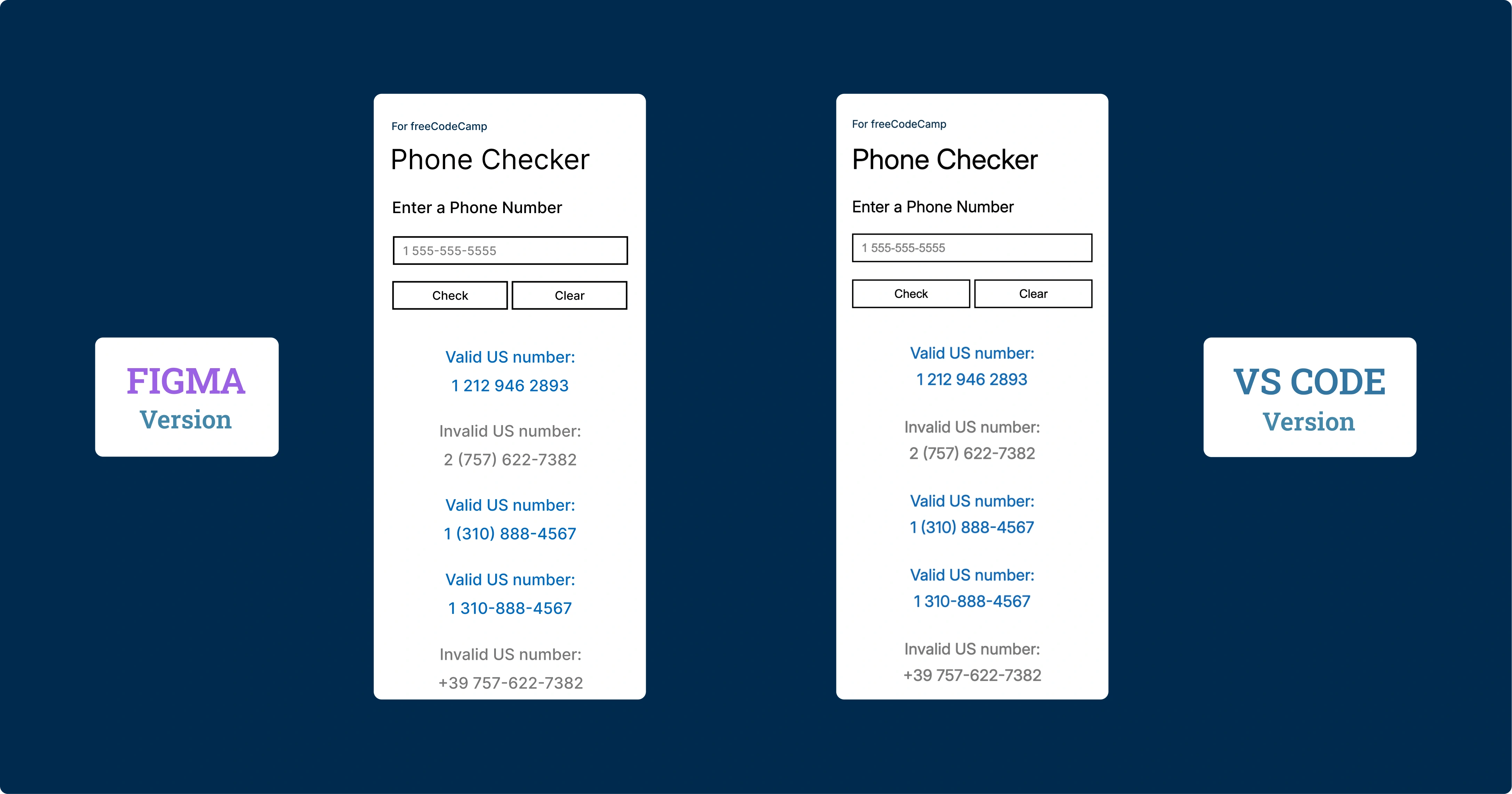
Telephone Number Validator
Il Progetto
Validatore di numeri telefonici statunitensi sviluppato con Regular Expressions, design responsive mobile-first e architettura orientata alla performance. Un'applicazione che dimostra la potenza delle regex nella validazione di pattern complessi.
Codice Sorgente
- index.html
- styles.css
- script.js
<!-- DESIGN
   ------
   * This file contains the HTML structure of the Phone Checker application.

   * The structure follows this flow:
   * - Head with meta tags, CSS link, and preconnection to Google Fonts.
   * - Body with main containing the primary container.
   * - Container with device-frame (device bezel) that appears only on the
   *   desktop version.
   * - Device-screen (internal screen) that contains the entire application's UI.
   * - Form with input, buttons, and results area
-->

<!DOCTYPE html>
<html lang="en">
    <head>
        <title>Phone Checker</title>
        <meta charset="UTF-8" />
        <meta name="viewport" content="width=device-width, initial-scale=1.0">
        <link rel="stylesheet" href="styles.css">
        <link rel="preconnect" href="https://fonts.googleapis.com">
        <link rel="preconnect" href="https://fonts.gstatic.com" crossorigin>
        <link href="https://fonts.googleapis.com/css2?family=Inter:ital,opsz,wght@0,14..32,100..900;1,14..32,100..900&display=swap" rel="stylesheet">
    </head>

    <body>

        <!--
            * freeCodeCamp instructions:
            * - You should have an input element with an id of "user-input". ✔️
            * - You should have a button element with an id of "check-btn". ✔️
            * - You should have a button element with an id of "clear-btn". ✔️
            * - You should have a div, span or p element with an id of "results-div" ✔️
        -->

        <!--
            * I discovered that the modern approach uses classes for CSS and IDs for
            * elements primarily used in JavaScript. Performance is the same, and
            * counterintuitively, classes even seem faster as this article explains:
            * (https://csswizardry.com/2011/09/writing-efficient-css-selectors/)
        -->

        <main>

            <div class="container">
                <div class="device-frame">
                    <div class="device-screen">
                        <p class="tribute"><a href="https://www.freecodecamp.org/" target="_blank" rel="noopener noreferrer" aria-label="Visit freeCodeCamp website (opens in new tab)">For freeCodeCamp</a></p>
                        <h1>Phone Checker</h1>
                        <form id="phone-form">
                            <label for="user-input">Enter a Phone Number</label>
                            <input type="tel" id="user-input" placeholder="1 555-555-5555" />
                            <div class="button-group">
                                <button type="submit" id="check-btn">Check</button> <!-- I must remember to add e.preventDefault() in JS -->
                                <button type="button" id="clear-btn">Clear</button>
                            </div>
                            <div id="results-div"></div>
                        </form>
                    </div>
                 </div>
            </div>

        </main>

        <script src="script.js"></script>
    </body>

</html>
/* DESIGN
   ------
   * I chose to make the mobile version the default, meaning without
   * a dedicated media query, unlike the desktop version
   * The reasons are twofold:
   * - mobile traffic has now surpassed desktop traffic
   * - mobile devices load only the base CSS without the elaborate
   *   device-frame bezel, thus reducing loading time, also considering
   *   that mobile users often have slower connections
*/


/* UNIVERSAL (common variables to mobile and desktop) */

:root {
    /* Font */
    --font-family: "Inter", Arial, sans-serif;
    --font-color: #000;
    --font-weight-primary: 400;
    --result-font-weight: 450;
    /* the value above (450) is unusual but it's the right middle ground
     * between normal and bold, it's also the closest to the prototype made
     * in Figma, which indicates 500 but in my opinion overestimates by 50 */

    /* Color */
    --tribute-font-color: #002B4E;
    --user-input-placeholder-font-color: #808080;
    --user-input-color-fill: #FFF;
    --button-color-fill: #FFF;
    --button-color-fill-hover: #0369BC;
    --button-font-color-hover: #fff;
    --result-valid-font-color: #0369BC;
    --result-invalid-font-color: #787878;

    /* Animation */
    --result-animation: slideInFade 0.4s cubic-bezier(0.2, 1, 0.3, 1);
}


/* MOBILE (default version) */

:root {
    /* Background */
    --background-color: #FFF;

    /* Position*/
    --tribute-margin-top: 36px;
    --title-margin-top: 18px;
    --label-margin-top: 32px;
    --user-input-margin-top: 26px;
    --button-group-margin-top: 26px;
    --result-margin-top-first: 48px;
    --result-margin-bottom: 32px;

    /* tribute */
    --tribute-font-size: 16px;

    /* title */
    --title-font-size: 42px;

    /* label, result*/
    --label-result-font-size: 24px;

    /* input, button*/
    --user-input-placeholder-button-font-size: 18px;
    --user-input-button-border: 2.373px solid #000;

    /* input */
    --user-input-padding-left-right: 0 12px;
    --user-input-height: 43.5px;
    --user-input-border-hover-active: 2.373px solid #0369BC;

    /* button */
    --button-group-gap: 6px;
    --button-height: 43.5px;

    /* Result */
    --result-font-size: 24px;
    --result-line-height: 40px;

}


/* DESKTOP (override of mobile variables and addition of device-frame) */

@media (min-width: 560px) and (min-height: 730px) {

:root {
    /* Background */
    --background-color: #002B4E;

    /* Position*/
    --tribute-margin-top: 20px;
    --title-margin-top: 8px;
    --label-margin-top: 18px;
    --user-input-margin-top: 18px;
    --button-group-margin-top: 18px;
    --result-margin-top-first: 40px;
    --result-margin-bottom: 22px;

    /* tribute */
    --tribute-font-size: 12px;

    /* title */
    --title-font-size: 32px;

    /* label, result*/
    --label-result-font-size: 18px;

    /* input, button*/
    --user-input-placeholder-button-font-size: 14px;
    --user-input-button-border: 1.7px solid #000;

    /* input */
    --user-input-padding-left-right: 0 10px;
    --user-input-height: 31px;
    --user-input-border-hover-active: 1.7px solid #0369BC;

    /* button */
    --button-group-gap: 4px;
    --button-height: 31px;

    /* Device frame */
    --device-frame-width: 332px;
    --device-frame-height: 680px;
    --device-frame-background: url("https://github.com/user-attachments/assets/817a409b-2181-4eab-8c9c-8ed38ad5e080");

    /* Device screen */
    --device-screen-width: 294px;
    --device-screen-height: 521px;
    --device-screen-background: #fff;
    --device-screen-top: 72px;
    --device-screen-left: 19px;
    --device-screen-padding: 0 20px;

    /* Result */
    --result-font-size: 18px;
    --result-line-height: 30px;
}

.device-frame {
    position: absolute;
    top: 49%;
    /* For the top position, I chose 49% instead of 50% for better visual balance */
    left: 50%;
    transform: translate(-50%, -50%);
    display: flex;
    flex-direction: column;
    align-items: center;
    text-align: center;
    width: var(--device-frame-width);
    height: var(--device-frame-height);
    background-image: var(--device-frame-background);
}

.device-screen {
    width: var(--device-screen-width);
    height: var(--device-screen-height);
    background-color: var(--device-screen-background);
    top: var(--device-screen-top);
    left: var(--device-screen-left);
    padding: var(--device-screen-padding);
    position: absolute;
    text-align: left;
    overflow-y: auto;
    overflow-x: hidden;
    scrollbar-color: transparent transparent;
}

button:hover {
    background-color: var(--button-color-fill-hover);
    color: var(--button-font-color-hover);
}

}


/* Total CSS reset to avoid unexpected behavior across different browsers */
* {
    margin: 0;
    padding: 0;
    box-sizing: border-box;
}

body {
    background-color: var(--background-color);
    font-family: var(--font-family);
    color: var(--font-color);
}

.container {
    display: flex;
    flex-direction: column;
    padding: 0 24px;
    min-height: 100vh; /* Fallback for browsers not supporting dvh */
    min-height: 100dvh; /* It is a dynamic viewport: prevents jump when mobile browser's URL bar toggles */
}

.tribute, label, #user-input, button {
    font-weight: var(--font-weight-primary);
}


.tribute {
    margin-top: var(--tribute-margin-top);
    font-size: var(--tribute-font-size);
}

.tribute a {
    position: relative;
    color: var(--tribute-font-color);
    text-decoration: none;
}

h1 {
    margin-top: var(--title-margin-top);
    font-weight: var(--font-weight-primary);
    font-size: var(--title-font-size);
}

label {
    margin-top: var(--label-margin-top);
    display: block;
    font-size: var(--label-result-font-size);
}

#user-input, button {
    font-size: var(--user-input-placeholder-button-font-size);
    border: var(--user-input-button-border);
}

#user-input {
    margin-top: var(--user-input-margin-top);
    width: 100%;
    height: var(--user-input-height);
    background-color: var(--user-input-color-fill);
    padding: var(--user-input-padding-left-right);
}

#user-input::placeholder {
    color: var(--user-input-placeholder-font-color);
}


#user-input:active, #user-input:focus {
    border: var(--user-input-border-hover-active);
    outline: none;
}

.button-group {
    margin-top: var(--button-group-margin-top);
    display: flex;
    gap: var(--button-group-gap);
}

button {
    flex: 1;
    height: var(--button-height);
    background-color: var(--button-color-fill);
    border: var(--user-input-button-border);
    cursor: pointer;
    color: var(--font-color);
}

button.clicked {
    background-color: var(--button-color-fill-hover);
    color: var(--button-font-color-hover);
    transform: perspective(400px) rotateX(2deg) rotateY(-2deg) scale(0.98);
}

.phone-result {
    text-align: center;
    font-size: var(--result-font-size);
    line-height: var(--result-line-height);
    margin-bottom: var(--result-margin-bottom);
    font-weight: var(--result-font-weight);
    animation: var(--result-animation);
}

.phone-result::after {
    content: "";
    display: block;
}

.phone-result:first-child {
    margin-top: var(--result-margin-top-first);
}

.phone-result.result-valid {
    color: var(--result-valid-font-color);
}
.phone-result.result-invalid {
    color: var(--result-invalid-font-color);
}

@keyframes slideInFade {
    0% {
        opacity: 0;
        transform: translateY(-10px) scale(0.95);
    }
    100% {
        opacity: 1;
        transform: translateY(0) scale(1);
    }
}
/* DESIGN
   ------
   * This file contains the validation logic for US phone numbers

   * Flow:
   * - Definition of constants that include input limits, the regex
   *   for validation, and DOM references.
   * - Prevention of the form's default behavior which would otherwise
   *   cause the page to refresh.
   * - Management of the Check button click with preliminary validations (empty
   *   field and excessive length).
   * - Main function checkNumber(), which executes validation via
   *   regex and handles the display of results.
   * - Visual feedback on buttons with a temporary click effect.
   * - Function limitResults() that maintains a maximum number of displayed
   *   results.
   * - Clear button that clears the interface

   * I've named functions only when reused, such as checkNumber and
   * limitResults

   * I don't add Enter key support for quick validation, because it is
   * redundant. Since the HTML is structured as a form, the default browser
   * behavior already triggers the button click when Enter is pressed
*/

/* freeCodeCamp instructions:
    * - When you click on the #check-btn element without entering a value
    *   into the #user-input element, an alert should appear with the text
    *   "Please provide a phone number". ✔️
    * - When you click on the #clear-btn element, the content within the
    *   #results-div element should be removed. ✔️
    * I've summarized the other 30 requirements in these points:
    * - Valid numbers: must have 10 digits total, country prefix
    *   1 (optional), spaces, hyphens, parentheses allowed in the input area ✔️
    * - Invalid numbers: anything that doesn't have 10 digits, prefix different
    *   from 1, malformed parentheses, or "strange" characters ✔️
*/

const maxInputLength = 20;
const maxResult = 50; // Limit to prevent DOM performance issues with too many results
const phoneRegex = /^(1\s?)?(\(\d{3}\)|\d{3})[\s\-]?\d{3}[\s\-]?\d{4}$/;
/* Above regex validates US phone numbers in their standard formats:
   * ^(1\s?)? : Optional country code 1 with optional space.
   *    The entire group is optional, allowing numbers to start with or without it.
   * (\(\d{3}\)|\d{3}) : Area code (3 digits) with or without parentheses.
   *    The OR operator (|) allows both formats, thus (555) or 555.
   * [\s\-]? : Optional separator (space or hyphen) after the area code.
   *    Square brackets create a character class, ? makes it optional.
   * \d{3} : Exchange code: exactly 3 digits of the local number.
   * [\s\-]? : Another optional separator between number groups.
   * \d{4}$ : Subscriber number: exactly 4 digits.
   *   The $ anchor ensures the string ends here, preventing extra characters
*/

const input = document.getElementById("user-input");
const checkBtn = document.getElementById("check-btn");
const clearBtn = document.getElementById("clear-btn");
const resultsDiv = document.getElementById("results-div");
const buttons = document.querySelectorAll("button");

document.querySelector("form").addEventListener("submit", (e) => e.preventDefault());

checkBtn.addEventListener("click", (e) => {
    e.preventDefault();
    if (input.value === "") {
        alert("Please provide a phone number");
        return;
    } else if (input.value.length > maxInputLength) {
        alert("Phone number too long");
        return;
    } else {
        checkNumber()
    }
});

const checkNumber = () => {
    const phoneNumber = input.value;
    const phoneResult = document.createElement("div");
    phoneResult.classList.add("phone-result");


   /* For inserting the <br> I used a particular approach, first textContent
    * to sanitize against XSS, then innerHTML to modify only the colon
    * character (: ) already validated. This way the content is already safe
    * before the HTML conversion */

    if (phoneRegex.test(phoneNumber)) {
        phoneResult.textContent = `Valid US number: ${phoneNumber}`;
        phoneResult.innerHTML = phoneResult.innerHTML.replace(': ', ':<br>');
        phoneResult.classList.add("result-valid");

    } else {
        phoneResult.textContent = `Invalid US number: ${phoneNumber}`;
        phoneResult.innerHTML = phoneResult.innerHTML.replace(': ', ':<br>');
        phoneResult.classList.add("result-invalid");

    }

    resultsDiv.insertBefore(phoneResult, resultsDiv.firstChild);
    limitResults();
    input.value = "";
}

buttons.forEach(button => {
    button.addEventListener("click", () => {
        button.classList.add("clicked");
        setTimeout(() => button.classList.remove("clicked"), 200);
    });
});

const limitResults = () => {
    const results = resultsDiv.children;
    while (results.length > maxResult) {
        resultsDiv.removeChild(results[results.length - 1]);
    }
}

clearBtn.addEventListener("click", (e) => {
    e.preventDefault();
    input.value = "";
    resultsDiv.innerHTML = "";
});
Il Progetto Più Bello Fatto Fin'ora
È stato il progetto più bello fatto fin'ora. La regex è stata la parte più difficile in assoluto.
Non ho provato altri approcci: avrei potuto gestire la convalida del numero di telefono in modi alternativi, come una cascata di if statement. Il codice sarebbe stato più facile da scrivere e persino da leggere, ma sarebbe stato tremendamente lungo. Optare per la regex è stato anche un modo per rafforzarne la mia comprensione. Ho infatti scritto la spiegazione dettagliata della regex all'interno dello script.js, sia per far comprendere a chiunque a cosa serve ogni pezzetto, sia per consolidare quanto ho appreso.
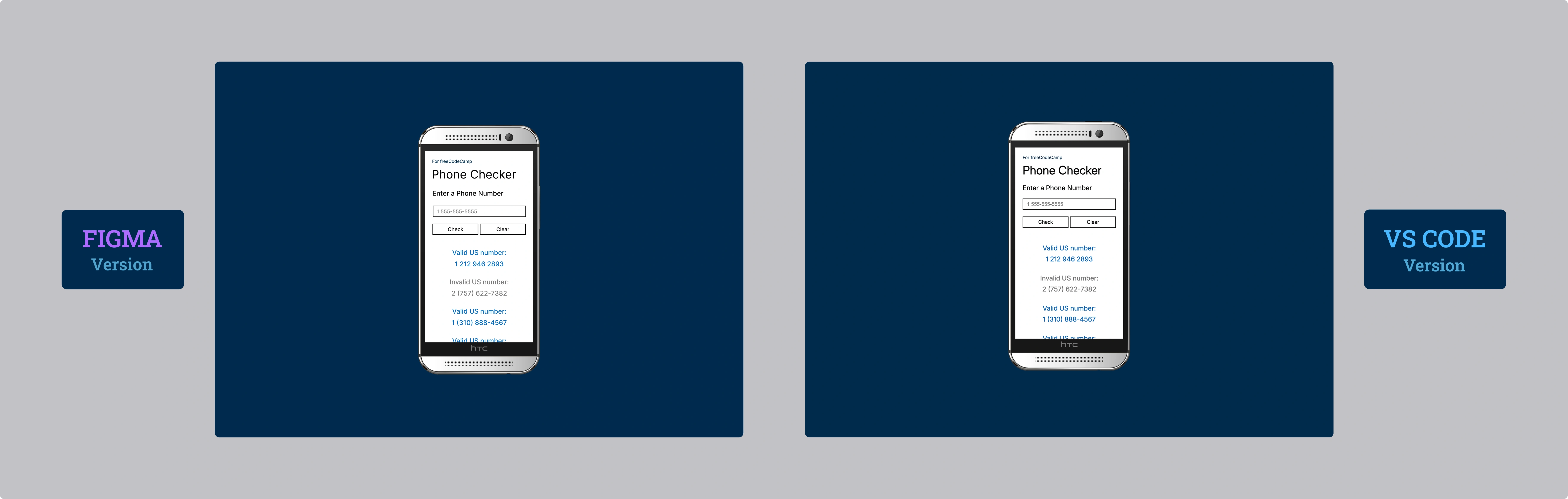
Il Design: HTC One M8 e Windows Phone Aesthetic
Per quanto riguarda il design, ho deciso di inserire un HTC One M8 for Windows (la versione per Verizon) in un semplice sfondo blu stile Windows Phone. È venuto meglio di come me lo ero immaginato. Ho provato con la versione gold e black, ma questa silver è quella che si sposa meglio con lo sfondo.
Mobile-First (Davvero): Una Scelta Consapevole
La versione mobile è la versione di default. Come ho scritto nei commenti dello styles.css, ho scelto di creare una media query per desktop e non più, contrariamente al passato, la versione mobile in media query.
Le ragioni sono due:
- Diffusione: Il mobile ha ormai da anni superato il traffico del desktop.
- Performance: Impostandola come default, il caricamento del device frame (l'HTC) avviene solo se visualizzato da desktop. Inoltre chi naviga da desktop ha generalmente internet più veloce, quindi è stato ancora più sensato.
La Riflessione: Mobile-First non è un Dogma
Non se ne parla mai, ma credo che al di là del gold standard "mobile-first", bisognerebbe valutare in base al dispositivo che verrà utilizzato prevalentemente per navigare la nostra applicazione.
Se si crea un'applicazione destinata principalmente al desktop, forse ha più senso adottare il vecchio metodo di dedicare una media query al mobile.
In questo progetto ho comunque scelto l'approccio mobile-first anche per abituarmi a questo modo di pensare, una skill che voglio consolidare.
Potrei sbagliarmi, ma mi sorgono sempre red flag quando sento "è così e basta". Ci sono sempre mille sfumature e "dipende" che spesso non vengono menzionati.
La Filosofia dei Commenti
Come già fatto nello scorso certification project, ho dedicato particolare attenzione ai commenti nel codice. Ho scritto tutto lì: la logica, le scelte architetturali, i pattern utilizzati. Ripeterlo qui sarebbe ridondante e, soprattutto, difficile da comprendere senza avere il codice sottomano.
In questo progetto ho deciso di ridurre i commenti inutili, quelli che antirez chiama "Trivial Comments", al fine di rendere il codice più pulito. Ho concentrato la maggior parte dei commenti all'inizio di ogni documento, creando una sorta di mappa che guida la lettura del codice senza appesantirlo.
Ci tengo solo a dire che a ogni progetto che passa la mia self confidence aumenta e, allo stesso passo, il mio divertimento.
Cosa Ho Imparato
Regular Expressions:
- Pattern complessi per validazione numeri telefonici US:
/^(1\s?)?(\(\d{3}\)|\d{3})[\s\-]?\d{3}[\s\-]?\d{4}$/ - Gestione di prefissi opzionali (country code 1)
- Alternanza tra formati con parentesi
(\d{3})e senza\d{3} - Character classes
[\s\-]per separatori multipli - Anchor
^e$per validazione stretta senza caratteri extra
Strategia Mobile-First Consapevole:
- Default CSS senza media query per mobile
- Media query
@media (min-width: 560px) and (min-height: 730px)solo per desktop e tablet - Caricamento condizionale del device-frame (bezel) solo su desktop e tablet
- Ottimizzazione per connessioni mobili più lente
CSS Variables Avanzate:
- Override di variabili CSS nelle media query per design responsivo
- Sistema di design scalabile con variabili semantiche
- Gestione di due temi completi (mobile/desktop) con stesso set di variabili
DOM Manipulation Sicura:
.textContentper sanitizzazione XSS prima di ogni modifica.innerHTMLsolo dopo validazione del contenuto- Pattern sicuro: sanitize → modify → insert
Viewport Dinamico:
min-height: 100dvhper gestire la barra URL mobile dinamica- Fallback
100vhper browser non supportati
Performance e UX:
- Limite
maxResult = 50per prevenire problemi di performance DOM .insertBefore()per stack LIFO dei risultati- Animazione
@keyframes slideInFadecon cubic-bezier per feedback fluido - Effetto click con
transform: perspective()per feedback tattile
Form Handling:
e.preventDefault()per controllo completo del comportamento del form- Validazione lunghezza input con
maxInputLength - Alert per feedback immediato su errori di input
Architettura Codice:
- Separazione logica tra validazione, visualizzazione e interazione
- Commenti strutturati con sezione DESIGN per overview architetturale
- Naming semantico per funzioni riutilizzabili
Riflessione
È stato fondamentale, nella creazione dell'HTML, testare iterativamente sul mio edge case preferito: l'iPhone 12 mini e, sorprendentemente, anche su un HTC One M8 (versione Android).
Ho infatti scoperto di recente il comando "ipconfig getifaddr en0" (in macOS) nel terminale, che mi ha aperto un mondo. Mi sono aggiunto sul desktop in un file txt la procedura che ho riassunto:
- Esegui ipconfig getifaddr en0 nel terminale
- Ti darà un numero (n) ovvero il tuo IP locale
- In VS Code, dopo aver cliccato su Live Server, ci sarà il numero della porta (p)
- Nel dispositivo desiderato, scrivi nella barra degli indirizzi: n:p
Chiudo sempre il Live Server quando ho finito. Per quanto il rischio in realtà sia basso, considerando che per accedere alla porta bisogna comunque essere sotto la mia stessa rete wifi.
Prossimo Progetto: Imparare le basi della OOP costruendo un carrello della spesa