Mood Board
The Project
Build a Mood Board is a freeCodeCamp Lab where I applied Props, .map(), and Spread Syntax to create a grid of visual cards. While technically simple, it pushed me to reason about hidden architectural constraints and implicit dependencies that can generate "silent" bugs.
Source Code
- index.jsx
- styles.css
- index.html
/* DESIGN
------
* This file contains the React logic for the Mood Board application
* The architecture follows this component-based flow:
*
* Data configuration (the content):
* - Instead of writing repetitive HTML, I defined a `moodData` constant array inside the main component
* - This array holds all the specific details (colors, images, descriptions) in one place, acting
* like a local database for the view
*
* The Parent component (<MoodBoard>):
* - Acts as the layout orchestrator
* - It renders the main title (<h1>) outside the grid to span the full width
* - It contains a wrapper <div> ".mood-board" which applies the CSS Grid layout provided by freeCodeCamp
* - Inside this wrapper, it executes the logic (.map) to transform the raw data into visible UI cards
*
* The Child component (<MoodBoardItem>):
* - Serves as a reusable template (the "Card")
* - It is "dumb" (stateless): it simply receives style and content via props and renders them into
* the specific HTML structure required by the CSS (.mood-board-item, .mood-board-image,
* and .mood-board-text)
*/
/* freeCodeCamp instructions:
* 1. You should export a MoodBoardItem component. ✔️
* 2. Your MoodBoardItem component should return a div with a class of
* mood-board-item at its top-level element. ✔️
* 3. The background color of the .mood-board-item element should be set
* to the value of color prop using inline styles. ✔️
* 4. Your MoodBoardItem component should render an img element with a class
* of mood-board-image and its src set to the value of the image prop. ✔️
* 5. Your MoodBoardItem component should render an h3 element with a class
* of mood-board-text and its text set to the value of the description prop. ✔️
* 6. You should export a MoodBoard component. ✔️
* 7. Your MoodBoard component should return a div as its top-level element. ✔️
* 8. Your MoodBoard component should render an h1 element with a class of
* mood-board-heading and the text Destination Mood Board. ✔️
* 9. Your MoodBoard component should render at least three MoodBoardItem components,
* each should pass color, image, and description props with valid values. ✔️
* 10. Your MoodBoard component should be rendered to the page's #root element. ✔️
*/
export function MoodBoardItem({ color, image, description }) {
/*
* Because that JSX `style` isn't like HTML strings. It requires a JavaScript Object
* The syntax `style={{ key: value }}` uses the first braces for the JS portal
* and the second for the Object literal.
*
* React properties must be CamelCase: `background-color` becomes `backgroundColor`
*/
return (
<div className="mood-board-item"
style={{ backgroundColor: color }}
>
<img src={image} alt={description} className="mood-board-image" />
<h3 className="mood-board-text">
{description}
</h3>
</div>
)
}
export function MoodBoard() {
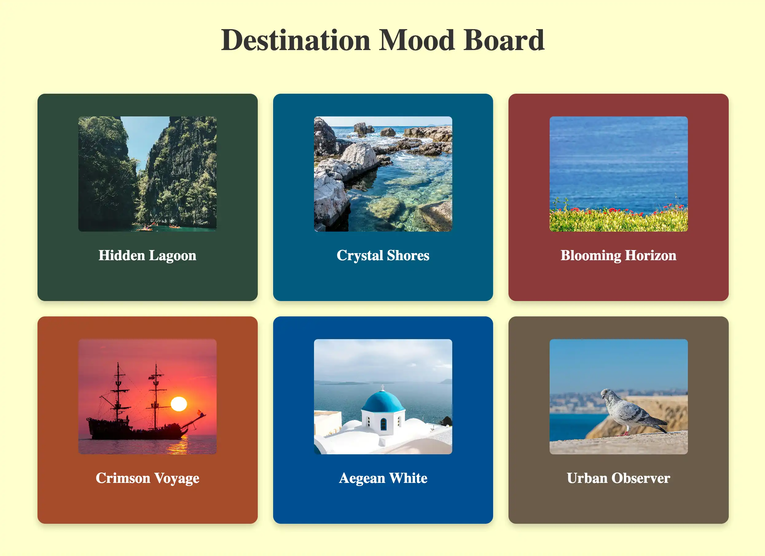
const moodData = [
{
id: 1,
image: "https://cdn.freecodecamp.org/curriculum/labs/pathway.jpg",
description: "Hidden Lagoon",
color: "#2E4A3D", // I extracted dominant colors from images to ensure high contrast with white text
},
{
id: 2,
image: "https://cdn.freecodecamp.org/curriculum/labs/shore.jpg",
description: "Crystal Shores",
color: "#005B7F",
},
{
id: 3,
image: "https://cdn.freecodecamp.org/curriculum/labs/grass.jpg",
description: "Blooming Horizon",
color: "#8C3A3A",
},
{
id: 4,
image: "https://cdn.freecodecamp.org/curriculum/labs/ship.jpg",
description: "Crimson Voyage",
color: "#A64B2A",
},
{
id: 5,
image: "https://cdn.freecodecamp.org/curriculum/labs/santorini.jpg",
description: "Aegean White",
color: "#004E92",
},
{
id: 6,
image: "https://cdn.freecodecamp.org/curriculum/labs/pigeon.jpg",
description: "Urban Observer",
color: "#6B5B4A",
}
];
return (
<div>
<h1 className="mood-board-heading">Destination Mood Board</h1>
<div className="mood-board">
{/*
* The transformation (.map):
* I discovered that React renders Arrays of Components automatically.
* Unlike `forEach` (which does work but returns nothing), `.map()` returns
* a NEW array (immutability concept) where every data object is transformed
* into a JSX Component
*
* The spread syntax shortcut ({...item}):
* Instead of writing: `color={item.color} image={item.image} description={item.description}`
* I use `{...item}` which opens the object properties directly into props, to avoid
* repetitive code
*
* Important constraint: I realized that this shortcut relies on a strict naming contract
* because React acts like a "Blind Courier": it simply takes every key from the data object
* and delivers it as a prop, without translating or checking if the component understands it
* For example, if my data used the key "imgUrl" but the component was waiting for "image",
* the delivery would technically succeed, but the component would receive a prop it doesn't
* recognize (imgUrl), leaving the actual "image" prop undefined
* For this to work, the Data Model and the Component Interface must speak exactly the same language.
*/}
{moodData.map((item) => (
<MoodBoardItem
key={item.id}
{...item}
/>
))}
</div>
</div>
);
}
/* DESIGN
   ------
   * File Origin: Pre-packaged styling by freeCodeCamp
   * Role: The "Visual Contract" (Global Constraints)
   *
   * Architectural analysis of the provided styles:
   * I analyzed this file to understand the boundaries within which my React component must live
   *
   * Global atmosphere (Body):
   * - Sets the background to a pale yellow (#ffffcc)
   * - This dictates that my data model (`moodData`) needs strong, dark colors
   *   to ensure readability and contrast against this light canvas
   *
   * The Grid strategy (.mood-board):
   * - The layout is hardcoded as `display: grid` with `grid-template-columns: repeat(3, 1fr)`
   * - Constraint Discovery: This explicitly forces a 3-column layout.
   * - Impact on React: I realized this is why the <h1> must be placed outside the `.mood-board`
   *   container in my JSX. If placed inside, the title would be treated as a grid item
   *   and squashed into a single column (1/3 width), breaking the header design
   *   (Note: I technically could have kept the <h1> inside by applying `grid-column: 1 / -1`.
   *   In CSS Grid syntax, lines are numbered, and `-1` is a special value representing
   *   the "very last line". So `1 / -1` tells the element:
   *   "Span from the start to the absolute end", creating a full-width row regardless
   *   of how many columns exist. However, moving it outside felt structurally cleaner)
   *
   * Card anatomy (.mood-board-item):
   * - Uses Flexbox (`display: flex`, `flex-direction: column`) to vertically center content
   * - Enforces a fixed height (250px)
   * - This means my <MoodBoardItem /> component is purely a "content filler",
   *   as the layout logic is entirely handled here by CSS.
*/

body {
  background-color: #ffffcc;
}

.mood-board-heading {
  text-align: center;
  font-size: 2.5em;
  color: #333;
  margin-top: 20px;
}

.mood-board {
  display: grid;
  grid-template-columns: repeat(3, 1fr);
  gap: 20px;
  padding: 20px;
  max-width: 900px;
  margin: 0 auto;
}

.mood-board-item {
  border-radius: 10px;
  padding: 10px;
  display: flex;
  flex-direction: column;
  align-items: center;
  justify-content: center;
  color: #fff;
  box-shadow: 0 4px 8px rgba(0, 0, 0, 0.2);
  text-align: center;
  height: 250px;
}

.mood-board-image {
  border-radius: 5px;
  width: 180px;
  height: 150px;
  object-fit: cover;
}

.mood-board-text {
  margin-top: 20px;
  font-size: 1.2em;
}
<!-- DESIGN
     ------
     * File Origin: Pre-packaged environment by freeCodeCamp
     * Role: The "Engine Room" (Host Environment)
     *
     * How it works (In-browser Compilation):
     * I realized that this file differs from standard professional workflows (like Vite/Next.js)
     * Usually, we "cook" (compile) the code on our computer before sending it to the browser
     * Here, the "cooking" happens directly inside the user's browser via Babel
     *
     * The Ingredients (CDNs):
     * Instead of installing React via terminal (npm install), this file pulls React (the logic)
     * and ReactDOM (the rendering) directly from the internet via <script> tags
     * It's like streaming a movie instead of downloading it
     *
     * The Live Translator (Babel Standalone):
     * Browsers don't understand React/JSX natively. This file loads "Babel", a tool that acts
     * as a simultaneous interpreter. It reads the code inside "index.jsx", translates it
     * instantly into standard JavaScript, and executes it
     *
     * The Canvas (#root):
     * The <body> is intentionally empty except for a single <div id="root">
     * This is the "mounting point" where React will paint the entire Mood Board application
     *
     * The Spark (Bootstrapping):
     * The script at the very bottom connects the dots
     * - It uses `type="text/babel"` and `data-type="module"` to enable modern JavaScript features (ES6 Imports)
     * - It grabs the 'root' div and tells React: "Import the { MoodBoard } from our file and draw it here".
-->

<!doctype html>
<html>
  <head>
    <meta charset="UTF-8" />
    <title>Mood Board</title>
    <script src="https://cdnjs.cloudflare.com/ajax/libs/react/18.3.1/umd/react.development.js"></script>
    <script src="https://cdnjs.cloudflare.com/ajax/libs/react-dom/18.3.1/umd/react-dom.development.js"></script>
    <script src="https://cdnjs.cloudflare.com/ajax/libs/babel-standalone/7.26.3/babel.min.js"></script>
    <script
      data-plugins="transform-modules-umd"
      type="text/babel"
      src="index.jsx"
    ></script>
    <link rel="stylesheet" href="styles.css" />
  </head>

  <body>
    <div id="root"></div>
    <script
      data-plugins="transform-modules-umd"
      type="text/babel"
      data-presets="react"
      data-type="module"
    >
      import { MoodBoard } from './index.jsx';
      ReactDOM.createRoot(document.getElementById('root')).render(
        <MoodBoard />
      );
    </script>
  </body>
</html>
As usual, I "went into detail" in the code comments, but I want to highlight a few key passages here as well.
Reviewing the UX Engineer Log
Recently, I traveled to Rome to participate in two university design workshops. During the trip, I decided to replace my usual reading books with my UX Engineer Log. I had been wanting to review everything I’ve learned over these months for a while, using this tool for its true purpose: serving as a Second Brain. Although I had already benefited from consulting it during projects, I had never systematically used it for active study.
I started by browsing through individual projects, but I immediately realized that approach was too scattered. The right path was the Vademecums. I started with HTML, but abandoned it almost immediately: I felt I already owned those concepts. I decided to raise the bar by moving on to JavaScript. And there, I was "captivated".
I immersed myself in the first section—which was incredibly dense—trying to read it through the eyes of an external user. As much as my judgment might be biased (I have an inevitable conflict of interest), I was surprised. The method by which I aggregated information project after project, noting down the Code Tutor's explanations in AppFlowly under the "Add to Vademecum" block, created a natural progression. Reading it all together was satisfying: these weren't abstract notions, but concepts assimilated through practice, finally organized. I love this method of documenting, and I find it extremely rewarding.
I thought my JavaScript basics were solid, but I was wrong. The review brought up doubts that I promptly cleared up and transformed into new notes: I will integrate them into the Vademecum soon to make it crystal clear for future readers.
Data-Driven Architecture
The adoption of .map() and the Spread Operator stemmed almost naturally from the review I just finished. Although these are patterns I likely would have used anyway, having them fresh in my memory turned a possibility into a conscious and immediate choice (availability bias played its role).
Instead of giving in to hardcoding (manually writing six <MoodBoardItem /> components), I opted for a Data-Driven approach oriented towards scalability:
moodDataArray: Acts as a local database. It handles only the pure data (id, images, descriptions, and dominant colors for contrast). Adding a card means simply adding an object here, without touching the rest of the JSX.<MoodBoard />Component: This is the orchestrator. It doesn't know the specific content, but it knows how to transform a list of data into UI elements via.map(), generating the grid dynamically.<MoodBoardItem />Component: This is the visual template. It receives data and "packages" it into the HTML structure required by the CSS, without worrying about logic.
Why .map() and not forEach
The choice of .map() is dictated by React's declarative nature. In JSX, every expression must return a renderable value, which forEach does not do (it executes a loop but returns undefined in terms of UI).
Conversely, .map() produces a new array (guaranteeing immutability of the original array): it takes an input array of data and returns a new output array of components. React automatically renders arrays of components.
This distinction is fundamental for Reconciliation. Since React decides whether to update the UI by comparing memory references, if I were to modify the original array (e.g., with push), the reference would remain identical, and React would ignore the change. .map(), by always returning a new array, guarantees a new reference, signaling to React that it is time to update the UI.
The Spread Operator and the "Blind Courier"
I used the Spread Operator ({...item}) for cleanliness and convenience, but this choice made me reflect on how React acts as a "Blind Courier".
The library only cares about the shipping label (key) to track the component in the Virtual DOM; the rest of the content (...item) is delivered "unopened".
Here arises a critical constraint: React does not check if the recipient understands the content. If the array contains the key imgUrl but the component expects image, the delivery succeeds, but the component will receive an unknown prop (property), leaving the correct one undefined.
To use this shortcut, the Data and the Component must speak exactly the same language: it is an implicit dependency that, had I ignored it, would have generated silent bugs.
The Error in the Footer (and the choice of authenticity)
Re-reading the code for the Footer project, I noticed I used the {/* comment */} syntax outside of the components as well. I discovered this was a conceptual error: curly braces serve to open the JavaScript "portal" inside JSX; outside of it, we are in standard JavaScript, and a classic /* comment */ would have sufficed.
I deliberately decided not to fix that file. Even though it might look like an "own goal" in the eyes of a recruiter, I founded this path on the real chronology of the logs. I prefer to show the transparency of my evolution rather than a retroactive perfection constructed after the fact.
Pre-packaged CSS Constraints
Analyzing the CSS provided by freeCodeCamp defined the boundaries within which my React code had to operate:
- Body: The pale yellow background (
#ffffcc) dictated the choice of dark, saturated colors for themoodDataarray, ensuring necessary contrast with the white text. - Hardcoded Grid: The rule
grid-template-columns: repeat(3, 1fr)forces a three-column layout. This was a critical discovery: I had to position the<h1>outside the.mood-boardcontainer. If I had placed it inside, it would have been treated as a grid item and squashed into a single column, breaking the design. Simply put, CSS imposed the structure, and React filled it. - Card Anatomy: With a fixed height of 250px and Flexbox managed by CSS, the
<MoodBoardItem />component became purely a content filler, entirely delegating layout logic to the stylesheet.
What I Learned
Inline Styles (The JavaScript Portal):
- Reinforced that the
styleattribute in JSX does not accept strings like in HTML, but demands JavaScript objects. The{{ }}syntax isn't just random double braces: the first opens the "JavaScript portal", the second defines the object literal. - Mandatory mindset shift: from standard CSS (
background-color) to DOM JavaScript properties (backgroundColor). We aren't writing stylesheets; we are programming style.
.map() as an Assembly Line:
- Abandoned the imperative approach (like
forloops) for the declarative one..map()acts like an assembly line that takes raw materials (raw data) and churns out finished products (UI Components) in a single stroke. - Crucial for React: by returning a new array (instead of modifying the existing one), it guarantees the immutability necessary for the framework to detect changes and update the view.
Spread Syntax and Implicit Contracts:
- The use of
{...item}is an elegant but dangerous shortcut: it creates an invisible dependency between the Data Model and the Component Interface. - React acts as a "Blind Courier": it delivers all database keys directly to the component. If names don't match perfectly (e.g.,
imgUrlvsimage), data is silently lost in transit.
Hierarchy: CSS Commands, React Executes:
- Discovered that layout constraints (CSS Grid) can dictate component architecture. The
<h1>was moved outside the.mood-boardcontainer not due to React logic, but to avoid being crushed by grid rules. - The lesson: React fills the boxes, but often it's CSS that decides where those boxes can stay. You cannot ignore the "visual contract" when designing the component tree.
Comment Grammar (Context Switching):
- Learned that JSX is not HTML, not even in comments. Inside visual rendering, comments must be encapsulated in
{/* ... */}to be interpreted as JavaScript and not rendered as text. - It's a constant context switch: outside the
return, we are in pure JavaScript (//or/* */); inside, we are in the Virtual DOM, which requires escape braces.
Git & GitHub Vademecum
I currently have a new Vademecum dedicated to Git and GitHub in the works, maintaining the same "Real World" approach I already applied to the ones on HTML, CSS, JavaScript, and UX & UI. It is a project in the making, born to consolidate concepts learned during the development with Docusaurus. However, I didn't limit myself to my "solo" experience: I wanted to delve into the real dynamics of teamwork, studying standard collaborative workflows. I enriched it all with an essential collection of terminal commands that have proven, in practice, to be among my best daily allies.
Next: Consolidate the basics through Quizzes and learn to work with State, Hooks, and Events, to then apply everything in the Toggle Text App.