Footer
The Project
Footer is a React component that represents my first unguided exercise after learning the basics of JSX syntax and componentization.
It was extremely useful as an exercise because freeCodeCamp had taught me how to create a navbar, but not a footer. Well, the concepts translate with extreme similarity: same logic of semantic lists, same separation between structure (JSX) and style (CSS), same declarative approach.
Source Code
- index.jsx
- styles.css
- index.html
{/* DESIGN
------
* This file contains the React structure for the Footer component
* The architecture follows this semantic and functional flow:
*
* Architectural decisions (Layout strategy):
* - I realized that the original reference design (simoneamico.com) utilized a 2-column layout
* - To satisfy the strict lab constraint ("At least three unordered lists"), I logically split the
* content into "Navigation", "Social", and "Contacts"
* - This approach allows the component to pass validation tests while maintaining logical grouping
* and visual hierarchy
*
* Semantic structure (Accessibility):
* - I chose the HTML5 <footer> tag as the top-level semantic landmark
* - I encapsulated link groups in <ul> elements to ensure accessibility, as screen readers
* interpret these specifically as navigational lists
* - The copyright section is isolated in a ".footer-bottom" container to allow for separate
* spacing and styling logic
*
* Implementation details:
* - All links use href="#" placeholders as mandated by the lab requirements
* - The "footer-columns" wrapper is designed to support CSS Flexbox or Grid for responsive alignment.
*/}
{/*
* freeCodeCamp instructions:
* 1. You should export a Footer component. ✔️
* 2. Your Footer component should return a footer element. ✔️
* 3. Your Footer component should only contain a single footer element. ✔️
* 4. Your footer element should not have any siblings. ✔️
* 5. Your footer element should contain at least three unordered lists. ✔️
* 6. Each of your unordered lists should have at least two list items. ✔️
* 7. Your footer should have at least one paragraph element. ✔️
* 8. You should have a copyright (©) symbol within one of your paragraphs. ✔️
* 9. Your footer should have at least three links with the href value set to #. ✔️
* 10. None of your links should be empty. ✔️
*/}
export const Footer = () => {
return (
<footer>
{/*
* Container wrapper designed for CSS Grid/Flexbox alignment.
* Even though this lab focuses on HTML structure, this div
* prepares the layout for the 3-column responsive design.
*/}
<div className="footer-columns">
{/* Section 1: Main navigation */}
<div className="footer-section">
<h4>NAVIGATION</h4>
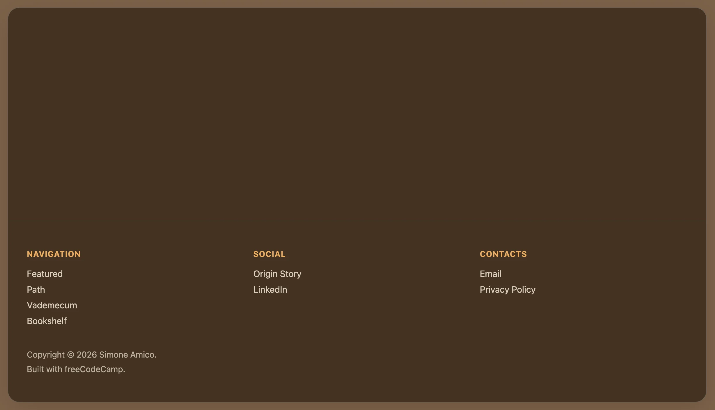
<ul>
<li><a href="#">Featured</a></li>
<li><a href="#">Path</a></li>
<li><a href="#">Vademecum</a></li>
<li><a href="#">Bookshelf</a></li>
</ul>
</div>
{/* Section 2: Social links (split from contacts to meet list quota) */}
<div className="footer-section">
<h4>SOCIAL</h4>
<ul>
<li><a href="#">Origin Story</a></li>
<li><a href="#">LinkedIn</a></li>
</ul>
</div>
{/* Section 3: Direct contacts and legal */}
<div className="footer-section">
<h4>CONTACTS</h4>
<ul>
<li><a href="#">Email</a></li>
<li><a href="#">Privacy Policy</a></li> {/* added "Privacy Policy" to satisfy "at least 2 items" rule */}
</ul>
</div>
</div>
{/* Copyright Section */}
<div className="footer-bottom">
<p>Copyright © 2026 Simone Amico.</p>
<p>Built with freeCodeCamp.</p>
</div>
</footer>
);
}
/* DESIGN
   ------
   * This configuration defines the "App variant" of the UX Engineer Log, reinterpreting the
   * style core "Coffee & Sand" into a "Espresso & Amber" palette

   * CSS Architecture:
   * - Massive token centralization: I adopted a strict "Design Token" methodology, extracting
   *   all "magic numbers" (colors, spacing, typography, z-indices, animation timings) into
   *   the :root scope. This acts as a single source of truth, ensuring visual consistency
   *   across the React component tree and facilitating global theme adjustments
   * - Layout strategy: The application uses a "Frame vs Canvas" approach. The body acts as
   *   the viewport/environment, while the #root container acts as the application window,
   *   using overflow clipping to maintain the global border radius
   * - Typography: I maintained the system Font Stack to ensure zero CLS (Cumulative Layout
   *   Shift) and immediate rendering, prioritizing performance and native OS integration over
   *   aesthetic customization.
*/

/* DESIGN TOKENS (VARIABLES) - UNIVERSAL */
:root {
  /* PALETTE: Coffee & Sand */
  --color-primary: #ffbd69;
  --color-primary-dark: #614a32;
  --color-primary-light: #a68563;

  --bg-frame: #7c6148;
  --bg-canvas: #423121;
  --bg-navbar: #423121;
  --bg-hover: rgba(0,0,0,0.05);

  --border-color: #6b6053;
  --text-main: #ffffff;
  --text-muted: #dcd0c0;

  /* Dimensions and Layout */
  --layout-max-width: 1200px;
  --layout-frame-padding: 20px;

  /* Spacing System (8pt Grid) */
  --space-xs: 0.5rem;   /* 8px */
  --space-sm: 1rem;     /* 16px */
  --space-md: 1.5rem;   /* 24px */
  --space-lg: 2rem;     /* 32px */
  --space-xl: 3rem;     /* 48px */

  /* Borders and Radius */
  --radius-sm: 8px;     /* Buttons/Inputs */
  --radius-lg: 20px;    /* App Container */
  --border-width: 1px;

  /* Effects */
  --shadow-soft: 0 10px 40px -10px rgba(0, 0, 0, 0.18);
  --transition-fast: 0.2s ease;

  /* Typography*/
  --font-base: system-ui, -apple-system, Segoe UI, Roboto, Helvetica, Arial, sans-serif;
  --text-sm: 0.85rem;
  --text-base: 0.95rem;
  --weight-medium: 500;
  --weight-bold: 600;

  /* Z-index layers*/
  /* Defined here to avoid z-index wars in the component css */
  --z-navbar: 100;
  --z-dropdown: 1000;
}

/* GLOBAL RESET */
* {
  box-sizing: border-box;
  margin: 0;
  padding: 0;
}

body {
  font-family: var(--font-base);
  background-color: var(--bg-frame);
  color: var(--text-main);
  min-height: 100vh;

  /* Layout: Frame Padding */
  /* Creates the visual gap between the browser window and the app container,
     reinforcing the "Floating Window" metaphor on desktop screens */
  padding: var(--layout-frame-padding);
  display: flex;
  justify-content: center;
}

/* APP CONTAINER */
#root {
  background-color: var(--bg-canvas);
  width: 100%;
  max-width: var(--layout-max-width);
  border-radius: var(--radius-lg);
  border: var(--border-width) solid var(--border-color);
  box-shadow: var(--shadow-soft);

  /*
   * Architectural decision: `overflow: hidden` is crucial here
   * It forces the square corners of the Navbar and Footer to respect the
   * rounded corners of this container, avoiding the "corner bleed" artifact.
  */
  overflow: hidden;

  display: flex;
  flex-direction: column;
  min-height: 95vh;
}


/* NAVBAR*/

.navbar {
  background-color: var(--bg-navbar);
  border-bottom: var(--border-width) solid var(--border-color);
  padding: var(--space-sm) var(--space-lg);

  /* Layout: Spaced Alignment */
  display: flex;
  justify-content: space-between;
  align-items: center;

  position: relative;
  z-index: var(--z-navbar);
}

.navbar ul {
  list-style: none;
  display: flex;
  gap: var(--space-md); /* Gestalt Principle: Grouping via whitespace */
  align-items: center;
}

/* NAVIGATION ITEMS */
.nav-item {
    position: relative; /* Anchor point for the absolute dropdown */
}

.nav-item a {
  text-decoration: none;
  color: var(--text-main);
  font-weight: var(--weight-bold);
  font-size: var(--text-base);
  transition: color var(--transition-fast);
}

.nav-item a:hover {
  color: var(--color-primary-light);
}

/* BUTTON OVERRIDE */
/* Styled to look like a chip/badge to differentiate interactive tools from passive links */
.nav-item button {
  background: none;
  border: var(--border-width) solid var(--color-primary);
  color: var(--color-primary);
  padding: 0.5rem 1rem;
  border-radius: var(--radius-sm);
  cursor: pointer;
  font-weight: var(--weight-bold);
  font-family: inherit;
  transition: all var(--transition-fast);
}

.nav-item button:hover {
  background-color: var(--color-primary);
  color: #fff;
}


/* DROPDOWN MENU */

.sub-menu {
  position: absolute;
  /* Visual adjustments for the dropdown panel */
  background-color: var(--bg-canvas);
  border: var(--border-width) solid var(--border-color);
  border-radius: var(--radius-sm);
  padding: var(--space-xs) 0;
  box-shadow: var(--shadow-soft);

  /* Interaction Logic: Hidden by default, Flex on hover */
  display: none;
  flex-direction: column !important; /* Forces vertical stack overriding navbar flex-row */
  gap: 0 !important;
  margin-top: var(--space-xs);
  z-index: var(--z-dropdown);
  min-width: 160px;
}

/* Hover State Logic */
/* I realized that in a production React environment, this would likely be handled via State (isOpen).
   However, for this specific lab, CSS :hover provides a performant, JS-free solution. */
.nav-item:hover .sub-menu {
  display: flex;
  animation: fadeIn var(--transition-fast);
}

.sub-menu li a {
  display: block;
  padding: var(--space-xs) var(--space-md);
  color: var(--text-muted);
  font-weight: var(--weight-medium);
}

.sub-menu li a:hover {
  background-color: var(--bg-hover);
  color: var(--color-primary);
}


/* FOOTER */

footer {
  margin-top: auto; /* Sticky Footer technique: pushes footer to bottom of flex container */
  border-top: var(--border-width) solid var(--border-color);
  padding: var(--space-xl) var(--space-lg);
  background-color: transparent;
}

/* Footer Grid Layout */
.footer-columns {
  display: grid;
  /* Responsive Pattern: Auto-fit columns based on available width (min 200px) */
  grid-template-columns: repeat(auto-fit, minmax(200px, 1fr));
  gap: var(--space-lg);
  margin-bottom: var(--space-sm);
}

.footer-section h4 {
  font-size: var(--text-sm);
  text-transform: uppercase;
  letter-spacing: 0.05em;
  opacity: 0.9;
  margin-bottom: var(--space-sm);
  color: var(--color-primary);
}

.footer-section ul {
  list-style: none;
}

.footer-section li {
  margin-bottom: var(--space-xs);
}

.footer-section a {
  text-decoration: none;
  color: var(--text-muted);
  font-size: var(--text-base);
  transition: color var(--transition-fast);
}

.footer-section a:hover {
  color: var(--color-primary);
  text-decoration: underline;
}

/* COPYRIGHT SECTION */
.footer-bottom {
  padding-top: var(--space-sm);
  font-size: 0.9rem;
  color: var(--text-muted);
  opacity: 0.8;
}

.footer-bottom > p:first-of-type {
  padding-bottom: var(--space-xs);
}


/* MOBILE ADAPTATION (< 768px) */
/* Strategy: "Native Feel"
   On mobile, I remove the "Frame" metaphor to maximize screen real estate,
   making the app feel native rather than a website inside a box.
*/
@media screen and (max-width: 768px) {
  body {
    padding: 0; /* Remove frame padding */
  }

  #root {
    border-radius: 0;
    border: none;
  }

  /* Stacked Navigation */
  .navbar {
    flex-direction: column;
    gap: var(--space-sm);
    padding: var(--space-sm);
  }

  /* Stacked Footer */
  .footer-columns {
    grid-template-columns: 1fr; /* Force single column stack */
    text-align: left;
  }
}

/* ANIMATIONS DEFINITIONS */
@keyframes fadeIn {
    from { opacity: 0; transform: translateY(-5px); }
    to { opacity: 1; transform: translateY(0); }
}
<!-- DESIGN
     ------
     * File Origin: Pre-packaged environment by freeCodeCamp
     * Role: The "Engine Room" (Host Environment)
     *
     * How it works:
     * This file is different from a standard professional project (like Vite)
     * Usually, we "cook" (compile) the code on our computer before sending it
     * to the browser
     * Here, instead, the "cooking" happens directly inside the user's browser
     *
     * The Ingredients (CDNs):
     * Instead of installing React via terminal (npm install), this file pulls
     * React (the logic) and ReactDOM (the rendering) directly from the internet
     * via <script> tags. It's like streaming a movie instead of downloading it
     *
     * The Live Translator (Babel Standalone):
     * Browsers don't understand React/JSX natively
     * This file loads "Babel", a tool that acts as a simultaneous interpreter
     * It reads the code inside "index.jsx", translates it instantly into
     * standard JavaScript, and executes it. This allows the lab to work
     * immediately without any setup.
     *
     * The Canvas (#root):
     * The <body> is intentionally empty except for a single <div id="root">
     * This is the "mounting point" where React will paint the entire application
     *
     * The Spark (Bootstrapping):
     * The script at the very bottom connects the dots. It grabs the 'root' div
     * and tells React: "Take the <Footer /> component and draw it here".
-->

<!doctype html>
<html>
  <head>
    <meta charset="UTF-8" />
    <title>Reusable Footer Component</title>
    <script src="https://cdnjs.cloudflare.com/ajax/libs/react/18.3.1/umd/react.development.js"></script>
    <script src="https://cdnjs.cloudflare.com/ajax/libs/react-dom/18.3.1/umd/react-dom.development.js"></script>
    <script src="https://cdnjs.cloudflare.com/ajax/libs/babel-standalone/7.26.3/babel.min.js"></script>
    <script
      data-plugins="transform-modules-umd"
      type="text/babel"
      src="index.jsx"
    ></script>
    <link rel="stylesheet" href="styles.css" />
  </head>

  <body>
    <div id="root"></div>
    <script
      data-plugins="transform-modules-umd"
      type="text/babel"
      data-presets="react"
      data-type="module"
    >
      import { Footer } from './index.jsx';
      ReactDOM.createRoot(document.getElementById('root')).render(<Footer />);
    </script>
  </body>
</html>
Design: Hybrid between Light and Dark Mode
I opted to replicate the footer of the simoneamico.com site (Docusaurus), but I didn't want to make it identical because that one already exists.
I played with a visual hybrid between the site's Light and Dark mode: "Espresso & Amber" palette (dark variant of "Coffee & Sand"), three-column layout, but with a skeuomorphic twist that simulates a "dark wood frame" (#7c6148) wrapping the "espresso content" (#423121).
It was the CSS that dressed the footer as if it were at the bottom of a card/application, but the component itself remains standalone, keeping intact the task required by freeCodeCamp: pure semantic structure, exportable and reusable.
Note on shared CSS: I kept navbar styles (from the previous project) in the file to have a coherent design system. Navbar and Footer share the same tokens (colors, spacing, z-index), so it makes sense to keep them in the same CSS instead of duplicating variables. It's the same approach I would use in a real project.
What I Learned
Divide et Impera (Layout Strategy):
- The reference design uses a 2-column layout, but freeCodeCamp required "at least three
<ul>lists". I logically divided the content into "Navigation", "Social" and "Contacts" to satisfy the constraint while maintaining visual hierarchy and logical grouping. - This choice isn't just formal: it prepares the component for a data-driven future (instead of writing three
<ul>by hand, I'll pass an array of sections as prop and use.map()).
HTML5 Semantics and Accessibility:
- Mandatory use of the
<footer>tag as a first-level semantic landmark (screen readers immediately recognize the context). <ul>lists to group links: not just freeCodeCamp validation, but explicit signal to assistive tech that it's navigation..footer-bottomseparation for copyright: spacing/styling logic isolated from the rest, preparing the ground for more complex responsive layouts.
Design Tokens and Single Source of Truth:
- I centralized everything in CSS
:rootvariables (colors, 8pt grid spacing, typography, z-index, transitions). Modifying the theme means touching a single point, not 50 scattered files. - Consistent naming convention:
--color-primary,--space-md,--radius-lg. This mentally prepares for the "Props" concept in React: instead of hardcoding values, you pass references to a system.
Responsive Layout (Grid Auto-Fit):
grid-template-columns: repeat(auto-fit, minmax(200px, 1fr)): CSS Grid pattern that automatically adapts the number of columns based on available width. It's the CSS version of React's "responsive by default".- On mobile (
@media screen and (max-width: 768px)), I forcegrid-template-columns: 1frfor vertical stack. I also removed body padding and border-radius to go from "framed app" to "fullscreen native experience".
Overflow Clipping and Border Radius:
overflow: hiddenon the#rootcontainer is crucial: it forces navbar and footer (which have square corners) to respect the parent container'sborder-radius, avoiding the "corner bleed" artifact.- This is a pattern that will come in handy when I need to manage child components that shouldn't "overflow" from the parent's boundaries.
Hover State with pure CSS vs React State:
- I managed the navbar dropdown with CSS
:hover(display: none→display: flex). Performant and JS-free, perfect for a lab. - But I added a comment in the code: "In production React, this would be managed via State (isOpen)". I understood that CSS hover doesn't work on mobile (no hover with finger) and isn't keyboard-controllable. React State solves both.
Sticky Footer Technique:
margin-top: autoon footer inside a containerdisplay: flex; flex-direction: column; min-height: 95vh: modern technique for "footer stuck at bottom" without absolute positioning. The footer auto-pushes itself to the viewport bottom, even if content is scarce.
CDN Architecture vs Vite (Engine Room):
- I analyzed the pre-packaged
index.htmlfrom freeCodeCamp: it loads React/ReactDOM via CDN (streaming) instead of local bundle, and uses Babel Standalone as a "simultaneous translator" that converts JSX into JS directly in the browser. - It's the opposite of Vite: instead of "cooking" the code on my computer before sending it to the browser, the "cooking" happens live in the user's browser. Convenient for labs, but not scalable in production (too much overhead).
Link Placeholder (href="#") and Technical Debt:
- All links use
href="#"as required by the lab. I understood that this is "intentional technical debt": in a real React SPA, these would become<Link to="/path">(React Router) for navigation without reload. - Here too, the current structure is "React-ready": just replace
<a>with<Link>component and pass routes as prop.
Animation FadeIn with @keyframes:
- Dropdown menu uses
animation: fadeIn 0.2sinstead of justtransition, because I want to control both opacity AND transform (translateY). Transition only handles single properties that change, Keyframes orchestrate sequences.
Mobile-First Mindset:
- I wrote desktop-first CSS (for visual convenience during development), but I understood that in production you start from mobile (
@media (min-width: 768px)) for Progressive Enhancement. Now that I've seen both approaches, I understand why mobile-first is standard.
Reflections
By now you know it's always like this: when I do unguided exercises like Certification Projects or these Labs (which are essentially Certification Projects with pre-packaged index.html), I find little to say in READMEs precisely because I said everything in the source code in various comments.
Next:
Learning to work with Props, Conditional Rendering and Lists in React, to then apply everything in the Profile Card Component