Personal Portfolio
The Project
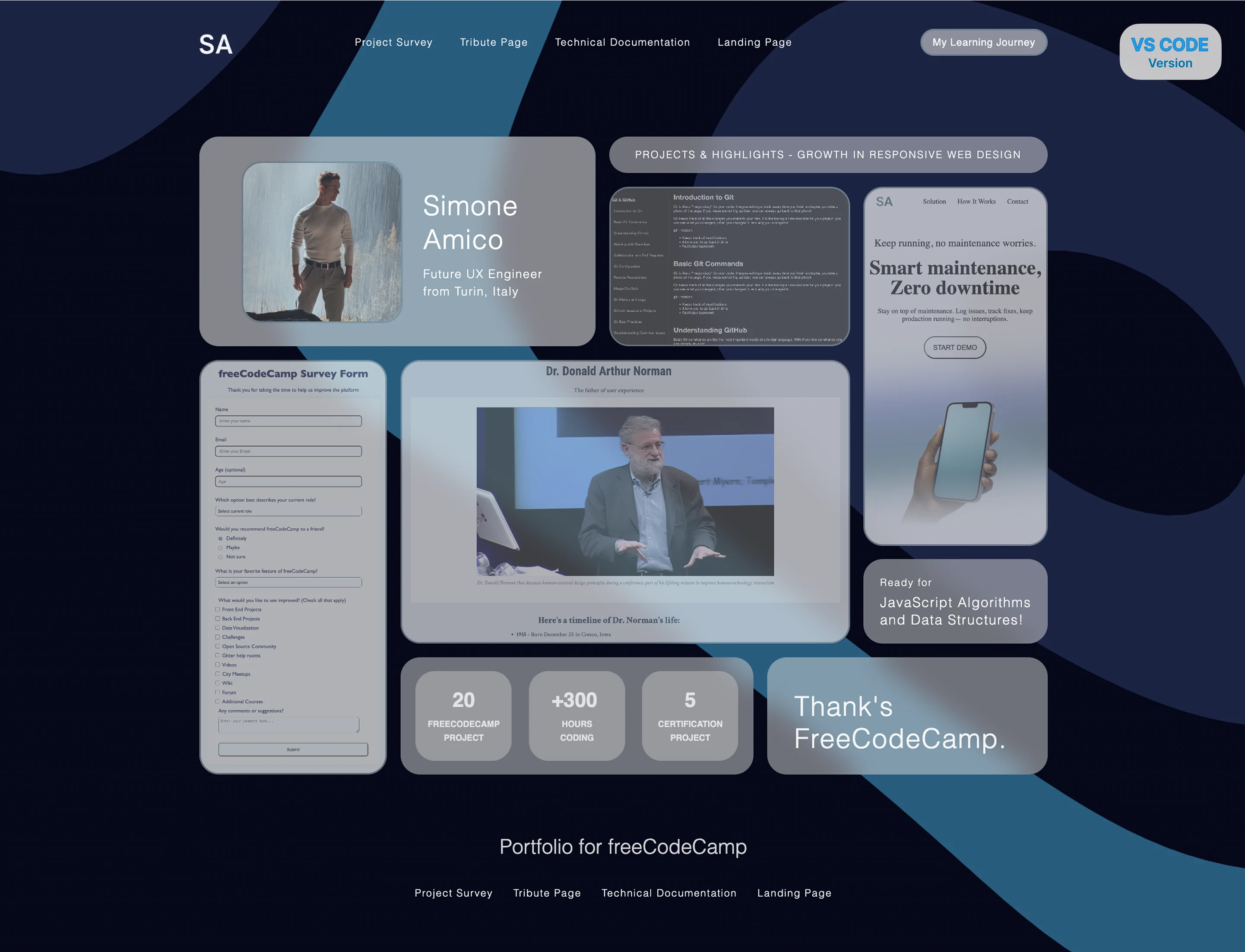
Professional personal portfolio with glassmorphism design and bento grid layout, developed as freeCodeCamp's final certification project. A turning point that marked the completion of the first major chapter of my development journey.
Source Code
- index.html
- styles.css
<!DOCTYPE html>
<html lang="en">
<head>
    <meta charset="UTF-8">
    <meta name="viewport" content="width=device-width, initial-scale=1.0">
    <title>Simone Amico - freeCodeCamp Portfolio</title>
    <link rel="stylesheet" href="styles.css">
</head>
<body>
    <div class="page-container">
        <header>
            <div class="navbar-container">

                <div class="navbar-logo">
                    <a href="/">
                        <img src="https://github.com/user-attachments/assets/e1edf115-1797-4e86-adb0-49251167cae8" alt="logo SA" class="logo" width="40px">
                    </a>
                </div>

                <nav class="navbar-navigation-link top-navbar-navigation-link" aria-label="Main Navigation">
                    <ul class="ul-list">
                        <li><a href="https://github.com/simoneamico-ux-dev/my-learning-journey/blob/main/05-survey-form/survey-form.html" class="nav-link" target="_blank" rel="noopener noreferrer">Project Survey</a></li>
                        <li><a href="https://github.com/simoneamico-ux-dev/my-learning-journey/tree/main/10-tribute-page" class="nav-link" target="_blank" rel="noopener noreferrer">Tribute Page</a></li>
                        <li><a href="https://github.com/simoneamico-ux-dev/my-learning-journey/tree/main/14-technical-documentation-page" class="nav-link" target="_blank" rel="noopener noreferrer">Technical Documentation</a></li>
                        <li><a href="https://github.com/simoneamico-ux-dev/my-learning-journey/tree/main/17-landing-page" class="nav-link" target="_blank" rel="noopener noreferrer">Landing Page</a></li>
                    </ul>
                </nav>

                <form action="https://github.com/simoneamico-ux-dev/my-learning-journey" method="get" target="_blank">
                    <button type="submit" class="navbar-button">My Learning Journey</button>
                </form>

            </div>
        </header>

        <main>
            <div class="bento-container">

                <div class="card hero-intro">
                    <div class="text-container">
                        <h1 class="hero-intro-first-text">Simone Amico</h1>
                        <h2 class="hero-intro-second-text">Future UX Engineer<br>from Turin, Italy</h2>
                    </div>
                </div>

                <a href="https://github.com/simoneamico-ux-dev" target="_blank" rel="noopener noreferrer">
                    <img src="https://github.com/user-attachments/assets/c1f32eee-594e-4a41-a219-c665214e481f" class="img-hero" alt="Simone Amico's Photo">
                </a>

                    <div class="card banner-highlights">
                        <p>PROJECTS & HIGHLIGHTS - GROWTH IN RESPONSIVE WEB DESIGN</p>
                    </div>

                <a href="https://github.com/simoneamico-ux-dev/my-learning-journey/blob/main/05-survey-form/survey-form.html" target="_blank" rel="noopener noreferrer">
                    <div class="card project-1">
                        <img src="https://github.com/user-attachments/assets/7e15f0dd-e08b-402c-b0e1-147d8843153f" alt="Project Survey Project">
                    </div>
                </a>

                <a href="https://github.com/simoneamico-ux-dev/my-learning-journey/tree/main/10-tribute-page" target="_blank" rel="noopener noreferrer">
                    <div class="card project-2">
                        <img src="https://github.com/user-attachments/assets/476c29eb-422a-48d1-a423-7134e310a7fb" alt="Tribute Page Project">
                    </div>
                </a>

                <a href="https://github.com/simoneamico-ux-dev/my-learning-journey/tree/main/14-technical-documentation-page" target="_blank" rel="noopener noreferrer">
                    <div class="card project-3">
                        <img src="https://github.com/user-attachments/assets/d82ec546-84f8-416c-a76f-6b09f0985dd4" alt="Technical Documentation Project">
                    </div>
                </a>

                <a href="https://github.com/simoneamico-ux-dev/my-learning-journey/tree/main/17-landing-page" target="_blank" rel="noopener noreferrer">
                    <div class="card project-4">
                        <img src="https://github.com/user-attachments/assets/d3d5bc6a-b62f-44b1-ad49-2a368e2b1a5f" alt="Landing Page Project">
                    </div>
                </a>

                <div class="card status-learning">
                    <div class="text-container">
                        <p class="status-learning-first-text">Ready for</p>
                        <p class="status-learning-second-text">JavaScript Algorithms<br>and Data Structures!</p>
                    </div>
                </div>

                <div class="card stats-dashboard">

                    <div class="card stats-item stats-item-1">
                        <p class="stats-item-text stats-item-text-top stats-item-1-text-1">20</p>
                        <p class="stats-item-text stats-item-text-bottom stats-item-1-text-2">FREECODECAMP<br>PROJECT</p>
                    </div>

                    <div class="card stats-item stats-item-2">
                        <p class="stats-item-text stats-item-text-top stats-item-2-text-1">+300</p>
                        <p class="stats-item-text stats-item-text-bottom stats-item-2-text-2">HOURS<br>CODING</p>
                    </div>

                    <div class="card stats-item stats-item-3">
                        <p class="stats-item-text stats-item-text-top stats-item-3-text-1">5</p>
                        <p class="stats-item-text stats-item-text-bottom stats-item-3-text-2">CERTIFICATION<br>PROJECT</p>
                    </div>
                </div>

                <div class="card credits-thanks">
                    <p>Thank's<br>FreeCodeCamp.</p>
                </div>

            </div>
        </main>

        <footer>
            <p class="footer-phrase"><a href="https://www.freecodecamp.org/">Portfolio for freeCodeCamp</a></p>

            <nav class="navbar-navigation-link bottom-navbar-navigation-link" aria-label="Main Navigation">
                <ul class="ul-list-2">
                    <li><a href="https://github.com/simoneamico-ux-dev/my-learning-journey/blob/main/05-survey-form/survey-form.html" class="nav-link" target="_blank" rel="noopener noreferrer">Project Survey</a></li>
                    <li><a href="https://github.com/simoneamico-ux-dev/my-learning-journey/tree/main/10-tribute-page" class="nav-link" target="_blank" rel="noopener noreferrer">Tribute Page</a></li>
                    <li><a href="https://github.com/simoneamico-ux-dev/my-learning-journey/tree/main/14-technical-documentation-page" class="nav-link" target="_blank" rel="noopener noreferrer">Technical Documentation</a></li>
                    <li><a href="https://github.com/simoneamico-ux-dev/my-learning-journey/tree/main/17-landing-page" class="nav-link" target="_blank" rel="noopener noreferrer">Landing Page</a></li>
                </ul>
            </nav>
        </footer>
    </div>

    <div class="rotate-message">
    <div class="rotate-card">
        <div class="emoji">🔄️</div>
        <p>Rotate for mobile preview</p>
        <p>or watch it come alive on desktop</p>
    </div>
    </div>
</div>

</div>

</div>

</body>
</html>
:root {

/* SIZE*/
--width-container-grid: 1007px;
--height-container-grid: 757px;


/* COLOR */
--background-important-card: rgba(217, 217, 217, 0.6);
--background-medium-card: rgba(217, 217, 217, 0.5);

--blur-card: blur(13px);


/* BORDER */
--border-radius: 23px;

--border-card-clickable: 2px solid rgba(28, 93, 120, 0.30);


/* MARGIN */
--margin-between-linknavbar: 32px;
--margin-between-bottom-linknavbar: 24px;

--margin-top-frame-navbar: 36px;
--margin-bottom-navbar-grid: 64px;

--margin-between-card: 16px;

--margin-bottom-grid-footertitle: 96px;
--margin-bottom-footertitle-link: 32px;
--margin-bottom-link-endframe: 64px;

}

/* TOTAL RESET */

*, *::before, *::after {
    box-sizing: border-box;
    margin: 0;
    padding: 0;
}

html, body {
    height: 100%;
    font-family: 'Inter', sans-serif;
    background-image:
        linear-gradient(rgba(0, 0, 0, 0.5), rgba(0, 0, 0, 0.5)),
        url("https://github.com/user-attachments/assets/52383e7b-cd63-4058-9464-bbc15e27508b");
    background-repeat: no-repeat;
    background-position: center;
    background-size: cover;
    background-attachment: fixed;
}

html {
    scroll-behavior: smooth;
}

body {
    line-height: 1.6;
    overflow-x: hidden;
}

button {
    font-family: inherit;
    font-size: inherit;
    font-weight: inherit;
    color: inherit;
    border: none;
    background: none;
    cursor: pointer;
}

a {
    text-decoration: none;
}

.logo {
    border: none;
}


/* TOTAL CONTAINER */
.page-container {
    width: 1004px;
    height: 1121px;
    margin: 0 auto;
    position: relative;
}


/* HEADER */
.navbar-container {
    width: 100%;
    z-index: 999;
    display: flex;
    align-items: center;
    justify-content: space-between;
    position: relative;
    top: var(--margin-top-frame-navbar);
    font-size: 12px;
}

.navbar-container .ul-list {
    margin: 0;
}

.navbar-logo {
    width: 33px;
    height: 20.31px;
}

.ul-list {
    display: flex;
    list-style: none;
    gap: var(--margin-between-linknavbar);
    margin: 0;
    padding: 0;
}

.ul-list a {
    color: #F6F6F6;
    font-weight: 200;
    letter-spacing: 1.1px;
}

.navbar-button {
    width: 151px;
    height: 32px;
    background: var(--background-important-card);
    border: var(--border-card-clickable);
    backdrop-filter: blur(13px);
    border-radius: var(--border-radius);
    color: #F6F6F6;
    letter-spacing: 0.5px;
}

/* BENTO GRIDS */

.bento-container {
    width: 1004px;
    height: 755px;
    position: relative;
}

.card {
    border-radius: var(--border-radius);
    background: var(--background-medium-card);
    z-index: 999;
    backdrop-filter: var(--blur-card);
    position: absolute;
}

.card img {
    width: 100%;
    height: 100%;
    object-fit: cover;
    border-radius: var(--border-radius);
    opacity: 0.45;
}

img {
    border: var(--border-card-clickable);
}

.hero-intro {
    width: 469px;
    height: 248px;
    top: 132px;
    left: 0;
    background: var(--background-important-card);
    font-weight: 300;
    color: #fff;
    letter-spacing: 1.1px;
    position: relative;
}

h1 {
    font-weight: 300;
}

h2 {
    font-weight: 300;
}

.hero-intro-first-text {
    top: 62px;
    left: 265px;
    font-size: 32px;
    margin-bottom: 14px;
    line-height: 2.5rem;
    position: absolute;
}

.hero-intro-second-text {
    top: 152px;
    left: 265px;
    font-size: 14px;
    line-height: 1.3rem;
    position: absolute;
}

.img-hero {
    width: 191px;
    height: 191px;
    top: 161.25px;
    left: 50px;
    z-index: 1000;
    object-fit: cover;
    position: absolute;
    border-radius: 23px;
    opacity: 0.85;
}

.banner-highlights {
    width: 519px;
    height: 43px;
    top: 132px;
    left: 485px;
    font-size: 12px;
    font-weight: 300;
    color: #fffffff5;
    display: flex;
    text-align: center;
    justify-content: center;
    align-items: center;
    letter-spacing: 1.4px;
}

.project-1 {
    width: 222px;
    height: 491px;
    top: 396px;
    left: 0;
    cursor: pointer;
}

.project-2 {
    width: 532px;
    height: 336px;
    top: 396px;
    left: 238px;
    cursor: pointer;
}

.project-3 {
    width: 285px;
    height: 189px;
    top: 191px;
    left: 485px;
    cursor: pointer;
}

.project-4 {
    width: 218px;
    height: 425px;
    top: 191px;
    left: 786px;
    cursor: pointer;
}

.status-learning {
    width: 218px;
    height: 100px;
    top: 632px;
    left: 786px;
    font-weight: 300;
    color: #fffffff5;
    letter-spacing: 1.1px;
    display: flex;
    justify-content: center;
    align-items: center;
}

.status-learning-first-text {
    font-size: 12px;
    margin-bottom: 4px;
}

.status-learning-second-text {
    font-size: 16px;
    line-height: 1.3rem;
}


.stats-dashboard {
    width: 418px;
    height: 139px;
    top: 748px;
    left: 238px;
}

.stats-item {
    width: 114px;
    height: 106.43px;
    top: 16px;
    opacity: 0.85;
    object-fit: cover;
    position: absolute;
    display: flex;
    justify-content: center;
    align-items: center;
    text-align: center;
    background: rgba(105, 105, 105, 0.1);
    backdrop-filter: var(--blur-card);
}

.stats-item-1 {
    left: 18px;
    right: 286px;
}

.stats-item-2 {
    left: 152px;
    right: 152px;
}

.stats-item-3 {
    left: 286px;
    right: 18px;
}

.stats-item-text {
    position: absolute;
    color: #F6F6F6;
}

.stats-item-text-top {
    top: 15px;
    font-size: 24px;
    font-weight: 800;;
}

.stats-item-text-bottom {
    top: 56px;
    font-size: 10px;
    font-weight: 600;
}

.stats-item-2-text-1 {
    padding-right: 6px;
}


.credits-thanks {
    width: 332px;
    height: 139px;
    top: 748px;
    left: 672px;
    font-weight: 300;
    font-size: 32px;
    color: #ffffffea;
    letter-spacing: 1.1px;
    display: flex;
    justify-content: center;
    align-items: center;
    line-height: 1.2;
    padding-top: 16px;
    padding-right: 16px;
}


/* FOOTER */

.footer-phrase {
    position: absolute;
    top: 985px;
    left: 0;
    right: 0;
    font-weight: 300;
    font-size: 24px;
    color: #f6f6f6db;
    display: flex;
    justify-content: center;
    align-items: center;
}

.footer-phrase a {
    color: inherit;
    cursor: pointer;
}

.bottom-navbar-navigation-link {
    position: absolute;
    top: 1045px;
    left: 0;
    right: 0;
    display: flex;
    justify-content: center;
    align-items: center;
}

.ul-list-2 {
    display: flex;
    list-style: none;
    gap: var(--margin-between-bottom-linknavbar);
    margin: 0;
    padding: 0;
}

.ul-list-2 a {
    color: #F6F6F6;
    font-weight: 200;
    letter-spacing: 1.1px;
    font-size: 12px;
}


/* ANIMATION */

.project-1, .project-2, .project-3, .project-4, .img-hero, .navbar-button {
    transition: all 0.3s ease;
}

.project-1 img, .project-2 img, .project-3 img, .project-4 img {
    transition: all 0.3s ease;
}

@media (hover: hover) and (pointer: fine) {
    .img-hero:hover {
        transform: scale(1.05);
        z-index: 1001;
        box-shadow: 0 15px 30px rgba(0, 0, 0, 0.15);
        filter: brightness(1.2) contrast(1.1) saturate(1.3);
        opacity: 1;
    }

    .project-1:hover, .project-2:hover, .project-3:hover, .project-4:hover , .navbar-button:hover {
        transform: scale(1.05);
        z-index: 1001;
        box-shadow: 0 15px 30px rgba(0, 0, 0, 0.5);
    }

    .project-1:hover img, .project-2:hover img, .project-3:hover img, .project-4:hover img, .navbar-button:hover{
        filter: brightness(1.2) contrast(1.1) saturate(1.3);
        opacity: 1;
    }
}

.project-1:active, .project-2:active, .project-3:active, .project-4:active , .img-hero:active, .navbar-button:active {
    transform: scale(0.95);
    box-shadow: 0 5px 10px rgba(0, 0, 0, 0.3);
    transition: all 0.3s ease;
}

.rotate-message {
  display: none;
}

@media (hover: none) and (pointer: coarse) {
    .card img {
    opacity: 0.6;
    }
}


@media (max-width: 600px) {
  .rotate-message {
    position: fixed !important;
    inset: 0;
    display: flex !important;
    justify-content: center;
    align-items: center;
    z-index: 99999;
    background:
    linear-gradient(rgba(0, 0, 0, 0.4), rgba(0, 0, 0, 0.4)),
    url("https://github.com/user-attachments/assets/52383e7b-cd63-4058-9464-bbc15e27508b");
    background-size: cover;
    background-position: center;
    background-attachment: fixed;
  }

  .rotate-card {
    min-width: (380px, 95vw);
    max-height: 300px;
    background: var(--background-important-card);
    backdrop-filter: var(--blur-card);
    border-radius: var(--border-radius);
    border: var(--border-card-clickable);
    padding: 2rem;
    display: flex;
    flex-direction: column;
    justify-content: center;
    align-items: center;
    text-align: center;
    color: #F6F6F6;
    font-weight: 400;
    letter-spacing: 1.1px;
    line-height: 1.4;
    font-size: 32px;
  }
  .emoji {
    font-size: 64px;
  }
}


/* Galaxy S21... */
@media (orientation: landscape) and (min-height: 320px) and (max-height: 390px) and (min-width: 780px) and (max-width: 849px)  {
  .page-container {
    zoom: 0.7;
  }
}

/* Smartphone foldable */
@media (orientation: landscape) and (min-height: 320px) and (max-height: 390px) and (min-width: 850px) and (max-width: 900px)  {
  .page-container {
    zoom: 0.8;
  }
}

/* Smartphone piccoli: Lumia, iPhone 6... */
@media (orientation: landscape) and (min-height: 320px) and (max-height: 390px) and (min-width: 600px) and (max-width: 700px)  {
  .page-container {
    zoom: 0.6;
  }
}

/* iPhone standard */
@media (orientation: landscape) and (min-height: 381px) and (max-height: 430px) {
  .page-container {
    zoom: 0.75;
  }
}

/* IPHONE PLUS/PRO MAX */
@media (orientation: landscape) and (min-height: 431px) and (max-height: 480px) {
  .page-container {
    zoom: 0.7;
  }
}

/* Android grandi */
@media (orientation: landscape) and (min-height: 481px) and (max-height: 540px) {
  .page-container {
    zoom: 0.7;
  }
}

/* iPad */
@media (orientation: landscape) and (min-height: 601px) and (max-height: 800px) {
  .page-container {
    zoom: 0.9;
  }
}

/* iPad mini */
@media (orientation: landscape) and (min-height: 541px) and (max-height: 600px) {
  .page-container {
    zoom: 0.7;
  }
}

/* Desktop */
@media (orientation: landscape) and (min-height: 801px) {
  .page-container {
    zoom: 1;
  }
}
The Incredible Realization
I never, ever would have imagined that what happened would happen. I feel immense joy because I still remember when I was 13, in eighth grade, creating sites with no-code platforms (Webnode) but I never would have expected to reach this point with minimal AI help from which I never copy-pasted.
The Proper Thanks
I thank this article by Massimo Avvisati where it all started - thanks to it I learned to apply glassmorphism in CSS. I thank Breccia from whose course I learned bento grids - without him I never would have succeeded, but especially it wouldn't have occurred to me to structure the portfolio this way. I thank Claude for helping me purchase a professional domain and guiding me through DNS and things I had never seen up close. But above all I thank freeCodeCamp.
The Surprising Result
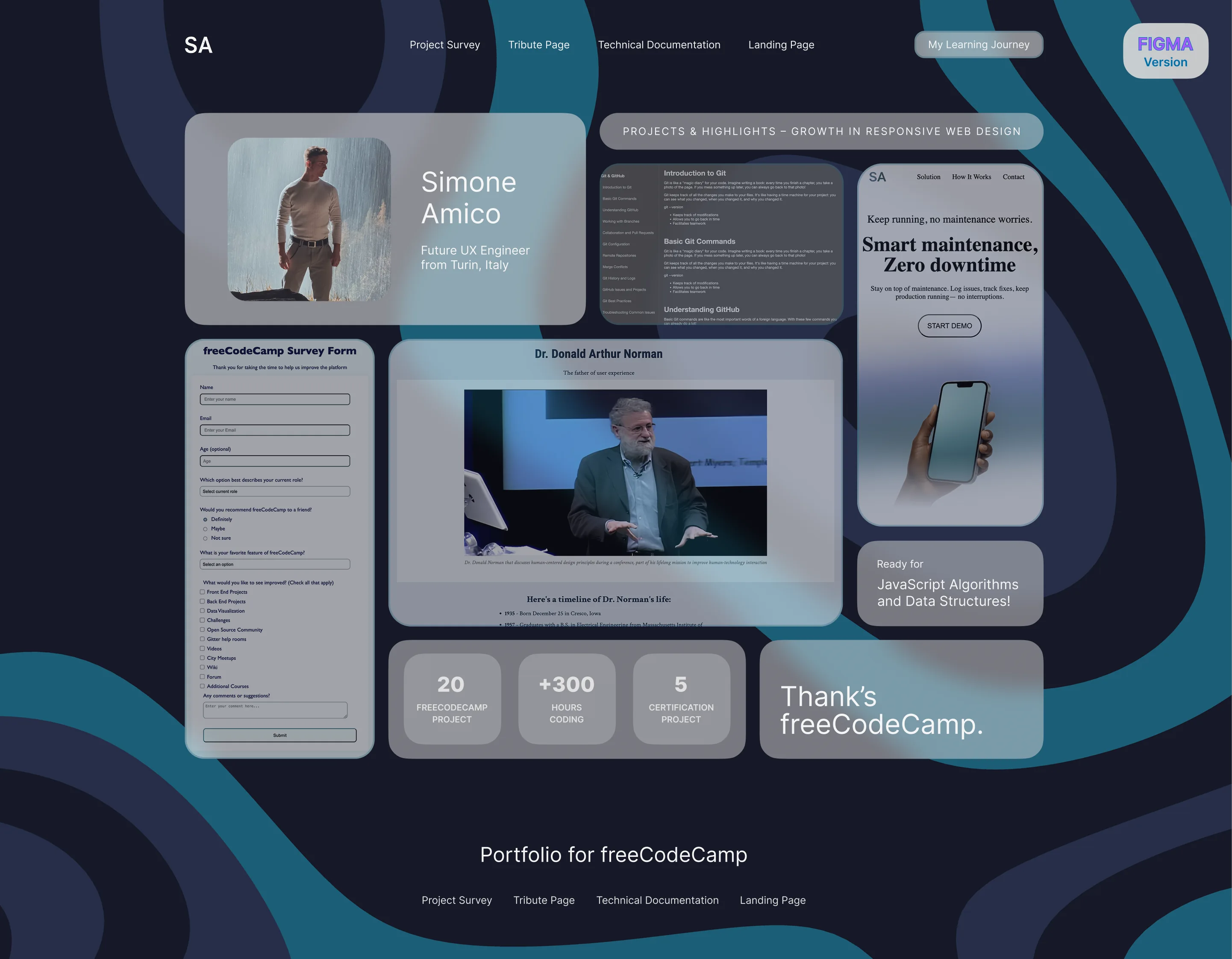
For the first time I'm proud to showcase the Visual Studio Code version over the Figma one, because the final implementation exceeded the original prototype!
The Winning Strategy
In this case I didn't score an own goal like in the Landing Page project. I created the Figma prototype based on what I thought I could do. As Refactoring UI teaches: if you need to add a new feature multiply by 4 the time you think is sufficient. Indeed I spent 1 full day for the Figma prototype and a full 3 days of code.
The Detailed Process
First day: Dedicated to the Figma prototype. I created the wallpaper creatively trying to reflect freeCodeCamp's personality as much as possible but with a touch of blue because without it I noticed the glossy effect didn't work. Then I tried to adapt everything pixel perfect, always based on what Refactoring UI taught me. Second day: I thought I was at the end, in fact I had written this in the txt file of the "Progress today" folder on my desktop: "Done part of html + CSS but not complete. Probably 65% of the project. Written 460 lines of code, I'm at this stage:"
I thought I had victory in my pocket but I was actually at 35% at most. Following days: The next two days required many more hours, first to add animations and effects that would guarantee a pleasant desktop experience and the last day the responsive which was the longest part of all.
The Error That Taught Me Everything
I made such a serious error that I carried it to the end: defining a very specific container and consequently positions relative to it that were too specific (I had taken them all from Figma) which on one hand would have guaranteed an experience exactly as created on Figma but would have required specific media queries even for tablet and smartphone, to the point of creating multiple applications in one - something I discovered that the biggest development teams do. I then opted as with the landing page to reach 70% in 3 days and immediately start JavaScript. I can't wait!
The Technological Discoveries
I learned so much in this project, and I also discovered:
- How to upload a website with repository from GitHub
- Responsively.app - amazing app that allows adding any device to test dimensions
- Firefox Developer Edition and Safari with developer settings
The Moment of Truth
But not only do I now have the certificate, I also have a personal domain!
What I Learned
Advanced Design System:
- Glassmorphism with backdrop-filter and blur effects
- Bento Grid Layout for modern visual organization
- CSS Variables for coherent design system
- Professional domain setup and DNS management
Complex Responsive Design:
- Device-specific media queries
- Zoom properties for precise adaptation
- Orientation handling for landscape/portrait
Animations and Interactions:
- Hover effects with scale and shadow
- Optimized transition timing
- Active states for tactile feedback
- Hover media queries (hover: hover) and (pointer: fine)
Professional Workflow:
- Complete Figma to Code pipeline
- GitHub repository deployment
- Professional domain integration
- Cross-browser testing with developer tools
The 70% Philosophy Confirmed
I didn't think I'd finish this chapter so well. I already see things that don't work in this portfolio but I remain firm on 70%.
Ready for JavaScript!
Final Reflection
The portfolio isn't perfect, but it represents everything I am at this moment in my journey. It's authentic, functional, and shows my growth. Above all, it gave me the confidence that I can really turn my design ideas into functional code. From a kid who tinkered with Webnode to a developer who creates his own portfolio from scratch with a personalized domain. The circle has closed, but it's also the starting point for the next chapter.
Technical Implementation Notes
Design Integrity vs Certification Requirements The version deployed at simoneamico.com represents my original design vision with optimal visual hierarchy and proportions. The version submitted for freeCodeCamp certification required minor technical modifications (fixed navbar, ID attributes) to pass automated tests. While these changes don't affect functionality, they slightly alter the intended design proportions. I believe in maintaining design integrity while meeting technical requirements - this project demonstrates both the ability to create compelling user experiences and adapt to technical constraints when necessary.
Certification compliance: freeCodeCamp tests passed ✔️
Achievement Unlocked: freeCodeCamp Responsive Web Design Certification ✔️
Next Adventure: JavaScript Algorithms and Data Structures