Product Landing Page
The Project
Landing page for an intelligent maintenance platform, developed as a freeCodeCamp certification project. "A Ferrari with some scratches" - as defined by Claude for the massive use of advanced techniques with some errors intentionally left.
Strategic choice: I decided on this specific website subject precisely because it's exactly what I'm working on in the Google UX course - to unite the two different learning paths synergistically.
Source Code
- index.html
- styles.css
<!DOCTYPE html>
<html lang="en">
<head>
<meta charset="UTF-8">
<meta name="viewport" content="width=device-width, initial-scale=1.0" />
<title> My First Landing Page</title>
<link rel="stylesheet" href="styles.css">
</head>
<body>
<main>
<header id="header">
<img src="" alt="" id="header-img">
<nav id="nav-bar">
<img src="logo.png" class="logo-image">
<div class="central-link">
<a href="#Solution" class="nav-link">Solution</a>
<a href="#How-It-Works" class="nav-link">How It Works</a>
<a href="#Contact" class="nav-link">Contact</a>
</div>
<button id="nav-start-demo" type="submit" class="start-demo">START DEMO</button>
</nav>
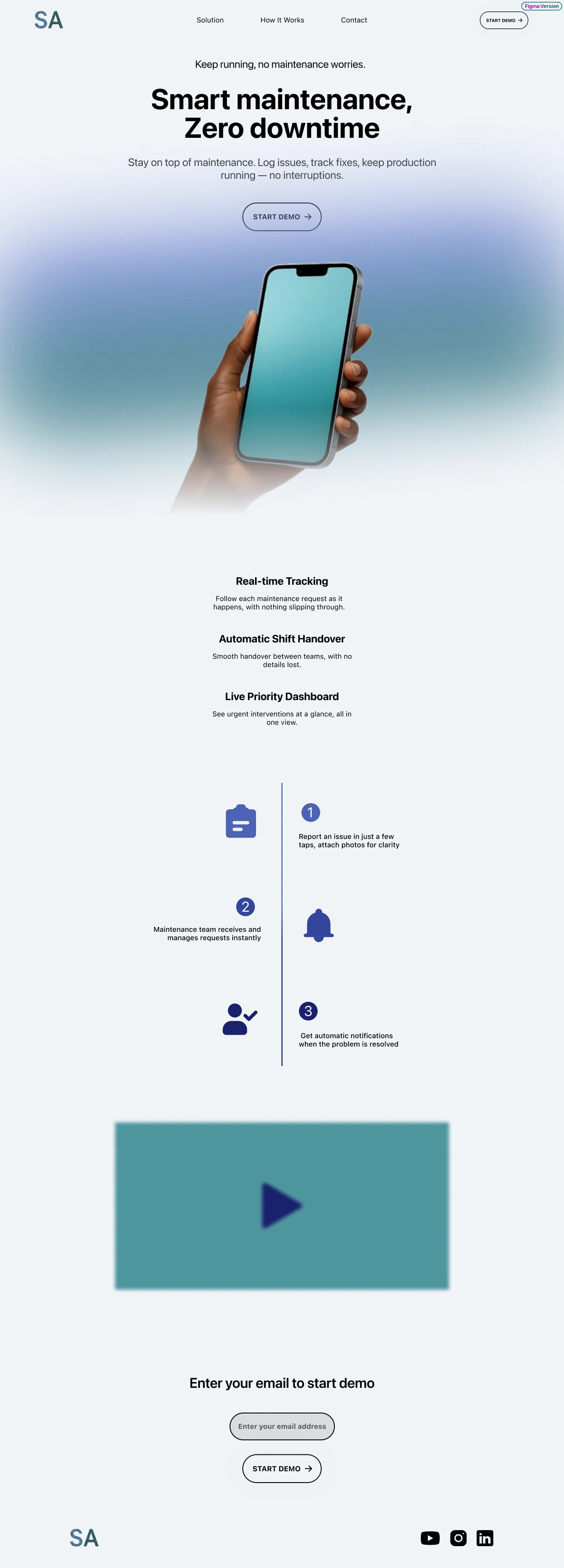
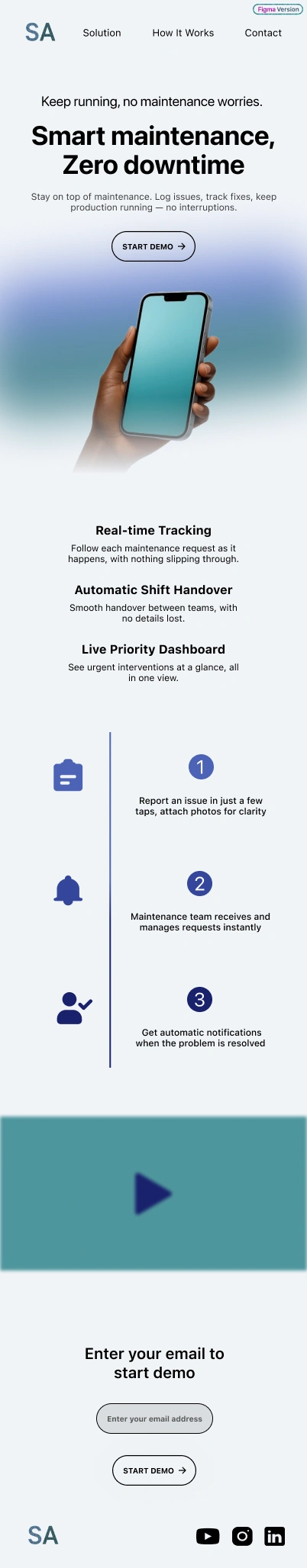
<section class="title-subtitle-button">
<h2 class="subtitle subtitle-top">Keep running, no maintenance worries.</h2>
<h1 class="title">Smart maintenance,<br>Zero downtime</h1>
<h2 class="subtitle subtitle-bottom">Stay on top of maintenance. Log issues, track fixes, keep production <br class="desktop-only">running— no interruptions.</span></h2>
<button id="hero-start-demo" type="submit" class="start-demo first-start-demo">START DEMO</button>
</section>
<section id="Solution" class="solution">
<h3>Real‑time Tracking</h3>
<p>Follow each maintenance request as it<br>happens, with nothing slipping through.</p>
<h3>Automatic Shift Handover</h3>
<p>Smooth handover between teams, with no<br>details lost.</p>
<h3>Live Priority Dashboard</h3>
<p class="end-solution">See urgent interventions at a glance, all in<br>one view.</p>
</section>
<section id="How-It-Works" class="how-it-works">
<ol>
<li>Report an issue in just a few taps, attach photos for clarity</li>
<li>Maintenance team receives and manages requests instantly</li>
<li>Get automatic notifications when the problem is resolved</li>
</ol>
</section>
<section id="youtube-video" class="youtube-video">
<div class="iframe">
<iframe src="https://www.youtube.com/watch?v=pCtkD5AMbDo" id="video" width="650" height="400"></iframe>
</div>
</section>
<section id="Contact">
<form action="https://www.freecodecamp.com/email-submit" id="form">
<h4 class="form-start">Enter your email to start demo</h4>
<div class="email-address">
<input name="email" type="email" id="email" placeholder="Enter your email address" required>
</div>
<button id="form-start-demo" type="submit" class="start-demo">START DEMO</button>
</form>
</section>
</header>
</main>
<footer>
<address>
<img src="logo.png" alt="logo azienda 'SA'" class="logo-footer">
<div class="social-link">
<img src="youtube.svg" alt="link a YouTube Channel di SA" class="social-youtube">
<img src="instagram.svg" alt="link ad Instagram di SA" class="social-instagram">
<img src="linkedin.svg" alt="link a Linkedin di SA" class="social-linkedin">
</div>
</address>
</footer>
</body>
</html>
:root {
    --wallpaper: #F1F4F8;
    --color-1: #377A84;
    --color-2: #7F94D6;
    --color-3: #4C63B6;
    --color-4: #35469C;
    --color-5: #19216C;
    --color-black: black;
    --color-hover: #0A6C74;
    --color-input-bg: rgba(0, 0, 0, 10%);

    --spacing-title-top: 32px;
    --spacing-title-bottom: 32px;
    --spacing-first-buttom-top: 48px;
    --spacing-first-buttom-bottom: 700px;
    --spacing-p-bottom: 16px;
    --spacing-h3-top: 48px;
    --navbar-height: 60px;
    --spacing-nav-padding: 16px 32px;
    --spacing-nav-link: 16px;
    --spacing-gap: 80px;
    --spacing-hero-padding: 60px 40px 100px 40px;
    --spacing-hero-padding-clean: 60px 0 100px 0;
    --spacing-button-padding: 16px 32px;
    --spacing-form-top: 192px;
    --spacing-how-it-works: 128px;
    --spacing-email-margin: 48px 0 32px;
    --spacing-footer-bottom: 25px;
    --spacing-footer-side: 100px;
    --spacing-social-right: 24px;
    --spacing-li-bottom: 16px;
    --spacing-button-input: 16px 24px;
    --spacing-transform: -1px;

    --font-size-title: 65px;
    --font-size-subtitle: 24px;
    --font-size-nav: 16px;
    --font-size-p: 16px;
    --font-size-h4: 32px;
    --font-size-nav-button: 10px;

    --font-weight-bold: 700;
    --font-weight-normal: 400;
    --font-weight-medium: 500;

    --radius-button: 33px;
    --radius-input: 32px;
    --radius-hero: 0 0 20px 20px;

    --logo-width: 66px;
    --logo-height: 39px;
    --button-width-nav: 110px;
    --button-height-nav: 40px;
    --button-width: 180px;
    --button-height: 65px;
    --input-width: 230px;
    --input-height: 63px;
    --youtube-width: 44px;
    --youtube-height: 33px;
    --instagram-width: 37px;
    --instagram-height: 36px;
    --linkedin-width: 37px;
    --linkedin-height: 36px;

    --transition-normal: all 0.2s ease;
    --line-height-title: 1;
    --background-size: 100%;
    --background-position: center 30px;
}

* {
    margin: 0;
    padding: 0;
    box-sizing: border-box;
}

html {
    background-color: var(--wallpaper);
    scroll-behavior: smooth;
}

nav {
    width: 100%;
    font-size: var(--font-size-nav);
    display: flex;
    justify-content: space-between;
    align-items: center;
    padding: var(--spacing-nav-padding);
    background: var(--wallpaper);
    position: fixed;
    top: 0;
    box-sizing: border-box;
}

a {
    text-decoration: none;
    color: var(--color-black);
}

.central-link {
    display: flex;
    gap: var(--spacing-gap);
}

.logo-image {
    width: var(--logo-width);
    height: var(--logo-height);
}

.nav-link:first-child {
    margin-left: var(--spacing-nav-link);
}

#nav-start-demo {
    margin-right: var(--spacing-nav-link);
}

.title-subtitle-button {
    text-align: center;
    margin-top: var(--navbar-height);
    background: url('sfondo-hero.png');
    background-size: var(--background-size);
    background-position: var(--background-position);
    background-repeat: no-repeat;
    padding: var(--spacing-hero-padding);
    border-radius: var(--radius-hero);
    padding: var(--spacing-hero-padding-clean);
}

.title {
    font-size: var(--font-size-title);
    font-weight: var(--font-weight-bold);
    margin-top: var(--spacing-title-top);
    margin-bottom: var(--spacing-title-bottom);
    line-height: var(--line-height-title);
}

.subtitle {
    font-weight: var(--font-weight-normal);
}

.subtitle-top {
    font-size: var(--font-size-subtitle-top);
}

.subtitle-bottom {
    font-size: var(--font-size-subtitle-bottom);
}

.subtitle-bottom {
    margin-bottom: var(--spacing-first-buttom-top);
}

.desktop-only {
    display: inline;
}

.solution {
    text-align: center;
}

.first-start-demo {
    margin-bottom: var(--spacing-first-buttom-bottom);
}

h3 {
    margin-top: var(--spacing-h3-top);
}

.start-demo {
    display: inline-block;
    padding: var(--spacing-button-padding);
    text-decoration: none;
    border-radius: var(--radius-button);
    font-weight: var(--font-weight-normal);
    font-size: var(--font-size-nav);
    cursor: pointer;
    transition: var(--transition-normal);
    text-align: center;
    width: var(--button-width);
    height: var(--button-height);
    background: none;
}

#nav-start-demo {
    width: var(--button-width-nav);
    height: var(--button-height-nav);
    font-size: var(--font-size-nav-button);
    white-space: nowrap;
    display: flex;
    align-items: center;
    justify-content: center;
}

#submit:hover {
    background: var(--color-hover);
    transform: translateY(var(--spacing-transform));
}

.form-start {
    margin-top: var(--spacing-form-top);
}

.how-it-works {
    text-align: center;
    margin: var(--spacing-how-it-works);
}

.how-it-works ol{
    list-style-position: inside;
    padding-left: 0;
}

.how-it-works li{
    margin-bottom: var(--spacing-li-bottom);
}

.how-it-works li:last-child {
    margin-bottom: 0;
}

.iframe > iframe {
    display: flex;
    justify-content: center;
    margin-bottom: 0 !important;
    width: 100% !important;
    height: 200px !important;
}

#Contact {
    display: flex;
    justify-content: center;
    text-align: center;
}

#email {
    margin-top: var(--spacing-first-buttom-top);
    margin-bottom: var(--spacing-title-bottom);
    width: var(--input-width);
    height: var(--input-height);
    background-color: var(--color-input-bg);
}

h4 {
    font-size: var(--font-size-h4);
    font-weight: var(--font-weight-medium);
}

input[type="email"] {
    width: fit-content;
    padding: var(--spacing-button-input);
    font-size: var(--font-size-nav);
    border-radius: var(--radius-input);
    margin: var(--spacing-email-margin);
}

footer {
    margin-bottom: var(--spacing-footer-bottom);
}

address {
    display: flex;
    justify-content: space-between;
}

.logo-footer {
    width: var(--logo-width);
    height: var(--logo-height);
    margin-left: var(--spacing-footer-side);
}

.social-link {
    display: flex;
    align-items: center;
    margin-right: var(--spacing-footer-side);
}

.social-youtube {
    width: var(--youtube-width);
    height: var(--youtube-height);
    margin-right: var(--spacing-social-right);
}

.social-instagram {
    width: var(--instagram-width);
    height: var(--instagram-height);
    margin-right: var(--spacing-social-right);
}

.social-linkedin {
    width: var(--linkedin-width);
    height: var(--linkedin-height);
}

@media (max-width: 768px) {
    :root {
    --spacing-title-top: 16px;
    --spacing-title-bottom: 16px;
    --spacing-first-buttom-top: 24px;
    --spacing-first-buttom-bottom: 230px;
    --spacing-p-bottom: 8px;
    --spacing-h3-top: 24px;
    --navbar-height: 30px;
    --spacing-nav-padding: 16px 32px;
    --spacing-nav-link: 16px;
    --spacing-gap: 20px;
    --spacing-hero-padding: 60px 40px 100px 40px;
    --spacing-hero-padding-clean: 60px 0 100px 0;
    --spacing-button-padding: 16px 32px;
    --spacing-form-top: 192px;
    --spacing-how-it-works: 64px;
    --spacing-email-margin: 24px 0 16px;
    --spacing-footer-bottom: 12px;
    --spacing-footer-side: 50px;
    --spacing-social-right: 12px;
    --spacing-li-bottom: 8px;
    --spacing-button-input: 8px 12px;
    --spacing-transform: -1px;

    --font-size-title: 35px;
    --font-size-subtitle-top: 18px;
    --font-size-subtitle-bottom: 12px;
    --font-size-nav: 12px;
    --font-size-p: 12px;
    --font-size-h4: 20px;
    --font-size-nav-button: 10px;

    --font-weight-bold: 700;
    --font-weight-normal: 400;
    --font-weight-medium: 500;

    --radius-button: 33px;
    --radius-input: 32px;
    --radius-hero: 0 0 20px 20px;

    --logo-width: 33px;
    --logo-height: 19.5px;
    --button-width-nav: 110px;
    --button-height-nav: 40px;
    --button-width: 110px;
    --button-height: 40px;
    --input-width: 163px;
    --input-height: 40px;
    --youtube-width: 44px;
    --youtube-height: 33px;
    --instagram-width: 37px;
    --instagram-height: 36px;
    --linkedin-width: 37px;
    --linkedin-height: 36px;

    --transition-normal: all 0.2s ease;
    --line-height-title: 1;
    --background-size: 150%;
    --background-position: center 130px;
}

    .subtitle-top {
        margin-top: -20px;
    }

    #nav-start-demo {
        display: none;
    }

    .start-demo {
        white-space: nowrap;
        display: inline-flex;
        align-items: center;
        justify-content: center;
        text-align: center;
    }

    nav {
        padding: 16px;
        margin-left: -10px;
    }

    .central-link {
        position: absolute;
        left: 100px;
    }

    .desktop-only {
        display: none;
    }

    h3 {
        font-size: 16px;
    }

    p {
        font-size: 12px;
    }

    .iframe {
        margin-bottom: -70px;
    }

    footer {
        margin-top: 48px;
    }

    address {
        display: flex;
        align-items: center;
        gap: 90px;
    }

    .logo-footer {
        margin-left: 40px;
    }

    .social-link {
        transform: scale(0.8);
    }
}
The Decision for Technical Authenticity
I decided on purpose not to have my code reviewed before publishing it, to say: "This is my exact level without AI."
The Love Affair with CSS Variables
I had said I fell in love with variables and here I decided to integrate them massively. Despite completely changing the interface from web to mobile, as Refactoring UI suggests, I found great benefit when in media queries I mostly just had to modify the variables to apply correct spacing and dimensions.
The Figma → Code Process
Not only did I complicate my life with massive use of variables, I did it even by first creating the design in Figma following all the Refactoring UI rules I've learned so far, then trying to replicate pixel-perfect everything designed in Figma.
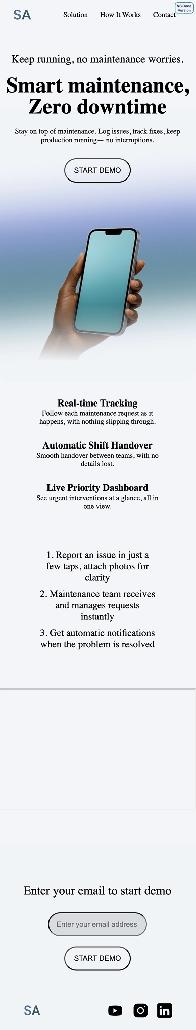
Mobile-first approach: I first designed for mobile as Refactoring UI suggests, because by doing so you then realize there isn't much to change for the desktop version. Also, you shouldn't be afraid of white spaces - it's better to add than to remove later.
I can say today that I fully empathize with front end developers who are tasked with turning UX/UI designers' Figma designs into code. I understand their "hate" and indeed I realized how difficult it is.
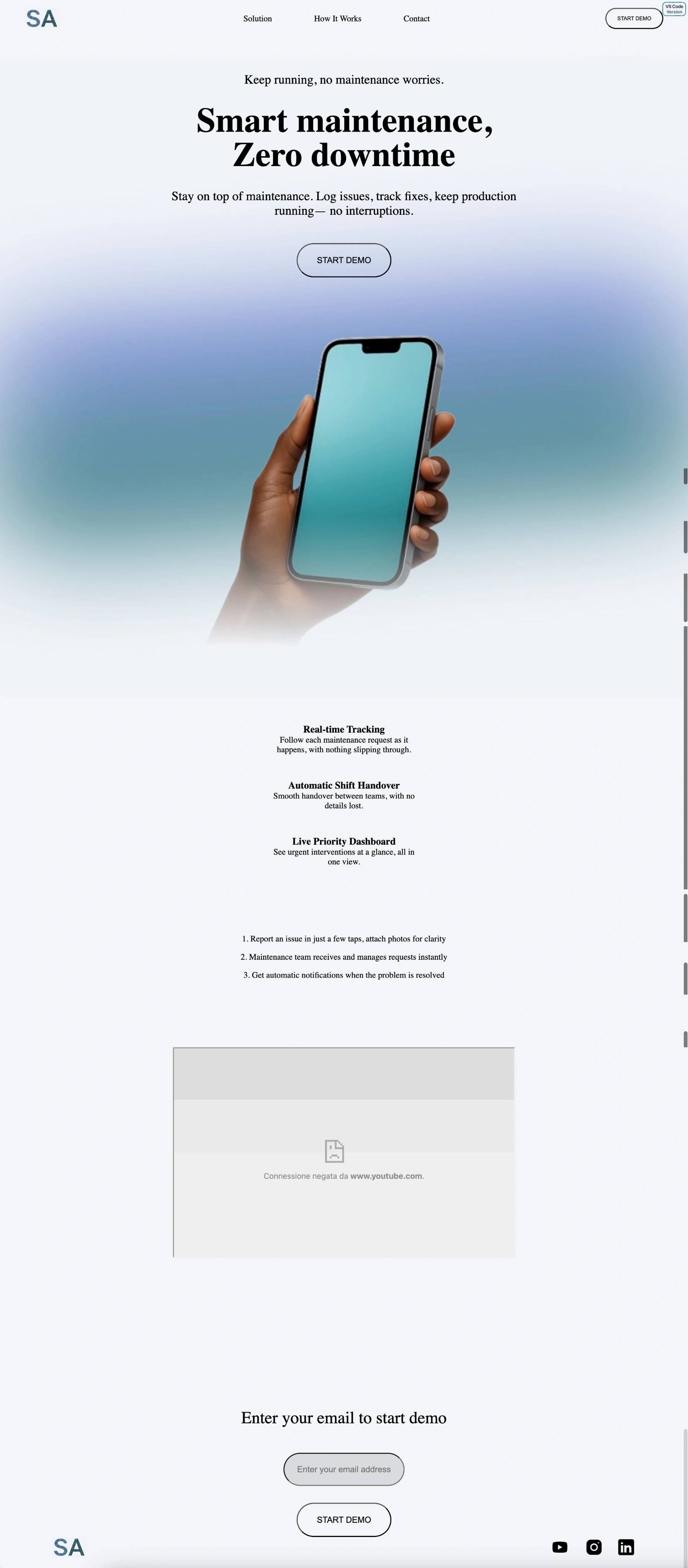
The "How It Works" Section Failure
I couldn't convert all of the Figma. I'm referring particularly to the "How It Works" section which after several attempts I decided to simplify into a numbered list (<ol>), always showing the difference between the Figma Version and the VS Code Version.
The Role Difference Insight
Precisely because of this I understand the difference between Front End Developer and UX Engineer:
- UX Designer: Thinks in terms of beauty and usability
- Front End Developer: Thinks in terms of code efficiency
- UX Engineer: When prototyping on Figma doesn't just see components, sees CSS rules, wonders whether to use flexbox rather than grid here...
The UX Engineer creates a product that balances all these aspects.
The Choice of 70% vs 100%
I'm not 100% satisfied, because the content was designed to work with perfect dimensions on MacBook Air and iPhone 16 Pro, therefore it doesn't have perfect proportions in other formats. I understood how demanding the responsive side is.
You'll ask: why didn't you push until making it perfect?
I preferred to spend a total of 3 days between Figma and VS Code, rather than three weeks (if I'm lucky), and use those days to move forward. At the same time I'm also doing course 3/8 of Google UX - tomorrow I plan to finish the last wireframes to complete this third course.
The Philosophy of Progressive Imperfection
I realized something fundamental: it's precisely this tendency toward perfection IMMEDIATELY that blocks the beginner who wants to become senior.
Gym analogy: I've been practicing gym for 6 years, I started with friends all "bigger" than me, but despite genetics playing against me, today I'm the "biggest" and by no small margin. Why? They almost all stopped or are inconsistent.
It's like saying: "I'm not leaving the gym until I do the best technically possible workout!" It's simply impossible. Much better to do many imperfect workouts - unconsciously you'll reach levels that as a beginner you didn't even imagine existed.
The Progressive Quality Index
Much better to do many 70% projects and then reach 100% after some time, rather than getting trapped in the loop of trying to reach 100% with the first one.
By "70%" I mean: working project, aesthetically decent, basic responsive, but not perfect in every detail. The "100%" would be: pixel-perfect on every device, advanced optimizations, perfectly clean code, every edge case handled.
The paradox is that by doing 10 projects at 70%, you gain the experience to naturally make 90-95% projects without effort. Staying stuck on the first one to make it perfect, you always remain at the initial level.
The Position on AI
I'm sure that massive use of AI will only bring me "rented" knowledge. Not only because those who get used to it are lost without it, but also because if I write the code myself, in case of problems I know exactly what I called that variable and where I put that flexbox instead of grid.
I'll use AI in this journey only to understand and get advice, I'll never copy and paste. Not only wouldn't I understand what I'm doing, I wouldn't even be straining myself - it's precisely this effort that makes you strong and independent.
What I Learned
Notable Techniques:
- Massive CSS Variables as true design system
- Variable overrides in media queries (genius!)
- Flexbox for precise alignments
- Ultra-rounded buttons modern style
- Responsive that changes everything on mobile
- Subtle but effective hover transitions
Problems Left Intentionally:
- Wrong heading hierarchy (h2 before h1)
- Span tag closed without opening
- Wrong YouTube URL for iframe
- Everything inside header (strange semantic structure)
Next Project: Learn CSS Animation by Building a Ferris Wheel