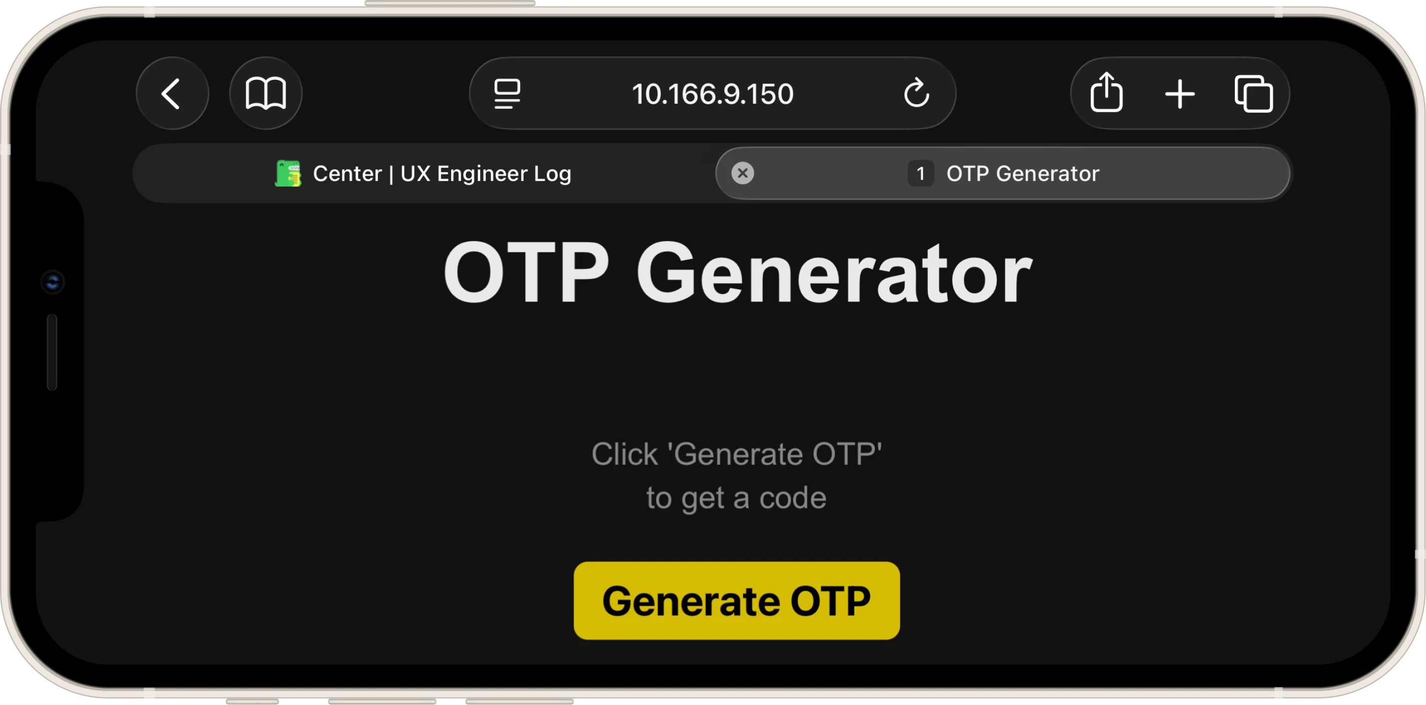
One-Time Password Generator
Il Progetto
Un Lab di freeCodeCamp che si è rivelato più un ripasso consapevole che una scoperta: useState, useEffect, rendering condizionale. Tutto già visto. Ma la libertà sul CSS e una domanda al Code Tutor sulla sicurezza crittografica hanno reso l'esercizio più interessante di quanto mi aspettassi.
Codice Sorgente
- index.jsx
- index.html
- styles.css
/* DESIGN
------
* This file contains the React logic for the OTP Generator application
* The architecture focuses on the "Side Effect" pattern and secure randomness:
*
* The Generation Logic (Cryptographic Randomness):
* - I used `window.crypto.getRandomValues()` instead of `Math.random()` because
* Math.random is pseudo-random (predictable), while the Web Crypto API pulls
* entropy from the operating system, making the OTP genuinely unpredictable
* - The modulo trick (`% 1000000`) extracts exactly 6 digits from a 32-bit integer,
* and `padStart(6, "0")` ensures codes like "000042" aren't truncated to "42"
*
* The Timer System (useEffect + setInterval):
* - I implemented a countdown using `useEffect` that watches two dependencies:
* `isActive` (whether the timer is running) and `timeLeft` (remaining seconds)
* - The effect contains a Guard Clause pattern: if the timer isn't active or has
* reached zero, it exits early and resets `isActive` to re-enable the button
* - When active, a `setInterval` decrements `timeLeft` every second
* - The cleanup function (`return () => clearInterval(...)`) is critical because
* this effect re-runs every time `timeLeft` changes (it's in the dependency array:
* `[isActive, timeLeft]`)
* Without cleanup:
* - Second 1: interval #1 created → decrements timeLeft to 4
* - Second 2: effect re-runs → interval #1 still active + interval #2 created
* - Second 3: intervals #1, #2, #3 all active → timeLeft decrements by 3 at once
* - Result: the countdown accelerates exponentially until the timer completes
* The cleanup ensures the old interval is destroyed before creating a new one,
* maintaining exactly one active interval at any time
*
* The UI State Machine:
* - The display cycles through three visual states driven by two boolean conditions:
* 1. No OTP yet → placeholder message (styled with `.empty` class)
* 2. OTP active → large 6-digit code with live countdown
* 3. OTP expired → same code visible, but timer shows expiration message
* - The button's `disabled` prop is bound directly to `isActive`, creating a
* self-regulating loop: generate → disable → countdown → enable.
*/
/* freeCodeCamp instructions:
* 1. You should use the useEffect hook to manage the countdown timer. ✔️
* 2. Your OTPGenerator component should return a div element with the class name container. ✔️
* 3. The div having the class container should include the following elements:
* - An h1 element with the ID otp-title and text "OTP Generator". ✔️
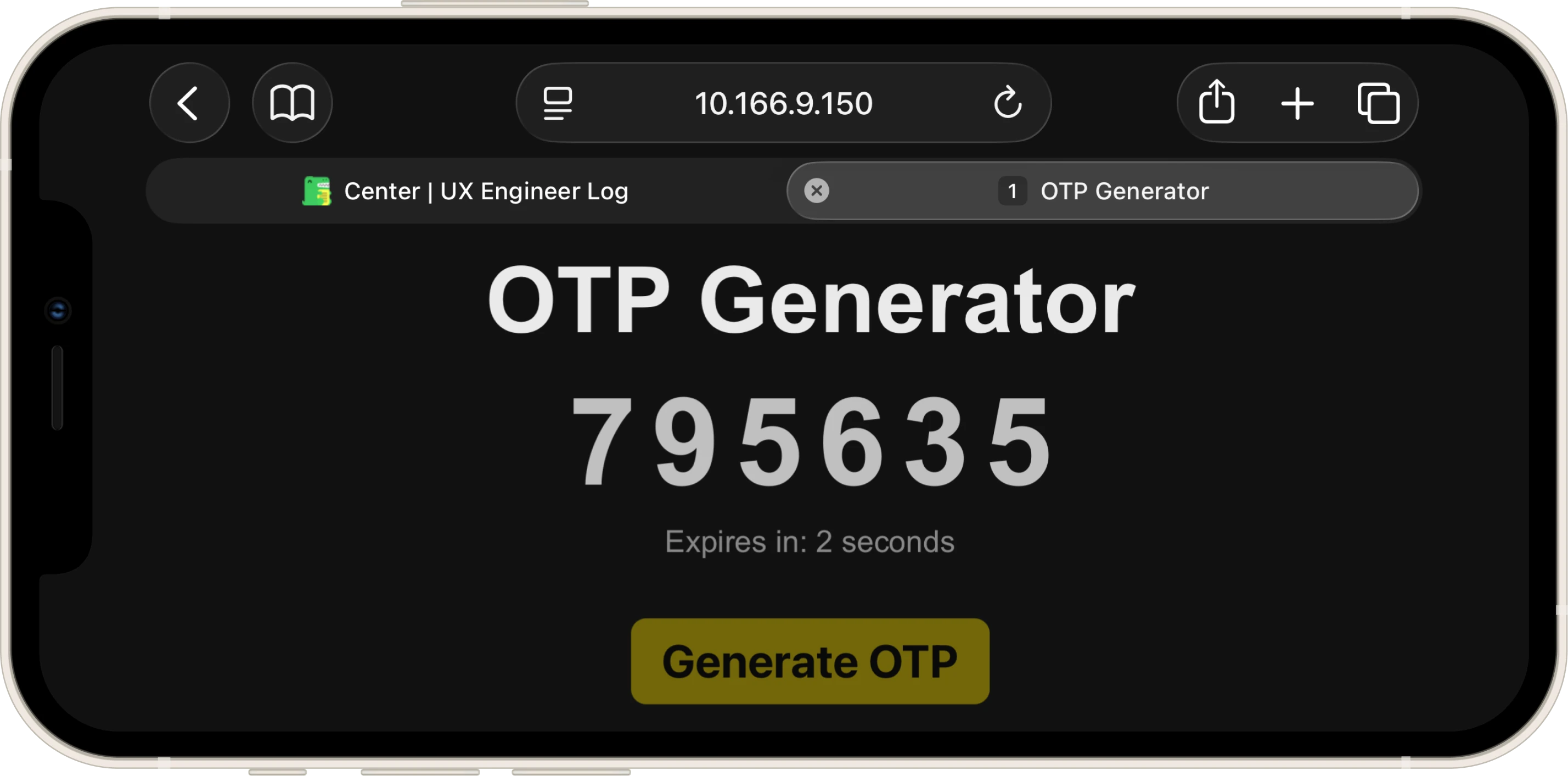
* - An h2 element with the ID otp-display that either displays the message "Click 'Generate OTP' to get a code"
* or shows the generated OTP if one is available. ✔️
* - A p element with the ID otp-timer and aria-live attribute set to a valid value that:
* - Starts off empty. ✔️
* - Displays "Expires in: X seconds" after the button is clicked, where X represents the remaining time
* before the OTP expires. ✔️
* - Shows the message "OTP expired. Click the button to generate a new OTP." once the countdown reaches 0. ✔️
* - A button element with the ID generate-otp-button labeled "Generate OTP". When clicked, it should generate a
* new OTP and start a 5-second countdown. ✔️
* - The "Generate OTP" button must be disabled while the countdown is active. ✔️
* 4. You should ensure the countdown timer stops automatically once it reaches 0 seconds to prevent unnecessary updates. ✔️
* 5. The generated OTP should be 6 digits long. ✔️
*/
const { useState, useEffect, useRef } = React;
export const OTPGenerator = () => {
const [otp, setOtp] = useState("");
const [timeLeft, setTimeLeft] = useState(0);
const [isActive, setIsActive] = useState(false);
const generateOTP = () => {
/*
* I chose the Web Crypto API over Math.random() for security reasons and to gain
* hands-on experience with the API
* `Uint32Array(1)` creates a typed array that holds one 32-bit unsigned integer,
* and `getRandomValues` fills it with cryptographically strong random data
* from the OS entropy pool (e.g. 2,567,523,558)
* The modulo operation (`% 1000000`) extracts the last 6 digits (e.g. 523,558),
* and `padStart` ensures we always get exactly 6 characters, even if the result
* starts with zeros (e.g. 4,821 becomes "004821")
*/
const array = new Uint32Array(1);
window.crypto.getRandomValues(array);
const sixDigits = array[0] % 1000000;
const secureOtp = sixDigits.toString().padStart(6, "0");
setOtp(secureOtp);
setTimeLeft(5);
setIsActive(true);
};
useEffect(() => {
/*
* Guard Clause pattern: I check the "stop conditions" first and exit early
* If the timer isn't active OR has reached zero, there's nothing to do
* Important detail: when `timeLeft` hits 0, I must also set `isActive` to false,
* otherwise the button would stay disabled forever since nothing would reset it
*/
if (!isActive || timeLeft === 0) {
if (timeLeft === 0) setIsActive(false);
return;
}
/*
* The interval engine: if we reach this point, the timer is active and has
* seconds remaining. I set up a `setInterval` that decrements `timeLeft` by 1
* every 1000ms
*
* The cleanup function (the returned arrow function) is critical here:
* because `useEffect` re-runs every time `timeLeft` changes, without cleanup
* each re-render would stack a NEW interval on top of the old one, causing
* the countdown to accelerate exponentially. The cleanup kills the previous
* interval before the next one starts
*/
const intervalId = setInterval(() => {
setTimeLeft(timeLeft - 1);
}, 1000);
return () => clearInterval(intervalId);
}, [isActive, timeLeft]); // Re-run when timer state or countdown value changes
return (
<div className="container">
<h1 id="otp-title" className="title">OTP Generator</h1>
{/*
* Conditional rendering with ternary:
* If `otp` has a value, I display the 6-digit code; otherwise, I show
* the placeholder message. The `.empty` class is toggled dynamically
* to switch between the large monospace OTP style and the smaller
* instructional text style
*/}
<h2 id="otp-display" className={`display ${!otp ? "empty" : ""}`}>
{otp ? otp : "Click 'Generate OTP' to get a code"}
</h2>
{/*
* The timer display uses a nested ternary to handle three states:
* 1. No OTP generated yet (`!otp`) → empty string (aria-live region stays silent)
* 2. OTP active (`isActive`) → "Expires in: X seconds" (live countdown)
* 3. OTP expired (`!isActive`) → expiration message prompting regeneration
*
* I set `aria-live="polite"` so screen readers announce countdown changes
* without interrupting the user's current focus
*/}
<p id="otp-timer" className="timer-text" aria-live="polite">
{otp ? (isActive ? `Expires in: ${timeLeft} seconds` : "OTP expired. Click the button to generate a new OTP.") : ""}
</p>
{/*
* The button's `disabled` prop is bound directly to `isActive`, creating
* a self-regulating cycle: clicking generates an OTP and disables the button,
* the countdown runs, and when it expires `isActive` becomes false,
* automatically re-enabling the button
*/}
<button
id="generate-otp-button"
className="generate-btn"
onClick={generateOTP}
disabled={isActive}
>
Generate OTP
</button>
</div>
);
};
<!DOCTYPE html>
<html>
<head>

<!-- DESIGN
     ------
     * File Origin: Pre-packaged environment by freeCodeCamp
     * Role: The "Engine Room" (Host Environment)
     *
     * How it works (In-browser Compilation):
     * This file differs from standard professional workflows (like Vite/Next.js).
     * Usually, we "cook" (compile) the code on our computer before sending it to the browser.
     * Here, the "cooking" happens directly inside the user's browser via Babel.
     *
     * The Ingredients (CDNs):
     * Instead of installing React via terminal (npm install), this file pulls React (the logic)
     * and ReactDOM (the rendering) directly from the internet via <script> tags.
     * It's like streaming a movie instead of downloading it.
     *
     * The Live Translator (Babel Standalone):
     * Browsers don't understand React/JSX natively. This file loads "Babel", a tool that acts
     * as a simultaneous interpreter. It reads the code inside "index.jsx", translates it
     * instantly into standard JavaScript, and executes it.
     *
     * The Canvas (#root):
     * The <body> is intentionally empty except for a single <div id="root">.
     * This is the "mounting point" where React will paint the entire OTP Generator application.
     *
     * The Spark (Bootstrapping):
     * The script at the very bottom connects the dots.
     * - It uses `type="text/babel"` and `data-type="module"` to enable modern JavaScript features (ES6 Imports).
     * - It grabs the 'root' div and tells React: "Import the { OTPGenerator } from our file and draw it here".
-->

    <meta charset="UTF-8" />
    <meta name="viewport" content="width=device-width, initial-scale=1.0" />
    <title>OTP Generator</title>
    <link rel="stylesheet" href="styles.css" />
    <script src="https://cdnjs.cloudflare.com/ajax/libs/react/18.3.1/umd/react.development.min.js"></script>
    <script src="https://cdnjs.cloudflare.com/ajax/libs/react-dom/18.3.1/umd/react-dom.development.min.js"></script>
    <script src="https://cdnjs.cloudflare.com/ajax/libs/babel-standalone/7.26.5/babel.min.js"></script>
    <script
      data-plugins="transform-modules-umd"
      type="text/babel"
      src="index.jsx"
    ></script>
</head>

<body>
    <div id="root"></div>
    <script
      data-plugins="transform-modules-umd"
      type="text/babel"
      data-presets="react"
      data-type="module"
    >
      import { OTPGenerator } from './index.jsx';
      ReactDOM.createRoot(document.getElementById('root')).render(<OTPGenerator />);
    </script>
</body>

</html>
/* DESIGN
   ------
   * This file contains all the styling for the OTP Generator application
   *
   * Design philosophy "Minimal Dark Mode":
   * I chose a dark theme (#121212) paired with high-contrast typography to create
   * a clean, focused interface. The design avoids decorative elements entirely:
   * no shadows, no gradients, no borders. The only visual "personality" comes from
   * the golden-yellow button (#d4bc03), which acts as the single accent color
   * and the only interactive element on screen
   *
   * I added a subtle "alive" interaction to the button: on press, the border-radius
   * morphs from sharp (8px) to pill-shaped (30px), giving tactile feedback that
   * confirms the user's action without any color flash or scale animation
   *
   * Mobile-First approach:
   * The base CSS targets mobile devices with generous vertical spacing and
   * touch-optimized button sizes. On desktop (768px+), the layout transforms
   * from a full-screen experience into a centered floating card with a darker background
   *
   * The architecture is a "Utility-First Variables" system:
   * I centralized all values in :root variables, organized by UNIVERSAL and MOBILE (default)
   * The DESKTOP and LANDSCAPE media queries only override these variables,
   * keeping the actual CSS rules minimal and avoiding property duplication
   *
   * The UNIVERSAL :root holds the tokens that never change across breakpoints:
   * - Typography (font-family, weights)
   * - Palette (background, text colors, button colors)
   * - Animation curves (duration, easing, button transition shorthand)
   * - OTP display tokens (letter-spacing, line-heights for display/timer/empty states)
   * - UI radius (card border-radius)
   * - Interaction tokens (disabled opacity)
   *
   * The MOBILE :root holds the tokens that get overridden by media queries:
   * - Layout spacing (container padding, granular element-to-element gaps)
   * - Font sizes (title, display, display-empty, timer, button)
   * - Anti-CLS structure (fixed heights and max-widths for display/timer areas)
   * - Component tokens (button padding, border-radius, active pill radius)
   * - Empty state tokens (translateY offset, horizontal padding for text squeeze)
   * - Desktop-only tokens (card background, card padding, card width)
   *
   * The stylesheet follows this flow:
   * - :root block with UNIVERSAL design tokens (typography, palette, animations, display,
   *   radius, interaction)
   * - A second :root block for MOBILE-specific variables (layout, spacing, font sizes,
   *   anti-CLS, components, empty state)
   * - Global reset and normalization rules
   * - Layout structure (container)
   * - Typography components (title, display, timer)
   * - Action button with hover/active/disabled states
   * - @media (max-height: 500px) for mobile landscape adjustments
   * - @media (min-width: 768px) for desktop card transformation.
*/


/* UNIVERSAL (Design Tokens) */

:root {
    /* TYPOGRAPHY STACK */
    --font-family: Arial, sans-serif;

    /* TYPOGRAPHY WEIGHTS */
    --font-weight-regular: 400;
    --font-weight-bold: 800;

    /* PALETTE - DARK THEME BASE */
    --background-color: #121212;         /* Main Background */
    --title-color: #ebeaea;              /* Primary Text */
    --display-color: #c0c0c0;            /* OTP Code Text */
    --timer-color: #888888;              /* Secondary Text (timer, placeholder) */

    /* PALETTE - CONTROLS */
    --btn-text: #000000;                 /* Button Label */
    --btn-bg: #d4bc03;                   /* Button Background (Golden Yellow) */
    --btn-bg-hover: #b49f02;             /* Button Hover State */
    --btn-bg-active: #ab9703;            /* Button Active State */

    /* ANIMATION CURVES */
    --duration-fast: 0.2s;
    --ease-default: ease;
    --btn-transition: border-radius var(--duration-fast) var(--ease-default), background-color var(--duration-fast) var(--ease-default), opacity var(--duration-fast) var(--ease-default);

    /* OTP DISPLAY TOKENS */
    --otp-letter-spacing: 8px;          /* "Security code" digit separation */
    --otp-line-height: 1;               /* Tight line-height so text doesn't exceed reserved box */
    --timer-line-height: 1.5;
    --empty-line-height: 1.4;

    /* UI RADIUS */
    --radius-card: 32px;                 /* Desktop card corners */

    /* INTERACTION TOKENS */
    --btn-disabled-opacity: 0.5;
}


/* MOBILE DEFAULT (Base Configuration) */

:root {
    /* LAYOUT SPACING */
    --container-padding-top: 14vh;
    --container-padding-x: 24px;

    /*
     * Granular Spacing System:
     * I defined individual spacing variables for each gap between elements instead of
     * using a generic spacing scale. This gives me absolute control over the vertical
     * rhythm, which matters because the OTP display and timer have very different
     * visual weights and need asymmetric spacing to feel balanced
    */
    --space-title-to-display: 48px;
    --space-display-to-timer: 24px;
    --space-timer-to-button: 48px;

    /* FONT SIZES */
    --font-size-title: 40px;
    --font-size-display: 64px;           /* Large monospace-style size for OTP code */
    --font-size-display-empty: 22px;     /* Smaller size for placeholder message */
    --font-size-timer: 16px;
    --font-size-btn: 20px;

    /*
     * Anti-CLS (Cumulative Layout Shift) Strategy:
     * The problem: this app has elements that change content dynamically. The OTP display
     * switches between a small placeholder sentence ("Click 'Generate OTP'...") and a large
     * 64px 6-digit code. The timer switches between empty, "Expires in: X seconds", and a
     * longer expiration message that may wrap to two lines. Every time these text sizes change,
     * the browser recalculates the element's height, which pushes everything below it
     * (the button, the timer) up or down, this visible "jump" is called Layout Shift
     *
     * The solution: I lock each area to a fixed `height` (not `min-height`, which would still
     * allow growth). This creates invisible "reserved boxes" that stay the same size regardless
     * of what's inside them. The content is then vertically centered within the box using
     * `display: flex` + `align-items: center`, so whether the text is tall or short, the box
     * never changes shape and nothing around it moves
     *
     * The `max-width` on the timer serves a related purpose: by setting a maximum line length,
     * I force the longer expiration message to wrap predictably into two lines instead of
     * stretching into one long line on wide screens and wrapping unpredictably on narrow ones
     * This prevents the layout from shifting when the message changes
     *
     * These three values change per breakpoint (mobile, landscape, desktop) because the font
     * sizes change, a 64px OTP on mobile needs 60px of reserved space, while on desktop with
     * more breathing room I reserve 80px
    */
    --timer-max-width: 250px;            /* Forces long timer text to wrap predictably */
    --display-min-height: 60px;          /* Reserved space for 64px OTP code */
    --timer-min-height: 48px;            /* Reserved space for timer text (up to 2 lines) */

    /* COMPONENT TOKENS */
    --btn-padding: 12px 20px;
    --btn-radius: 8px;
    --btn-radius-active: 30px;           /* Pill shape on press */

    /* EMPTY STATE TOKENS */
    --empty-transform-y: 82px;           /* Pushes placeholder text toward button */
    --empty-padding-x: 58px;             /* Squeezes text to force line breaks */
}


/* RESET & GLOBAL STYLES */

* {
    margin: 0;
    padding: 0;
    box-sizing: border-box;
}

body {
    background-color: var(--background-color);
    font-family: var(--font-family);
    color: var(--title-color);
}


/* LAYOUT STRUCTURE */

.container {
    display: flex;
    flex-direction: column;
    align-items: center;
    text-align: center;
    padding: var(--container-padding-top) var(--container-padding-x) 40px;
    max-width: 600px;
    margin: 0 auto;
}


/* COMPONENT: TYPOGRAPHY */

.title {
    color: var(--title-color);
    font-size: var(--font-size-title);
    font-weight: var(--font-weight-bold);
}

/*
 * OTP Display Area:
 * This is where the Anti-CLS strategy (explained in the :root block above) gets applied
 * I used `height` (not `min-height`) to create an absolutely rigid box: it won't grow
 * when the 64px OTP code appears, and it won't shrink when the small placeholder text
 * is shown. Combined with `display: flex` + `align-items: center`, the content floats
 * vertically centered inside this fixed box, so nothing below it ever moves
 *
 * The `letter-spacing` improves readability by adding space between the digits, and it
 * also gives a cleaner, more professional look.
 * Side effect: CSS adds the spacing after every character, including the last one, which
 * makes the whole block look shifted to the left. I compensate with a negative `margin-right`
 * equal to the letter-spacing (calculated via `calc(var(...) * -1)`) to re-center it visually
*/
.display {
    color: var(--display-color);
    font-size: var(--font-size-display);
    letter-spacing: var(--otp-letter-spacing);
    font-weight: var(--font-weight-bold);
    margin-top: var(--space-title-to-display);
    transition: all var(--duration-fast) var(--ease-default);
    margin-right: calc(var(--otp-letter-spacing) * -1);

    display: flex;
    align-items: center;
    justify-content: center;

    height: var(--display-min-height);
    line-height: var(--otp-line-height);
    overflow: visible;
}

.timer, .timer-text {
    color: var(--timer-color);
    font-size: var(--font-size-timer);
    margin-top: var(--space-display-to-timer);
    max-width: var(--timer-max-width);

    display: flex;
    align-items: center;
    justify-content: center;

    height: var(--timer-min-height);
    line-height: var(--timer-line-height);
}

/*
 * Empty State (Placeholder Message):
 * When no OTP has been generated, I switch to a smaller font, remove the letter-spacing,
 * and apply `transform: translateY(82px)` to visually push the placeholder text downward,
 * closer to the button. This creates the illusion that the text "lives" near the button
 * rather than floating in the empty OTP area. The horizontal `padding` squeezes the text
 * to force line breaks at a comfortable width on mobile screens
*/
.display.empty {
    font-size: var(--font-size-display-empty);
    letter-spacing: normal;
    font-weight: var(--font-weight-regular);
    color: var(--timer-color);
    margin-right: 0;

    transform: translateY(var(--empty-transform-y));
    padding: 0 var(--empty-padding-x);
    line-height: var(--empty-line-height);
}


/* COMPONENT: ACTION BUTTON */

.generate-btn {
    color: var(--btn-text);
    background-color: var(--btn-bg);
    border: none;
    padding: var(--btn-padding);
    font-size: var(--font-size-btn);
    font-weight: var(--font-weight-bold);
    border-radius: var(--btn-radius);
    cursor: pointer;
    transition: var(--btn-transition);
    margin-top: var(--space-timer-to-button);
    -webkit-tap-highlight-color: transparent; /* Removes the blue flash on iOS tap */
}

/* Desktop-only hover (disabled on touch devices to prevent sticky hover states) */
@media (hover: hover) {
    .generate-btn:hover:not(:disabled) {
        background-color: var(--btn-bg-hover);
    }
}

/*
 * Active State (Button Press):
 * I animated the `border-radius` instead of using `transform: scale()` because
 * I was inspired by the button in my Roman Number Converter project, which follows
 * Google's Material Design approach
*/
.generate-btn:active:not(:disabled) {
    border-radius: var(--btn-radius-active);
    background-color: var(--btn-bg-active);
}

.generate-btn:disabled {
    opacity: var(--btn-disabled-opacity);
    cursor: not-allowed;
}


/* MOBILE LANDSCAPE (Phone rotated horizontally) */

/*
 * Landscape optimization: after noticing how many major sites neglect this orientation,
 * I tested extensively on my iPhone 12 mini (with two Safari tabs for maximum vertical
 * compression) and fine-tuned every value below
 * My strategy was to compress vertical rhythm, reduce typography to avoid scrolling,
 * exploit horizontal space with a wider timer, and match Anti-CLS heights to smaller fonts
*/
@media (max-height: 500px) and (orientation: landscape) {
    :root {
        --container-padding-top: 5vh;

        /* Compacted vertical rhythm */
        --space-title-to-display: 22px;
        --space-display-to-timer: 16px;
        --space-timer-to-button: 28px;

        /* Slightly reduced typography */
        --font-size-title: 48px;
        --font-size-display-empty: 18px;
        --font-size-timer: 16px;
        --font-size-btn: 24px;
        --font-weight-bold: 700;

        /* Wider timer to exploit landscape width */
        --timer-max-width: 80vw;

        /* Reduced Anti-CLS boxes for smaller fonts */
        --display-min-height: 48px;
        --timer-min-height: 24px;

        --btn-padding: 8px 16px;

        /* Landscape empty state overrides */
        --empty-transform-y: 42px;
        --empty-padding-x: 190px;
    }
}


/* DESKTOP DASHBOARD (Card Transformation) */

/*
 * On screens wider than 768px, I transform the full-bleed mobile layout into a
 * centered floating card. The body becomes a flexbox container that vertically
 * centers the card, and the `.container` gains a darker background (#060500),
 * rounded corners, and fixed dimensions, creating a "device-within-device" effect
 * that feels more like a native app widget on large screens
*/
@media (min-width: 768px) {
    :root {
        --card-bg-color: #060500;
        --container-padding-top: 5vh;

        /* Desktop vertical rhythm */
        --space-title-to-display: 32px;
        --space-display-to-timer: 24px;
        --space-timer-to-button: 64px;

        /* Desktop typography */
        --font-size-title: 38px;
        --font-size-display: 64px;
        --font-size-display-empty: 24px;
        --font-size-timer: 18px;
        --font-size-btn: 20px;

        /* Larger Anti-CLS boxes for desktop fonts */
        --timer-max-width: 320px;
        --display-min-height: 80px;
        --timer-min-height: 56px;

        /* Larger button for mouse interaction */
        --btn-padding: 18px 36px;
        --btn-radius: 12px;
        --btn-radius-active: 40px;

        /* Desktop card dimensions */
        --card-padding: 60px 50px;
        --card-width: 420px;

        /* Desktop empty state overrides */
        --empty-transform-y: 110px;
        --empty-padding-x: 40px;
    }

    body {
        display: flex;
        justify-content: center;
        align-items: center;
        min-height: 100vh;
    }

    /* Card transformation: from transparent full-bleed to floating dark card */
    .container {
        background-color: var(--card-bg-color);
        border-radius: var(--radius-card);
        padding: var(--card-padding);
        max-width: 100%;
        width: var(--card-width);
        margin: 0;
    }

    .display.empty {
        text-align: center;
    }
}
crypto.getRandomValues(): La Domanda Giusta al Momento Giusto
La primissima cosa che ho pensato prima di iniziare è stata: posso usare crypto.randomUUID() che avevo approfondito nella Profile Card?
Il problema è che randomUUID() genera una stringa come c90d075d-53a1-..., e per estrarne 6 cifre avrei dovuto rimuovere i trattini, filtrare le lettere, estrarre i numeri, sperare ce ne fossero abbastanza e, altrimenti, rigenerare. Un accrocchio. Ho chiesto al Code Tutor, che mi ha spiegato che esiste uno strumento più diretto, crypto.getRandomValues(), nato esattamente per questo.
Non volevo usare Math.random(): avevo imparato che è pseudo-casuale e quindi prevedibile. Seppur fosse over-engineering per un esercizio didattico focalizzato sull'applicare useState, useEffect e il rendering condizionale, il funzionamento di questa API mi affascinava così tanto che non vedevo l'ora di applicarla.
Design: Obsidian + Roman Numeral Converter
Non mi sono focalizzato sul design e non ho fatto il prototipo in Figma, ma avendo carta bianca sul CSS ho deciso di andare sul semplice. Cercando alternative ad AppFlowy questa mattina, mi ero imbattuto nel sito di Obsidian: dark, minimal, nessun elemento decorativo superfluo. Ho deciso di partire da quello stile e di combinarlo con un dettaglio che avevo usato nel Roman Numeral Converter: il pulsante ispirato al Material Design che in stato active passa da angoli squadrati a pill-shaped (a forma di pillola) tramite animazione del border-radius, dando un feedback tattile gradevole.
Landscape: L'Edge Case Preferito
Ho dedicato più attenzione del solito al landscape, dopo essermi reso conto di quanto siti anche importanti lo trattino come un caso secondario. Ho preso in mano il mio edge case preferito, l'iPhone 12 mini, e ho ottimizzato ogni spaziatura per quella viewport strettissima in verticale. Ho aggiunto anche un'altra scheda in Safari per simulare la massima costrizione possibile.
Ecco il risultato:
Questa attenzione non è nata casualmente: tre giorni prima avevo aggiunto una media query al custom.css di questo sito per gestire il landscape su iPhone. Il problema erano le barre colorate laterali che il browser aggiunge di default per evitare la tacca. Sono funzionali, ma orribili da vedere. Guardando come lo risolvono i migliori, ho notato due approcci opposti:
- Apple e Google: la navbar si estende fino ai bordi fisici dello schermo ("Full Bleed"), mentre il contenuto rimane allineato entro i margini sicuri, molto evidente nel sito Apple.com.
- Wikipedia: la navbar resta compressa dentro i margini, creando un effetto "inscatolato" che spezza la continuità visiva, esattamente l'effetto che dava il mio sito.
Ho scelto l'approccio di Apple.com. Il pattern che ho usato è calc(env(safe-area-inset-left) + 12px): garantisce quindi sempre almeno 12px di padding, aggiungendo sopra di essi la dimensione della tacca sui dispositivi che ce l'hanno. Su dispositivi senza tacca, env(safe-area-inset-left) vale zero, quindi il risultato è semplicemente 12px, risolvendo anche il problema del "contenuto incollato al bordo" sui foldable, il secondo edge case su cui ho la fortuna di poter testare.
Anti-CLS
Un problema che non avevo considerato fin dall'inizio, ma che si è rivelato interessante da risolvere: il CLS (Cumulative Layout Shift), ovvero quei "salti" visivi che si verificano quando un elemento cambia dimensione e trascina tutto il resto su o giù con sé.
Il display dell'OTP cambia contenuto dinamicamente: prima mostra un placeholder con un font piccolo, poi un codice a 6 cifre con un font quasi tre volte più grande.
Stessa cosa per il timer: parte vuoto, poi mostra il conto alla rovescia, poi un messaggio di scadenza che occupa due righe. Ogni volta che il testo cambia, il browser ricalcola quanto spazio occupa quell'elemento, e tutto quello che sta sotto si sposta di conseguenza.
La soluzione è stata riservare in anticipo lo spazio necessario con un height fisso. Ho scelto height e non min-height perché min-height lascia ancora libero l'elemento di crescere. Il box deve essere rigido. Il contenuto si centra dentro con flexbox e il layout non si muove, qualunque cosa ci stia dentro.
.display {
    height: var(--display-min-height); /* Box rigido: non cresce, non si restringe */
    display: flex;
    align-items: center;
    justify-content: center;
}
Un'altra cosa che ho scoperto lavorando sul letter-spacing: CSS aggiunge lo spazio dopo ogni carattere, incluso l'ultimo, spostando visivamente tutto il blocco verso sinistra. Ho compensato con un margin-right: calc(var(--otp-letter-spacing) * -1) che riporta tutto esattamente in asse.
Cosa Ho Imparato
Guard Clause nel useEffect:
Controllare le condizioni di uscita all'inizio dell'effect, prima di qualsiasi logica, mantiene il codice piatto e leggibile. Senza il setIsActive(false) quando timeLeft raggiunge zero, il bottone resterebbe disabilitato per sempre: niente reimposta lo stato, il ciclo si blocca.
Interval Stacking:
Senza la funzione di cleanup (return () => clearInterval(intervalId)), ogni re-render causato dal cambio di timeLeft avvierebbe un nuovo setInterval senza fermare il precedente. Il conto alla rovescia accelererebbe esponenzialmente. La cleanup uccide l'intervallo precedente prima che ne parta uno nuovo.
aria-live="polite":
Aggiungere aria-live al timer significa che uno screen reader annuncia ogni aggiornamento del conto alla rovescia senza interrompere il focus corrente dell'utente. "Polite" aspetta che l'utente abbia finito ciò che sta facendo prima di parlare. È un dettaglio minimo nel codice, ma fa la differenza per chi non vede lo schermo.
hover: hover:
Wrappare gli stili hover dentro @media (hover: hover) previene il cosiddetto "sticky hover" su touch screen: su iOS, dopo un tap, lo stato :hover rimane attivo visivamente finché non si tocca qualcos'altro. Limitando l'hover ai dispositivi che supportano il puntatore, si evita questo artefatto senza rinunciare al feedback per chi usa il mouse.
Next:
Consolidare tutto con il React State and Hooks Review e il React State and Hooks Quiz, per poi affrontare la teoria di Working with Forms in React sul funzionamento dei form in React e il nuovo hook useActionState, che applicherò nella Superhero Application Form (Workshop).