Color Picker App


Il Progetto
Un esercizio Lab di freeCodeCamp incentrato sugli Stati in React, trasformato in un'opportunità per esplorare i limiti tra purezza dell'esercizio e over-engineering. Nato come semplice color picker, si è evoluto mentalmente in un "Color Harmony Tool" prima di essere riportato volutamente all'essenziale.
Codice Sorgente
- index.jsx
- styles.css
- index.html
/* DESIGN
------
* This file contains the React logic for the Color Picker application
* The architecture focuses on the "Controlled Component" pattern and accessibility logic:
*
* The Logic Layer (Helper Function):
* - I defined a `getContrastColor` function outside the component to keep the math separate
* from the UI
* - It implements the YIQ biological formula (weighing Green > Red > Blue) to determine if
* the text should be black or white based on the background brightness (WCAG compliance)
*
* The Component State (Single Source of Truth):
* - The app uses a single state variable `color` initialized to "#ffffff"
* - This state acts as the absolute truth (meaning there is only one place where data exists,
* preventing conflicts): it drives both the visual background color and the value inside the
* input field
*
* The "Controlled Component" Pattern:
* - Unlike standard HTML inputs, the <input> here does not manage its own state
* - Its value is locked to the React state (`value={color}`)
* - Updates only happen via the `onChange` handler, which captures the user's continuous input
* and updates the Single Source of Truth
*
* The UI Rendering:
* - Dynamic styling is applied via the `style` attribute (inline styles)
* - This was necessary because freeCodeCamp provides a pre-packaged CSS file;
* inline styles have higher specificity, allowing us to override the static background color
* - The hex code is displayed in uppercase for better aesthetics (Presentation Layer),
* while the internal logic keeps it lowercase for browser compatibility (Data Layer)
*/
/* freeCodeCamp instructions:
* 1. You should define and export a ColorPicker component. ✔️
* 2. You should use the useState hook. ✔️
* 3. You should have a #color-picker-container element with a white background. ✔️
* 4. You should have a #color-input element which should be a color input. ✔️
* 5. Your #color-input should be a child of #color-picker-container. ✔️
* 6. When #color-input is changed, #color-picker-container should have its background set to that new value. ✔️
*/
const { useState } = React;
// Logic to change text color based on background shade, in order to respect WCAG contrast
const getContrastColor = (hex) => {
const cleanHex = hex.replace("#", ""); // Remove the hash if present, because having it at the start of the hex code isn't useful for RGB conversion and can cause issues in subsequent calculations
/* Now that we have clean values, we convert the chunks into integers (R, G, B)
I use parseInt specifying base 16 (hexadecimal) otherwise the computer wouldn't understand that "FF" equals 255 */
const r = parseInt(cleanHex.slice(0, 2), 16);
const g = parseInt(cleanHex.slice(2, 4), 16);
const b = parseInt(cleanHex.slice(4, 6), 16);
/* We calculate the perceived brightness (standard YIQ formula)
We don't do a simple average divided by 3 because the human eye is biologically more sensitive to green,
so it carries more weight in the calculation. This is because the human eye evolved in nature (forests, savanna).
We developed a monstrous sensitivity for shades of Green (to distinguish plants, predators in the grass)
and Red/Yellow (ripe fruit, meat). Blue, in nature, is rare (sky, water) and it's not vital to see it "strongly".
For this reason, to fully understand the formula, it's as if the numbers were a pie divided into 1000 slices:
- Green (587 slices out of 1000): Green accounts for 59% of the light you see. If you remove green, the image becomes very dark
- Red (299 slices out of 1000): Red accounts for 30%. It's important, but less than green
- Blue (114 slices out of 1000): Blue accounts for only 11% */
const yiq = ((r * 299) + (g * 587) + (b * 114)) / 1000;
return (yiq >= 128) ? "black" : "white";
}
export const ColorPicker = () => {
const [color, setColor] = useState("#ffffff"); // Initialized to white as strictly required by freeCodeCamp tests
const textColor = getContrastColor(color); // I calculate the text color based on the current state
const handleColorChange = (e) => {
setColor(e.target.value); // I capture the change in the input and update the state from the current #ffffff
};
return (
<div id="color-picker-container" style={{
backgroundColor: color,
color: textColor
}}>
<div style={{
textAlign: "center",
marginBottom: "72px"
}}>
{/* I visualize the HEX by transforming it to uppercase ONLY at render time
In this way the user sees "#FFFFFF", but the underlying data remains "#ffffff" (the only one compatible with the browser) */}
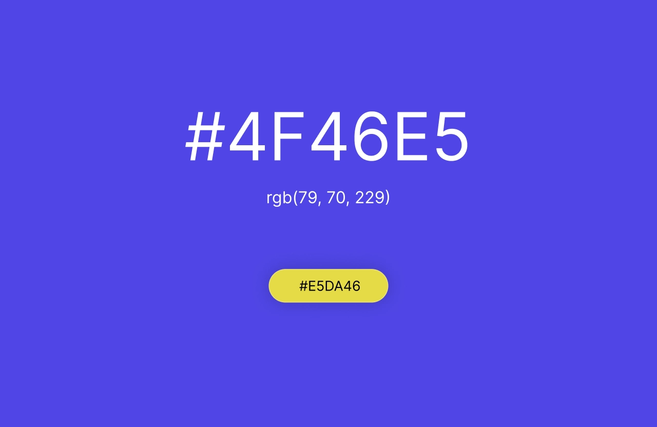
<h1>{color.toUpperCase()}</h1>
</div>
<input
id="color-input"
type="color"
value={color}
onChange={handleColorChange} // We don't use onClick because I discovered that when I want to know what the user wrote/chose, onChange is used, whereas onClick is used only when I want to trigger an immediate command (like in the Toggle Text App)
/>
</div>
);
};
/* DESIGN
   ------
   * File Origin: Pre-packaged styling by freeCodeCamp
   * Role: The "Visual Contract" (Global Constraints)
   *
   * Architectural analysis of the provided styles:
   * I analyzed this file to understand the boundaries within which my React component must live
   *
   * The Layout Strategy (#color-picker-container):
   * - Uses Flexbox (`display: flex`, centered) to ensure the content stays perfectly in the middle of the viewport
   * - Sets a static background (`#ffffff`)
   * - IMPACT ON REACT: This is the critical constraint. Since this file is read-only,
   *   I realized I must use inline styles (`style={{ backgroundColor... }}`) in my JSX
   *   to effectively override this static color with the dynamic state
   *
   * Input Positioning (input[type="color"]):
   * - Uses `position: absolute` with a top margin
   * - This intentionally separates the input control from the text flow, placing it
   *   visually below the hex code display without affecting the Flexbox alignment
*/

body,
html {
    margin: 0;
    padding: 0;
    height: 100%;
    font-family: Arial, sans-serif;
}

#color-picker-container {
    height: 100vh;
    display: flex;
    justify-content: center;
    align-items: center;
    flex-direction: column;
    background-color: #ffffff;
}

input[type="color"] {
    position: absolute;
    margin-top: 50px;
    height: 40px;
}
<!DOCTYPE html>
<html>
<head>

<!-- DESIGN
     ------
     * File Origin: Pre-packaged environment by freeCodeCamp
     * Role: The "Engine Room" (Host Environment)
     *
     * How it works (In-browser Compilation):
     * I realized that this file differs from standard professional workflows (like Vite/Next.js).
     * Usually, we "cook" (compile) the code on our computer before sending it to the browser.
     * Here, the "cooking" happens directly inside the user's browser via Babel.
     *
     * The Ingredients (CDNs):
     * Instead of installing React via terminal (npm install), this file pulls React (the logic)
     * and ReactDOM (the rendering) directly from the internet via <script> tags.
     * It's like streaming a movie instead of downloading it.
     *
     * The Live Translator (Babel Standalone):
     * Browsers don't understand React/JSX natively. This file loads "Babel", a tool that acts
     * as a simultaneous interpreter. It reads the code inside "index.jsx", translates it
     * instantly into standard JavaScript, and executes it.
     *
     * The Canvas (#root):
     * The <body> is intentionally empty except for a single <div id="root">.
     * This is the "mounting point" where React will paint the entire Color Picker application.
     *
     * The Spark (Bootstrapping):
     * The script at the very bottom connects the dots.
     * - It uses `type="text/babel"` and `data-type="module"` to enable modern JavaScript features (ES6 Imports).
     * - It grabs the 'root' div and tells React: "Import the { ColorPicker } from our file and draw it here".
-->

    <meta charset="UTF-8" />
    <title>Color Picker</title>
    <link rel="stylesheet" href="styles.css" />
    <script src="https://cdnjs.cloudflare.com/ajax/libs/react/18.3.1/umd/react.development.min.js"></script>
    <script src="https://cdnjs.cloudflare.com/ajax/libs/react-dom/18.3.1/umd/react-dom.development.min.js"></script>
    <script src="https://cdnjs.cloudflare.com/ajax/libs/babel-standalone/7.26.5/babel.min.js"></script>
    <script
      data-plugins="transform-modules-umd"
      type="text/babel"
      src="index.jsx"
    ></script>
</head>

<body>
    <div id="root"></div>
    <script
      data-plugins="transform-modules-umd"
      type="text/babel"
      data-presets="react"
      data-type="module"
    >
      import { ColorPicker } from './index.jsx';
      ReactDOM.createRoot(document.getElementById('root')).render(<ColorPicker />);
    </script>
</body>

</html>
La Regola del 70%: Quando il Superpotere Diventa un Ostacolo
Dopo aver scritto il README di Center, mi sono concentrato nel continuare il percorso React. È stato in quel momento che la regola del 70% mi ha salvato dall'over-engineering in cui stavo incappando.
L'esercizio di freeCodeCamp chiedeva semplicemente di:
- Lasciare invariati
index.htmlestyles.css - Modificare
index.jsxper implementare uno stato che controllasse il colore di sfondo
Ma ho iniziato a immaginare altro.
L'Idea Che Non Divenne Realtà
Volevo costruire un tool per ricavare il complementare esatto di un colore. Non un semplice opposto calcolato con l'inversione hex (quella che si fa con la calcolatrice da programmatore), ma un complementare che preservasse luminosità e saturazione.
Avevo imparato quella procedura qualche mese fa, ma era fine a sé stessa: invertendo i valori hex si invertivano anche luminosità e saturazione, rendendo il risultato inutilizzabile.
Con l'aiuto del Code Tutor, immaginammo un algoritmo che seguisse questo percorso:
HEX → RGB → HSL → RGB → HEX
Per fare un'analogia, con il metodo RGB (Sottrazione) sarebbe stato come dire: "Prendi le tue coordinate GPS attuali e invertile." Rischi di finire in mezzo all'oceano o sottoterra.
Mentre con il metodo HSL sarebbe stato "Girati di 180 gradi." Sei nello stesso punto, ma guardi nella direzione opposta.
La formula quindi era:
H' = (H + 180) % 360
Dove H è la tonalità del colore (un angolo da 0° a 360° sulla ruota dei colori):
- 0° = Rosso
- 120° = Verde
- 240° = Blu
Esempi:
- Rosso (H = 0°): 0 + 180 = 180° → Ciano (complementare perfetto)
- Blu (H = 200°): 200 + 180 = 380° → 380 % 360 = 20° → Arancione
Il Mockup Che Non Vide La Luce
Immaginavo un'interfaccia con:
- Sfondo Principale: Il colore scelto dall'utente
- Testo Centrale: Il codice HEX (nero o bianco in base al contrasto YIQ)
- Badge/Bottone: Colorato con il Complementare Calcolato
Mi sono preso qualche minuto per prototipare la schermata in Figma. Cliccando sull'unico pulsante si sarebbe cambiato il colore dello sfondo, e sarebbe comparso l'hex complementare.
Il paradosso UX che mi bloccò: Avevo due scenari possibili, entrambi con friction cognitiva:
-
Scenario A (Button → Background): Clicco il pulsante, ma il valore HEX compare sullo sfondo come titolo
<h1>, non sul pulsante stesso. L'utente clicca su un elemento ma il feedback visivo appare altrove. C'era una disconnessione spaziale tra azione e risultato. -
Scenario B (Button → Button): Il pulsante mostra il suo proprio HEX complementare. Logico dal punto di vista del colore (vedo il risultato dell'algoritmo HSL), ma confuso dal punto di vista dell'interazione: "Ho cliccato per cambiare lo sfondo, perché il pulsante mi dice il suo colore invece di quello che ho scelto?"
Entrambi violavano il principio di affordance chiara: l'utente non avrebbe capito immediatamente cosa stava impostando. Avrei dovuto fare usability test per validare quale pattern generasse meno attrito, o semplicemente rifletterci su, ma...
Mi stavo spostando dal focus dell'esercizio: applicare in autonomia gli Stati in React. Una visione del genere funziona alla grande in progetti come Center o Mosaic, ma qui mi avrebbe preso tempo nello scrivere logica JavaScript HSL che non era il focus del percorso attuale di apprendimento React.
Ho trovato grande piacere nell'immergermi nell'index.jsx cercando di garantire un minimo di UX e accessibilità WCAG, pur rispettando i vincoli dell'esercizio.
Miglioramenti chiave:
-
Visualizzazione HEX Permanente
Nell'esempio di freeCodeCamp, per sapere il codice hex dello sfondo dovevi aprire il color picker. Ho aggiunto un<h1>che mostra sempre il valore corrente in uppercase. -
Contrasto WCAG Dinamico
Ho implementato la formula YIQ per calcolare automaticamente se il testo deve essere nero o bianco in base alla luminosità dello sfondo. Una mancanza critica dell'esempio originale: l'etichetta "Choose a color..." era nera, quindi illeggibile su sfondi scuri. -
Architettura "Controlled Component"
L'input non gestisce il proprio stato internamente. Il suovalueè vincolato allo stato React (value={color}), e gli aggiornamenti avvengono solo tramiteonChange, che cattura l'input continuo dell'utente.
La Formula YIQ: Perché i Nostri Occhi Preferiscono il Verde
Nel codice ho commentato estensivamente la formula:
yiq = ((r * 299) + (g * 587) + (b * 114)) / 1000
Perché questi pesi? L'occhio umano è biologicamente più sensibile al verde. Ci siamo evoluti nella natura (foreste, savana), sviluppando una sensibilità mostruosa per:
- Verde (587/1000 = 59%): Distinguere piante, predatori nell'erba
- Rosso (299/1000 = 30%): Frutta matura, carne
- Blu (114/1000 = 11%): In natura è raro (cielo, acqua), non vitale vederlo "forte"
Infatti se rimuoviamo il verde da un'immagine, diventa molto scura. Questo è il motivo per cui il verde domina il calcolo della luminosità percepita.
onClick vs onChange: Una Scoperta Fondamentale
Nei commenti ho documentato una distinzione importantissima che ho imparato:
| Evento | Quando usarlo? | Elementi tipici | Cosa ci interessa? |
|---|---|---|---|
onClick | Voglio lanciare un comando immediato | <button>, <a>, <div> | L'azione in sé ("Fallo ora!") |
onChange | Voglio sapere cosa ha scritto/scelto l'utente | <input>, <textarea>, <select> | Il Dato (e.target.value) |
Per questo ho usato onChange sul color input: non mi interessa l'azione del click, ma il valore che l'utente sta selezionando in tempo reale.
Cosa Ho Imparato
Controlled Component Pattern:
L'input non gestisce il proprio stato. Il suo value è vincolato allo stato React (value={color}), gli aggiornamenti avvengono solo tramite onChange. Questo è "Single Source of Truth": esiste un solo punto dove il dato vive, prevenendo conflitti.
Inline Styles per Necessità (Specificity Warfare):
Il CSS di freeCodeCamp impone background-color: #ffffff statico. Poiché il file è read-only, ho usato style={{ backgroundColor: color }} per ottenere la specificità necessaria a sovrascriverlo dinamicamente. Inline styles (1,0,0,0) battono classi (0,0,1,0).
In CSS esiste una gerarchia di potere chiamata specificità. Chi ha il punteggio più alto vince:
| Metodo | Specificità | Esempio |
|---|---|---|
| Inline style | 1,0,0,0 | <div style="color: red"> |
| ID | 0,1,0,0 | #mioId { color: blue } |
| Classe | 0,0,1,0 | .miaClasse { color: green } |
| Tag | 0,0,0,1 | div { color: yellow } |
Separazione Presentation Layer / Data Layer:
Visualizzo l'HEX in uppercase (color.toUpperCase()) solo al render per estetica, ma lo stato interno rimane lowercase (#ffffff) per compatibilità browser. Il dato "vero" è separato dalla sua rappresentazione visiva.
WCAG Non È Opzionale:
Anche in un esercizio di 30 righe, garantire contrasto 4.5:1 è responsabilità di uno UX Engineer. La formula YIQ è un pattern che porterò in ogni progetto futuro.
La Regola del 70% Funziona:
Saper dire "no" a feature fantasiose (Color Harmony Tool completo) quando l'obiettivo è padroneggiare gli Stati React, non costruire un prodotto complesso.
Next:
Consolidare useEffect, useRef e Custom Hooks, per poi applicare tutto nella Fruit Search App dove imparerò a comprendere gli Effects, referenziare valori tramite Refs e creare Hooks riutilizzabili.
P.S. L'Eredità di Center
D'ora in poi, nei file index.html, posizionerò i commenti di documentazione all'interno del tag <head>, subito dopo il <!DOCTYPE html>.
Questa scelta nasce dall'esperienza con Center. Trattandosi di un software per un'azienda reale, sentivo la responsabilità di consegnare un prodotto "a prova di proiettile" e indagai a fondo sulla stabilità del rendering.
Scoprii che qualsiasi contenuto (anche un commento) posizionato prima del DOCTYPE rischia di innescare la Quirks Mode, costringendo il browser a emulare comportamenti obsoleti e potenzialmente rompendo il layout CSS.
Anche se i browser moderni spesso tollerano questa pratica, preferisco non affidarmi al caso. È un accorgimento a costo zero che garantisce la totale stabilità del rendering.