Calcola Turno
Il Progetto
Calcola Turno è una Progressive Web App (PWA) che risolve un problema concreto per gli operatori di fabbrica: sapere in anticipo quale turno faranno (mattino, pomeriggio o notte) in qualsiasi giorno futuro.
Pensata per essere installata come app nativa, funziona completamente offline e calcola i turni in modo automatico senza richiedere aggiornamenti manuali o connessione.
Codice Sorgente
- index.html
- styles.css
- script.js
- sw.js
- manifest.json
<!-- DESIGN
------
* This HTML is characterized by:
* - A Single Page Application (SPA) structure managed via visibility states
* (hidden class) rather than multi-page navigation, to ensure instant
* transitions typical of native apps
* - Native System Fonts stack (Segoe UI, San Francisco) instead of external
* imports to maximize load performance and blend in with the OS UI (Metro/iOS)
* - A strict PWA (Progressive Web App) configuration in the <head>,
* specifically targeting iOS quirks (meta apple-mobile-web-app) which
* often ignores standard manifest declarations.
-->
<!DOCTYPE html>
<html lang="it">
<head>
<meta charset="UTF-8">
<!--
* I set maximum-scale=1.0 and user-scalable=no to prevent the browser
* from zooming in when double-tapping buttons, mimicking the
* non-scalable interface of a native mobile application
-->
<meta name="viewport" content="width=device-width, initial-scale=1.0, maximum-scale=1.0, user-scalable=no">
<title>Calcola Turno</title>
<link rel="stylesheet" href="styles.css">
<link rel="manifest" href="manifest.json">
<!--
* Dynamic theme-color: allows the browser status bar to adapt
* automatically to the user's system preference (Light/Dark mode),
* maintaining visual consistency
-->
<meta name="theme-color" content="#0078D4" media="(prefers-color-scheme: light)">
<meta name="theme-color" content="#121212" media="(prefers-color-scheme: dark)">
<!-- --- iOS SPECIFIC CONFIGURATION --- -->
<!--
* iOS Safari requires specific link tags for the home screen icon
* and meta tags to hide the URL bar (standalone mode), as it does
* not fully support the web app manifest for these features yet
-->
<link rel="apple-touch-icon" href="icon.png">
<meta name="apple-mobile-web-app-capable" content="yes">
<meta name="apple-mobile-web-app-status-bar-style" content="black-translucent">
<meta name="apple-mobile-web-app-title" content="Turni">
<!-- * Fallback icon for desktop browser tabs -->
<link rel="icon" type="image/png" href="icon.png">
</head>
<body>
<!--
* This wrapper simulates the device frame during development/desktop view,
* but acts as a transparent container in mobile view thanks to
* CSS media queries
-->
<div class="device-frame">
<div class="device-screen">
<div class="container">
<!-- VIEW 1: ONBOARDING -->
<div id="onboarding-view">
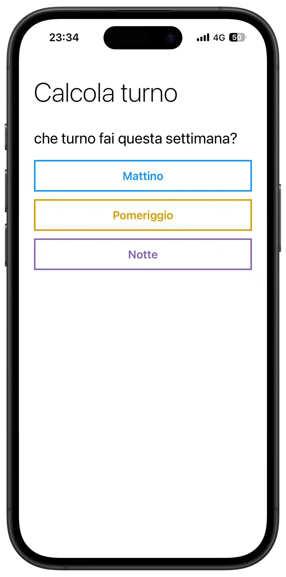
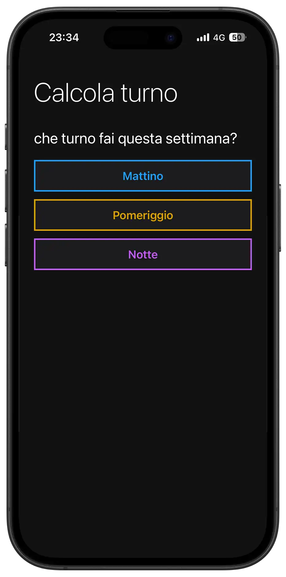
<h1>Calcola turno</h1>
<div class="section">
<div class="section-title">che turno fai questa settimana?</div>
<!--
* I used a flex/grid container for buttons to handle
* responsive alignment. The buttons utilize data-attributes
* for logic to keep the DOM clean from styling classes
-->
<div class="onboarding-buttons">
<!--
* Grid Stack Technique: inside the button, span and loader
* occupy the same grid area to allow seamless transition
* between text and loading spinner without layout shifts
-->
<button class="group-btn" data-select-shift="Mattino">
<span class="btn-text">Mattino</span>
<div class="loader"></div>
</button>
<button class="group-btn" data-select-shift="Pomeriggio">
<span class="btn-text">Pomeriggio</span>
<div class="loader"></div>
</button>
<button class="group-btn" data-select-shift="Notte">
<span class="btn-text">Notte</span>
<div class="loader"></div>
</button>
</div>
</div>
</div>
<!-- VIEW 2: MAIN APPLICATION
Hidden by default, toggled via JavaScript upon initialization
-->
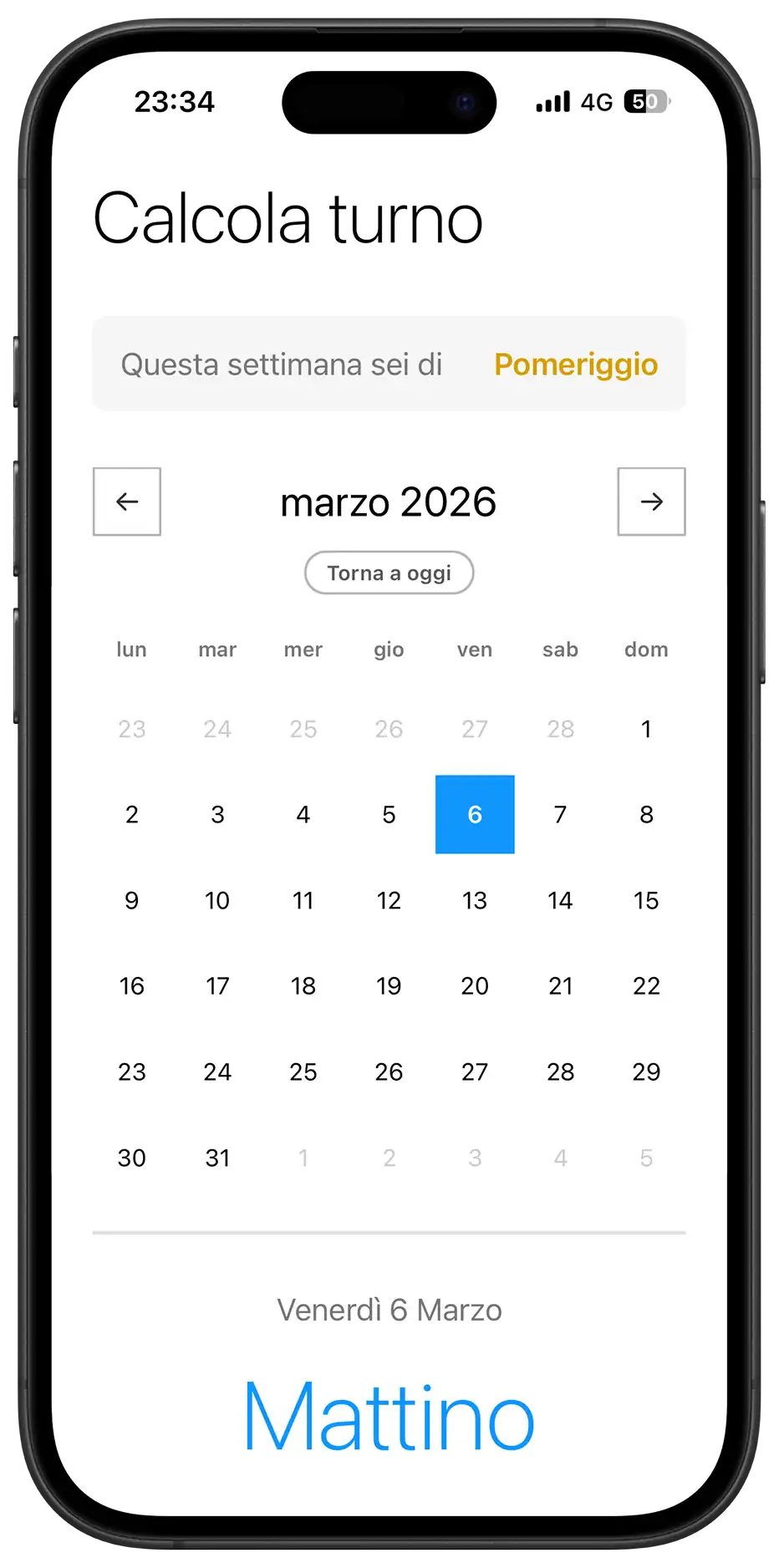
<div id="main-view" class="hidden">
<h1>Calcola turno</h1>
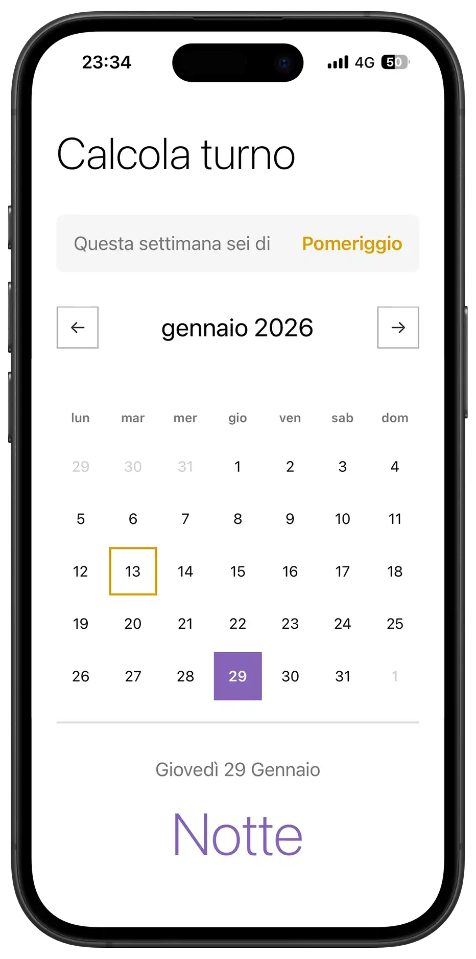
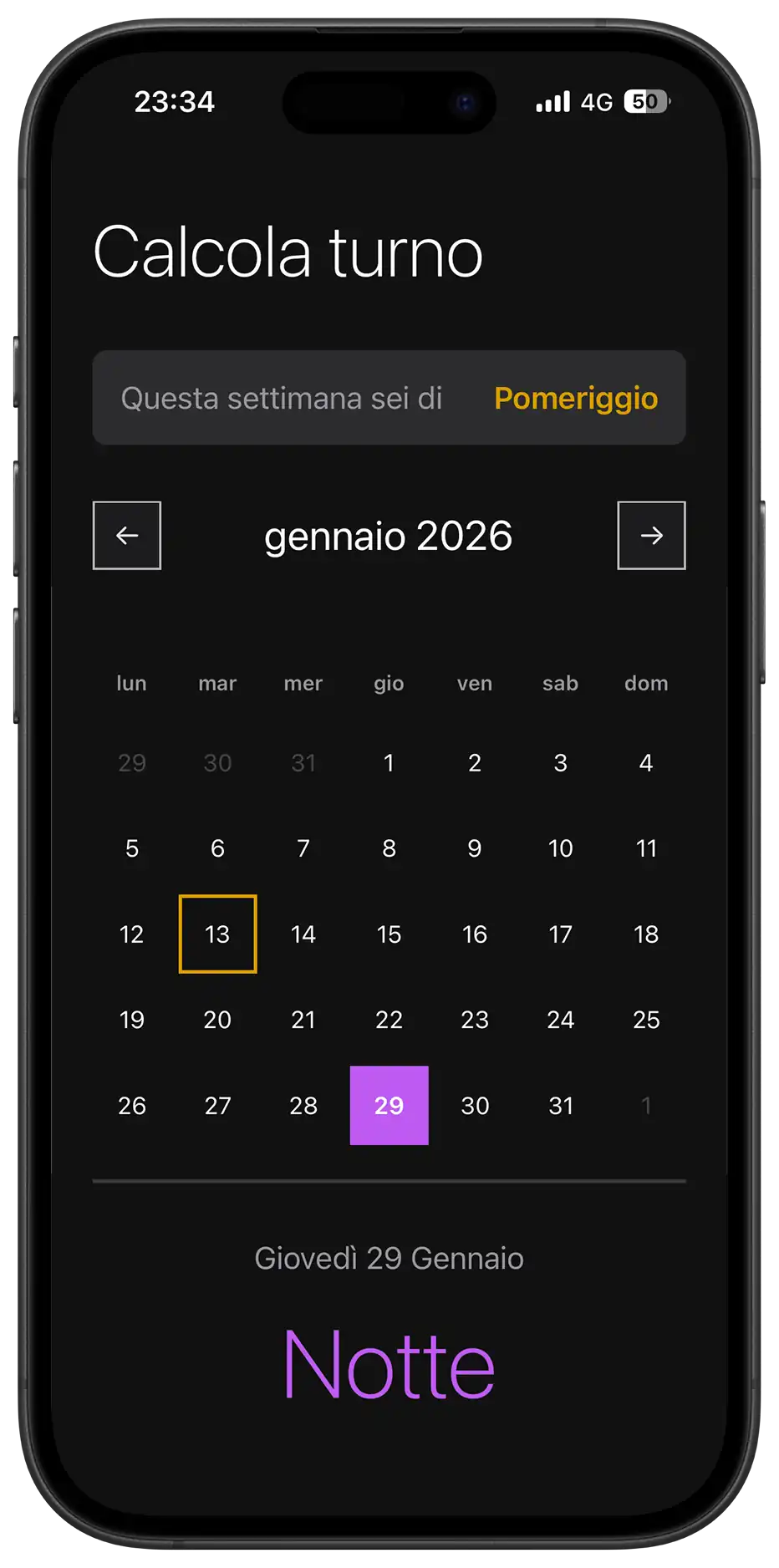
<!-- Information Card Component -->
<div class="section">
<div class="current-week-card">
<div class="card-label">Questa settimana sei di</div>
<div class="card-value" id="week-shift-display">-</div>
</div>
</div>
<!--
* Calendar Component
* Divided into Controls (Nav), Header (Weekdays) and Grid (Days)
-->
<div class="section">
<div class="calendar-controls">
<div class="calendar-header">
<button class="nav-btn" id="prev-month" aria-label="Mese precedente">←</button>
<!--
* Hybrid Input Wrapper: overlays a native transparent
* date input over a custom text div. This forces mobile
* browsers to open their native date scrollers (wheel),
* improving UX over a custom-built JS picker
-->
<div class="month-picker-wrapper">
<div class="month-year" id="month-year"></div>
<input type="month" id="native-month-picker" aria-label="Seleziona mese">
</div>
<button class="nav-btn" id="next-month" aria-label="Mese successivo">→</button>
</div>
<button id="today-btn" class="today-btn">Torna a oggi</button>
</div>
<div class="weekdays">
<div class="weekday">lun</div>
<div class="weekday">mar</div>
<div class="weekday">mer</div>
<div class="weekday">gio</div>
<div class="weekday">ven</div>
<div class="weekday">sab</div>
<div class="weekday">dom</div>
</div>
<!-- Grid container populated dynamically by JavaScript -->
<div class="days" id="calendar-days"></div>
</div>
<!-- Result Feedback Area -->
<div class="result" id="result">
<div class="result-date" id="result-date">oggi</div>
<div class="result-shift" id="result-shift">-</div>
</div>
<div class="footer-actions">
<button id="reset-btn" class="text-btn">Non è corretto? Reimposta</button>
</div>
</div>
</div>
</div>
</div>
<!--
* Install Banner Component
* Positioned fixed at the bottom, separate from the main flow
* Visibility is managed by localStorage and device type detection in JS
-->
<div id="install-banner" class="install-banner hidden">
<div class="install-content">
<img src="icon.png" alt="Icona" class="install-icon">
<div class="install-text">
<span class="install-title">Installa l'App</span>
<span class="install-desc" id="install-instructions">Per un'esperienza migliore</span>
</div>
<button id="install-btn-action" class="install-action-btn">Installa</button>
<button id="close-install" class="install-close" aria-label="Chiudi banner">✕</button>
</div>
</div>
<div id="update-toast" class="update-toast hidden">
<div class="update-content">
<span class="update-text">È disponibile un aggiornamento</span>
<button id="refresh-btn" class="update-action-btn">AGGIORNA</button>
</div>
</div>
<script src="script.js"></script>
</body>
</html>
/* DESIGN
------
* The styling philosophy follows a "Metro UI" inspired direction, characterized by:
* - High contrast and bold typography (Segoe UI/San Francisco stack)
* - "Alive" interactivity: elements react with tactile feedback
* - Mobile-First approach: The base CSS renders the mobile app to ensure
* maximum performance on weaker devices
*
* The architecture is a "Utility-First Variables" system:
* - All values (fonts, margins, sizes, colors) are centralized in :root variables,
* organized by UNIVERSAL and MOBILE (default)
* - The DESKTOP media query overrides these variables and applies the
* CSS Grid structure for the dashboard layout.
*/
/* UNIVERSAL (Shared logic across all views) */
:root {
/* Typography */
--font-family: "Segoe UI", -apple-system, system-ui, sans-serif;
--font-weight-light: 200;
--font-weight-regular: 400;
--font-weight-semibold: 600;
/* Palette - Base (Light Mode Default) */
--background-color: #FFF;
--font-color: #000;
--text-secondary: #787878;
--text-disabled: #CCCCCC;
--white: #FFF;
--light-bg: #F5F5F5;
--border-color: #E1E1E1;
/* Palette - Controls (Neutral Gray Scale) */
--control-color: #333333; /* Dark Gray for arrows/borders */
--control-active-bg: #333333; /* Background when pressed */
--control-active-text: #FFFFFF;
/* Palette - Shifts (Immutable) */
--color-mattino: #1196fd;
--color-pomeriggio: #d99f00;
--color-notte: #8764B8;
/* Animations */
--slide-animation: softPivot 0.25s ease-out;
}
/* MOBILE (Default View Configuration) */
:root {
/* Layout & Spacing */
--container-max-width: 480px;
--container-padding: 0 24px;
--title-margin-top: 32px;
--section-margin-top: 32px;
--element-margin-top: 20px;
/* Font Sizes */
--font-size-title: 42px;
--font-size-section: 24px;
--font-size-text: 18px;
--font-size-result: 56px;
/* Components */
--button-height: 50px;
--nav-btn-size: 40px;
--calendar-min-height: auto; /* Flexible on mobile */
/* Borders */
--border-thickness: 1.5px;
--button-border: 2.373px solid #373737;
--result-border-top: 2px solid var(--border-color);
}
/* BASE RESET & GLOBAL STYLES */
* {
margin: 0;
padding: 0;
box-sizing: border-box;
scrollbar-width: none;
-ms-overflow-style: none;
}
*::-webkit-scrollbar {
display: none;
width: 0;
height: 0;
background: transparent;
}
button, .nav-btn, .group-btn, .day, .today-btn {
touch-action: manipulation;
-webkit-tap-highlight-color: transparent;
}
body {
background-color: var(--background-color);
font-family: var(--font-family);
color: var(--font-color);
overflow-x: hidden;
}
.hidden {
display: none !important;
}
/* LAYOUT STRUCTURE */
.container {
padding: var(--container-padding);
min-height: 100vh;
min-height: 100dvh;
max-width: var(--container-max-width);
margin: 0 auto;
width: 100%;
}
/* TYPOGRAPHY COMPONENTS */
h1 {
margin-top: var(--title-margin-top);
font-size: var(--font-size-title);
font-weight: var(--font-weight-light);
}
.section {
margin-top: var(--section-margin-top);
}
.section-title {
font-size: var(--font-size-section);
font-weight: var(--font-weight-regular);
margin-bottom: var(--element-margin-top);
}
.helper-text {
margin-top: 16px;
font-size: 14px;
color: var(--text-secondary);
text-align: center;
}
/* COMPONENT: ONBOARDING BUTTONS */
.onboarding-buttons {
display: flex;
flex-direction: column;
gap: 12px;
}
.group-btn {
width: 100%;
height: var(--button-height);
border: var(--button-border);
background-color: var(--white);
font-size: var(--font-size-text);
font-weight: var(--font-weight-regular);
cursor: pointer;
transition: all 0.1s;
display: grid;
place-items: center;
grid-template-areas: "stack";
}
.group-btn:hover {
border-color: var(--control-color);
}
.btn-text {
grid-area: stack;
transition: opacity 0.2s ease;
}
/* Loader Logic */
.loader {
grid-area: stack;
width: 20px;
height: 20px;
border: 2px solid var(--white);
border-bottom-color: transparent;
border-radius: 50%;
visibility: hidden;
opacity: 0;
transition: opacity 0.2s ease;
animation: rotation 0.6s linear infinite;
}
@keyframes rotation {
0% { transform: rotate(0deg); }
100% { transform: rotate(360deg); }
}
.group-btn.loading {
pointer-events: none;
cursor: wait;
}
.group-btn.loading .btn-text {
visibility: hidden;
opacity: 0;
}
.group-btn.loading .loader {
visibility: visible;
opacity: 1;
}
/* Shift Colors (Data Attributes) */
.group-btn[data-select-shift="Mattino"] {
color: var(--color-mattino);
border-color: var(--color-mattino);
font-weight: 600;
}
.group-btn[data-select-shift="Mattino"]:hover {
background-color: rgba(17, 150, 253, 0.1); }
.group-btn[data-select-shift="Mattino"].loading {
background-color: var(--color-mattino);
color: #FFF;
}
.group-btn[data-select-shift="Pomeriggio"] {
color: var(--color-pomeriggio);
border-color: var(--color-pomeriggio);
font-weight: 600;
}
.group-btn[data-select-shift="Pomeriggio"]:hover {
background-color: rgba(217, 159, 0, 0.1);
}
.group-btn[data-select-shift="Pomeriggio"].loading {
background-color: var(--color-pomeriggio);
color: #FFF;
}
.group-btn[data-select-shift="Notte"] {
color: var(--color-notte);
border-color: var(--color-notte);
font-weight: 600;
}
.group-btn[data-select-shift="Notte"]:hover {
background-color: rgba(135, 100, 184, 0.1);
}
.group-btn[data-select-shift="Notte"].loading {
background-color: var(--color-notte);
color: #FFF;
}
/* COMPONENT: CURRENT WEEK CARD */
.current-week-card {
background-color: var(--light-bg);
padding: 16px;
border-radius: 8px;
display: flex;
justify-content: space-between;
align-items: center;
}
.card-label {
font-size: var(--font-size-text);
color: var(--text-secondary);
}
.card-value {
font-size: var(--font-size-text);
font-weight: var(--font-weight-semibold);
}
.card-value.mattino {
color: var(--color-mattino);
}
.card-value.pomeriggio {
color: var(--color-pomeriggio);
}
.card-value.notte {
color: var(--color-notte);
}
/* COMPONENT: CALENDAR CONTROLS */
.calendar-controls {
display: flex;
flex-direction: column;
align-items: center;
margin-bottom: 16px;
gap: 8px;
}
.calendar-header {
display: flex;
justify-content: space-between;
align-items: center;
width: 100%;
}
.month-picker-wrapper {
position: relative;
display: flex;
align-items: center;
justify-content: center;
padding: 6px 16px;
border-radius: 8px;
transition: background-color 0.2s;
}
.month-year {
font-size: var(--font-size-section);
font-weight: var(--font-weight-regular);
cursor: pointer;
transition: color 0.2s;
}
/* Native Picker Overlay */
#native-month-picker {
position: absolute;
top: 0;
left: 0;
width: 100%;
height: 100%;
opacity: 0;
cursor: default;
z-index: 10;
}
/* Nav Button Styling (Neutral Gray) */
.nav-btn {
width: var(--nav-btn-size);
height: var(--nav-btn-size);
background-color: var(--white);
border: var(--border-thickness) solid #b6b6b6;
color: var(--control-color);
font-size: 18px;
cursor: pointer;
/* Ensure smooth return animation */
transition: background-color 0.1s, transform 0.1s ease-out;
}
/* Active State (3D Tactile Feedback) */
/* Applies the specific perspective tilt when pressed */
.nav-btn:active,
.nav-btn.clicked {
transform: perspective(400px) rotateX(2deg) rotateY(-2deg) scale(0.98);
/* Visual feedback coloring */
background-color: var(--control-active-bg);
border-color: var(--control-active-bg);
color: var(--control-active-text);
}
.today-btn {
background: transparent;
border: 1.5px solid #b6b6b6;
border-radius: 20px;
padding: 4px 12px;
font-size: 12px;
color: #5b5b5b;
font-weight: var(--font-weight-semibold);
cursor: pointer;
transition: all 0.2s;
opacity: 0;
transform: translateY(-5px);
pointer-events: none;
}
.today-btn.visible { opacity: 1;
transform: translateY(0);
pointer-events: auto;
}
.today-btn:hover {
background-color: var(--control-color);
color: var(--white);
border-color: var(--control-color);
}
/* COMPONENT: CALENDAR GRID */
.weekdays {
display: grid;
grid-template-columns: repeat(7, 1fr);
gap: 4px;
margin-bottom: 8px;
}
.weekday {
text-align: center;
font-size: 12px;
font-weight: var(--font-weight-semibold);
color: var(--text-secondary);
padding: 8px 0;
}
.days {
display: grid;
grid-template-columns: repeat(7, 1fr);
gap: 4px;
margin-bottom: var(--element-margin-top);
min-height: var(--calendar-min-height);
align-content: start;
}
.day {
aspect-ratio: 1;
display: flex;
align-items: center;
justify-content: center;
font-size: 14px;
font-weight: var(--font-weight-regular);
cursor: pointer;
border: 2px solid transparent;
transition: transform 0.2s, background-color 0.2s;
}
.day.other-month {
color: var(--text-disabled);
cursor: default;
}
/* Day Selection Logic */
.day.selected {
color: #FFF;
font-weight: var(--font-weight-semibold);
background-color: var(--control-color);
border-color: transparent;
}
.day.selected.mattino {
background-color: var(--color-mattino);
color: #FFF;
}
.day.selected.pomeriggio {
background-color: var(--color-pomeriggio);
color: #000;
}
.day.selected.notte {
background-color: var(--color-notte);
color: #FFF;
}
.day.today {
border-color: var(--control-color);
}
.day.today.mattino {
border-color: var(--color-mattino);
}
.day.today.pomeriggio {
border-color: var(--color-pomeriggio);
}
.day.today.notte {
border-color: var(--color-notte);
}
/* COMPONENT: RESULT AREA */
.result {
text-align: center;
padding: 32px 0;
border-top: var(--result-border-top);
animation: var(--slide-animation);
}
.result-date {
font-size: var(--font-size-text);
font-weight: var(--font-weight-regular);
color: var(--text-secondary);
margin-bottom: 16px;
text-transform: capitalize;
}
.result-shift {
font-size: var(--font-size-result);
font-weight: var(--font-weight-light);
margin-bottom: 8px;
}
.result-shift.mattino {
color: var(--color-mattino);
}
.result-shift.pomeriggio {
color: var(--color-pomeriggio);
}
.result-shift.notte {
color: var(--color-notte);
}
/* Footer */
.footer-actions {
margin-top: 20px;
text-align: center;
padding-bottom: 40px;
}
.text-btn {
background: none;
border: none;
color: var(--text-secondary);
text-decoration: underline; font-size: 14px; cursor: pointer;
}
/* GLOBAL COMPONENTS: TOAST & BANNER */
.install-banner, .update-toast {
position: fixed;
left: 50%;
transform: translateX(-50%) translateY(150%);
background-color: var(--white);
transition: transform 0.4s cubic-bezier(0.175, 0.885, 0.32, 1.275);
z-index: 1000;
}
/* Specific Banner Styles */
.install-banner {
bottom: 20px;
left: 20px;
right: 20px;
width: auto;
transform: translateY(150%);
border: var(--button-border);
border-radius: 12px;
padding: 12px;
box-shadow: 0 10px 30px rgba(0,0,0,0.15);
}
.update-toast {
bottom: 80px;
width: max-content;
max-width: 90%;
background-color: #323232;
color: #FFF;
padding: 12px 20px;
border-radius: 50px;
box-shadow: 0 4px 12px rgba(0,0,0,0.3);
z-index: 2000;
}
.install-banner.visible {
transform: translateY(0);
}
.update-toast.visible {
transform: translateX(-50%) translateY(0);
}
/* Toast/Banner Internals */
.install-content, .update-content {
display: flex;
align-items: center;
gap: 12px;
}
.install-icon {
width: 40px;
height: 40px;
border-radius: 8px;
}
.install-text { flex: 1;
display: flex;
flex-direction: column;
}
.install-title {
font-weight: 600;
font-size: 14px;
}
.install-desc {
font-size: 12px;
color: var(--text-secondary);
}
.update-text {
font-size: 14px;
font-weight: 500;
color: #FFF;
}
.install-action-btn, .update-action-btn {
background-color: var(--control-color);
color: #FFF;
border: none;
padding: 6px 12px;
border-radius: 20px;
font-size: 12px;
font-weight: 600;
cursor: pointer;
}
.install-close {
background: transparent;
border: none;
color: var(--text-secondary);
cursor: pointer;
padding: 4px;
}
/* ANIMATIONS */
.group-btn.clicked, .day.clicked {
transform: perspective(400px) rotateX(2deg) rotateY(-2deg) scale(0.98);
transition: transform 0.1s ease-out;
}
@keyframes softPivot {
0% {
opacity: 0;
transform: perspective(400px) rotateX(7deg) translateY(-2px);
}
100% {
opacity: 1;
transform: perspective(400px) rotateX(0deg) translateY(0);
}
}
/* MEDIA QUERY: DARK MODE */
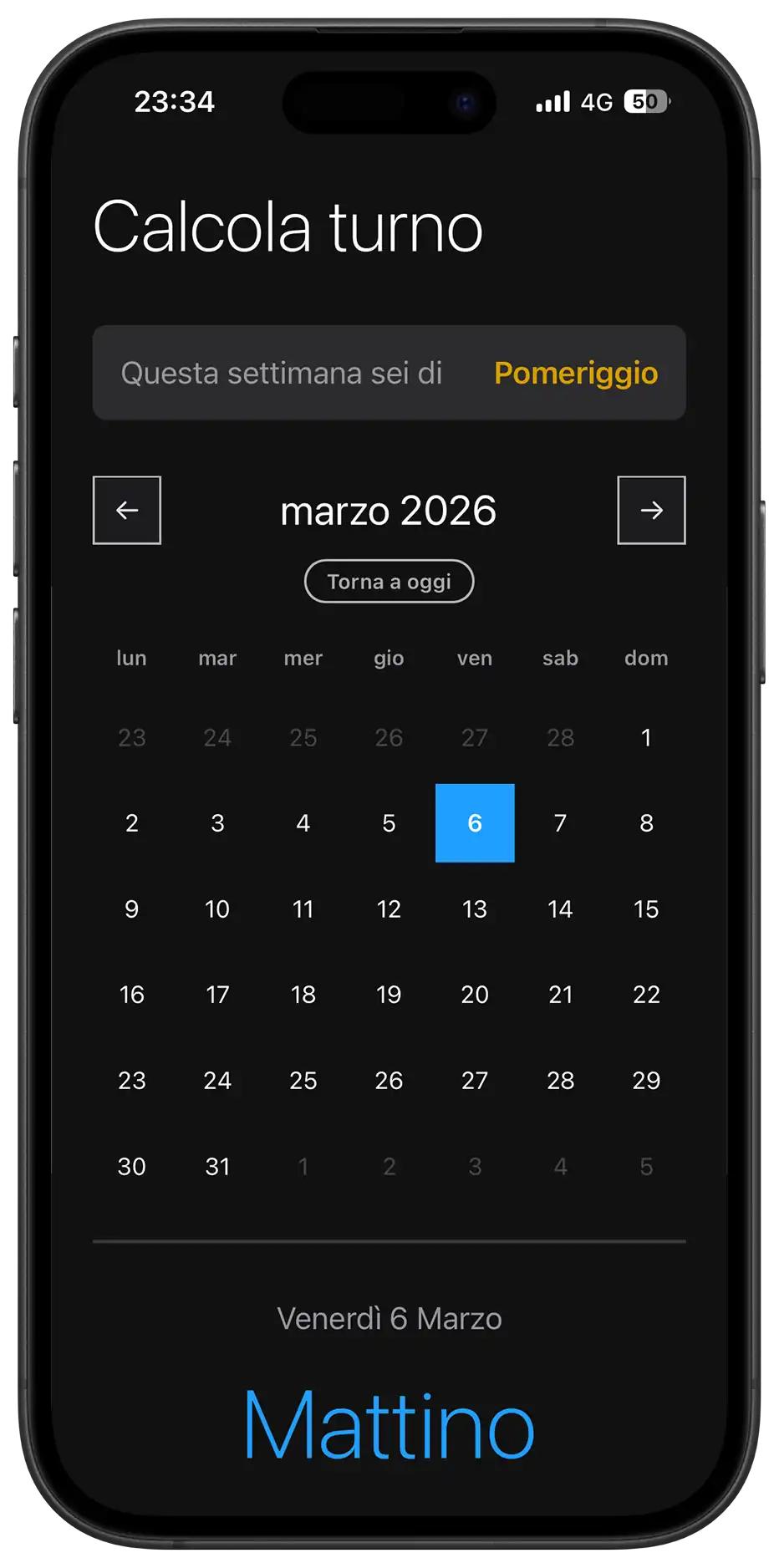
@media (prefers-color-scheme: dark) {
:root {
--background-color: #121212;
--font-color: #FFFFFF;
--white: #1C1C1E;
--light-bg: #2C2C2E;
--border-color: #3A3A3C;
--text-secondary: #98989F;
--text-disabled: #474747;
/* Controls shift to Light Gray for visibility */
--control-color: #E1E1E1;
--control-active-bg: #E1E1E1;
--control-active-text: #000000;
/* Adjustments for readability */
--color-mattino: #209efe;
--color-pomeriggio: #d99f00;
--color-notte: #BF5AF2;
}
body { color-scheme: dark; }
.day.selected {
color: #000;
}
.today-btn {
color: #ababab;
}
.install-banner {
background-color: #1C1C1E;
border-color: #333;
}
.update-toast { background-color: #4A4A4A;
border: 1px solid #666;
}
.group-btn[data-select-shift="Mattino"].loading .loader,
.group-btn[data-select-shift="Pomeriggio"].loading .loader {
border-color: #000; border-bottom-color: transparent;
}
}
/* DESKTOP DASHBOARD (Overriding variables & Structural Grid) */
/* Triggered on screens wider than 950px (Desktop & Large Tablets Landscape) */
@media (min-width: 950px) {
:root {
/* Override Base Colors for "Dashboard" Look */
/* Note: We do not set the dark background here as a default
We let the specific body rules below handle the mode distinction */
/* Layout & Dimensions Overrides */
--container-max-width: 900px;
--container-padding: 50px 70px;
--calendar-min-height: 290px;
/* Typography Overrides */
--font-size-title: 36px;
--font-size-result: 64px;
--font-size-text: 16px;
/* Remove Borders for desktop layout as the card provides the structure */
--result-border-top: none;
}
/* 1. Global Background - LIGHT MODE DEFAULT */
body {
display: flex;
align-items: center;
justify-content: center;
height: 100vh;
background-color: #00457a;
background-image: radial-gradient(circle at top right, #051c2f 0%, rgb(0, 63, 110) 100%);
}
/* 2. Neutralize Phone Wrappers */
/* We use 'display: contents' to make these divs virtually disappear from the DOM tree */
.device-frame, .device-screen {
display: contents;
}
/* 3. Main Card Style */
.container {
height: auto; min-height: 550px;
background-color: var(--white);
border-radius: 24px;
margin: 0; position: relative;
border: 1px solid #535353;
}
/* 4. GRID LAYOUT SYSTEM */
#main-view {
display: grid;
width: 100%;
height: 100%;
grid-template-columns: 1fr 1.2fr;
grid-template-rows: auto auto 1fr auto;
grid-template-areas:
"title calendar"
"week calendar"
"result calendar"
"footer calendar";
gap: 0 60px;
align-items: stretch; /* Prevents vertical resizing issues */
}
/* 5. Structural Adjustments (Grid Area assignments) */
h1 {
grid-area: title;
margin-top: 0;
margin-bottom: 20px;
text-align: left;
}
.section:nth-of-type(1) { /* Week Card */
grid-area: week;
margin-top: 0;
display: flex;
flex-direction: column;
justify-content: center;
}
.current-week-card {
height: 100%;
}
.result {
grid-area: result;
padding: 0;
margin: 0;
text-align: center;
animation: none;
display: flex;
flex-direction: column;
justify-content: center;
}
.result-shift {
line-height: 1.1;
letter-spacing: -1px;
}
.footer-actions {
grid-area: footer;
text-align: left;
padding: 0;
margin: 0;
display: flex;
flex-direction: column;
justify-content: center;
}
.section:nth-of-type(2) {
grid-area: calendar;
margin-top: 0;
height: auto;
min-height: 100%;
display: flex;
flex-direction: column;
justify-content: center;
border-left: 1px solid var(--border-color);
padding-left: 60px;
}
/* Desktop Interactions */
/* Fix: We use :not(:active) and :not(.clicked) to ensure the hover color
doesn't override the dark click feedback color when pressed. */
.nav-btn:hover:not(:active):not(.clicked) {
background-color: var(--light-bg);
border-color: #999;
}
.day:hover:not(.selected):not(.other-month):not(:active):not(.clicked) {
background-color: var(--light-bg);
}
.days { gap: 8px; }
/* Onboarding Overrides */
#onboarding-view {
max-width: 400px;
margin: 0 auto;
padding-top: 40px; }
.onboarding-buttons {
gap: 20px;
}
.group-btn {
height: 60px;
font-size: 20px;
}
.group-btn:hover {
transform: translateY(-2px);
box-shadow: 0 4px 12px rgba(0,0,0,0.1);
}
/* DARK MODE DESKTOP OVERRIDES */
@media (prefers-color-scheme: dark) {
body {
background-color: #1a1a1a;
background-image: radial-gradient(circle at top right, #000000 0%, #242424 100%);
}
.container {
border: 1px solid #404040;
}
.section:nth-of-type(2) {
border-left-color: #333;
}
.month-picker-wrapper:hover, .day:hover:not(.selected):not(.other-month) {
background-color: #333;
}
}
}
/* TABLET TWEAKS (Intermediate view) */
/* Bridging the gap between Mobile and Desktop Card */
@media (min-width: 550px) and (max-width: 949px) {
:root {
/* Relaxed spacing for larger touch screens */
--container-max-width: 530px;
/* Slightly larger typography to fill the space */
--font-size-title: 48px;
--font-size-result: 72px;
/* Bigger touch targets for easier interaction */
--button-height: 60px;
}
/* Center the vertical container for elegance */
.container {
margin-top: 5vh;
border-radius: 24px; /* Introduces a polished rounded look */
}
}
/* MEDIA QUERY: LANDSCAPE MOBILE (Dashboard Mode) */
@media (orientation: landscape) and (max-height: 600px) {
.container {
max-width: 100%;
padding: 10px 40px;
height: 100vh;
display: flex;
align-items: center;
overflow: hidden;
}
#main-view {
width: 100%;
height: 100%;
display: grid;
grid-template-columns: 0.8fr 1.2fr;
grid-template-rows: auto auto 1fr auto;
grid-template-areas: "title calendar" "week calendar" "result calendar" "footer calendar";
gap: 0 40px; align-content: center;
}
h1 {
grid-area: title;
margin-top: 0;
font-size: 28px;
text-align: left;
}
.section:nth-of-type(1) {
grid-area: week;
margin-top: 10px;
}
.result {
grid-area: result;
border-top: none;
padding: 20px 0;
text-align: left;
display: flex;
flex-direction: column;
align-items: flex-start;
justify-content: center;
}
.result-date {
margin-bottom: 5px;
}
.result-label {
order: -1;
margin-bottom: 5px;
font-size: 12px;
}
.result-shift { font-size: 42px;
line-height: 1;
}
.footer-actions { grid-area: footer;
text-align: left;
margin-top: 0;
padding-bottom: 0;
}
.section:nth-of-type(2) {
grid-area: calendar;
margin-top: 0;
height: auto;
min-height: 100%;
display: flex;
flex-direction: column;
justify-content: center;
border-left: 1px solid var(--border-color);
padding-left: 60px;
}
.days {
gap: 2px;
}
.day {
font-size: 13px;
width: 100%;
max-width: 40px;
margin: 0 auto;
}
#onboarding-view {
overflow-y: auto;
max-height: 100vh;
}
}
/* DESIGN
------
* The JavaScript logic is built around a deterministic mathematical model
* rather than a stored database of dates
* It is characterized by:
* - A reference date (Epoch) approach: calculation of shifts is based on
* the delta of weeks from a fixed point in time (Jan 5, 2025)
* - Separation of Concerns: pure functions handle the date math, while
* DOM functions handle the rendering, ensuring the logic is testable
* - A "Tactile" UX philosophy: The code intentionally introduces small
* delays (setTimeout) during interactions to allow CSS 3D animations
* to complete, giving the interface a physical feel
* - PWA Bifurcation: distinct handling for iOS (manual instructions) and
* Android (native prompt interception) to maximize installation rates.
*/
// --- CONFIGURATION & STATE ---
/* * I use localStorage to persist the user's shift group (A, B, or C)
* This ensures the user doesn't need to onboarding every time they open the app
*/
let selectedGroup = localStorage.getItem('userGroup');
/* * State variables for the calendar navigation.
* selectedDate tracks the user's click, currentMonth tracks the visible grid
*/
let selectedDate = new Date();
let currentMonth = new Date();
const months = ['gennaio', 'febbraio', 'marzo', 'aprile', 'maggio', 'giugno',
'luglio', 'agosto', 'settembre', 'ottobre', 'novembre', 'dicembre'];
/* * The Epoch: Sunday, Jan 5th, 2025
* This is the mathematical anchor for the modulo-3 cycle calculation
*/
const referenceDate = new Date(2025, 0, 5);
// --- HELPER ANIMATION ---
/* * This helper function manages the class-based state for CSS animations
* It adds a class to trigger the transform, then removes it after 150ms
* to reset the state for the next interaction.
*/
const animateButton = (element) => {
if (!element) return;
element.classList.add('clicked');
setTimeout(() => {
element.classList.remove('clicked');
}, 150);
};
// --- SERVICE WORKER & UPDATES ---
/* * Advanced Registration Logic:
* Instead of just registering, we actively listen for the 'updatefound' event
* This allows us to detect when a new version (sw.js) is being installed
* and prompt the user to refresh, ensuring they always have the latest math logic.
*/
if ('serviceWorker' in navigator) {
window.addEventListener('load', () => {
navigator.serviceWorker.register('./sw.js').then(reg => {
// 1. Listen for new updates found on the server
reg.addEventListener('updatefound', () => {
const newWorker = reg.installing;
newWorker.addEventListener('statechange', () => {
// Has the new worker finished installing?
if (newWorker.state === 'installed') {
// Check if there is ALREADY a controller (old version running)
// If yes, it means this is an update, not the first visit.
if (navigator.serviceWorker.controller) {
showUpdateToast();
}
}
});
});
}).catch(err => console.log('SW errore:', err));
// 2. Fallback: Detect if the controller changed (e.g. via skipWaiting)
// This handles cases where the update happened silently in background
navigator.serviceWorker.addEventListener('controllerchange', () => {
// We can optionally auto-reload here, but showing the toast is safer UX
showUpdateToast();
});
});
}
// --- UPDATE TOAST UI LOGIC ---
const updateToast = document.getElementById('update-toast');
const refreshBtn = document.getElementById('refresh-btn');
const showUpdateToast = () => {
updateToast.classList.remove('hidden');
// Small delay for animation
setTimeout(() => {
updateToast.classList.add('visible');
}, 100);
};
refreshBtn.addEventListener('click', () => {
// Simply reloading the page will load the new Service Worker (already active via skipWaiting)
window.location.reload();
});
// --- CALCULATION LOGIC (PURE FUNCTIONS) ---
/* * To determine the shift, we first need to know how many full weeks have passed
* since our reference date
* I normalize hours to 0 to avoid daylight saving time bugs impacting the diff.
*/
const getWeekNumber = (date) => {
const weekStart = new Date(date);
const day = weekStart.getDay();
// Adjust to start of week (Monday or Sunday based on preference, here logic aligns with Ref)
const diff = weekStart.getDate() - day + (day === 0 ? -6 : 1);
weekStart.setDate(diff);
weekStart.setHours(0, 0, 0, 0);
const refWeekStart = new Date(referenceDate);
const refDay = refWeekStart.getDay();
const refDiff = refWeekStart.getDate() - refDay + (refDay === 0 ? -6 : 1);
refWeekStart.setDate(refDiff);
refWeekStart.setHours(0, 0, 0, 0);
const diffTime = weekStart - refWeekStart;
/* * BUG FIX (Daylight Saving Time):
* I changed Math.floor to Math.round
* When DST starts/ends, a week might have 1 hour less/more
* Division leads to 9.99 or 10.01 weeks. Math.floor would break logic (9 instead of 10)
* Math.round safely handles the +/- 1 hour offset.
*/
const diffWeeks = Math.round(diffTime / (7 * 24 * 60 * 60 * 1000));
return diffWeeks;
};
/* * The core algorithm:
* The shift pattern repeats every 3 weeks. By using the modulo operator (%)
* on the week difference, we determine the position in the cycle (0, 1, or 2)
* The ((x % n) + n) % n formula handles negative differences correctly (past dates).
*/
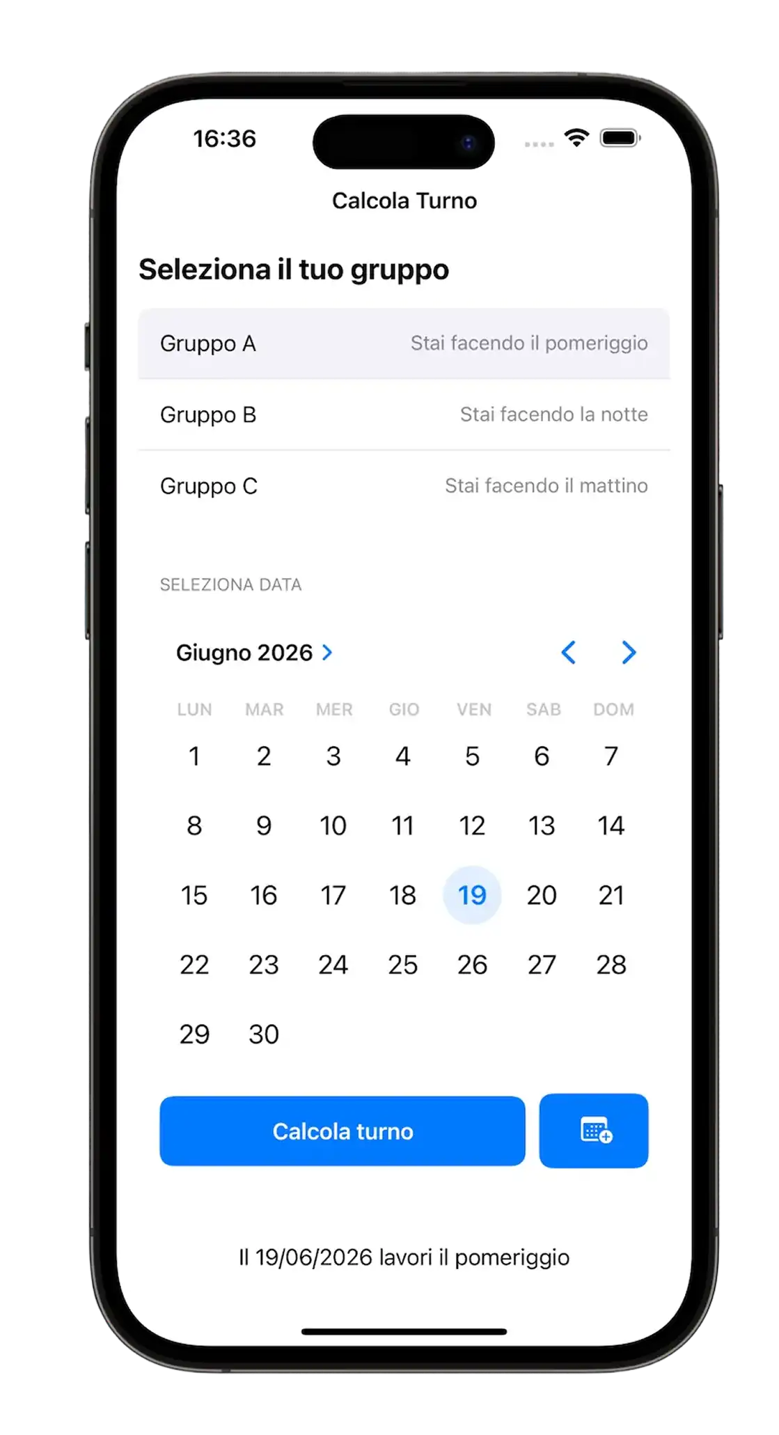
const calculateShift = (group, date) => {
const weeksDiff = getWeekNumber(date);
const cyclePosition = ((weeksDiff % 3) + 3) % 3;
const shifts = {
'A': ['Pomeriggio', 'Mattino', 'Notte'],
'B': ['Notte', 'Pomeriggio', 'Mattino'],
'C': ['Mattino', 'Notte', 'Pomeriggio']
};
return shifts[group][cyclePosition];
};
/* * Reverse lookup for Onboarding:
* When a user says "I am working Morning today", we check which group (A, B, or C)
* would actually have Morning today, and assign that group to the user.
*/
const findGroupFromCurrentShift = (shiftName) => {
const today = new Date();
const groups = ['A', 'B', 'C'];
for (let g of groups) {
if (calculateShift(g, today) === shiftName) {
return g;
}
}
return 'A'; // Fallback safety
};
// --- UI RENDERING & DOM MANIPULATION ---
/* * Improves UX by only showing the "Back to Today" button when the user
* has navigated away from the current month/year view.
*/
const checkTodayButtonVisibility = () => {
const today = new Date();
const btn = document.getElementById('today-btn');
if (currentMonth.getMonth() !== today.getMonth() ||
currentMonth.getFullYear() !== today.getFullYear()) {
btn.classList.add('visible');
} else {
btn.classList.remove('visible');
}
};
const updateResult = () => {
const shift = calculateShift(selectedGroup, selectedDate);
const today = new Date();
let dateStr;
if (selectedDate.toDateString() === today.toDateString()) {
dateStr = 'oggi';
} else {
dateStr = selectedDate.toLocaleDateString('it-IT', {
weekday: 'long',
day: 'numeric',
month: 'long'
});
}
document.getElementById('result-date').textContent = dateStr;
const shiftEl = document.getElementById('result-shift');
shiftEl.textContent = shift;
// Dynamic styling: applying the class (e.g., .mattino) colors the text
shiftEl.className = 'result-shift ' + shift.toLowerCase();
/* * Animation Trigger:
* Removing and re-adding the animation property forces the browser
* to reflow and restart the CSS animation on the result text.
*/
const resultEl = document.getElementById('result');
resultEl.style.animation = 'none';
setTimeout(() => {
resultEl.style.animation = '';
}, 10);
};
const renderCalendar = () => {
const year = currentMonth.getFullYear();
const month = currentMonth.getMonth();
document.getElementById('month-year').textContent = `${months[month]} ${year}`;
/* * Synchronization with Native Input:
* We update the invisible <input type="month"> value so that if the user
* clicks the label, the native picker opens on the correct month.
*/
const pickerInput = document.getElementById('native-month-picker');
const monthStr = (month + 1).toString().padStart(2, '0');
pickerInput.value = `${year}-${monthStr}`;
const firstDay = new Date(year, month, 1);
const lastDay = new Date(year, month + 1, 0);
const prevLastDay = new Date(year, month, 0);
const firstDayWeek = firstDay.getDay();
// Convert Sunday (0) to 6 (European week start)
const startDay = firstDayWeek === 0 ? 6 : firstDayWeek - 1;
const daysContainer = document.getElementById('calendar-days');
daysContainer.innerHTML = '';
// 1. Rendering padding days from previous month
for (let i = startDay - 1; i >= 0; i--) {
const day = document.createElement('div');
day.className = 'day other-month';
day.textContent = prevLastDay.getDate() - i;
daysContainer.appendChild(day);
}
const today = new Date();
// 2. Rendering current month days
for (let i = 1; i <= lastDay.getDate(); i++) {
const day = document.createElement('div');
day.className = 'day';
day.textContent = i;
const dayDate = new Date(year, month, i);
// Calculate shift for this specific cell to apply color indicators
const shiftForThisDay = calculateShift(selectedGroup, dayDate);
/* * State Visualization:
* We combine 'today/selected' classes with 'shift' classes (mattino/pomeriggio)
* to allow CSS to render border-colors or background-colors dynamically.
*/
// CASE 1: IS IT TODAY?
if (today.toDateString() === dayDate.toDateString()) {
day.classList.add('today');
day.classList.add(shiftForThisDay.toLowerCase());
}
// CASE 2: IS IT SELECTED?
if (selectedDate.toDateString() === dayDate.toDateString()) {
day.classList.add('selected');
day.classList.add(shiftForThisDay.toLowerCase());
}
/* * Interaction Logic:
* The click event triggers the 3D animation first.
* Crucially, we use a setTimeout matching the animation duration (150ms)
* before re-rendering. This prevents the DOM rewrite from cutting off
* the visual feedback, making the app feel "broken" or laggy.
*/
day.addEventListener('click', () => {
animateButton(day);
setTimeout(() => {
selectedDate = dayDate;
renderCalendar();
updateResult();
}, 150);
});
daysContainer.appendChild(day);
}
// 3. Rendering padding days for next month to fill the grid
const totalCellsSoFar = daysContainer.children.length;
const remainingDays = (7 - (totalCellsSoFar % 7)) % 7;
for (let i = 1; i <= remainingDays; i++) {
const day = document.createElement('div');
day.className = 'day other-month';
day.textContent = i;
daysContainer.appendChild(day);
}
checkTodayButtonVisibility();
};
const renderMainView = () => {
// 1. Header update (Current Week Status)
const today = new Date();
const currentShift = calculateShift(selectedGroup, today);
const weekDisplay = document.getElementById('week-shift-display');
weekDisplay.textContent = currentShift;
weekDisplay.className = 'card-value ' + currentShift.toLowerCase();
// 2. Main Render components
renderCalendar();
updateResult();
// 3. UI Check
checkTodayButtonVisibility();
};
/* * Initialization Router:
* Checks if userGroup exists in localStorage to decide between
* the Onboarding View or the Main Application View.
*/
const initApp = () => {
const onboardingView = document.getElementById('onboarding-view');
const mainView = document.getElementById('main-view');
if (selectedGroup) {
onboardingView.classList.add('hidden');
mainView.classList.remove('hidden');
renderMainView();
} else {
onboardingView.classList.remove('hidden');
mainView.classList.add('hidden');
}
};
// --- EVENT LISTENERS ---
// 1. Onboarding Selection
document.querySelectorAll('.group-btn').forEach(btn => {
btn.addEventListener('click', () => {
if (btn.classList.contains('loading')) return;
// Visual Feedback (3D Tilt)
animateButton(btn);
// State: Loading
btn.classList.add('loading');
/* * Artificial Delay (400ms):
* Even though calculation is instant, adding a delay communicates
* to the user that "work is being done" (saving settings),
* providing a smoother transition to the main view.
*/
setTimeout(() => {
const shiftChosen = btn.dataset.selectShift;
selectedGroup = findGroupFromCurrentShift(shiftChosen);
localStorage.setItem('userGroup', selectedGroup);
btn.classList.remove('loading');
initApp();
}, 400);
});
});
// 2. Navigation (Previous Month)
document.getElementById('prev-month').addEventListener('click', () => {
const btn = document.getElementById('prev-month');
animateButton(btn);
currentMonth.setMonth(currentMonth.getMonth() - 1);
renderCalendar();
});
// 3. Navigation (Next Month)
document.getElementById('next-month').addEventListener('click', () => {
const btn = document.getElementById('next-month');
animateButton(btn);
currentMonth.setMonth(currentMonth.getMonth() + 1);
renderCalendar();
});
// 4. Navigation (Native Picker Input)
document.getElementById('native-month-picker').addEventListener('input', (e) => {
if (e.target.value) {
const [y, m] = e.target.value.split('-');
currentMonth.setFullYear(parseInt(y));
currentMonth.setMonth(parseInt(m) - 1);
renderCalendar();
}
});
// 5. Navigation (Reset to Today)
document.getElementById('today-btn').addEventListener('click', () => {
const now = new Date();
currentMonth = new Date(now);
selectedDate = new Date(now);
renderCalendar();
updateResult();
});
// 6. Reset Settings
document.getElementById('reset-btn').addEventListener('click', () => {
if(confirm('Vuoi reimpostare il tuo turno?')) {
localStorage.removeItem('userGroup');
selectedGroup = null;
location.reload();
}
});
// 7. Keyboard Navigation (Advanced Grid Mode)
/* * State variable to track Keyboard Interaction Mode:
* false = Month Navigation (Left/Right changes month).
* true = Day Navigation (Arrows move inside the grid).
*/
let isDayNavigationMode = false;
document.addEventListener('keydown', (e) => {
// Safety check: Only navigate if we are in the Main View
const mainView = document.getElementById('main-view');
if (mainView.classList.contains('hidden')) return;
const daysContainer = document.getElementById('calendar-days');
// --- ACTIVATION: Enter Day Mode ---
// If not active, ArrowDown activates it.
if (!isDayNavigationMode && e.key === 'ArrowDown') {
e.preventDefault();
isDayNavigationMode = true;
daysContainer.classList.add('keyboard-active'); // Enable visual CSS ring
/* * SYNC FIX:
* We check if the currently visible month differs from the
* internal 'selectedDate' (which might still be set to Today).
*/
if (currentMonth.getMonth() !== selectedDate.getMonth() ||
currentMonth.getFullYear() !== selectedDate.getFullYear()) {
// If we are viewing a different month, we "land" on the 1st day of that month
selectedDate = new Date(currentMonth.getFullYear(), currentMonth.getMonth(), 1);
// Update the view to highlight the 1st day
renderMainView();
/* * STOP EXECUTION:
* We return here so we don't immediately jump 7 days forward.
* The user now sees the 1st day selected and is ready to navigate.
*/
return;
}
// If we were already in the correct month, the code falls through
// and applies the standard ArrowDown logic (+7 days) below.
}
// --- DEACTIVATION: Exit Day Mode ---
if ((e.key === 'Enter' || e.key === 'Tab' || e.key === 'Escape') && isDayNavigationMode) {
e.preventDefault();
isDayNavigationMode = false;
daysContainer.classList.remove('keyboard-active');
return;
}
// --- NAVIGATION LOGIC ---
if (isDayNavigationMode) {
// MODE A: DAY NAVIGATION (Grid Movement)
let dayChanged = false;
if (e.key === 'ArrowLeft') {
selectedDate.setDate(selectedDate.getDate() - 1); // Previous Day
dayChanged = true;
} else if (e.key === 'ArrowRight') {
selectedDate.setDate(selectedDate.getDate() + 1); // Next Day
dayChanged = true;
} else if (e.key === 'ArrowUp') {
selectedDate.setDate(selectedDate.getDate() - 7); // Previous Week
dayChanged = true;
} else if (e.key === 'ArrowDown') {
selectedDate.setDate(selectedDate.getDate() + 7); // Next Week
dayChanged = true;
}
if (dayChanged) {
e.preventDefault(); // Stop scrolling the page
// Check if we crossed into a different month
if (selectedDate.getMonth() !== currentMonth.getMonth() ||
selectedDate.getFullYear() !== currentMonth.getFullYear()) {
currentMonth = new Date(selectedDate);
}
renderMainView();
}
} else {
// MODE B: STANDARD NAVIGATION (Default)
if (e.key === 'ArrowLeft') {
document.getElementById('prev-month').click();
} else if (e.key === 'ArrowRight') {
document.getElementById('next-month').click();
} else if (e.key === 'Enter') {
document.getElementById('today-btn').click();
}
}
});
// Boot the Application
initApp();
// --- PWA INSTALLATION LOGIC ---
/* DESIGN NOTE:
* The installation logic is bifurcated because iOS and Android handle
* PWA installation differently.
* - Android: Supports 'beforeinstallprompt' to trigger a native modal.
* - iOS: Requires manual user action (Share -> Add to Home), so we must
* show educational UI instructions instead of a functional button.
*/
let deferredPrompt; // Stores the event for Android
const installBanner = document.getElementById('install-banner');
const installBtn = document.getElementById('install-btn-action');
const closeInstallBtn = document.getElementById('close-install');
const instructionsText = document.getElementById('install-instructions');
// Check if app is already running in standalone mode (Installed)
const isStandalone = window.matchMedia('(display-mode: standalone)').matches || window.navigator.standalone;
// Check user preference persistence
const hasSeenBanner = localStorage.getItem('installBannerDismissed');
const showBanner = () => {
if (hasSeenBanner || isStandalone) return;
installBanner.classList.remove('hidden');
// Delay for CSS enter animation
setTimeout(() => {
installBanner.classList.add('visible');
}, 2000);
};
// 1. ANDROID HANDLING
window.addEventListener('beforeinstallprompt', (e) => {
e.preventDefault(); // Prevent Chrome's mini-infobar
deferredPrompt = e;
instructionsText.textContent = "Aggiungi alla Home per usarla offline";
installBtn.style.display = 'block';
showBanner();
});
// 2. iOS HANDLING
const isIos = /iPad|iPhone|iPod/.test(navigator.userAgent) && !window.MSStream;
if (isIos && !isStandalone) {
// Educational Mode: Instructions only, button hidden
instructionsText.textContent = "Premi Condividi ⏍ e poi 'Aggiungi a Home'";
installBtn.style.display = 'none';
showBanner();
}
// 3. INSTALL ACTION (Android Only)
installBtn.addEventListener('click', async () => {
if (deferredPrompt) {
deferredPrompt.prompt();
const { outcome } = await deferredPrompt.userChoice;
console.log(`Installation outcome: ${outcome}`);
deferredPrompt = null;
installBanner.classList.remove('visible');
}
});
// 4. DISMISS LOGIC
closeInstallBtn.addEventListener('click', () => {
installBanner.classList.remove('visible');
// Persist dismissal so we don't annoy the user
localStorage.setItem('installBannerDismissed', 'true');
setTimeout(() => {
installBanner.classList.add('hidden');
}, 500);
});
// --- AUTO-REFRESH DATA (MIDNIGHT HANDLER) ---
let lastKnownDay = new Date().getDate();
const checkDateChange = () => {
// Prevent errors if the app is still in the setup phase
if (!selectedGroup) return;
const now = new Date();
const currentDay = now.getDate();
if (currentDay !== lastKnownDay) {
console.log('Midnight passed! Refreshing view...');
lastKnownDay = currentDay;
// Update Global State to "Today" and re-render
selectedDate = new Date(now);
currentMonth = new Date(now);
renderMainView();
}
};
// 1. Periodic check every 60 seconds (active usage)
setInterval(checkDateChange, 60000);
// 2. Immediate check when app returns to foreground (handles background/sleep scenarios)
document.addEventListener('visibilitychange', () => {
if (document.visibilityState === 'visible') {
checkDateChange();
}
});
/* DESIGN
   ------
   * Service Worker Strategy: Cache First, Network Fallback.
   * This configuration ensures the app loads instantly even without internet
   * (Offline First philosophy).
   *
   * Update Logic:
   * It uses 'skipWaiting' and 'clients.claim' to force the new version
   * to take control immediately after installation, preventing the
   * common issue where PWA users are stuck on an old version until restart.
*/

/* * VERSION CONTROL:
   * I must increment this string (e.g. v9 -> v10) every time I modify any file
   * This triggers the update process on the user's device
*/
const CACHE_NAME = 'turni-app-v10';

const ASSETS = [
  './',
  './index.html',
  './styles.css',
  './script.js',
  './manifest.json',
  './icon.png'
];

/* 1. INSTALL PHASE
   * Triggers when the browser sees a change in this file (byte-difference)
   * We force the download of all assets into the new cache bucket.
*/
self.addEventListener('install', (e) => {
  // Forces the waiting service worker to become the active service worker
  self.skipWaiting();

  e.waitUntil(
    caches.open(CACHE_NAME).then((cache) => {
      console.log('[SW] Caching new assets...');
      return cache.addAll(ASSETS);
    })
  );
});

/* 2. ACTIVATE PHASE
   * Triggers after the new SW is installed and the old one is gone
   * Here we perform "Housekeeping": deleting old cache buckets (v8, v7...)
   * to respect the user's storage space.
*/
self.addEventListener('activate', (e) => {
    e.waitUntil(
        caches.keys().then((keyList) => {
            return Promise.all(keyList.map((key) => {
                if (key !== CACHE_NAME) {
                    console.log('[SW] Cleaning old cache:', key);
                    return caches.delete(key);
                }
            }));
        })
    );
    // Tells the SW to take control of the page immediately without reloading
    return self.clients.claim();
});

/* 3. FETCH PHASE
   * Intercepts every network request (HTML, CSS, Images)
   * Strategy: "Cache First" -> If found in cache, serve it (Fast!)
   * If not, go to the network.
*/
self.addEventListener('fetch', (e) => {
  e.respondWith(
    caches.match(e.request).then((response) => {
      // Return cached version or fall back to network
      return response || fetch(e.request);
    })
  );
});
{
  "name": "Calcola Turno",
  "short_name": "Turni",
  "description": "Calcola e visualizza i tuoi turni di lavoro con un calendario perpetuo intelligente.",
  "lang": "it-IT",
  "dir": "ltr",
  "start_url": "./index.html",
  "display": "standalone",
  "orientation": "any",
  "background_color": "#ffffff",
  "theme_color": "#0078D4",
  "categories": [
    "productivity",
    "utilities"
  ],
  "icons": [
    {
      "src": "icon.png",
      "sizes": "192x192",
      "type": "image/png",
      "purpose": "any maskable"
    },
    {
      "src": "icon.png",
      "sizes": "512x512",
      "type": "image/png",
      "purpose": "any maskable"
    },
    {
      "src": "icon.png",
      "sizes": "1024x1024",
      "type": "image/png",
      "purpose": "any maskable"
    }
  ]
}
Seconda versione
Questa è la seconda versione di Calcola Turno. La prima l'avevo sviluppata un anno e mezzo fa, molto prima di iniziare questo percorso, usando esclusivamente l'AI in modalità "Vibe Coding" (termine che "all'epoca" non esisteva ancora) senza capire realmente cosa stesse accadendo sotto il cofano. Impiegai diversi giorni, non ricordo con esattezza quanti, ma non avevo alcuna competenza, solo la voglia di realizzarla a qualunque costo.
Aveva funzionato: l'app si è diffusa in fabbrica e ha risolto un problema concreto per chi lavora sui 3 turni.
Questa volta è diverso. Ho ricostruito l'app da zero in 5 ore totali (2 ore per il core funzionante + 3 ore per rifinitura e responsive), applicando tutto ciò che ho imparato in questi mesi.
La versione 1.0 (2024)
Perché Rifarla?
La sera prima di rientrare al lavoro ero in ansia. Non sapevo se sarei rimasto nello stesso reparto, e il solo pensiero di non poter continuare a imparare e dedicarmi ai progetti mi "uccideva". Ho placato quell'ansia facendo l'unica cosa che amo fare: costruendo qualcosa. Ho ripreso l'idea di Calcola Turno, ma questa volta con una consapevolezza completamente diversa. Non stavo solo "facendo funzionare" un'app con l'aiuto dell'AI. Stavo orchestrando l'AI, dicendole esattamente cosa serviva, chiedendo conferma su ogni scelta, verificando che non mi stessi perdendo qualcosa di importante.
Il Design System: Windows Phone 8 Rivisitato
Ho usato il design system creato per Telephone Number Validator, fortemente ispirato a Windows Phone 8, ma con una scelta particolare: nessun primary color nel senso tradizionale.
Dato che è un'app destinata agli operatori della fabbrica in cui lavoro, sapevo che l'estetica Windows sarebbe stata familiare: tutti i computer aziendali usano Windows, quindi il linguaggio visivo Metro/Modern UI risulta immediato e riconoscibile per loro.
Volevo che l'utente avesse solo 3 colori in testa quando usava l'app:
- Azzurro = Mattino
- Giallo = Pomeriggio
- Viola = Notte
È un'applicazione colorata, ma con colori primari neutri. Paradossale, ma funziona: i colori qui non fungono da decorazione, bensì da informazione diretta.
Il Design dell'Icona: Dal Calendario ai Tre Turni
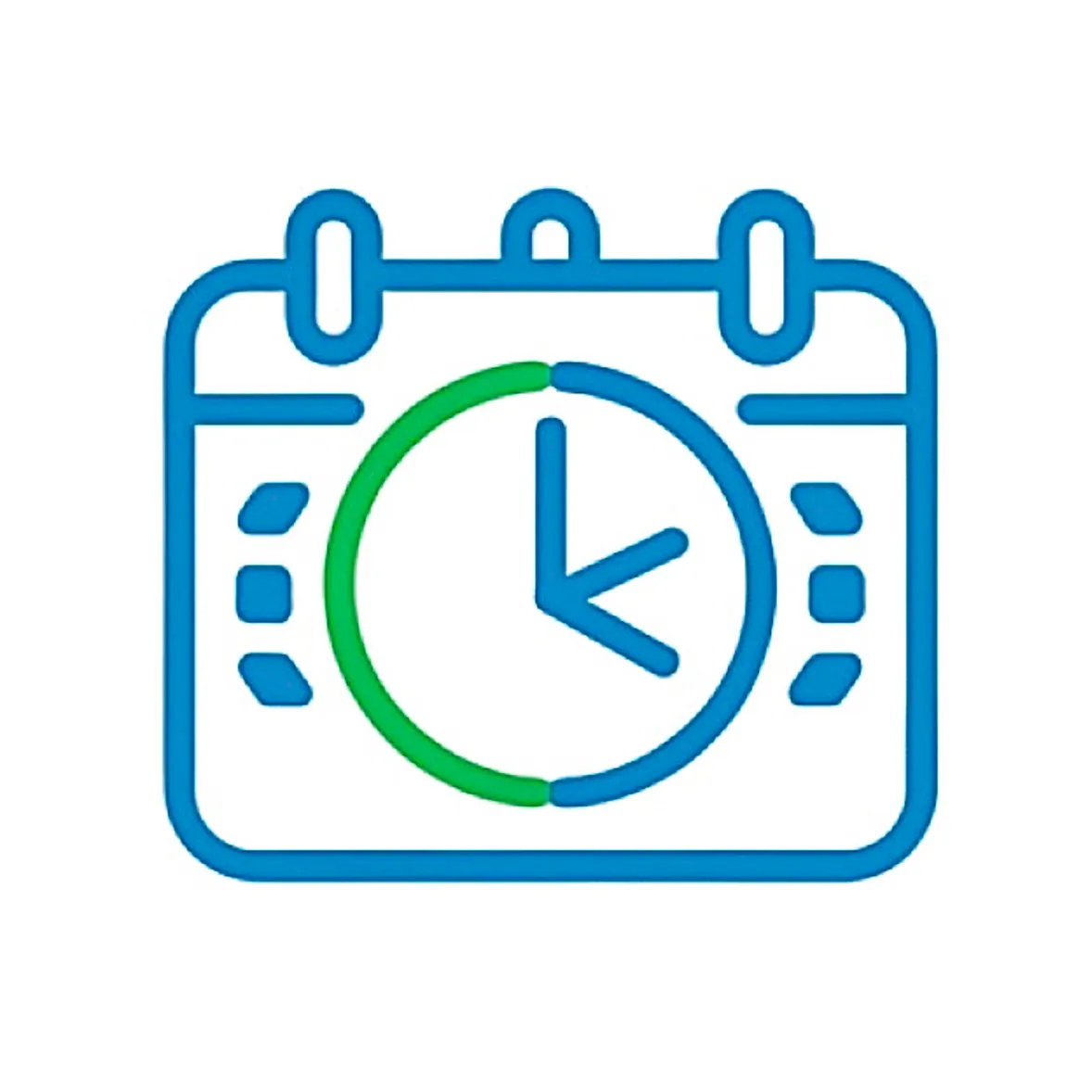
Ero ancorato mentalmente all'idea del calendario con all'interno un orologio che caratterizzava la primissima versione.
Volevo qualcosa di diverso e guardando le altre applicazioni sul mio telefono, mi sono reso conto di una cosa: le icone migliori sono quelle con semplicità assoluta. Niente sovrapposizioni complesse, niente dettagli che si perdono a 60×60 pixel.
Ho realizzato diverse versioni su Figma, iterando continuamente: un calendario realizzato con 3 pezzi di puzzle che rappresentavano i 3 turni, poi un orologio con una freccia che ruotava attorno ad esso. Nessuna mi convinceva del tutto.
Ho riaperto l'app e ho trovato la risposta proprio davanti a me: i 3 rettangoli dell'onboarding, quelli che rappresentano i 3 turni (Mattino, Pomeriggio, Notte).
Così ho garantito tre cose fondamentali:
- Coerenza visiva con l'interfaccia interna dell'app
- Riconoscibilità immediata da parte degli utenti
- Pulizia visiva assoluta, senza elementi ridondanti
L'icona della primissima versione era completamente diversa, era infatti più dettagliata, ma (forse) meno efficace. Questa volta ho scelto l'essenziale. D'altronde l'app promette di fare una cosa sola: dirti quale dei 3 turni farai.
2024
→

2025
Architettura: Offline-First e Gestione della Cache
Fin dall'inizio ho ragionato sull'architettura e su cosa avrei avuto bisogno per il backend, in particolare mi riferisco al localStorage e alla gestione della cache. Volevo che funzionasse offline e ricordasse il turno scelto dall'utente nell'onboarding. Volevo che fosse funzionante la sera stessa, quindi ho orchestrato l'AI dicendole le mie idee e chiedendo conferma se mi stessi perdendo qualcosa o se ci fossero modi migliori per giungere alla soluzione.
Il problema della mezzanotte
Un punto interessante è stato l'algoritmo per cambiare automaticamente il giorno del calendario a mezzanotte esatta.
Inizialmente pensavo a una soluzione che credevo elegante: un Timer che calcolasse esattamente quanto tempo mancava alla mezzanotte. All'apertura dell'app, JavaScript avrebbe controllato quanto tempo sarebbe mancato prima della mezzanotte, regolandosi di conseguenza per il cambio del giorno.
Il problema? Mi sarei scontrato con la gestione di iOS e Android che congelano i browser in background per risparmiare batteria. Il timer si sarebbe fermato.
Ho optato per una soluzione veramente semplice e banale: un Interval di 60 secondi. Ogni 60 secondi JavaScript controlla, per dirla semplice, se oggi != ieri (oggi è diverso da ieri).
Mi premeva l'impatto sulla batteria, che ho scoperto essere bassissimo. Questo perché la CPU si sveglia per un micro-istante, controlla un numero, vede che non è cambiato nulla e torna "a dormire". È molto più costoso per la batteria gestire il rendering grafico o la connessione alla rete.
L'idea del "Timer preciso alla mezzanotte" avrebbe quindi rischiato di creare bug in cui l'app non si aggiorna se il telefono va in standby, mentre il risparmio energetico sarebbe talmente piccolo da non essere misurabile.
Ebbene, in 2 ore avevo l'app funzionante. Ho dedicato altre 3 ore il giorno successivo per rifinire i dettagli e disegnare l'esperienza desktop e landscape negli smartphone.
Layout Responsive: Da Mobile a Dashboard
L'esperienza landscape trasforma l'app in una dashboard: i turni vengono disposti orizzontalmente, sfruttando al meglio lo spazio disponibile e offrendo una visione più ampia del calendario.
È stato un progetto divertentissimo. Mi sono fermato perché mi sarei perso nei dettagli.
Riflessioni: Empatia, Processo e Controllo
Non sono cinico, altrimenti non mirerei a fare questo lavoro, ma credo che alle persone non interessi sentire che sai fare questo o quell'altro, bensì sapere cosa sai fare nel concreto e, per essere ancora più specifici, cosa sai fare di concreto da cui loro possano trarre vantaggio.
Credo sia il medesimo tema del public speaking. Carlo Loiudice diceva (non ricordo se in uno dei suoi corsi oppure nei suoi podcast) che il pubblico è egoista: non gli interessa chi sei, cosa hai fatto e perché sei lì a parlare, bensì cosa si porta a casa di quello che dici.
Proprio per questo motivo sostengo che sia di vitale importanza che quello che fai ti piaccia non solo per i risultati che ottieni e i feedback altrui, bensì per il processo stesso.
La sensazione più bella infatti non è stata da parte dei colleghi che mi hanno fatto i complimenti e hanno aggiunto l'app alla home, bensì la sensazione che seppur usando l'AI molto più del solito, sapevo esattamente cosa stavamo facendo e perché.
È stato tutto ciò che mi ha permesso di fare un lavoro migliore, molto più divertente e didattico della versione precedente in 1/10 del tempo.
Cosa Ho Imparato
Architettura SPA senza framework:
- Implementato pattern Single Page Application pura con switching di visibilità (
.hidden) tra onboarding e vista principale, eliminando navigazione e ricariche pagina per un'esperienza "app nativa". - Gestione dello stato applicativo minimalista con
localStorageper persistenza del gruppo utente e variabili globali (selectedDate,currentMonth) per lo stato UI corrente.
Algoritmo deterministico per turni ciclici:
- Creato sistema di calcolo turni basato su epoch (5 gennaio 2025) e ciclo modulare ogni 3 settimane, evitando completamente database o API esterne.
- Implementato
getWeekNumber()con normalizzazione europea (lunedì come inizio settimana) e gestione edge case domenica. - Risolto bug DST (Daylight Saving Time) usando
Math.roundinvece diMath.floorper compensare settimane di 167.9 o 168.1 ore durante cambio ora legale. - Pattern reverse lookup: deduzione automatica gruppo A/B/C dal turno corrente dell'utente, rendendo l'onboarding più intuitivo ("che turno fai oggi?" invece di "sei del gruppo A?").
PWA e offline-first architecture:
- Service Worker con strategia "cache-first, network fallback" e precaching aggressivo di tutti gli asset critici.
- Lifecycle gestito con
skipWaiting()eclients.claim()per aggiornamenti immediati, ma con controllo UI lato utente (toast + reload manuale). - Manifest biforcato: gestione nativa
beforeinstallpromptper Android/desktop e fallback con istruzioni manuali per iOS (che ignora parte del manifest standard). - Versioning manuale cache (
turni-app-v10) con pulizia automatica vecchie versioni in fase diactivate.
UX mobile "app-like":
- Meta viewport con
maximum-scale=1.0euser-scalable=noper eliminare zoom involontario da doppio tap. - iOS-specific:
apple-mobile-web-app-capable,apple-touch-icon,theme-colordinamico via media query per status bar coerente con tema. - Feedback tattile via classe
.clickedcon ritardi intenzionali (setTimeout) per non troncare animazioni durante interazioni veloci. - Input
type="month"nativo invisibile sovrapposto a label custom: su mobile apre picker nativo (rotella iOS, spinner Android) invece di datepicker HTML custom meno performanti.
CSS utility-first con variabili responsive:
- Design system centralizzato in
:rootper colori, spaziature, tipografia e dimensioni componenti, con override via media query (dark mode, desktop, tablet, landscape). - Layout Grid "stack technique" per sovrapporre testo e loader nei bottoni senza salti di layout durante stato loading.
- Responsive avanzato: desktop (min-width: 950px) trasforma app in dashboard a due colonne usando
display: contentsper neutralizzare wrapper semantici egrid-template-areasper riorganizzare completamente il layout. - Animazioni CSS (
@keyframes softPivot) retriggerate via JavaScript (trick:animation='none'→ reflow → ripristino) per restart sincronizzato con cambio stato.
Navigazione da tastiera accessibile:
- Modalità "day navigation" attivabile con
ArrowDown: frecce navigano giorno per giorno (±1 o ±7), con auto-scorrimento mese quando si esce dai bordi. - Separazione chiara tra "navigazione mese" (ArrowLeft/Right cambiano mese) e "navigazione giorno" per evitare conflitti di input.
- Gestione
Enter,Tab,Escapeper entrare/uscire da modalità giorno e tornare a oggi.
Gestione tempo real-time e lifecycle:
- Auto-refresh a mezzanotte con controllo ogni 60s (
setInterval) confrontandolastKnownDaycon data corrente. - Listener
visibilitychangeper ricontrollare stato quando app torna in foreground dopo standby prolungato (previene bug "app rimasta aperta tutta notte"). - Controllo DST-safe per evitare sfasamenti di un giorno durante cambio ora.
Performance e thermal management:
- Zero font esterni, scrollbar nascosta,
touch-action: manipulation,-webkit-tap-highlight-color: transparentper ridurre overhead rendering e migliorare sensazione tattile. - Uso strategico di
pointer-events: nonedurante stati loading per prevenire doppi click e race condition. - Approccio "Silent Mac": interval a 60s ha impatto in termini di consumi difficilmente misurabile perché la CPU si sveglia solo per confrontare un numero, non per rendering o network.
Pattern UI avanzati:
- Calendario con padding smart: giorni mese precedente/successivo (
.other-month) disabilitati ma visibili per completare griglia 7 colonne senza buchi visivi. - Classi dinamiche basate su turno (
.mattino,.pomeriggio,.notte) applicate sia a.todayche a.selectedper colorazione semantica immediata. - Animazione click con ritardo prima di cambio stato (
setTimeout 150ms) per dare feedback visivo completo prima di triggerare rerender pesante.
Next:
La precedenza ora è imparare React. Ho iniziato oggi, grazie al fatto che mi sono portato parecchio avanti con l'università nell'ultimo mese.
Ma la sfida ora non è imparare una nuova libreria, perché sono certo di riuscirci come sono riuscito ad imparare JavaScript, bensì gestire lavoro, università e questo percorso che vorrei fare a tempo pieno.