Mood Board
Il Progetto
Build a Mood Board è un Lab freeCodeCamp dove ho applicato Props, .map() e Spread Syntax per creare una griglia di card visive. Tecnicamente semplice, ma mi ha fatto ragionare su vincoli architetturali nascosti e dipendenze implicite che possono generare bug "silenziosi".
Codice Sorgente
- index.jsx
- styles.css
- index.html
/* DESIGN
------
* This file contains the React logic for the Mood Board application
* The architecture follows this component-based flow:
*
* Data configuration (the content):
* - Instead of writing repetitive HTML, I defined a `moodData` constant array inside the main component
* - This array holds all the specific details (colors, images, descriptions) in one place, acting
* like a local database for the view
*
* The Parent component (<MoodBoard>):
* - Acts as the layout orchestrator
* - It renders the main title (<h1>) outside the grid to span the full width
* - It contains a wrapper <div> ".mood-board" which applies the CSS Grid layout provided by freeCodeCamp
* - Inside this wrapper, it executes the logic (.map) to transform the raw data into visible UI cards
*
* The Child component (<MoodBoardItem>):
* - Serves as a reusable template (the "Card")
* - It is "dumb" (stateless): it simply receives style and content via props and renders them into
* the specific HTML structure required by the CSS (.mood-board-item, .mood-board-image,
* and .mood-board-text)
*/
/* freeCodeCamp instructions:
* 1. You should export a MoodBoardItem component. ✔️
* 2. Your MoodBoardItem component should return a div with a class of
* mood-board-item at its top-level element. ✔️
* 3. The background color of the .mood-board-item element should be set
* to the value of color prop using inline styles. ✔️
* 4. Your MoodBoardItem component should render an img element with a class
* of mood-board-image and its src set to the value of the image prop. ✔️
* 5. Your MoodBoardItem component should render an h3 element with a class
* of mood-board-text and its text set to the value of the description prop. ✔️
* 6. You should export a MoodBoard component. ✔️
* 7. Your MoodBoard component should return a div as its top-level element. ✔️
* 8. Your MoodBoard component should render an h1 element with a class of
* mood-board-heading and the text Destination Mood Board. ✔️
* 9. Your MoodBoard component should render at least three MoodBoardItem components,
* each should pass color, image, and description props with valid values. ✔️
* 10. Your MoodBoard component should be rendered to the page's #root element. ✔️
*/
export function MoodBoardItem({ color, image, description }) {
/*
* Because that JSX `style` isn't like HTML strings. It requires a JavaScript Object
* The syntax `style={{ key: value }}` uses the first braces for the JS portal
* and the second for the Object literal.
*
* React properties must be CamelCase: `background-color` becomes `backgroundColor`
*/
return (
<div className="mood-board-item"
style={{ backgroundColor: color }}
>
<img src={image} alt={description} className="mood-board-image" />
<h3 className="mood-board-text">
{description}
</h3>
</div>
)
}
export function MoodBoard() {
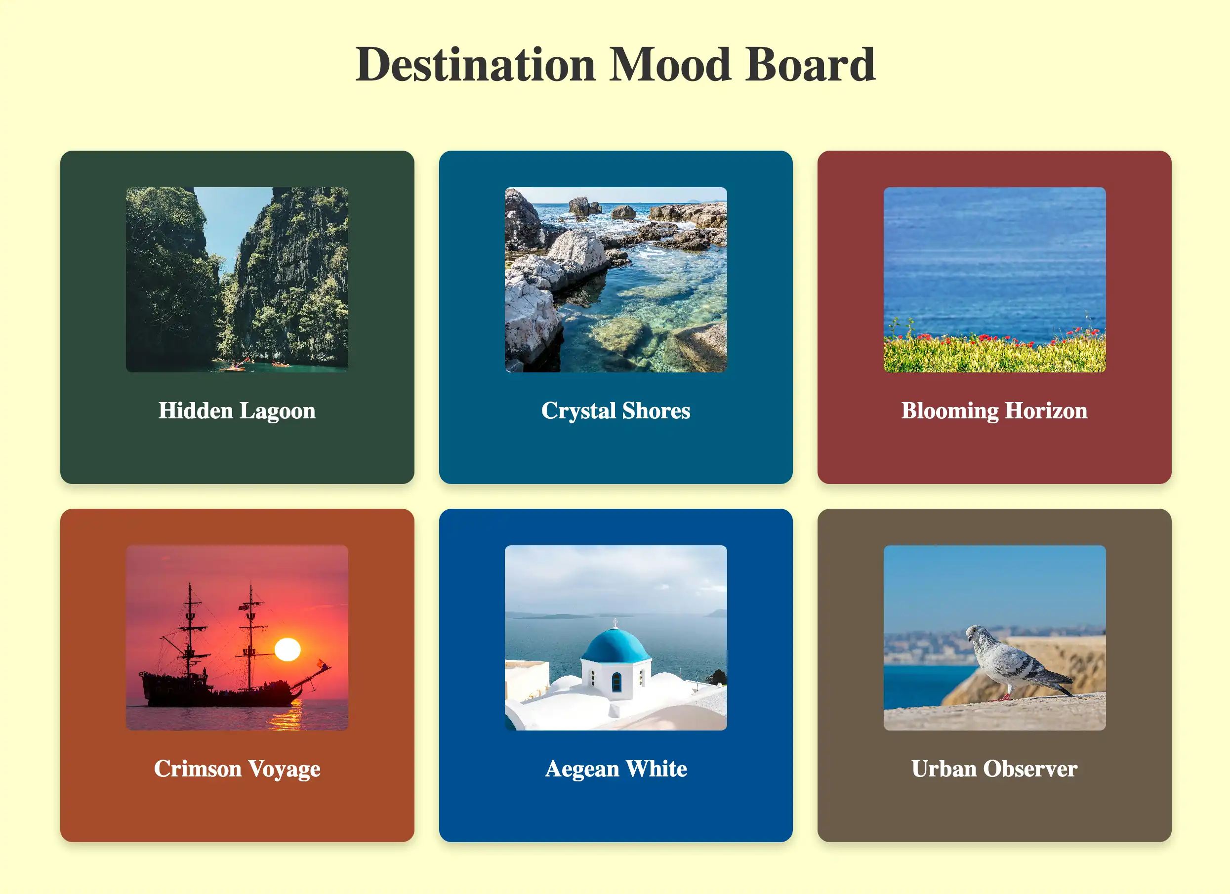
const moodData = [
{
id: 1,
image: "https://cdn.freecodecamp.org/curriculum/labs/pathway.jpg",
description: "Hidden Lagoon",
color: "#2E4A3D", // I extracted dominant colors from images to ensure high contrast with white text
},
{
id: 2,
image: "https://cdn.freecodecamp.org/curriculum/labs/shore.jpg",
description: "Crystal Shores",
color: "#005B7F",
},
{
id: 3,
image: "https://cdn.freecodecamp.org/curriculum/labs/grass.jpg",
description: "Blooming Horizon",
color: "#8C3A3A",
},
{
id: 4,
image: "https://cdn.freecodecamp.org/curriculum/labs/ship.jpg",
description: "Crimson Voyage",
color: "#A64B2A",
},
{
id: 5,
image: "https://cdn.freecodecamp.org/curriculum/labs/santorini.jpg",
description: "Aegean White",
color: "#004E92",
},
{
id: 6,
image: "https://cdn.freecodecamp.org/curriculum/labs/pigeon.jpg",
description: "Urban Observer",
color: "#6B5B4A",
}
];
return (
<div>
<h1 className="mood-board-heading">Destination Mood Board</h1>
<div className="mood-board">
{/*
* The transformation (.map):
* I discovered that React renders Arrays of Components automatically.
* Unlike `forEach` (which does work but returns nothing), `.map()` returns
* a NEW array (immutability concept) where every data object is transformed
* into a JSX Component
*
* The spread syntax shortcut ({...item}):
* Instead of writing: `color={item.color} image={item.image} description={item.description}`
* I use `{...item}` which opens the object properties directly into props, to avoid
* repetitive code
*
* Important constraint: I realized that this shortcut relies on a strict naming contract
* because React acts like a "Blind Courier": it simply takes every key from the data object
* and delivers it as a prop, without translating or checking if the component understands it
* For example, if my data used the key "imgUrl" but the component was waiting for "image",
* the delivery would technically succeed, but the component would receive a prop it doesn't
* recognize (imgUrl), leaving the actual "image" prop undefined
* For this to work, the Data Model and the Component Interface must speak exactly the same language.
*/}
{moodData.map((item) => (
<MoodBoardItem
key={item.id}
{...item}
/>
))}
</div>
</div>
);
}
/* DESIGN
   ------
   * File Origin: Pre-packaged styling by freeCodeCamp
   * Role: The "Visual Contract" (Global Constraints)
   *
   * Architectural analysis of the provided styles:
   * I analyzed this file to understand the boundaries within which my React component must live
   *
   * Global atmosphere (Body):
   * - Sets the background to a pale yellow (#ffffcc)
   * - This dictates that my data model (`moodData`) needs strong, dark colors
   *   to ensure readability and contrast against this light canvas
   *
   * The Grid strategy (.mood-board):
   * - The layout is hardcoded as `display: grid` with `grid-template-columns: repeat(3, 1fr)`
   * - Constraint Discovery: This explicitly forces a 3-column layout.
   * - Impact on React: I realized this is why the <h1> must be placed outside the `.mood-board`
   *   container in my JSX. If placed inside, the title would be treated as a grid item
   *   and squashed into a single column (1/3 width), breaking the header design
   *   (Note: I technically could have kept the <h1> inside by applying `grid-column: 1 / -1`.
   *   In CSS Grid syntax, lines are numbered, and `-1` is a special value representing
   *   the "very last line". So `1 / -1` tells the element:
   *   "Span from the start to the absolute end", creating a full-width row regardless
   *   of how many columns exist. However, moving it outside felt structurally cleaner)
   *
   * Card anatomy (.mood-board-item):
   * - Uses Flexbox (`display: flex`, `flex-direction: column`) to vertically center content
   * - Enforces a fixed height (250px)
   * - This means my <MoodBoardItem /> component is purely a "content filler",
   *   as the layout logic is entirely handled here by CSS.
*/

body {
  background-color: #ffffcc;
}

.mood-board-heading {
  text-align: center;
  font-size: 2.5em;
  color: #333;
  margin-top: 20px;
}

.mood-board {
  display: grid;
  grid-template-columns: repeat(3, 1fr);
  gap: 20px;
  padding: 20px;
  max-width: 900px;
  margin: 0 auto;
}

.mood-board-item {
  border-radius: 10px;
  padding: 10px;
  display: flex;
  flex-direction: column;
  align-items: center;
  justify-content: center;
  color: #fff;
  box-shadow: 0 4px 8px rgba(0, 0, 0, 0.2);
  text-align: center;
  height: 250px;
}

.mood-board-image {
  border-radius: 5px;
  width: 180px;
  height: 150px;
  object-fit: cover;
}

.mood-board-text {
  margin-top: 20px;
  font-size: 1.2em;
}
<!-- DESIGN
     ------
     * File Origin: Pre-packaged environment by freeCodeCamp
     * Role: The "Engine Room" (Host Environment)
     *
     * How it works (In-browser Compilation):
     * I realized that this file differs from standard professional workflows (like Vite/Next.js)
     * Usually, we "cook" (compile) the code on our computer before sending it to the browser
     * Here, the "cooking" happens directly inside the user's browser via Babel
     *
     * The Ingredients (CDNs):
     * Instead of installing React via terminal (npm install), this file pulls React (the logic)
     * and ReactDOM (the rendering) directly from the internet via <script> tags
     * It's like streaming a movie instead of downloading it
     *
     * The Live Translator (Babel Standalone):
     * Browsers don't understand React/JSX natively. This file loads "Babel", a tool that acts
     * as a simultaneous interpreter. It reads the code inside "index.jsx", translates it
     * instantly into standard JavaScript, and executes it
     *
     * The Canvas (#root):
     * The <body> is intentionally empty except for a single <div id="root">
     * This is the "mounting point" where React will paint the entire Mood Board application
     *
     * The Spark (Bootstrapping):
     * The script at the very bottom connects the dots
     * - It uses `type="text/babel"` and `data-type="module"` to enable modern JavaScript features (ES6 Imports)
     * - It grabs the 'root' div and tells React: "Import the { MoodBoard } from our file and draw it here".
-->

<!doctype html>
<html>
  <head>
    <meta charset="UTF-8" />
    <title>Mood Board</title>
    <script src="https://cdnjs.cloudflare.com/ajax/libs/react/18.3.1/umd/react.development.js"></script>
    <script src="https://cdnjs.cloudflare.com/ajax/libs/react-dom/18.3.1/umd/react-dom.development.js"></script>
    <script src="https://cdnjs.cloudflare.com/ajax/libs/babel-standalone/7.26.3/babel.min.js"></script>
    <script
      data-plugins="transform-modules-umd"
      type="text/babel"
      src="index.jsx"
    ></script>
    <link rel="stylesheet" href="styles.css" />
  </head>

  <body>
    <div id="root"></div>
    <script
      data-plugins="transform-modules-umd"
      type="text/babel"
      data-presets="react"
      data-type="module"
    >
      import { MoodBoard } from './index.jsx';
      ReactDOM.createRoot(document.getElementById('root')).render(
        <MoodBoard />
      );
    </script>
  </body>
</html>
Come al solito mi sono "sfogato" nei commenti, ma ci tengo a riportare alcuni passaggi anche qui.
Il Ripasso su UX Engineer Log
Di recente sono stato a Roma per partecipare a due laboratori universitari di design. Durante il viaggio, ho deciso di sostituire la lettura dei soliti libri con il mio UX Engineer Log. Era da tempo che volevo ripassare tutto ciò che ho appreso in questi mesi, sfruttando questo strumento per il suo vero scopo: fungere da Secondo Cervello. Sebbene ne avessi già tratto beneficio consultandolo durante i progetti, non l'avevo mai usato sistematicamente per lo studio attivo.
Ho iniziato sfogliando i singoli progetti, ma ho capito subito che l'approccio era dispersivo. La strada giusta erano i Vademecum. Sono partito dall'HTML, ma l'ho abbandonato quasi subito: sentivo di possedere già molto bene quei concetti. Ho deciso quindi di alzare l'asticella passando a JavaScript. E lì sono stato "rapito".
Mi sono immerso nella prima sezione, densissima, cercando di leggerla con gli occhi di un utente esterno. Per quanto il mio giudizio sia di parte (ho un inevitabile conflitto di interessi), ne sono rimasto sorpreso. Il metodo con cui ho aggregato le informazioni progetto dopo progetto, appuntandomi le spiegazioni del Code Tutor in AppFlowly nel blocco "Add al Vademecum", ha creato una progressione naturale. Rileggere tutto insieme è stato soddisfacente: non erano nozioni astratte, ma concetti assimilati attraverso la pratica, finalmente ordinati. Adoro questo modo di documentare e trovo estremamente gratificante farlo.
Credevo che le basi di JavaScript fossero ormai assodate, ma mi sbagliavo. Il ripasso ha fatto emergere dubbi che ho prontamente chiarito e trasformato in nuove note: le integrerò presto nel Vademecum per renderlo ancora più cristallino per chi leggerà in futuro.
Architettura Data-Driven
L'adozione di .map() e dello Spread Operator è scaturita quasi naturalmente dal ripasso appena concluso. Sebbene siano pattern che avrei probabilmente utilizzato comunque, averli freschi nella memoria ha trasformato una possibilità in una scelta consapevole e immediata (il bias di disponibilità ha giocato il suo ruolo).
Anziché cedere all'hardcoding (scrivere manualmente sei componenti <MoodBoardItem />), ho optato per un approccio Data-Driven orientato alla scalabilità:
- Array
moodData: Funge da database locale. Si occupa esclusivamente dei dati puri (id, immagini, descrizioni e colori dominanti per il contrasto). Aggiungere una card significa solo aggiungere un oggetto qui, senza toccare il resto del JSX. - Componente
<MoodBoard />: È l'orchestratore. Non conosce il contenuto specifico, ma sa come trasformare una lista di dati in elementi UI tramite.map(), generando la griglia dinamicamente. - Componente
<MoodBoardItem />: È il template visivo. Riceve i dati e li "impacchetta" nella struttura HTML richiesta dal CSS, senza preoccuparsi della logica.
Perché .map() e non forEach
La scelta di .map() è dettata dalla natura dichiarativa di React. In JSX, ogni espressione deve restituire un valore renderizzabile, cosa che forEach non fa (esegue un ciclo ma restituisce undefined in termini di UI).
Al contrario, .map() produce un nuovo array (garantendo immutabilità dell'array originale): prende un array di dati in entrata e restituisce un nuovo array di componenti in uscita. React renderizza automaticamente gli array di componenti.
Questa distinzione è fondamentale per la Reconciliation. Dato che React decide se aggiornare la UI confrontando i riferimenti in memoria, se modificassi l'array originale (es. con push), il riferimento rimarrebbe identico e React ignorerebbe il cambiamento. .map(), restituendo sempre un nuovo array, garantisce un nuovo riferimento, segnalando a React che è tempo di aggiornare la UI.
Lo Spread Operator e il "Blind Courier"
Ho utilizzato lo Spread Operator ({...item}) per pulizia e comodità, ma questa scelta mi ha fatto riflettere su come React agisca da "Corriere Cieco" (Blind Courier).
La libreria si preoccupa solo dell'etichetta di spedizione (key) per tracciare il componente nel Virtual DOM; tutto il resto del contenuto (...item) viene consegnato "a scatola chiusa".
Qui nasce un vincolo critico: React non controlla se il destinatario capisce il contenuto. Se l'array contiene la chiave imgUrl ma il componente si aspetta image, la consegna avviene con successo, ma il componente riceverà una prop (proprietà) sconosciuta, lasciando quella corretta undefined.
Per usare questa scorciatoia, Data e Componente devono parlare esattamente la stessa lingua: è una dipendenza implicita che, se avessi ignorato, avrei generato bug silenziosi.
L'Errore nel Footer (e la scelta dell'autenticità)
Rileggendo il codice del progetto Footer, ho notato di aver utilizzato la sintassi {/* commento */} anche all'esterno dei componenti. Ho scoperto che si trattava di un errore concettuale: le parentesi graffe servono ad aprire il "portale" JavaScript dentro il JSX; fuori da esso, siamo in un JavaScript standard e bastava un classico /* commento */.
Ho deciso deliberatamente di non correggere quel file. Anche se potrebbe sembrare un autogol agli occhi di un recruiter, questo percorso l'ho fondato sulla cronologia reale dei log. Preferisco mostrare la trasparenza della mia evoluzione piuttosto che una perfezione retroattiva costruita a posteriori.
Vincoli CSS Preconfezionati
L'analisi del CSS fornito da freeCodeCamp ha definito i confini entro cui il mio React doveva muoversi:
- Body: Il background giallo pallido (
#ffffcc) ha dettato la scelta di colori scuri e saturi per l'arraymoodData, garantendo il contrasto necessario col testo bianco. - Grid Hardcoded: La regola
grid-template-columns: repeat(3, 1fr)forza un layout a tre colonne. Questa è stata una scoperta critica: ho dovuto posizionare l'<h1>fuori dal container.mood-board. Se l'avessi messo dentro, sarebbe stato trattato come un elemento della griglia e schiacciato in una colonna, rompendo il design. In poche parole il CSS ha imposto la struttura, React l'ha riempita. - Card Anatomy: Con un'altezza fissa di 250px e Flexbox gestito dal CSS, il componente
<MoodBoardItem />è diventato puramente un riempitivo di contenuto, delegando interamente il layout al foglio di stile.
Cosa Ho Imparato
Inline Styles (Il Portale JavaScript):
- Ripassato che l'attributo
stylein JSX non accetta stringhe come in HTML, ma esige oggetti JavaScript. La sintassi{{ }}non è doppia graffa a caso: la prima apre il "portale JavaScript", la seconda definisce l'oggetto letterale. - Cambio di mentalità obbligato: da CSS standard (
background-color) a proprietà DOM JavaScript (backgroundColor). Non stiamo scrivendo fogli di stile, stiamo programmando lo stile.
.map() come Catena di Montaggio:
- Abbandonato l'approccio imperativo (cicli
forad esempio) per quello dichiarativo..map()agisce come una catena di montaggio che prende materie prime (dati grezzi) e sforna prodotti finiti (Componenti UI) in un colpo solo. - Cruciale per React: restituendo un nuovo array (invece di modificare l'esistente), garantisce l'immutabilità necessaria affinché il framework rilevi i cambiamenti e aggiorni la vista.
Spread Syntax e Contratti Impliciti:
- L'uso di
{...item}è una scorciatoia elegante ma pericolosa: crea una dipendenza invisibile tra il Data Model e l'interfaccia del Componente. - React agisce come un "Corriere Cieco": consegna tutte le chiavi del database direttamente al componente. Se i nomi non coincidono perfettamente (es.
imgUrlvsimage), il dato si perde silenziosamente nel tragitto.
Gerarchia: Il CSS comanda, React esegue:
- Scoperto che i vincoli del layout (CSS Grid) possono dettare l'architettura dei componenti. L'
<h1>è stato spostato fuori dal container.mood-boardnon per logica React, ma per non essere schiacciato dalle regole della griglia. - La lezione: React riempie le scatole, ma spesso è il CSS a decidere dove quelle scatole possono stare. Non si può ignorare il "contratto visivo" quando si progetta l'albero dei componenti.
Grammatica dei Commenti (Context Switching):
- Appreso che JSX non è HTML nemmeno nei commenti. All'interno del rendering visivo, i commenti devono essere incapsulati in
{/* ... */}per essere interpretati come JavaScript e non renderizzati come testo. - È un continuo cambio di contesto: fuori dal
returnsiamo in JavaScript puro (//o/* */), dentro siamo nel Virtual DOM che richiede le graffe di escape.
Vademecum Git & GitHub
Attualmente ho in cantiere un nuovo Vademecum dedicato a Git e GitHub, mantenendo lo stesso approccio "Real World" che ho già applicato a quelli su HTML, CSS, JavaScript e UX & UI. È un progetto in divenire, nato per consolidare i concetti appresi durante lo sviluppo con Docusaurus. Non mi sono però limitato alla mia esperienza "in solitaria": ho voluto approfondire le dinamiche reali del lavoro in team, studiando i flussi di lavoro collaborativi standard. Ho arricchito il tutto con una raccolta essenziale dei comandi da terminale che si sono rivelati, nel pratico, tra i miei migliori alleati quotidiani.
Next:
Consolidare le basi tramite Quiz e imparare a lavorare con State, Hooks ed Eventi, per poi applicare tutto nella Toggle Text App.