Footer
Il Progetto
Footer è un componente React che rappresenta il mio primo esercizio non guidato dopo aver appreso le basi della sintassi JSX e della componentizzazione.
È stato estremamente utile come esercizio perché freeCodeCamp mi aveva insegnato come creare una navbar, ma non un footer. Ebbene, i concetti si tramutano con estrema similitudine: stessa logica di liste semantiche, stessa separazione tra struttura (JSX) e stile (CSS), stesso approccio dichiarativo.
Codice Sorgente
- index.jsx
- styles.css
- index.html
{/* DESIGN
------
* This file contains the React structure for the Footer component
* The architecture follows this semantic and functional flow:
*
* Architectural decisions (Layout strategy):
* - I realized that the original reference design (simoneamico.com) utilized a 2-column layout
* - To satisfy the strict lab constraint ("At least three unordered lists"), I logically split the
* content into "Navigation", "Social", and "Contacts"
* - This approach allows the component to pass validation tests while maintaining logical grouping
* and visual hierarchy
*
* Semantic structure (Accessibility):
* - I chose the HTML5 <footer> tag as the top-level semantic landmark
* - I encapsulated link groups in <ul> elements to ensure accessibility, as screen readers
* interpret these specifically as navigational lists
* - The copyright section is isolated in a ".footer-bottom" container to allow for separate
* spacing and styling logic
*
* Implementation details:
* - All links use href="#" placeholders as mandated by the lab requirements
* - The "footer-columns" wrapper is designed to support CSS Flexbox or Grid for responsive alignment.
*/}
{/*
* freeCodeCamp instructions:
* 1. You should export a Footer component. ✔️
* 2. Your Footer component should return a footer element. ✔️
* 3. Your Footer component should only contain a single footer element. ✔️
* 4. Your footer element should not have any siblings. ✔️
* 5. Your footer element should contain at least three unordered lists. ✔️
* 6. Each of your unordered lists should have at least two list items. ✔️
* 7. Your footer should have at least one paragraph element. ✔️
* 8. You should have a copyright (©) symbol within one of your paragraphs. ✔️
* 9. Your footer should have at least three links with the href value set to #. ✔️
* 10. None of your links should be empty. ✔️
*/}
export const Footer = () => {
return (
<footer>
{/*
* Container wrapper designed for CSS Grid/Flexbox alignment.
* Even though this lab focuses on HTML structure, this div
* prepares the layout for the 3-column responsive design.
*/}
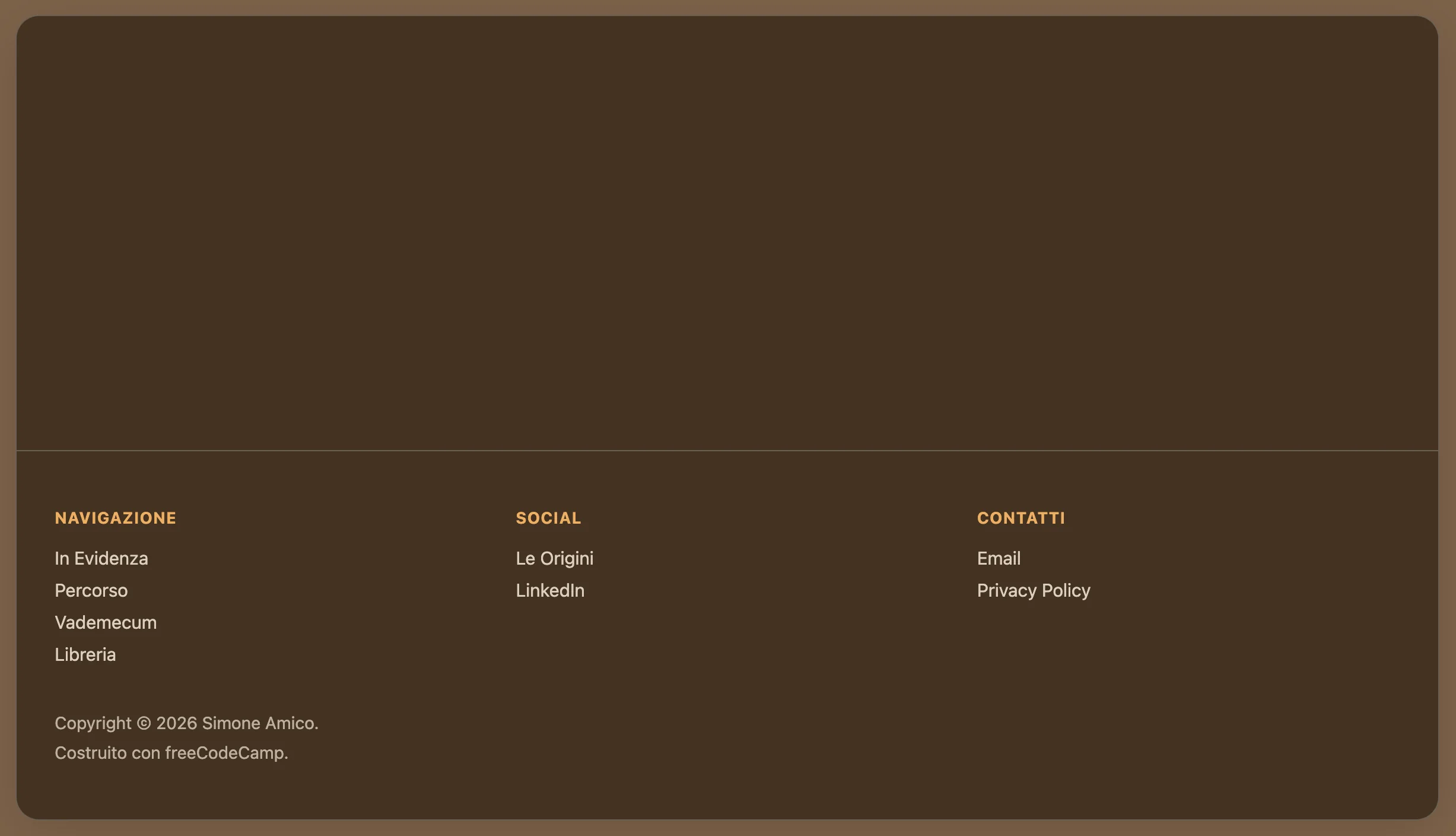
<div className="footer-columns">
{/* Section 1: Main navigation */}
<div className="footer-section">
<h4>NAVIGAZIONE</h4>
<ul>
<li><a href="#">In Evidenza</a></li>
<li><a href="#">Percorso</a></li>
<li><a href="#">Vademecum</a></li>
<li><a href="#">Libreria</a></li>
</ul>
</div>
{/* Section 2: Social links (split from contacts to meet list quota) */}
<div className="footer-section">
<h4>SOCIAL</h4>
<ul>
<li><a href="#">Le Origini</a></li>
<li><a href="#">LinkedIn</a></li>
</ul>
</div>
{/* Section 3: Direct contacts and legal */}
<div className="footer-section">
<h4>CONTATTI</h4>
<ul>
<li><a href="#">Email</a></li>
<li><a href="#">Privacy Policy</a></li> {/* added "Privacy Policy" to satisfy "at least 2 items" rule */}
</ul>
</div>
</div>
{/* Copyright Section */}
<div className="footer-bottom">
<p>Copyright © 2026 Simone Amico.</p>
<p>Costruito con freeCodeCamp.</p>
</div>
</footer>
);
}
/* DESIGN
   ------
   * This configuration defines the "App variant" of the UX Engineer Log, reinterpreting the
   * style core "Coffee & Sand" into a "Espresso & Amber" palette
   *
   * CSS Architecture:
   * - Massive token centralization: I adopted a strict "Design Token" methodology, extracting
   *   all "magic numbers" (colors, spacing, typography, z-indices, animation timings) into
   *   the :root scope. This acts as a single source of truth, ensuring visual consistency
   *   across the React component tree and facilitating global theme adjustments
   * - Layout strategy: The application uses a "Frame vs Canvas" approach. The body acts as
   *   the viewport/environment, while the #root container acts as the application window,
   *   using overflow clipping to maintain the global border radius
   * - Typography: I maintained the system Font Stack to ensure zero CLS (Cumulative Layout
   *   Shift) and immediate rendering, prioritizing performance and native OS integration over
   *   aesthetic customization.
*/

/* DESIGN TOKENS (VARIABLES) - UNIVERSAL */
:root {
  /* PALETTE: Coffee & Sand */
  --color-primary: #ffbd69;
  --color-primary-dark: #614a32;
  --color-primary-light: #a68563;

  --bg-frame: #7c6148;
  --bg-canvas: #423121;
  --bg-navbar: #423121;
  --bg-hover: rgba(0,0,0,0.05);

  --border-color: #6b6053;
  --text-main: #ffffff;
  --text-muted: #dcd0c0;

  /* Dimensions and Layout */
  --layout-max-width: 1200px;
  --layout-frame-padding: 20px;

  /* Spacing System (8pt Grid) */
  --space-xs: 0.5rem;   /* 8px */
  --space-sm: 1rem;     /* 16px */
  --space-md: 1.5rem;   /* 24px */
  --space-lg: 2rem;     /* 32px */
  --space-xl: 3rem;     /* 48px */

  /* Borders and Radius */
  --radius-sm: 8px;     /* Buttons/Inputs */
  --radius-lg: 20px;    /* App Container */
  --border-width: 1px;

  /* Effects */
  --shadow-soft: 0 10px 40px -10px rgba(0, 0, 0, 0.18);
  --transition-fast: 0.2s ease;

  /* Typography*/
  --font-base: system-ui, -apple-system, Segoe UI, Roboto, Helvetica, Arial, sans-serif;
  --text-sm: 0.85rem;
  --text-base: 0.95rem;
  --weight-medium: 500;
  --weight-bold: 600;

  /* Z-index layers*/
  /* Defined here to avoid z-index wars in the component css */
  --z-navbar: 100;
  --z-dropdown: 1000;
}

/* GLOBAL RESET */
* {
  box-sizing: border-box;
  margin: 0;
  padding: 0;
}

body {
  font-family: var(--font-base);
  background-color: var(--bg-frame);
  color: var(--text-main);
  min-height: 100vh;

  /* Layout: Frame Padding */
  /* Creates the visual gap between the browser window and the app container,
     reinforcing the "Floating Window" metaphor on desktop screens */
  padding: var(--layout-frame-padding);
  display: flex;
  justify-content: center;
}

/* APP CONTAINER */
#root {
  background-color: var(--bg-canvas);
  width: 100%;
  max-width: var(--layout-max-width);
  border-radius: var(--radius-lg);
  border: var(--border-width) solid var(--border-color);
  box-shadow: var(--shadow-soft);

  /*
   * Architectural decision: `overflow: hidden` is crucial here
   * It forces the square corners of the Navbar and Footer to respect the
   * rounded corners of this container, avoiding the "corner bleed" artifact.
  */
  overflow: hidden;

  display: flex;
  flex-direction: column;
  min-height: 95vh;
}


/* NAVBAR*/

.navbar {
  background-color: var(--bg-navbar);
  border-bottom: var(--border-width) solid var(--border-color);
  padding: var(--space-sm) var(--space-lg);

  /* Layout: Spaced Alignment */
  display: flex;
  justify-content: space-between;
  align-items: center;

  position: relative;
  z-index: var(--z-navbar);
}

.navbar ul {
  list-style: none;
  display: flex;
  gap: var(--space-md); /* Gestalt Principle: Grouping via whitespace */
  align-items: center;
}

/* NAVIGATION ITEMS */
.nav-item {
    position: relative; /* Anchor point for the absolute dropdown */
}

.nav-item a {
  text-decoration: none;
  color: var(--text-main);
  font-weight: var(--weight-bold);
  font-size: var(--text-base);
  transition: color var(--transition-fast);
}

.nav-item a:hover {
  color: var(--color-primary-light);
}

/* BUTTON OVERRIDE */
/* Styled to look like a chip/badge to differentiate interactive tools from passive links */
.nav-item button {
  background: none;
  border: var(--border-width) solid var(--color-primary);
  color: var(--color-primary);
  padding: 0.5rem 1rem;
  border-radius: var(--radius-sm);
  cursor: pointer;
  font-weight: var(--weight-bold);
  font-family: inherit;
  transition: all var(--transition-fast);
}

.nav-item button:hover {
  background-color: var(--color-primary);
  color: #fff;
}


/* DROPDOWN MENU */

.sub-menu {
  position: absolute;
  /* Visual adjustments for the dropdown panel */
  background-color: var(--bg-canvas);
  border: var(--border-width) solid var(--border-color);
  border-radius: var(--radius-sm);
  padding: var(--space-xs) 0;
  box-shadow: var(--shadow-soft);

  /* Interaction Logic: Hidden by default, Flex on hover */
  display: none;
  flex-direction: column !important; /* Forces vertical stack overriding navbar flex-row */
  gap: 0 !important;
  margin-top: var(--space-xs);
  z-index: var(--z-dropdown);
  min-width: 160px;
}

/* Hover State Logic */
/* I realized that in a production React environment, this would likely be handled via State (isOpen).
   However, for this specific lab, CSS :hover provides a performant, JS-free solution. */
.nav-item:hover .sub-menu {
  display: flex;
  animation: fadeIn var(--transition-fast);
}

.sub-menu li a {
  display: block;
  padding: var(--space-xs) var(--space-md);
  color: var(--text-muted);
  font-weight: var(--weight-medium);
}

.sub-menu li a:hover {
  background-color: var(--bg-hover);
  color: var(--color-primary);
}


/* FOOTER */

footer {
  margin-top: auto; /* Sticky Footer technique: pushes footer to bottom of flex container */
  border-top: var(--border-width) solid var(--border-color);
  padding: var(--space-xl) var(--space-lg);
  background-color: transparent;
}

/* Footer Grid Layout */
.footer-columns {
  display: grid;
  /* Responsive Pattern: Auto-fit columns based on available width (min 200px) */
  grid-template-columns: repeat(auto-fit, minmax(200px, 1fr));
  gap: var(--space-lg);
  margin-bottom: var(--space-sm);
}

.footer-section h4 {
  font-size: var(--text-sm);
  text-transform: uppercase;
  letter-spacing: 0.05em;
  opacity: 0.9;
  margin-bottom: var(--space-sm);
  color: var(--color-primary);
}

.footer-section ul {
  list-style: none;
}

.footer-section li {
  margin-bottom: var(--space-xs);
}

.footer-section a {
  text-decoration: none;
  color: var(--text-muted);
  font-size: var(--text-base);
  transition: color var(--transition-fast);
}

.footer-section a:hover {
  color: var(--color-primary);
  text-decoration: underline;
}

/* COPYRIGHT SECTION */
.footer-bottom {
  padding-top: var(--space-sm);
  font-size: 0.9rem;
  color: var(--text-muted);
  opacity: 0.8;
}

.footer-bottom > p:first-of-type {
  padding-bottom: var(--space-xs);
}


/* MOBILE ADAPTATION (< 768px) */
/* Strategy: "Native Feel"
   On mobile, I remove the "Frame" metaphor to maximize screen real estate,
   making the app feel native rather than a website inside a box.
*/
@media screen and (max-width: 768px) {
  body {
    padding: 0; /* Remove frame padding */
  }

  #root {
    border-radius: 0;
    border: none;
  }

  /* Stacked Navigation */
  .navbar {
    flex-direction: column;
    gap: var(--space-sm);
    padding: var(--space-sm);
  }

  /* Stacked Footer */
  .footer-columns {
    grid-template-columns: 1fr; /* Force single column stack */
    text-align: left;
  }
}

/* ANIMATIONS DEFINITIONS */
@keyframes fadeIn {
    from { opacity: 0; transform: translateY(-5px); }
    to { opacity: 1; transform: translateY(0); }
}
<!-- DESIGN
     ------
     * File Origin: Pre-packaged environment by freeCodeCamp
     * Role: The "Engine Room" (Host Environment)
     *
     * How it works:
     * This file is different from a standard professional project (like Vite)
     * Usually, we "cook" (compile) the code on our computer before sending it
     * to the browser
     * Here, instead, the "cooking" happens directly inside the user's browser
     *
     * The Ingredients (CDNs):
     * Instead of installing React via terminal (npm install), this file pulls
     * React (the logic) and ReactDOM (the rendering) directly from the internet
     * via <script> tags. It's like streaming a movie instead of downloading it
     *
     * The Live Translator (Babel Standalone):
     * Browsers don't understand React/JSX natively
     * This file loads "Babel", a tool that acts as a simultaneous interpreter
     * It reads the code inside "index.jsx", translates it instantly into
     * standard JavaScript, and executes it. This allows the lab to work
     * immediately without any setup.
     *
     * The Canvas (#root):
     * The <body> is intentionally empty except for a single <div id="root">
     * This is the "mounting point" where React will paint the entire application
     *
     * The Spark (Bootstrapping):
     * The script at the very bottom connects the dots. It grabs the 'root' div
     * and tells React: "Take the <Footer /> component and draw it here".
-->

<!doctype html>
<html>
  <head>
    <meta charset="UTF-8" />
    <title>Reusable Footer Component</title>
    <script src="https://cdnjs.cloudflare.com/ajax/libs/react/18.3.1/umd/react.development.js"></script>
    <script src="https://cdnjs.cloudflare.com/ajax/libs/react-dom/18.3.1/umd/react-dom.development.js"></script>
    <script src="https://cdnjs.cloudflare.com/ajax/libs/babel-standalone/7.26.3/babel.min.js"></script>
    <script
      data-plugins="transform-modules-umd"
      type="text/babel"
      src="index.jsx"
    ></script>
    <link rel="stylesheet" href="styles.css" />
  </head>

  <body>
    <div id="root"></div>
    <script
      data-plugins="transform-modules-umd"
      type="text/babel"
      data-presets="react"
      data-type="module"
    >
      import { Footer } from './index.jsx';
      ReactDOM.createRoot(document.getElementById('root')).render(<Footer />);
    </script>
  </body>
</html>
Design: Ibrido tra Light e Dark Mode
Ho optato per replicare il footer del sito simoneamico.com (Docusaurus), ma non volevo farlo identico perché quello già esiste.
Ho giocato su un ibrido visivo tra la modalità Light e Dark del sito: palette "Espresso & Amber" (variante dark di "Coffee & Sand"), layout a tre colonne, ma con un twist skeuomorfico che simula una "cornice in legno scuro" (#7c6148) che avvolge il "contenuto espresso" (#423121).
È stato il CSS a vestire il footer come se fosse al fondo di una card/applicazione, ma il componente stesso rimane a sé stante, mantenendo intatto il compito richiesto da freeCodeCamp: struttura semantica pura, esportabile e riutilizzabile.
Nota sul CSS condiviso: Ho mantenuto nel file anche gli stili della navbar (dal progetto precedente) per avere un design system coerente. Navbar e Footer condividono gli stessi token (colori, spacing, z-index), quindi ha senso tenerli nello stesso CSS invece di duplicare variabili. È lo stesso approccio che userei in un progetto reale.
Cosa Ho Imparato
Divide et Impera (Strategia di Layout):
- Il design di riferimento usa un layout a 2 colonne, ma freeCodeCamp richiedeva "almeno tre liste
<ul>". Ho diviso logicamente il contenuto in "Navigation", "Social" e "Contacts" per soddisfare il vincolo mantenendo gerarchia visiva e raggruppamento logico. - Questa scelta non è solo formale: prepara il componente per un futuro data-driven (invece di scrivere tre
<ul>a mano, passerò un array di sezioni come prop e userò.map()).
Semantica HTML5 e Accessibilità:
- Uso obbligatorio del tag
<footer>come landmark semantico di primo livello (screen reader riconoscono immediatamente il contesto). - Liste
<ul>per raggruppare link: non solo validazione freeCodeCamp, ma segnale esplicito agli assistive tech che si tratta di navigazione. - Separazione
.footer-bottomper copyright: logica di spaziatura/styling isolata dal resto, preparando il terreno per layout responsive più complessi.
Design Token e Single Source of Truth:
- Ho centralizzato tutto in variabili CSS
:root(colori, spaziature 8pt grid, tipografia, z-index, transizioni). Modificare il tema significa toccare un solo punto, non 50 file sparsi. - Naming convention coerente:
--color-primary,--space-md,--radius-lg. Questo prepara mentalmente al concetto di "Props" in React: invece di hardcodare valori, passi riferimenti a un sistema.
Layout Responsive (Grid Auto-Fit):
grid-template-columns: repeat(auto-fit, minmax(200px, 1fr)): pattern CSS Grid che adatta automaticamente il numero di colonne in base alla larghezza disponibile. È la versione CSS del "responsive by default" di React.- Su mobile (
@media screen and (max-width: 768px)), forzogrid-template-columns: 1frper stack verticale. Ho anche rimosso padding del body e border-radius per passare da "app in cornice" a "esperienza nativa fullscreen".
Overflow Clipping e Border Radius:
overflow: hiddensul container#rootè cruciale: forza navbar e footer (che hanno angoli quadrati) a rispettare ilborder-radiusdel contenitore padre, evitando l'artifact "corner bleed".- Questo è un pattern che tornerà utile quando dovrò gestire componenti figli che non devono "sforare" dai limiti del genitore.
Hover State con CSS puro vs React State:
- Ho gestito il dropdown della navbar con
:hoverCSS (display: none→display: flex). Performante e JS-free, perfetto per un lab. - Ma ho aggiunto un commento nel codice: "In produzione React, questo sarebbe gestito via State (isOpen)". Ho capito che CSS hover non funziona su mobile (no hover col dito) e non è controllabile via tastiera. React State risolve entrambi.
Sticky Footer Technique:
margin-top: autosul footer dentro un containerdisplay: flex; flex-direction: column; min-height: 95vh: tecnica moderna per "footer appiccicato in fondo" senza posizionamento assoluto. Il footer si auto-spinge verso il basso del viewport, anche se il contenuto è poco.
Architettura CDN vs Vite (Engine Room):
- Ho analizzato l'
index.htmlpreconfezionato da freeCodeCamp: carica React/ReactDOM via CDN (streaming) invece di bundle locale, e usa Babel Standalone come "traduttore simultaneo" che converte JSX in JS direttamente nel browser. - È il contrario di Vite: invece di "cuocere" il codice sul mio computer prima di inviarlo al browser, la "cottura" avviene live nel browser dell'utente. Comodo per lab, ma non scalabile in produzione (troppo overhead).
Link Placeholder (href="#") e Debito Tecnico:
- Tutti i link usano
href="#"come richiesto dal lab. Ho capito che questo è "debito tecnico intenzionale": in una SPA React vera, questi diventerebbero<Link to="/path">(React Router) per navigazione senza ricarica. - Anche qui, la struttura attuale è "React-ready": basterà sostituire
<a>con<Link>componente e passare le rotte come prop.
Animation FadeIn con @keyframes:
- Dropdown menu usa
animation: fadeIn 0.2sinvece di solotransition, perché voglio controllare sia opacità CHE transform (translateY). Transition gestisce solo proprietà singole che cambiano, Keyframes orchestrano sequenze.
Mobile-First Mindset:
- Ho scritto CSS desktop-first (per comodità visiva durante sviluppo), ma ho capito che in produzione si parte da mobile (
@media (min-width: 768px)) per Progressive Enhancement. Ora che ho visto entrambi gli approcci, capisco perché mobile-first è standard.
Riflessioni
Ormai sai che è sempre così: quando faccio esercizi non guidati come i Certification Project o questi Labs (che di fatto sono Certification Project con index.html preconfezionato), trovo poco da dire nei README proprio perché ho detto tutto nel codice sorgente nei vari commenti.
Next:
Imparare a lavorare con Props, Conditional Rendering e Lists in React, per poi applicare tutto nel Profile Card Component.