Magazine
Il Progetto
Rivista digitale sviluppata con CSS Grid, che replica il layout tipico di una rivista con colonne, sezioni ed elementi grafici complessi. Un ritorno alle origini del design editoriale applicato al web.
Codice Sorgente
- index.html
- styles.css
<!DOCTYPE html>
<html lang="en">
<head>
<meta charset="UTF-8" />
<meta name="viewport" content="width=device-width, initial-scale=1.0" />
<title>Magazine</title>
<link
href="https://fonts.googleapis.com/css?family=Anton%7CBaskervville%7CRaleway&display=swap"
rel="stylesheet"
/>
<link
rel="stylesheet"
href="https://use.fontawesome.com/releases/v5.8.2/css/all.css"
/>
<link
rel="stylesheet"
href="styles.css"
/>
</head>
<body>
<main>
<section class="heading">
<header class="hero">
<img
src="https://cdn.freecodecamp.org/platform/universal/fcc_meta_1920X1080-indigo.png"
alt="freecodecamp logo"
loading="lazy"
class="hero-img"
/>
<h1 class="hero-title">OUR NEW CURRICULUM</h1>
<p class="hero-subtitle">
Our efforts to restructure our curriculum with a more project-based
focus
</p>
</header>
<div class="author">
<p class="author-name">
By
<a href="https://freecodecamp.org" target="_blank" rel="noreferrer"
>freeCodeCamp</a
>
</p>
<p class="publish-date">March 7, 2019</p>
</div>
<div class="social-icons">
<a href="https://www.facebook.com/freecodecamp/">
<i class="fab fa-facebook-f"></i>
</a>
<a href="https://twitter.com/freecodecamp/">
<i class="fab fa-twitter"></i>
</a>
<a href="https://instagram.com/freecodecamp">
<i class="fab fa-instagram"></i>
</a>
<a href="https://www.linkedin.com/school/free-code-camp/">
<i class="fab fa-linkedin-in"></i>
</a>
<a href="https://www.youtube.com/freecodecamp">
<i class="fab fa-youtube"></i>
</a>
</div>
</section>
<section class="text">
<p class="first-paragraph">
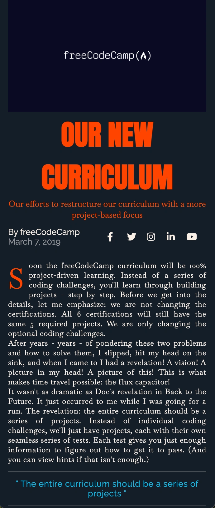
Soon the freeCodeCamp curriculum will be 100% project-driven learning. Instead of a series of coding challenges, you'll learn through building projects - step by step. Before we get into the details, let me emphasize: we are not changing the certifications. All 6 certifications will still have the same 5 required projects. We are only changing the optional coding challenges.
</p>
<p>
After years - years - of pondering these two problems and how to solve them, I slipped, hit my head on the sink, and when I came to I had a revelation! A vision! A picture in my head! A picture of this! This is what makes time travel possible: the flux capacitor!
</p>
<p>
It wasn't as dramatic as Doc's revelation in Back to the Future. It
just occurred to me while I was going for a run. The revelation: the entire curriculum should be a series of projects. Instead of individual coding challenges, we'll just have projects, each with their own seamless series of tests. Each test gives you just enough information to figure out how to get it to pass. (And you can view hints if that isn't enough.)
</p>
<blockquote>
<hr />
<p class="quote">
The entire curriculum should be a series of projects
</p>
<hr />
</blockquote>
<p>
No more walls of explanatory text. No more walls of tests. Just one
test at a time, as you build up a working project. Over the course of passing thousands of tests, you build up projects and your own understanding of coding fundamentals. There is no transition between lessons and projects, because the lessons themselves are baked into projects. And there's plenty of repetition to help you retain everything because - hey - building projects in real life has plenty of repetition.
</p>
<p>
The main design challenge is taking what is currently paragraphs of explanation and instructions and packing them into a single test description text. Each project will involve dozens of tests like this. People will be coding the entire time, rather than switching back and forth from "reading mode" to "coding mode".
</p>
<p>
Instead of a series of coding challenges, people will be in their code editor passing one test after another, quickly building up a project. People will get into a real flow state, similar to what they experience when they build the required projects at the end of each certification. They'll get that sense of forward progress right from the beginning. And freeCodeCamp will be a much smoother experience.
</p>
</section>
<section class="text text-with-images">
<article class="brief-history">
<h3 class="list-title">A Brief History</h3>
<p>Of the Curriculum</p>
<ul class="lists">
<li>
<h4 class="list-subtitle">V1 - 2014</h4>
<p>
We launched freeCodeCamp with a simple list of 15 resources,
including Harvard's CS50 and Stanford's Database Class.
</p>
</li>
<li>
<h4 class="list-subtitle">V2 - 2015</h4>
<p>We added interactive algorithm challenges.</p>
</li>
<li>
<h4 class="list-subtitle">V3 - 2015</h4>
<p>
We added our own HTML+CSS challenges (before we'd been relying on
General Assembly's Dash course for these).
</p>
</li>
<li>
<h4 class="list-subtitle">V4 - 2016</h4>
<p>
We expanded the curriculum to 3 certifications, including Front
End, Back End, and Data Visualization. They each had 10 required
projects, but only the Front End section had its own challenges.
For the other certs, we were still using external resources like
Node School.
</p>
</li>
<li>
<h4 class="list-subtitle">V5 - 2017</h4>
<p>We added the back end and data visualization challenges.</p>
</li>
<li>
<h4 class="list-subtitle">V6 - 2018</h4>
<p>
We launched 6 new certifications to replace our old ones. This was
the biggest curriculum improvement to date.
</p>
</li>
</ul>
</article>
<aside class="image-wrapper">
<img
src="https://cdn.freecodecamp.org/testable-projects-fcc/images/random-quote-machine.png"
alt="image of the quote machine project"
loading="lazy"
class="image-1"
width="600"
height="400"
/>
<img
src="https://cdn.freecodecamp.org/testable-projects-fcc/images/calc.png"
alt="image of a calculator project"
loading="lazy"
class="image-2"
width="400"
height="400"
/>
<blockquote class="image-quote">
<hr />
<p class="quote">
The millions of people who are learning to code through freeCodeCamp
will have an even better resource to help them learn these
fundamentals.
</p>
<hr />
</blockquote>
<img
src="https://cdn.freecodecamp.org/testable-projects-fcc/images/survey-form-background.jpeg"
alt="four people working on code"
loading="lazy"
class="image-3"
width="600"
height="400"
/>
</aside>
</section>
</main>
</body>
</html>
*,
::before,
::after {
  padding: 0;
  margin: 0;
  box-sizing: border-box;
}

html {
  font-size: 62.5%;
}

body {
  font-family: 'Baskervville', serif;
  color: linen;
  background-color: rgb(20, 30, 40);
}

h1 {
  font-family: 'Anton', sans-serif;
}

h2, h3, h4, h5, h6 {
  font-family: 'Raleway', sans-serif;
}

a {
  text-decoration: none;
  color: linen;
}

main {
  display: grid;
  grid-template-columns: minmax(2rem, 1fr) minmax(min-content, 94rem) minmax(2rem, 1fr);
  row-gap: 3rem;
}

img {
  width: 100%;
  object-fit: cover;
}

hr {
  margin: 1.5rem 0;
  border: 1px solid rgba(120, 120, 120, 0.6);
}

.heading {
  grid-column: 2 / 3;
  display: grid;
  grid-template-columns: repeat(2, 1fr);
  row-gap: 1.5rem;
}

.text {
  grid-column: 2 / 3;
  font-size: 1.8rem;
  letter-spacing: 0.6px;
  column-width: 25rem;
  text-align: justify;
}

.hero {
  grid-column: 1 / -1;
  position: relative;
}

.hero-title {
  text-align: center;
  color: orangered;
  font-size: 8rem;
}

.hero-subtitle {
  font-size: 2.4rem;
  color: orangered;
  text-align: center;
}

.author {
  font-size: 2rem;
  font-family: "Raleway", sans-serif;
}

.author-name a:hover {
  background-color: #306203;
}

.publish-date {
  color: rgba(255, 255, 255, 0.5);
}

.social-icons {
  display: grid;
  font-size: 3rem;
  grid-template-columns: repeat(5, 1fr);
  grid-auto-flow: column;
  grid-auto-columns: 1fr;
  align-items: center;
}

.first-paragraph::first-letter {
  font-size: 6rem;
  color: orangered;
  float: left;
  margin-right: 1rem;
}

.quote {
  color: #00beef;
  font-size: 2.4rem;
  text-align: center;
  font-family: "Raleway", sans-serif;
}

.quote::before {
  content: '" ';
}

.quote::after {
  content: ' "';
}

.text-with-images {
  display: grid;
  grid-template-columns: 1fr 2fr;
  column-gap: 3rem;
  margin-bottom: 3rem;
}

.lists {
  list-style-type: none;
  margin-top: 2rem;
}

.lists li {
  margin-bottom: 1.5rem;
}

.list-title, .list-subtitle {
  color: #00beef;
}

.image-wrapper {
  display: grid;
  grid-template-columns: 2fr 1fr;
  grid-template-rows: repeat(3, min-content);
  gap: 2rem;
  place-items: center;
}

.image-1, .image-3 {
  grid-column: 1 / -1;
}

@media only screen and (max-width: 720px) {
  .image-wrapper {
    grid-template-columns: 1fr;
  }
}

@media only screen and (max-width: 600px) {
  .text-with-images {
    grid-template-columns: 1fr;
  }
}

@media only screen and (max-width: 550px) {
  .hero-title {
    font-size: 6rem;
  }

  .hero-subtitle,
  .author,
  .quote,
  .list-title {
    font-size: 1.8rem;
  }

  .social-icons {
    font-size: 2rem;
  }

  .text {
    font-size: 1.6rem;
  }
}

@media only screen and (max-width: 420px) {
  .hero-title {
    font-size: 4.5rem;
  }
}
Il ritorno dell’HTML
Finalmente sono tornato ad imparare nuovi concetti di HTML oltre al CSS! Negli ultimi progetti erano quasi esclusivamente (per la stragrande maggioranza) incentrati su nuove funzionalità CSS.
Compromesso di apprendimento:
- CSS: grid layout avanzato, pseudo-elementi, media query complesse, tipografia responsive
- HTML: struttura semantica (
<main>,<section>,<article>,<aside>), accessibilità, icone Font Awesome
L’equilibrio è stato perfetto per consolidare entrambi gli aspetti.
La tentazione del portfolio e la saggezza dell’attesa
Proprio tra l’aggiunta dell’HTML commentato e la creazione di questo README, mi sono reso conto che sarebbe stato molto meglio aggiungere screenshot dei risultati finali dei progetti su GitHub. Ho iniziato a informarmi su GitHub Pages, domini personalizzati, ecc…
Ma a un certo punto mi sono fermato e mi sono chiesto: “Ok l’entusiasmo, ma non hai ancora finito Responsive Web Design su freeCodeCamp. Ok, sei alla fine, ok, hai fatto tantissima strada, pochi mesi fa non sapevi nemmeno come intestare un HTML, ma non hai ancora imparato JavaScript o React.”
La decisione per l’autenticità
Ho deciso di essere coerente fin dal primo progetto e raccontare tutto il mio percorso, e lo sto facendo ancora adesso. Aggiungerò screenshot da ora in poi, ma il miglior portfolio è quello che realizzerò dopo aver imparato, non mentre sto imparando.
Riguardo alla scelta di essere autentico, avrei potuto migliorare i README dei primi progetti, che erano davvero “scarni”, ma non l’ho fatto perché l’obiettivo qui è mostrare l’intero processo. Non sono su Instagram, dove tutti mostrano la versione migliore di sé stessi — qui mostro la mia vera storia di apprendimento.
Dato che so già che non smetterò mai di imparare, perché quando svolgi una professione con serietà e passione sei un professionista e allo stesso tempo uno studente per tutta la vita, tanto vale creare tutto per bene dopo aver completato il percorso che ho costruito per me stesso:
Il mio percorso di apprendimento
- Responsive Web Design (freeCodeCamp)
- JavaScript Algorithms and Data Structures (freeCodeCamp)
- Front End Development Libraries (freeCodeCamp)
- Epic React (Kent C. Dodds)
- Become a Designer (Breccia)
- Google UX Design
- Laurea in Design Industriale
- Refactoring UI
- Molti libri di design e coding
- Magari un bel bootcamp
Il progetto in sé
Tornando al progetto, mi è piaciuto esattamente come avevo previsto nell’altro README. Anche se non sono un fan degli articoli scritti in stile giornale con colonne, ho capito dove voleva arrivare freeCodeCamp: partire da dove tutto è iniziato — il giornale cartaceo.
È un approccio didattico brillante: prima impari il layout che ha definito la comunicazione visiva per secoli, poi puoi innovare in modo consapevole. I principi di gerarchia, colonne e spaziatura dei quotidiani sono la base di ogni moderno design editoriale.
CSS Grid: quando ha senso usarlo
Refactoring UI tende a preferire soluzioni più semplici, ma CSS Grid ha casi d’uso legittimi:
- Layout editoriali come questa rivista
- Dashboard con aree funzionali ben definite
- Gallerie di immagini complesse
- Landing page con sezioni sovrapposte
Credo (ma potrei sbagliarmi) che la cosa importante sia non abusarne quando Flexbox risolverebbe lo stesso problema in modo più semplice.
Riflessione finale
Il tempo speso a esplorare GitHub Pages non sarà tempo perso. Un giorno collegherò tutti i puntini.
Cosa Ho Imparato
CSS:
- CSS Grid per layout bidimensionali complessi
- Tipografia responsive con media query precise
- Object-fit per una gestione intelligente delle immagini
- Pseudo-elementi per le virgolette automatiche
- Caricamento ottimizzato dei font con Google Fonts
- Il trucco
font-size: 62.5%– converte la base da 16px a 10px (16px × 62.5% = 10px), rendendo i calcoli in rem super semplici
HTML:
<aside>per contenuti semanticamente correlatiloading="lazy"per il caricamento ottimizzato delle immaginirel="noreferrer"– anche se ho scoperto che è come chiudere una finestra lasciandone aperte altre 10! Blocca solo il referrer header, ma Google Analytics e altri tracker fanno il resto. È più un “gesto di cortesia” che una vera protezione.
Prossimo Progetto: Product Landing Page (Certification Project!)